House Heidi went from a dated, ramshackle mess to a luxury property in Canada’s top vacation destination, Whistler, BC. In order to be competitive in Whistler’s rental market and appeal to vacationers, Sarah had to bring in all her design might to completely transform House Heidi. The results is a chic and modern mountain escape, filled with ideas you’ll want to steal for 2023.
Watch Sarah’s Mountain Escape on HGTV Canada. Also available on the Global TV App and on STACKTV with Amazon Prime Video Channels, fuboTV, Rogers Ignite TV and Ignite SmartStream.
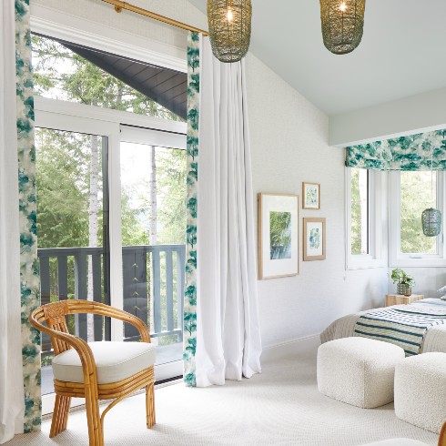
1. Be One With Nature
Named the Woodland Suite, this space is flooded with natural light thanks to all the windows and big sliding doors. Located at the back of the house, the suite looks onto the forest that surrounds the house and it feels as if you’re sleeping in a tree house. Bringing nature into a space is a trend that took root in House Heidi by opening up windows and choosing a colour palette of greens with wood accents to compliment the outdoors.
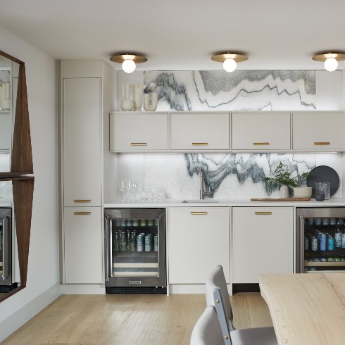
2. A Stone’s Throw
The tile and stone work in House Heidi is a component of the house that doubles as both a functional and design feature. Sarah thoughtfully curated the tiles and stonework to be durable and make a (back) splash. Weaving in inspiration from the mountains and glacial ice, the stonework in House Heidi is a reminder to guests that they really are in a sophisticated mountain escape.
Watch: A Very Whistler Welcome
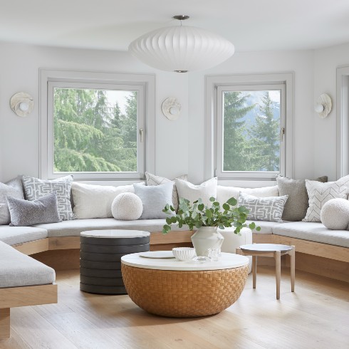
3. Design That Comes Full Circle
Not everyone can envision the potential of an awkward layout but Sarah proved to have perfect vision when it came to reimagining House Heidi. The entire house was a clutter of various rooms clumped together in an awkward layout and although cute, figuring out what to do with the turreted spaces was a challenge. Keeping an open mind is key to working with the space you have and Sarah proved this point by completely removing the kitchen and installing a luxe lounge in the second floor turret.
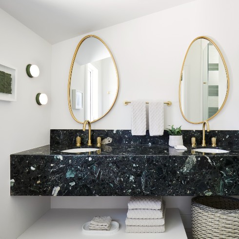
4. Floating Vanities
Floating vanities were an element Sarah felt strongly about, not only because of their elevated style but because they provide two important features: Extra storage and easy to clean. In order to maintain a rental property, Sarah was dead set on ensuring every aspect of House Heidi was functional and easy to clean, and floating vanities do just that, all while looking good. Guests can stow toiletries close by without cluttering up the counter space and the space above and below is accessible to clean. It’s a win-win.
Related: Catching Up With Sarah Richardson
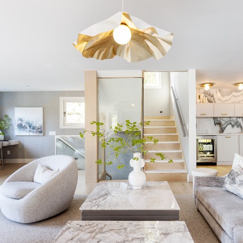
5. Statement Lighting
Lighting can make or break a room and it’s especially important if the goals are to turn up the luxury and create a particular atmosphere. Since House Heidi is a luxury rental, Sarah knew the light fixtures were a crucial design element for elevating the rooms.
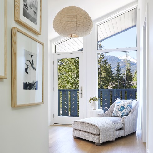
6. Gallery Walls
Located on the third floor landing is a specially curated gallery wall that honours the history of House Heidi and the Whistler community. Gallery walls are a great way to visually tell a story and in House Heidi’s case, the gallery wall draws guests into a cozy nook before entering the Glacier Suite. When designing a gallery wall, be sure to leave equal distance between frames to avoid looking too busy and cluttered.
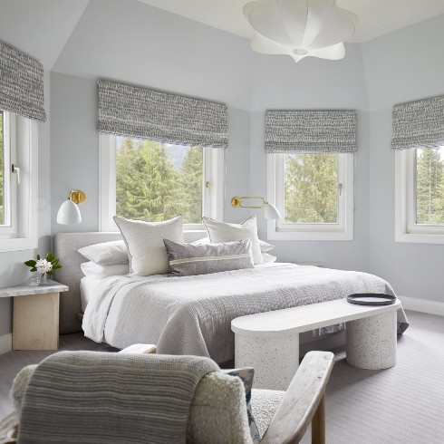
7. Vaulted Ceilings
As much as possible, Sarah increased the ceiling height wherever it was allowed, creating the effect of more space and roominess. The vaulted ceilings were a huge win and created more interest and depth to an otherwise average room. The Glacier Suite was located in one of the turrets but by punching up the ceiling, it went from cramped and awkward to palatial.
Watch: What’s in a Suite Name?
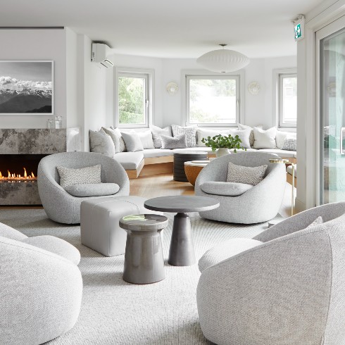
8. Amp Up the Texture
One way to warm up a room is by inviting texture to fill in when the palette is more cool in tone.
Texture can be found in carpeting, pillows, throws and upholstery, so even though the colour palette on the second floor of House Heidi is cool grays, it’s still a cozy and inviting space.
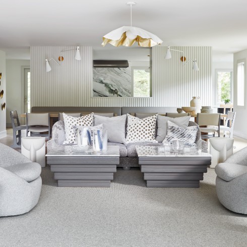
9. Warm and Cool Neutrals
Whistler is an all-season destination, so Sarah chose a colour palette of warm and cool neutrals. The varying grays are inspired by glaciers found in Whistler with dashes of gold and warmth from the fireplace to create a cozy vibe. So while the gray tones keep things cool for visitors in the summer, the house is still cozy, cabin-ready for visitors in the winter.
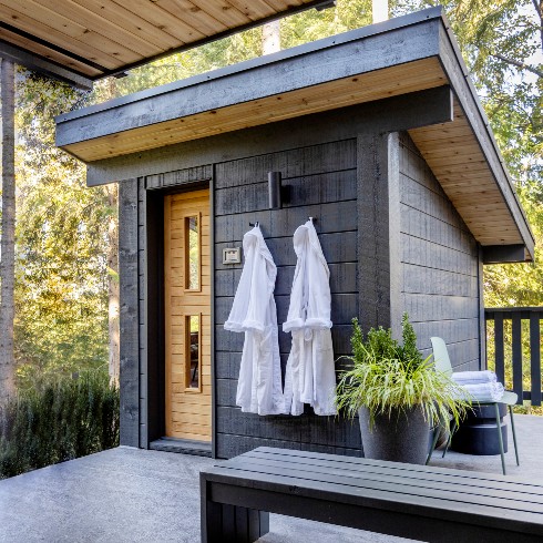
10. Self Care is Always in Style
Self care is always on trend and even more so on vacation! The sauna is an added amenity that makes House Heidi even more competitive in the rental market. Not only is it a toasty pick-me-up for guests but the structure itself is a thing of beauty that adds to the European ski chalet aesthetic, blending in perfectly to the rest of House Heidi.
Love these designs? Shop the look!
HGTV your inbox.
By clicking "SIGN UP” you agree to receive emails from HGTV and accept Corus' Terms of Use and Corus' Privacy Policy.


