Some entryways are simple, some are stuffed. Whatever your fancy, these vestibules are so inspiring they’ll have you taking notes. Shiplap-clad, a juicy-bright door, striking stripes – what’s your favourite?
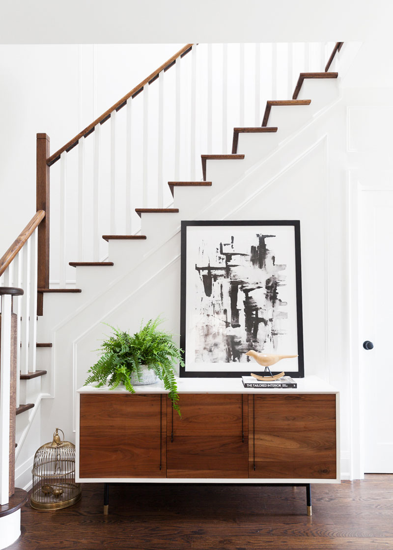
Mid-Mod Style
If you’re a clutter-bug, a console with storage is just what you need. Keep the surface stunning like in this art-filled Toronto home, where hits of metallic, an abstract painting, a midcentury-modern credenza and a jaunty fern make an inviting entranceway.
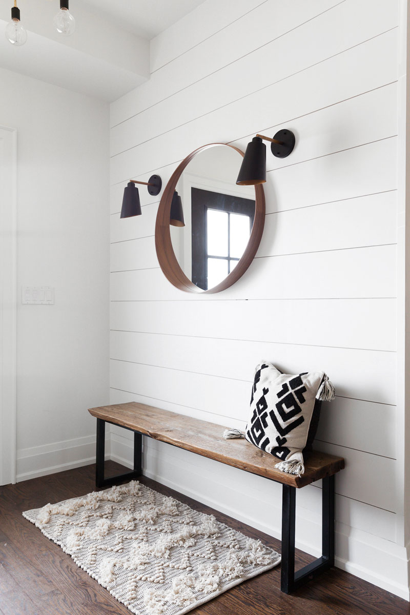
Simply Done
Here’s another entrance in that home you just saw. This one is all about paring it back to aesthetically pleasing essentials – flanking sconces, an IKEA mirror, a bench and a rug. It’s all set against a shiplap backdrop for a clean and inviting look. So don’t fret about that entrance – a little goes a long way!
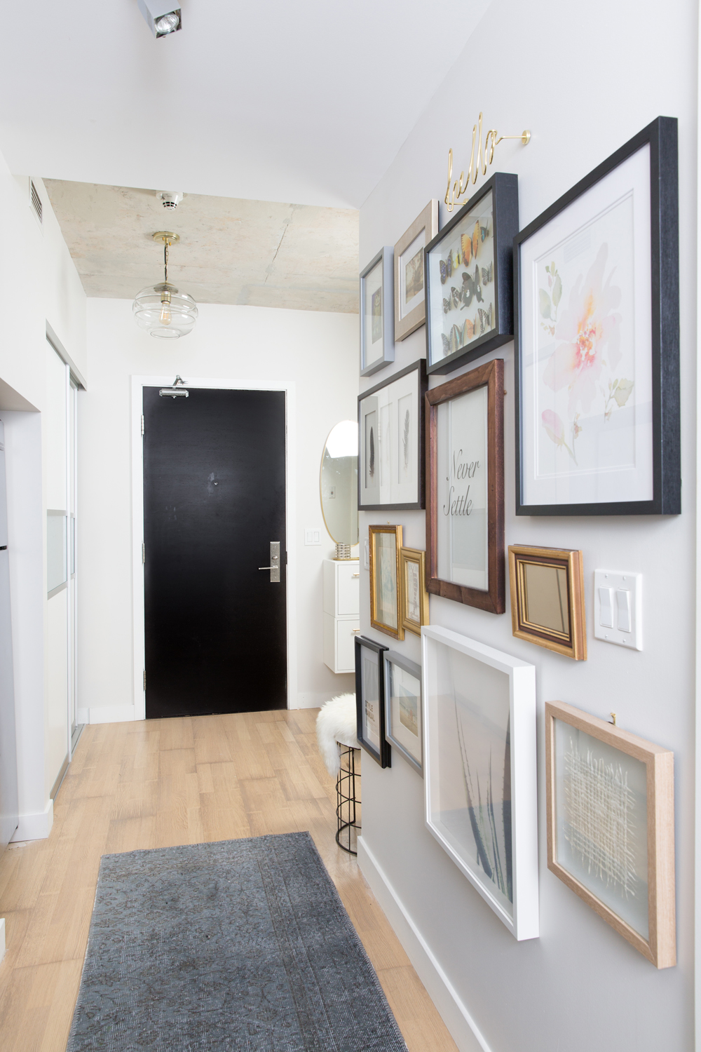
Go for a Gallery
Grouping artwork together is a fabulous, fun and super easy way to create an attention-grabbing hallway. It’s especially effective in smaller spaces that can’t handle a standalone piece of furniture. Take inspiration from this amazing 400-square-foot Toronto studio that’s packed with small-space tips.
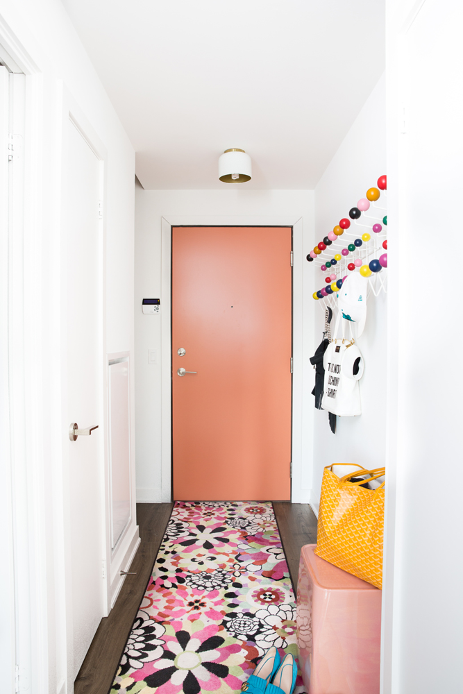
Juicy Pastels
You can’t help but smile at this entranceway that looks like a bubblegum machine exploded in the hallway (in the best way possible). It’s exactly what you need to bring spice to a condo. Read more about this daring designer’s home.
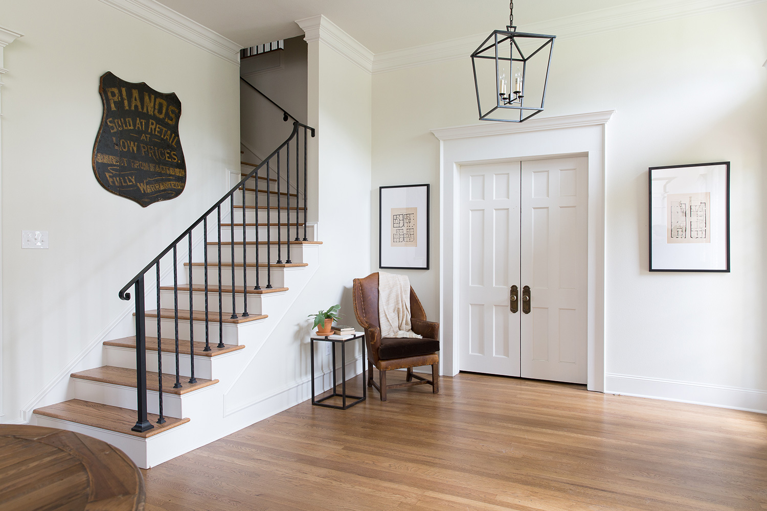
Grand Welcome
Not every single entranceway needs a console/mirror combo. Take a page from Fixer Upper‘s Joanna Gaines, who created a sparse yet stylish seating area. Here, black accents pop against the crisp white in her gorgeous vacation rental. You need to see this grand 1903-built home in its entirety.
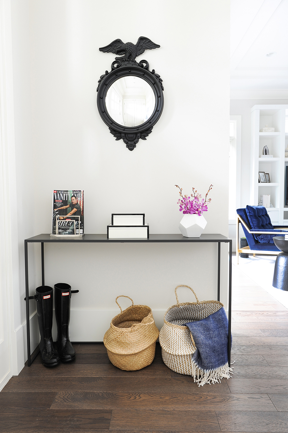
Streamlined Style
Space tight? Choose a streamlined console that’s tidy and functional. Toss in throw baskets for texture (and storage) and fabulous accessories, like this antique mirror. Learn more about this glam Vancouver home!
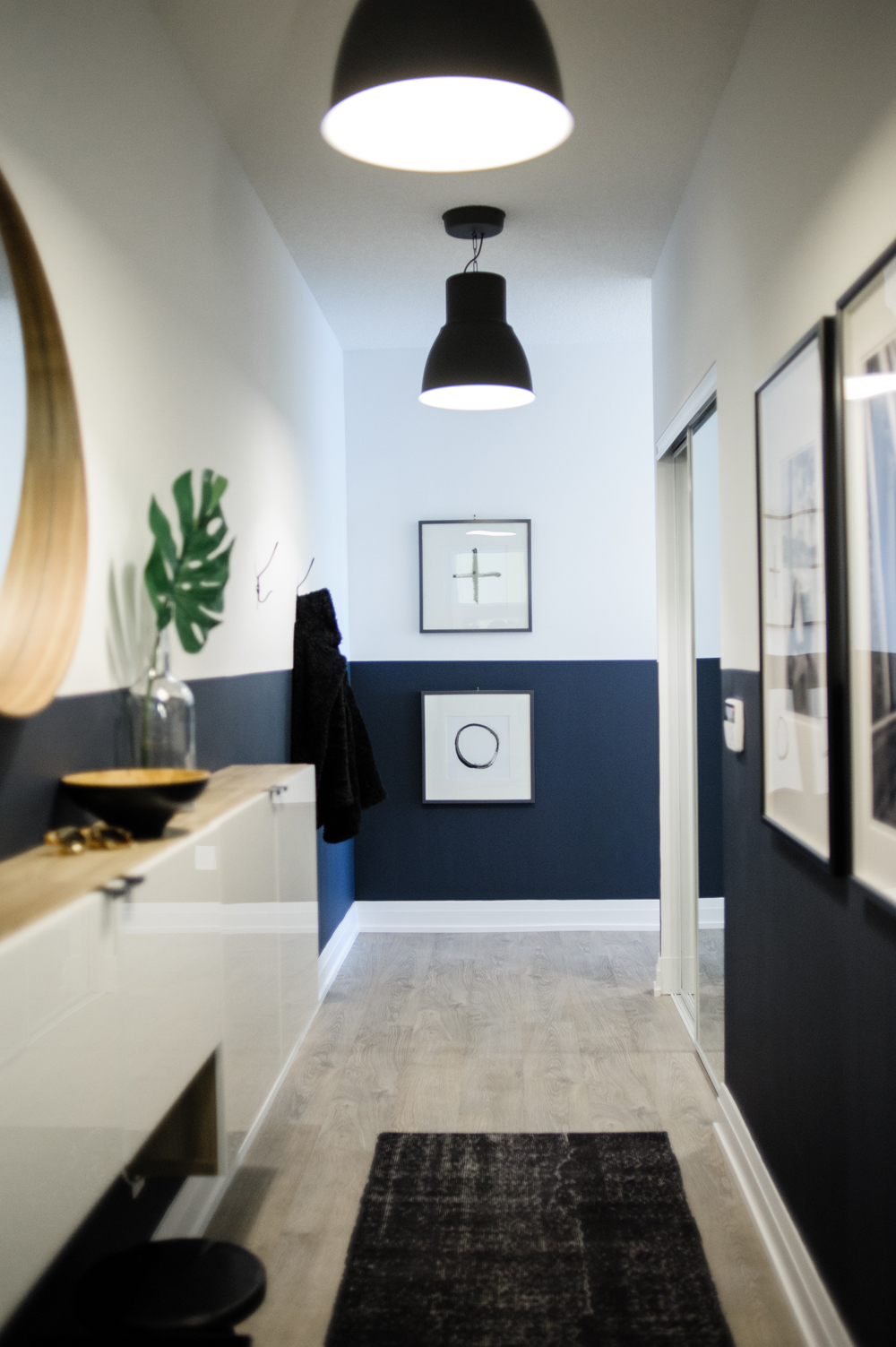
Double Barrel
Don’t forget to pay attention to the ceiling. In this condo, large black pendant lights make a dramatic impression when paired with a slick space-saving shoe cabinet. Hallways tend to get scuffed, so Toronto designer Natalie Chong painted the lower half of the wall deep navy. Read more about this IKEA-packed space.
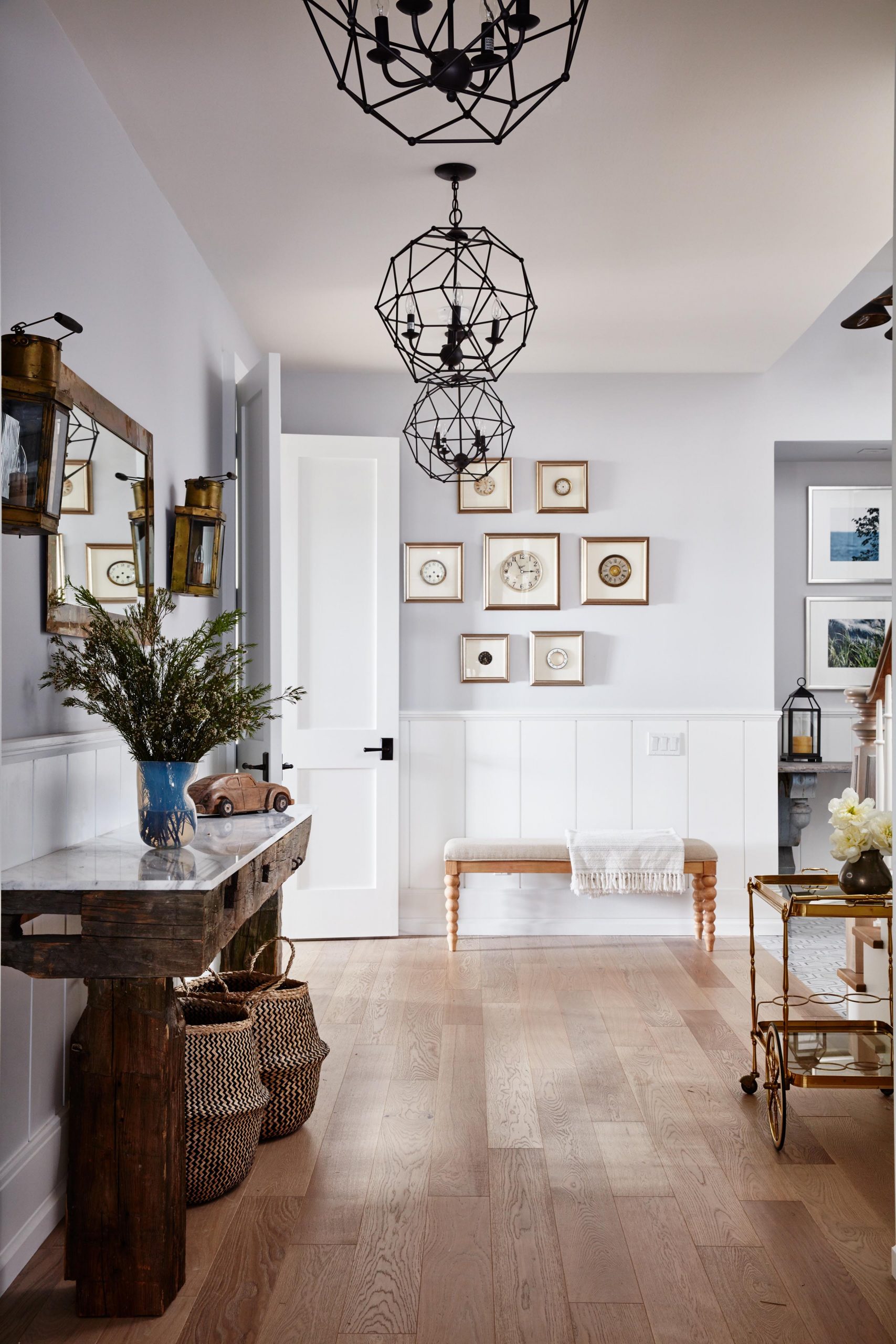
Charming Vestibule
In Sarah Off The Grid, Sarah Richardson brings in character-filled vignettes, resulting in an infinitely interesting home. This is the basement foyer of the showstopper dwelling – if you can believe it. Here, wainscotting and an array of furniture – from the luxe bar cart to the twisty bench and hefty hewn console – make for a head-turning welcome.
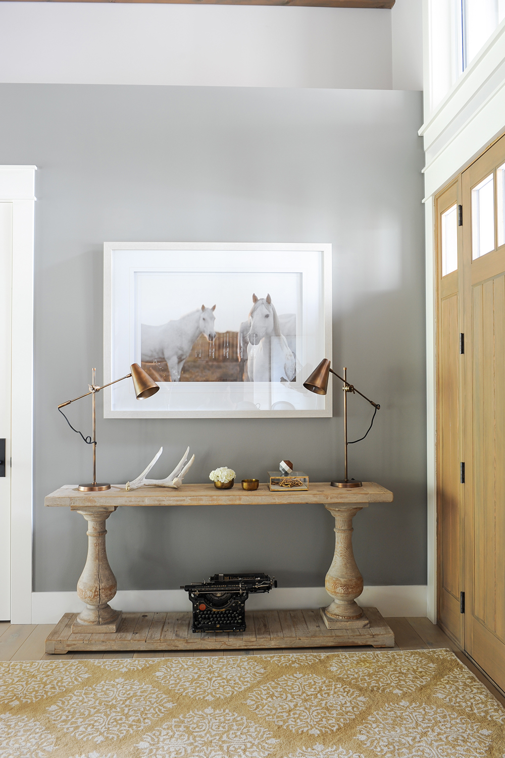
Rustic and Refined
It behooves you to copy this curated look that’s all about the mix: a pair of burnished brass lamps, a rustic console, enchanting equestrian artwork and a vintage typewriter are an unexpected combo that feels both refined and relaxed. Naturally, the rest of this wood-filled Vancouver home is just as gorgeous.
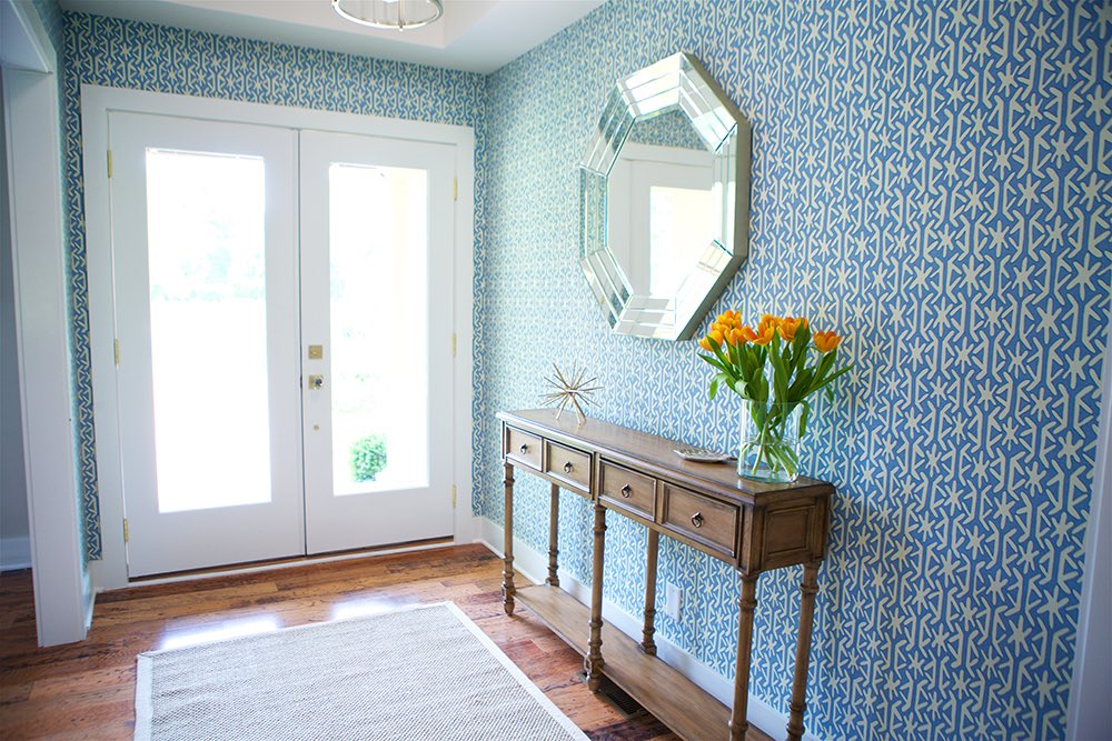
Wow Them With Wallpaper
The Property Brothers helped this pair of Nashville grandparents beautify a house, and the result is a colourful collection of rooms that feel youthful. The entranceway sets the scene with teal wallpaper and a contrasting wood console. Orange tulips pop against the blue.
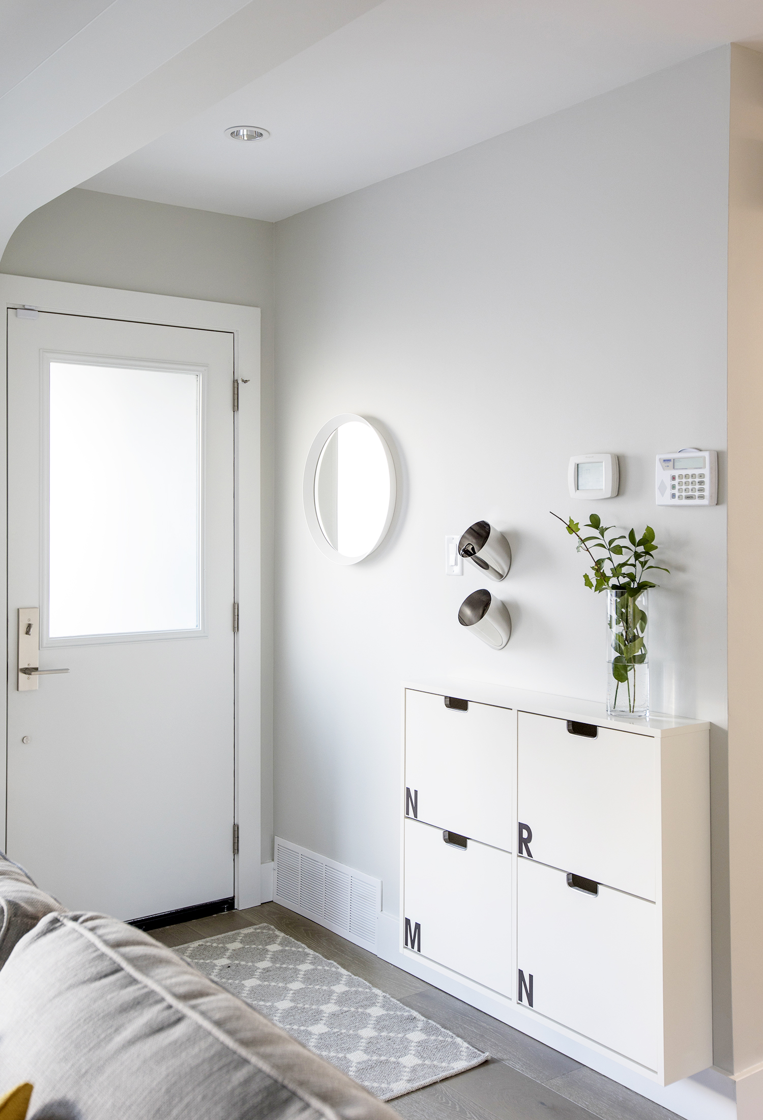
The Skinny
There is no excuse for not sprucing up the front entrance. Case in point: this compact and contemporary entrance featured on Love It Or List It Vancouver. Here, a space-saving IKEA shoe cabinet is both functional and fetching. Use the top as a ledge to display something pretty. And feel free to customize yours, like Jillian Harris did. The initials stand for each family member’s name.
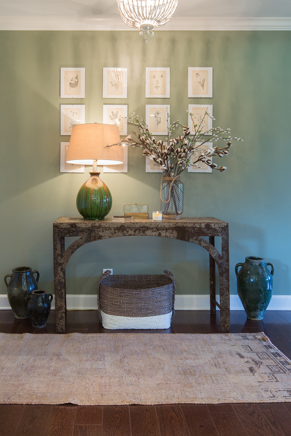
One-of-a-Kind Finds
Vintage pieces, like this tarnished console, bring a unique spin to a space. Hit up a salvage shop or flea market for a central piece that catches your eye and then build around it like the Property Brothers did here. A grid of artwork, country accessories and a sisal rug are charming choices.
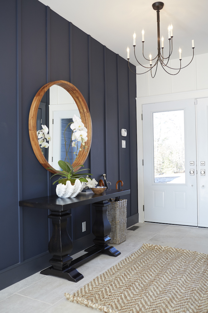
Panelled Perfection
This simple application gets big results every time: panelling, as seen on Home to Win Season 2. Now choose a colour – a deep hue is a good choice against white – and watch your friends ooh and ahh. A console with a thick trestle base and a wood mirror for contrast round out the look.
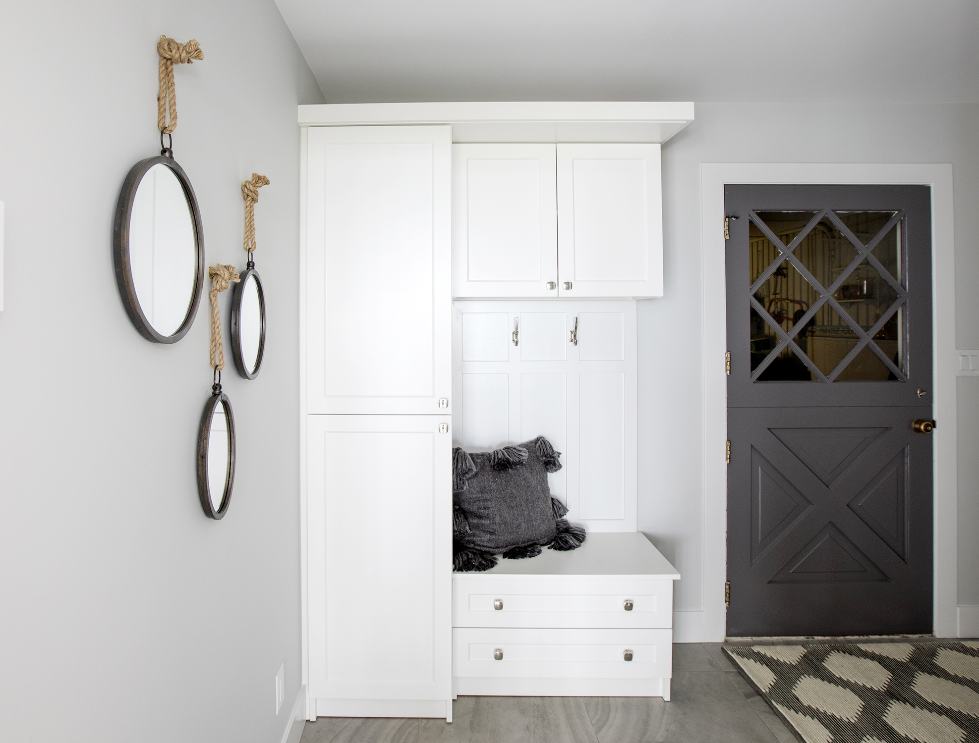
Mudroom Envy
If you’ve got the time, a built-in cabinet is a great way to keep the coats, hats and scarves out of view. Add accessories – in three, please, it’s a designer’s eye-pleasing trick – and you’re good to go. Check out more of this gorgeous oceanfront property designed by Jillian Harris.
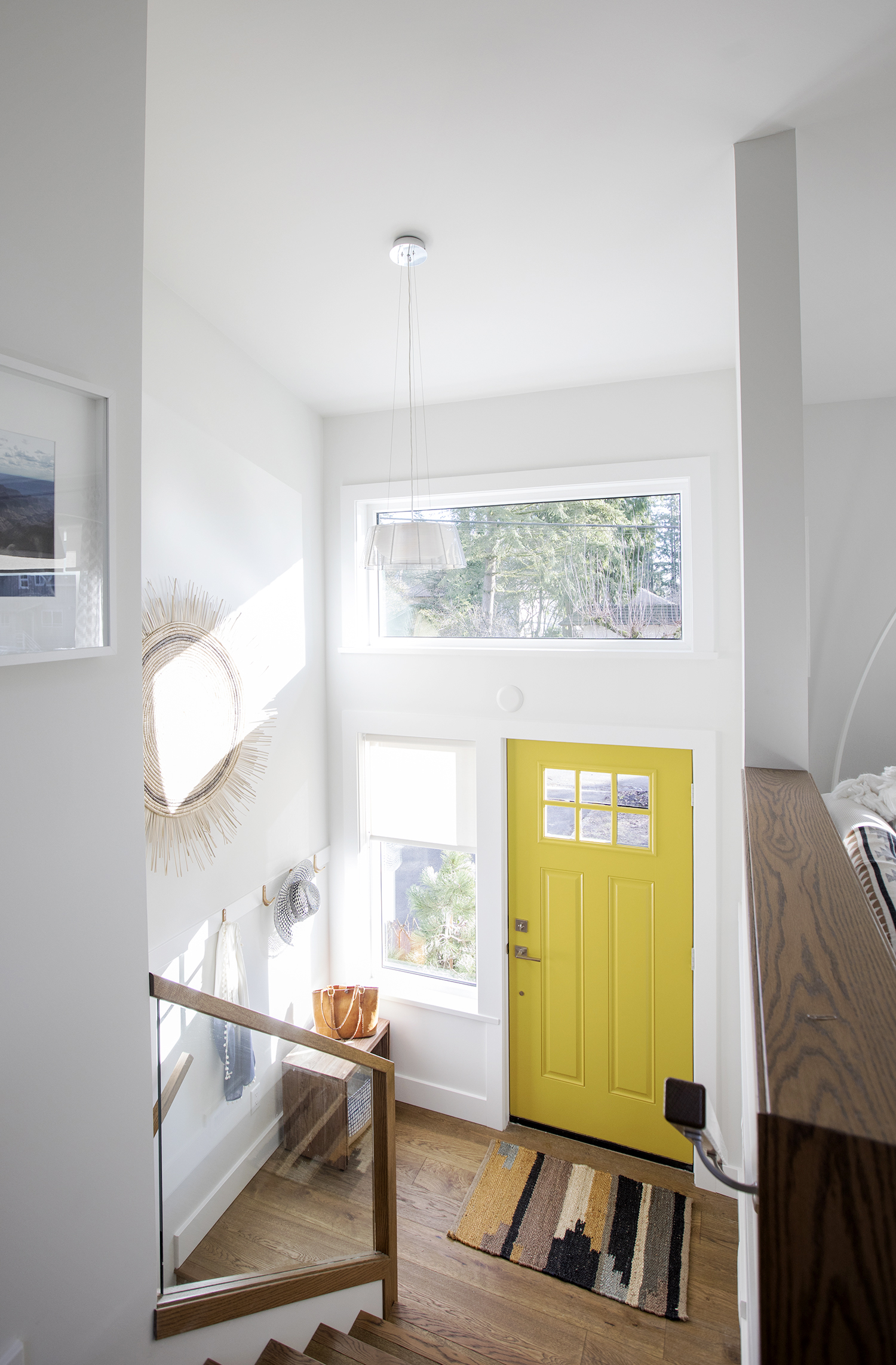
Sunny Welcome
Scared of bright paint? Then restrict the loud colour to the door, which Jillian Harris did in this contemporary makeover. Such an easy and effective way to make an entrance!
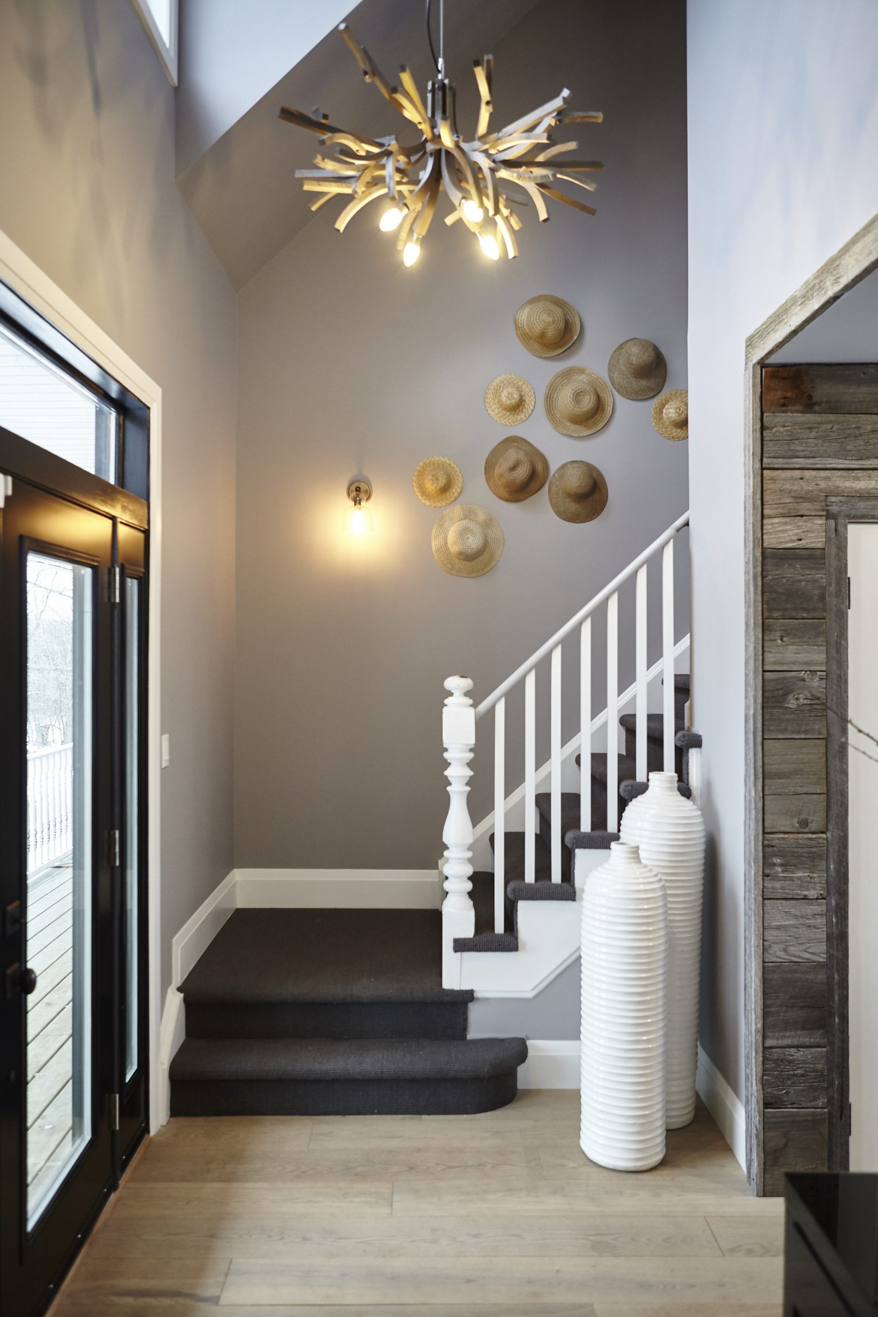
Hat Trick
Animate a hallway by grouping similar items together, like in this fun foyer seen on Home to Win. The sculptural chandelier made up of wavy branches is an interesting counterpoint to the hats and tall vases. Pro tip: Experiment with unlike things in an entrance to wow guests!
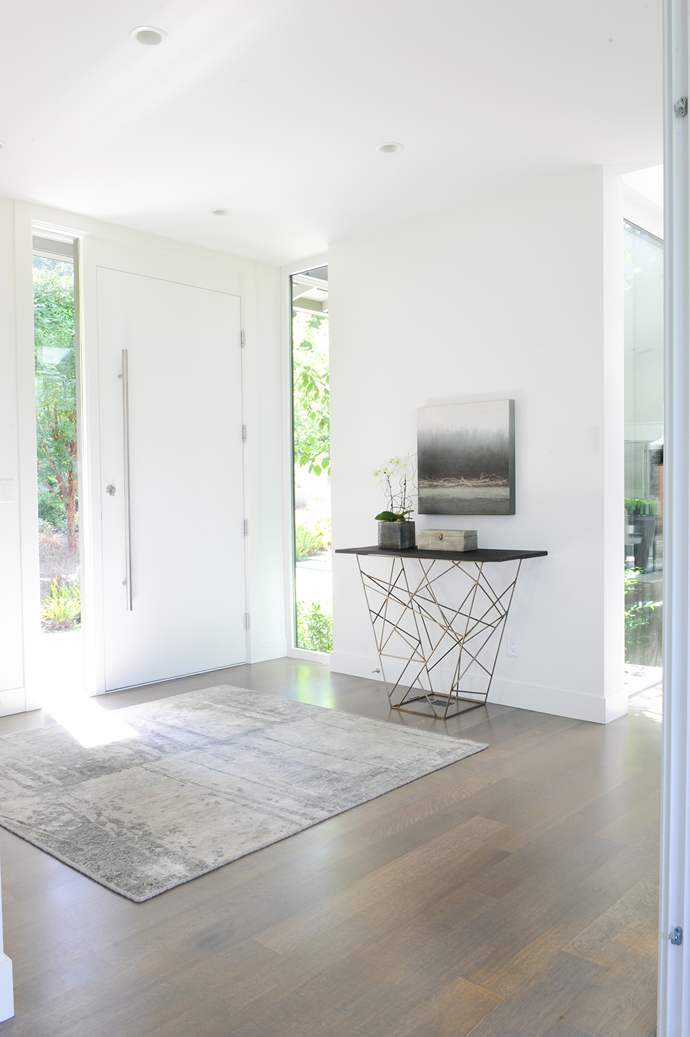
Open Air
A sculptural console table is the only furnishing in this open and airy front entrance. Which is why it needed to evoke interest. The lesson here? Be selective, but don’t be afraid to uplift the space with a statement-making piece or two.
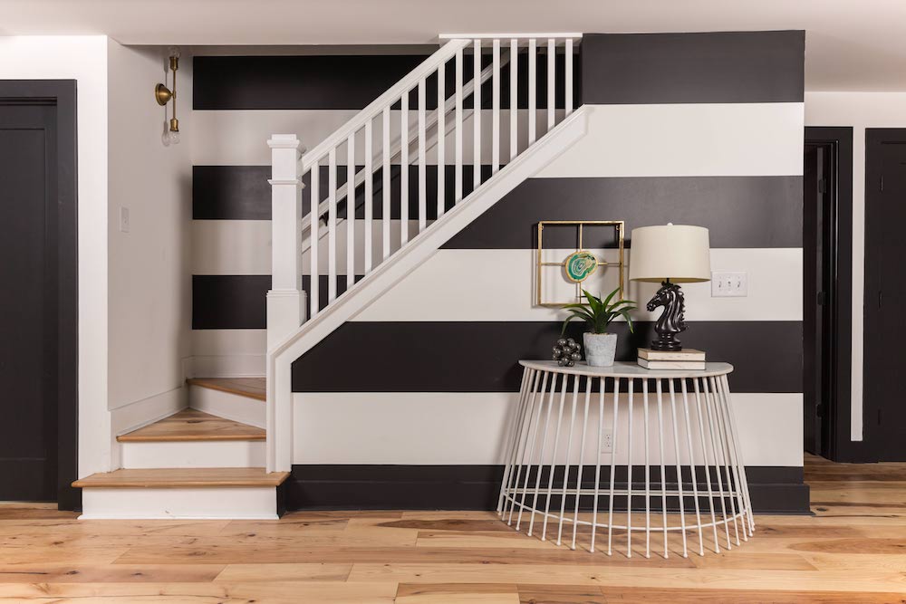
Bold Decorating
This eye-popping entryway is the work of Kortney and Dave Wilson of Masters of Flip. They brought a host of zany elements to this tiny rundown cottage – there’s even a teal ceiling! This vignette is all about those massive stripes as a backdrop to that curved, cage-like console.
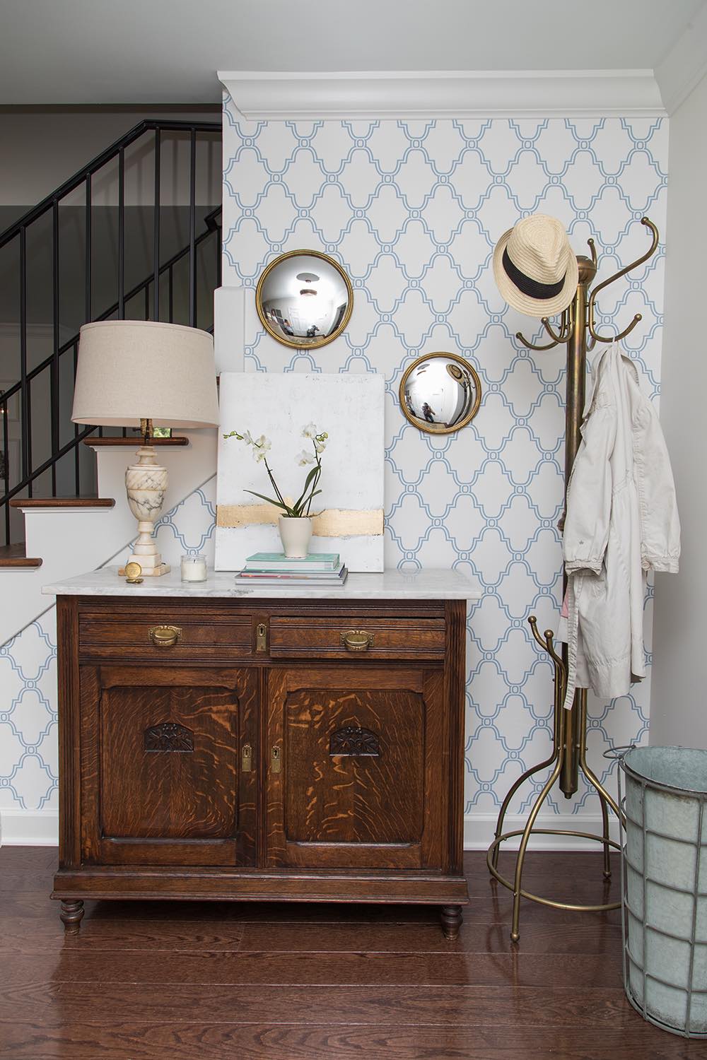
Traditional Tease
Elements of traditional decorating – the antique dresser, the brass coat rack – converge with a modern take on damask to bring sass to this space.
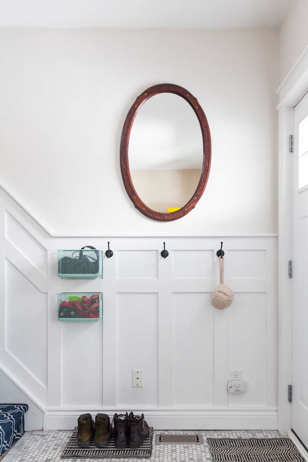
Panels and Pluck
There’s no excuse to leave an entryway bare, even if space is snug. Case in point: this 1925-era Toronto home that’s inspired by a farmhouse. Open the door, and guests are met with an antique oval mirror that feels eclectic against the patterned staircase. Hooks and baskets hold miscellaneous items.
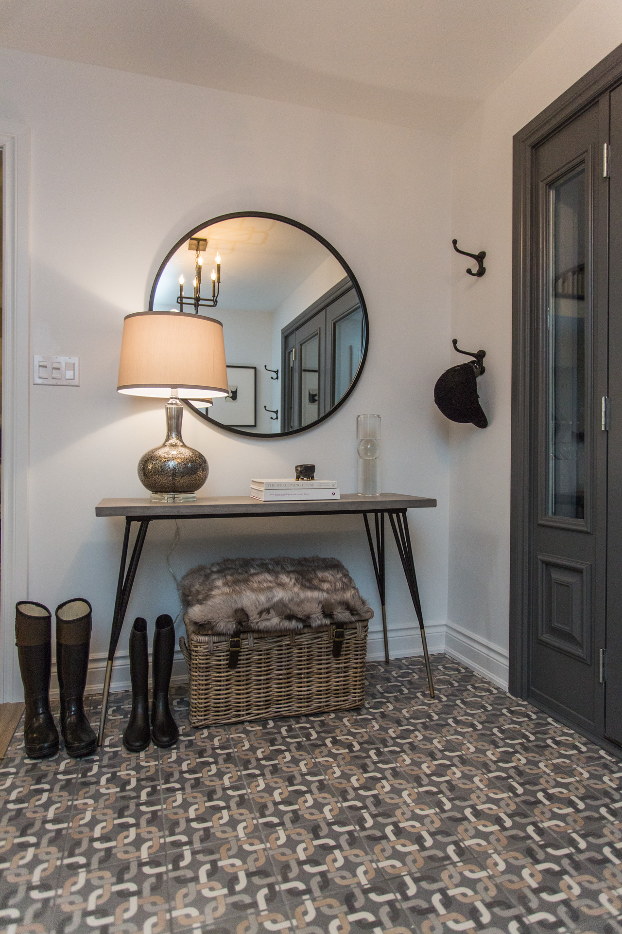
Tiles With Style
Bryan and Sarah Baeumler brought a refined design sensibility to this house, where the entranceway was treated to earthy-toned geometric floor tile, classic furnishings and big hooks for oomph.

Contemporary Comfort
A built-in storage bench with a handy mirror and an origami light fixture set the contemporary mood in this home designed by Toronto’s Alana Fletcher. The wood-and-white mix is a motif throughout this showstopper of a space.
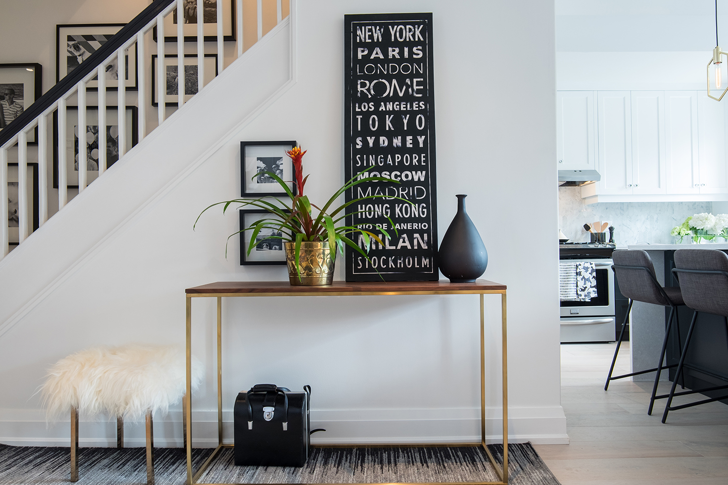
Balancing Act
In this entrance, the Property Brothers brought a dose of charm against the staircase. Gold, white, but most importantly black – such a captivating staple – are the main players. Varying the heights of the accessories is key. The brothers balanced the composition, which is centred around the geographic artwork.
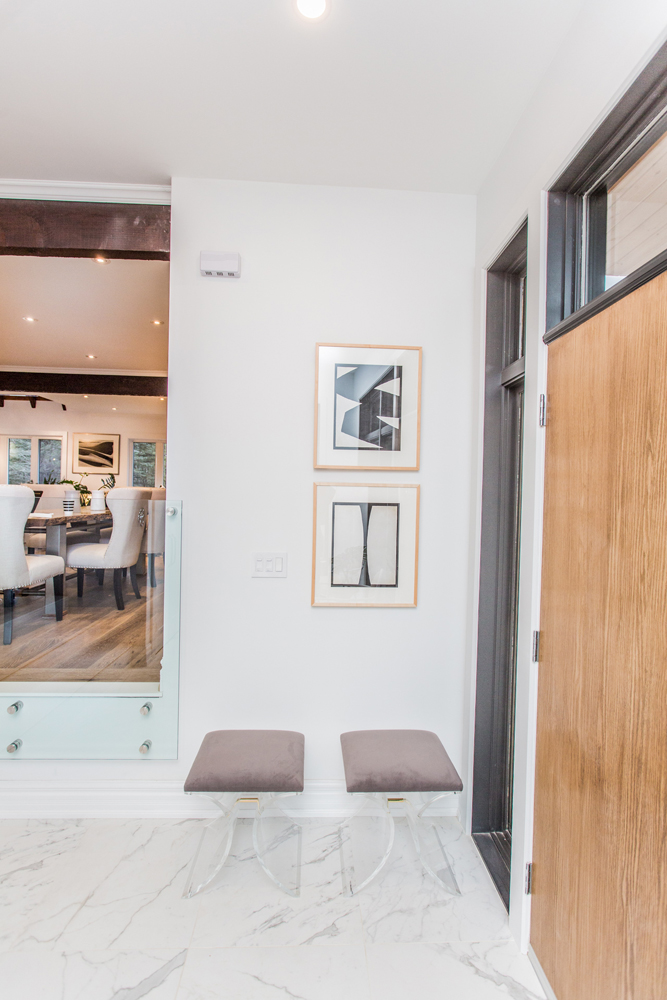
Soft Opening
Not every hallway needs to be stuffed. The Baeumlers brought elegance to this airy home with a duo of plum-coloured Lucite benches. The stylish seating and artwork reinforces the subdued glamour.
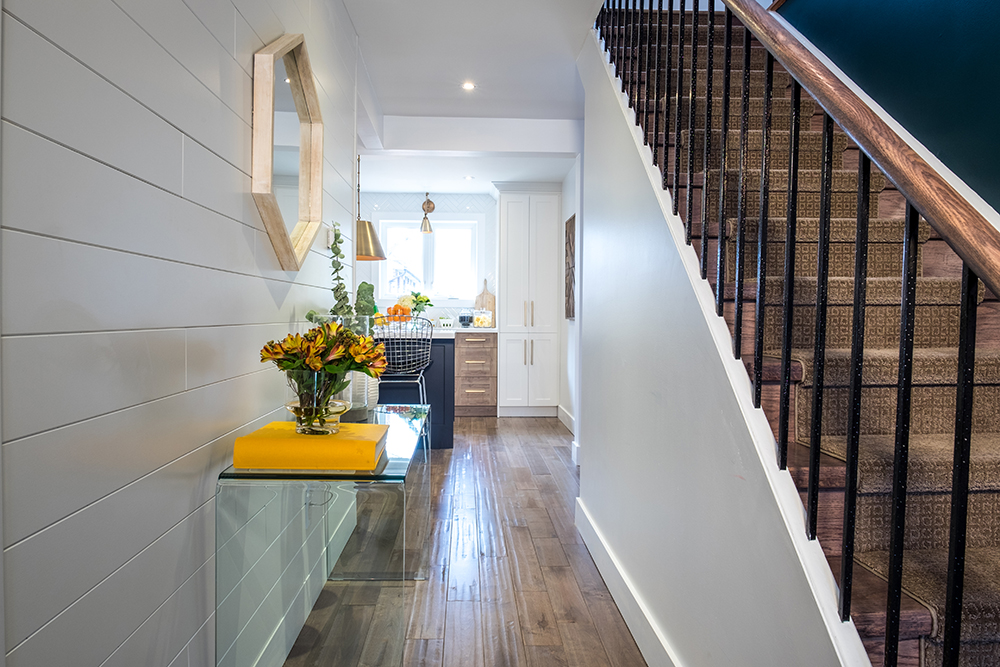
Shipshape Shiplap
When faced with a long hallway, the Property Brothers knew they had to do something special: shiplap to the rescue! So simple, so inexpensive and so captivating. Jonathan then brought in a glass waterfall console for a clutter-free look. Sunny yellow accessories are instantly uplifting.
HGTV your inbox.
By clicking "SIGN UP” you agree to receive emails from HGTV and accept Corus' Terms of Use and Corus' Privacy Policy.


