From a puppy paradise to an entertainer’s oasis, Kortney and Kenny have been giving us non-stop memorable builds. Season 3 of Making It Home with Kortney and Kenny has come to an end, but don’t despair, we’re here to round up the best of these homes’ overhauls.
It’s been a season full of new demos, renos and deserving families. Each renovation is unique to these special families, with their own stand-out moments. Here we look back on some of the highlights and aspects of these designs that left an impact.
Watch Making It Home with Kortney and Kenny on HGTV Canada. Also available on the Global TV App and STACKTV with Amazon Prime Video Channels, fuboTV, Rogers Ignite TV and Ignite SmartStream.
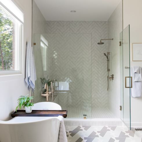
A Refreshing Retreat
In every home there needs to be a space to get away. In Tatum and Michael’s primary bath, Kortney wanted to create a personal retreat. To give the space a spa-like relaxing feel she made most of the design monochromatic. With a massive, white-tiled glassed-in shower and large white soaker tub, she added intrigue with a unique two-tone tile pattern on the floor. It was the perfect backdrop to allow the space’s fixtures to stand out against. Across from the shower the team added a lush green vanity, accented with gold hardware. The choice of green was a strategic one, so that any additions of plants would add to the fresh aesthetic.
See the full reveal: From Drab to Drama—Kortney and Kenny Reimagine This 80’s Family Home
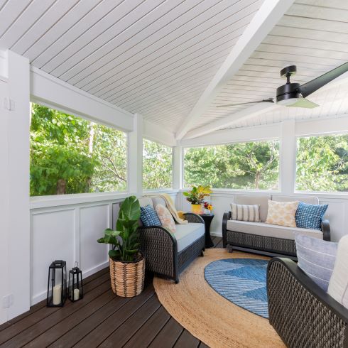
Decked Out
Home doesn’t just start and stop at the door. For Cara and Garrett’s new home the back deck was an important space. The team took on the big task of creating a screened-in living-space that could be used year-round. With painted white walls and roof to contrast the deep brown decking, Kortney blended them together with an oversized tan rug. Paired with the same contrasted design, the outdoor furniture continued the same aesthetic. All of which she accented with soft blue tones in a smaller throw rug and pillows.
See the full reveal: Kortney and Kenny Create a Crisp, Clean Home Full of Life
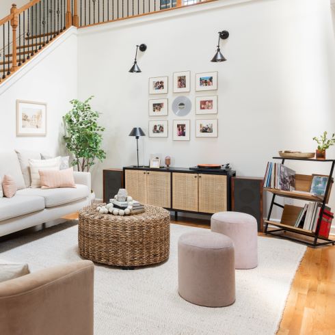
A Living Room to Listen to
Rose and Keith’s living space centered around two things, quality time and quality music. Kenny helped to design a handmade boho display for the family’s record player and vinyl collection. Above this they incorporated a family photo feature. Kortney wanted the space to feel simple and laid back, choosing softer and muted colours, as well as textures. To modernize the dated fireplace, the team white-washed the brick and added a rustic timber mantle, adding warmth and intrigue to the room’s focal piece.
See the full reveal: Kortney and Kenny Bring the French Countryside to this Dated Family Home
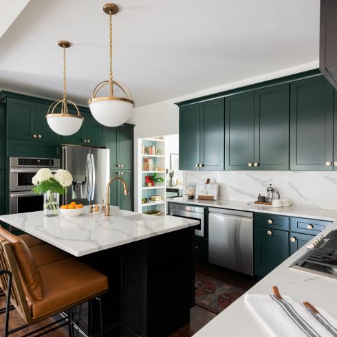
Grand and Green
Andy and Benjamin wanted a home that could mature with them. Nothing says timeless and elegant quite like dark green cabinetry. Kortney kept the space light by contrasting them with white marble countertops that continued up as a backsplash. Gold light fixtures and hardware served as a stunning complimentary accent, while the dark hardwood flooring and tan leather seating created a sense of warmth to the regal designs.
See the full reveal: Kortney and Kenny Design a Modern Sophisticated Dream Home
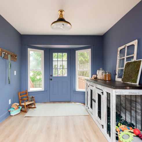
Going to the Dogs
Dana and Phil wanted a home that worked for them above all else. Kortney knew that she could deliver that utility while also creating a beautiful home. The first thing the team got to work on was installing a second entryway at the rear of their home. With bay windows on each side natural light flooded the space. Muted blue walls with light hardwood, complimented by a white ceiling created intrigue that flowed into the hallways. Kortney wanted to continue this design element without growing repetitive so as the hallway transitioned to storage, one wall kept its colour while the opposite became white storage and shelving. Most importantly was the installation of a beautiful handmade dog kennel for the furrier family members.
See the full reveal: Kortney and Kenny Design a Stylish Puppy Paradise
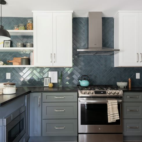
A Sneaky Splash of Colour
Fashion and function can go hand in hand. Emma and Scott’s styles differed, one liked subtle and the other a pop of colour. Kortney knew that she could satisfy both tastes in one space. She started off with a bold design choice in two-tone cabinetry, with white upper and soft grey lowers. She tied the two shades together with a beautiful and subtle oversized blue herringbone tile backsplash. The tile served as the perfect backdrop and addition of colour to let the cabinets stand out. Finally, she finished the design off with a sleek black countertop that peninsulas out.
See the full reveal: Kortney and Kenny Create a Vibrant and Accessible Home for This Family of Four
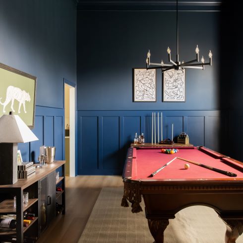
Remaining Entertaining
What’s a home without the people that matter? Odessa and Shannon were entertainers through and through and their home showed that. The Making It Home team wanted to create the perfect space for just that. In their pool room they added simplistic, contemporary trim work with a regal blue paint, lighter on top to draw eyes upward. Light hardwood flooring and industrial pieces made from reclaimed railroad ties added a relaxed sense of warmth. Finally, Kortney added artwork and a modern black chandelier to add interest. Cue us up.
See the full reveal: Kortney and Kenny Create an Entertainer’s Oasis
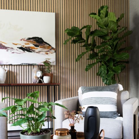
A Natural Divide
Opportunity can come in any form. James and Elizabeth’s second living room made for the perfect parlour. Kortney, wanting to create a mature and modern space added a feature wall of vertical wooden slats, paired with a muted textured wallpaper. She hung a modern art deco chandelier over four lounge chairs and a simplistic coffee table. With soft orange linen curtains and several potted plants, the room became a relaxing contemporary offshoot in the home.
See the full reveal: Kortney and Kenny Design a Dreamy Home Base For This Family of Travelers
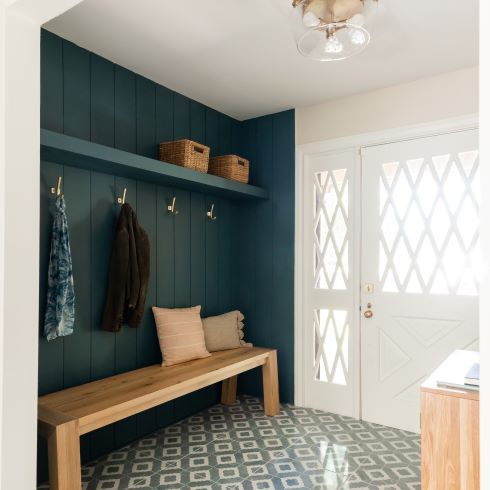
Bring on the Bright
Michael and Emily’s house needed new life and new light. To make the home feel light and bright as soon as you walk in, Kortney installed a gorgeous, bright farm-style door with latticed glass inserts. With most of the interior being in crisp whites, contrasting it subtly and tastefully would be difficult. To accomplish this, Kortney created a coat hook nook, with a board and batten design, painted in a unique, flat dark blue. It added both interesting textures and tones to the small feature. She kept the farm-chic theme going with a white and off-blue tile that tied the feature wall with the rest of the home’s bright walls, then topped it off with a chunky wooden bench.
Love these designs? Shop the look here!
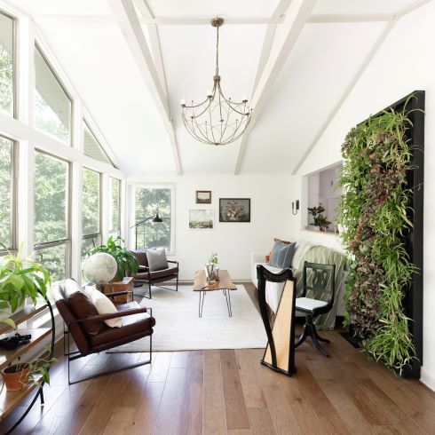
Wonderous Windows
You can never have too much nature. Calea & Blake’s sunroom was a designer’s dream. The MIH started by painting the walls and overhead beams in a crisp white. Paired with the lighter tones of the new hardwood flooring brightened up the space and allowed the views to stand out. They added a lush, living feature wall of plants to add a splash of natural colour. From there they wanted to keep the décor simple and minimalistic. The chandelier, lounge chairs, and coffee table were all low and slender, so as to maintain the room’s feelings of openness. The result was a relaxed space that blurred the lines of inside and out.
HGTV your inbox.
By clicking "SIGN UP” you agree to receive emails from HGTV and accept Corus' Terms of Use and Corus' Privacy Policy.


