Calgary’s Kayla Browne may be an architect, but she doesn’t conform to the stereotype: She doesn’t habitually dress head to toe in black. “How boring,” says Browne, principal at BOLD Workshop Architecture and senior associate at Sturgess Architecture. Not only does Browne rock red lipstick, her closet is filled with Crayola-bright outfits — colour-coordinated, natch. She brings the same irreverence to her home, an artsy build in Calgary’s historic Inglewood neighbourhood that she shares with her husband, Nick Tumu, and cats, Stink and Tina Turner. Spacious and lofty, with a rippled metal exterior, a catwalk and thrusts of colour, the 3,821-square-foot home is a contemporary charmer. In the rear, there’s also a detached 490-square-foot laneway house. A demi-courtyard off the kitchen, meanwhile, offers outdoor respite — though with an interior like this, why go anywhere? Tour this stunner via video here.
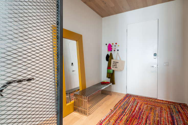
Bright Beginnings
Kayla’s home sets the tone in the foyer for the rest of the space: variegated rug, slatted steel bench and Eames Hang-It-All rack, with Bubblegum-esque pegs, are clean-lined and cheery. Meanwhile, a wood-wrapped ceiling imparts warmth.
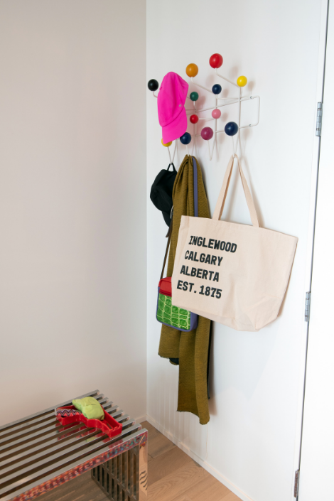
Then and Now
It’s welcoming now but the original house, built in 1901, was dilapidated when the couple bought it, and had to be torn down. “It had been vacant for five years. It wasn’t in liveable condition,” says Kayla. “There was mould and broken windows.”
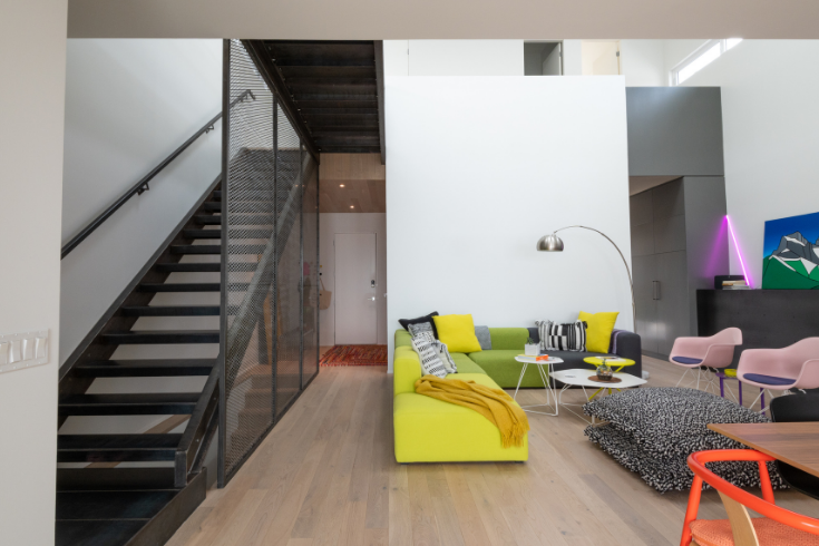
Shake Your Little Tush On The Catwalk
The cool-as-can-be steel catwalk (see it in the next pic) and sleek stairs give the home edgy attitude.
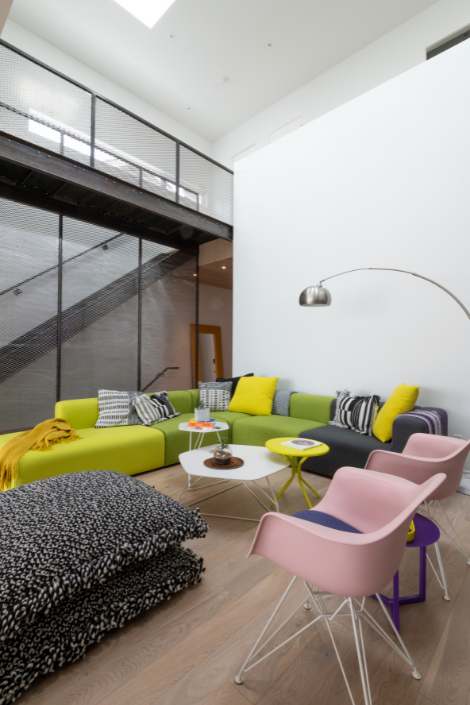
Heads Up
Kayla and Nick never feel cramped — their digs have a double-height ceiling and skylights. Natural light pours into the bright and airy abode throughout the day. Oh, and check out those Eames Eiffel chairs. Pink with purple seats, they’re a fun spin on the usual.
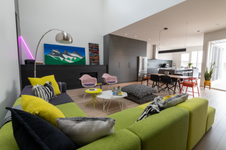
Bespoke Details
Grey millwork runs along the side of one wall — from the fireplace zone to the kitchen — giving the space a seamless, shipshape vibe more akin to a stylish loft, rather than a house.
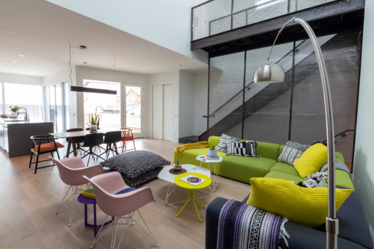
Sofa, So Good
The modular Mags sofa by Hay, a riotous piece in chartreuse, lime and grey, was a first for Contemporary Office Interiors, a store in Calgary. “I said, ‘I don’t want to do all one colour — can we do three?'” No one has asked us to do that before,'” says Kayla. The mix is fabulous!
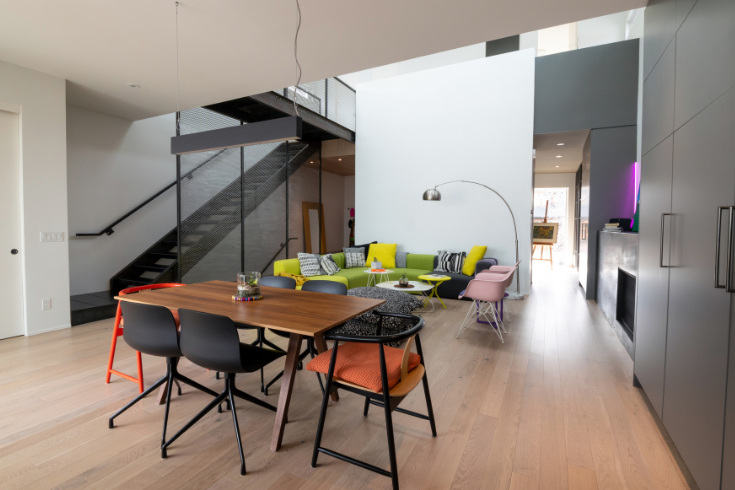
What’s In a Name?
Architects are always naming their projects. Laypeople should start to do the same (though come to think of it, “Dirty Dishes In the Sink House,” doesn’t have quite the same ring to it.) Kayla’s home — Slice House — is named in response to the site’s orientation, which is angled slightly due north. The main-floor volume rotates from the upper floor to reveal a slice facing true south in the front, and a slice facing east in the back. Translation: Because of this, lots of light pour through the house, at different times during the day.
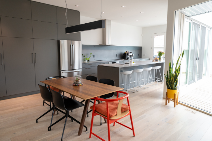
Distinct Zones
The open-plan space is demarcated with tight furniture vignettes, so the pieces don’t feel like they’re floating in the space. PS: We love the simplicity of this dining room set-up, with its linear pendant.
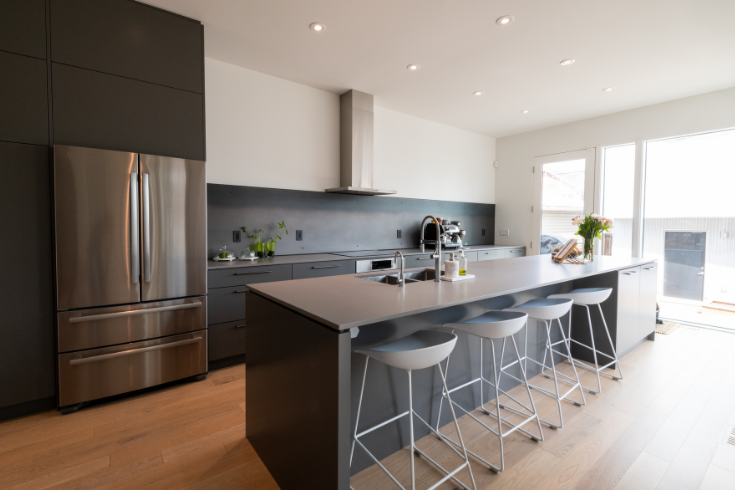
A Killer Kitchen
The kitchen’s millwork integrates beautifully with the fireplace to its left. Doors lead to the patio. “In the summer we have a long table out there and there’s a built-in bench,” says Kayla. “It forms a demi-courtyard. On the backside of the patio there’s a bench with small columnar poplars that will get tall and majestic as the years pass.
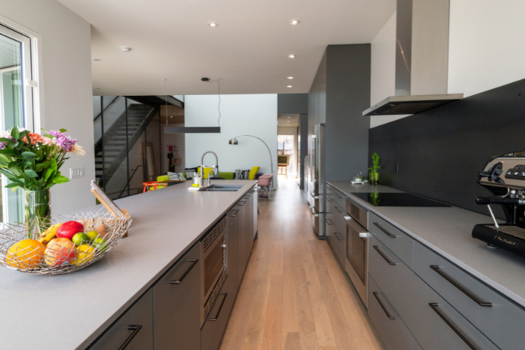
Island Time
Caesarstone countertops and a raw black steel backsplash are quietly sophisticated — and excellent for food prep. “We cook all the time on that big long island,” says Kayla. “It’s east facing, so particularly nice in the morning — the sun kisses your neck as you make a coffee.”
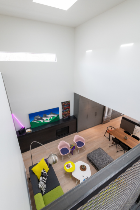
Bird’s Eye View
Here’s a view from the shared desktop zone above. Honey, bring me up a sandwich! “There are no hallways in the house,” says Kayla. Even this upper-floor area contains a room of sorts
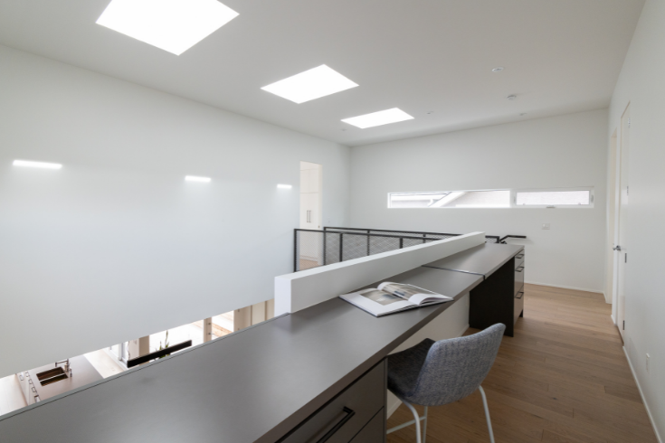
Study Time
Here’s a better look at that super-long communal desk: It’s such an inspiring, light-filled space. And it has a good purpose. “The idea is to keep your electronics out of the bedroom, and work in this space,” says Kayla.
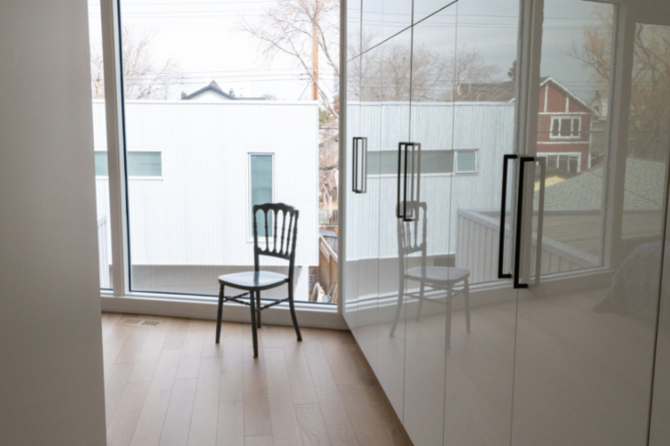
Closet Caper
The glossy closets in the principal room hide a splashy secret. That’s where you’ll find Kayla’s fastidiously organized clothes that are all colour-coordinated.
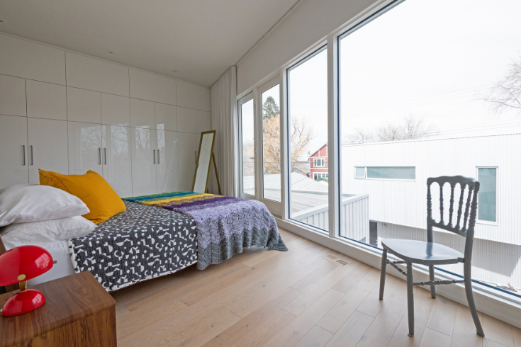
The Main Bedroom
Here’s a wider view of the couple’s bedroom with its patterned West Elm bedspread, and punchy mustard pillow. “It faces east,” notes Kayla, “so I get woken up by the sun.”
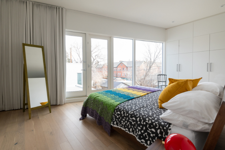
A Simple Plan
We just love a calm and comfortable bedroom — don’t you? Note, the furnishings are deliberately simple, so they’re in tune with the architecture.
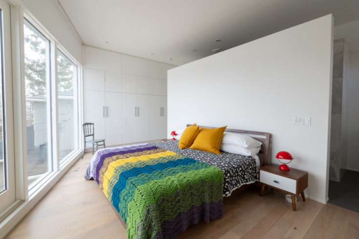
Wonder Wall
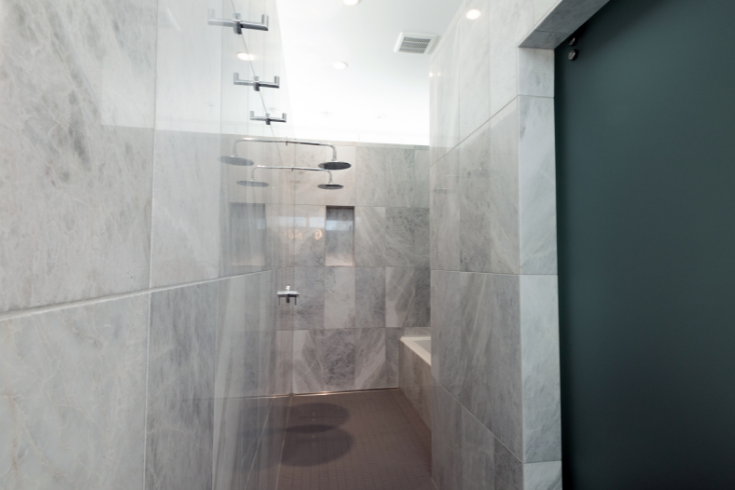
Behind the wall that stops two feet short of the ceiling is the ensuite wet room with its shower, tub and enclosed toilet room. The half wall gives the space a sculptural aspect and “keeps the wet room naturally well lit and serene,” says Kayla.
Bathed in Light
Here’s that bathroom Kayla was talking about. It’s so light and joyful. “Light is healing,” says the architect.
When Lighting Strikes
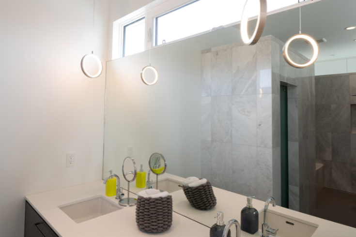
Clad in opulent polar white marble, “it’s like you’re in a hotel,” says Kayla of the principal ensuite bathroom, with its suspended lighting that casts a flattering soft glow.
Moody Vibes
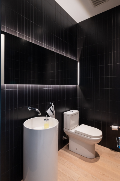
Blanketed in black tile, the moody powder room features a cylindrical vanity that feels futuristic and sculptural. Cove lighting around the mirror is much kinder on the eyes than harsh overheads.
Stylish Study
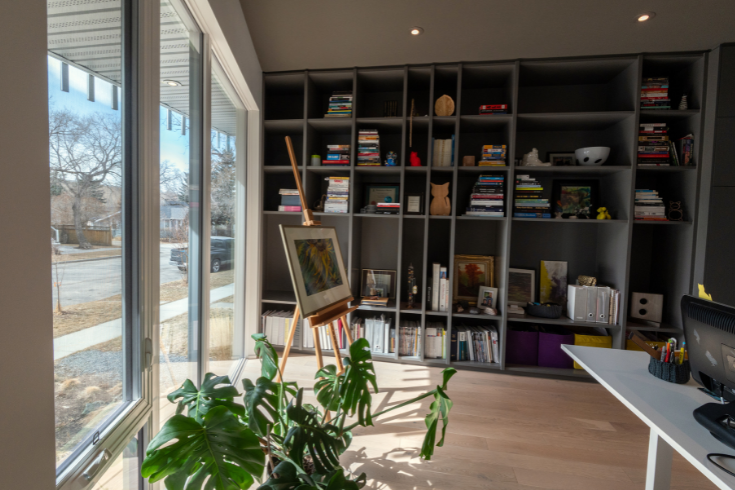
The gorgeous street-facing study has shelves and is oriented to the east. “I think [that vantage point] is important,” says Kayla. “Because that’s where I spend all of my daytime hours. You can be part of the street during the day.”
HGTV your inbox.
By clicking "SIGN UP” you agree to receive emails from HGTV and accept Corus' Terms of Use and Corus' Privacy Policy.


