Freelance graphic designer Rachelle Letain and her fiance, general contractor Mat Sewerynek, were renting a condo in Toronto’s Queen West in 2015 when they decided to start house shopping. They set a budget of $450,000, before they quickly realized they couldn’t afford a home anywhere near their favourite west-end spots. On a friend’s recommendation, they checked out Hamilton. They immediately fell in love with Locke Street, a trendy area dotted with antique shops and cute restaurants, and bought a two-bedroom bungalow for nearly $100,000 under budget. With an eye for Scandinavian minimalism and midcentury Californian design, the couple updated the 1950s house into a place of their own.
California Dreaming
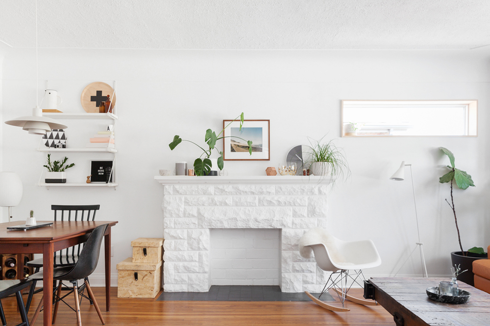
The living space was once quite dark, so Rachelle and Mat punched a new window to the right of the fireplace and painted the entire room white. The biggest transformation was the all-white fireplace, which was once different shades of grey and tan.
Related: 15 Minimalist Living Room Ideas That Prove Less is More
Surf’s Up
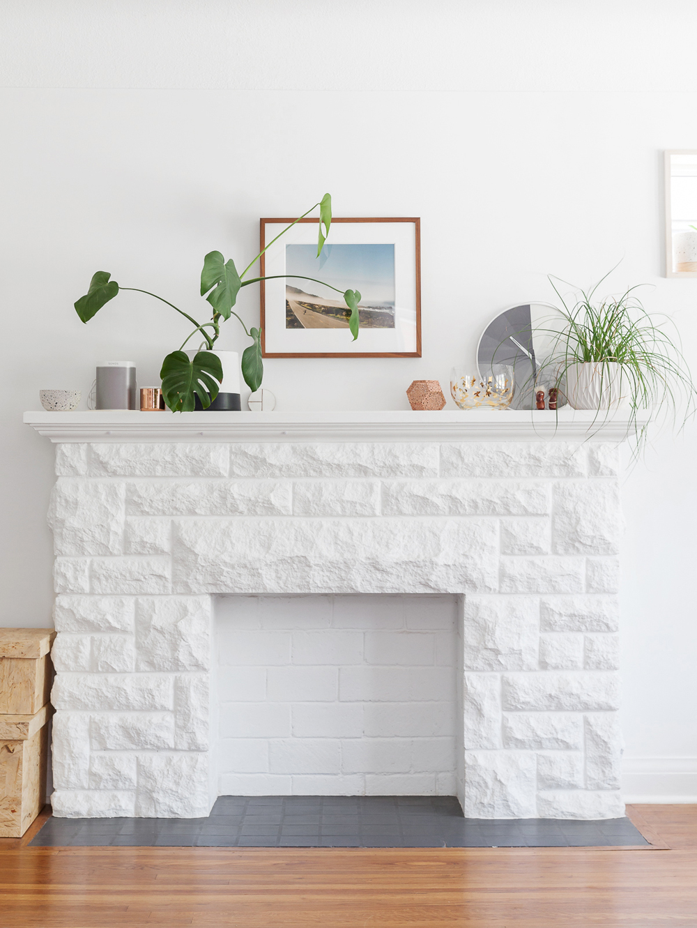
To capture those California vibes, they hung a framed photo of Big Sur above the mantle and added pops of greenery throughout.
Related: 12 Designer Secrets for Making Your Living Room Look Collected (Not Cluttered)
Something Old, Something New
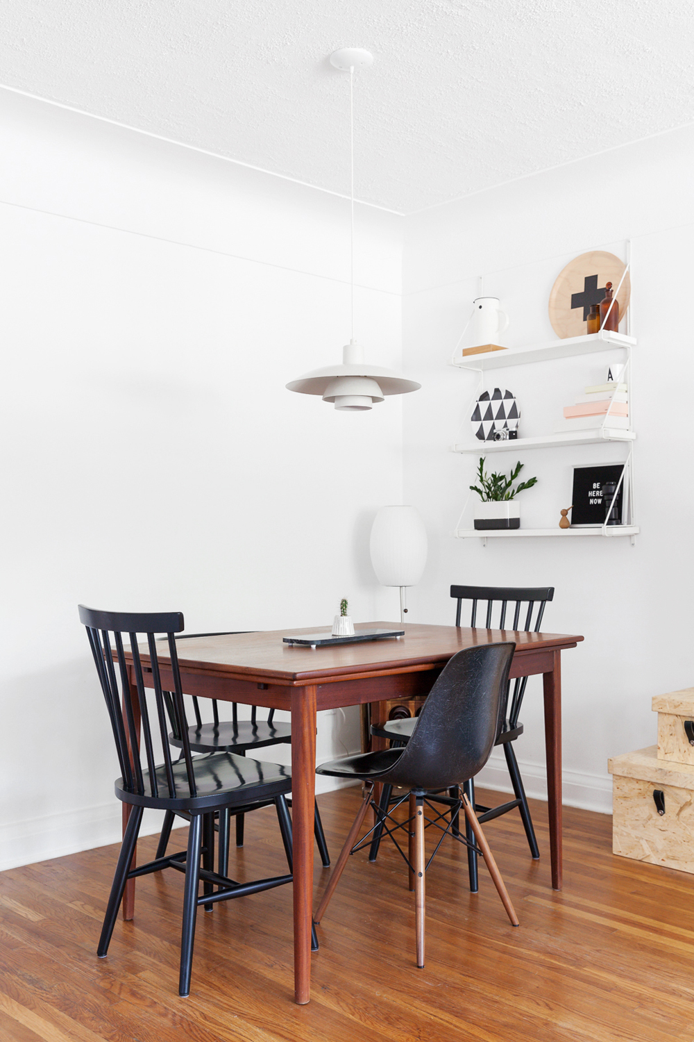
The mix-and-match dining space is grounded by the vintage white light fixture that Rachelle and Mat scored off eBay. The dining room table was similarly found online through Kijiji from a friendly Danish couple. It can be expanded to seat 10 people.
Factory Finds
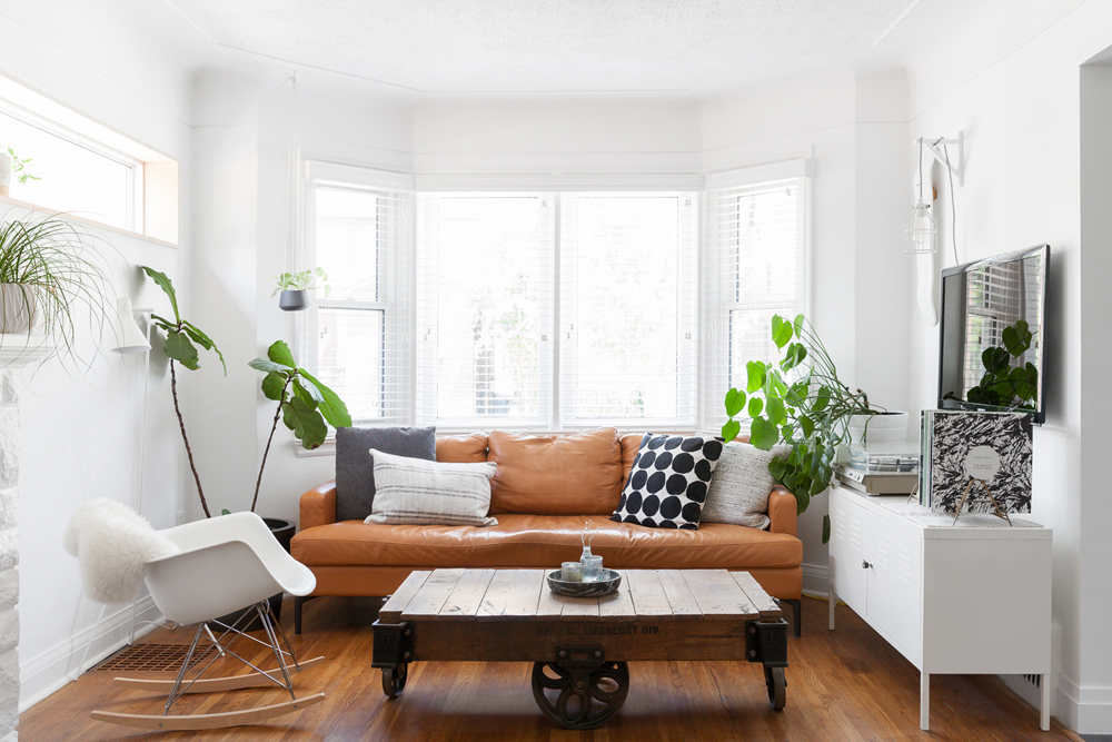
Ever the handyman, Mat built this coffee table from a factory cart that he deconstructed and refinished. The leather couch, from EQ3, was chosen both for its striking colour and because it can take a beating from their dog, Arrow. The white Eames rocking chair was Rachelle’s first big furniture purchase, and it has passed the test of time. Most of the pillows are from Rug & Weave, a home decor shop in Guelph, Ont.
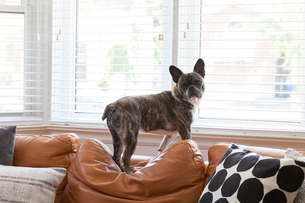
Neighbourhood Watch
The couch even comes dog-approved.
Related: 14 Tips on Buying Pet-Friendly Furniture That’ll Stand Up to Your Furry Friends
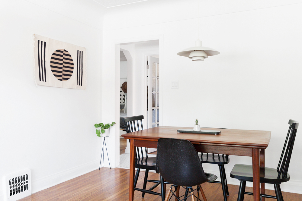
Graphic Content
On the wall, Rachelle added a pop of graphic intrigue with a piece from Block Shop Textiles, a California-based company that produces sustainable woven pieces. A little prayer plant in the corner, found at crown flora studio in Toronto, adds a little life to the corner.
Related: 20 Easy-to-Care-For Indoor Plants That Go Beyond Succulents
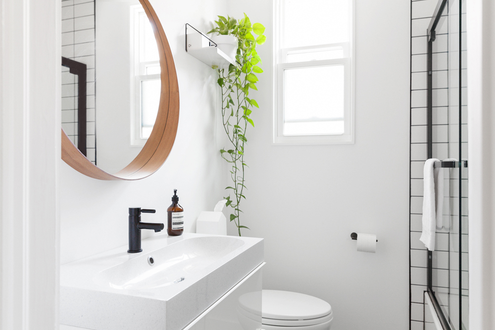
Lighten Up
Believe it or not, the bathroom was originally a deep, eggplant purple. Rachelle said that walking into the bathroom felt like “entering a bat cave.” A radical redesign included several coats of white paint, matte black fixtures, a monochromatic tile job and a trip to Ikea for the sink and mirror.
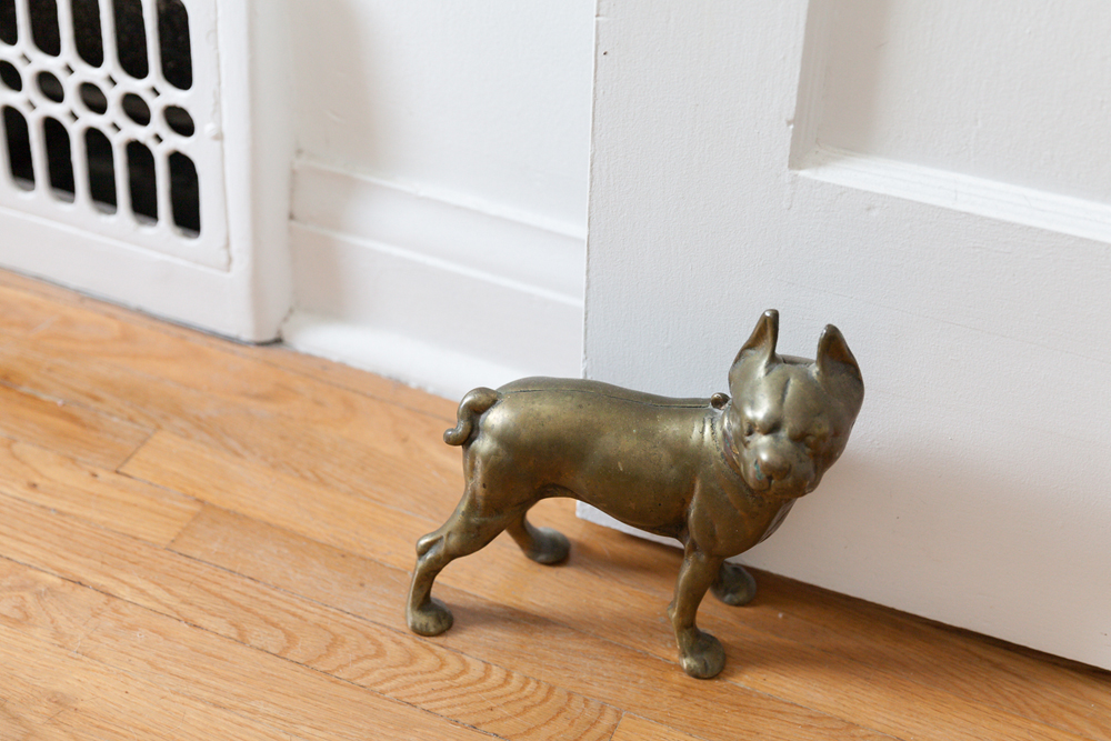
Doggy Destiny?
This vintage brass door stopper once lived in the home of Rachelle’s grandmother. Fast forward 20 years, it is identical to Rachelle and Mat’s dog, down to the funny kink in the tail. Rachelle’s grandmother gifted it to her granddaughter, and the canine twin now stands guard at the bedroom door.
Related: 10 Must-Know Expert Tips About Sourcing From Salvage
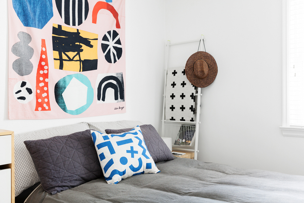
Power Clashing
Originally, the bedroom was a clean white slate. Then Rachelle stumbled upon this Atelier Bingo tapestry at Urban Outfitters and figured it would add a proper focal point. The bold pattern plays off the blue-and-white throw pillow, from West Elm, and the cross-checked quilt.
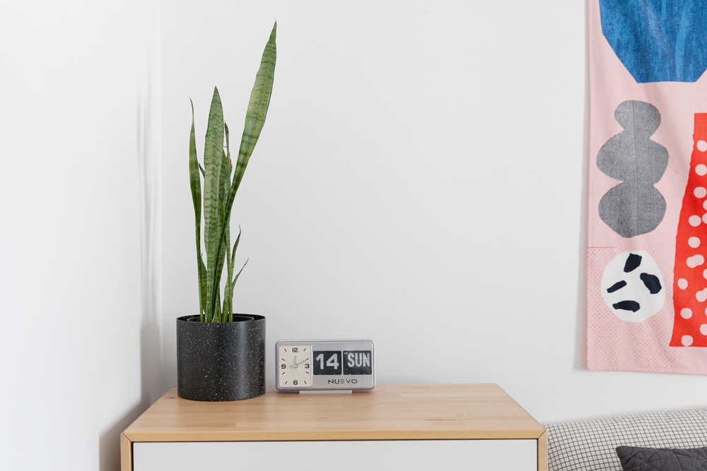
Flip Flop
The bedside table doubles as a dresser, and it’s a resting place for the vintage flip clock that Rachelle found in Antique Avenue, a vintage shop in Hamilton. The snake plant and speckled pot are both from Dynasty in Toronto.
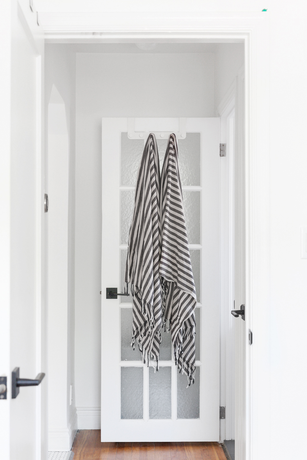
Dry Off
Rachelle is all about making the most of even the smallest design choices. Even the Turkish towels, from Leaves of Trees in Toronto, serve an aesthetic purpose. (Better yet, they’re deceptively absorbent.)
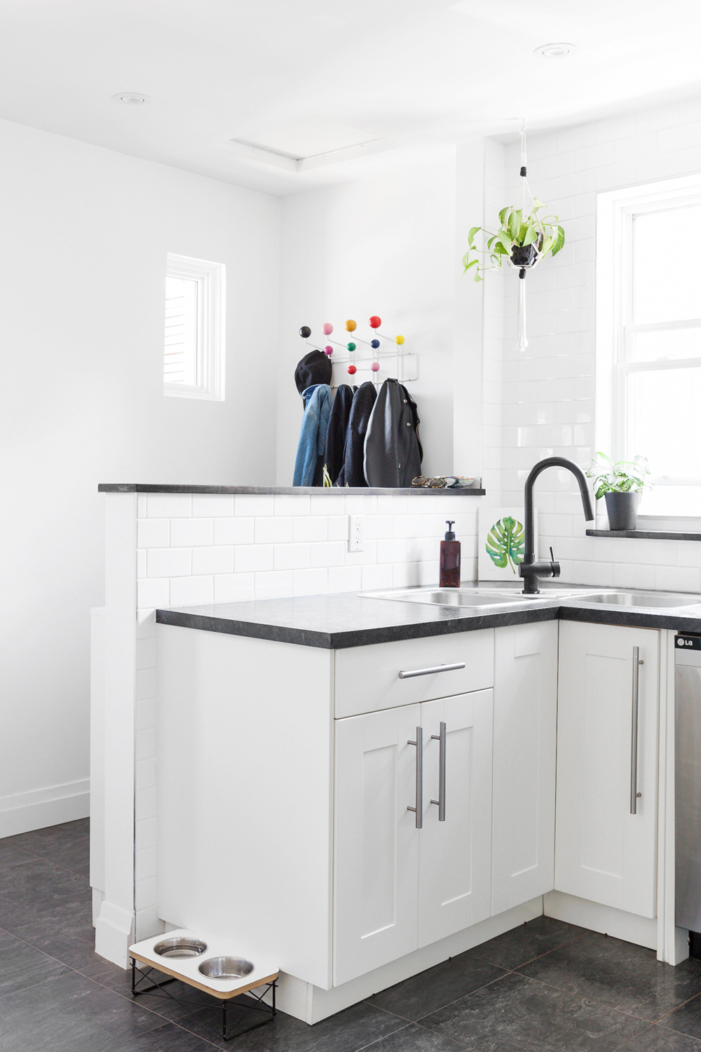
Breaking Down Barriers
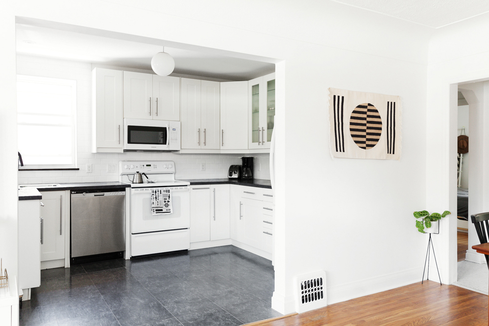
The entryway to the kitchen was once cordoned off by a wall. On their first night in the house, Mat broke it down into a half wall to invite more light. The kitchen was painted a bold red, so Rachelle and Mat cleaned it up with a fresh coat of white to complement the subway tile. Arrow’s dog bowl, found on Etsy, matches the kitchen’s neutral tones.
Wide Open Spaces
Here’s a better look at the kitchen and dining space.
Related: This Jewel-Toned Kitchen Proves the Saving Power of Upcycling
Shape Up
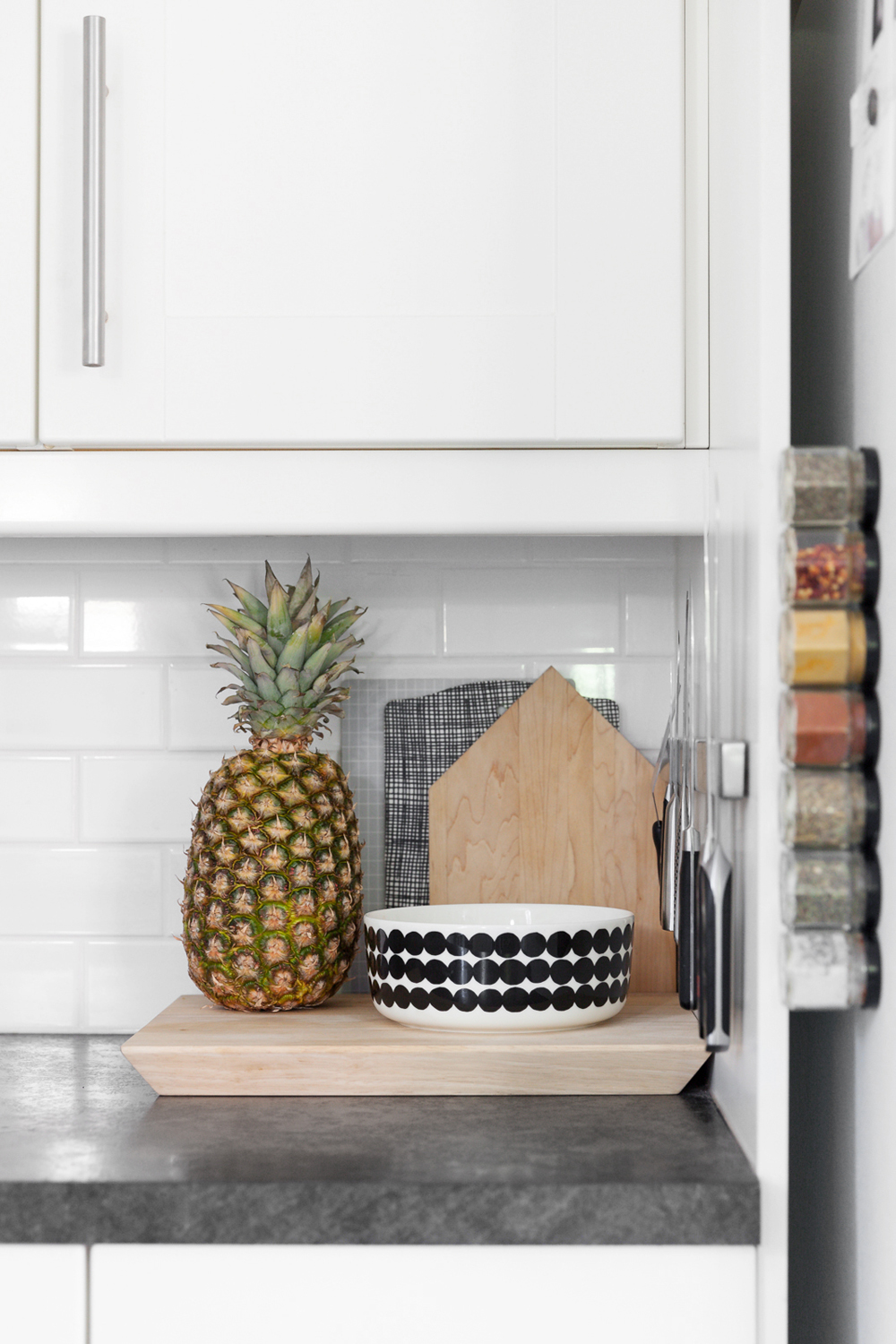
As a graphic designer, Rachelle was drawn to this black-and-white patterned bowl by Marimekko. The house-shaped cutting board is another piece Mat made himself.
Double Time
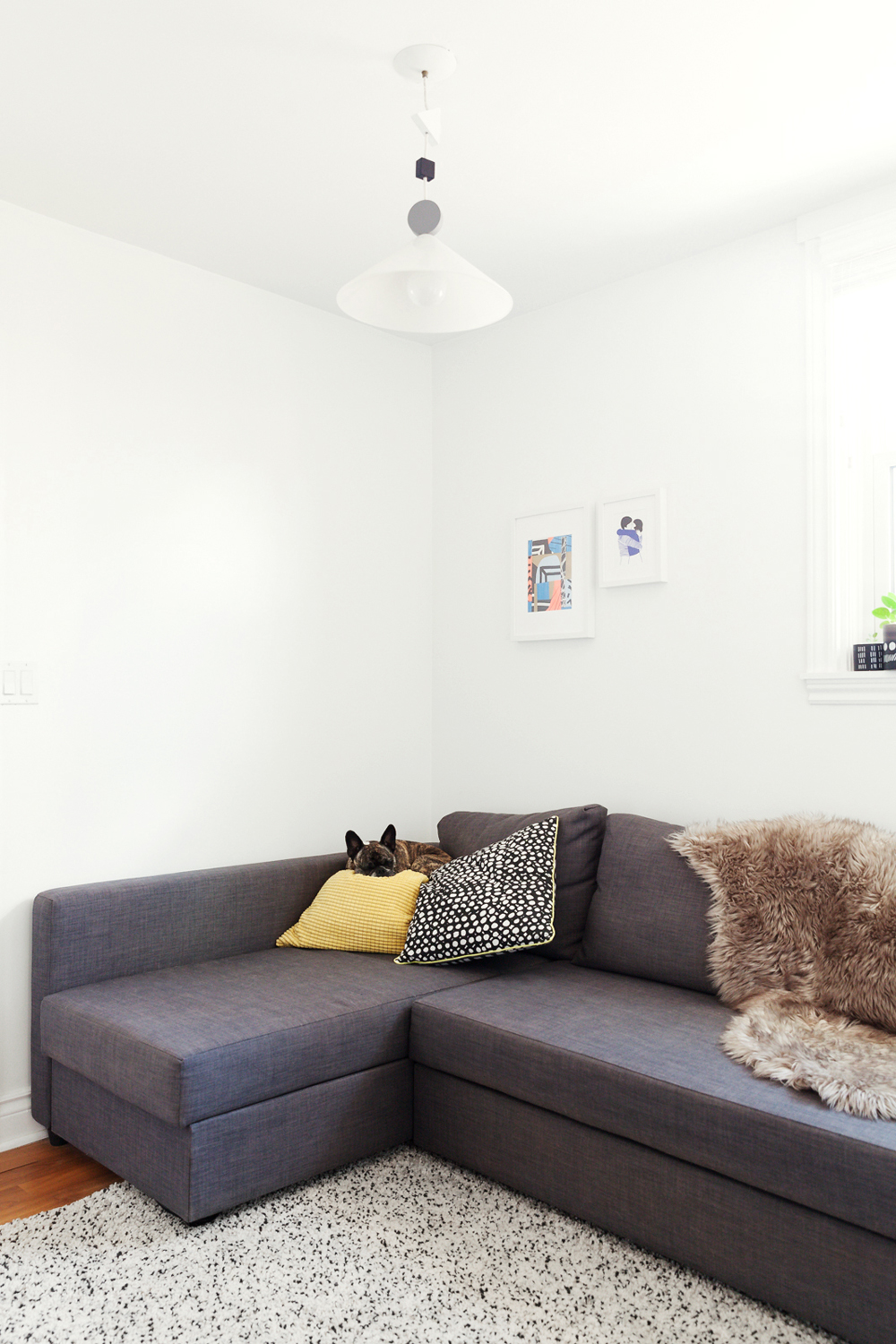
Rachelle and Mat opted to use their second bedroom as an extra hangout space. However, if they have guests over, the grey Ikea couch pulls out into a double bed. The pillows and light fixture are also from Ikea.
Book Nook
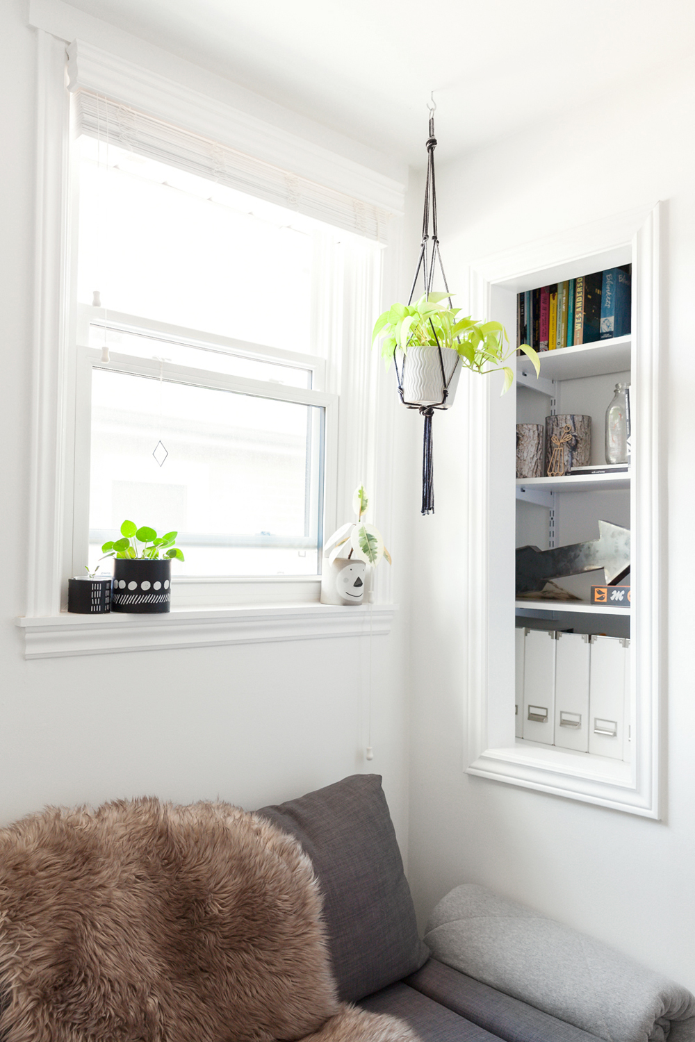
In another life, this cubby was once the pantry for the kitchen. Mat and Rachelle turned it into a bookshelf and storage space for important documents. A pothos plant hangs in a macrame planter that Rachelle made herself.
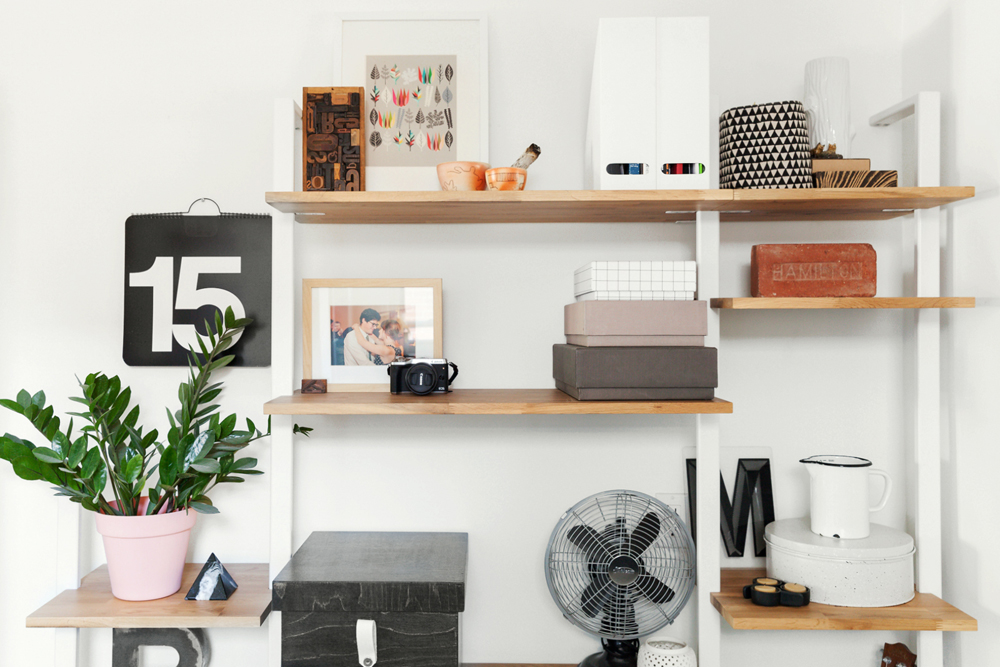
Storage Goals
This modular shelving unit from EQ3 can be adapted to fit different heights and lengths. Rachelle and Mat use it to store plenty of odds and ends, including a ZZ plant, a marble paperweight, a vintage enamel pitcher and artwork. The Hamilton brick on the right is a particularly prized local find.
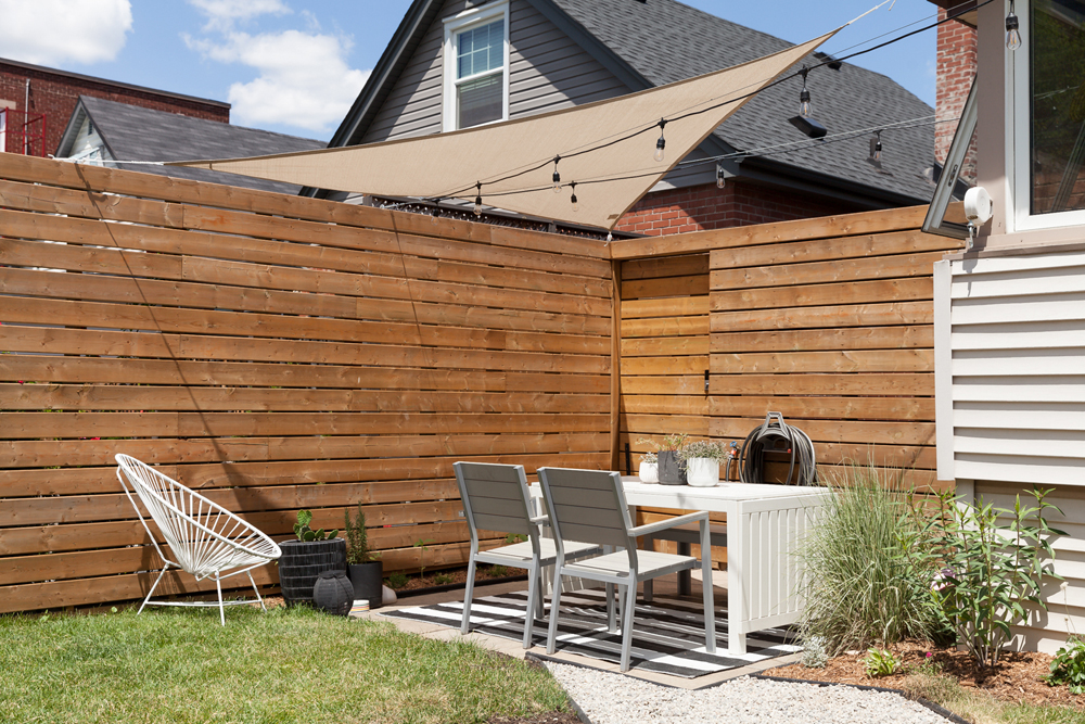
Serving Shade
Originally, the backyard had little more than a wire fence. Mat added some much-needed privacy with this wooden fence, which he built himself. The sun sail above adds some shade for hotter days. The patio furniture is all from Ikea.
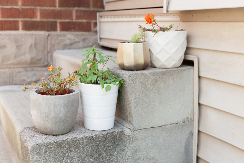
Grow Your Own
Greenery is a mainstay both indoors and out. The top two pots were thrifted finds, and the concrete piece was purchased from Centro Garden in Burlington. The white pot is from Ikea.
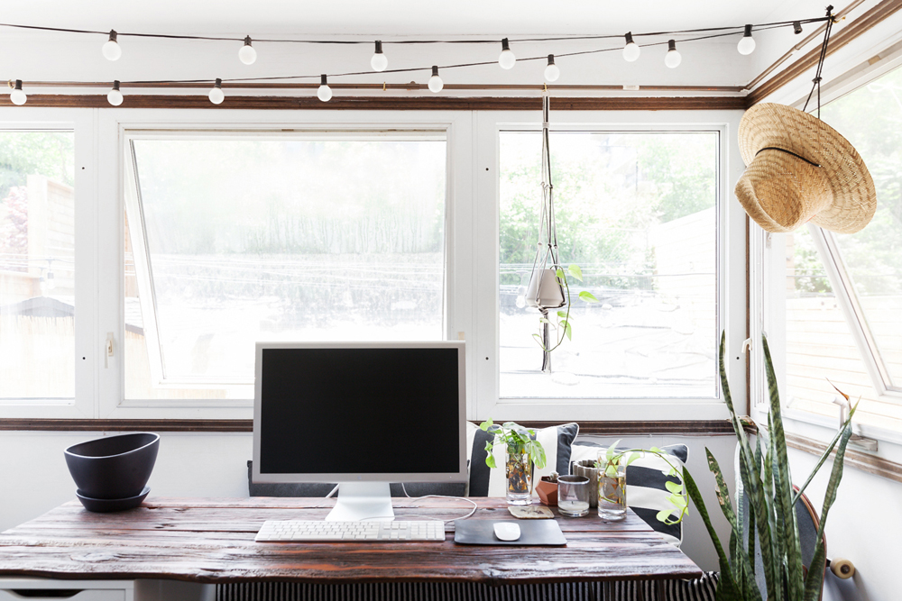
Office With a View
The office space is built off the back room. It isn’t functional in winter but offers a cottage-like work environment the rest of the year. Mat built the desk from old barn board, and Rachelle takes advantage of the light to propagate several tiny plants.
Related: 15 Insanely Stylish Small Home Office Ideas to Copy
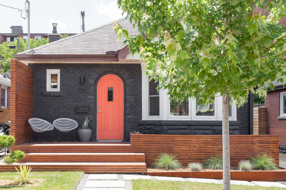
Bold Beginnings
From the sidewalk, the facade of the home is quite striking. Rachelle and Mat originally considered a yellow door, but settled on neon coral after spotting a few other yellow doors in the area. They built and stained the cedar deck themselves and added a little privacy fence beside the front door, where they’ve place a pair of vintage Solair chairs they found second-hand.
HGTV your inbox.
By clicking "SIGN UP” you agree to receive emails from HGTV and accept Corus' Terms of Use and Corus' Privacy Policy.


