Designer Kelly Lynn Armstrong, of Toronto’s Elsie & Kel Design, fell for the charm of her 1909-built home in the city’s Riverdale neighbourhood. It was perfect for her family – husband Andrew and kids Stella and Harry – but needed a contemporary nudge. She turned to her design partner Laura Collins, and together they preserved the best and updated the rest.
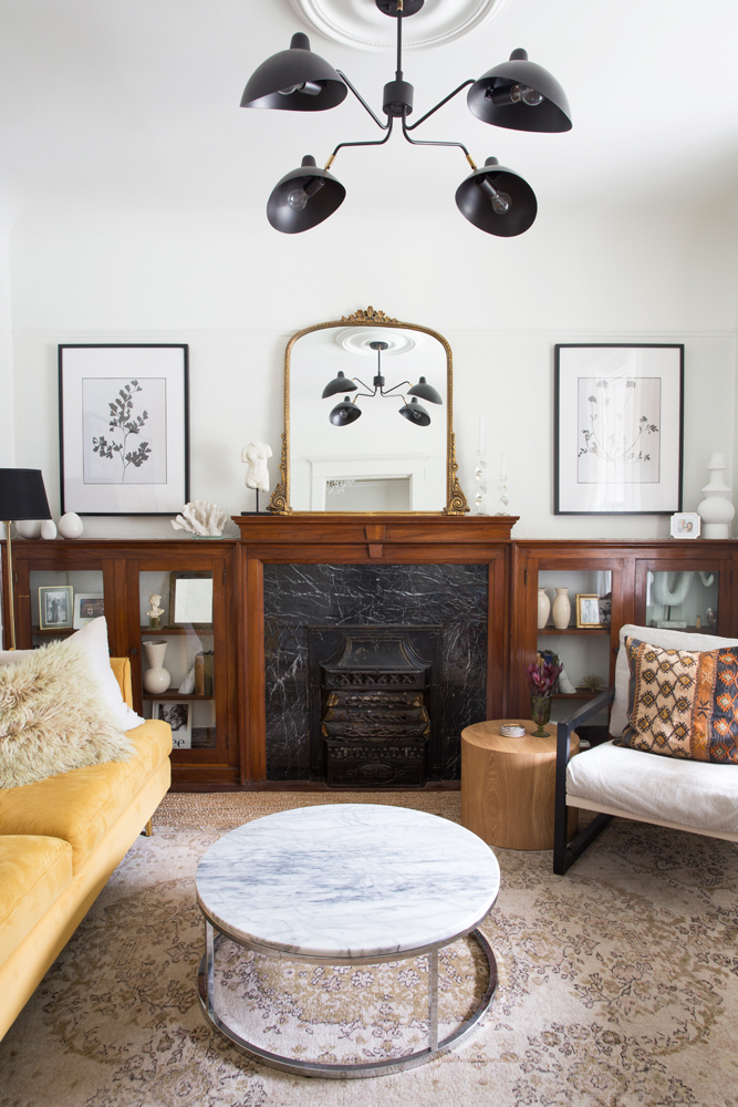
It’s All A Front
While the living room’s cabinetry and fireplace are original, the magnificent stone-like facade is not. “The fireplace was faced with dated tiles,” says Kelly. “My cheap and fast DIY remedy? Place black marble adhesive on top of the existing tiles to achieve the look of marble without the cost!” The artwork is also DIY. Kelly elevated it with custom matting to make it appear more expensive than it is. The ornate mirror from Anthropologie draws the eye upward and bounces light around.
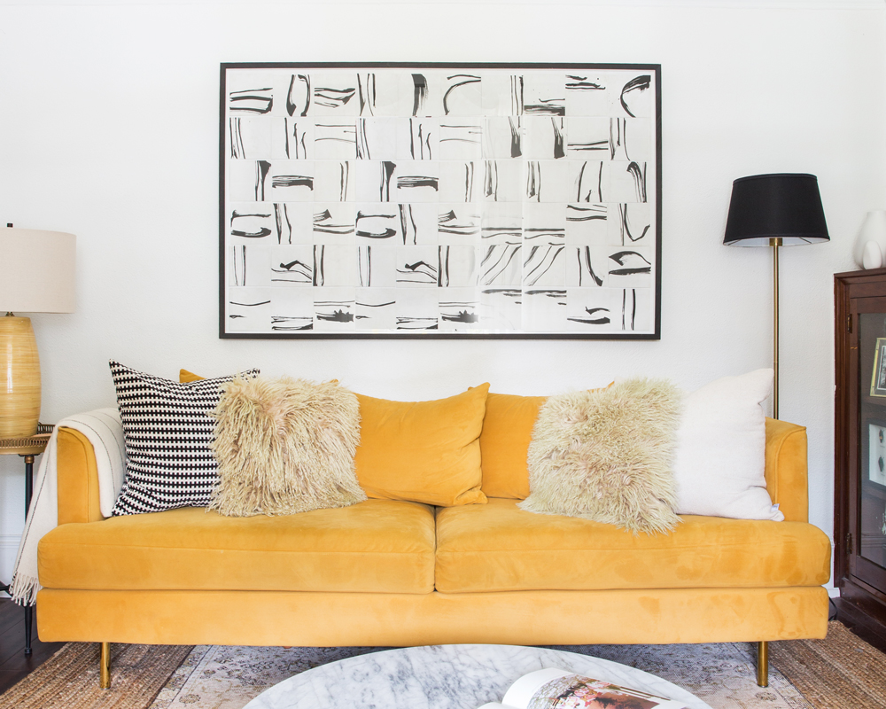
It Was All Yellow
A colourful sofa goes against the design edict that says large items should be neutral toned. Even Kelly second-guessed it. “Making a statement-sofa decision is so hard, and I went back and forth many times,” she says. “Funnily enough, yellow is all the rage right now, so it appears quite trendy, but thanks to its tailored shape it’s a classic that will endure.” The large-scale abstract artwork is from Celadon and speaks to the room’s black and white direction.
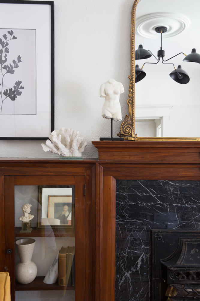
Lighten Up
Kelly’s attention to detail and DIY prowess is on display in the living room’s accessories, especially these white ones near the fireplace. “Since I decided not to paint the wood of the cabinetry and mantel, I wanted to find ways to lighten them up,” she says. “I like how these white pieces keep the area light and bright.” The stunning contemporary chandelier (from Morba) reflected in the mirror was inspired by Serge Mouille.
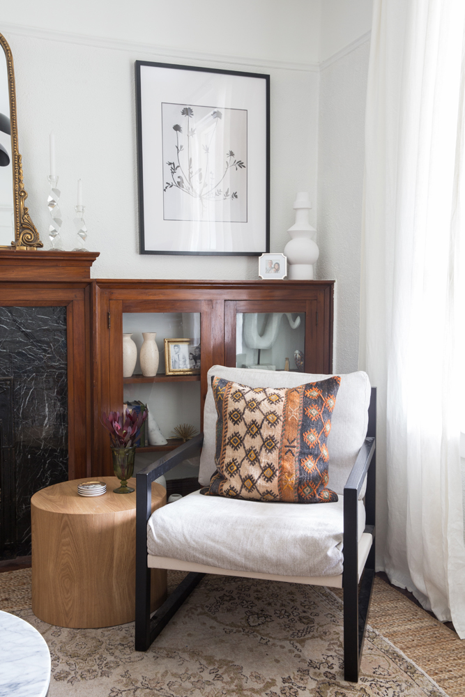
Modern Elements
In this corner of the living room, Kelly layered in contemporary pieces like this clean-lined chair from EQ3 and round wood sidetable from Structube. “I love how modern they are amongst the more traditional aspects of the space,” she says. To the left, a small portion of the coffee table is visible. “I purchased it before I had kids! But now, realizing that sharp corners are so dangerous with wee ones, I’m even happier with it.”
Heirloom Chic
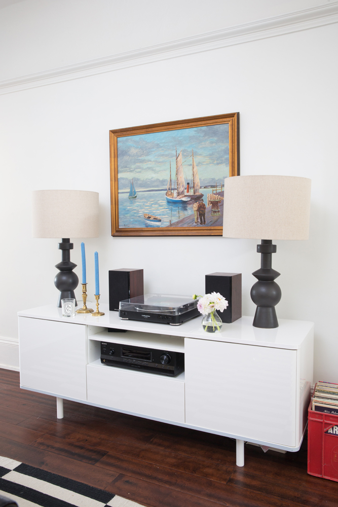
The dining room’s IKEA console is a signature element in Kelly and Laura’s work. “We love using them in just about any space,” says Kelly. “They’re sleek, functional and affordable.” The designers used the West Elm lamps in a client’s home and Kelly had to have a pair for herself. They sit in front of a painting her husband Andrew inherited from his grandmother. “Andrew and I met at Dalhousie University and this reminds us of the East Coast.”
Great Galley
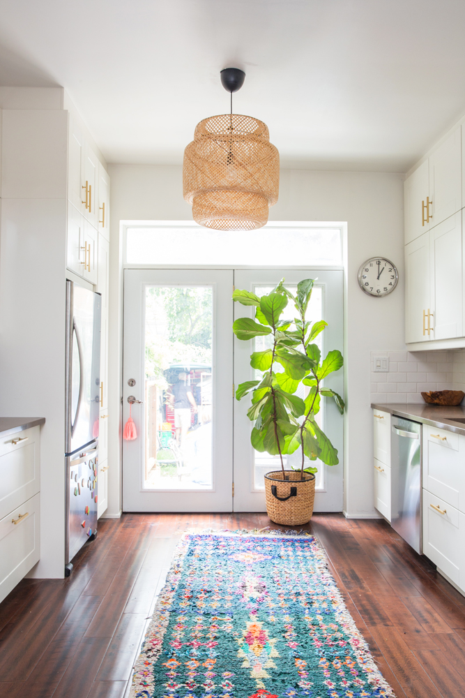
Define a galley kitchen with a great light fixture like Kelly did. “Laura and I considered a flush-mount light, but we both loved the boho, relaxed vibes of this IKEA one.” Kelly purchased the gorgeous nubby runner in a souk in Marrakech. It adds a punch of colour and texture in the simple space.
Finishing Touches
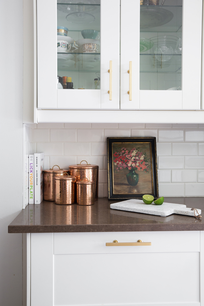
Kelly glammed up the existing all-white kitchen cabinetry with elegant brass hardware from Lewis Dolin. The simple subway tile backsplash lets countertop accessories, like copper canisters and a vintage floral painting, shine.
A La Carte Decor
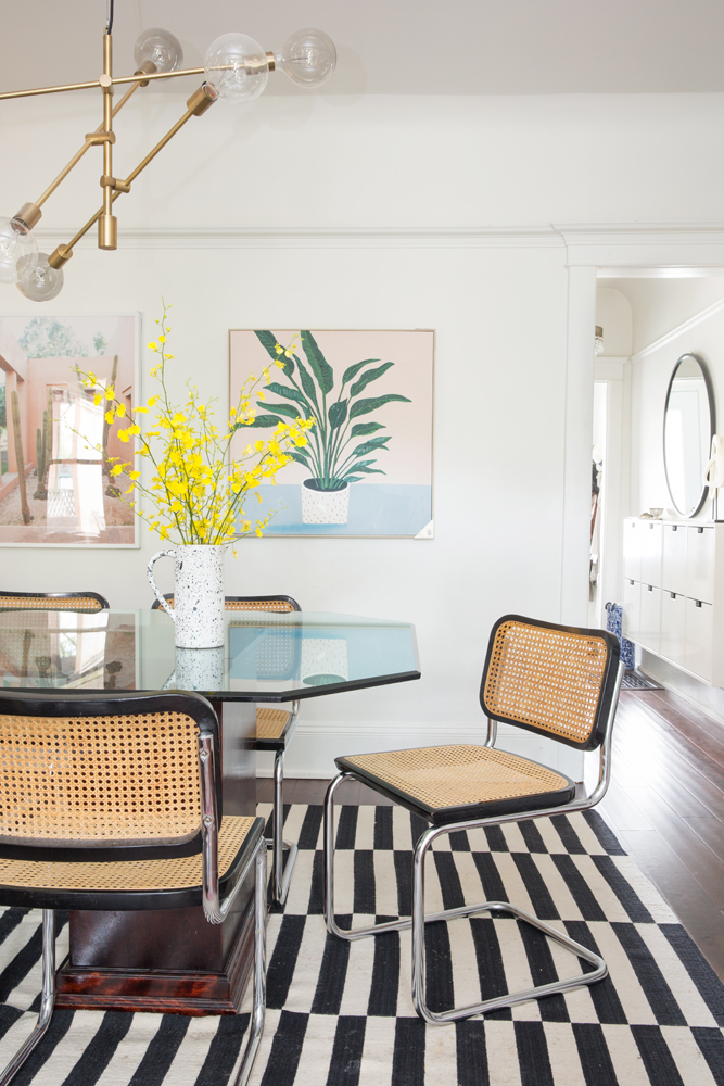
Kelly’s dining room is an eclectic medley of decor: a hand-me-down table from her parents, chairs from a consignment store, an IKEA rug and a globe-light chandelier. The artwork is just as varied. “I took the one on the left while travelling in Morocco and the one on the right is from HomeSense – it caught my eye and I thought it was a nice addition.”
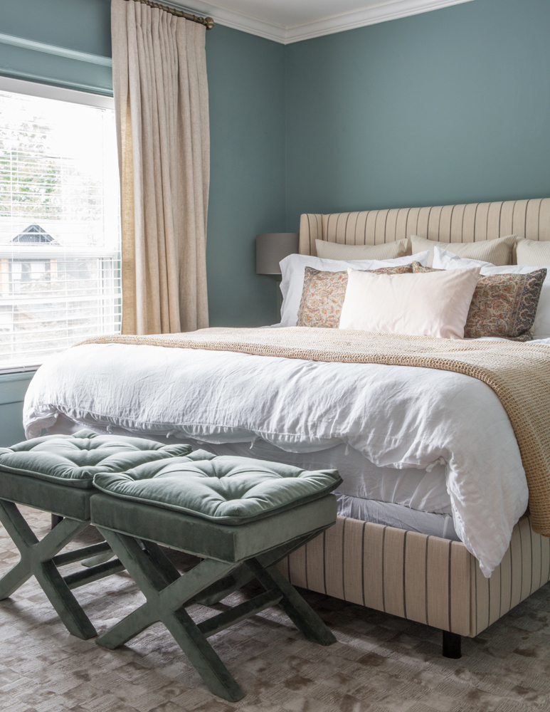
Blue Note
Doesn’t this make you want to paint your bedroom? “Laura and I went crazy for this colour,” says Kelly (it’s Farrow and Ball Oval Room Blue). The headboard is from RC Wiley and nicely blends modern with traditional, while the tufted stools were a vintage store find that they had reupholstered. The drapes were custom-made by Tonic Living and layer in boutique hotel elegance.
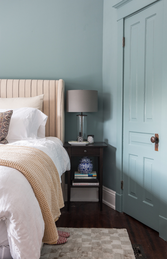
Paint It Out
Most assume the “paint it out” mandate is reserved for all white, but the master bedroom shows otherwise. “Since the room is quite traditional in its mouldings and design, I wanted to update it and give it a more modern appeal. I think painting the door frame the same colour as the walls, versus expected white, gives it that contemporary effect.”
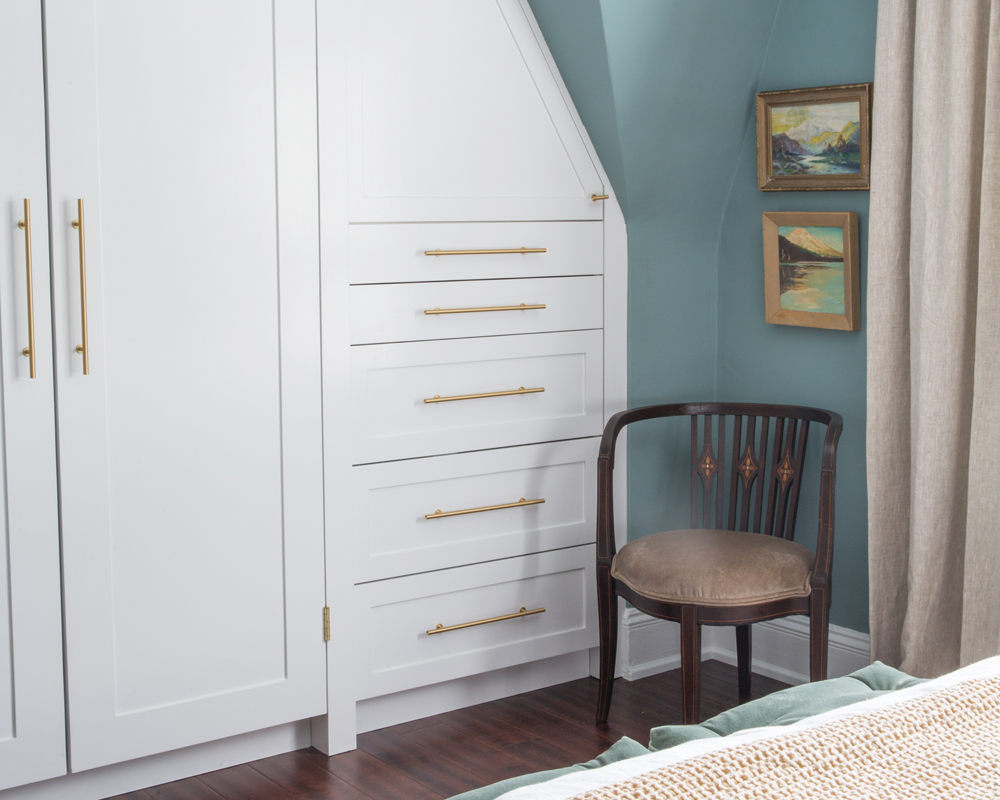
Custom Order
Kelly reclaimed the awkward space in this corner of the bedroom by adding custom-made cabinetry to maximize storage. She used the same brass hardware as in the kitchen for continuity. The chair belonged to her great-grandmother and is a nice foil to the new built-ins.
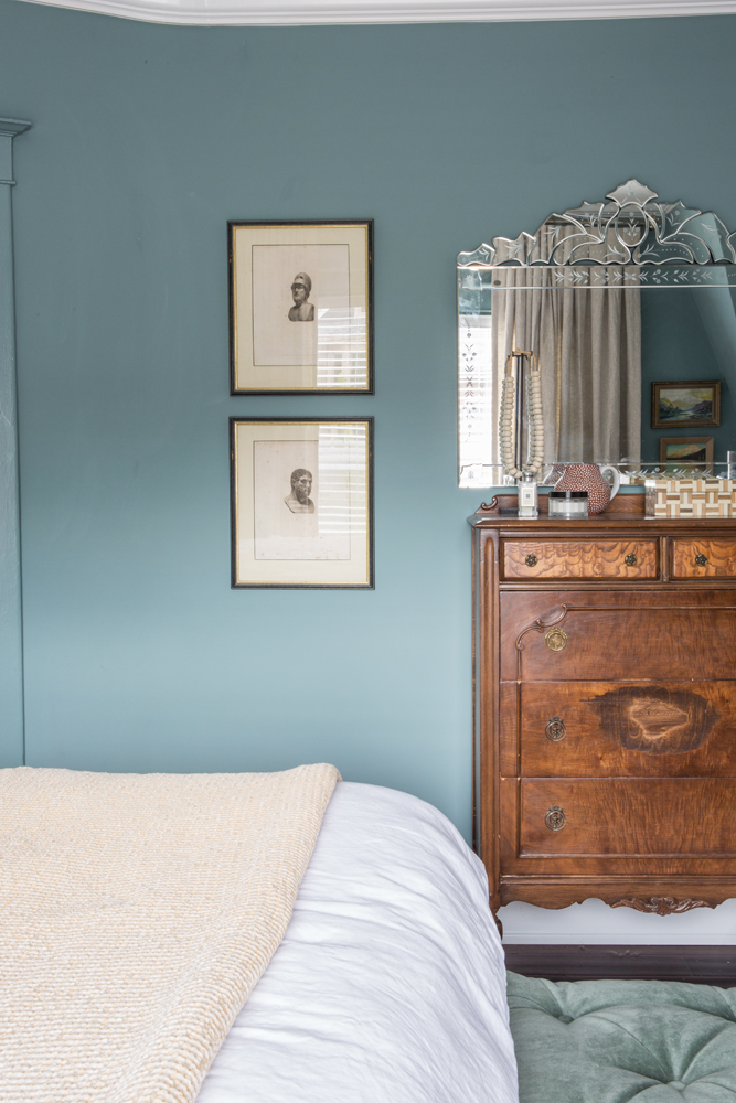
These Old Things
The burled wood dresser is a handsome contrast to the Venetian-style mirror found at an antique shop. The framed prints are also antiques that Kelly and Laura found at a shop during a trip to Margate, England.
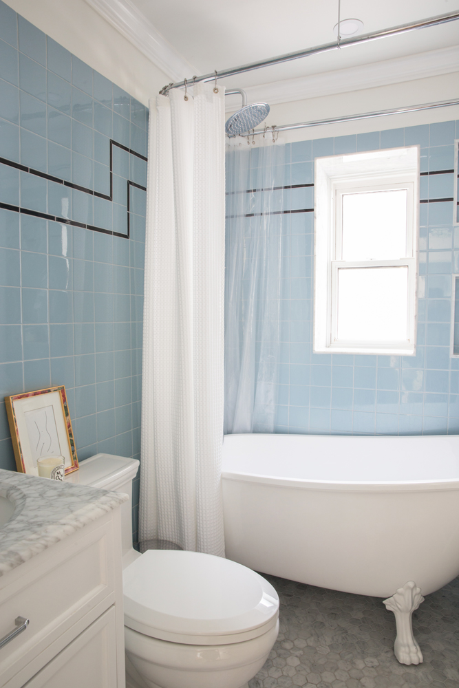
Out of the Blue
“The choice of blue wall tiles was probably the most considered of them all!” says Kelly. “I was having a hard time committing to such an investment in blue. But they were inspired by the time Laura and I spent in London sourcing pieces. I love how the English take more design risks.” Marble tiles feel luxurious underfoot, and Kelly replaced the original tiny tub with this clawfoot soaker.
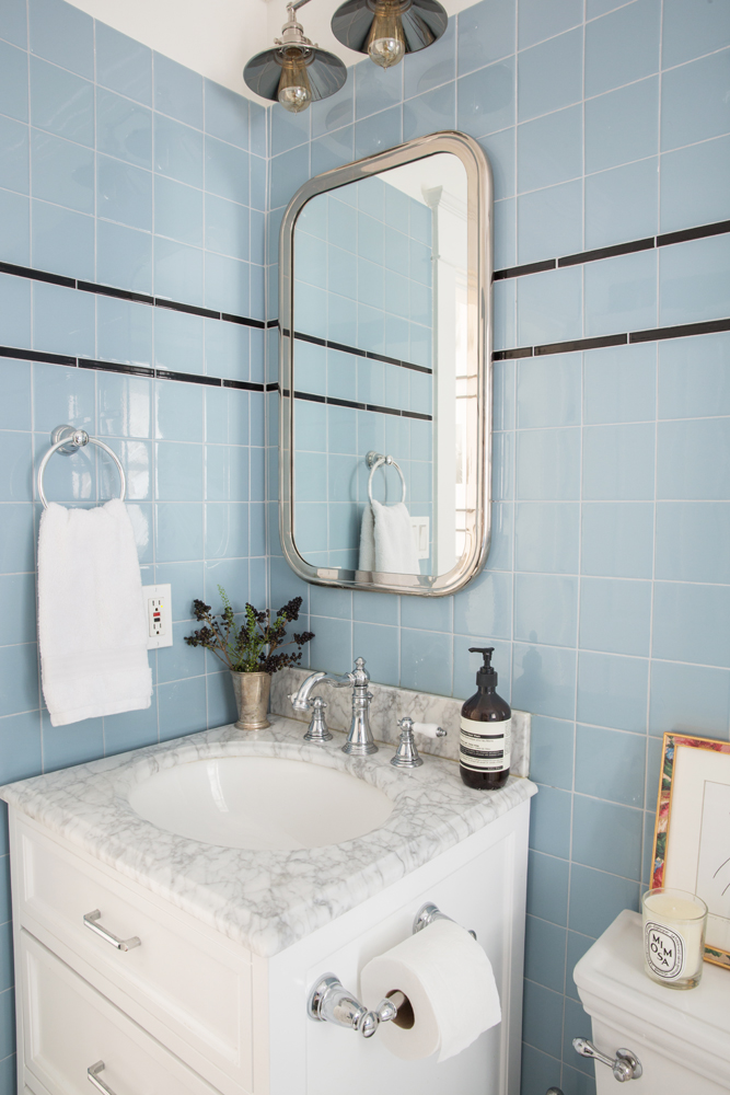
Out of Sight
The marble-topped vanity from Wayfair has drawers, which offer much-needed storage in the small bathroom. They’re augmented by the mirror above. “It’s actually an inset medicine cabinet. Hidden storage was critical here.”
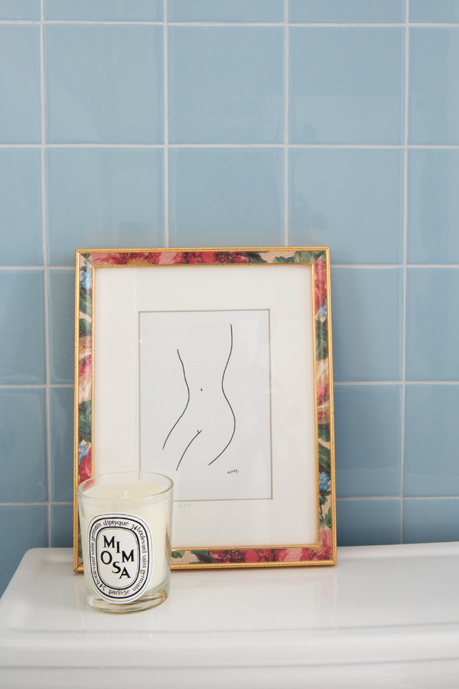
All In the Details
The bathroom’s framed artwork and scented candle continue the boutique hotel feel created in the master bedroom.
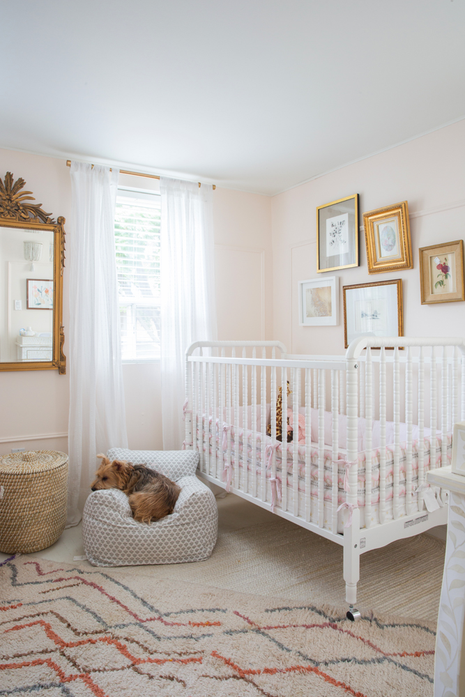
Pretty In Pink
For Stella’s room, Kelly channeled girly yet tempered it with traditional accessories for a look that’s super cute and kind of grown-up all at the same time. The barely-there pink walls are Opal by Benjamin Moore, and the Jenny Lind crib (we love its vintage vibe!) was purchased online from Wayfair. The layered rugs include one Kelly purchased in Morocco. Mackie, the family’s Schnauzer/Yorkie mix, likes to snooze in this serene spot.
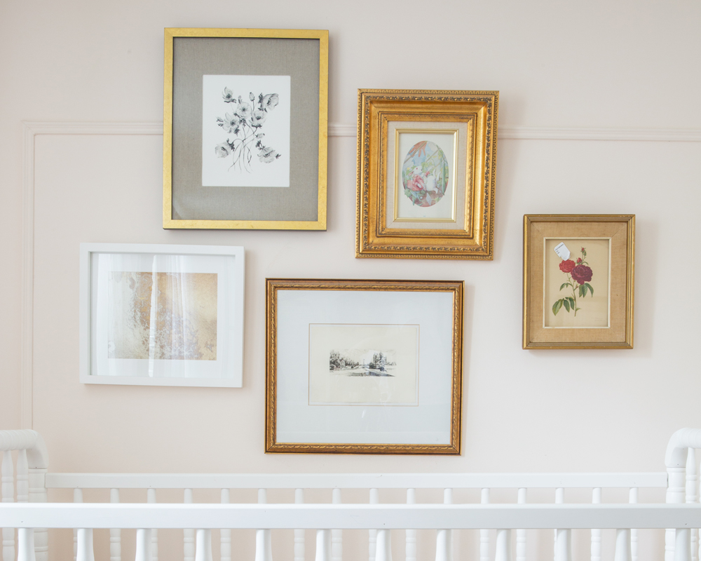
Art Matters
Good design stands the test of time, and this gallery wall in Stella’s nursery proves that. “I sourced these images from all over. Many are vintage and hand-me-downs,” says Kelly. “I wanted something that would look great in the room beyond Stella’s first years.” There’s a vintage picture of Notre Dame, two prints from Minted and another print (a gift from Laura) that’s a page from the Alice in Wonderland story.
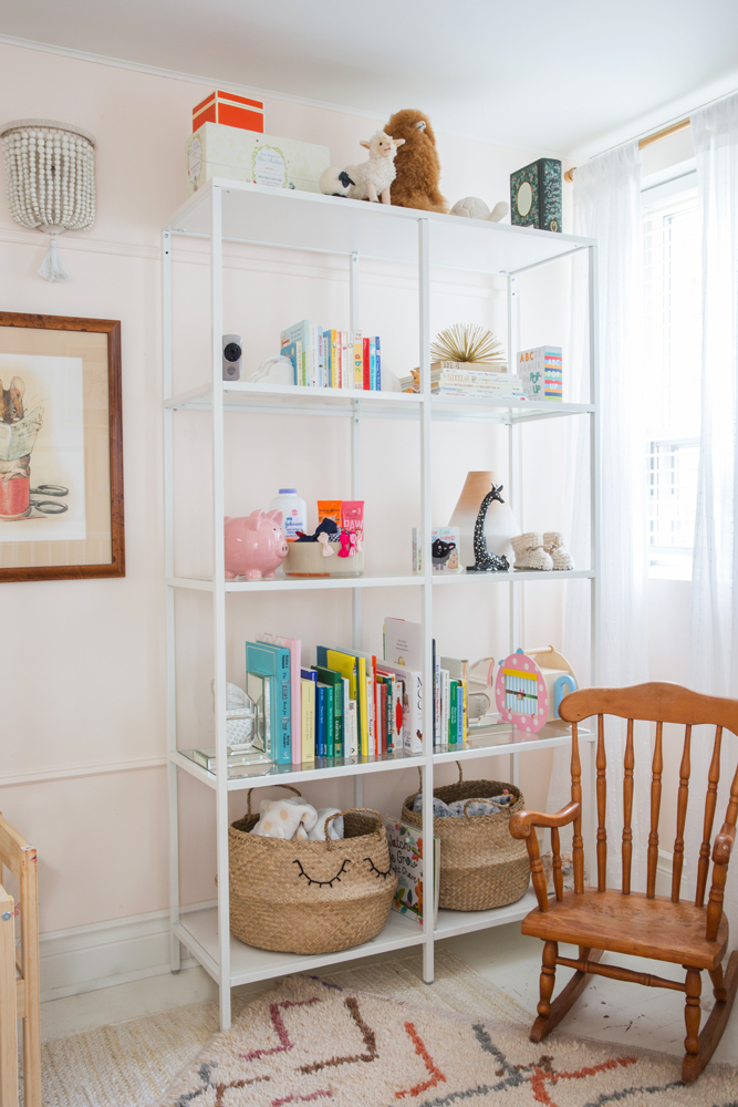
Shelf Life
White IKEA bookshelves blend into the pretty pale colour scheme and make it easy to access books and toys. We like how the baskets on the lower shelves are just as functional but offer a bit of closed storage.
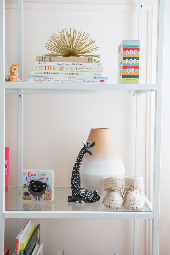
Vintage Collection
As well as housing books and toys, Stella’s shelves display gifts with meaning. “The booties were Stella’s slippers (she’s since grown out of them!) and the vintage giraffe was also a gift from Laura. We’re starting her love of vintage finds early!”
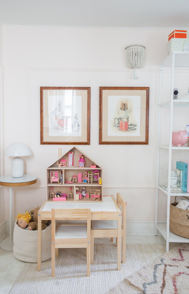
Eye for Detail
You know your mom’s a designer when even your dollhouse is colour coordinated to your room. We like how Laura reinforces the pink theme in small details that will appeal to adults’ discerning eyes and delight those of little ones.
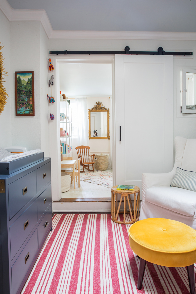
Sliding Doors
Here’s another idea you’ll want to steal. “When we purchased the home, we knew that once we had a second baby, it would be a challenge to figure out rooming,” says Kelly. “This sliding door between Harry’s room and Stella’s doesn’t take up much room and adds a fun design feature to Harry’s space.”
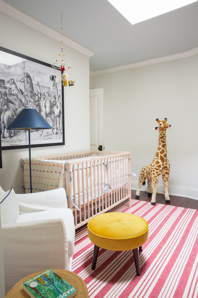
Circus Style
There’s something decidedly handsome about Harry’s room, from the crisp white walls to the black-and-white artwork and super fun giraffe. Kelly says, “The theme of this nursery is a subtle hint of circus!” The stool is from Restoration Hardware, which Kelly covered in zingy yellow velvet.
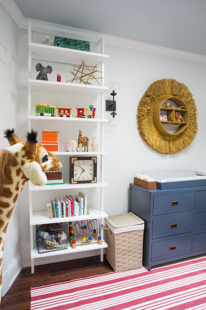
True Blue
The blue dresser/change table adds a welcome pop of colour. For continuity, we love how Harry’s room also features white open shelves like those in Stella’s adjoining space.
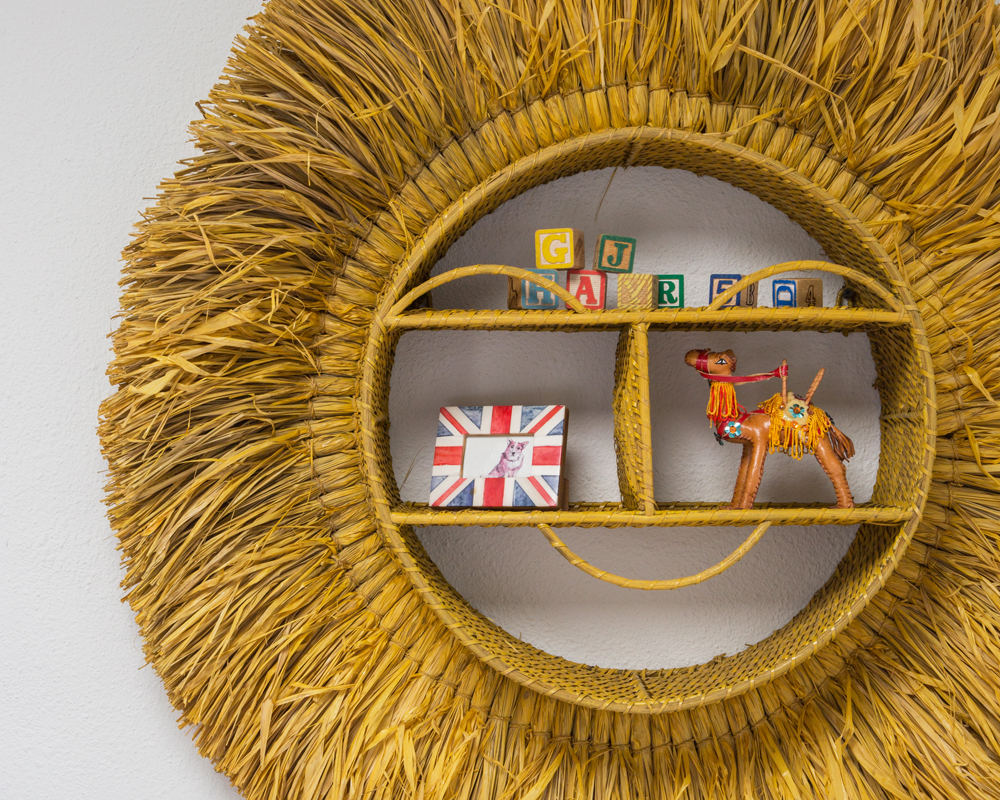
Lion King
“This wall hanging (Pottery Barn Kids x Justina Blakeney) is a sun, but I also loved that it hinted to a lion and our circus theme,” says Kelly. “The toy blocks are vintage and the camel was also found during my trip to Morocco.”
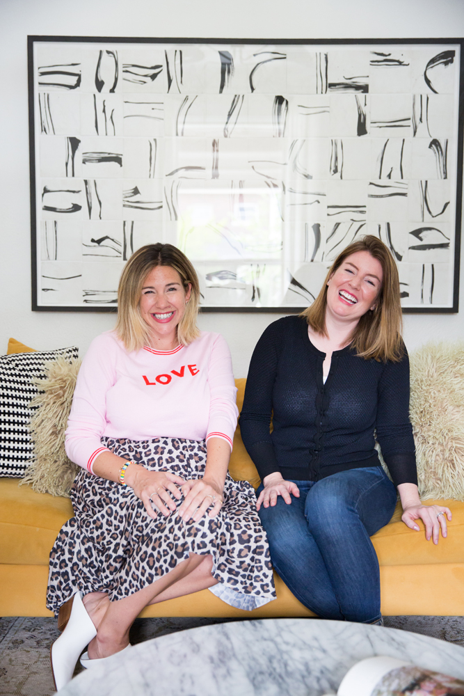
Designing Women
Designers Kelly Lynn Armstrong (left) and Laura Collins of Elsie & Kel Design. “Laura really helped me with all the decisions along the way, and we’re proud that we were able to maintain the home’s charm while updating it with a bit of modern decor.”
HGTV your inbox.
By clicking "SIGN UP” you agree to receive emails from HGTV and accept Corus' Terms of Use and Corus' Privacy Policy.


