Heading back to their native Canada, Jonathan and Drew counsel husband and wife Jason and Janna on how to marry their conflicting aesthetics. He likes antique touches while she’s all about clean, modern lines – somehow the Brothers manage to construct the perfect compromise.
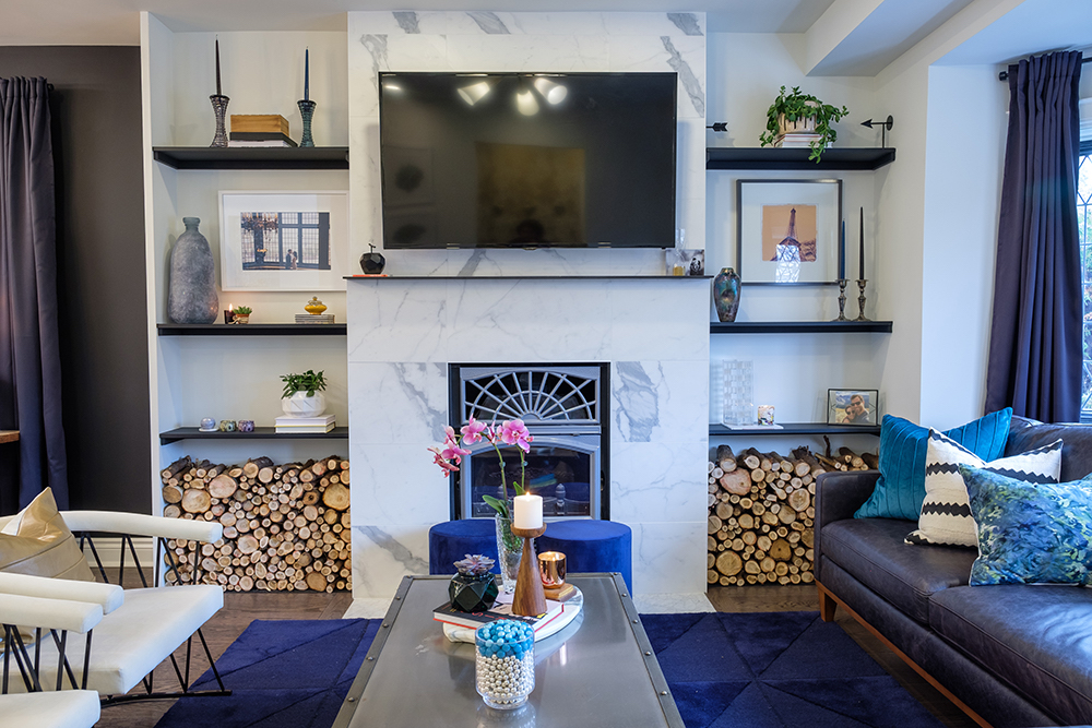
Come Together Right Now
For first-time homeowners Janna and Jason, it was important that the décor in their new dwelling strike a balance between their opposing personal styles – he’s all rock ‘n’ roll and her tastes are more refined.
Read more: 15 Gorgeous Dark Blue Kitchen Designs You’ll Want to Re-Create
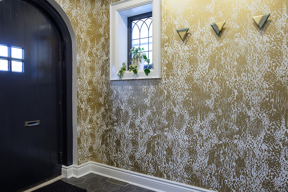
An Oldie But a Goodie
To appease Jason’s love of vintage accents, Jonathan made sure to keep some of the original features of this 80-year-old Toronto home, such as the arched front door and lead-paned windows.

Something Old Something New
Adding stunning slabs of grey-veined marble around the salvaged enameled fireplace seamlessly brought together the old and the new in this 1930s home.
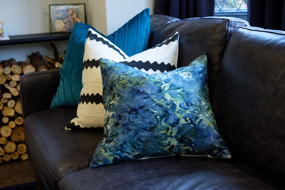
Something Blue
To take the living room palette from simple to striking, Jonathan chose a deep, true blue as the colour accent, which is found threaded throughout the space in the throw pillows, drapes and geometric area rug.
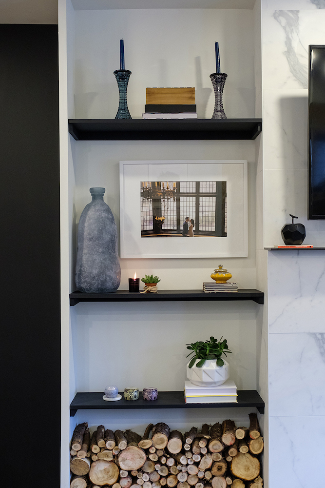
Home Coming
Personal touches, such as a framed wedding photo, were incorporated into the design to make Janna and Jason feel right at home from the moment they step in the front door.
Making Room
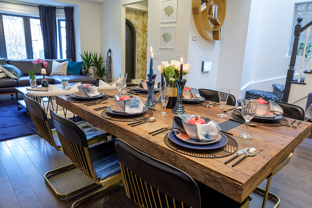
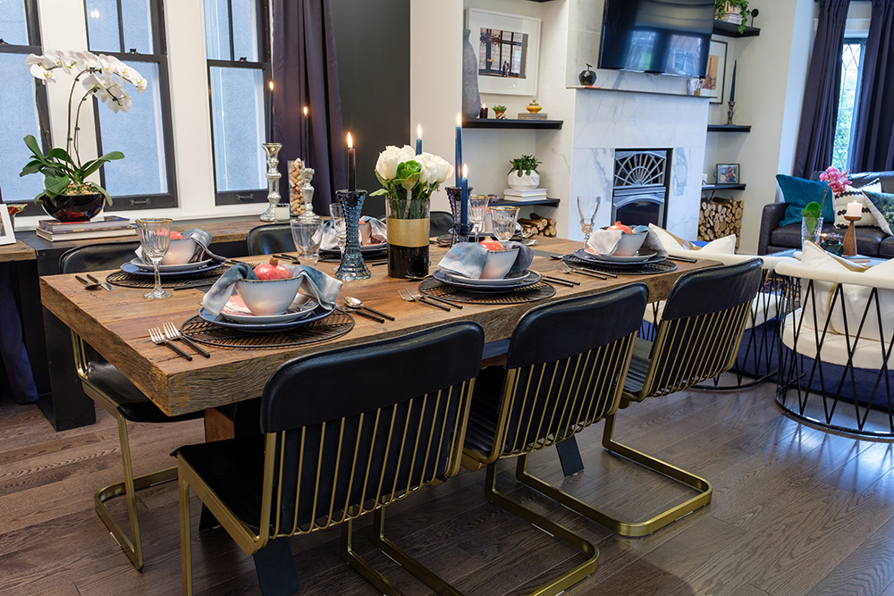
One of the must-haves on Janna’s renovation wish list was a spacious dining room with sufficient square footage to hold her beloved solid-wood dining table, which she had lugged from city to city.
Match Up
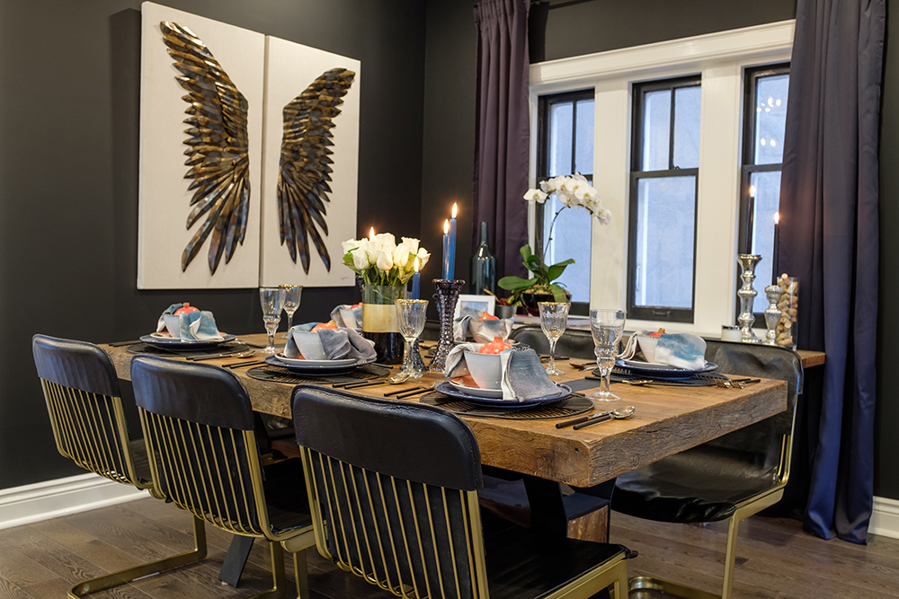
The dining-room table finally found its forever home in this now open-concept house – Jonathan even sourced a rough-wood sideboard to match. The angel-winged artwork and black-leather-and-brass chairs added an edgy vibe, which made Jason very happy.
Place Matte
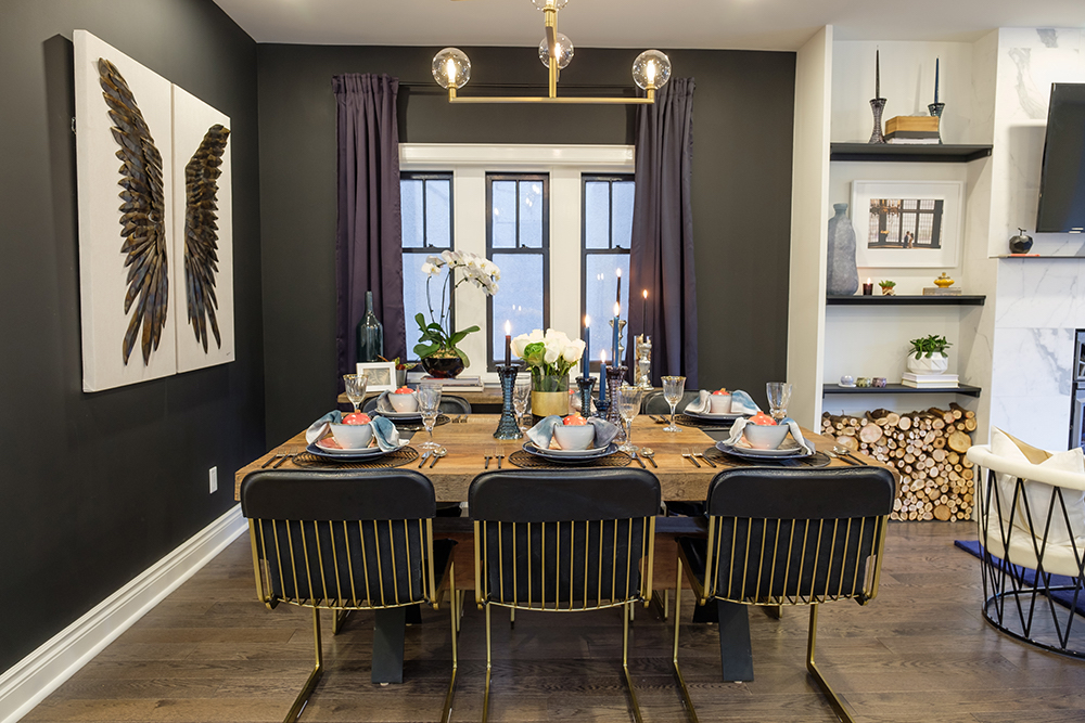
Using a clever design trick, Jonathan’s team painted the walls around the dining area a matte black, acting as a visual border outlining the edges of the “room” in an open-concept living space.
It’s Black and White
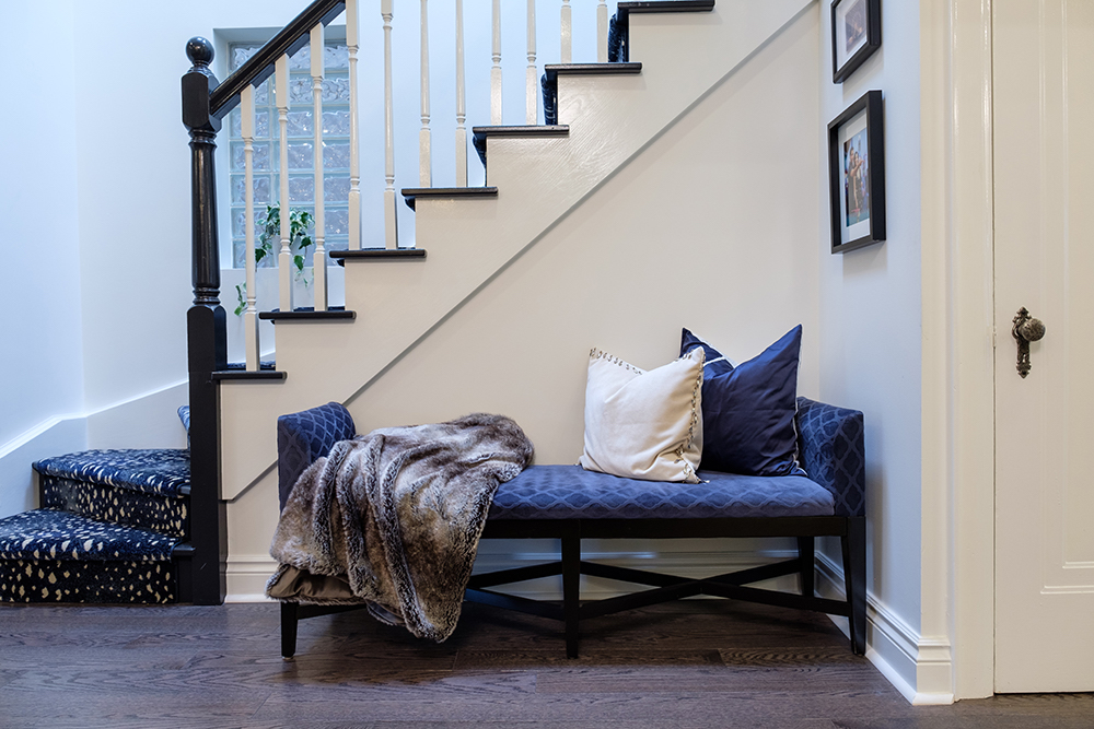
Janna really wanted to get rid of elements in the fixer upper that felt too traditional (and stay within budget), so instead of replacing the bannister with something more modern, Jonathan painted the oak in a sleek, high-gloss contrasting white and black.
Musical Rooms
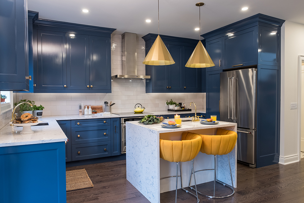
During an earlier renovation (and this hodgepodge house had many over the years!), the kitchen was moved to the back of the house, reflecting modern preferences of having the kitchen back out to the yard.
Footprints in the Sand
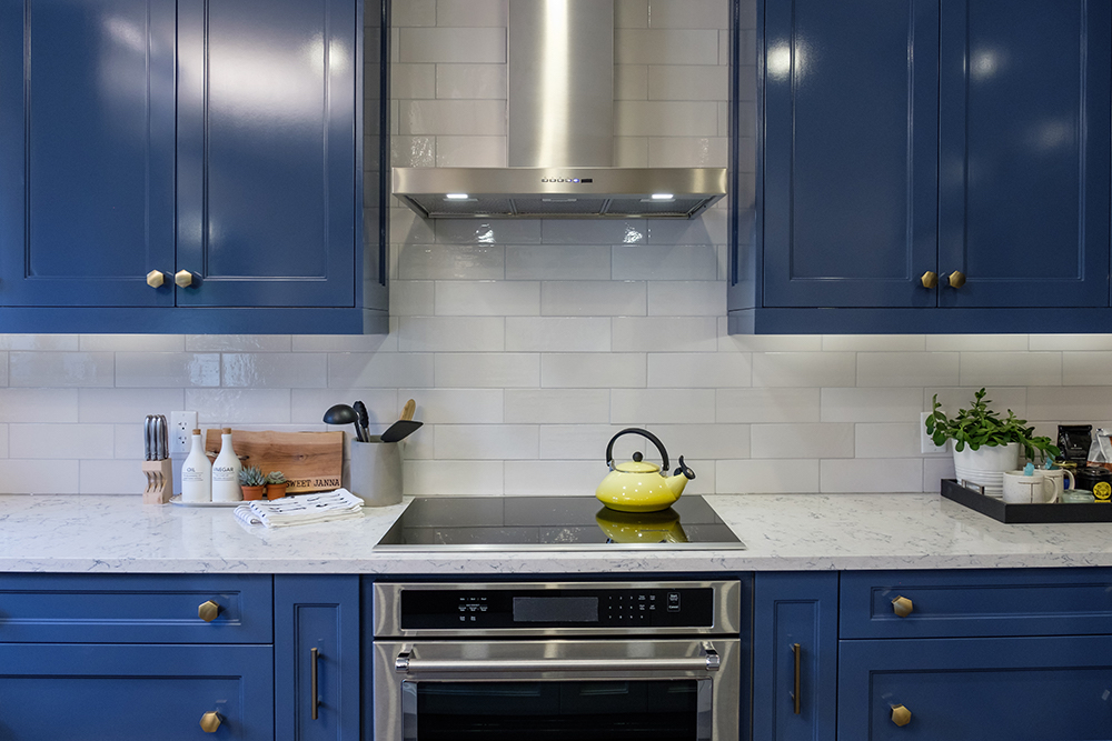
In the kitchen, Jonathan kept the footprint the same but shuffled around the appliances to enhance the flow and function. If the layout ain’t broke, don’t fix it – just update the space with new everything.
Blue Ribbon
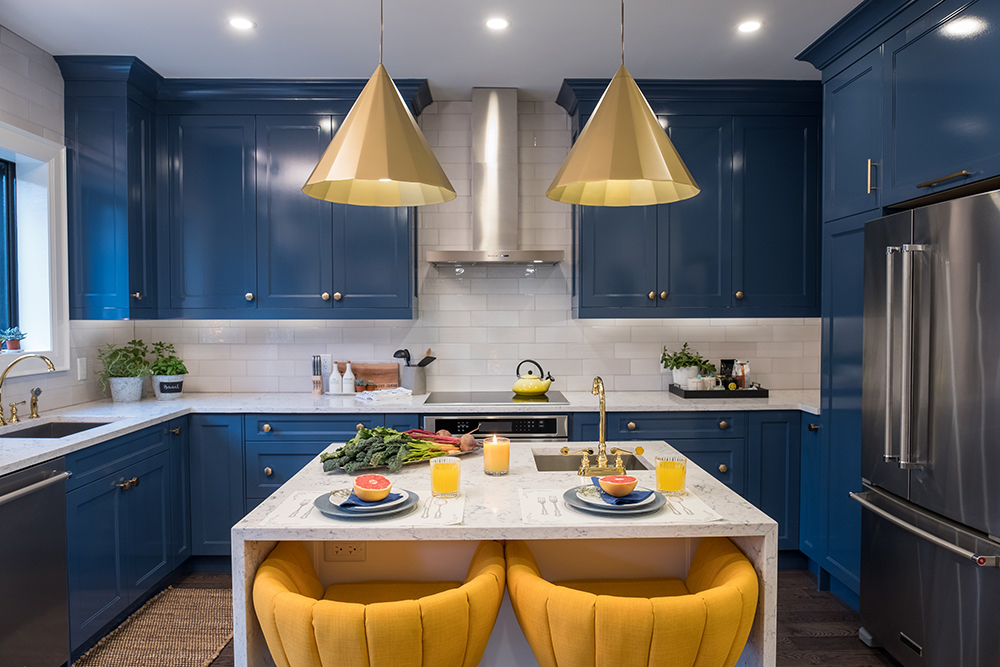
The new, blue cabinets now go right up to the ceiling, giving the couple the extra storage they were missing in their cramped condo, which was one of the reasons they wanted to upgrade to a nearly 3,000-sq.-ft. house in the first place.
Double Feature
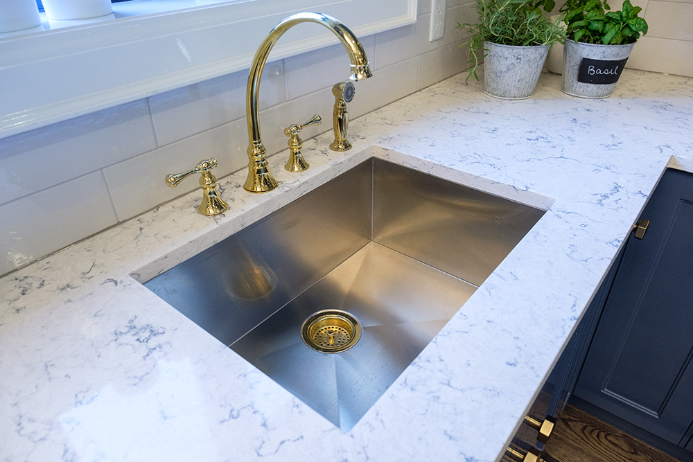
Gorgeous, high-end granite countertops and a deep, stainless-steel chef’s sink were just two of the updated features that helped convince Janna and Jason that post-renovation this might just be their forever home.
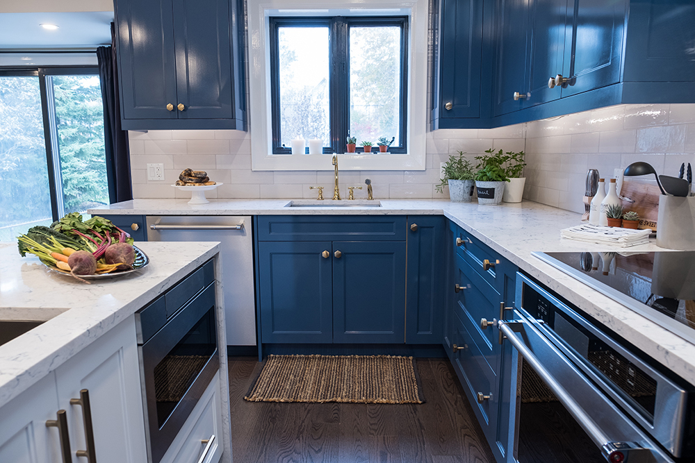
Full of Complements
In genius mix of materials and colours, the high-gloss deep-blue cabinets, white subway-tile backsplash and muted gold hardware complement the new, dark hardwood floors that run throughout the main floor of the house.
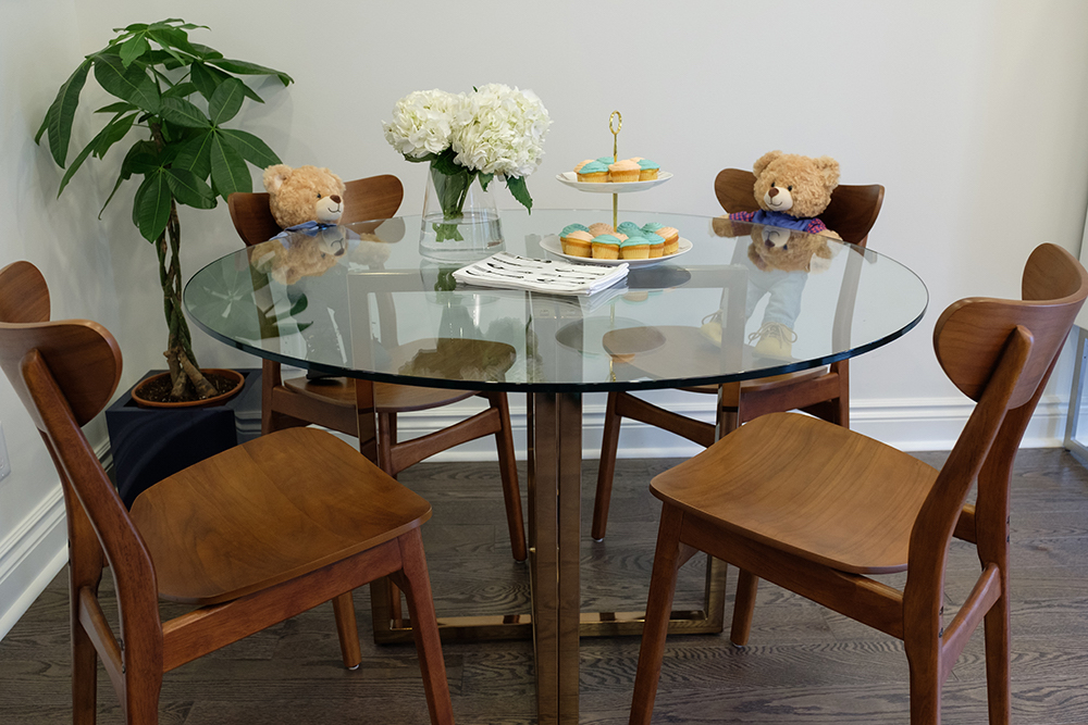
Baby Onboard
Halfway through the renovation project, Janna found out she was pregnant, so they increased their budget and changed the design direction to a more kid-friendly, open-concept plan, which gave them clear sight lines across the main floor.
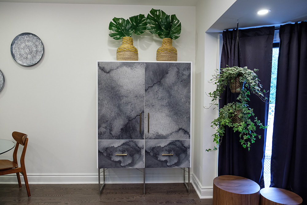
Storage Facility
Now that Janna and Jason were expecting, having extra storage (for toys and baby gear) was more important than ever. Luckily, Jonathan was on it and incorporated stylish storage options into the home’s design.
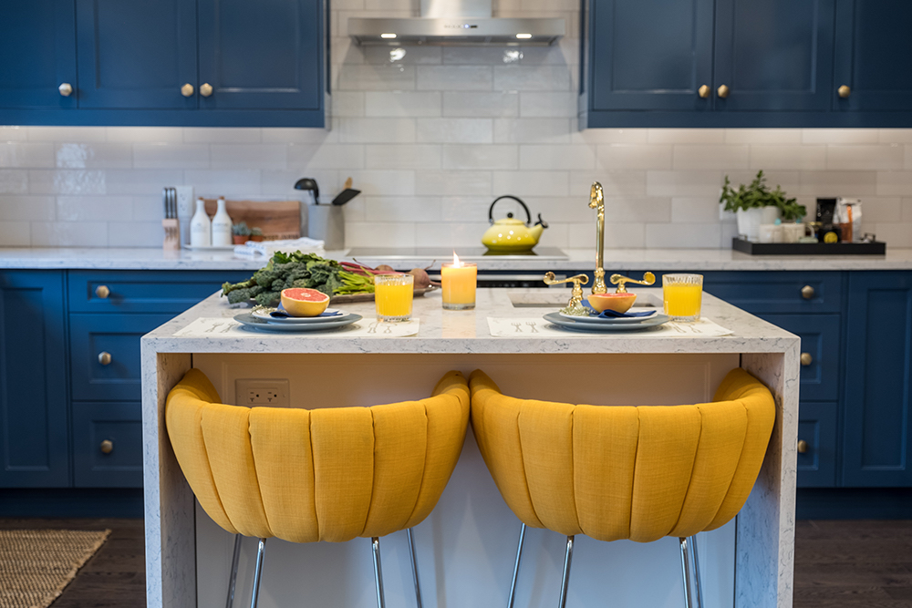
Non-Mellow Yellow
Contrasting a vibrant yellow against complimentary blue is a bold colour choice for any room, but it’s a risk that paid off when Janna first saw the completed space: “This is exactly what we had in mind!”
Moved to Tears
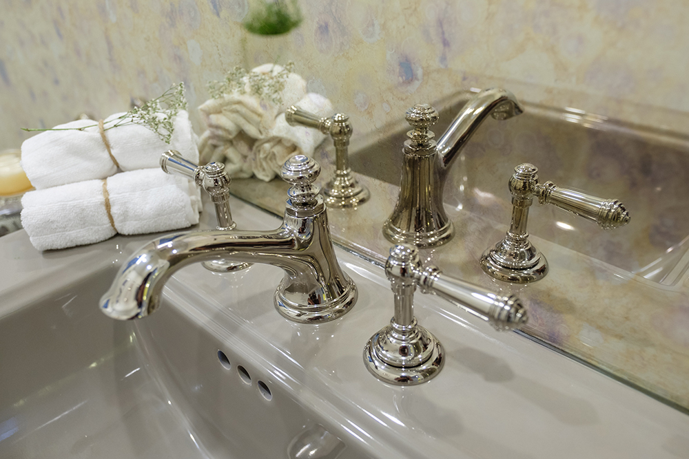
The main-floor powder room wasn’t ignored either – it got a complete makeover from top to bottom. In fact, Jason was so moved by the design choices, he teared up a little bit when the Brothers brought him in.
Grey Stoked
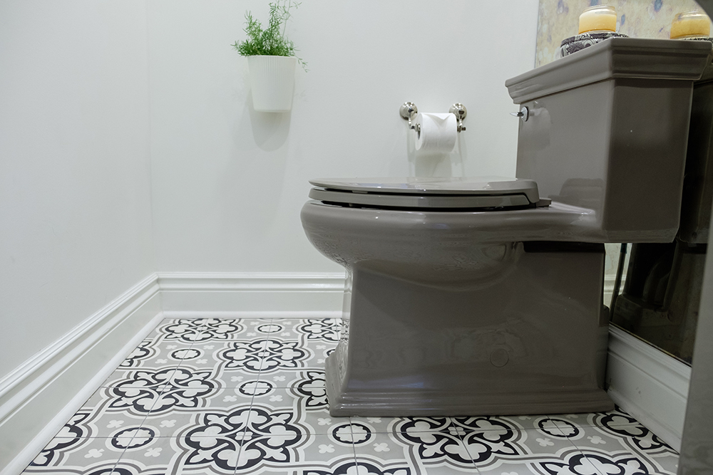
Keeping Jason’s vintage-leaning sensibilities in mind, Jonathan opted for grey ceramic toilet and sink in the powder room, rather than basic white. The 1920s-inspired geometric floor tiles tie together all the shades of grey found in the small space.
Right On the Money
After buying the house for $1.57 million, Janna and Jason gave the Brothers $168K and eight weeks to turn it into their dream (now-family) home. “You really married the two styles, which is really what we wanted for our first home together,” said Janna, after touring the completed renovation for the first time.
HGTV your inbox.
By clicking "SIGN UP” you agree to receive emails from HGTV and accept Corus' Terms of Use and Corus' Privacy Policy.


