Mother-daughter duo Karen E Laine and Mina Starsiak Hawk have transformed many homes, but the experience is more impactful (and stressful) when it’s your own property – as was the case with this inside-and-out renovation. Mina and her husband Steve bought a 2,720-square-foot Indianapolis home for $85,000 three years ago, and they’d been renting it ever since. With the home vacant and the area becoming more desirable, it was time to revamp the property to see if they could cash in on their investment. Inspired by the beachy elegance of the Hamptons with touches of urban edge, this renovation is almost too good to put on the market.
Stream all of your favourite HGTV Canada show Live and On Demand on the Global TV app and on STACKTV . HGTV Canada is available through all major TV service providers.
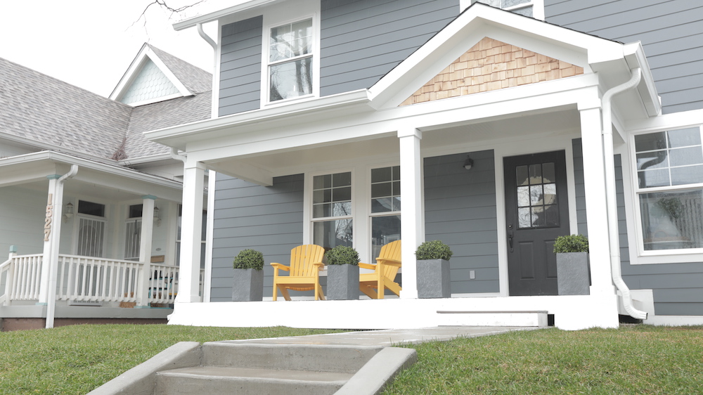
Curb Appeal
Mina and Steve bought the three-bedroom, two-bathroom home in the up-and-coming Bates-Hendricks neighbourhood as an investment property a few years ago, but they knew it needed work. The time felt right to step up the East Street home’s game, so they decided to transform the home with a $130,000 renovation budget and the help of Karen and their team.
Related: 12 Curb Appeal Improvements Guaranteed to Increase the Value of Your Home
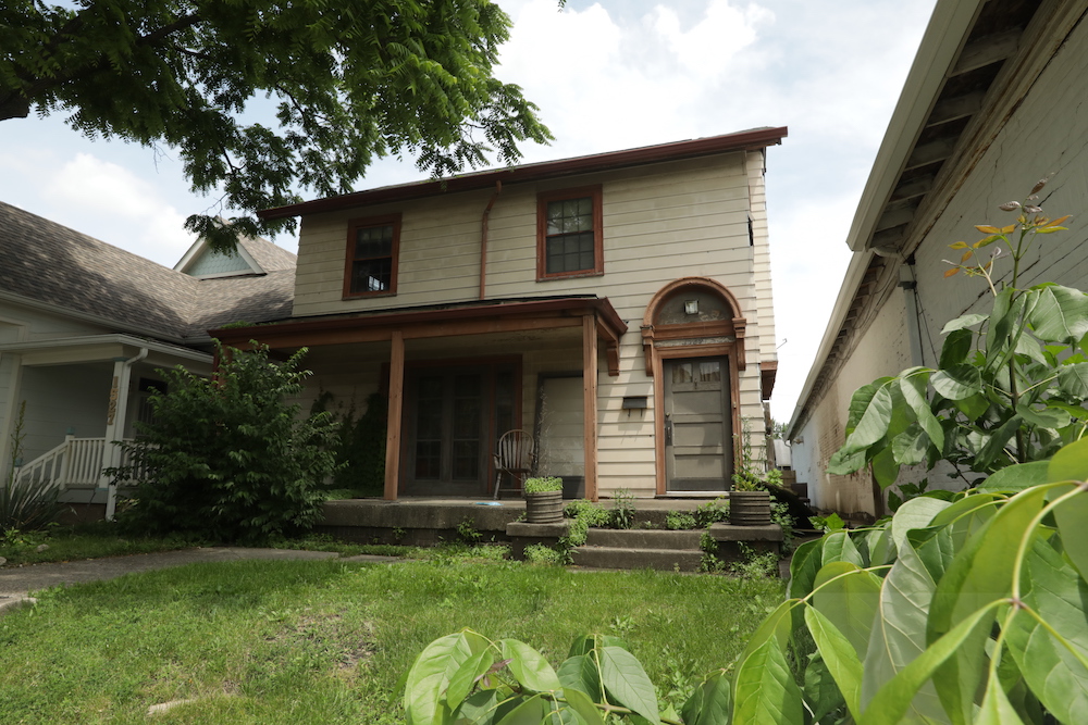
A Winding Path
The home had ample square footage and, well, good bones – but it was rundown and with plenty of potential for improvement. The home’s tired exteriors, for example, lacked curb appeal with a winding path to the front door and a porch in need of an update. New dark-grey paint, white trim and cedar shake details refreshed the house’s exterior.
Related: 15 Balcony and Front Porch Design Ideas We Want to Steal
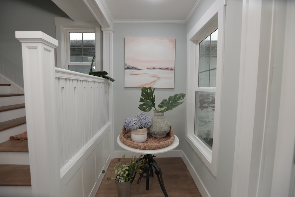
First Impressions
By moving the front door more to the centre of the home, Mina eliminated the claustrophobic entryway for an open feel and a better first impression. Furthering the fresh look, a sophisticated colour palette of beige and white reinforced a urban-meets-Hamptons-inspired decor theme, while soft blues, greens and baskets enhanced the beachy, organic tone of the home.
Related: 14 Colour Palettes That Go Surprisingly Well Together
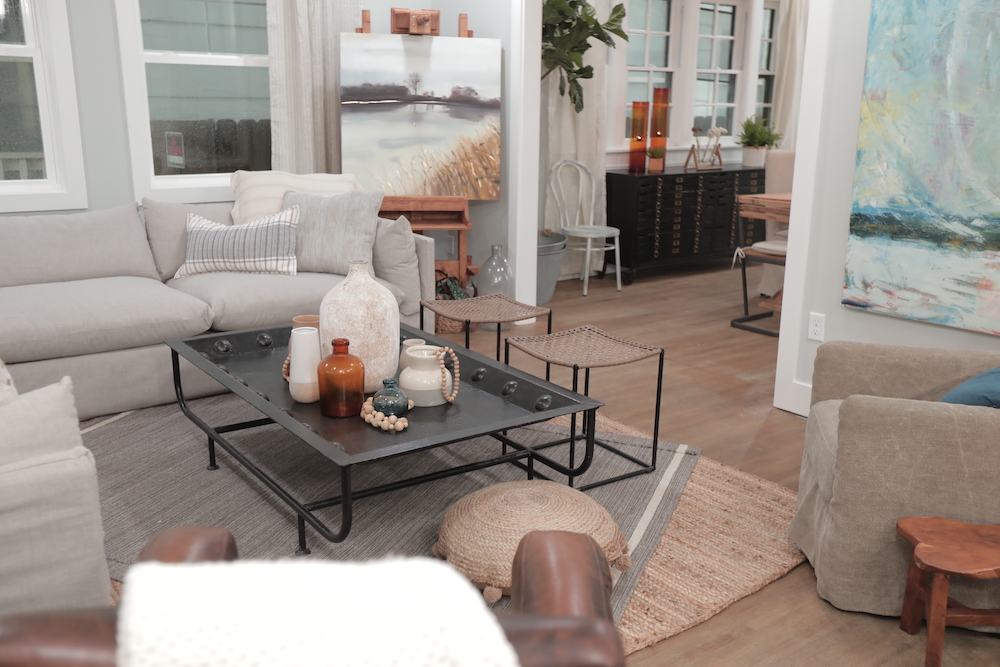
An Open Concept
When it came to the main floor’s layout, Mina wanted to capture the best of both worlds with a more open feel that still offered a sense of separation between rooms. By widening – but keeping – the openings from the living room into the kitchen and dining room, the team balanced flow and functionality.
Related: 20 Tips for Arranging Furniture in Your Living Room
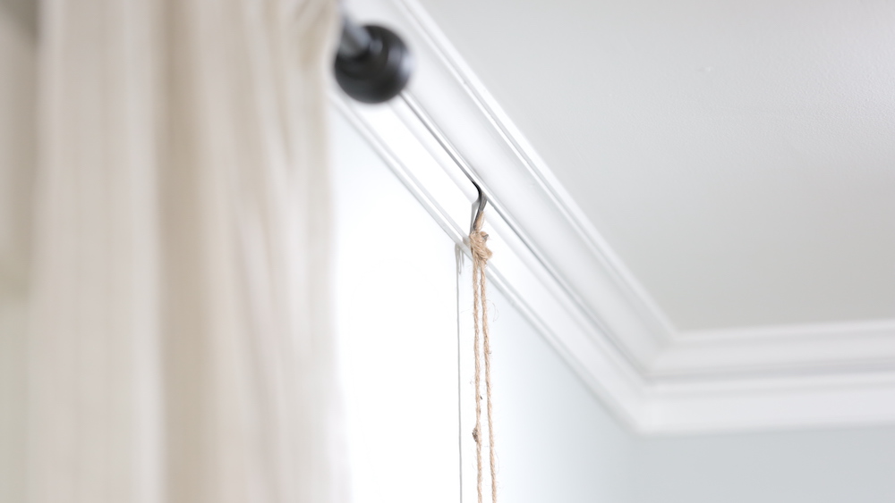
Original Character
In the living room, Mina and Karen discovered a “picture rail” along the crown molding – a unique architectural detail from days gone by. Picture rails allow you to hang frames from hooks attached to the rail so you don’t damage your wall – essentially, an old-school cousin to today’s gallery walls. By taking care to preserve, refresh and integrate the picture rails into the new living room design, Mina kept some of the original character in the space, as well as a cool, convenient feature for future homeowners.
Related: Picture Perfect: A Foolproof Guide to Hanging Your Pictures Perfectly, Every Time
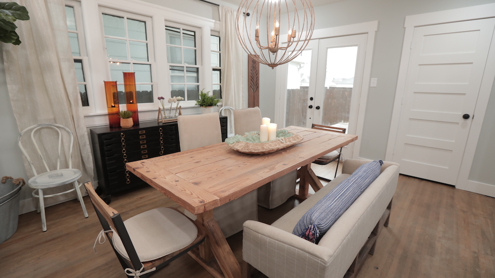
Dining Room Light
In the dining room, adding French doors served multiple practical and stylish purposes: they offered additional access to the backyard, made it easier to move furniture in and out of the home and added lots of natural light to a dining space that was living on the darker side.
Related: 15 Dining Room Lighting Ideas That’ll Shine in 2020
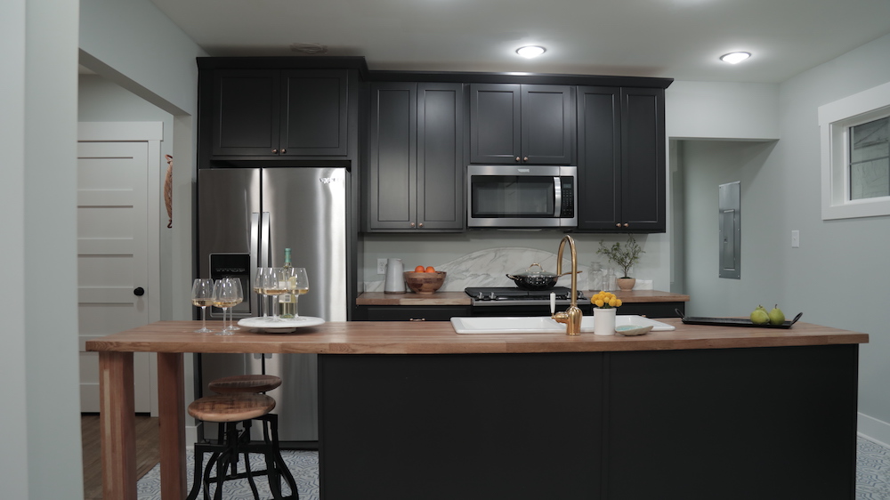
Keeping Costs Low and Sophistication High
The kitchen was craving a big refresh, and the team delivered with a total transformation complete with nearly black cabinets, gold hardware, a huge centre island and butcher-block-style counters (which aligned with the character of the space while keeping the reno budget intact). For an elevated, cost-effective touch, Mina designed a stunning curved backsplash for the space behind the stove that she had made from a remnant of marble – giving the room a luxe element with major cost savings.
Related: Backsplash, Tile, Cabinetry: The 15 Top Kitchen Trends for 2020
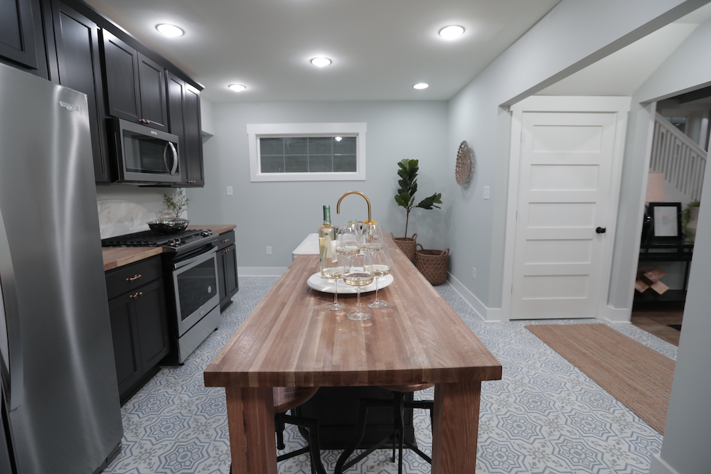
Kitchen Patterns
Underfoot, Mina used graphic kitchen tile flooring for a touch of interest and elegant character. Although the tile pattern is intricate, the soft blue and grey tones beautifully offset the drama and keep the look quite sophisticated.
Related: 15 of Our Favourite Kitchen Renovations From HGTV Shows
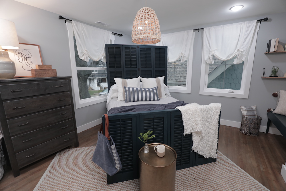
Cozy Sea-Side Vibes
Upstairs, the master bedroom was totally reconfigured to maximize the space – splitting the oversized room into an appropriately sized master, new closet and new en suite bathroom. For decor, the team kept with the chic, Hamptons-inspired feel with grey walls, white window treatments and a stylish pendant light. Karen created a one-of-a-kind statement piece for the master as well, repurposing old shutters to create a unique headboard and footboard for the bed.
Related: Knock, Knock: Door Decor is the Latest Home Decorating Trend
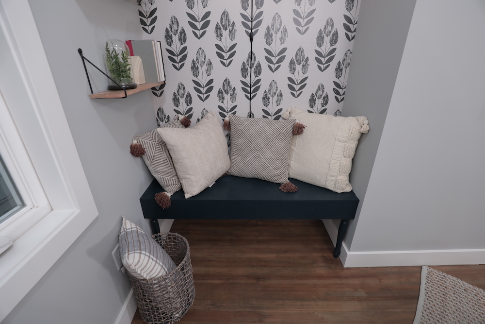
A Neat Nook
Even after reconfiguring the master bedroom to create a new en-suite bathroom, there was still an awkward nook in the bedroom’s corner. Not wanting to waste space, the team built a custom bench area in the space – which could be used as a cozy reading spot or even a dreamy spin on an upstairs breakfast nook.
Related: Good Bones’ Mother-Daughter Duo Uncover Charm and Value in Rundown Bungalow
HGTV your inbox.
By clicking "SIGN UP” you agree to receive emails from HGTV and accept Corus' Terms of Use and Corus' Privacy Policy.


