Sometimes you absolutely love your starter home, but over time it just isn’t able to grow with your evolving family. But as Hilary Farr proved on a recent episode of Love It Or List It, sometimes all your starter home needs is a little reconfiguration in order to meet your expanding needs. See how she transformed this house into a functioning abode for a family of five and made them fall in love with their space all over again.
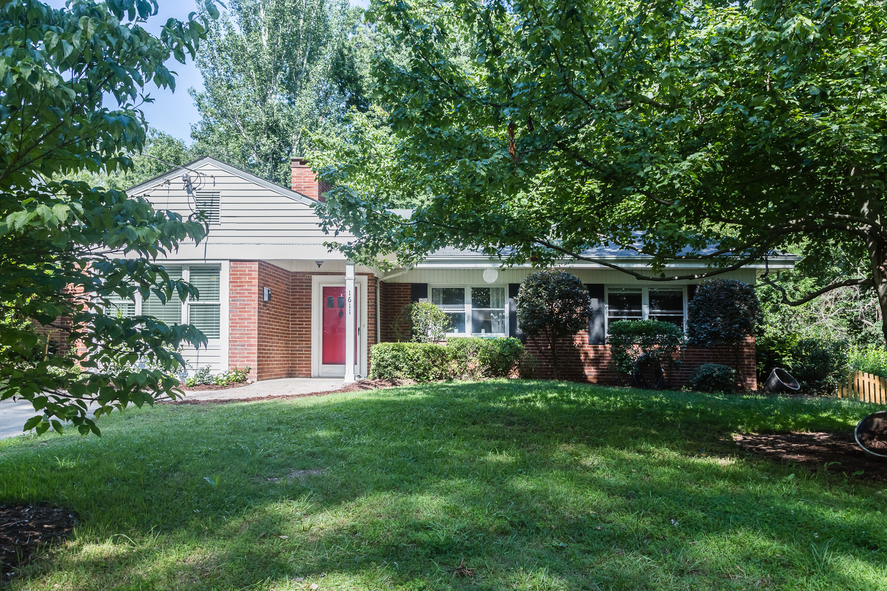
A New Facade
Before a garage (which was used mostly for storage), took up extra living space. Given that this home is situated on a street where practically none of the homes feature a garage, it made total sense for Hilary to get rid of it and create a larger interior for this family.
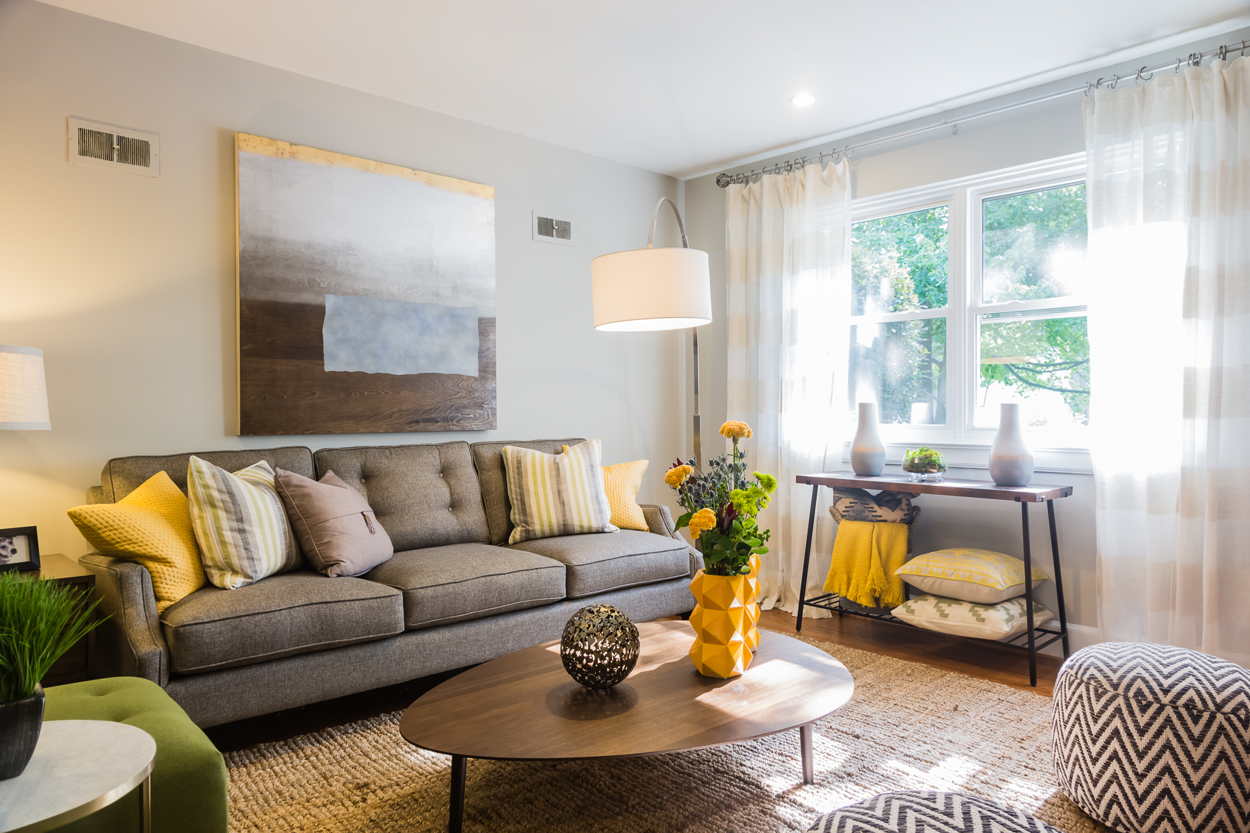
A Warm Welcome
Some fresh paint and a little creativity in terms of furniture selection transformed a tiny living room into a large, liveable space for the family. Grey tones pop with yellow accents like these throw pillows and vases. Meanwhile a neutral area rug ties it all together, making this living room bright, bold and big.
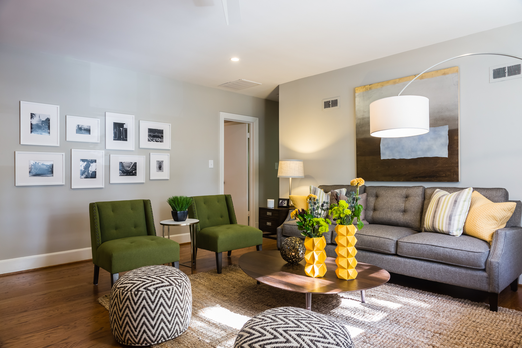
Going Green
In order to play up some of the natural elements Hilary added these pine-coloured, oversized chairs. They add extra seating along with the printed cushions, which add a touch of modernity to the space. A lower sitting coffee table helps create the illusion of more space as well.
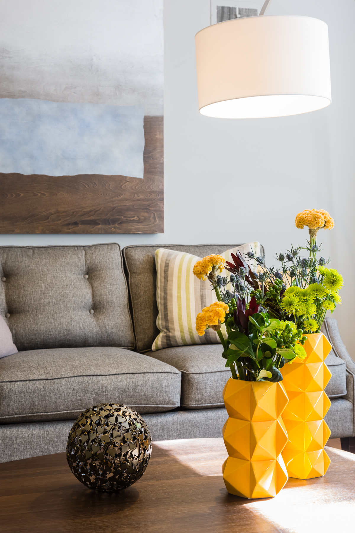
Natural Elements
Because the yellow is such a bold and sunny colour choice, it made sense for Hilary to pare it down with natural finishes like fresh flowers, metal finishes and matching art.
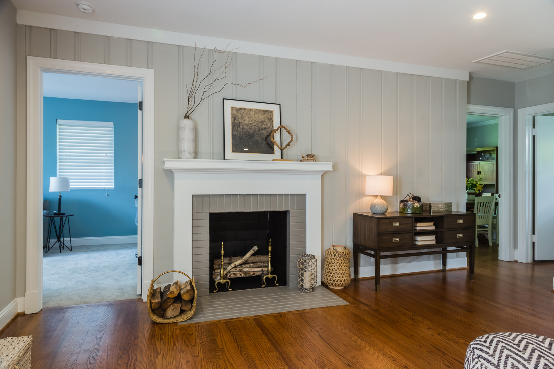
Accent Wall
The fireplace tends to be the focal point in any room, and this living room is no exception. The whites and greys continue here thanks to painted bricks; meanwhile Hilary added lots of natural wood for decor purposes. Add in a small side table for knickknacks and bonus storage, and this is a great room to entertain in or to hang out as a family.
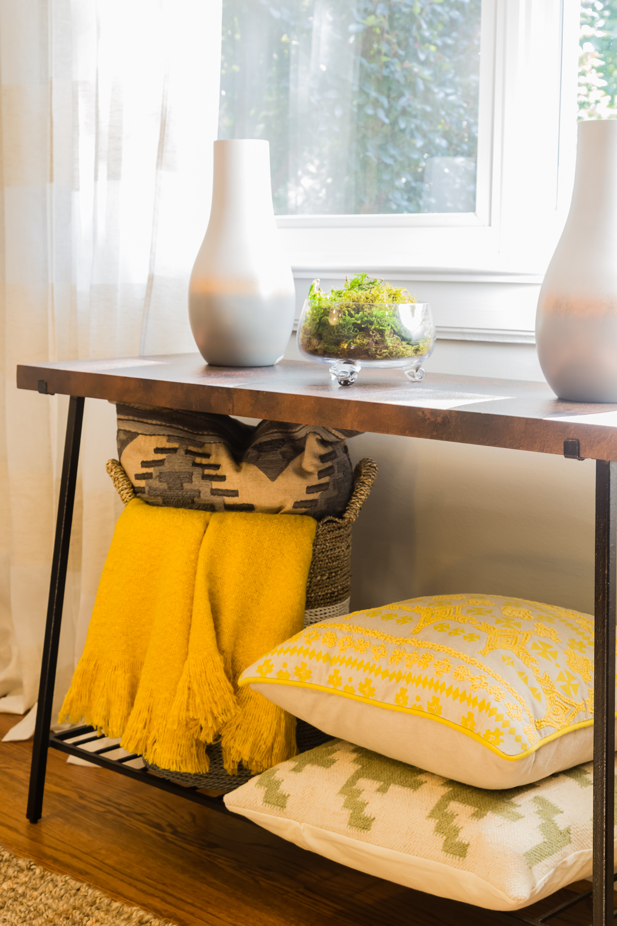
Small Spaces
Just because you have an awkward space doesn’t mean it has to be dead space. Hilary made the most of the area under the window with a small side table, then built it into part of the decor thanks to yellow accents. It’s the perfect mix of decor and function thanks to its storage capabilities; a must-have for any family living room.
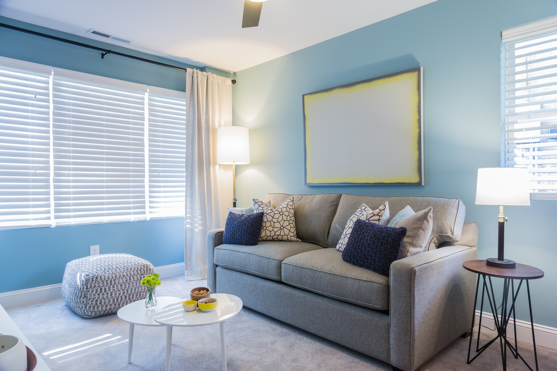
Bold and Blue
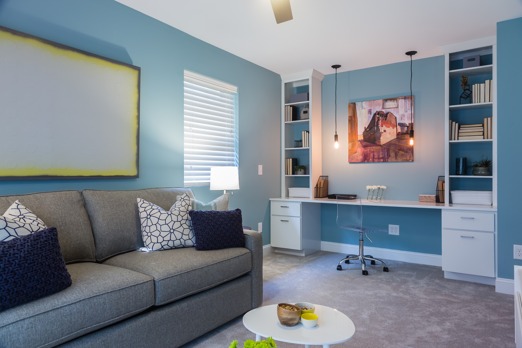
What do you do if you like to entertain, you need a space for the kids to hang out in, and you need an office area? You pull together a three-in-one room, of course. This pretty blue hue makes a smaller space universal and adds a calming effect, which is perfect for guests who may want to use this room and its pull-out couch when staying over.
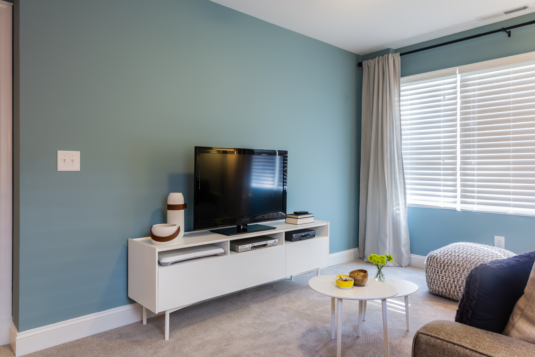
Entertaining Area
The small media centre is perfect for whenever the kids want to hang out and watch a movie, or for any guests looking for some late-night entertainment. Meanwhile keeping the space carpeted is a great idea for when the children are horsing around, but the soft grey keeps the overall room feeling modern and spacious.
Working Corner
On the other end of the room a built-in table with a couple of storage units doubles as the perfect desk. We love the bonus shelves and art above; they help transform the room into an artsy and modern space where office creativity can easily flow.
Budding Bathroom
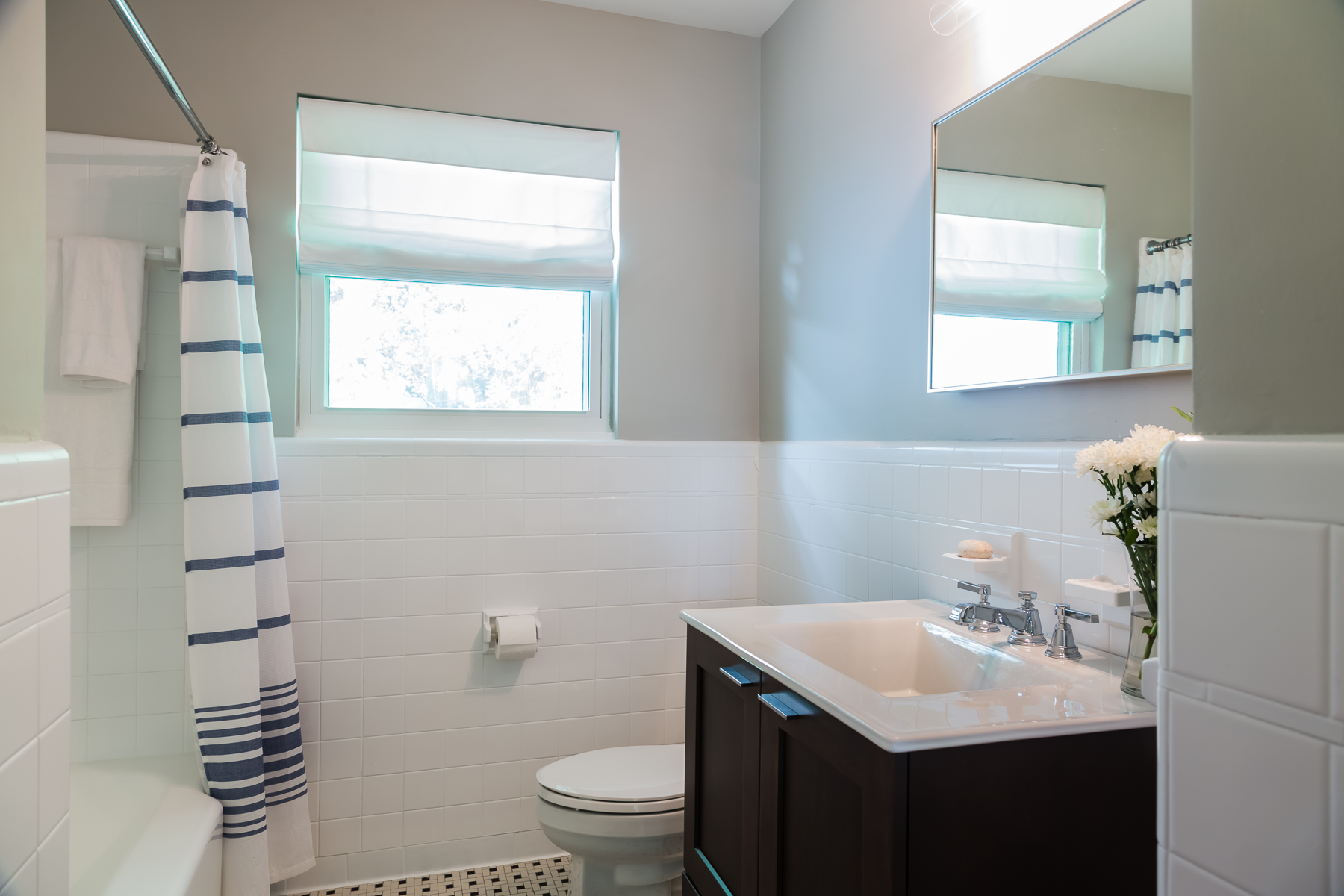
Meanwhile Hilary also ensured that the main bathroom got a bit of an upgrade so that guests and family members alike could benefit. Simple tiling paired with an inexpensive vanity create a modern and clean look that’s perfect for a variety of ages and tastes.
Master Makeover
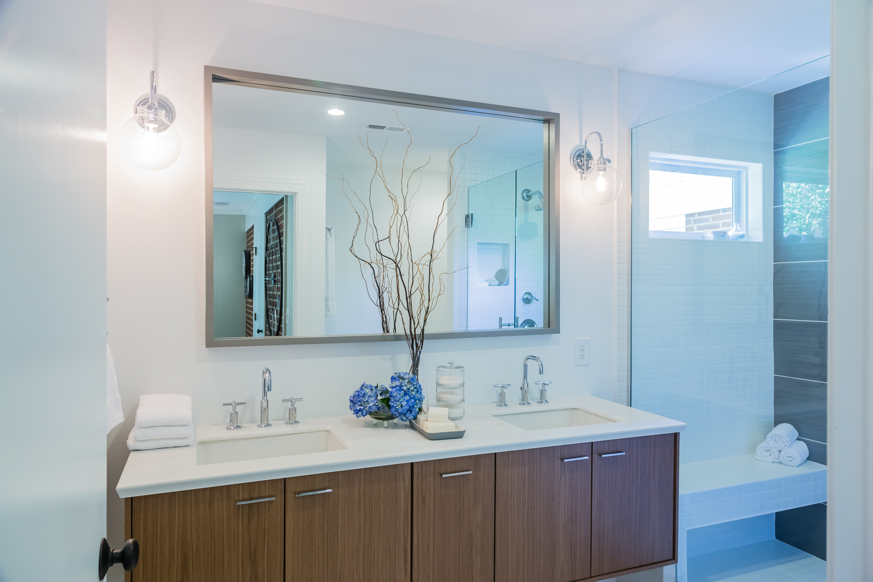
The real bathroom upgrade happened in the master ensuite, however. Given how busy these parents are, it was important to create a zen-like space for them to enjoy together. The natural wood cabinetry and soft white finishes here does that trick, while the oversized mirror helps create the illusion of more space.
Simple Showers
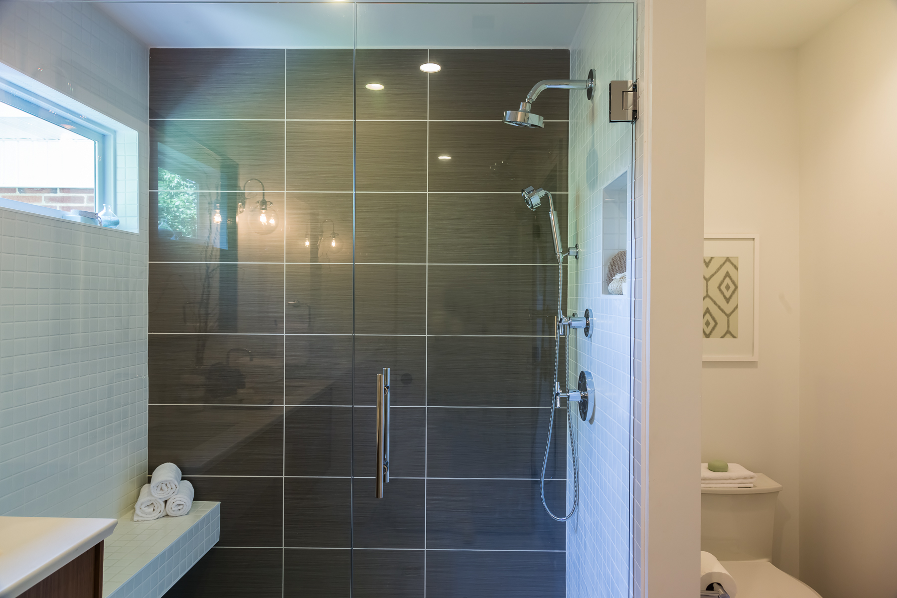
Darker tiling in the stand-up shower give the room a modern finish, but it’s paired with the smaller white tiling on either side so as to keep it feeling bright and open. We love the addition of a bench — especially since there’s no actual tub, as well as the modern glass door.
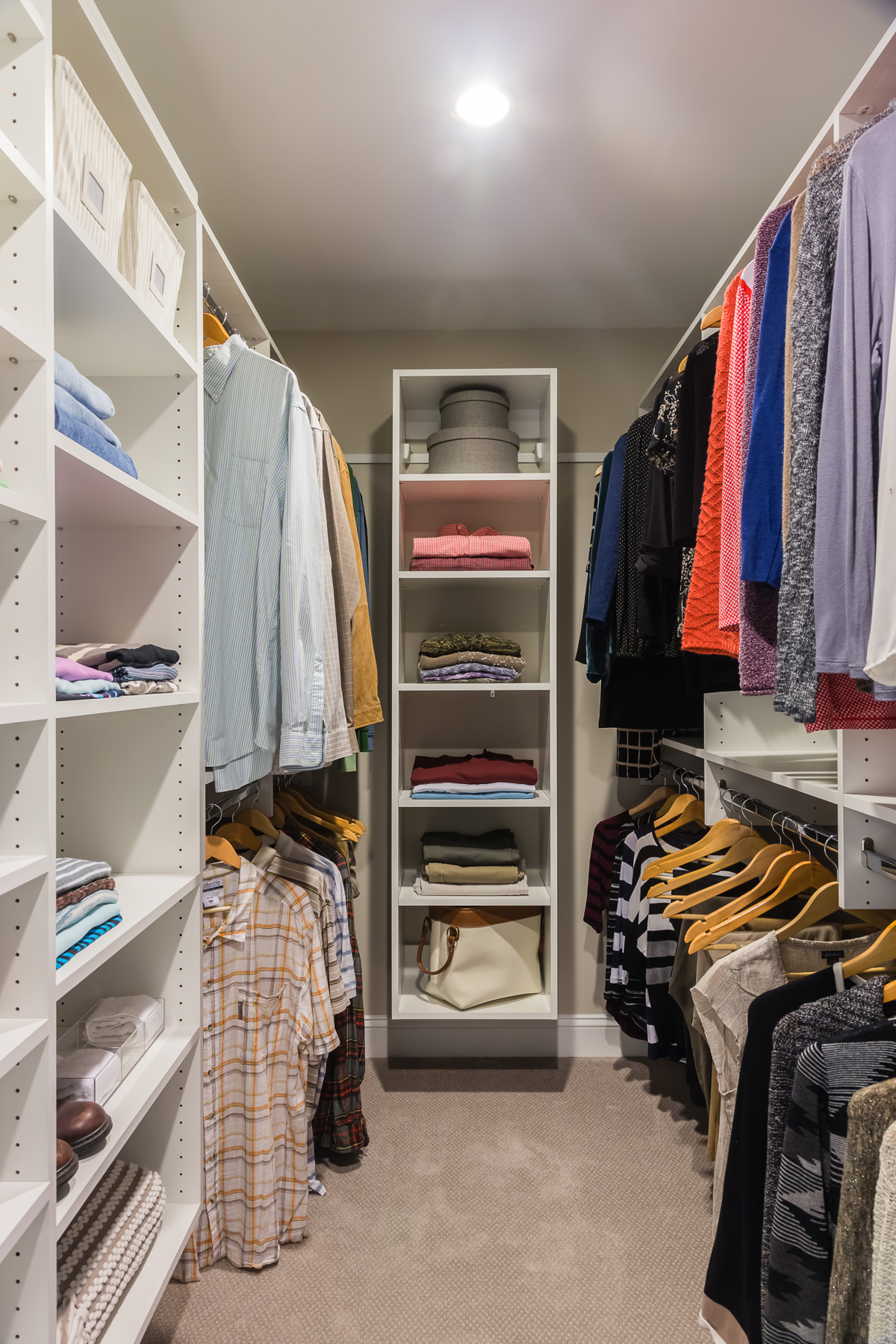
A Walk-In Dream
Before this couple’s large master bedroom boasted zero storage. After, by adding a wall and creating this closet organization system, Hilary transformed the room into an equally large but tidy space that gives the homeowners so much more organization.
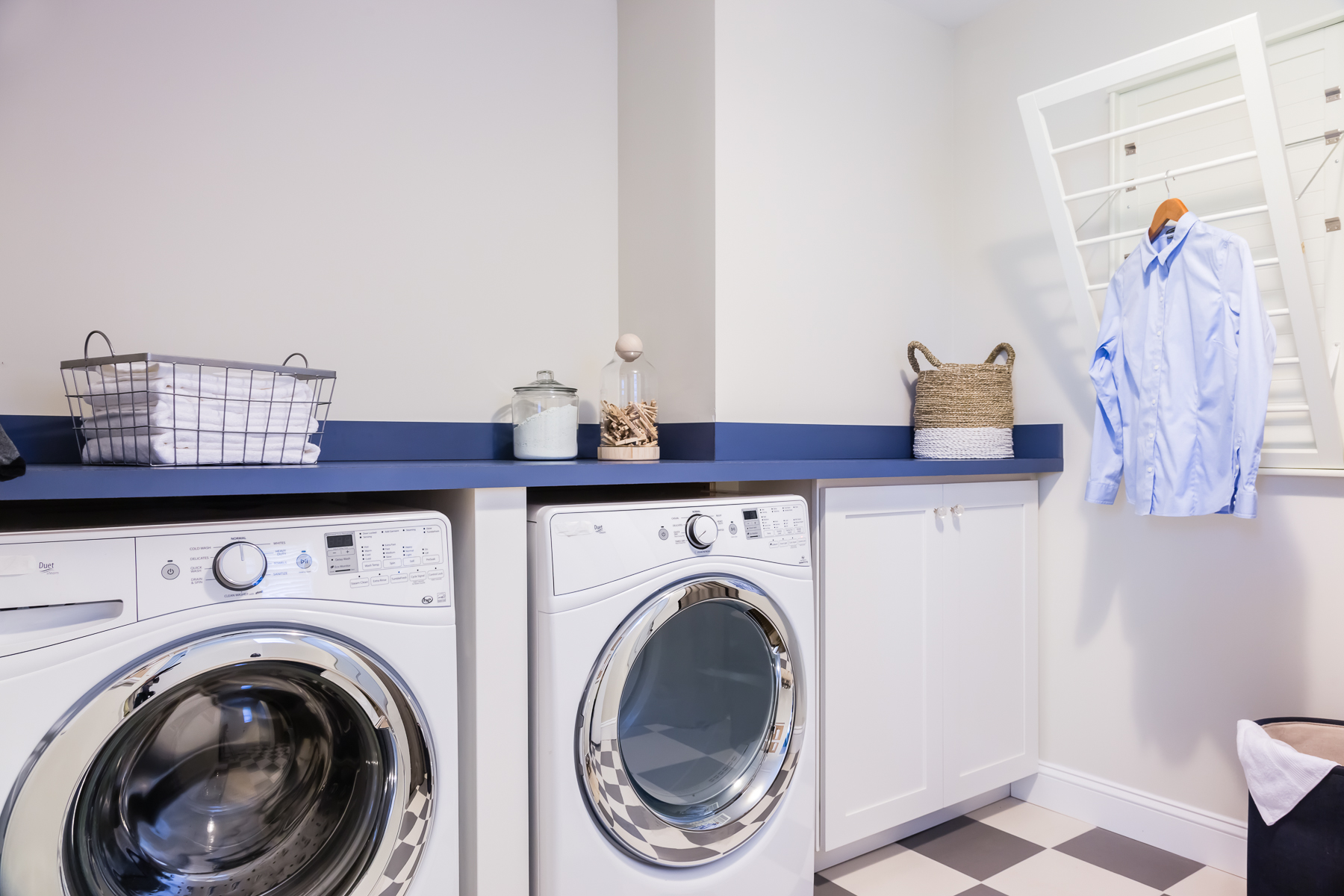
Finished Laundry
One last thing on this couple’s checklist? A laundry room that actually felt as though it was a part of the house. Before brick walls and an open space just hosted a washer and dryer. Hilary added walls, some checkered tiling and this folding shelf that adds so much more function and storage to the room. Cute little jars to hold laundry essentials and a collapsable drying rack complete the renovation. Now that the home is working for the entire family, it’s no wonder they chose to love it.
HGTV your inbox.
By clicking "SIGN UP” you agree to receive emails from HGTV and accept Corus' Terms of Use and Corus' Privacy Policy.


