House-flipping experts Kortney and Dave Wilson show us how to masterfully mix red, blue and yellow on Masters of Flip. In this master class of colour, they take a ho-hum all-white cottage and turn it into a fun house – only without the clowns.
Greeting Party
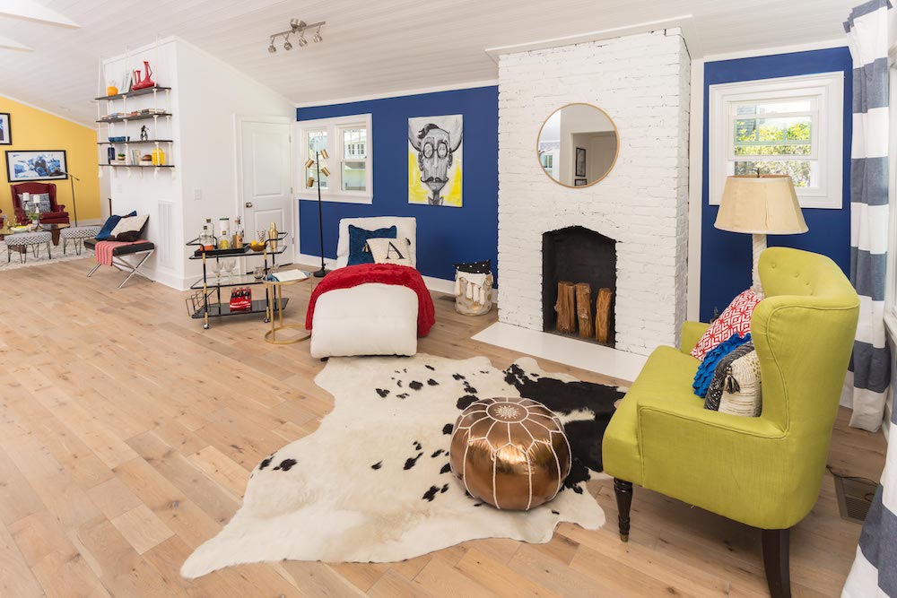
When you walk in the front door of this open-concept home, you’re welcomed by a ’60s-inspired receiving area and an original brick fireplace painted a brilliant white.
Primary Playtime
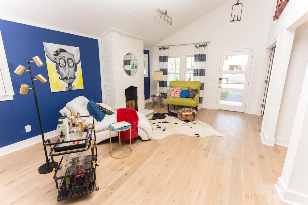
The true-blue wall was a bold choice but it’s the accessories, such as the red faux-fur throw, yellow-highlighted artwork and chartreuse bench, that really punch up the primary-colour quota.
Red Room
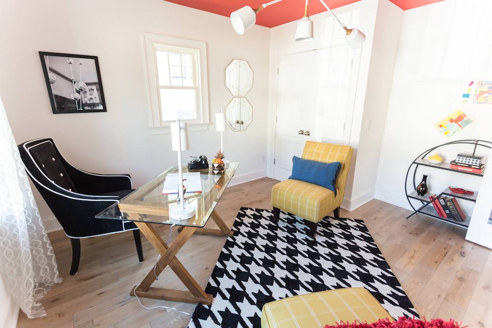
The red paint on the office (or perhaps bedroom) ceiling reflects off of the white walls, giving the spacious room a warm pink glow. The black chair and hound’s-tooth rug help to absorb some of that striking terra-cotta colour.
Open Wide
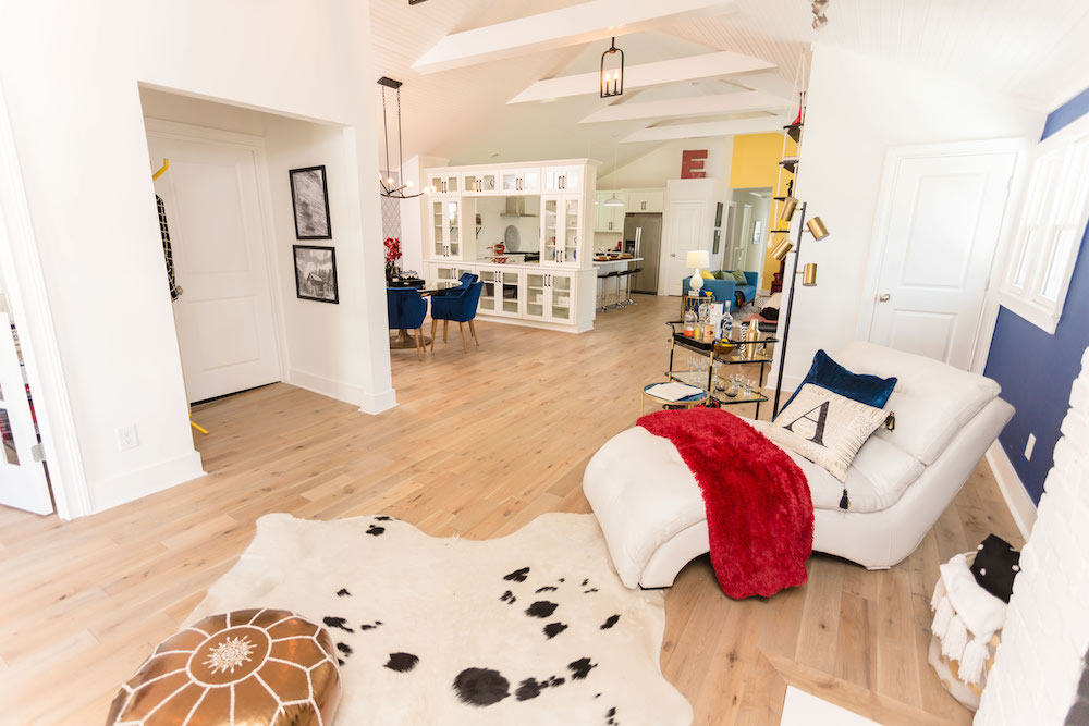
As part of the redo, the Wilsons removed a couple of walls and added two more beams to the vaulted ceiling, which completely opened up the landscape of this single-story home.
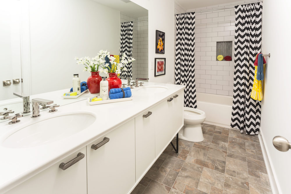
Inherited Hopes
Since the Wilsons bought this house mid-renovation (the previous flippers wanted out), they decided to work with the white subway tile that was already installed in the main bathroom.
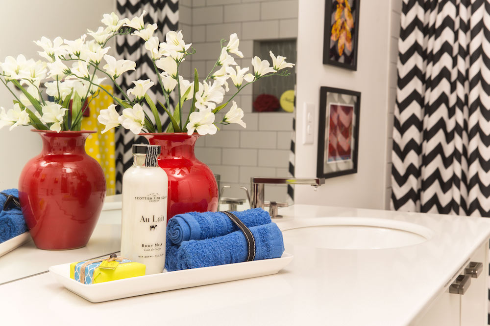
Flip to It
Kortney pulled in red, blue and yellow with groupings of fun accessories, bathroom linens and artwork to give this main bathroom the same punch of colour she uses throughout the rest of this fun-house flip.
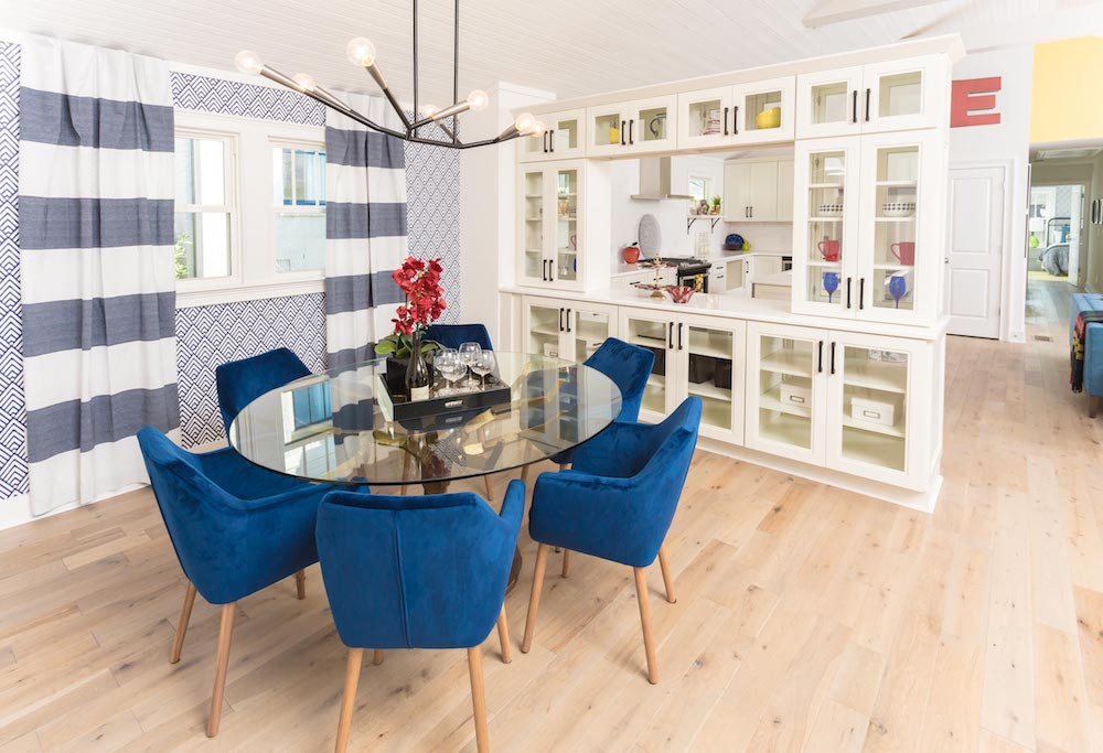
Jimmy Buffet
To get a full-sized dining room, Dave decided to get rid of one of the bedrooms and convert it into a luxurious entertainment area that connects to the kitchen via a long, white built-in buffet.
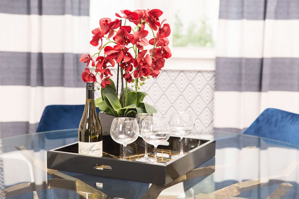
Primary School
Using a clever decorating trick, Kortney chose black accessories – such as this serving tray and orchid planter – to help ground a space that’s saturated with primary colours.
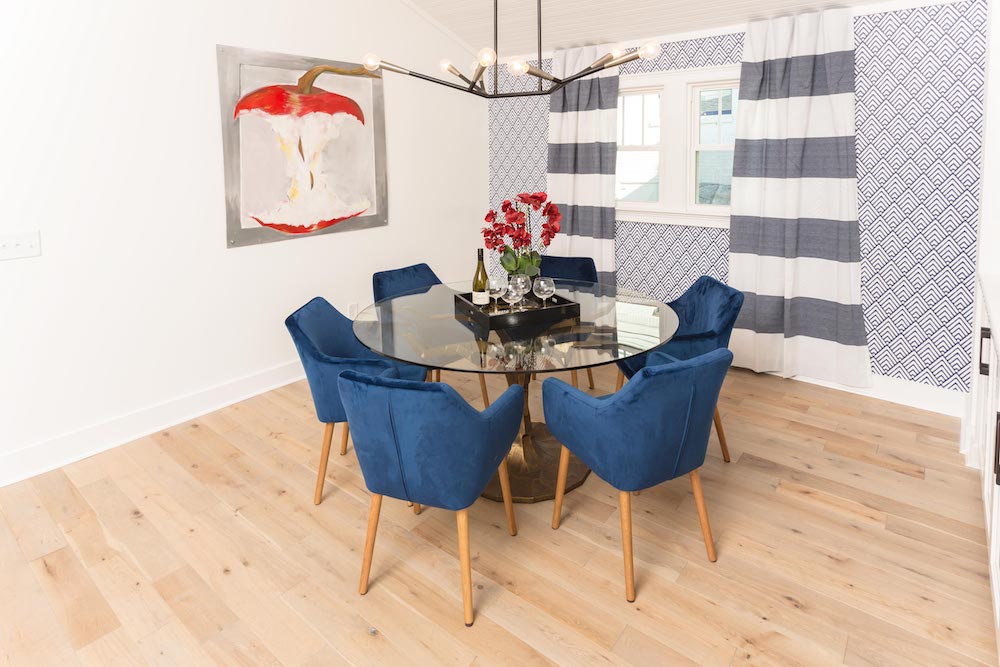
Blue Velvet
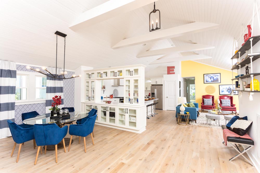
Ultra-luxe, blue-velvet chairs encircle a round, glass-topped dining-room table, giving this dynamic dining room a decidedly modern vibe. The red of the apple artwork and blooming orchids reminds buyers that blue’s not the only colour at play in this funky space.
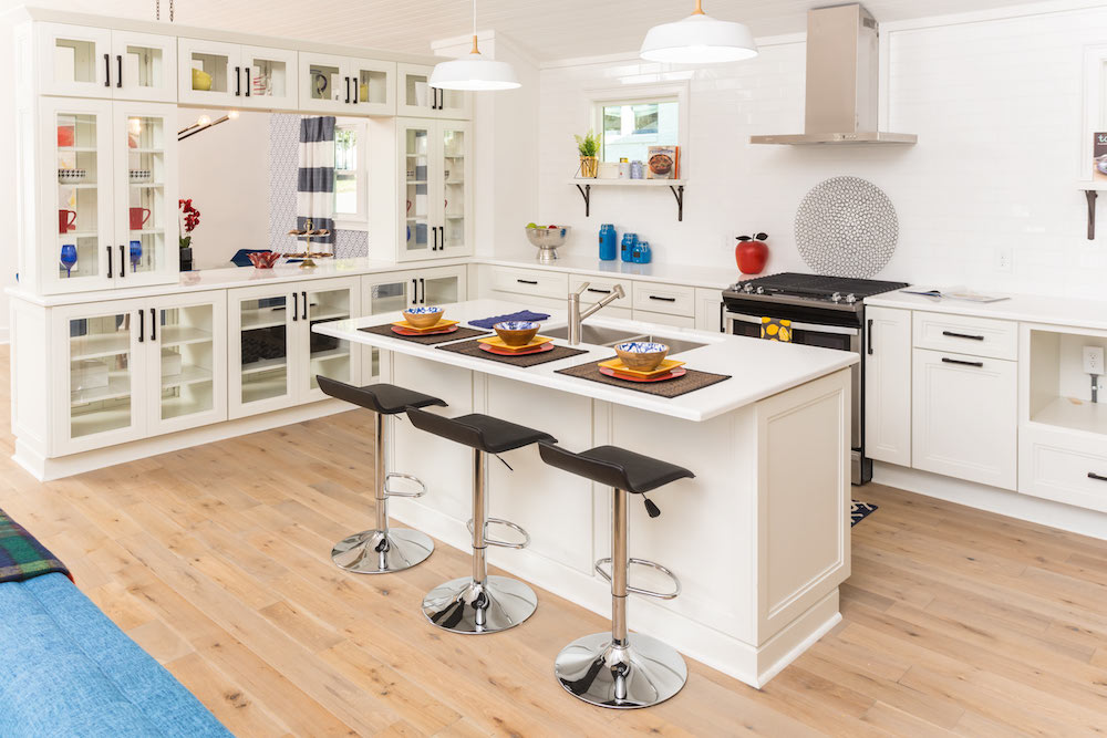
Splitting Up Together
A wall of double-sided glass cabinets forms a divide between the kitchen and dining room, giving this very open space some needed shape and structure.
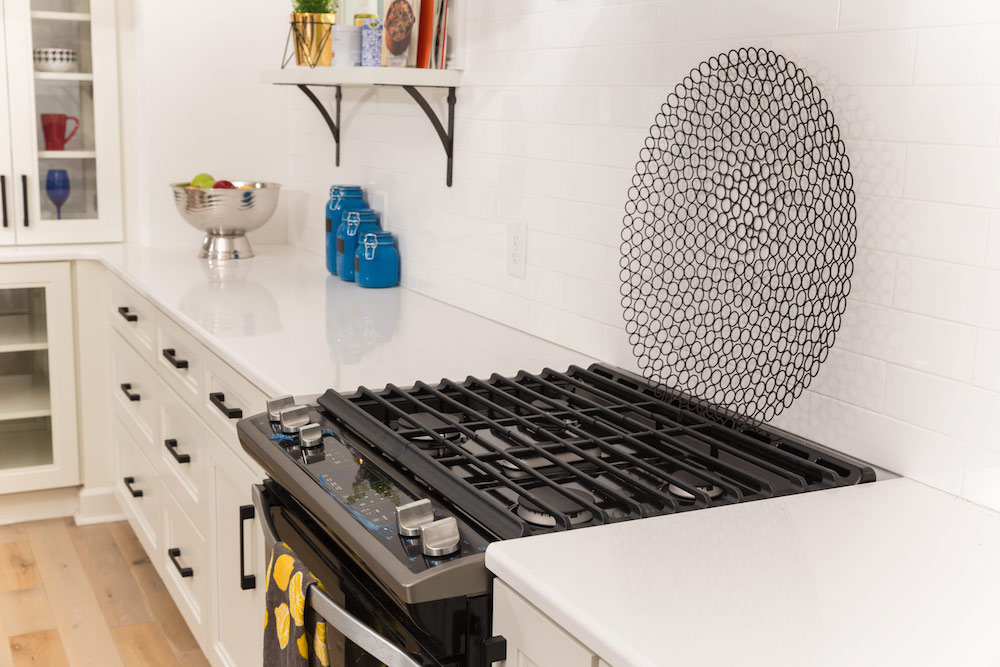
The Aerie
Kortney used minimal staging in the kitchen as she didn’t want to overwhelm the all-white space with too much colour. The result is a clean, airy kitchen ready for a new owner to add their own personal touches.
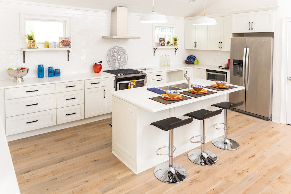
Modern Traditions
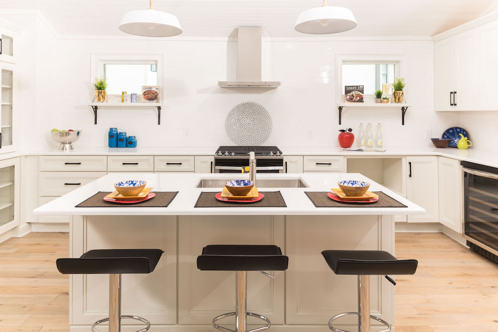
With its white shaker cabinets, simple black hardware and white subway-tile backsplash, the kitchen is traditional in its design – but with a modern interpretation.
Balancing Act
The simple symmetry of the two white open shelves situated under the windows, as well as the two white industrial over-island pendants, bring a real feeling of balance to a house that could have gone overboard with the colour.
Rug Hug
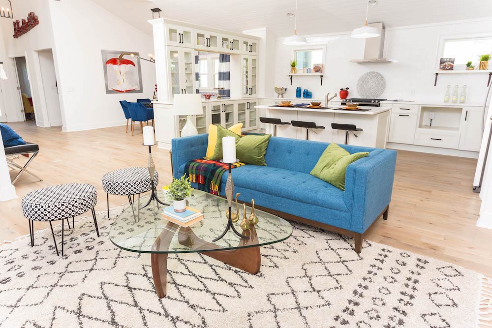
A white-and-black kilim rug acts as a neutral centrepiece to ground the blue textured couch, with its chartreuse and yellow throw cushions, in this open-concept living room.
Decked Out
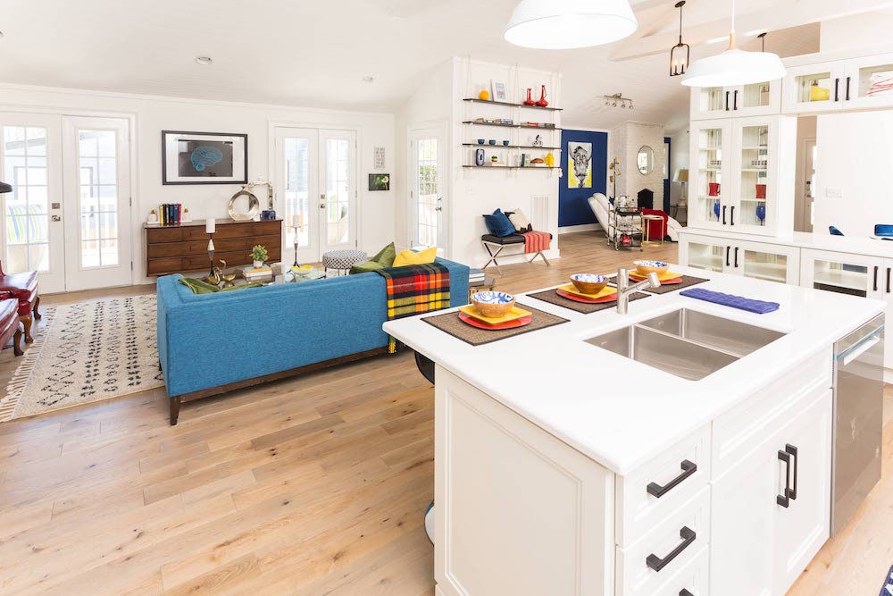
The kitchen opens directly onto the living room, but the entertainment space doesn’t end there – those two French doors go straight out onto a deck, complete with an outdoor seating area.
Devil in the Details
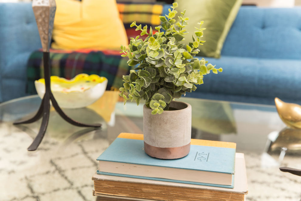
Even the smallest of details – such as a yellow bookbinding and green faux houseplant – in this colourful living room feature the same shades shown throughout this fun Masters of Flip house.
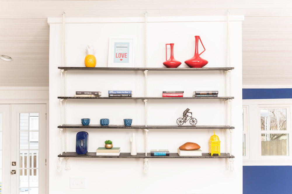
Hit Me Up
After first testing out red, yellow and blue for this feature wall, Kortney landed on using white paint as the backdrop for these custom-made floating shelves. She then selected brightly coloured accessories to give the space a quick hit of colour.
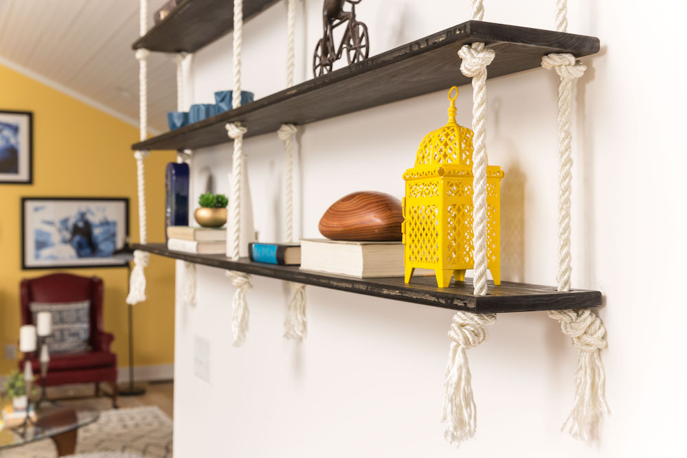
Mellow Out Yellow
The yellow accessories sitting on the black-stained floating shelves reflect the sunny paint colour used on the back wall of the living room, while the wood and black objets du art help to tone down those prevalent primary pigments.
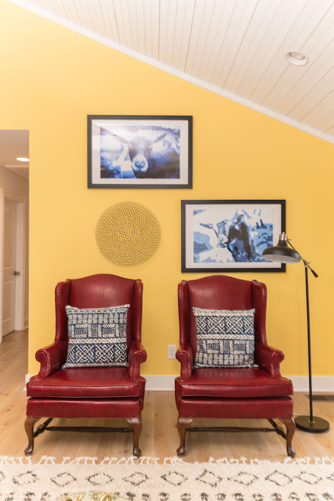
Key Colours
The yellow paint on the back wall of the living room has creamy orange undertones, while the red-leather armchairs have a black, textured quality to them – neither are true “primary” colours and that’s key to getting the correct primary-colour mix and match.
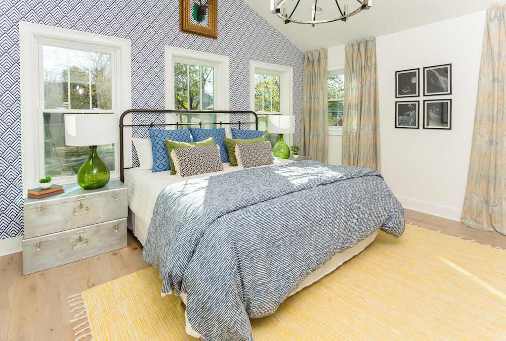
Let There Be Light
Thanks to the vaulted ceilings, wallpaper feature wall and oversized silver chandelier, the master bedroom feels extra spacious – the three large light-filled windows don’t hurt either.
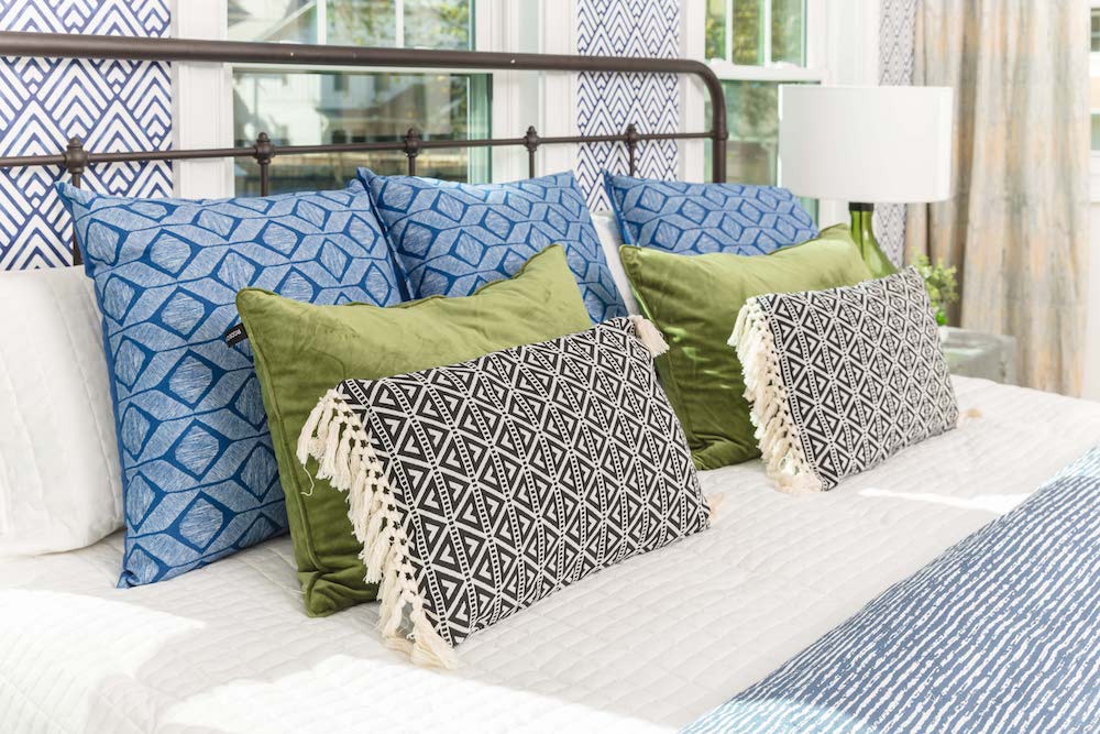
Turn It Down
Since bedrooms are supposed to be calm, reflective spaces, Kortney decided to take the primary-colour tones down a notch in the master bedroom and go with a more muted selection of blues and greens.
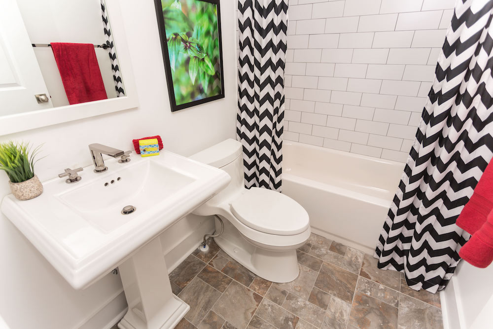
Mighty White
“Primary colours can be really overwhelming,” says Kortney of her chosen colour palette in the master ensuite, and throughout the house. “So I really neutralized everything with white.”
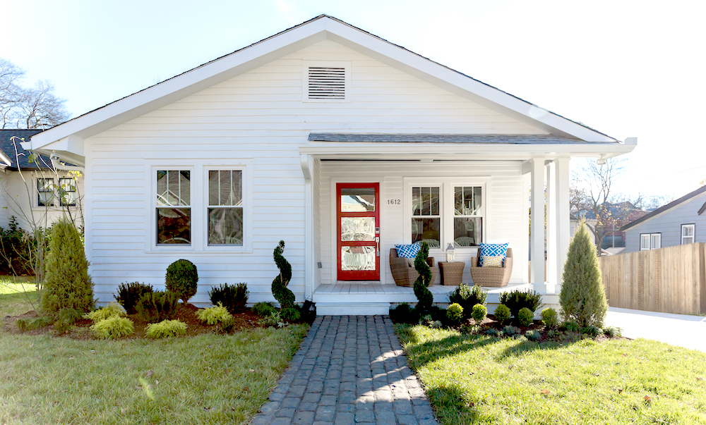
Right Said Red
As the house’s exterior was in need of much more help than the already half-renovated interior, the facade got a major facelift. New siding, paver walkway, topiary garden and red front door were all added to skyrocket this Nashville home’s curb appeal.
Black Out
The Wilsons bought this partially renovated house for US$362 and put $90K worth of renovations into it. They’re hoping to get a cool $550K, which means they’ll be in the black – and not the red (or blue or yellow) – with a profit of $65K.
HGTV your inbox.
By clicking "SIGN UP” you agree to receive emails from HGTV and accept Corus' Terms of Use and Corus' Privacy Policy.


