I’ve been in hundreds of homes over the years, and while I’m usually pretty open-minded about design and renovation choices, there are some things that really drive me crazy. Read on to learn what they are.
Scott McGillivray is a real estate expert and host of HGTV Canada’s Income Property and Moving the McGillivrays.
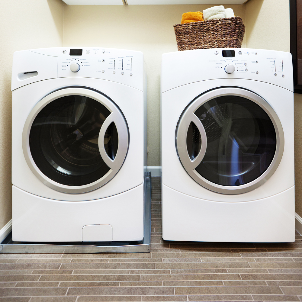
Washer and Dryer Doors
Side-by-side washer and dryer doors that open the same way are my number one pet peeve. When opening the doors this way, transferring clothes from the washer to the dryer means you have to go over the door and you will inevitably drop things on the floor. I lived like this for a long time and I still have nightmares about it. You want them to open in opposite directions for easy use.
Want more design don’ts? Check out these 17 design mistakes that make your home the “wrong home”.
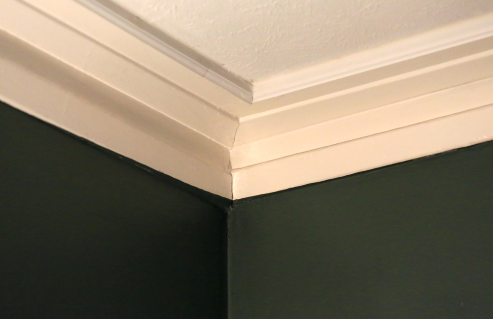
Uneven Moulding
When I walk into a house and I see crown moulding or baseboards that don’t line up at the joints, it raises some red flags. What it says to me is that this was a quick DIY job, and it makes me question what else was done on the cheap. All in all, it just looks bad.
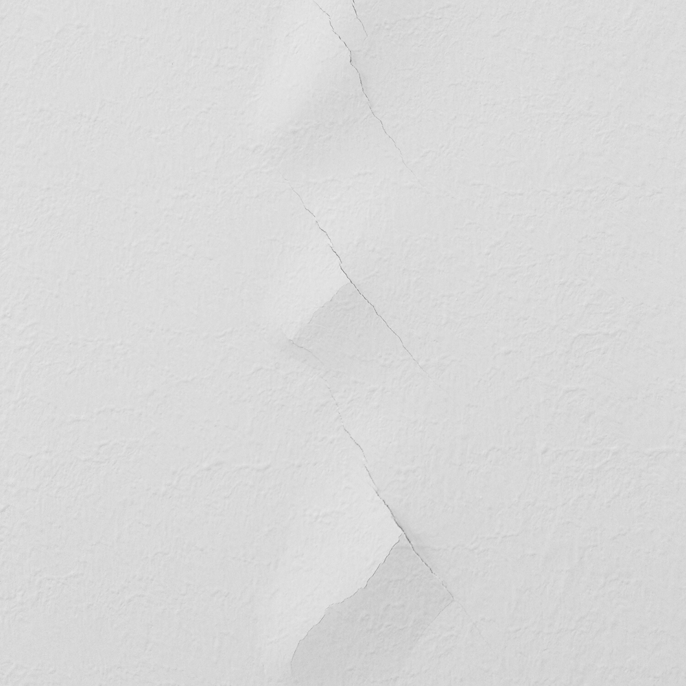
Poorly Patched Walls
I know I’m a bit of a perfectionist, but poorly patched walls drive me nuts. If you’re going to the trouble of patching them, why wouldn’t you want to do it right? Argh!
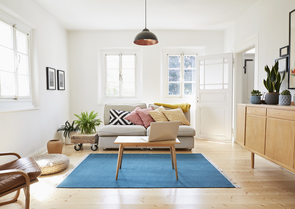
No Window Treatments
Some people like to have windows completely unobstructed for the sake of a beautiful view. I get it. But in the majority of residential homes, window treatments are really a must. Aside from the whole privacy issue, when you don’t have curtains, drapes or blinds, it makes the whole room look incomplete.
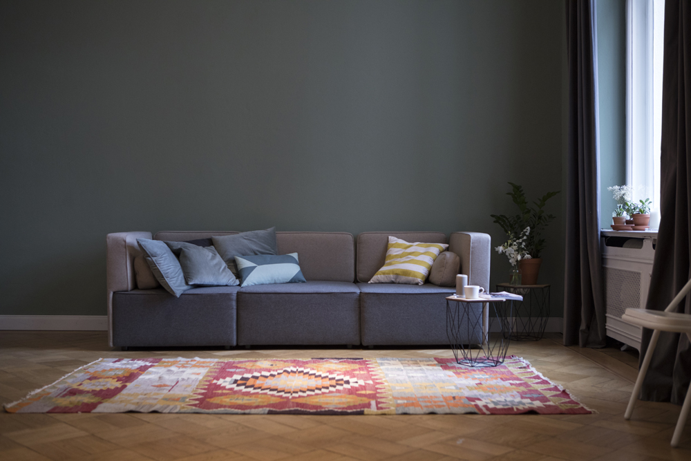
No Art on the Walls
Like window treatments, a room doesn’t look complete unless there are a few focal points on the wall. I’m not saying you need to run out and buy expensive original paintings, but you really should have something to liven up the space. Whether it’s a painting, photograph or any other kind of wall art, put something up.
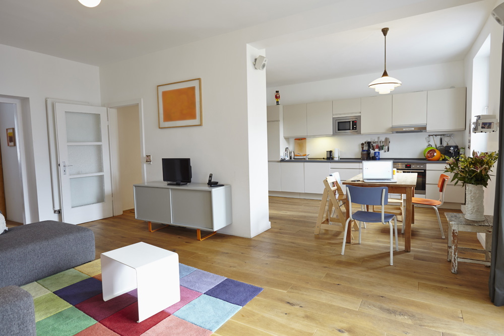
Art Hung Too High
Once you’ve got the art you want to hang, make sure you don’t hang it too high. Most people hang art so that they have to look up at it, but it really should be at eye-level (more or less). If you have to crank your neck to look at it, you’ve hung your art too high.
For inspiration on what you should be doing in your space, take a look at these 10 Design Trends You’ll Never Regret.
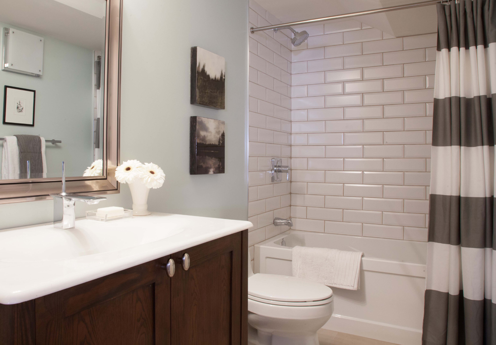
Unfinished Tile Installations
I hate seeing tile jobs that aren’t finished off with a profile. Whether it’s a backsplash or in a shower, when the tile edge isn’t capped off with a proper profile, it doesn’t just look unfinished, it actually puts the tile at risk. If you’ve gone to all the trouble of tiling, why not do the last step properly?
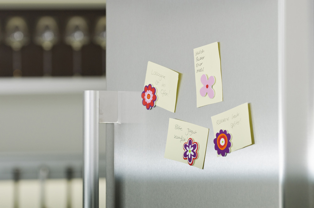
Fridges That Open Towards You
I know I’ll catch flak for this one because in one episode of Buyers Bootcamp we did it because of space (there was literally no other option). That said, I hate it when the fridge door opens towards the work area. You want it to open away so that you can easily reach in. When it opens the wrong way, you’re always going to have to reach around the door to get things.
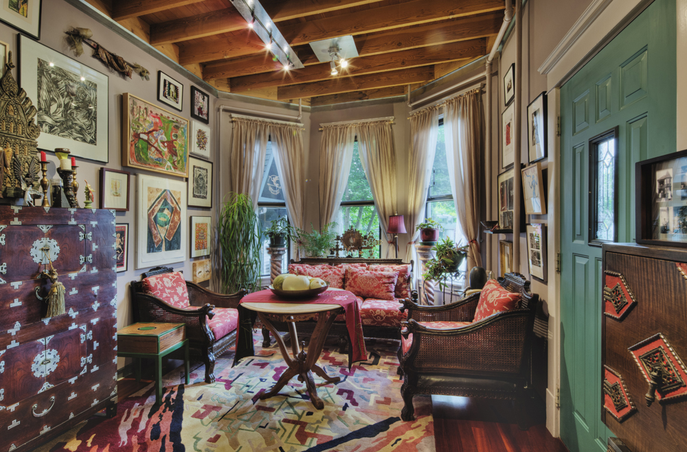
Too Much Clutter
Every room needs a few accessories to give it some personality, but you can definitely have too much of a good thing. Always make sure that you’re giving items room to breathe, and spacing your room accents generously. Otherwise, it looks crowded and overwhelming.
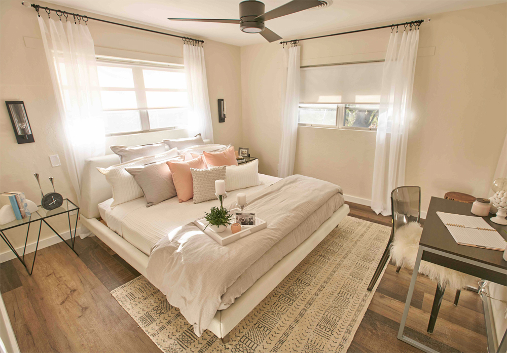
Rugs That Are Too Small
I’ve been guilty of this on more than one occasion, usually due to time constraints and product availability. But rugs that are too small for the space drive me a bit crazy. My rule of thumb is that, in the majority of cases, all four legs of a piece of furniture should be able to fit on top of the rug.
Want to update your master bedroom? Take a look at these 23 Tips To Creating a Dreamy Master Bedroom.
HGTV your inbox.
By clicking "SIGN UP” you agree to receive emails from HGTV and accept Corus' Terms of Use and Corus' Privacy Policy.


