Love to travel in style? Grab a coffee and settle in to our current edit of some of the world’s snazziest boutique hotels, all the way from Venice, Italy to Kitchener-Waterloo. Check in to these sumptuous digs and check out how to steal their style for the ultimate spin on room service.

Use Colour and Pattern to Make a Statement
One of the most romantic hotels in the world, Venice’s Ca Maria Adele serves up lavish opulence with aplomb. Each room is individually decorated and based on a theme. This stunning red-and-gold beauty is the Doge’s Room and it works precisely because of the full-on dramatic approach. Repetition is key in terms of colour and pattern and we also love how the bathrobes are neatly presented on the pillows – a great idea to copy for a guestroom.
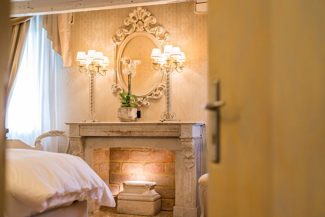
Dress Up a Non-Working Fireplace
Ca Maria Adele’s Fireplace Room may not have a functional hearth, but that’s beside the point. If a costly fireplace conversion is out of the question, replace the fire with a subtle light source or candles and embrace symmetry. We love how these boldly ornamental lamps frame the mirror and simple orchid.
Related: 8 Coolest Lighting Trends That Will Transform Any Room
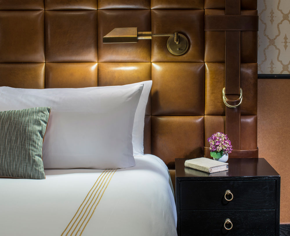
Invest in a Showstopper Headboard
This leather one at Gild Hall in New York City ticks all the design boxes. It layers in colour, texture and visual interest; we swooned at the great belt and buckle detail. A focal point on its own, it gets even more interesting thanks to the ingenious placement of the reading sconce which frees up space on the bedside tabletop.
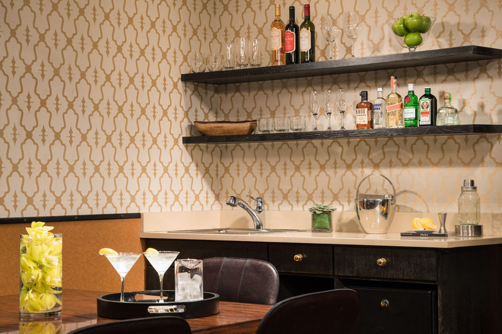
Build an Open Bar
Splurge on a penthouse room at Gild Hall and enjoy your own in-room bar. The floating shelves here are pretty and practical and we recommend translating this at home, whether in a principal room or guest space. The open display takes the pressure off when entertaining – guests can help themselves – and makes over-nighters feel like they’re staying in a boutique hotel. Wallpaper keeps it edgy.
Related: 15 Bold Print Wallpaper Ideas That Will Transform Your Space
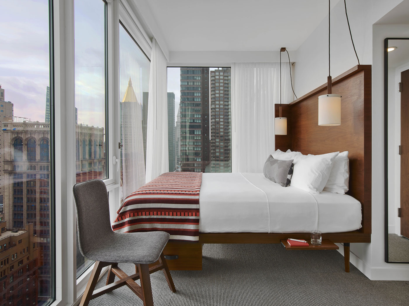
Maximize Floor Space
Space is at a premium in New York City, but The Arlo Nomad has a savvy way around that. No piddly proportions here – just an ample king-size bed with smart design. Bedside lamps are suspended from above (alleviating the need for side tables), while thoughtful details like a flip-up tray offer just enough room for water and a book; a drawer below provides storage. The colourful blanket keeps the look lively.
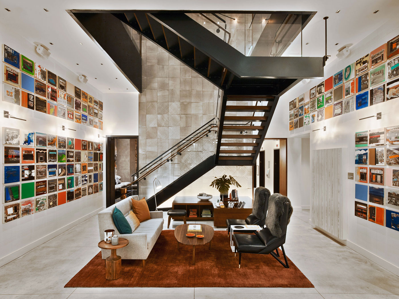
Repeat One Element for Impact
The dreamy lobby at the Arlo Nomad invites serious lounging and, while there are oodles of ideas to steal here, the art display has to be number-one on the list. Multiples of one element – such as canvases that are all the same size and shape – feel curated and add oomph. It’s an easy look to replicate on a budget, too.
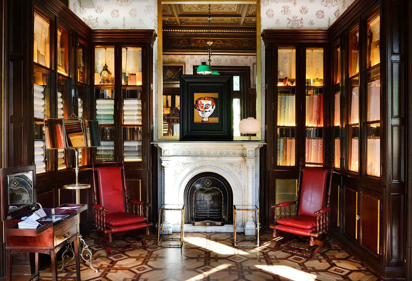
Embrace Unpainted Wood
The stunning Cotton House Hotel in Barcelona, happily, doesn’t adopt the “paint it out” edict. Gorgeous glass-fronted bookcases are left in their original dark wood tone that’s amplified by the rich red leather chairs flanking the fireplace. The effect is luxurious, perfect for this room where guests can have a bespoke cotton shirt made.
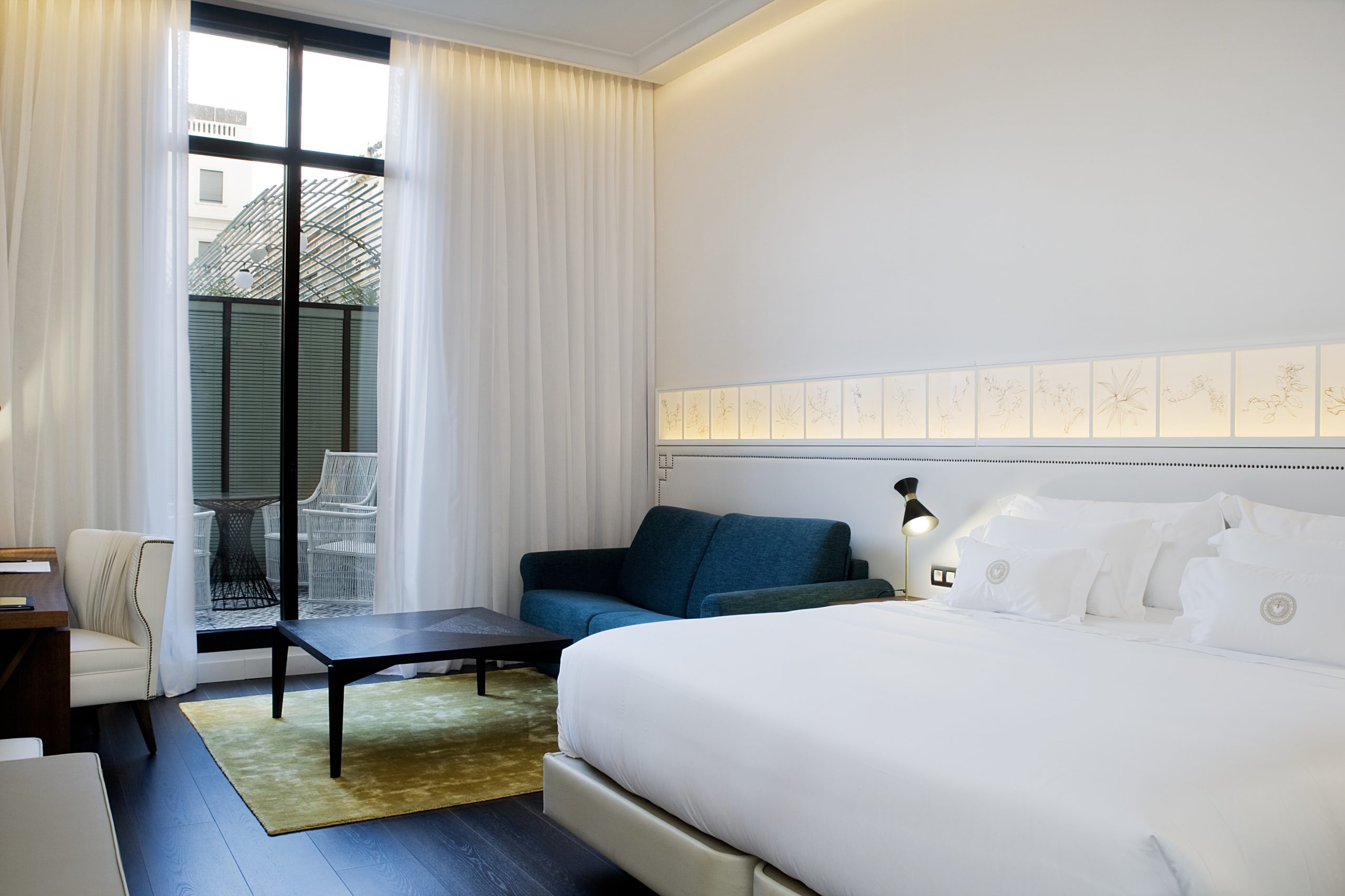
Extend the Headboard Across a Small Space
The Cotton House Hotel guest rooms are serene and feel even larger than their square footage thanks to a mostly white backdrop and this killer feature: a nailhead-detailed leather headboard that spans the length of the room. They’ve embellished it further with light boxes but it works just as well on its own and suits any colour palette and design.
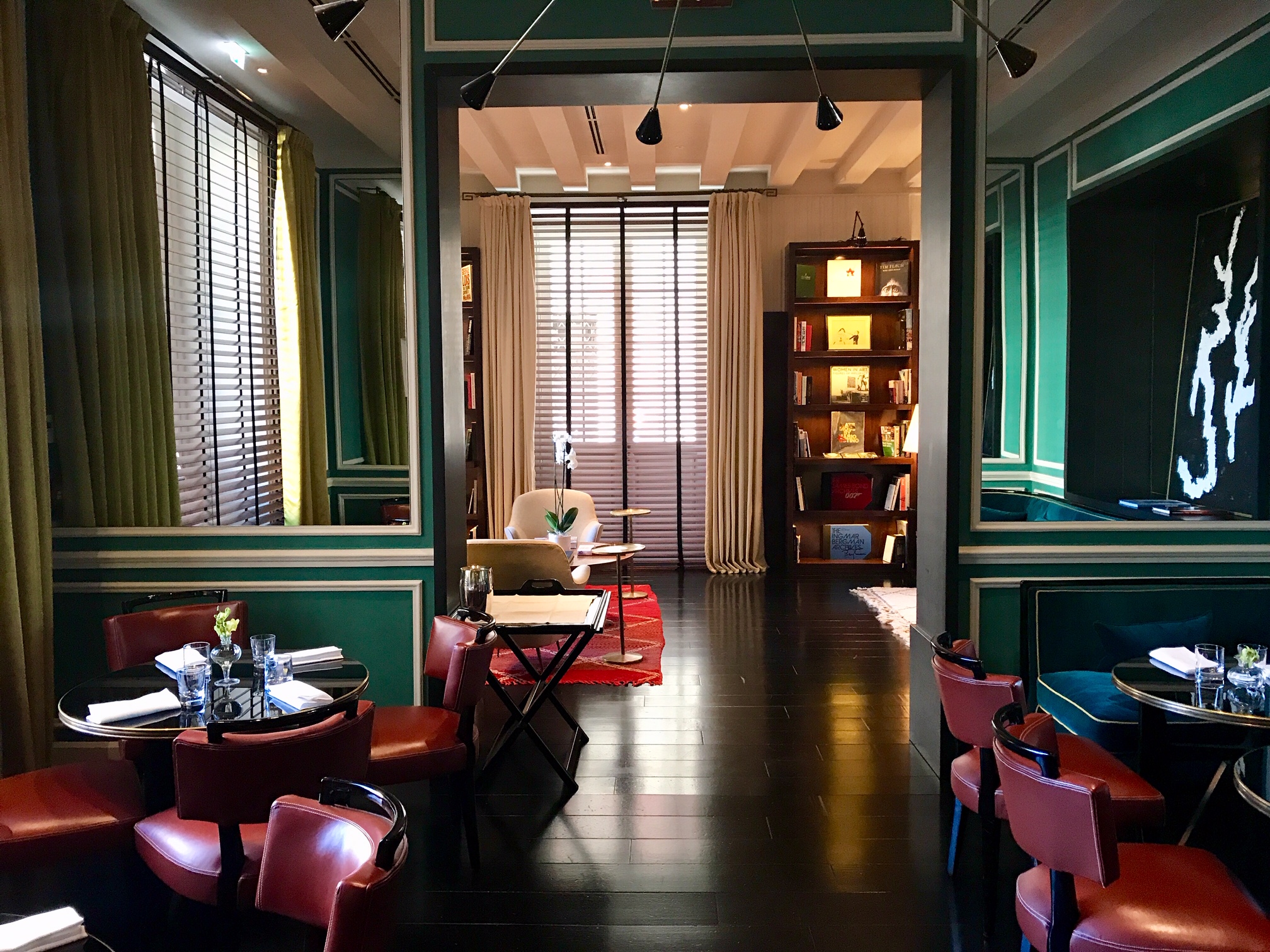
Invigorate a Dining Room with Jewel Tones
Rome’s J.K. Place doesn’t do anything by half measure, read: adding in a pop of colour isn’t the brief here. Rather, this delicious dining room is a colour riot with emerald-green walls, teal velvet banquettes and apple-red leather chairs. The jewel tones keep it elegant and contemporary pieces, like the art and chandelier, feel edgy. The framed mirror inserts in the wall panelling are a smart touch.
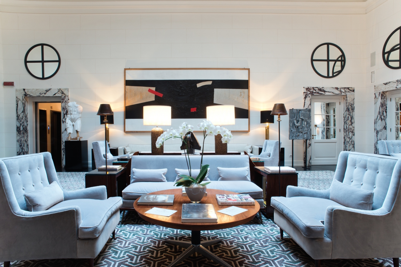
Sidle Up to Symmetry
The lobby at J.K. Place Rome is brimming with luxurious (albeit somewhat expensive) details but one of its best comes without a price tag: symmetry. This space works so well thanks to the way it doubles up (or down) on pairs of furnishings. End tables, floor lamps, table lamps and sofas are all repeated to a handsome effect that’s welcoming and invites lounging.
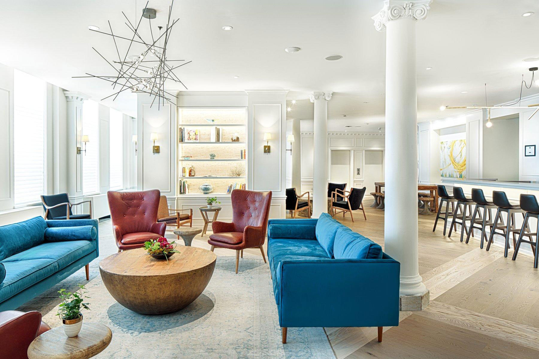
Mash Up Traditional Style
Kitchener, Ontario’s The Walper is a lovingly restored, historic 19th-century building that’s animated with contemporary flair. This is a place where Ionic columns are accessorized with edgy chandeliers and where traditional wainscotting is the backdrop to Mid-Century Mod furniture. The look here in the second-floor bar, and throughout, is both dynamic and calming.
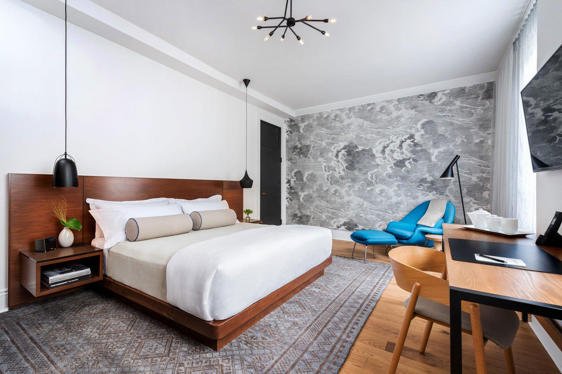
Hang Wallpaper for a Focal Wall
The Walper nails the focal wall. Imagine this room without the wallpaper – sure, it would still be stylish (we adore the bed’s built-in tables) but it wouldn’t have the same visual impact, which is nicely played up by the turquoise-blue chair and stool. This works for any size or style room and is a fun weekend DIY project – it also eradicates the need for art.
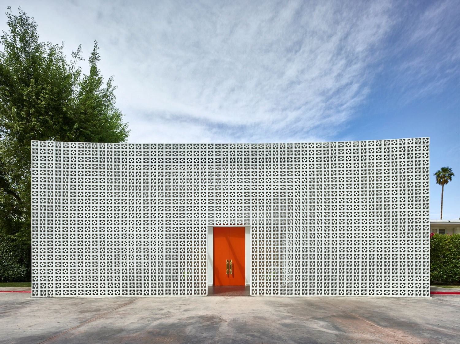
Colour in Your Front Door
Take a page out of The Parker Palm Springs’ book, and bring a little Palm Springs warmth to our cold climate, with a juicy front door makeover. This saturated citrusy orange is pure whimsy and, surprisingly, reads well with most brick tones. The brass pulls are the ultimate sophisticated finish. Try this at home for snazzy curb appeal.

Decorate Dead Spaces
While there’s lots of eye candy in this Parker Palm Springs’ vignette, the big takeaway for us is where it’s situated. A quirky cart on the stairs’ landing, a seating area in front of the stairs and a picture easel that demarcates this spot from the adjacent hallway are all interesting and unexpected ways to fill a space with style – not to mention the ascending artwork!

Light the Way
Full disclosure: The Rockhouse in Negril is one of our editor’s all-time favourite spots to recharge. She loves its laid-back style and we love the ambient lighting both indoors and out – note the uplit tree and the serene reflection on the water. Smart lighting is a look to duplicate anywhere, from the backyard to the cottage.
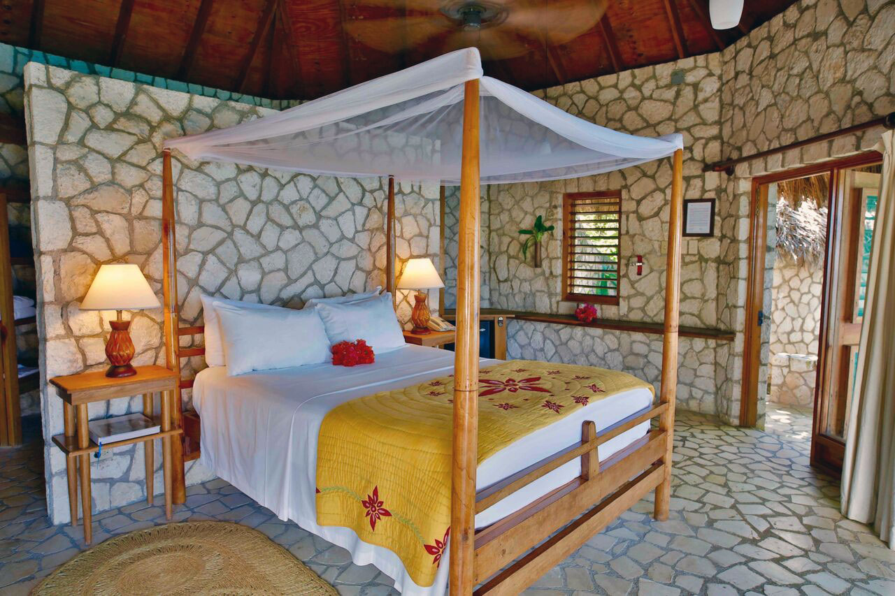
Go With the Flow
One of the best design tips is to let the decor reflect the setting. Rooms at The Rockhouse are simply furnished and don’t compete with the charming stone and wood surrounds. Translation: a cottage should look like a cottage, not a French Chateau – work with the surrounds and the decor will take care of itself.
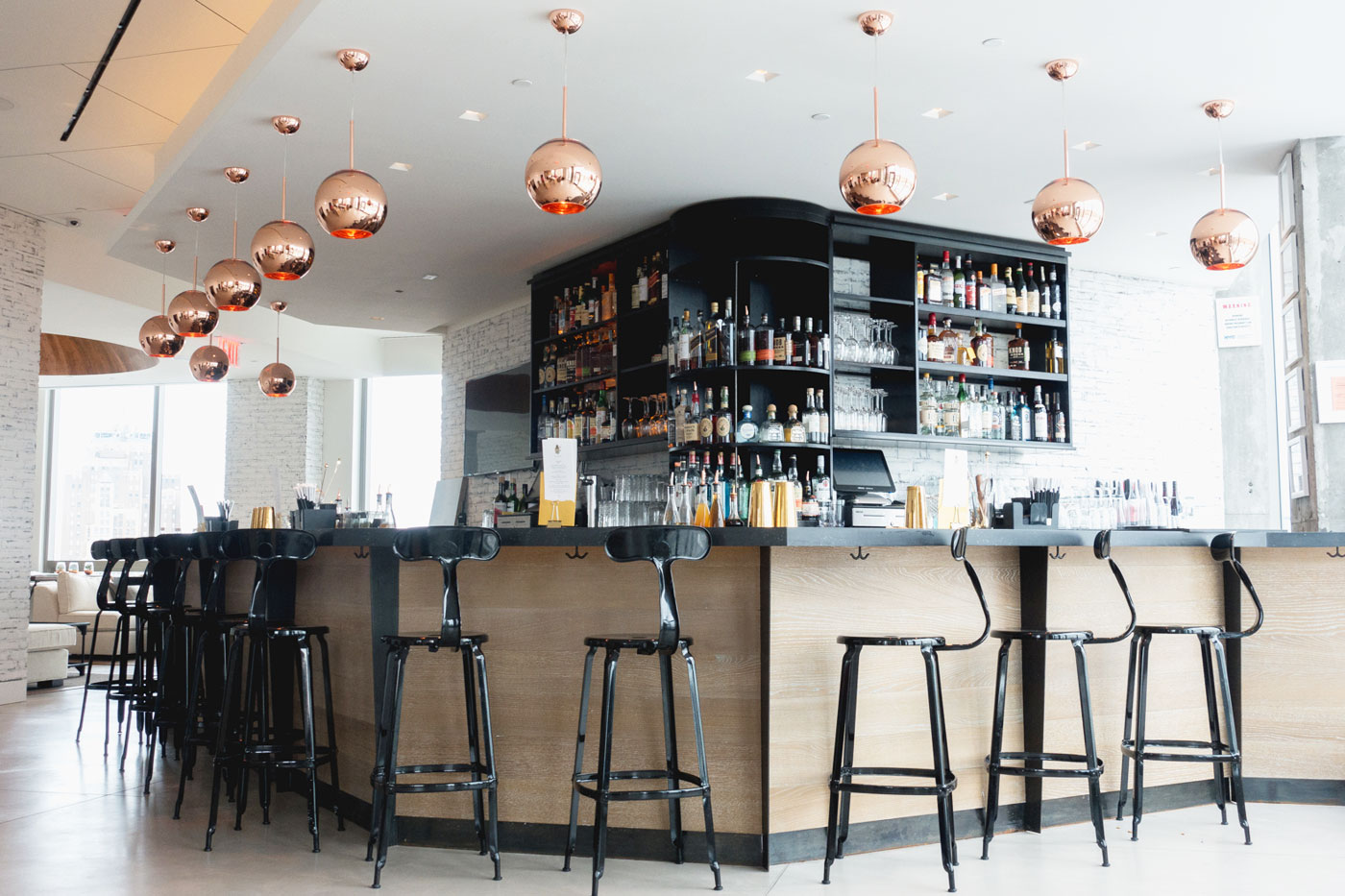
Get Reflective
New York City’s Hotel 50 Bowery is the ultimate in hip and cool design yet there’s still a level of sophistication in the bar thanks to these show-stopper pendant lights. Groupings of copper shades add metallic sheen, interest and draw the eye upward. The takeaway: choose an unlikely material and use it in abundance; the effect wouldn’t be as great if there were only a few of these.
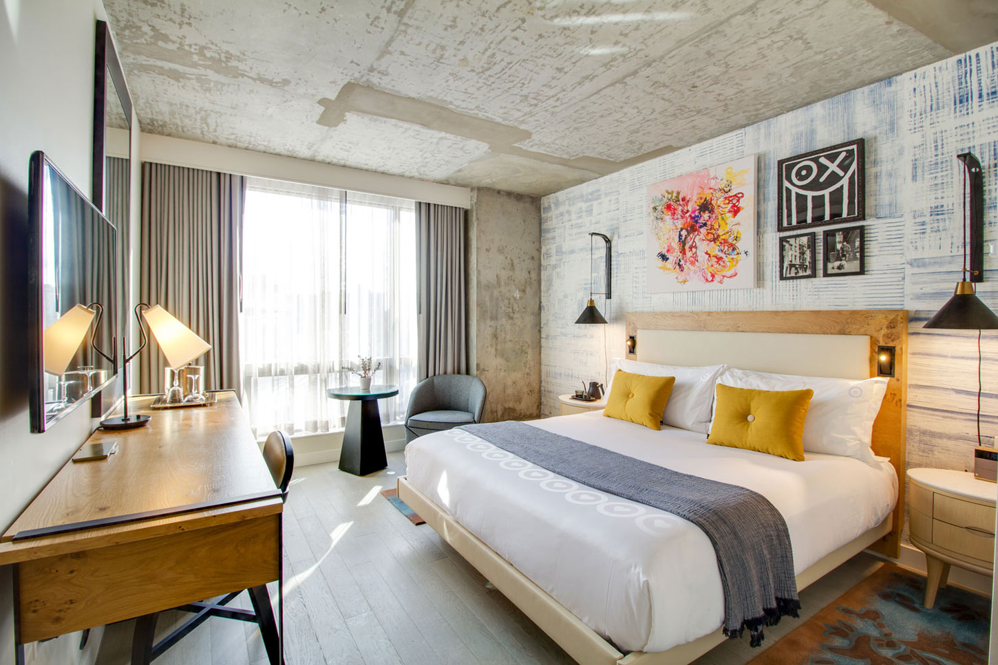
Spread Out Texture
This king room at The Hotel 50 Bowery is an exercise in visual delight: a stripey focal wall behind the bed is complemented by a distressed ceiling and planked floor, while textiles such as the bedside rugs, soft drapes and crinkly throw continue the theme. Imperfect finishes and odd mixes can create a stylishly cohesive look.
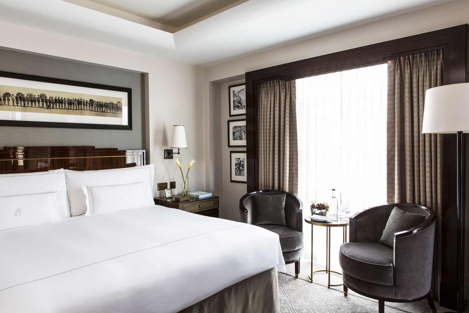
Take a Tailored Approach
Trends may come and go but The Beaumont, in London’s Mayfair ‘hood, prefers classic style. This handsome room is simple yet luxurious thanks to monogrammed bedding – a great treatment to indulge in at home – and a subdued and mostly neutral colour palette with black-framed photos. We also rate comfy chairs and a side table in the bedroom – a nice perch for morning coffee.

Opt for Opulence
While we can’t get enough of Kondo-ing, there’s something to be said for pure and simple Old World glamour. The American Bar at The Beaumont gets it just right with soft, flattering golden light, an abundance of bottles and decadent red flourishes – maybe we all need a red carpet somewhere in our home…
Related: 10 Marie Kondo-Inspired Organization Essentials That Will Spark Joy

Create an Outdoor Room
You won’t find any resin or plastic patio furniture on the Jamaica Inn’s verandahs. They’ve styled these outdoor retreats just like they’re inside so don’t be surprised to find slip-covered wingback chairs, shaded lamps and proper tables and chairs – a great look to copy for a Canadian verandah or covered porch.
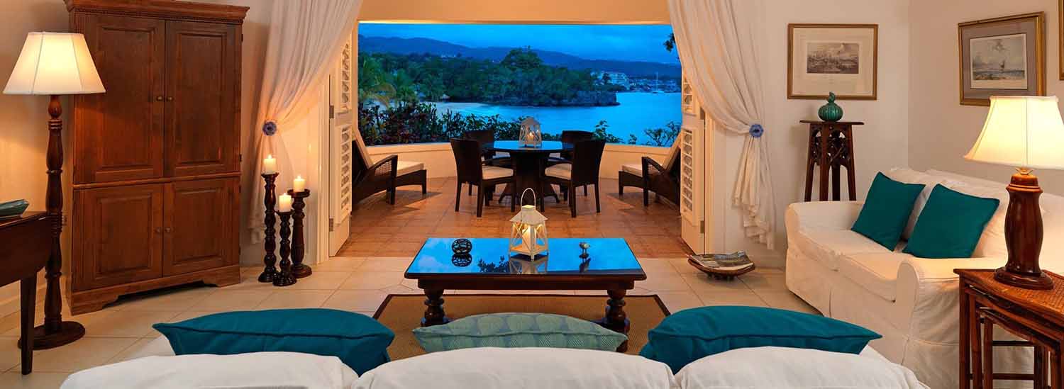
Take Cues From Nature
This cottage at the Jamaica Inn feels like an extension of the Ocho Rios view beyond. A mostly white backdrop is punctuated with accents of ocean-like greens and blues for sleek symmetry. Practical bonus: the furniture is slip-covered for easy cleaning in this sand and sunscreen setting.

Colour Match
Matchy-matchy is considered a faux pas but The Kensington in London, England, makes it work. Don’t you just love how the mustard tone of the velvet lobby chairs is repeated in the brass accents on the tables and lamps? The lamp shades reference the elegant sofa beneath them and the overall effect is tone-on-tone terrific.

Liven-Up Neutrals
They are small touches but the blue lampshades and blue and silvery cushions have big impact in this guest room at The Kensington. They elevate the look, making it a bit lighter and energetic. Want to play up your headboard at home? Choose a quilt that complements it the way this textured one does by echoing the tufted details of the headboard.
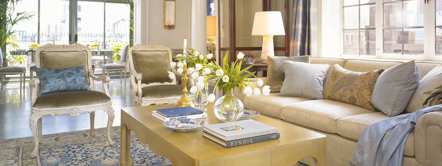
Celebrate Classics
There’s something especially soothing about this tone-on-tone, trend-defying vignette in The Lowell’s penthouse suite. Everything here, from the simple sofa and coffee table to the Persian rug and carved wood chairs, defies a specific era. They could be from 2019, 2000 or even older – no matter, they have a timelessness that just looks great and isn’t that what we all want from a room?
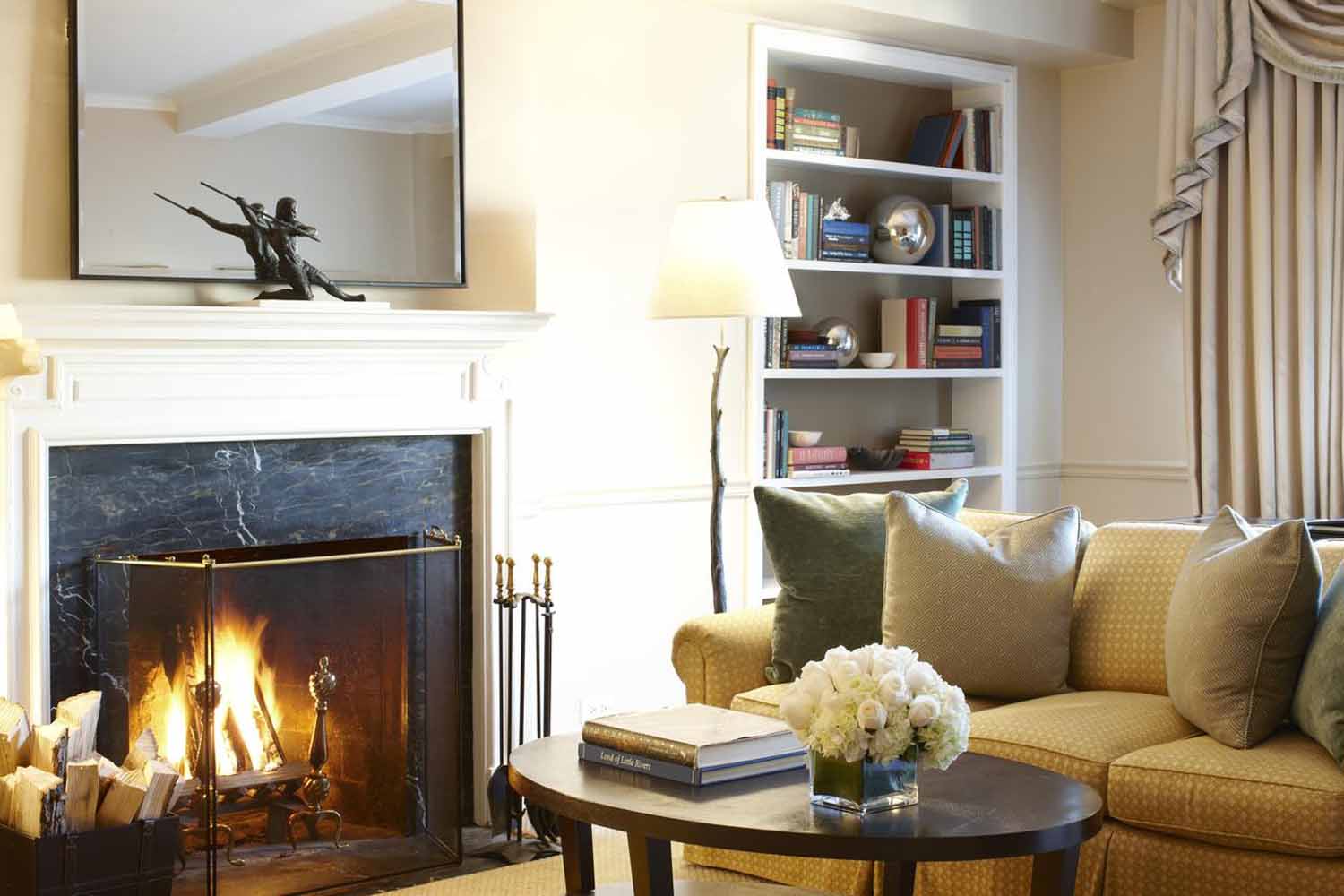
Furnish Your Bedroom
The Lowell knows that a bedroom should be more than just a place to sleep. Decorating with that in mind nets dreamy results, with perks like a place (other than the bed) to sit and read. It also creates a decorated effect thanks to the coffee table and book shelves. The luxury of a bedroom fireplace may not be something everyone can attain, but setting up a cozy bedroom nook is very doable.
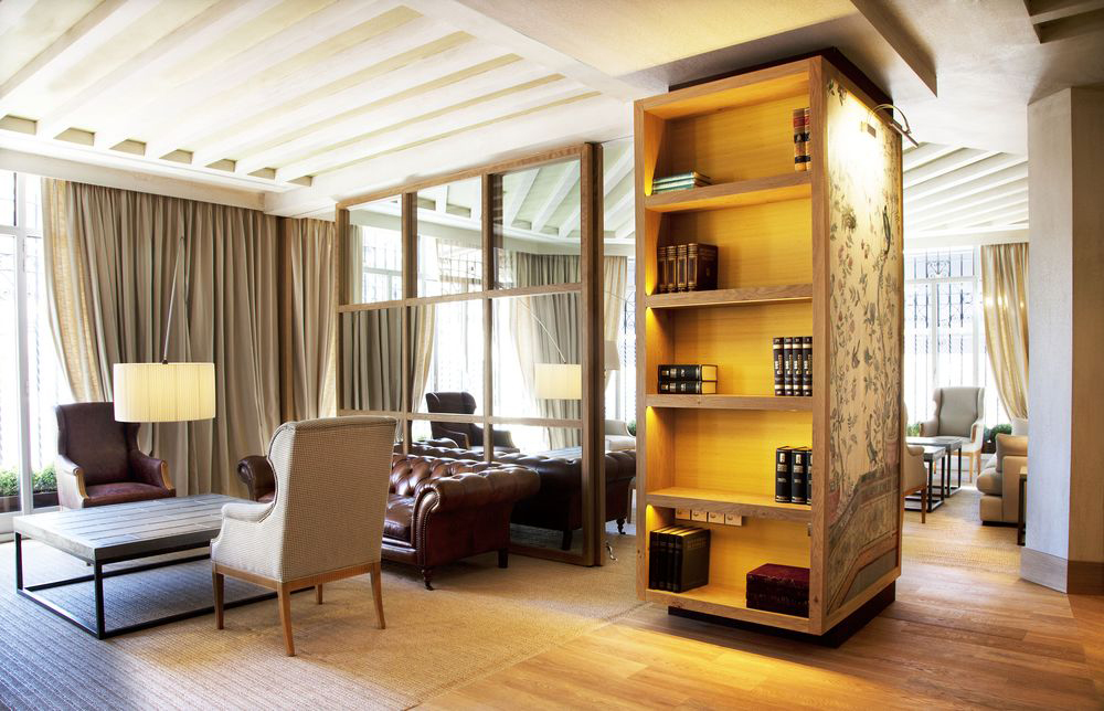
Use Mirrors and Wallpaper as Panelling
Madrid’s The Urso Hotel takes an easy and elegant approach to design. We love how they’ve created interest in the lobby by using mirror insets and wallpaper as points of architectural interest. Papering the sides of a bookshelf and spotlighting the pretty pattern achieves a rich, mural-like effect. The mirror inserts are on a dividing wall here but would work just as well in an otherwise plain hallway or on a landing. Bonus: they bounce light around and make any space feel more expansive.
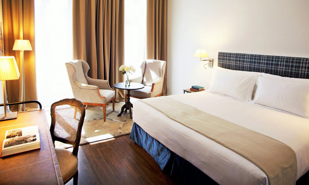
Pop in Some Plaid
The Urso’s guestrooms have a relaxed yet tailored approach and this headboard furthers that effect. A headboard is a great feature and the perfect spot to experiment with colour and pattern. Plaid ticks all the boxes – it’s classic, timeless and works for any age (read: this looks just as great in a master suite as it does in a little boy’s room). It’s also not a huge commitment either so can be reupholstered to suit the mood or trend forecast.
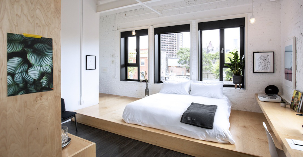
Put in a Platform
The Annex, Toronto’s latest boutique hotel named after the eclectic neighbourhood it’s set in, abounds with thoughtful details. We love how simple and inexpensive materials like plywood look polished here and rate the platform setting for defining the sleep area – a fun look especially suited to an open-concept space. The Annex wants guests to feel like they live here – not just sleep here – and this cool design will make anyone feel like they’ve found their dream loft.
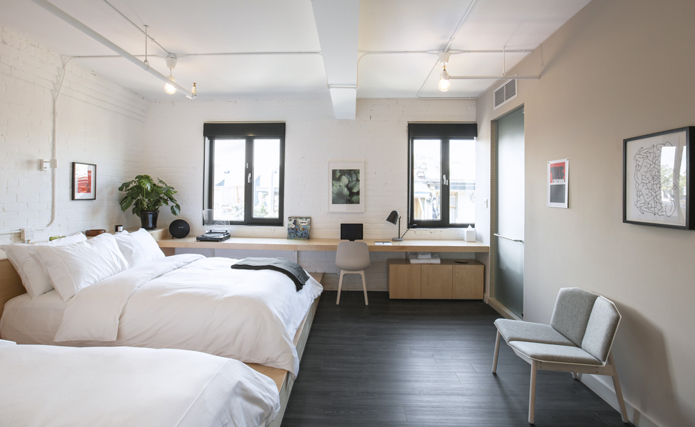
Hang Local Art
Because art and travel go hand in hand, The Annex only features works by local and Canadian artists, illustrators and photographers. It’s a point of difference to consider in an age of internet shopping and who doesn’t love to support homegrown talent? We like how they mix media and presentations: there are pieces with no frames, with black frames and with white ones, as well as drawings, paintings and photos all in one room. It feels curated and, once again, like a home rather than a hotel.
HGTV your inbox.
By clicking "SIGN UP” you agree to receive emails from HGTV and accept Corus' Terms of Use and Corus' Privacy Policy.


