When interior designer Michelle Martel and her husband decided to downsize, they were looking for a turn-key home, but they fell in love with the opposite – a 1904 Victorian home in Westmount, Quebec – and their mission changed. “We wanted to bring this old Victorian back to life and to celebrate its history, while adding a contemporary twist,” Michelle explains. By honouring the home’s original elements and unique architecture while adding her own fresh updates, Michelle has done just that: the old home is new again, and it’s alive with style and character. Bonus: check out the video of this super inspiring space.
Charms and Challenges
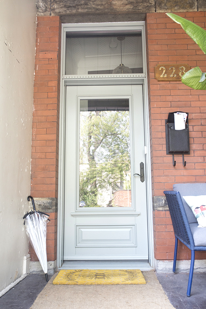
The Victorian dream home had stunning original features that Michelle knew she wanted to preserve – like 12-foot ceilings, original plaster moldings and oak trims – but it also came with some challenges. “When you take on a massive renovation of an old Victorian, you must be prepared for some surprises, and we got quite a few in this project,” Michelle says. “After living in the house for just six months, we packed up the entire house and moved out to start removing the asbestos, replacing the electrical and renovating the entire main floor in just three months. We remodelled the kitchen and powder room, and replaced the hardwood floors. It was very intense, but well worth it.”
Related: How Home Town’s Ben and Erin Napier Modernize Old Homes and Keep Their Charm Intact
An Oasis Out Front
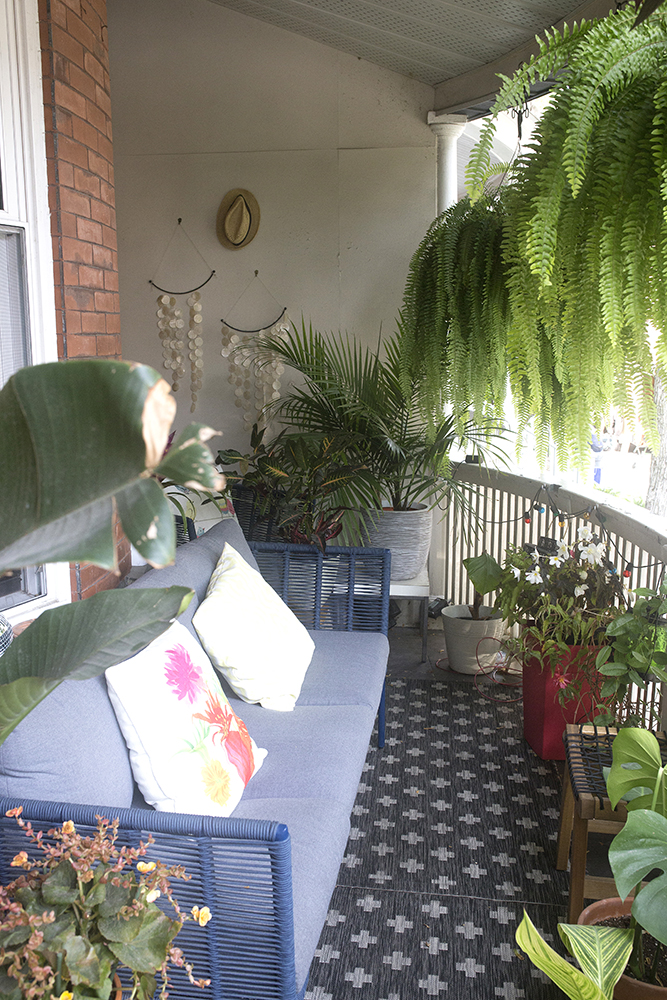
For Michelle, moving to the city meant letting go of her previous home’s sprawling backyard – but her new home’s front porch offers beautiful outdoor living space that she can fill with greenery and fresh style. “This balcony has been our oasis, and my love of plants is on full display here. The hanging baskets bring a sense of privacy – and they are beautiful to watch in all kinds of weather,” Michelle says.
Related: 15 Balcony and Front Porch Design Ideas We Want to Steal
Great Galleries
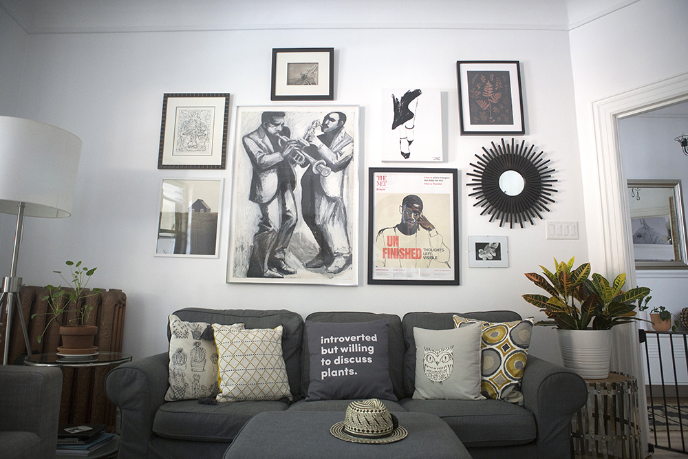
In the living room, and throughout the home, Michelle curates a mix of art, photos and gallery walls to bring life and dimension to the space. “Gallery walls are such a wonderful way to tell the story of who we are and what we love to surround ourselves with,” she says. “Art and photography are an amazing way to do that, and I love creating gallery walls to bring our family history to life. My clients are always amazed and thrilled to see their walls come to life with the images and artifacts they cherish so much.”
Related: Sarah Baeumler’s 7 Gallery Wall Tips That Will Make Yours Look Like You Hired a Pro
Small Treasures
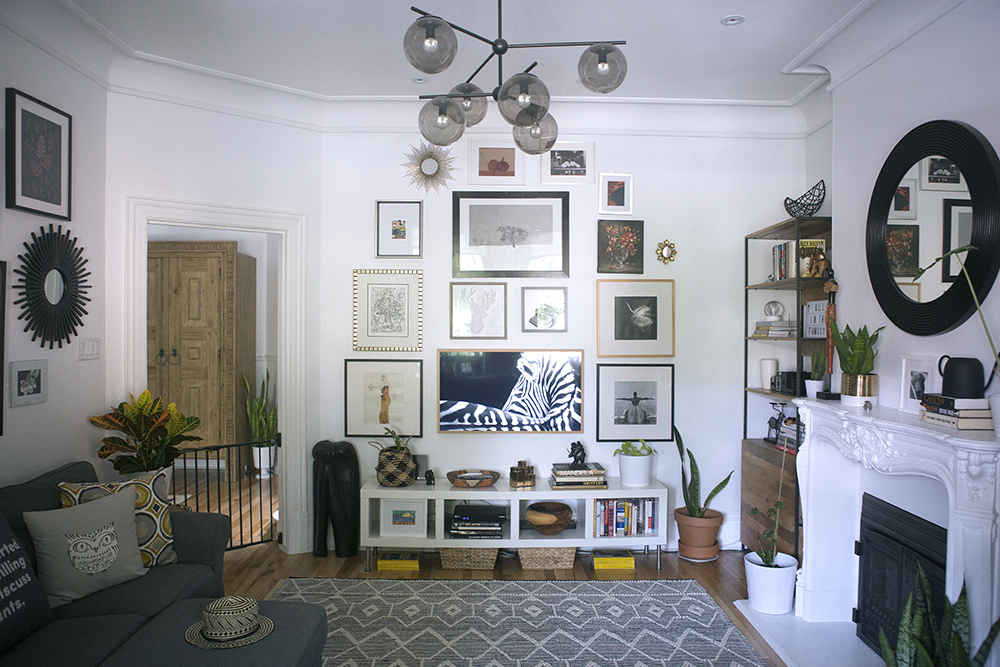
“Our gallery walls are filled with treasures I’ve found at garage sales, flea markets, museums and online shops, as well as items from local artists and even calendars,” Michelle says. The distinctive zebra piece is actually another hidden treasure: it’s a Samsung “The Frame” television. Overhead, the living room gets an extra pop of visual dimension from a contemporary light fixture from West Elm.
Fired Up Design
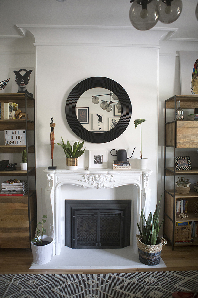
The fireplace, which is topped with a round mirror from Pier 1 (styled with a black frame that’s reminiscent of a soulful record), was transformed into a living room focal point. Michelle painted the once-boring-beige fireplace a bright white and used her expertise to style the mantel with a mix of personal and pretty objects. Michelle’s advice? “The key is to create different levels to create depth and interest while maintaining balance. Keeping a unified colour scheme makes for a strong statement and ultimately a beautiful display of the things you love.”
A Stylish Storage Solution
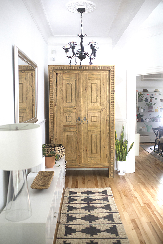
This elegant armoire was selected for style – and substance. “Old homes are notorious for their lack of storage, and our home was no exception,” Michelle explains. “We do not have a closet on the main floor, so this armoire is the perfect solution for our coats and extra shoes. It was the first piece of furniture we purchased, and it came from Bois & Cuir.”
Related: Our Favourite Storage Solutions to Stash Your Stuff Around the House
Chic Contrast
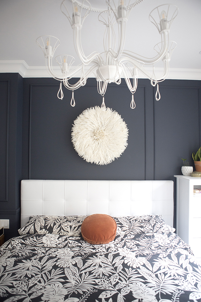
The home’s master bedroom is a master class in blending contemporary elements and classic architectural details in a Victorian home. As Michelle explains, “I wanted to highlight the picture frame moulding on the wall and the headboard, so that beautiful navy achieved that to perfection. The traditional Juju hat above the bed provides a whimsical element as well as texture and dimension, which is beautiful. The light fixture is a modern take on the classic chandelier, which is a great way to pay homage to the history of the house with a modern twist.”
Related: The Coolest Lighting Trends That Will Transform Any Room
A Wall Worth Waking Up To
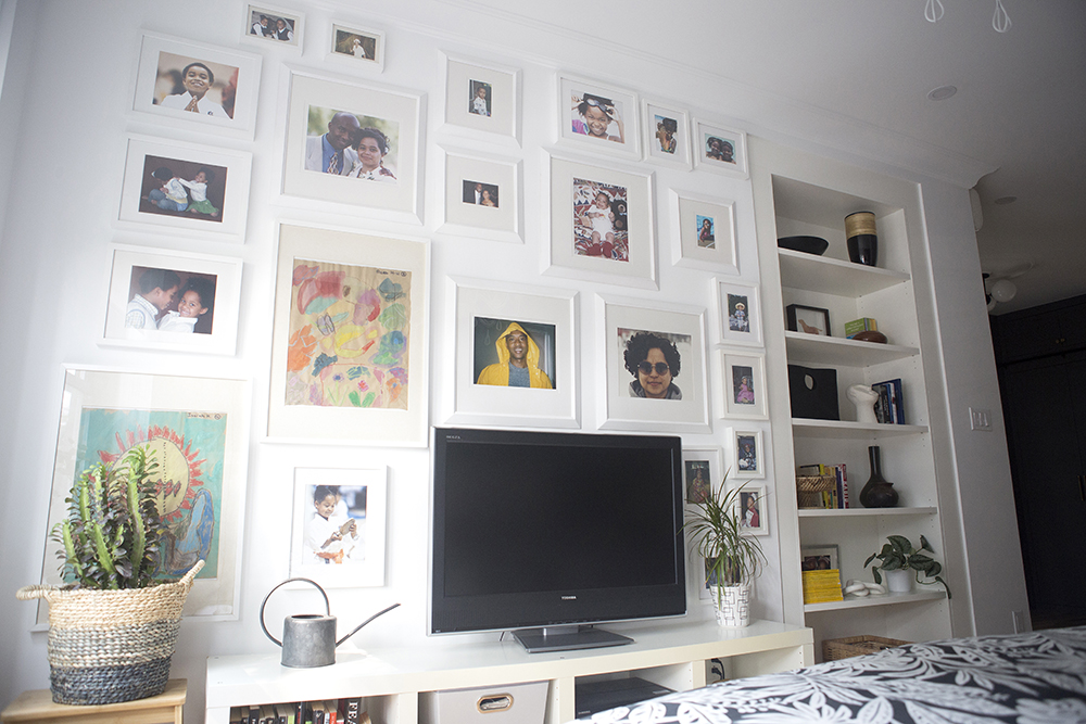
The master bedroom also features a photo wall that’s full of family memories – and style. By choosing white frames only, Michelle creates major visual impact, while also offering a powerful sense of unity. For Michelle, seeing this wall every morning is a wonderful way to start the day. “Family photos can easily get lost in the busy lives we live,” Michelle says. “I put this wall together 10 years ago in our previous home. It tells the story of our family, the special moments, and it greets us every morning when we wake up.”
Related: Picture Perfect: A Foolproof Guide to Hanging Your Pictures Perfectly, Every Time
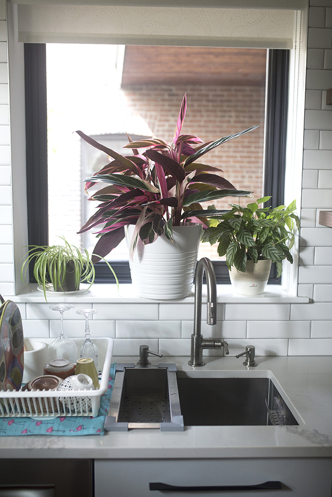
Cooking Up a Bright Look
In the kitchen, creating a mix of contemporary and classic details meant more than just expert styling. “The kitchen was a complete renovation, and the first big project we took on,” Michelle explains. “We wanted to keep it as open as possible and eliminating the upper cabinets on one side did just that. While it is not a sit-in kitchen, it has a very warm and welcoming, easy feel to it with the cubbies and open shelves.”
Related: Standout Kitchen Sinks That Will Make You Want to Rethink Your Counters
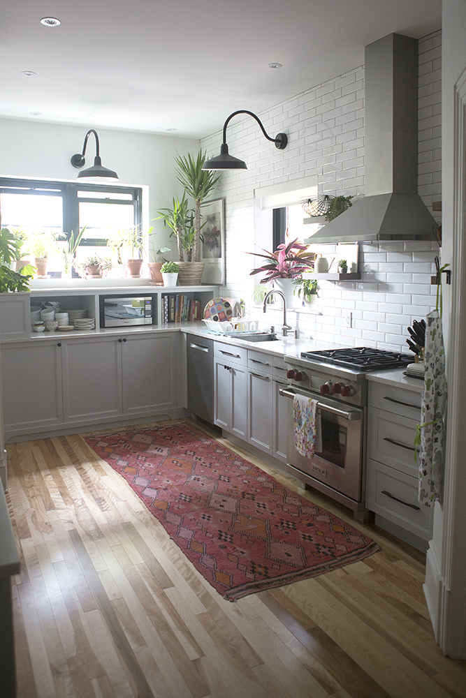
Bright Touches
Indeed, the kitchen renovation was worth the work, with the finished product showcasing a welcoming space that’s at once bright, classic and still contemporary – in large part due to the finishes and design choices. “Thanks to our high ceilings, we were able to bring in those oversized light fixtures,” Michelle says. “The grey colour of the cabinets was the hardest decision to make, but I wanted to ensure we picked a colour that would stay relevant and classic over time. The vintage rug was the last piece we purchased, and it is the perfect pop of colour.”
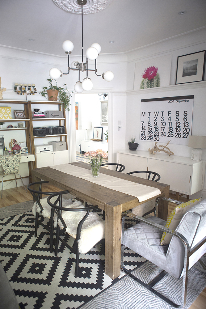
A Layered Look to Dine For
For Michelle and her family, the dining room serves as a multi-purpose room. “We eat there, chat and relax on the sofa, and pay bills and do research at the desk. It has it all, and that is precisely why we downsized,” Michelle explains. To create the room’s elegant-meets-eclectic look from the ground up, Michelle layered Structube and IKEA area rugs from her previous home.
Related: 12 Rooms That Prove All the More Valuable for Time Spent at Home
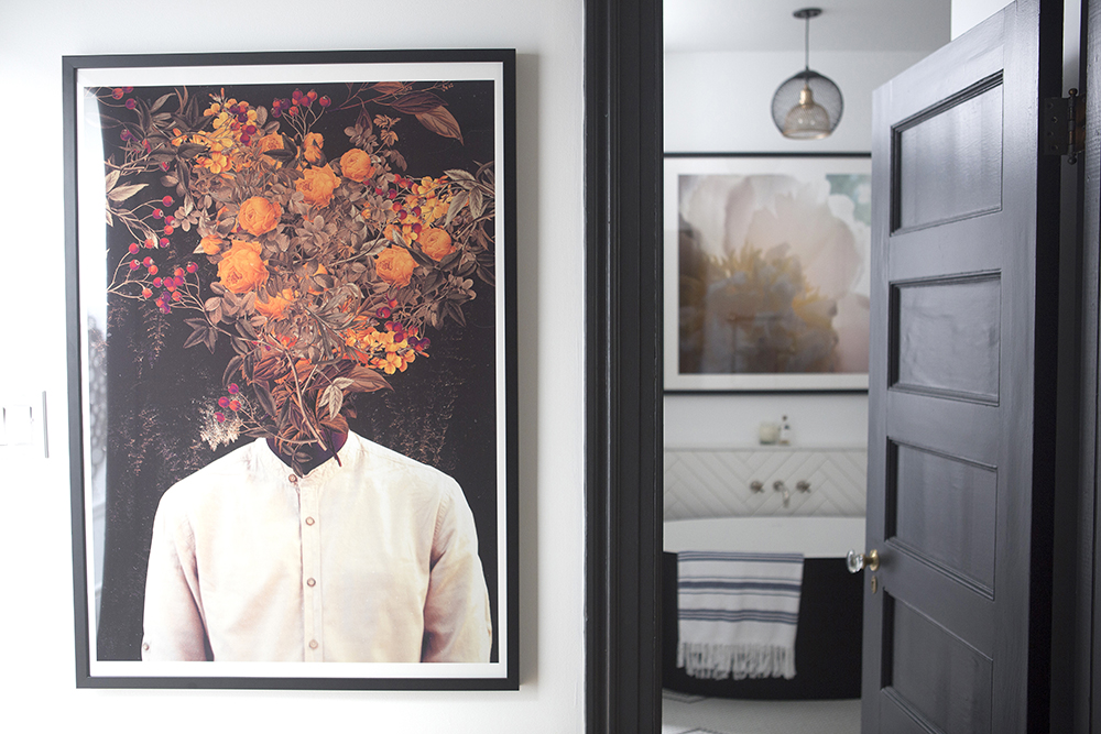
The Art of Representation
– like this stunning piece called “I Loved You 1000 Times” from I Am Fy – brings life to many of the spaces in the home. “Representation matters,” Michelle says, “and our home is filled with art including people of colour. That piece brings together elements I love in art and in real life. Female representation and flowers. I am always looking at positive imagery of Black people on print, sculptures, etc. It was important to us to expose our children to uplifting images of our community in our home. This piece is so original and vibrant, I could not resist.”
Fresh Ideas
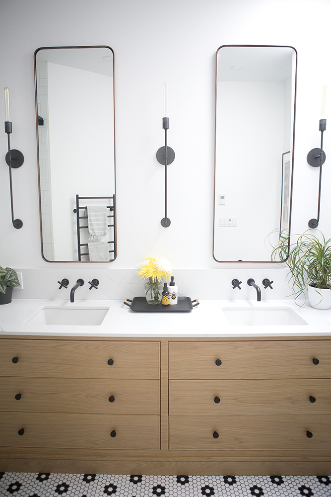
When it came time to renovate the second floor, Michelle decided to collaborate with a design firm for fresh energy, and the results are the perfect balance of character and contemporary. In this bathroom, “I knew I wanted a classic black and white floor to bring back a sense of history to the space. The contrasting wood was a modern touch and a fun mix of old and new,” Michelle says.
Hello, Fun
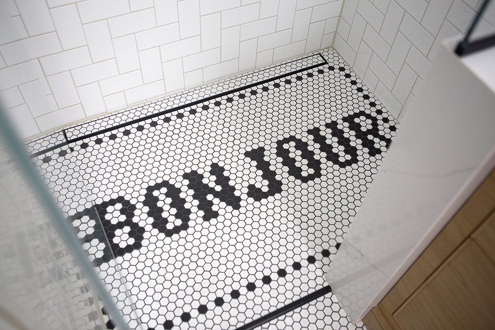
For the shower, the black-and-white tile took on an added pop of playful charm, with a personal connection: “As my first language is French and we live in Montreal, I wanted to bring in that element into the design,” Michelle says. “What better way to start the day than a shower welcoming you with a big ‘Bonjour’?”
Plant Life
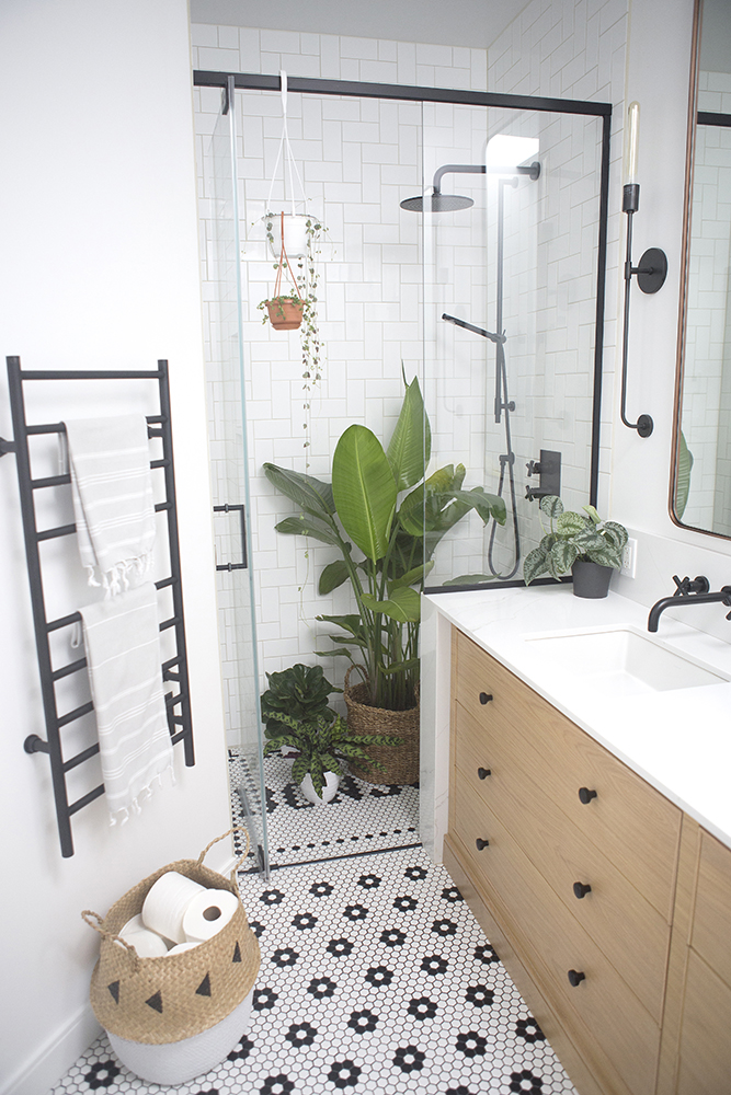
In almost every room of the home, you’ll find plenty of plants and greenery. “My plants are my passion, and they bring me such comfort and joy,” Michelle says. “Plants require a reasonable amount of TLC, and once a month I bring them into the shower for a good rinse… I do not shower with the plants, I simply use the handheld showerhead to get rid of any pests and dust. This view brings a smile to my Instagram followers.”
Related: House Plants That Help Reduce Humidity in the Bathroom
Paint it Black
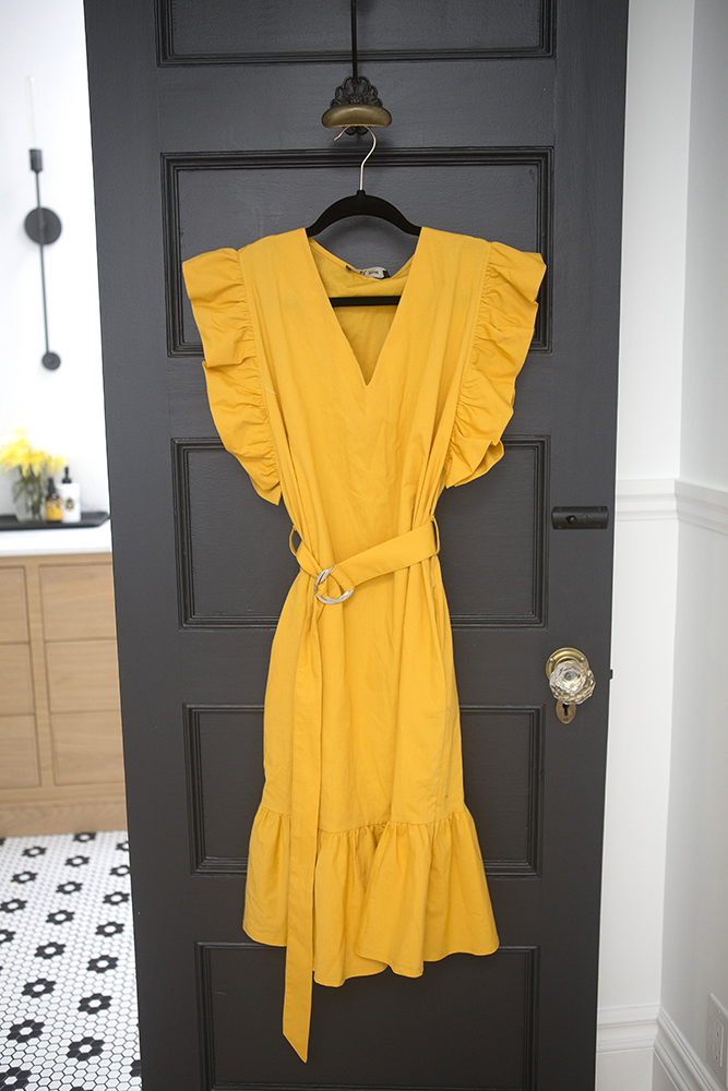
They thought beyond the floors and walls to find more opportunities to create a cohesive feel in the design – like this coordinated bathroom door. “We painted the doors black to bring contrast and tie it all together,” Michelle says.
Related: Knock, Knock: Door Decor is the Latest Home Decorating Trend
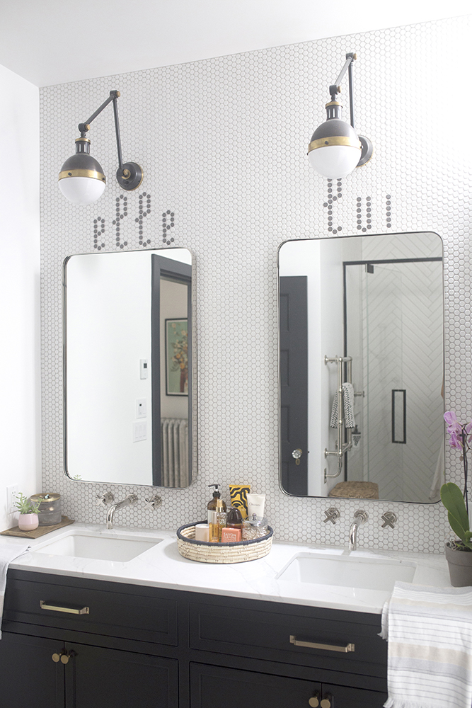
Hers & His
In the second bathroom, Michelle went for a melody of modern and traditional elements with a custom feel. “Once again, I wanted to pay homage to the official language here in Montreal, the ‘elle’ and ‘lui’ simply means ‘hers’ and ‘his,'” Michelle says. “The light fixtures are from Mitzi, and they are classic and modern all at once, bringing the right amount of old and new.”
Related: How Save My Reno Makes a Second-Floor Spacious in a Victorian Home
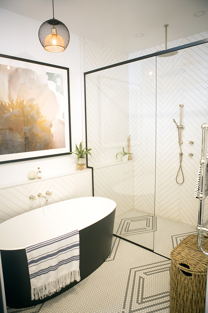
Bold and Beautiful
The rest of the bathroom builds on that balance, with custom-designed floor tiles, a spacious shower and a stunning freestanding tub. “The black tub was a difficult decision, as we wanted to make sure the design would be classic and relevant for years to come,” Michelle says. “Great design requires taking chances and thinking outside the box, and this tub was our big risk. While the colour is bold, the sleek lines and contemporary look bring an unexpected element that makes it the star of the show.”
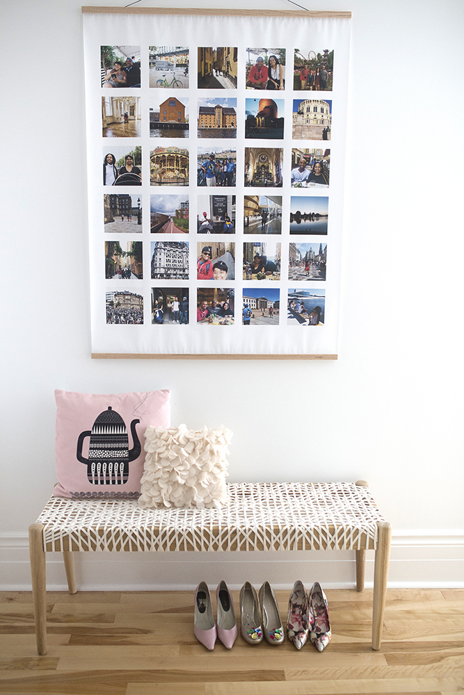
Memories Make Art
By incorporating special photos and personal details into art and decor, Michelle is able to weave family into the bones of the home’s design – as with this statement-making hanging art piece. “In the summer of 2019, we took a trip to Sweden, Norway and Denmark. I took a million
photos on my phone. Most of us sit on so many wonderful memories but do not know
what to do with them. Through my Instagram account, I found this amazing company,
@parabpress, and was able to order this beautiful collage of our trip online and directly
from my phone,” Michelle explains.
Related: Awesome Living Room Wall Art That Makes a Statement: Beyond Paintings and Photos
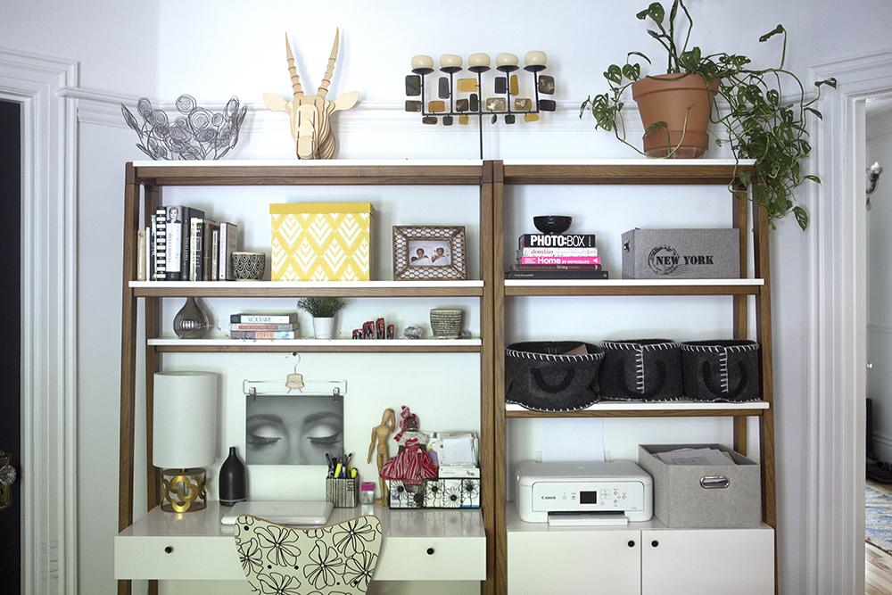
Office Space
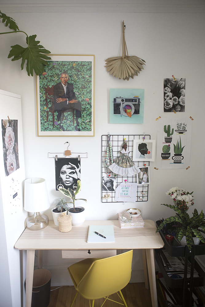
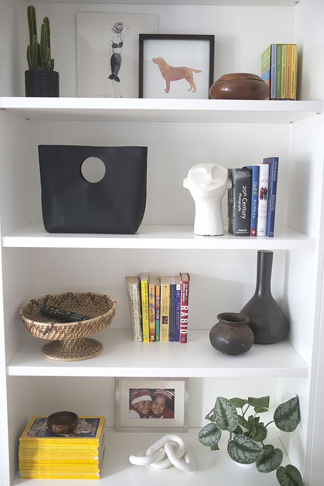
For this main-floor home work space, Michelle thought vertical to make the most of a small space. “It is no secret that I love styling shelves, and I am always excited to display little treasures that will tell a story,” Michelle says. “While an office needs to be functional and efficient, it can also be inspiring and beautiful. Books and art are the easiest way to warm up any space. Adding a few family photos and some artifacts makes for a space that is more than just an office.”
Compact, but Creative
For Michelle’s home office, artful touches and beautiful accents inspire and highlight the creative tone of the area. “I love art and I am always drawn to it wherever I go. Postcards, calendars, greeting cards, posters – the possibilities are endless,” she says. “It is fair to say that I have quite a selection and I rotate my art regularly. These are my favourite at the moment, but the ‘Obama’ portrait from Society6 is never coming down! This is another example of a gallery wall that can have different elements and textures to it.”
Related: How to Take Your Home Office to The Next Level, According to an HGTV Designer
A Reimagined Space
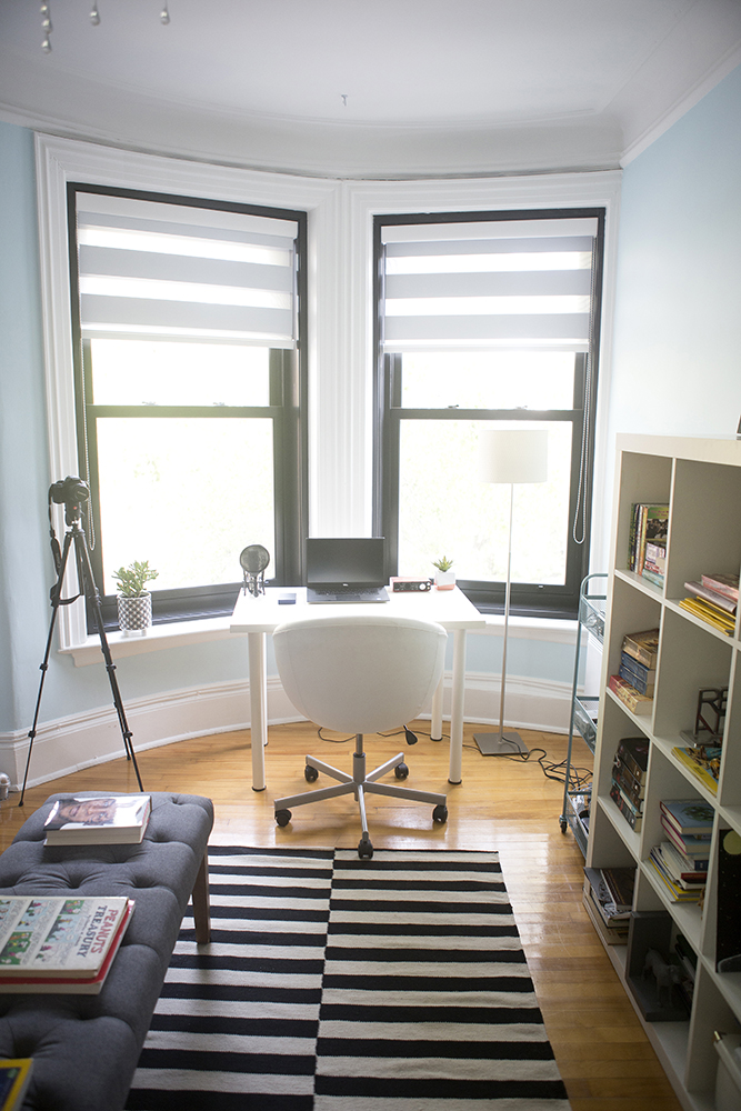
Just as she brought new life to the Victorian home on the whole, Michelle adapted this former bedroom into a light-filled studio space for her son. “This was a bedroom, but with the pandemic, we decided to convert it into a studio for our son, who is a Communications & Cultural Studies student,” Michelle says. “Without access to the university’s studio to record his podcast and to work and study, I created this incredibly beautiful and inspiring space for him.”
Related: How the Global Pandemic Has Made Us Rethink Every Room in Our Homes
Blue Brick, Bright Light
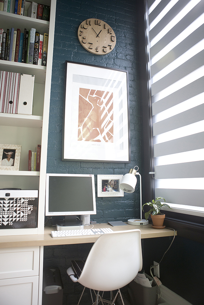
Another space that’s found a fresh perspective? This former balcony, that they converted into a compact, sophisticated office for Michelle’s husband. “The brick was on the outside and was red. My husband is from the beautiful Island of St. Kitts, so I wanted to bring a little bit of his homeland back here,” Michelle says.
Related: How to Transform That Awkward Nook Into a Useful Home Office
Tropical Vibes
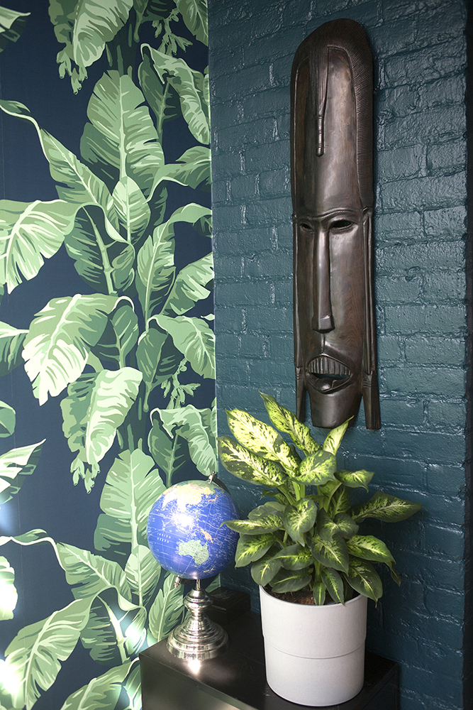
Changing the space’s colour palette transformed the room’s feel. “That colour is a beautiful teal hue and is reminiscent of the rain forest we walk through when we visit. The stunning tropical wallpaper from @wallshoppeofficial brings it all together,” Michelle says.
Related: Tropical-Inspired Room Designs That Are Perfect for the Ultimate Staycation
A Personalized Philosophy
The secret to ensuring each room conveys character, while still staying fresh, personal and lively? Think about who will live in the space, and go from there. “All the home offices were designed with the unique personality and style of each of us using them,” Michelle says. “My philosophy when it comes to design is always about who will use the space. It should represent them and evoke their sense of style through the objects and things they love to do. That is undeniably the best way to bring cohesiveness, style and history to any home.”
HGTV your inbox.
By clicking "SIGN UP” you agree to receive emails from HGTV and accept Corus' Terms of Use and Corus' Privacy Policy.


