This bright and airy townhouse kitchen renovation goes to show that even small spaces can have a big impact! For this couple, counter-space, flow and storage were the main sticking points, so we took advantage of every square inch and literally put a new spin on the kitchen. We nixed the half-wall separating it from the dining area and expanded the cabinets to create an L-shaped layout to allow for better flow and function, while still allowing room for family dinners perched at the beautiful white quartz counter. Neutral and transitional was the name of the design game, so we used solid white panel doors for the base cabinets, and up top we went for glass panel fronts to add visual interest and allow for fun pops of colour to be displayed through pretty bowls, accessories and cookbooks. Then we tossed in tons of texture and contrast through wide-plank oak floors, walnut shelves, grey walls and a rich backsplash that was both glossy and matte. Paired with schoolhouse style pendant lights, graphic print roman shades, and plenty of art, this space screams fresh, young and vibrant!
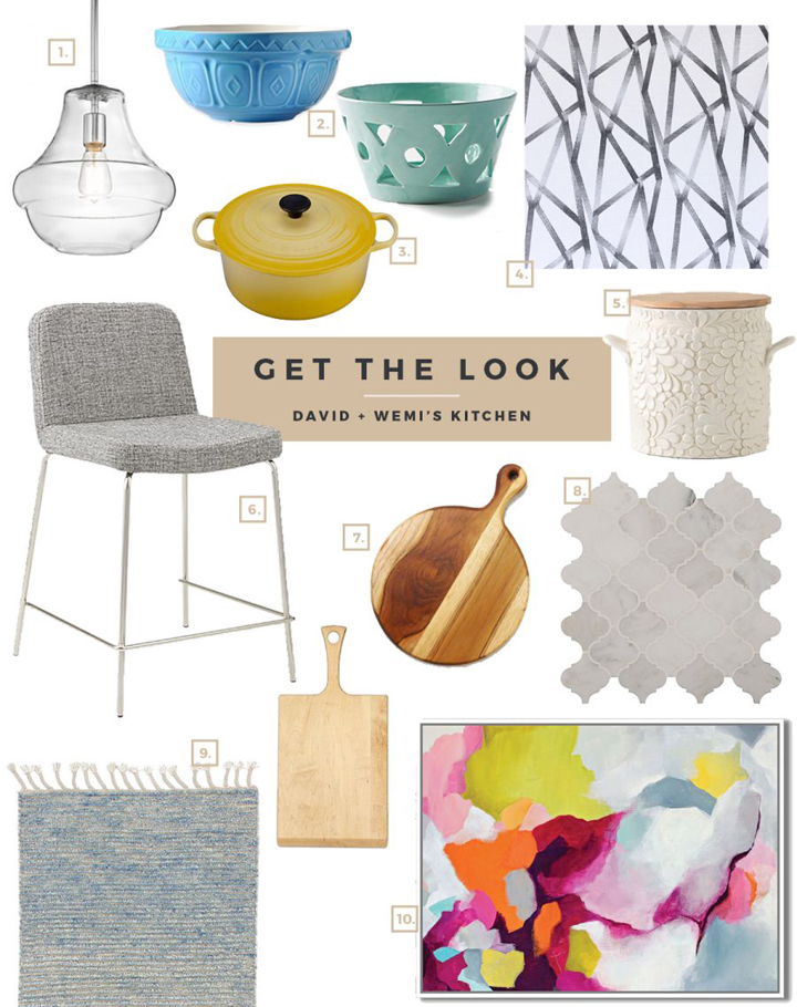
Love the look and feel of this cookie-cutter-turned-one-of-a-kind kitchen? See my picks for recreating the look in your own home!

- Schoolhouse Pendants
- Turquoise and powder blue bowls
- Le Creuset French Oven
- Roman Shades in Intersections
- Bread Box
- Grey Barstools
- Assorted Cutting Boards + Charcuterie Boards
- Arabesque Backsplash
- Blue Wool Runner
- Large-scale Abstract Art
For more behind-the-scenes action from this episode of Save My Reno, visit my blog, sabrinasmelko.com.
HGTV your inbox.
By clicking "SIGN UP” you agree to receive emails from HGTV and accept Corus' Terms of Use and Corus' Privacy Policy.


