Plain, old spec finishes just wouldn’t do for Edmonton-based designer Brianna Hughes, of Brianna Hughes Interiors. She wanted her Westmount-neighbourhood, 1,600-square-foot home (where she lives with her son Fitz, 8, and cat, James Murphy) to sing with style. And thanks to her savvy implementation of colour, texture and art, it does, hitting all the right notes in this eclectic mid-century modern home. You can watch the video here:
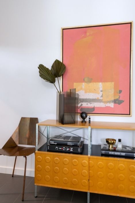
Front of House
The home’s front entry sets the tone for this vibrant space. “I like mid-century modern design, colour and an eclectic, almost European feel,” says homeowner and designer Brianna Hughes. This vignette works in tandem with her vision and the chair not only looks fab, but is a practical spot for putting on shoes at the front door.
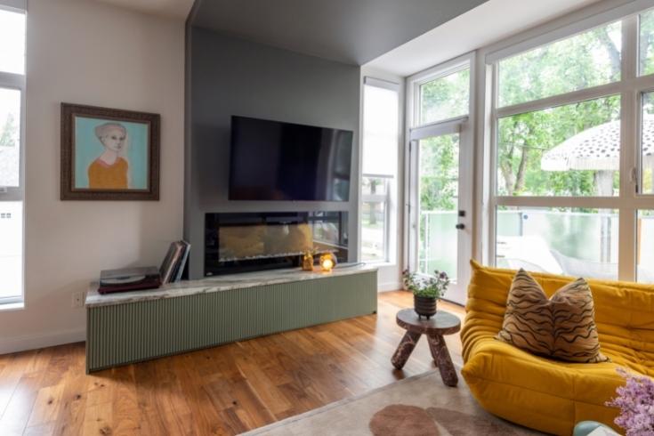
Make Do
Sometimes less-than-ideal features can be given a brilliant reboot. Brianna disliked the living room’s fireplace (she’s not a fan of the drop area over the room) so she added a cabinet beneath it, painted it a rich neutral shade (Card Room Green by Farrow and Ball) and finished it with a sleek granite top from Urban Granite in Edmonton.
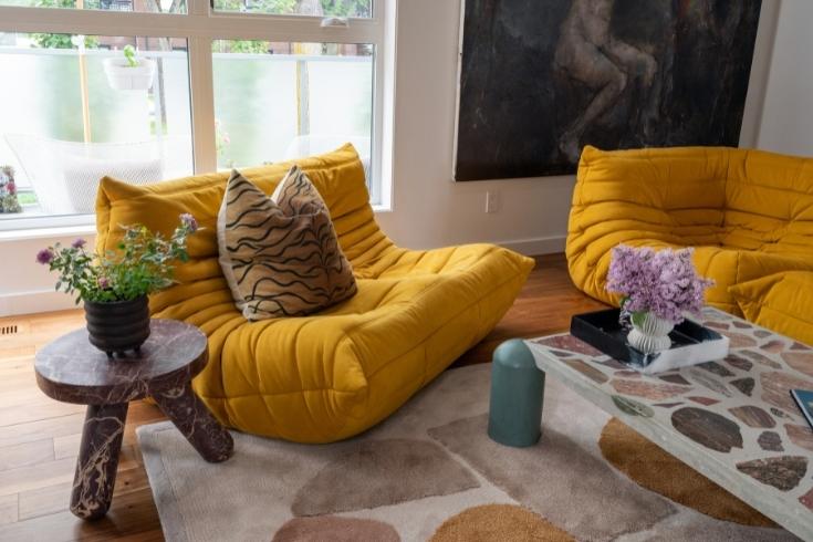
Not So Mellow Yellow
Brianna’s penchant for European and mid-century flair is evident in these wow-factor, cumin-coloured sofas. She says, “They’re Ligne Roset Togo pieces from the ’70s and I found them at one of my favourite local design stores, Dwell Modern.” They are more than just form too. “My son Fitz loves to jump and play all over them – they’re super comfortable.”
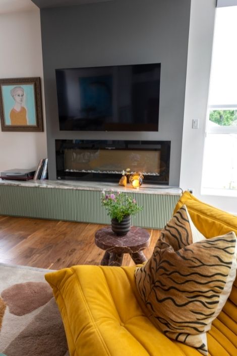
Colour and Pattern
Patterned accessories, like a cushion and rug, impart a fun, finished look to the living room, while the mix of rich shades (both bright and neutral) has a distinctively warm charm – even with all of this design prowess, it feels like a comfy, family space.
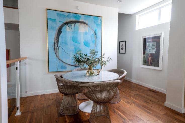
Blue Period
The unexpected mix of colours extends to the dining area where a cool blue hue is introduced. “I love this painting,” says Brianna. “It’s from local artist Phil Darrah and I purchased it at the Peter Robertson Gallery.” The crisp hue is a fresh foil to the living area’s richer palette and the abstract circle subtly echoes the table and chairs.
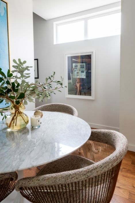
Roundabout Style
The round dining table and curved back chairs bring fluidity to the space and impart interest beneath the long, boxy windows.
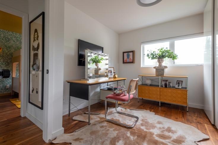
Desk Job
The home office is a visual delight. A classic cowhide rug loosens up all the angles in the space and the hardworking, mis-matched furniture feels curated – anything but office-blah. The open lines of the desk and chair keep it mood airy.
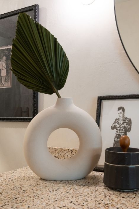
Artful Touches
Brianna’s ensuite bathroom dazzles with little details, like a sculptural vase and interesting artwork. “It’s by one of my favourite artists, Dana Holst. The piece is called “Mr. Nice Guy,” and it’s an oil-on-paper based on a 1920s’ matinee idol.” It’s a great reminder that practical spaces, such as bathrooms, can also have decorative oomph.
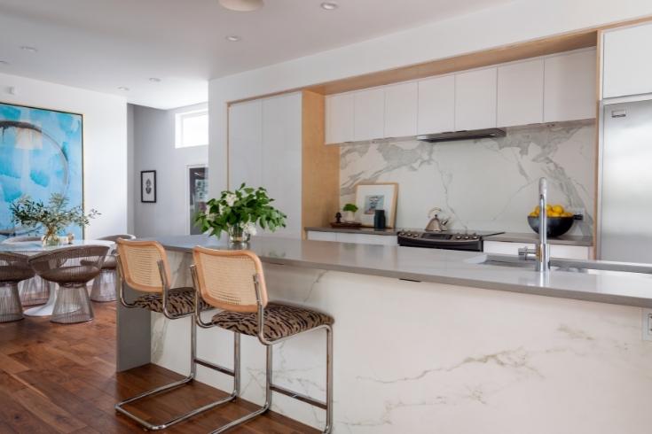
Stone Age
The spec-home came with some finishes that were a departure from Brianna’s vision. In the kitchen, she couldn’t change the cabinets so upgraded their presence with Neolith stone slabs from River City Tile. These were added to the island face and backsplash to stunning effect. “They add a richer, more European feel to the all-white cabinets.”
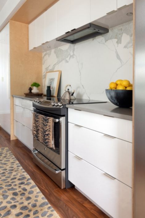
Fine Finishes
Other kitchen upgrades include flush-mount lighting from Cedar and Moss – these replaced original pendants and achieve a more open aspect. The engineered walnut flooring (here and throughout) replaces the original mix of laminate and carpeting.
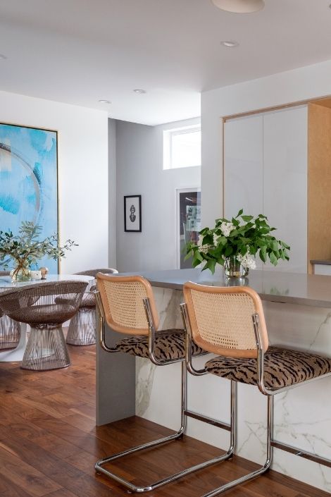
By Design
The design tweaks in the open plan shift it from spec-house to spectacular. “The material upgrades and the layering in of art make the home feel more luxurious and in line with my style,” says Brianna.
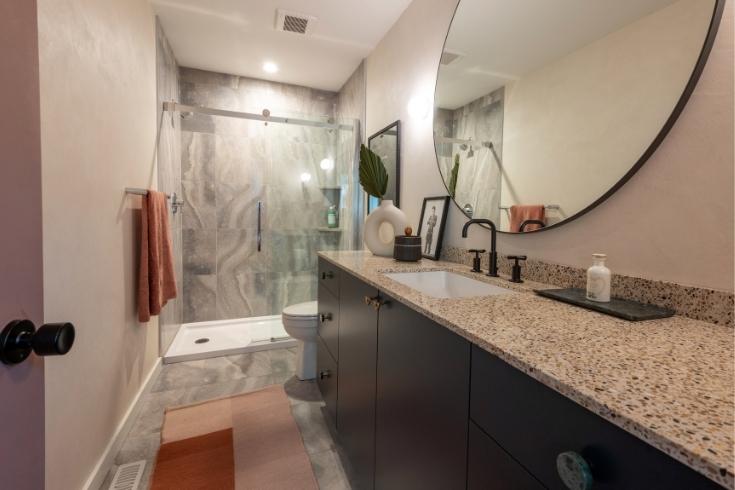
Big Idea
The principal bathroom’s original piddly vanity was replaced with a longer green slab cabinet topped with a fun terrazzo countertop from Cle Tile, provided by Iron River Surfaces.
Meanwhile, an oversized round mirror is in keeping with the new scale.
Strokes of Genius
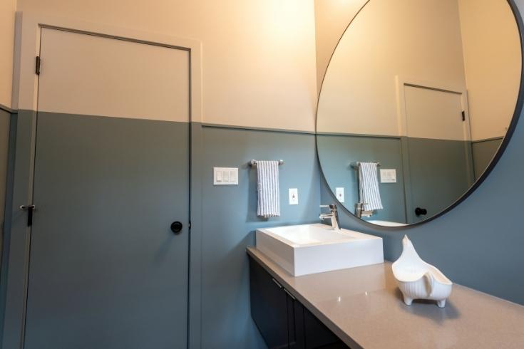
In her son Fitz’s bathroom, Brianna relied on a simple technique to amp up the visual interest. She used two tones of paint (Denime and Pavillion Grey) for a modern take on wainscotting that gussies up an otherwise plain space.
Think Pink
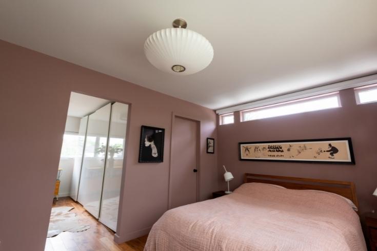
Brianna landed on a pink palette for her bedroom. The walls are painted Sulking Room Pink and the bedding continues the hue in a softer shade.
Wall Power
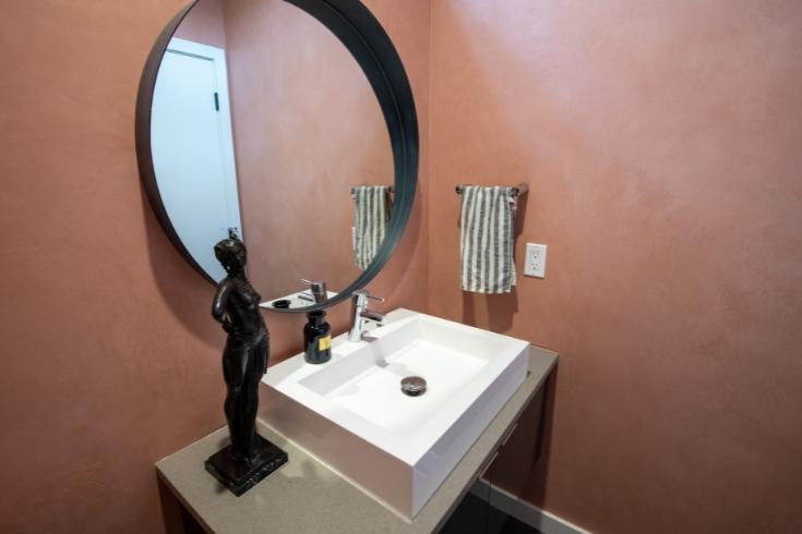
The pink powder room offers more than just lovely colour. “I added a clay finish to the walls with a product by American Clay,” says Brianna. “It mimics the look of Old-World plaster.” This treatment, done by Surfaces Design, is a neat way to shift the tone from flat to fabulous.
Softly, Softly
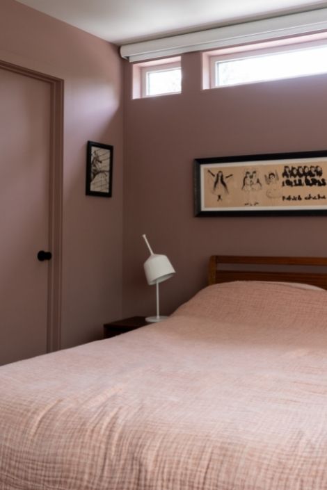
“My bedroom’s monochromatic palette, along with the warm walnut flooring, makes the space very soothing,” says Brianna. It’s an interesting and easy repetition of colour that nets a big overall impact.
Happy Days
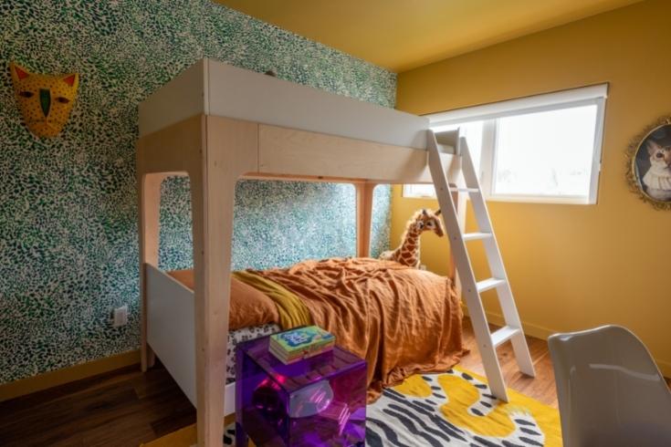
How fun is Fitz’s bedroom? Painting everything – doors, baseboards, casings and the ceiling – a sunny yellow makes it radiate happy energy. The shade is India Yellow from Farrow and Ball and it’s not the only noteworthy wall treatment.
Focal Points
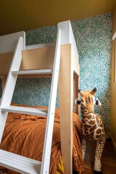
The zingy painted walls are complemented by fresh green wallpaper – it’s called “Cheetah Vision” by Aimée Wilder, and its intricate cheetah-print pattern forms subtle, peek-a-boo cheetah faces that peek out amongst the swirls of dots.
Personal Touch
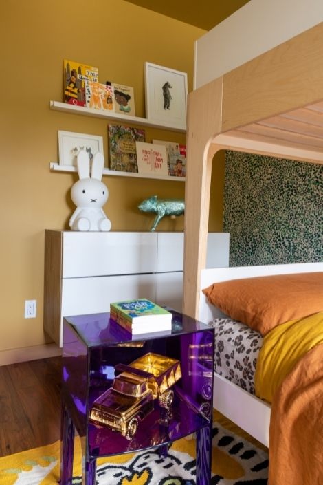
Simple shelves and a bright purple cabinet showcase some of Fitz’s favourite art and design pieces and they nicely tie back into the home’s entryway, which is also full of interest. Brianna says, “Our home feels calm and complete now.”
HGTV your inbox.
By clicking "SIGN UP” you agree to receive emails from HGTV and accept Corus' Terms of Use and Corus' Privacy Policy.


