Opulent finishes, bold wall treatments and sophisticated décor choices run throughout this Save My Reno redesign. With a limited budget, contractor Sebastian Clovis and designer Sabrina Smelko have created a rich, masculine space that oozes with private-club charm.
Hometown Pride
When friends Raj and Nader bought this bland semi-detached house in Toronto they were faced with a myriad of design challenges. Thanks to the Save My Reno team, they now have a sleek, sophisticated home to be proud of.
Find out Sebastian Clovis’ top 5 most-common renovation mistakes and how to avoid them.
Radio Silence
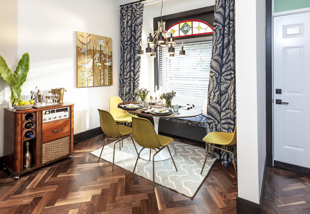
A once-underused nook at the front of the house now boasts a hip breakfast table featuring an original stained-glass window and an upcycled bar cart, which used to be a clunky vintage radio Nader had been dragging around from house to house for years.
Layer Up
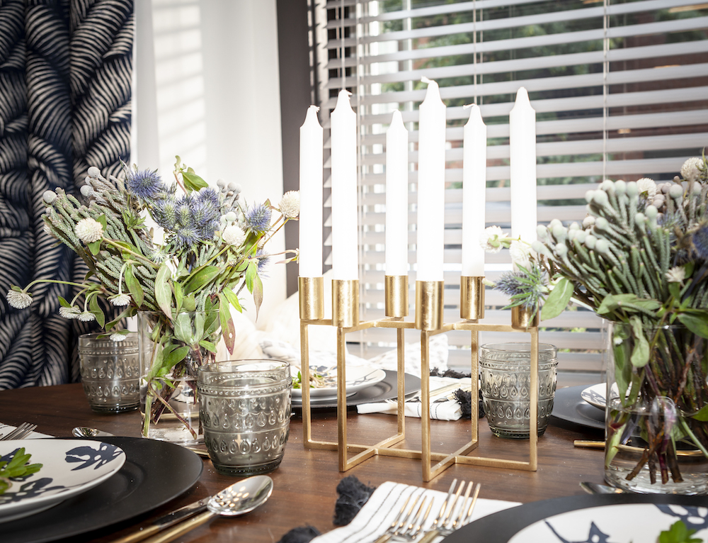
Gold accents, heavy drapes and dark teak wood are used throughout the space to add layers of luxury and relaxed comfort to the newly executed open-plan design of the main floor.
Simple Simon
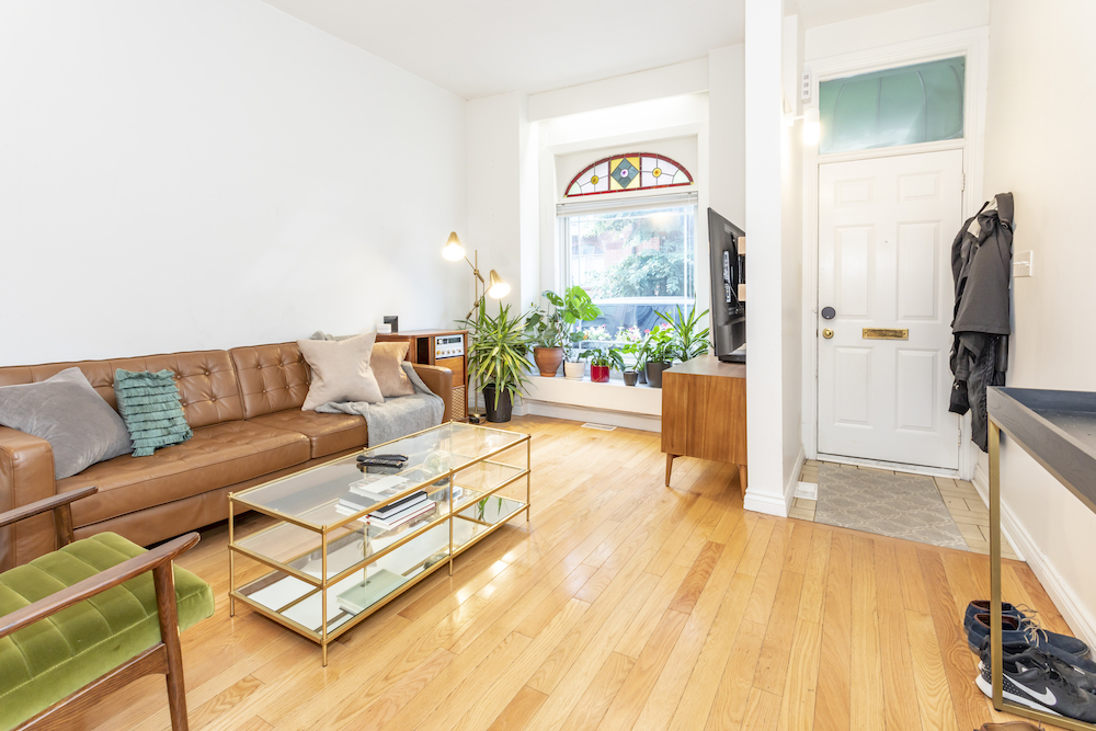
While the original space was clean and simple – with its blonde-stained wood floors and white walls – it lacked character and area definition. Enter the Save My Reno team.
The Old Switcheroo
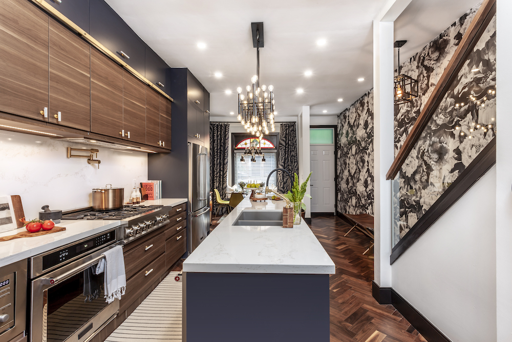
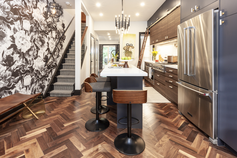
When Sebastian and Sabrina got their hands on the space, they decided to flip it all around, moving the living area to the back of the house where the old kitchen was located, and shifting the new kitchen into the centre to become the hub of the home.
Find out how you can use bold print wallpaper to bring your space alive.
Stair Master
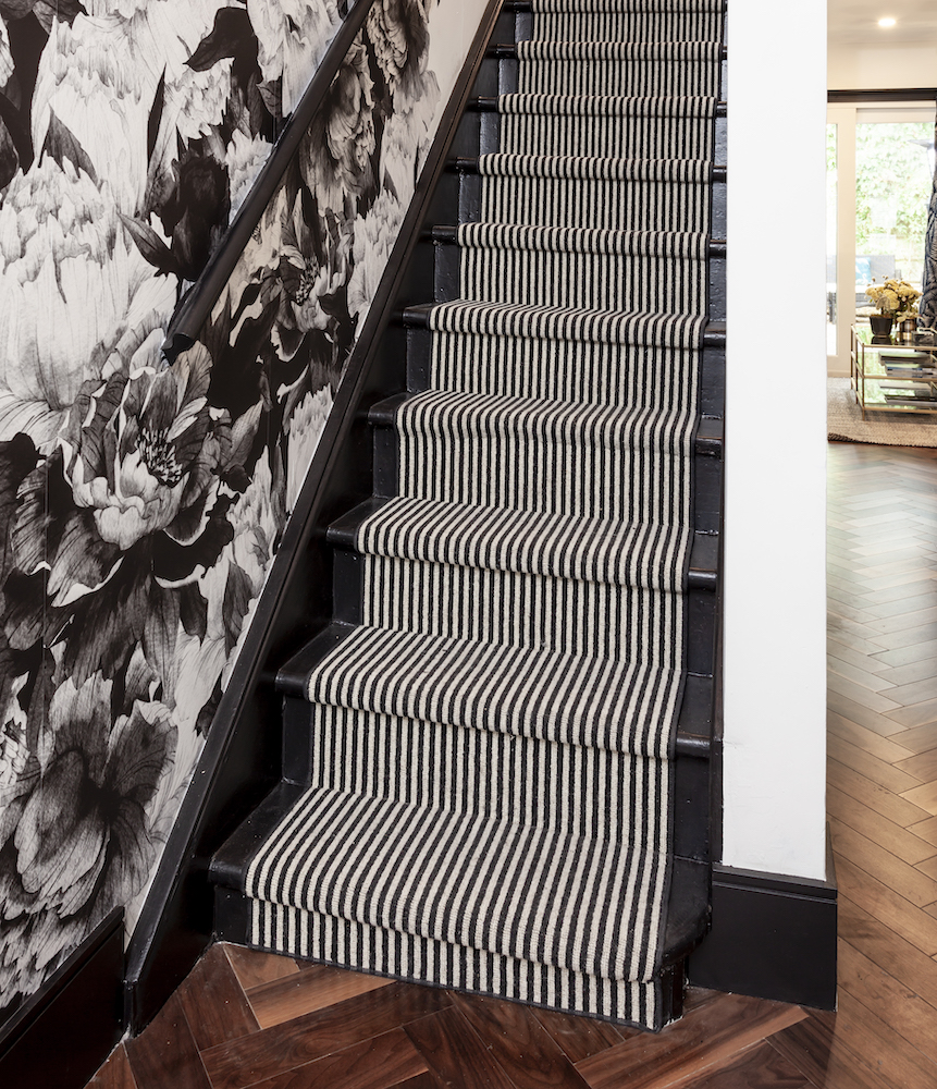
Rather than replacing the rickety old staircase, Sebastian and Raj shored up the risers removing the squeaks, installed a glass bannister and striped runner, and put up a bold black-and-white floral wallpaper over the entire entry wall.
What Was
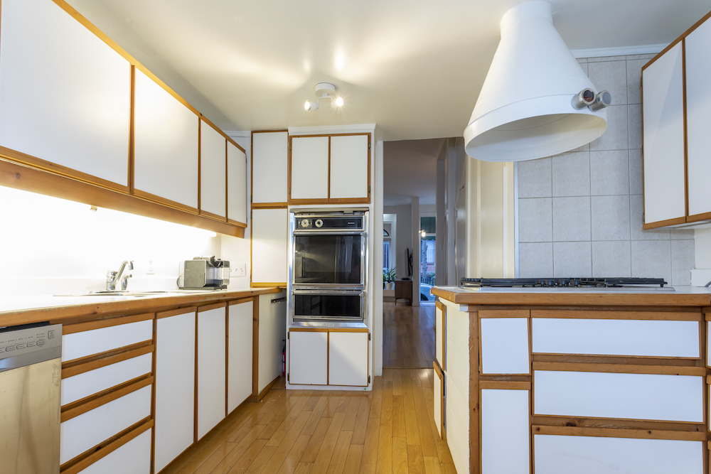
An addition at the back of the building housed the old kitchen, with its narrow passageway, ultra-low ceilings and outdated cabinetry. The entire room was ripped out and turned into a cozy living area.
Flow
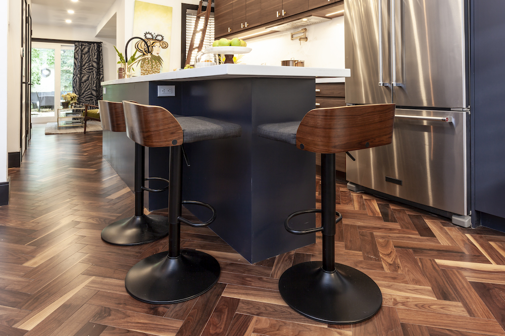
To ground the now-open-concept living area, Sabrina suggested a dark engineered-wood floor in a classic herringbone pattern. The floors flow from the front breakfast nook to the back lounge area, tying together the whole space.
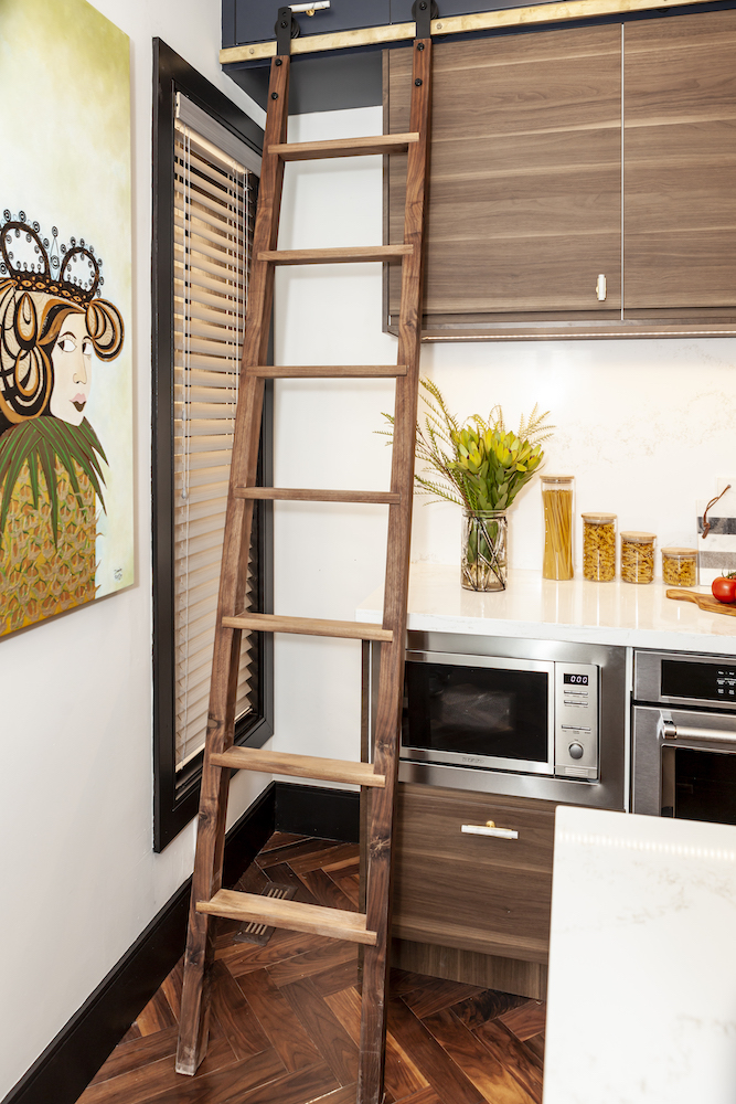
Jacob’s Ladder
To maximize storage in the kitchen, Sebastian installed sleek, navy-blue cabinets right up to the ceiling, adding a ladder and track for easy accesses – and as an eye-catching design feature.
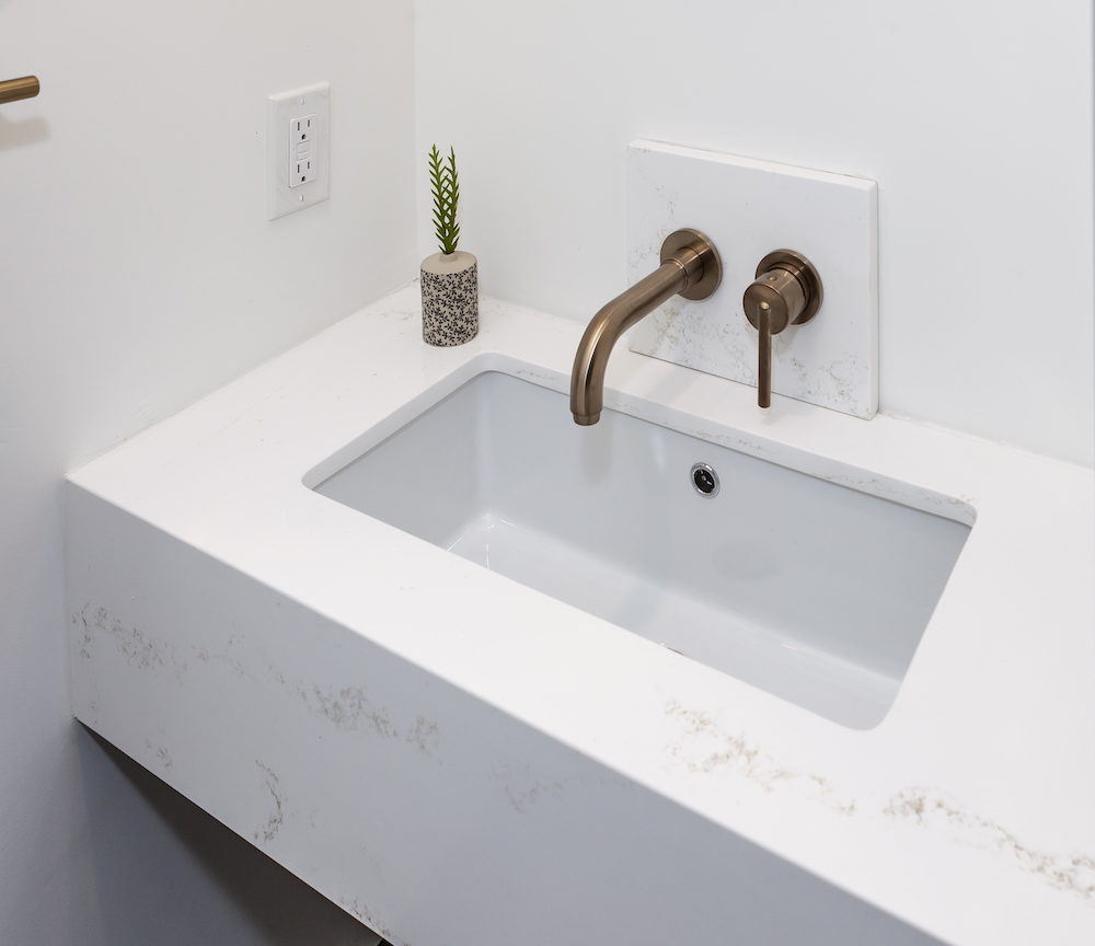
All Part of the Plan
As part of the $70,000 renovation plan, the tiny main-floor powder room got a major upgrade with space-saving features such a wall-mount toilet, built-in quartz vanity and recessed faucet.
HGTV your inbox.
By clicking "SIGN UP” you agree to receive emails from HGTV and accept Corus' Terms of Use and Corus' Privacy Policy.


