Pro athlete turned builder and host of HGTV Canada’s Save My Reno, Sebastian Clovis, is swooping in to save the day for homeowners in need of overhauls in Gut Job. From crumbling, old houses to overrun backyards, there’s no space Sebastian can’t save! Check back each week for incredible reveals that’ll leave you dreaming of your own reno, and see where you can shop all of these incredible looks!
Watch Gut Job on HGTV Canada. Also available on the Global TV App, and STACKTV with Amazon Prime Video Channels and Rogers. HGTV Canada is available through all major TV service providers.
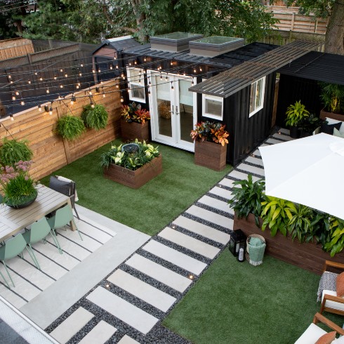
Jen and Miguel’s Magnificent Backyard Makeover
Jen and Miguel had lost the battle over their backyard to the animals! Termites had destroyed their deck, squirrels had ransacked the shed, and their dog had destroyed what was left of the garden. They tasked Sebastian and his Gut Job team with transforming their barren backyard into an urban oasis, and judging from this reveal, he delivered! But to understand just how far this outdoor space came, check out the next slide to see the before photo!
Related: 14 Inspiring Outdoor Dining Areas
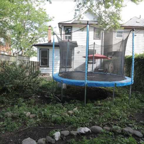
An Overgrown Backyard in the City
Jen and Miguel’s backyard was no longer functional as a relaxing outdoor space to entertain. So even in the summer months, they were relegated to entertaining indoors. Sebastian could see the potential in their backyard though, which was actually much bigger than it seemed. Their first step was removing the trampoline, clearing the sad grass and defining zones for multiple entertaining spaces in the backyard.
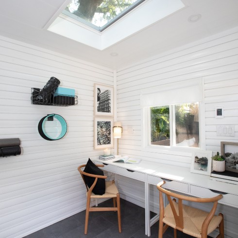
A Backyard Shipping Container Studio
A key component of the backyard makeover was the creation of a studio, where Miguel could run his photography business, and Jen could practice yoga. The busy parents were thrilled with the idea of a quiet space outside of the family home where they could escape to.
Installing the shipping container was far from zen, however. After an oversized container was delivered in error, the project was delayed while waiting for the correct container to arrive. Then Sebastian had the hair-raising task of transporting it over the patio stone. It was a nail-biting day on site, but the team pulled it off. It wouldn’t be a gut job without a few stomach knots!
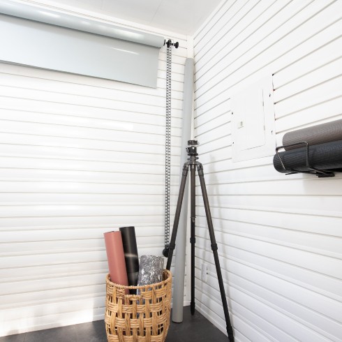
The Beauty of a Blank Space
Sebastian and his team invested in the design of the backyard, but when it came to the shipping container studio, they kept the space pretty minimal. This allows the shed to evolve to meet the needs of both Jen and Miguel. It’s an office, and a yoga studio, and a photography studio. And when either of them pick up a new passion, the shed is equipped with surface space and a customizable storage walls to adapt to and support those passions!
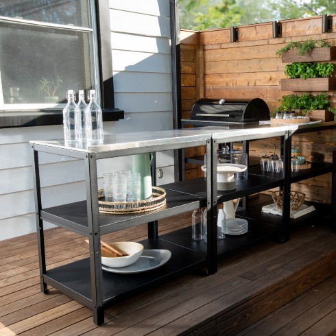
A Contemporary Backyard Kitchen
Entertaining outdoors was something Jen and Miguel had dearly missed, so an outdoor cooking station with a barbeque was essential for supporting their social life! Sebastian opted for open shelving over closed to maintain an airy and functional design.
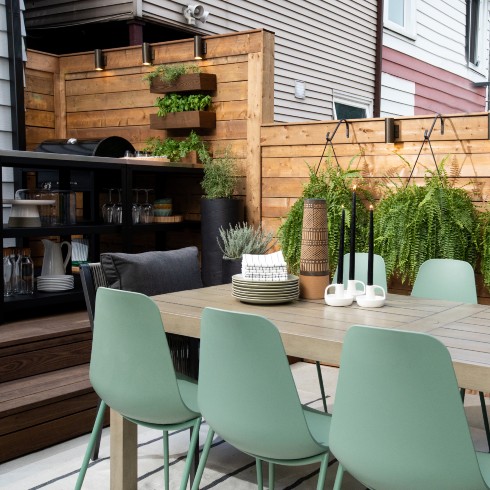
Outdoor Seating for 10
The backyard was designed with zones in mind. The dining zone was created to fit lots of guests (up to 10 at the table!). And Sebastian designed the space with greenery at varying heights, to really fill one’s vision, and transform the space from an urban backyard, to a lush oasis.
By night, the dining zone is lit up under strings of Edison bulbs, so dinners can run late into the night.
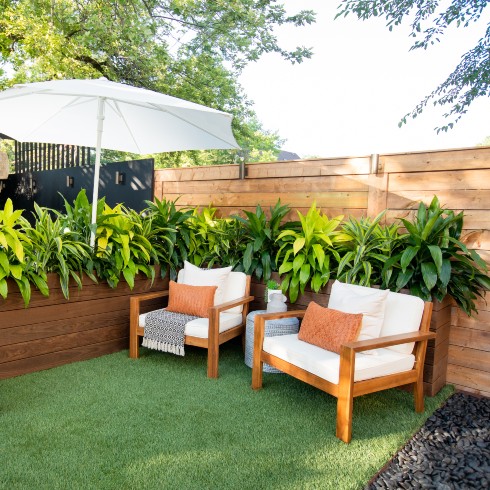
Contrasting Elements Meet in This Backyard Oasis
To balance the hard elements of the cooking and dining zones, Sebastian created this leafy sitting area across from the dining table. The entire backyard is a juxtaposition of colours, textures and zones. It’s also perfect for outdoor parties where some guests prefer to dine at the table, while others enjoy a drink and conversation under the ferns.
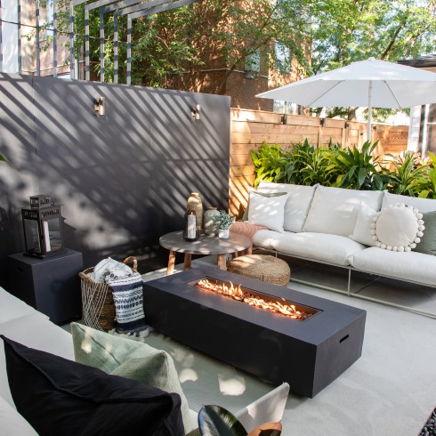
Lounging in the Breathtaking Backyard Makeover
A luxurious lounge space was created, nestle in the very back corner of the yard. Sebastian’s idea behind the placement of this was to create separation from the home (and all of its responsibilities). This is where Jen and Miguel can sit back, put their feet up next to the fire, and relax under the shade of their modern pergola.
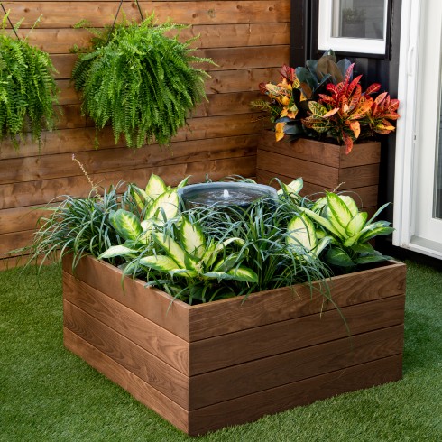
Water Elements Across from the Backyard Firepit
Every feature of this backyard was designed to create a sense of calm tranquility. When the doors of the studio open wide, the water feature is a spectacular and invigorating sight!
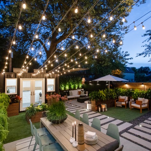
The Beautiful Backyard by Night
Jen and Miguel were blown away by their new backyard, it was beyond anything they could have imagined or hoped for, and designed to meet the needs of their lives and professions perfectly. The only issue they were left with was what to do if they ever outgrew the home: They’d never be able to leave this breathtaking backyard oasis!
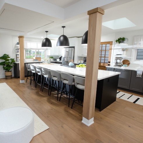
The Heart of Rebecca & Debbie’s Home
Rebecca and Debbie had raised two children of their own, and fostered six more kids in their small but mighty home. The kitchen and living room had never fully accommodated their family. Meals were often spent divided into small groups, because they didn’t have a table or kitchen island to fit all eight members of the family. Sebastian knew that without changing the home’s footprint, he’d have to find creative ways to maximize the space, create seating for everyone, and enhance the flow of the open-concept living space.
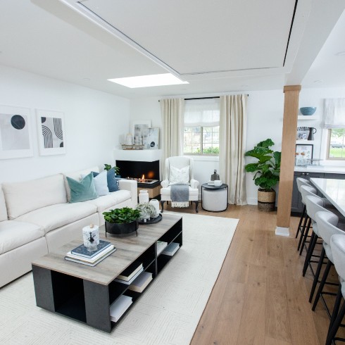
A Unique Living Room Layout
Sebastian and his team positioned the living room right up against the wall, to leave walkways in and around the kitchen open. They even tucked away design elements, like a fireplace, and a secret television so as not to take up valuable floorspace.
Design-wise, the living room is light and bright. Nothing crowds the room!
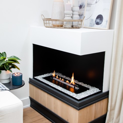
A Cute Corner Fireplace
This fireplace fits snug in a corner, adding warmth and ambiance to the crisp, cool design of the living room, and offers surface space above for art and decorative elements. This is a great example of introducing decor, without crowding precious floor space.
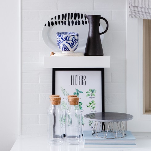
Cool, Clean Colours
To ensure the open-concept living room and kitchen truly felt as one, Sebastian stayed true to a single colour scheme throughout of crisp white, matte black and pops of blue. The overall look is modern, without being too sophisticated. This is a family home after all!
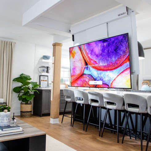
Entertaining Entertainment
After dinner wraps up, movie night can begin! Rebecca and Debbie went from having a cramped, makeshift living room to a bona fide screening room! The television, which descends from the ceiling, is truly something to see, and now there’s room for everyone to gather round on the sofa. The only challenge is getting eight family members to agree on a movie!
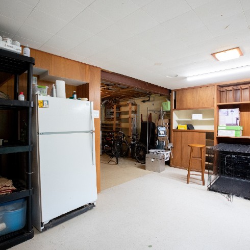
A 60-Year-Old Basement in Need of a Gut Job
Efeso and Anthony’s story was nothing short of heartbreaking. When Efeso’s mother became ill and needed a kidney transplant, Efeso donated one of his. She lived for three more years before passing away. When his father had a stroke after losing his wife, Efeso and Anthony decided it was time he moved from Brazil to stay with them. That was the inspiration behind their basement renovation, but midway through the project, Efeso’s father passed away.
Determined to give Efeso and Anthony the beautiful, functional basement they’d envisioned, Sebastian and his team finished the project, and presented the couple with a serene and inspiring space.
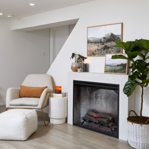
A Cool and Contemporary Basement
After ripping out the old paneling, old floors and old everything else, Sebastian created a chic, basement apartment to accommodate guests, while also providing room for Efeso’s business, breeding and grooming dogs.
The basement bulkheads were removed to create a more comfortable space, new stairs with a glass railing were installed, along with new floors and a chic electric fireplace.
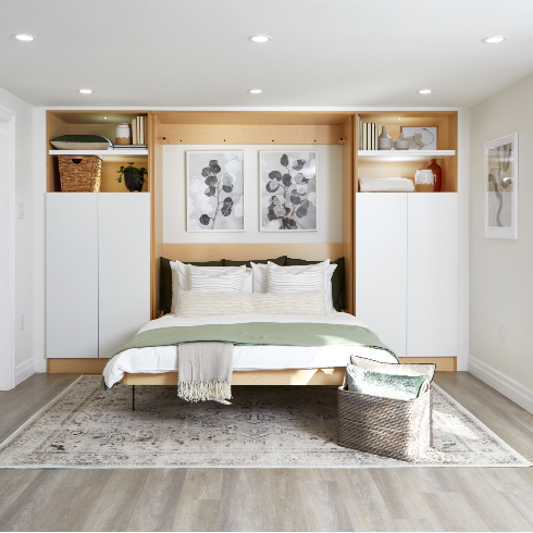
Space-Saving Solutions in the Basement
To maximize the space in the basement, and have it function as a kitchen, living room and bedroom, Sebastian created a Murphy bed with storage flanking either side the bed. This way, the bed can be tucked away for entertaining, and easily popped out for guests.
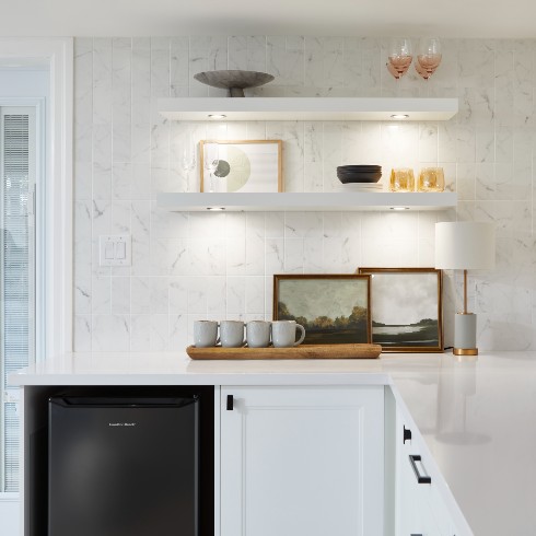
The Cutest Little Basement Kitchen
The basement bedroom and kitchen are all one space, so Sebastian and his design team made strategic choices to ensure the style of the kitchen was cohesive with the bedroom, and didn’t scream “busy kitchen.” Instead, it feels more like a chic boutique hotel kitchenette, complete with a mini fridge, handy mugs and glassware, and beautiful decor on floating shelves. This way, the basement can easily serve as a space to entertain, and provide all the comforts necessary for guests during longer stays.
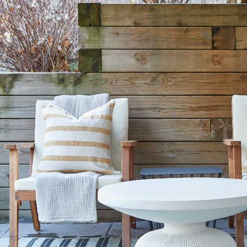
Outdoor Space Included!
The beauty of Efeso and Anthony’s basement was a walkout to the big backyard. Not only did it flood the basement with natural light, it allowed for a sweet little seating area just outside the French doors. By carrying the style of the basement apartment all the way out to the patio furniture and decor, it creates an inviting outdoor space for guests to relax in. Who wouldn’t want to start their day here with a big mug of coffee?
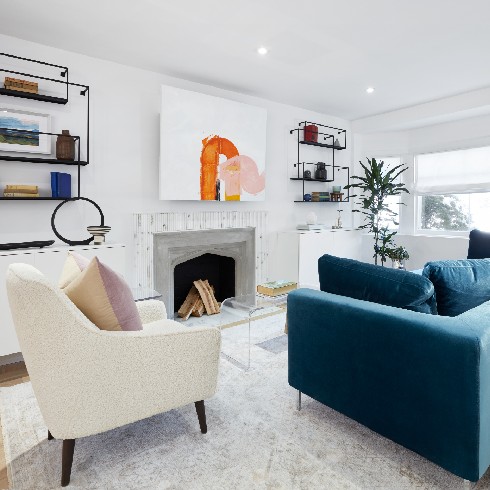
A Functional Family Room
Sebastian and his team wanted to create a living room that would be functional for Steph and Fred’s family of six, without being TV-centric. A television, along with loads of storage, is conveniently tucked behind artwork and cabinet doors. The result is a space that can function for movie night and wine and cheese when Fred and Steph have their friends over.
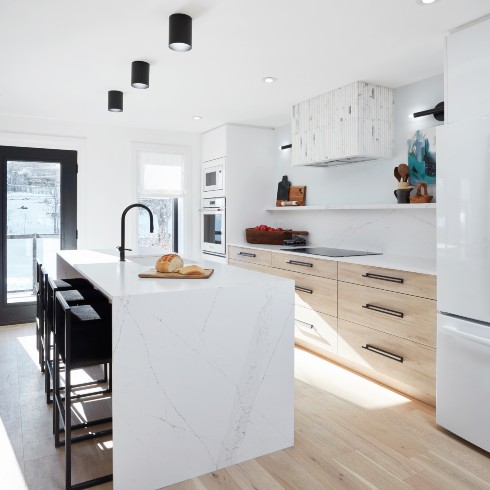
A Modern and Serene White Kitchen
The kitchen opens onto the living room, so Sebastian and his team carried over design elements, like the beautiful light wood floors, and the fluted marble detailing from the fireplace to the range hood.
The island provides space for prep and casual meals. Steph and Fred’s four children can easily hop up to the counter for breakfast, while their parents pack their lunches for school. It’s a room where everyone can easily gather and be together.
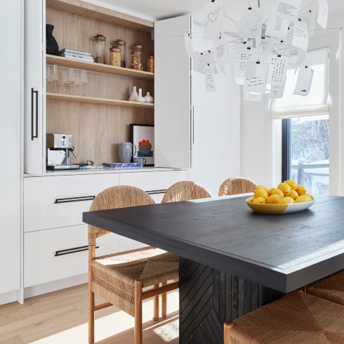
A Dining Room to Write Home About
The dining area flows off the kitchen, so again, Sebastian and his team carried the colours and design of the living room right through.
Sebastian’s partner Ayanna, had the brilliant idea to create a storage wall with accordion doors that when opened, offer handy shelves and a coffee hub, but close easily and seamlessly and give the room a more formal appearance. So much of this busy home for six is multi-functional in this way.
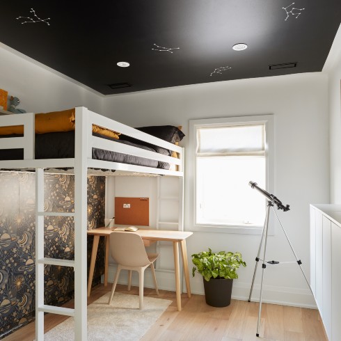
A Children’s Bedroom That’s Out of This World
Instead of going overboard on a kid’s theme, Sebastian and Ayanna opted for cool, muted tones, that could grow with Fred and Steph’s children as they age. Still, subtle elements, like constellations painted on the black ceiling in this bedroom, add a playful touch.
To maximize space in the small children’s bedrooms, Sebastian and his team brought in loft beds. This way, the floor space beneath the bed can be easily utilized by a desk.
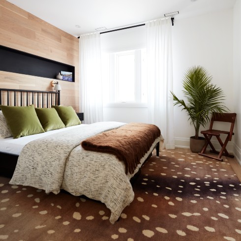
A Warm and Welcoming Primary Bedroom
Fred and Steph’s primary bedroom was a joy to create for Sebastian and Ayanna. They wanted the room to be a reflection of both individuals, so soft elements, like earth tones and rich textures, met with industrial lighting and inky black touches.
The room is ultra sophisticated, a true escape for the parents of four. But Sebastian made sure it would still work for their busy lives, and loaded the room with storage, like the recessed shelf directly above the bed and floating bedside tables.
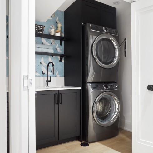
A Genius Laundry Room Closet
Ask any parent and they’ll tell you the importance of having a proper laundry room, with surface space and storage.
Though not part of the initial scope of the project, when it became clear to Sebastian that a basement reno was necessary for the gut job, he made sure to include a laundry room that was not only practical, but pretty too!
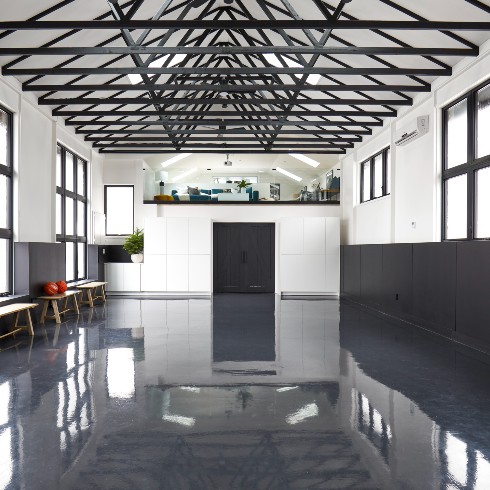
A Dream Sports Facility
Cindy and Ram had an empty, 1,300-square-foot barn on their property in the country, and dreamed of utilizing the space for their active family. With help from Sebastian and his team, they gutted the barn, and created a multi-functional sports facility, complete with an office and family room, a reading nook, a workshop, and loads of storage.
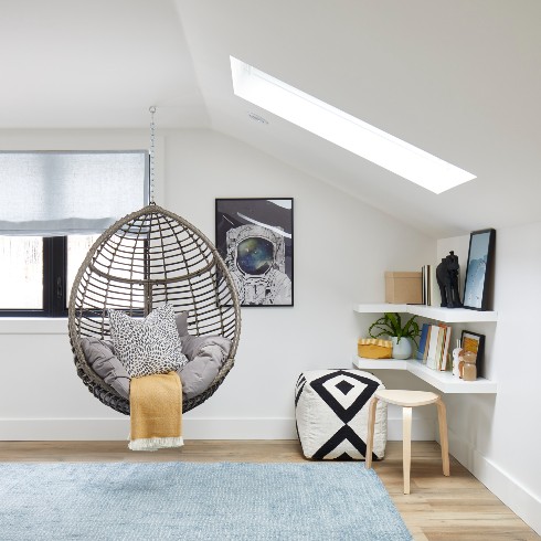
A Rad Little Reading Nook
For Cindy and Ram’s daughter, Sebastian and his team created a sweet, little reading nook in an empty corner of the loft. A few floating shelves designed in an L-shape created a DIY desk and storage, but it’s the swinging pod chair that really elevates this corner and makes it a fun and functional space for young kids.
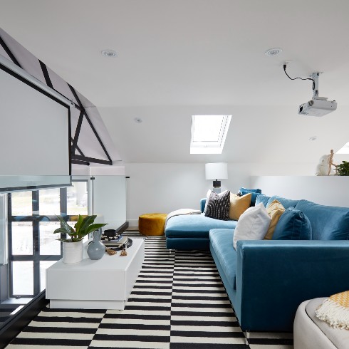
A Makeshift Movie Theatre
Along with a sports facility and office space, Sebastian thought a media area would be handy for the family as the kids got older, and wanted a space of their own outside of the house, to have friends over. To save space, Sebastian and his team installed a projector and screen, which can be lowered or raised for movie nights!
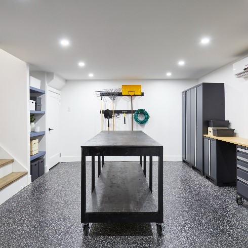
A Workshop That Works the Angles
All of the family members had put in their special requests for the project, and Cindy had specifically asked for a workshop. Since moving to the country, she’d become the resident fixer in the family. She tasked Sebastian with creating a workshop where she’d have surface space on caster wheels for projects and tinkering, and storage for tools and equipment.
Sebastian knew that a big property in the country meant lots of yardwork, and even more tools! So he designed open, hanging storage for shovels, rakes and garden hoses. This way, when Cindy and Ram ask their kids to help out with chores around the property, they can’t shirk their responsibilities by claiming they can’t find the rake!
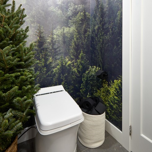
An Indoor Outhouse
Without plumbing in the old barn, Sebastian had his work cut out for him when Cindy and Ram requested a bathroom for their recreation facility. He installed an incinerator toilet, and a pump sink to run water.
A gorgeous wrap-around mural of a forest transforms the tiny space into an epic element of the gut job.
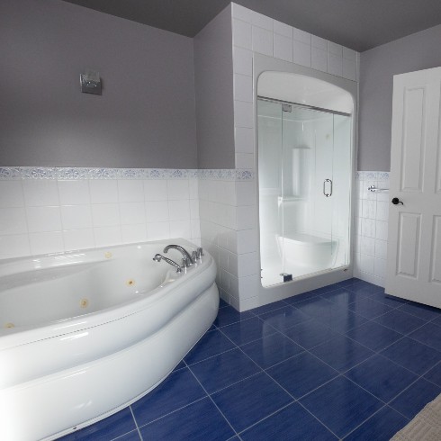
Bye Bye Old Bathroom
June and Thomas had been living in their forever home for a few years, raising their kids, but spending an eternity with their primary bathroom wasn’t exactly part of the dream. The jacuzzi tub didn’t work, the single vanity wasn’t big enough, and the small shower, with the low bar, made it challenging for Thomas to use. The couple were relegated to the family bathroom down the hall, which was extra disappointing when they considered the glorious size of their en suite.
They knew with Sebastian’s help, and a $65,000 renovation budget, they could create the dream bathroom this space was meant to be!
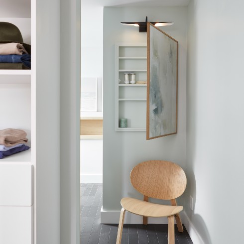
Surprise, Surprise Storage
Tucked behind a piece of abstract art is a secret cabinet. It’s perfect for things like medicine, which need to be safely tucked away from the younger members of the family. We love how Sebastian and his team went all out to install a picture light overhead. You’d really never guess what’s hidden behind it!
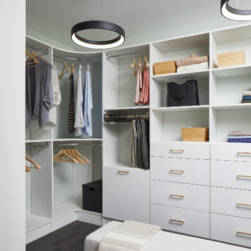
So Much More Than a Closet
Sebastian managed to reconfigure the space between the primary bedroom and bathroom to create a chic, walk-through dressing room. It provided extra storage that June and Thomas had desperately needed (mostly to store Thomas’s extensive shoe collection).
While the white open shelves are pretty minimalist, two black floating halo pendants give the space a modern, boutique feel, and mirror the unusual curved clothing bars.
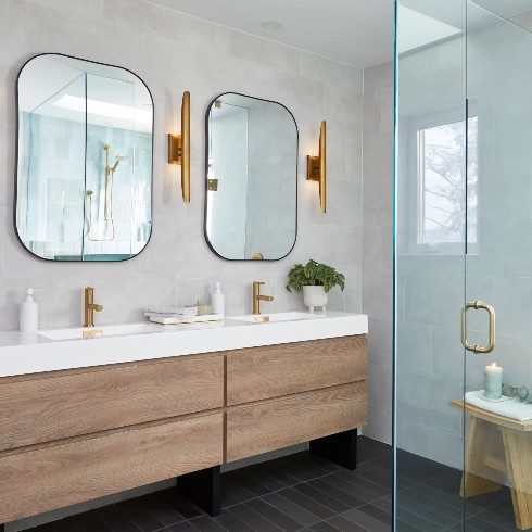
A Touch of Glamour
A double vanity was a no-brainer replacement for the single sink in the original bathroom. All of the hardware in the bathroom is gold, which adds a bit of glamour to the other more natural elements that Sebastian leaned on, like raw wood and ocean blues.
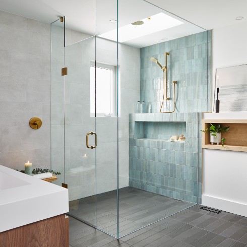
An Ocean-Inspired Primary Bathroom
When it came to the design of the primary bathroom, June and Thomas had requested calming, ocean tones, and a water theme. The result is a space that feels tranquil and modern. A beautiful tile feature wall in the glass shower provides cool colours that contrast beautifully against gold hardware. The blue tiles were selected to resemble water droplets!
But that’s not even the coolest part of this huge walk-in shower…
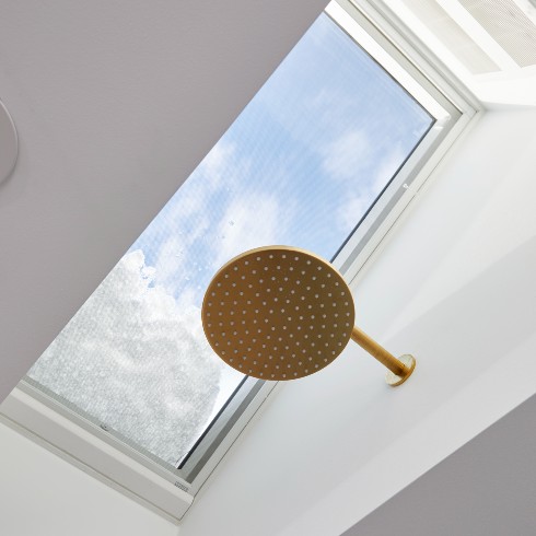
A Rain Shower in the Clouds
With water as the design cue, Sebastian and his team installed a gold shower head within the new skylight. This way, light and water pour down from the heavens, for a shower that feels out of this world. It’s one of the most majestic showers we’ve ever seen!
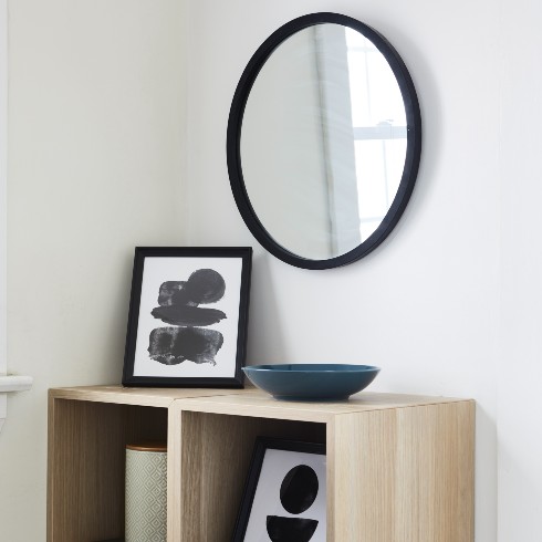
By-the-Door Storage Solutions for Cam and Luke
Cam and Luke had expressed frustration over their lack of storage by the front door, so along with a tall cabinet for coats and shoes, Sebastian created this artful stack of storage cubes, with a modern mirror hung above. It’s a simple set up that solves the challenge of front-door clutter, while creating a mod little vignette.
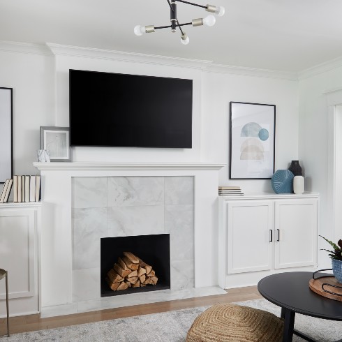
Chic Storage for Kid Clutter
After a $65,000 main floor makeover (thanks to the hard work pf Sebastian and his team), Cam and Luke’s home is unrecognizable! They managed to open up the squared off home, and create a main floor that felt big, bright and bursting with storage.
In the living room, custom built-ins flank the new fireplace, providing handy storage to hide away toys and books before bedtime.
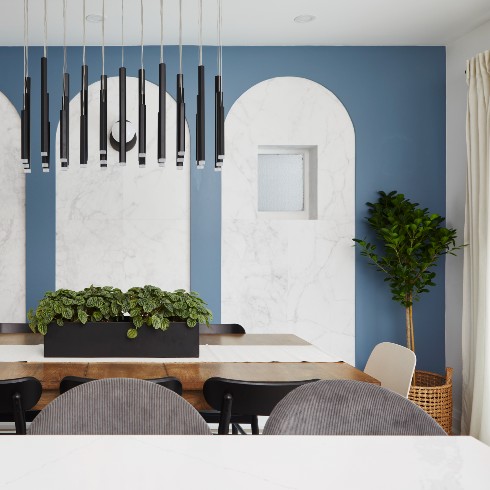
Beautiful in Black and Blue
The dining room sits between the living room and kitchen, so it really connects the spaces, and communicates between the rooms. New French doors fill the dining room with light, and trendy arches add a splash of intrigue, and define the room as a sophisticated space. It feels like a defined room, while still creating flow throughout the main floor.
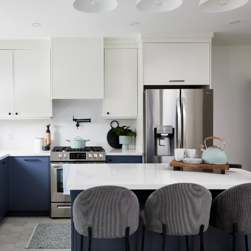
A Pretty Perfect Kitchen
The kitchen was redesigned with functionality and storage as the primary focus. Sebastian brought down the wall between the kitchen and dining room, creating an expanded sense of space, and allowing appliances to be shifted around the perimeter of the room. This made way for a practical island — offering both surface space and underneath storage.
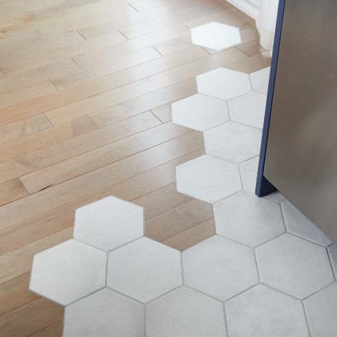
Honey, This Tile is Everything
Even with function as the focus, Sebastian worked in some cool, decorative touches, like this gorgeous transition between the kitchen floor tile and the hardwood in the dining and living room. These are things you won’t find in any other home!
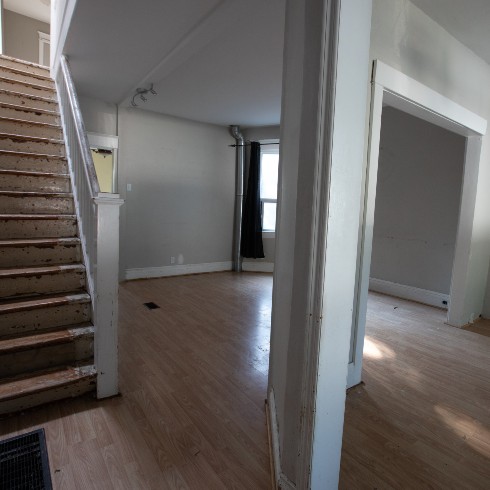
Eric and Erika’s Family Fixer Upper
Eric and Erika had bought their home mainly for the location. They loved the neighbourhood and school district. But the house itself was barely that. The foundation was literally crumbling beneath them! Before Sebastian and his team could even get to the fun stuff, they had to underpin the basement, build new exterior walls, reframe the house, install new electrical, plumbing and HVAC, install drywall and finally paint it! Then it was Samantha Pynn’s turn to tackle this epic gut job!
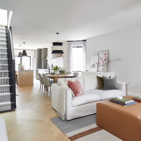
Eric and Erika’s Dream Family Home
With tears in their eyes, Eric and Erika toured their new home, remarking that it looked like something out of a magazine. The original dark, disjointed layout was replaced with a dreamy open concept main floor. Samantha had chosen hip herringbone floors to add depth against the warm neutral colour palette of the living and dining area. Pops of black on the staircase and pendant lights help to ground the airy decor.
The final gut job is warm and welcoming, exactly how Eric and Erika feel in their new neighbourhood!
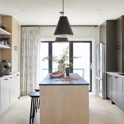
A Swanky New Kitchen
The kitchen has a touch of drama, thanks to a combination of light wood and charcoal grey cabinetry. While seemingly at odds, the mismatched cabinetry comes together in the harmony thanks to the central island, which marries both colours.
The very back wall of the kitchen features a folding glass wall, so the entire home can open up to the great outdoors.
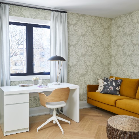
A Home Office Fit for Overtime Hours
Sebastian and his team reconfigured the second floor, stealing space from a bathroom with an oversized 1990s bathtub, and expanding a tiny bedroom to allow for this inviting office. Thanks to the extra square footage, the room could comfortably work as a bedroom down the road, too.
Samantha opted for an elegant lotus flower wallpaper, which draws on nature and speaks to the colours throughout the entire home, so even though it stands out as a statement, it feels cohesive. It’s a gorgeous backdrop for burnt orange and florals.
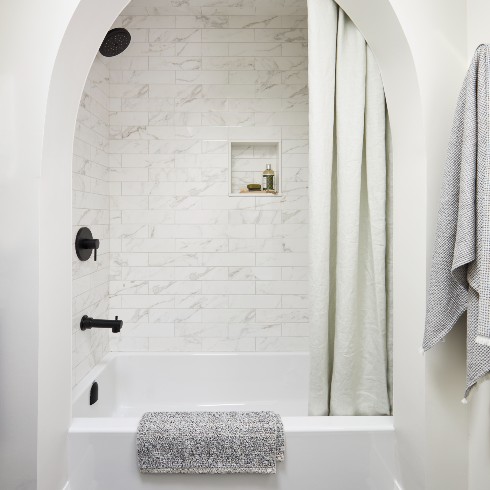
A Regal Bathtub
Though it lost a little square footage during the gut job, what the second floor bathroom gained in style was well worth the sacrifice.
Sebastian and Samantha added a bit of glamour to the modern bathroom with an archway framing the bath. It’s a simple touch that transforms the space. And the modern black matte hardware acts as a grounding and calming visual cue.
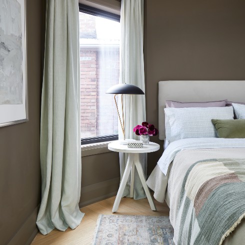
Checking In
A cozy guest bedroom feels like a cocoon thanks to painted trim and baseboards to match the walls. It’s conducive to sleep, which might be dangerous–guests will never want to leave!
To play up the cozy vibe of this room, Samantha layered in textures and let drapes pool on the floor. It’s a minor detail that makes a world of difference!
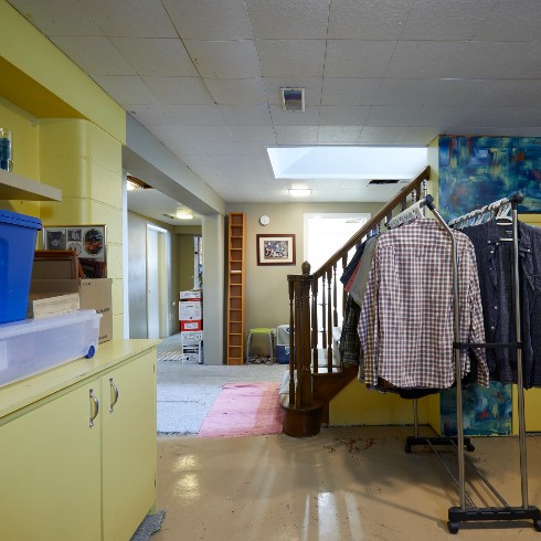
A Creepy Crawly Basement
Brian and Christine knew it was time to renovate their basement. After raising four boys, the needs of the home had changed. One son had moved into the home with his own wife and child, and Brian and Christine had happily moved down to the basement suite. But there was nothing sweet about the basement. It was dark, dingy and devoted to storing odds and ends. The couple wanted a space that would feel like their own.
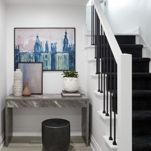
A Home of Their Own
Sebastian wanted the basement suite for Christine and Brian to feel like their own separate oasis, away from the noise of their boys upstairs. A modern style was created, using grey flooring, and white and black accents. The layout remained pretty much the same, but by painting the basement a bright white, it feels fresh and spacious, nothing like the cramped, dark basement that came before it.
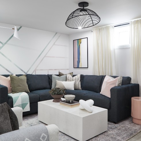
A Modern Living Area
Sebastian designed the basement living area to serve the family, with a big, plush sectional, occasional seating, and loads of storage.
A subtle DIY accent wall adds dimension to the room, while still keeping the colour scheme light and modern (and respecting the budget!). And a black wire light fixture anchors the white walls.
Opposite the couch, Sebastian built storage to sit underneath the television, and there’s a storage cubby under the stairs as well!
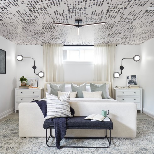
Basement Suite Dreams
After sacrificing so much for their children, Sebastian wanted Brian and Christine’s primary suite to feel luxurious and welcoming. He knew that after making such an unconventional living choice, they could also handle design elements that pushed the envelope, like the linear patterned wallpaper, to extend the sense of space, and the funky bedside sconces.
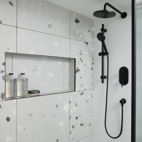
A Beautiful Basement Suite Bathroom
A triple entry bathrooms allows for access from the bedroom, the basement living room, and a dressing closet. Sebastian carried through the modern grey, black and white colour palette with a hip terrazzo tile shower, paired with striking matte black hardware.
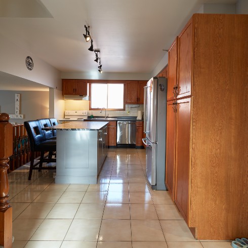
Time for Demo Day
After three years of dreaming of demo day and a kitchen renovation, Amanda and Jeremy were thrilled to have Sebastian and his crew show up to tear down! Amanda even joined the action and helped demolish the ugly cabinets she’d hated for so long!
The team did manage to save the original kitchen island, which Sebastian knew could be easily updated to match his modern plans.
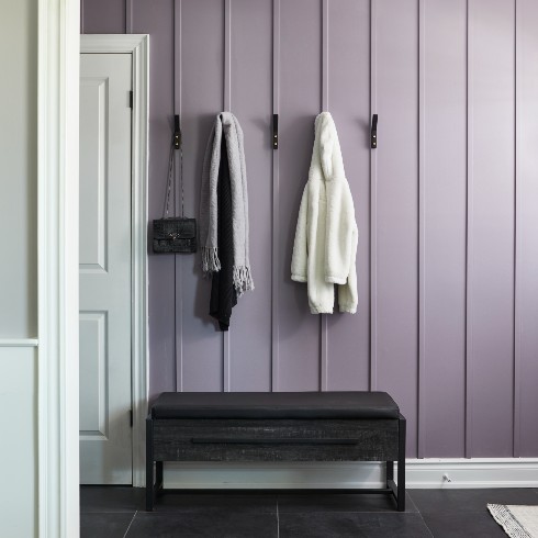
Say Hello to Smoky Mauve
Jeremy and Amanda got way more than they bargained for with this renovation! Sebastian and his team had livened up the entryway with lavender walls, modern hooks and a hip little bench. Amanda was overjoyed when she saw it. The vertical trim details adds a beautiful but subtle depth to the smoky mauve walls, and the black accents help steer the colour from feeling juvenile.
Along with the entryway, Sebastian and his team and updated other rooms of the home, and installed a skylight over the stairs. Now, the entryway hall was flooded with natural light!
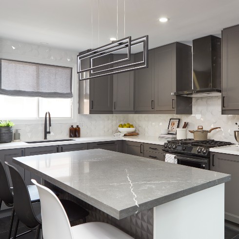
A Rock ‘n’ Roll Kitchen Reno
To match Jeremy’s “rock and roll” aesthetic, Sebastian and his team designed a modern kitchen with hip greige cabinetry, a white hexagon tile backsplash, and a modern light fixture over the island. It’s moody, edgy, but the kitchen island (which was the original, painted white), keeps the room from teetering into total darkness!
And when Amanda saw her new black sink, she did a little happy dance!
A Scenic Living Room
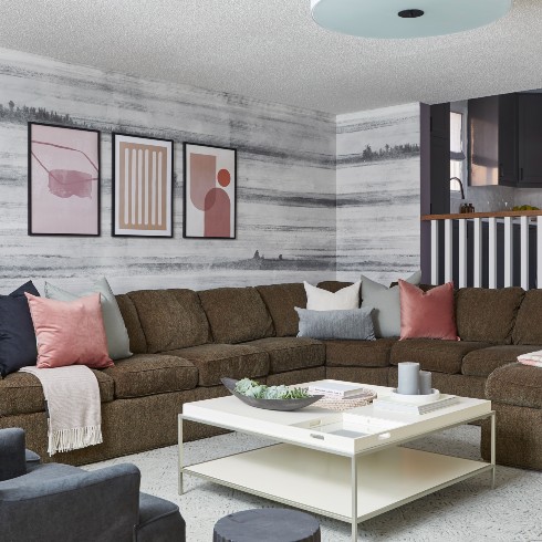
Amanda and Jeremy’s kitchen is in the center of the home, and opens onto a sunken living room and formal dining and living room, so the team felt the need to extend the renovation to ensure the entire home felt fresh and modern.
The sunken living room off the kitchen was quite spacious, so an abstract wallpaper wrapped the walls to make it feel cozy. Pops of warm pinks were also added in to break up the modern colour scheme from the kitchen.
A Dynamo Dining Room
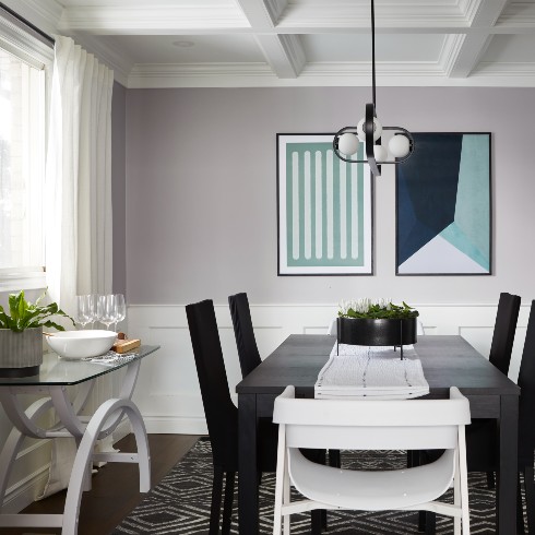
The dining room already had a beautiful coffered ceiling to show off, so Sebastian and his team installed a new, modern light fixture to match the kitchen, colourful artwork to add personality, and brought the funky white and glass console table up from the living room.
Budget-Friendly Living Room Updates
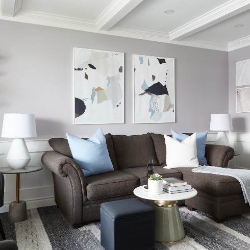
In the formal living room, the couple’s existing furniture was spruced up with decorative accents (pillows, a throw and coffee table decor), and modern artwork and lamps pull it all together. It just goes to show how easy it can be to transform a space quickly and on a budget.
A Dated Bathroom with Loads of Potential
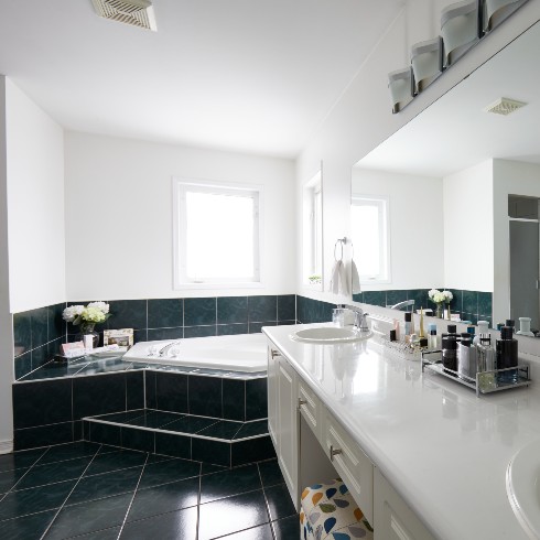
Jackeline and Julien’s primary bathroom had loads of potential, dating all the way back to the early 1990s. Sebastian knew that by reconfiguring the spacious bathroom, and capitalizing on the incredible natural light, this bathroom could go from dated to dramatic.
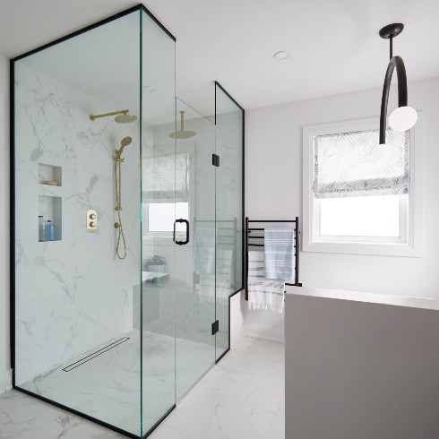
A Glass Case of (Positive) Emotion
Out with the dated Jacuzzi tub, and in with the modern walk-in shower! Sebastian’s gut job gave the couple a practical shower with modern gold and black accents.
No detail was spared! Sebastian made sure to include a custom bench in the shower, and recessed shelves to easily tuck away products.
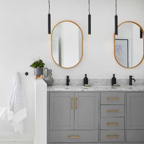
A Boast-Worthy Bathroom Vanity
The previous bathroom had a double vanity with storage, but in truth it was too large. A scaled down double vanity with a mix of storage options met the couple’s needs, while carving out space for other essential bathroom features.
The hanging black pendant lights over the sink were an unexpected choice, that really elevates the style of the bathroom.
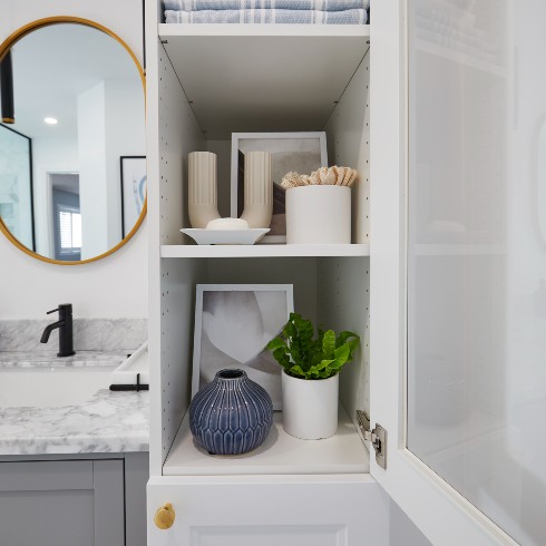
Peek-a-Boo Bathroom Storage
Beside the vanity, Sebastian installed a floor-to-ceiling cabinet in a contrasting white with a frosted door. It’s the perfect storage option for spare towels and toilet paper, soaps and decorative objects.
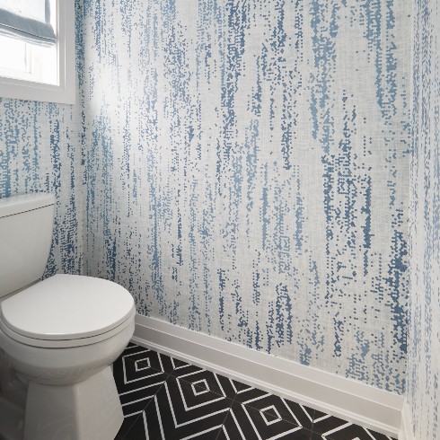
Wallpaper for a Water Closet
A water closet is always ideal if space allows, and Sebastian managed to make one work for Jackeline and Julien.
Small spaces, like powder rooms or water closets, are the perfect places to take a little design risk. Sebastian and his team opted for a dramatic, geometric black and white floor tile, with an abstract blue wallpaper.
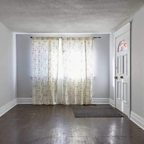
Creating a Dream Home
Darcy and Meghan felt like they were out of options. Their bungalow was too small for their family, but they couldn’t afford to move. Enter Sebastian and his team to turn their itty bitty bungalow into a dream home! By digging out the basement, to create higher ceilings, Sebastian was able to double the square footage of the home. This meant the main floor could house a bigger kitchen, dining area and living room, and the basement could accommodate bedrooms and a bathroom for Darcy and Meghan’s children.
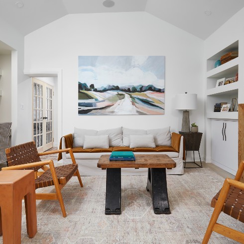
A Family Home
Creating a spacious family room, where Darcy and Meghan could relax and have fun with their children, was an essential part of this gut job. The arched ceiling gave the family room a sense of grandness, and custom built-ins and shelving provided hidden storage (for things like board games), and open shelves for family photos.
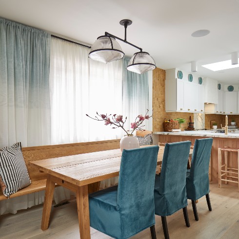
The Jewel of the Home
The design of this home is spectacular, all thanks to Ayanna! The broad design elements are kept pretty neutral, with stark white walls and light wood accents, but rich jewel tones are layered all throughout the home to add joy to this family home.
To maximize the space, the layout was made to be as open concept as possible. This allows for light to flow through the home, and the visual field stretches on. Plus, with little kids, life is made easier being able to prep meals while keeping an eye on them at the table.
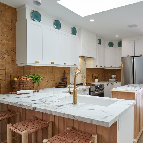
Maximize a Mini Kitchen
The kitchen was by no means spacious, but Sebastian maximized the use of space with an island on wheels that could sit in the center of the kitchen to aid with meal prep, and then roll back against a wall to free up space.
Sebastian and Ayanna also carried through the jewel-tone accents with turquoise plates hung over the white cabinetry. This is a great way to mask a bulkhead between the cabinets and ceiling.
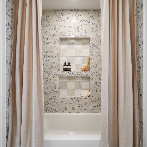
Bring on the Drama
The bathrooms in Darcy and Meghan’s home are some of Sebastian’s best! The primary bath is just off the kitchen and acts as a powder room too, so it had to pack a little glamour for guests! By hanging two shower curtain panels on either side of the bathtub, it creates a look that’s pure elegance!
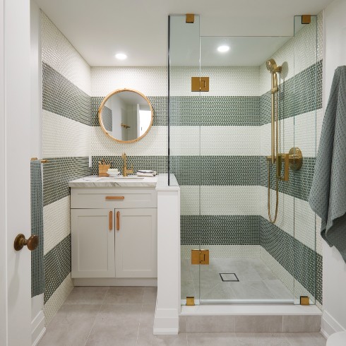
The Right Stripes
For the basement bathroom, Sebastian and his team had fun with the design. They wanted something family friendly, that could grow with the children as they age. The thick striped tiles add a bit of fun, while the gold hardware elevates a basement bathroom to luxurious standards!
Love these transformations? Shop the look here!
HGTV your inbox.
By clicking "SIGN UP” you agree to receive emails from HGTV and accept Corus' Terms of Use and Corus' Privacy Policy.


