When Dave was diagnosed with cancer, his wife Stephanie stepped up in a huge way. Between handling all of the work, the household chores and remaining her husband’s biggest cheerleader, Stephanie pretty much did it all. But when Dave got better, he wanted to do something nice to surprise his wife and show her how much her support meant to him. So he called in designer Cheryl Torrenueva and contractor Roger Morin to help redesign their main floor living space while Stephanie was out of the house. Here’s how they managed to transform the living and dining rooms into a more modern design and functional layout, all under 36 hours.
Expanded Living Space
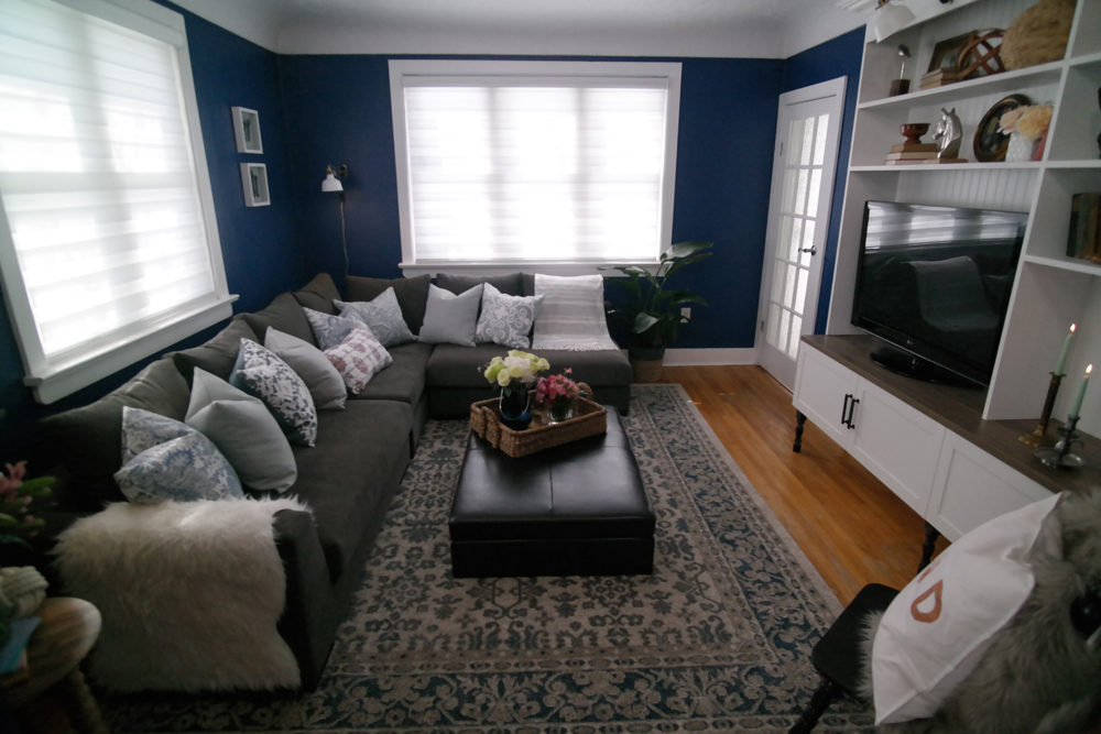
In order to maximize entertaining and living space, Cheryl redesigned this main area to include an oversized lounger that both Dave and Stephanie can sprawl out on, complete with a built-in media centre with tons of extra storage. Rich blue walls coupled with pretty white trim make the area pop, while restored original hardwood below adds instant character.
Related: A Toronto Home Brimming with Character (Wait Until You See the Kids’ Rooms!)
Corner Unit
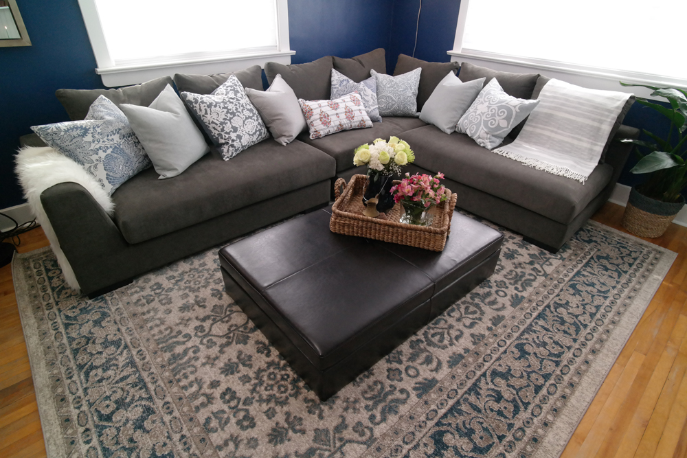
Thanks to the corner design of this specific sectional there’s tons of seating without taking up too much of the small space. The look is concise and modern thanks to a rectangular coffee table with more storage underneath, while an area rug adds another cozy layer to the overall look.
Shelves Galore
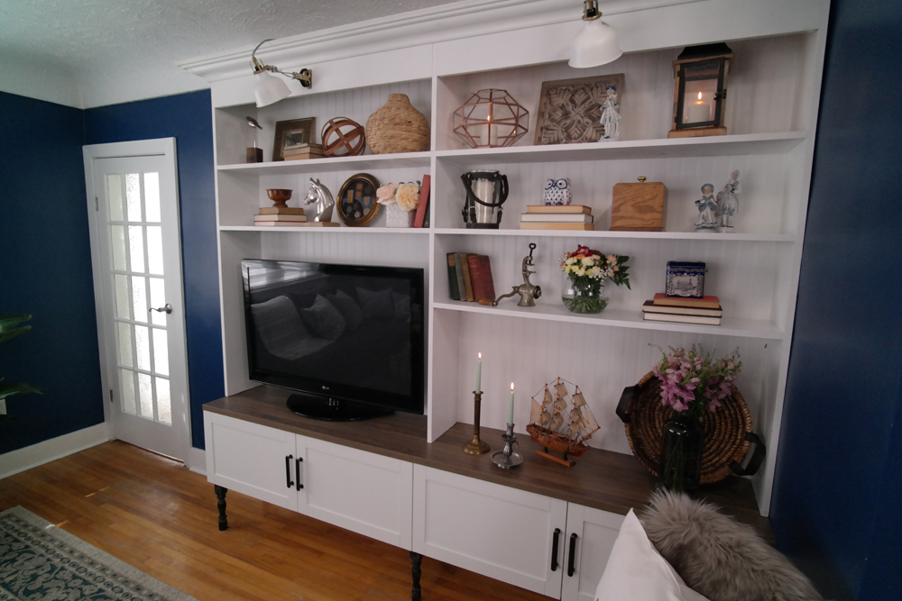
This media centre is the perfect mix of contemporary and country thanks to its sleek finishes and unique textures. The antique posts and trimmed backing add tons of character, while the oversized shelving slots allow for a variety of objects to be stored or featured.
Corner Dining
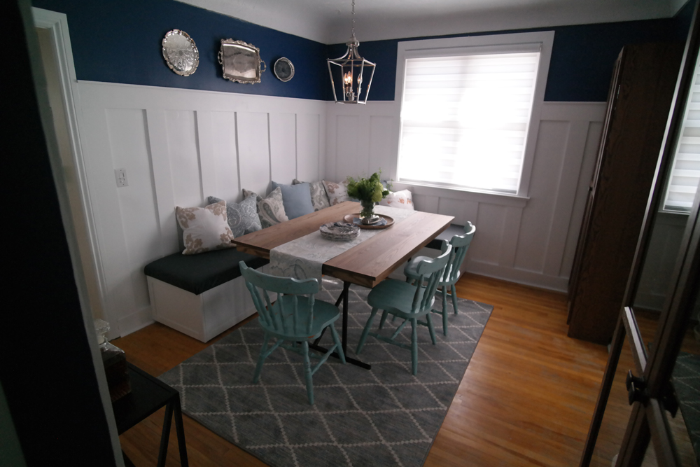
In the dining room, Cheryl and Roger dressed up the space to match, utilizing the corner to max out the seating potential. On the walls, they opted for a board and batten finish. The dark blue paint continues above, tying the spaces together.
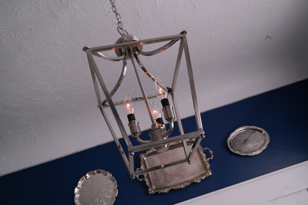
Pretty Lighting
Above, Cheryl opted for some more antique looks, like this lantern light fixture and the silver plates hanging on the wall. These design elements help to polish the room and add an experienced charm, resulting in another contemporary country finish.
Related: Design Style Quiz: What’s Your Home Decor Personality?
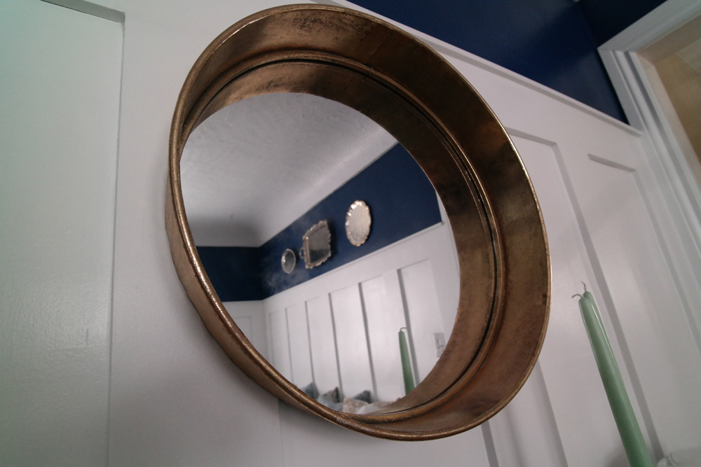
Unique Details
Small mirrors with interesting details, such as this wide-rimmed one above, help to open up the space while adding instant design appeal.
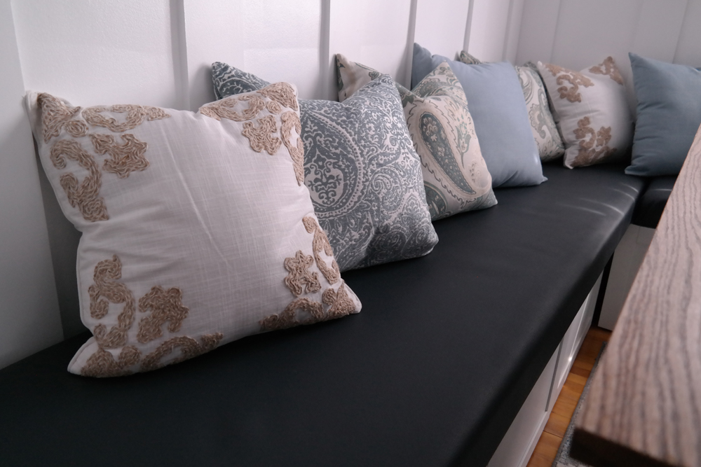
Bench Seating
The custom bench is also finished in that board and batten look, with a plush bench cushion matching the dark blue above. In order to tie the two looks together and add lots of comfort, Cheryl finished off the bench with various textured and coloured throw pillows. Now this is a space you’d want to lounge in.
Related: This Vancouver Heritage Home is Cool and Contemporary Without Forgetting Its Roots
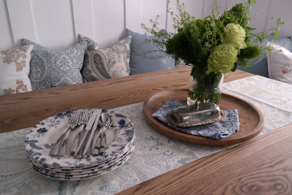
Simple Adornments
Rather than going for a full table setting, Cheryl dressed this beautiful wood table in a family style setting. It fits the country vibe while also adding a homey touch. A simple wood serving board, a table runner and some fresh flowers complete the look.
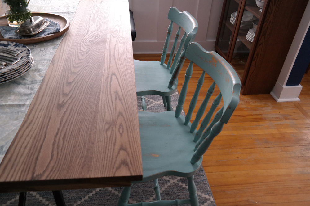
Antique Chairs
We love the robin’s egg blue finish on these chairs, especially with the worn wood look. They feel well-loved and add instant charm to the room, perfectly complimenting the soft wood finishes and area rug below.
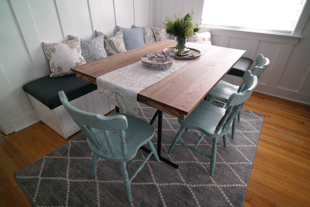
A Polished Space
Between this gorgeous new dining room and the entirely more functional living room, it’s no wonder that Stephanie was completely touched by her husband’s desire to do something nice for her. This space feels warm and inviting and is the perfect spot for two people to finally relax and enjoy each other’s company in again after the struggles this past little while has brought them.
HGTV your inbox.
By clicking "SIGN UP” you agree to receive emails from HGTV and accept Corus' Terms of Use and Corus' Privacy Policy.


