Built in 2008, this family home in Burnaby, BC reflected the trends of the time: dark earth tones, brown laminate flooring and cramped, separate rooms. But the homeowners (an active young family of four) craved more, namely a bright and airy open-concept space. So they enlisted Huong Nguyen, founder and creative director of interior design and furniture boutique The Spotted Frog, to create their dream space. After employing a fresh colour palette, glam accents and the most adorable baby’s rooms you’ve ever seen, the designer did just that.
Behind the Scenes
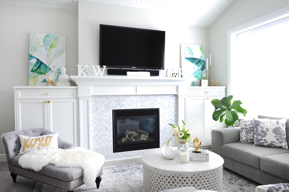
Not only a knockout arrangement of symmetry, the living room’s fireplace surrounds conceal audio and video equipment. “I wanted to create an architectural feature and hide all of the AV accessories,” says Huong. “These custom built-in cabinets do that and reflect the millwork details in the adjacent kitchen for cohesion.” The fireplace’s herringbone marble tiles also add a soft textural element without overwhelming the space.
Talking Point
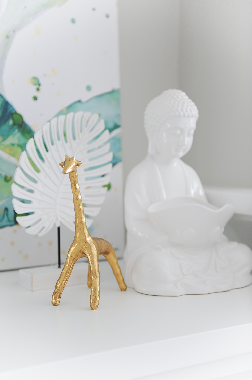
“Accessories should be quirky and start a conversation,” says Huong of the mantel vignette. “The gold giraffe is playful, and the Buddha is a symbolic reminder to find your Zen when life gets too hectic.” Both pieces are from The Spotted Frog.

Good Golly
This is Molly, the homeowners’ first “baby” before their children were born. She is a mixed breed but clearly doesn’t have mixed feelings about settling in on the plush faux fur throw by the fire.
Grey Matter
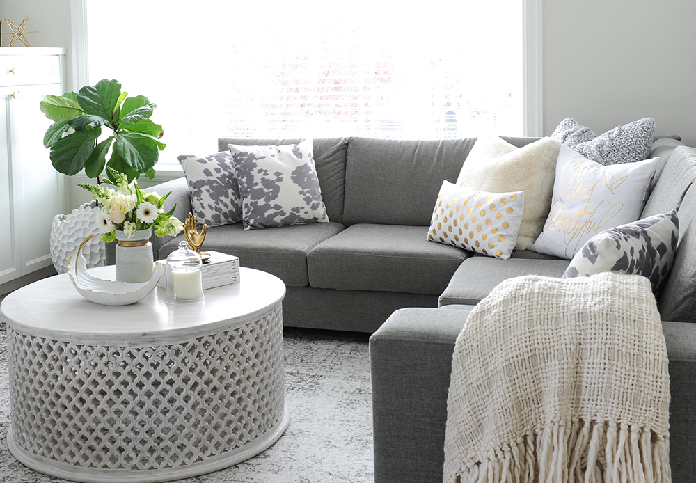
Huong chose a mid-tone grey velvet for the living’s room sectional, which was custom-made by BC-based company Van Gogh Designs. “This is the main seating area, so the grey will hide dirt. The sofa is also polyester, which can be spot-cleaned easily yet the velvet keeps it cozy.”
Cushy Job
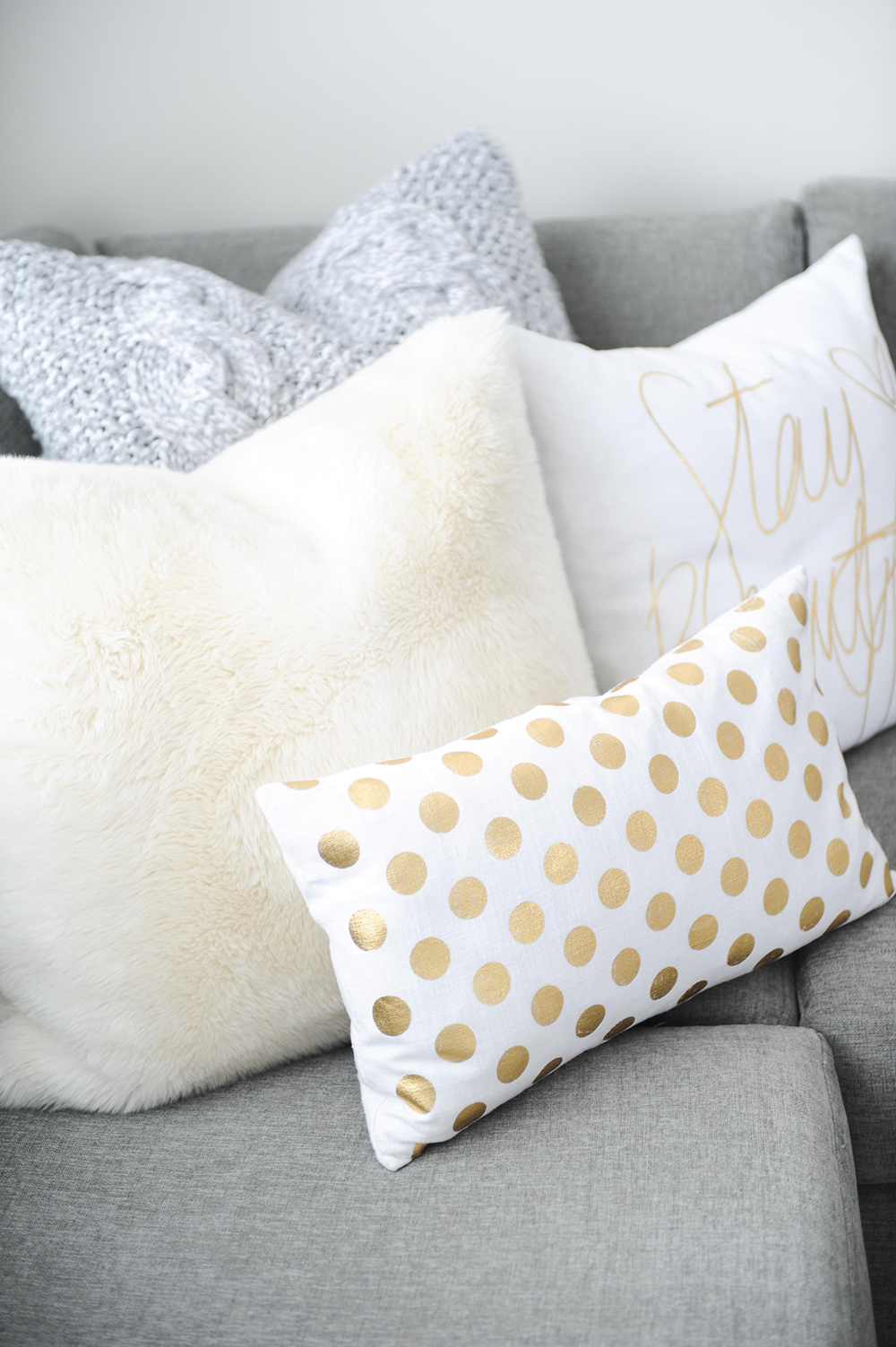
“I am a toss cushion addict!” says Huong. “I love mixing different textures, patterns and colours.” Here, faux fur and a plush knit are tempered with the whimsy of white and gold.
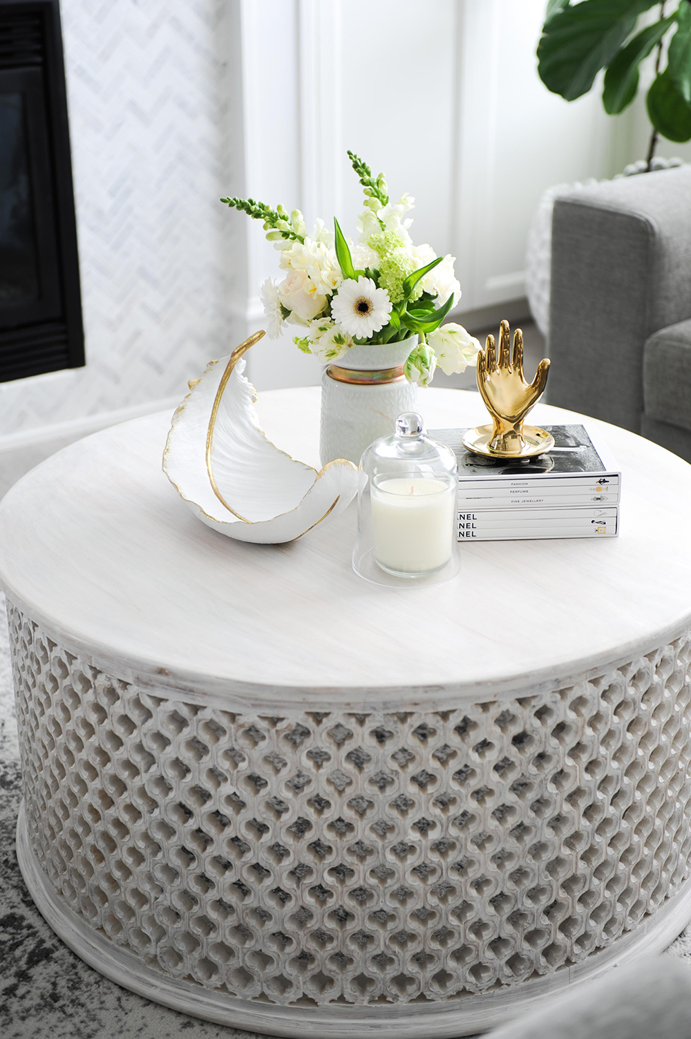
Base Note
Huong chose a round Noor coffee table as a foil to the living room’s sectional and straight lines. It’s crafted from solid mahogany and has a hand-carved, delicate fretwork base that adds texture and interest. The table was also whitewashed for a pretty finish, and the solid wood will stand up to the wear-and-tear of little ones.
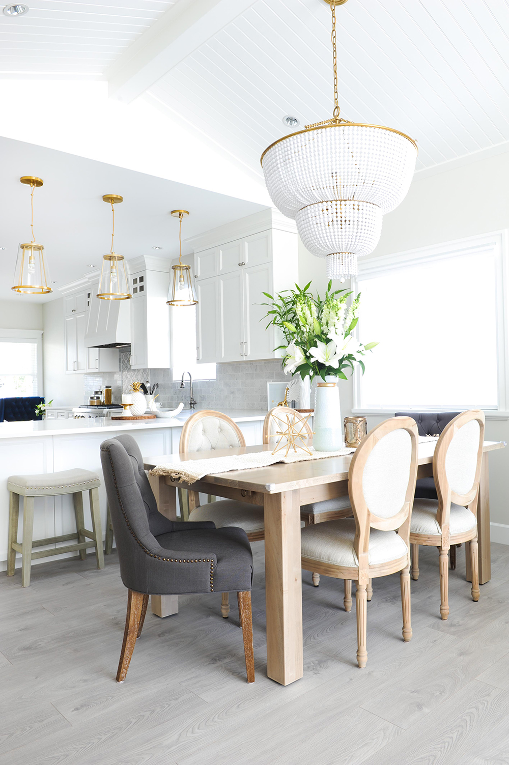
Seating Plan
The open-concept floor plan positions the kitchen peninsula beside the formal dining area. “There isn’t much space between these two spots, so I sourced backless compact stools that would efficiently tuck beneath the counter here.” We love that Huong didn’t hesitate to modify them. “They were originally bar height, and I had the legs cut to proper counter height.”
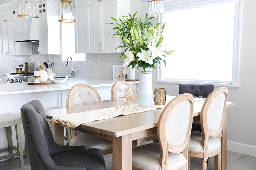
In the Mix
Formal French vintage-inspired chairs are casually tempered by the solid maple dining table, a custom piece that was made locally. Tabletop accessories carry through the theme of gold tones, especially those of the Crate and Barrel pendant lights over the peninsula.
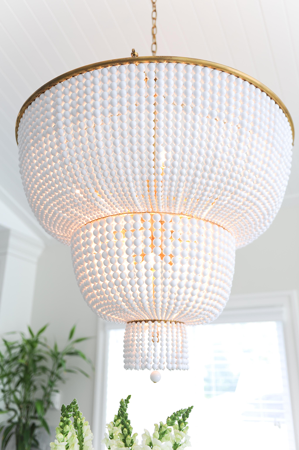
Cascading Beauty
“This gorgeous chandelier was truly the jumping-off point for the whole project,” says Huong. “We wanted an unexpected and jaw-dropping fixture that could hold its own in the open-concept space without looking to heavy.” With its cascading glass beads set on an antique frame, this two-tier chandelier from The Cross Decor & Design certainly fits the bill.
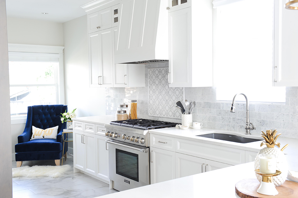
High Low
The kitchen floor appears to be marble tile, but it’s actually a much more budget-friendly material: porcelain. That savings allowed for the backsplash splurge of Bianco Carrara subway tiles. The stainless steel range picks up on the veining in both surfaces for sleek continuity.
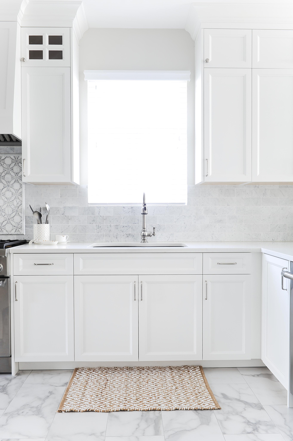
Shaker It Up
The custom-made kitchen cabinetry sports a classic Shaker silhouette with bevelled-inset door profiles. They also feature soft-closing hinges. Huong had the wood-tone cabinets painted Chantilly Lace by Benjamin Moore.
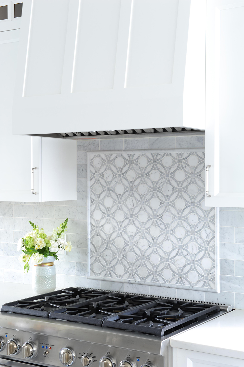
On the Range
An intricate detail highlights the range in the all-white kitchen. “This is a Bianco Carrara marble waterjet-cut mosaic framed with corresponding marble pencil trim,” says Huong. It distinguishes the contemporary kitchen with a hint of old-world luxury.
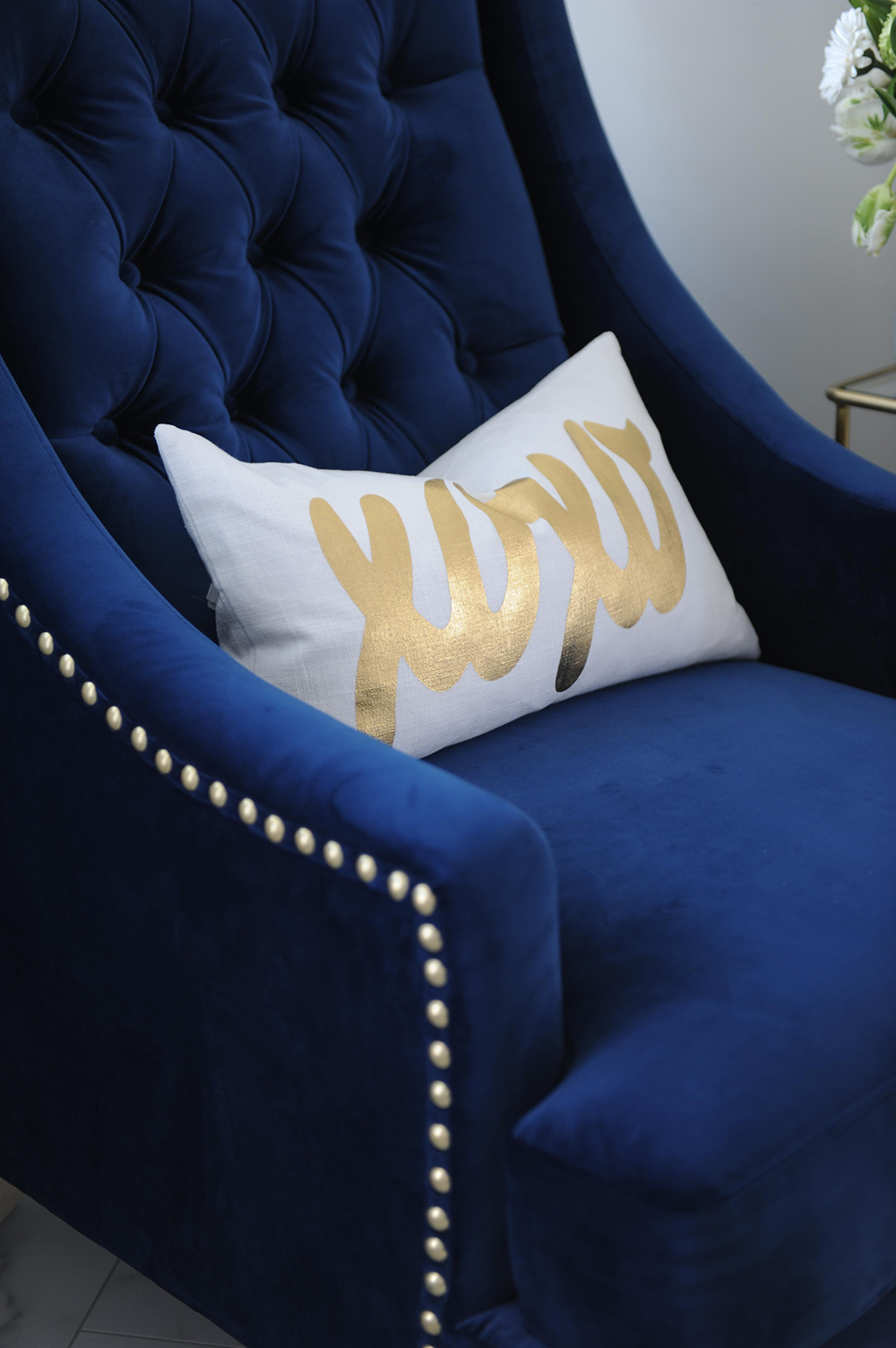
Quiet Time
“The wife wanted a quiet space to read a book or have a glass of wine,” says Huong, and this glam seat in a corner of the kitchen is her designated place to do just that. “The wing-backed royal-blue chair is a cheeky nod to the queen of the house.”
Go Grey
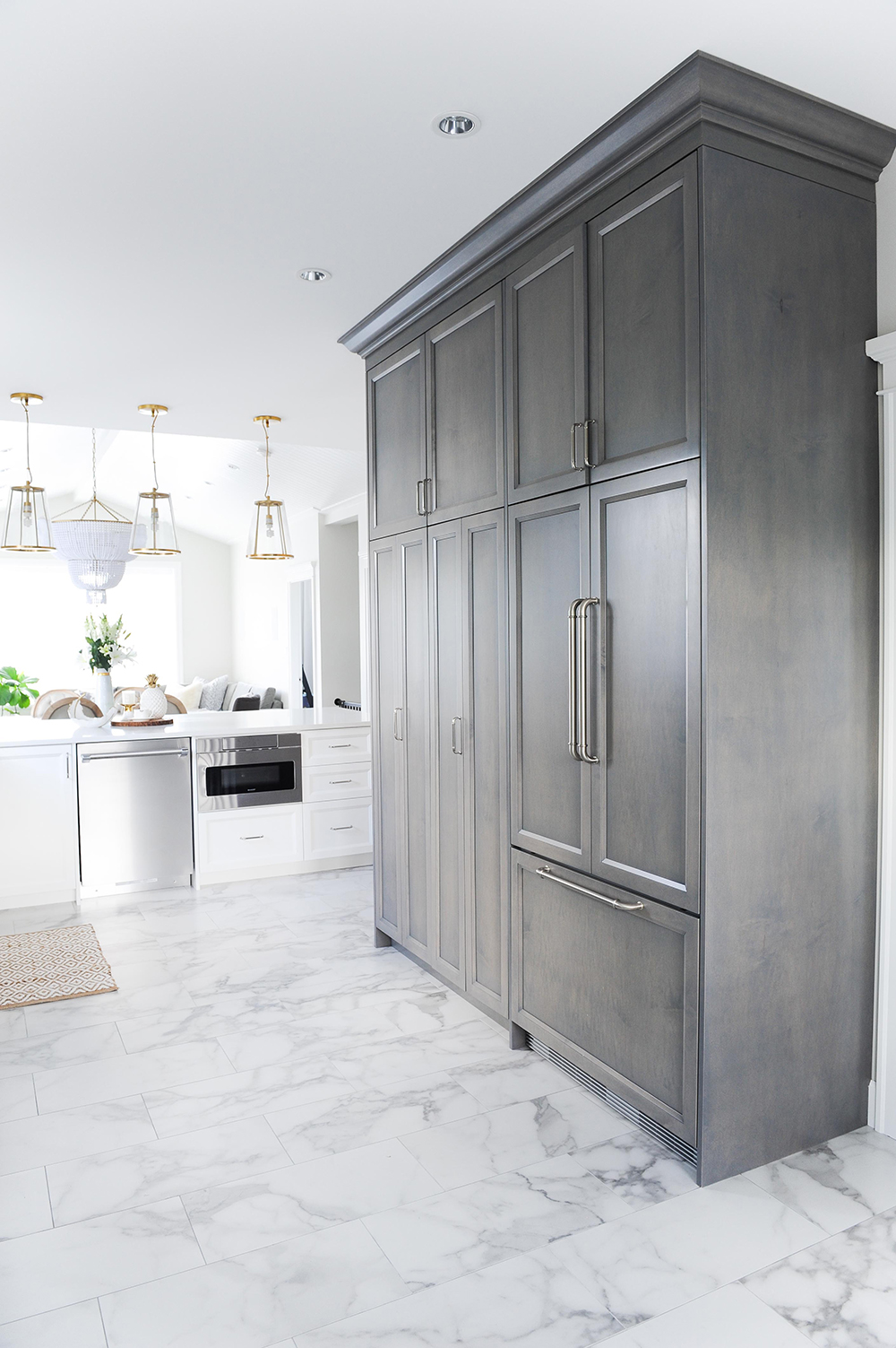
“The homeowners wanted to give the predominantly white kitchen a modern twist, so I stained this portion of cabinetry grey,” says Huong. It nicely reflects the veining of the floor beneath it, as well as the grey laminate flooring in the adjacent living area. The cabinetry was custom-made by Strokes Renovations. “The left side is a larder, with doors that can fold all the way back to access a secondary work top. The right side is an integrated fridge/freezer.”
All Access
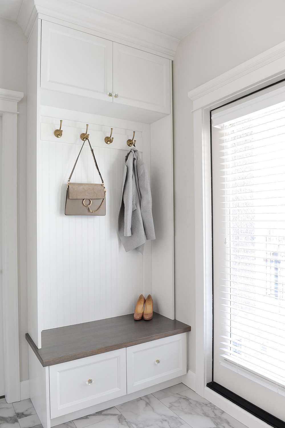
The back of the kitchen didn’t afford space for a separate mudroom, so Huong ingeniously designed a compact version of one. Closed storage hides seasonal items, and hooks keep everyday clothing close at hand. “I painted the beadboard backing the same shade as the kitchen cabinets for continuity and stained the seat grey to hide wear and tear.” The gold hooks are a budget find from Lee Valley Tools.
Oncoming Graphic
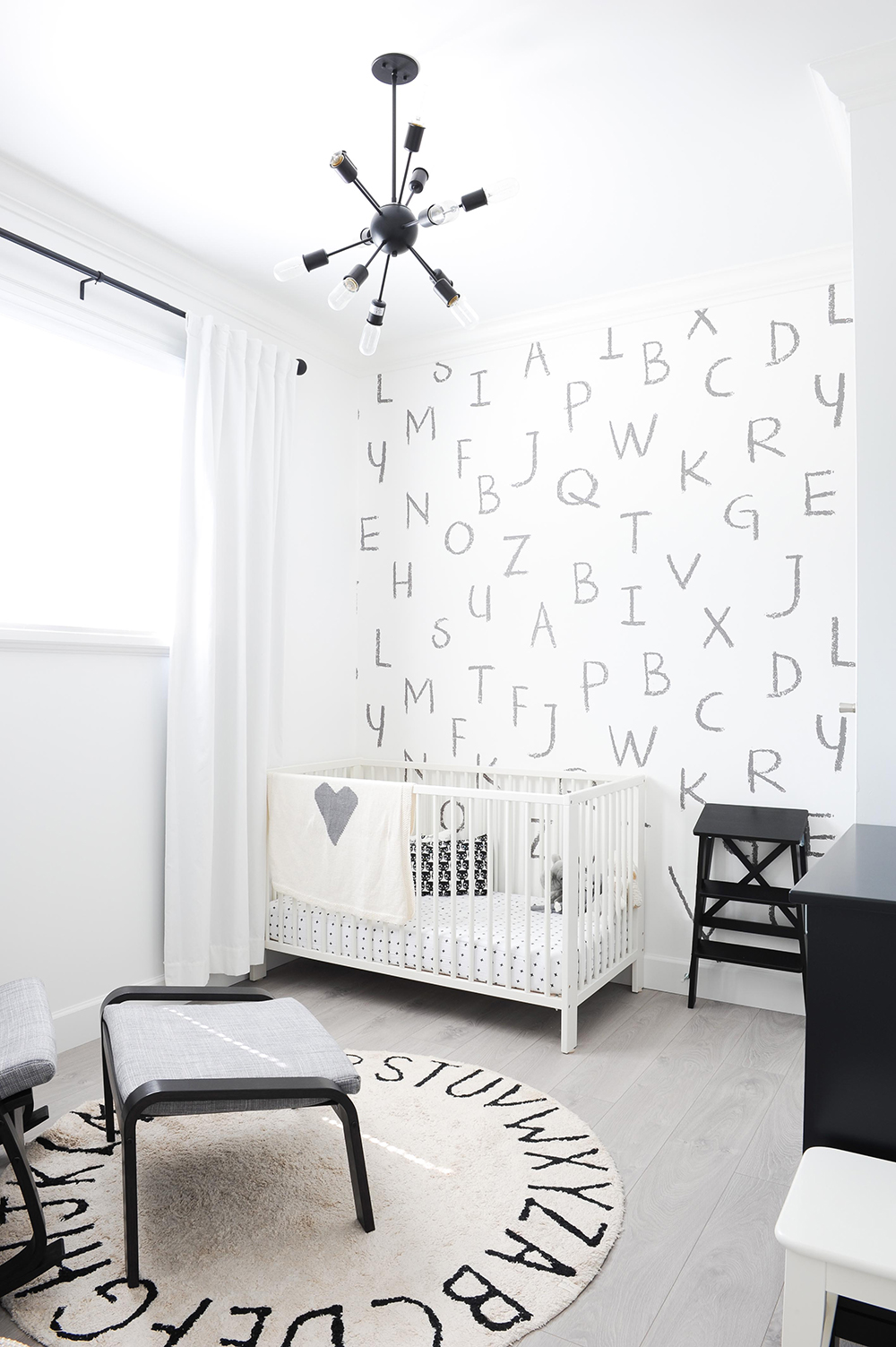
“Monochromatic magic” is how Huong Nguyen describes this boy’s nursery she designed. Colour-phobes who gravitate to a timeless black-and-white palette will especially love this ABC print. Add a black sputnik light and coordinating accessories, and you’re in business. Here’s the grand tour of this West Coast family home.
Cool for Cats
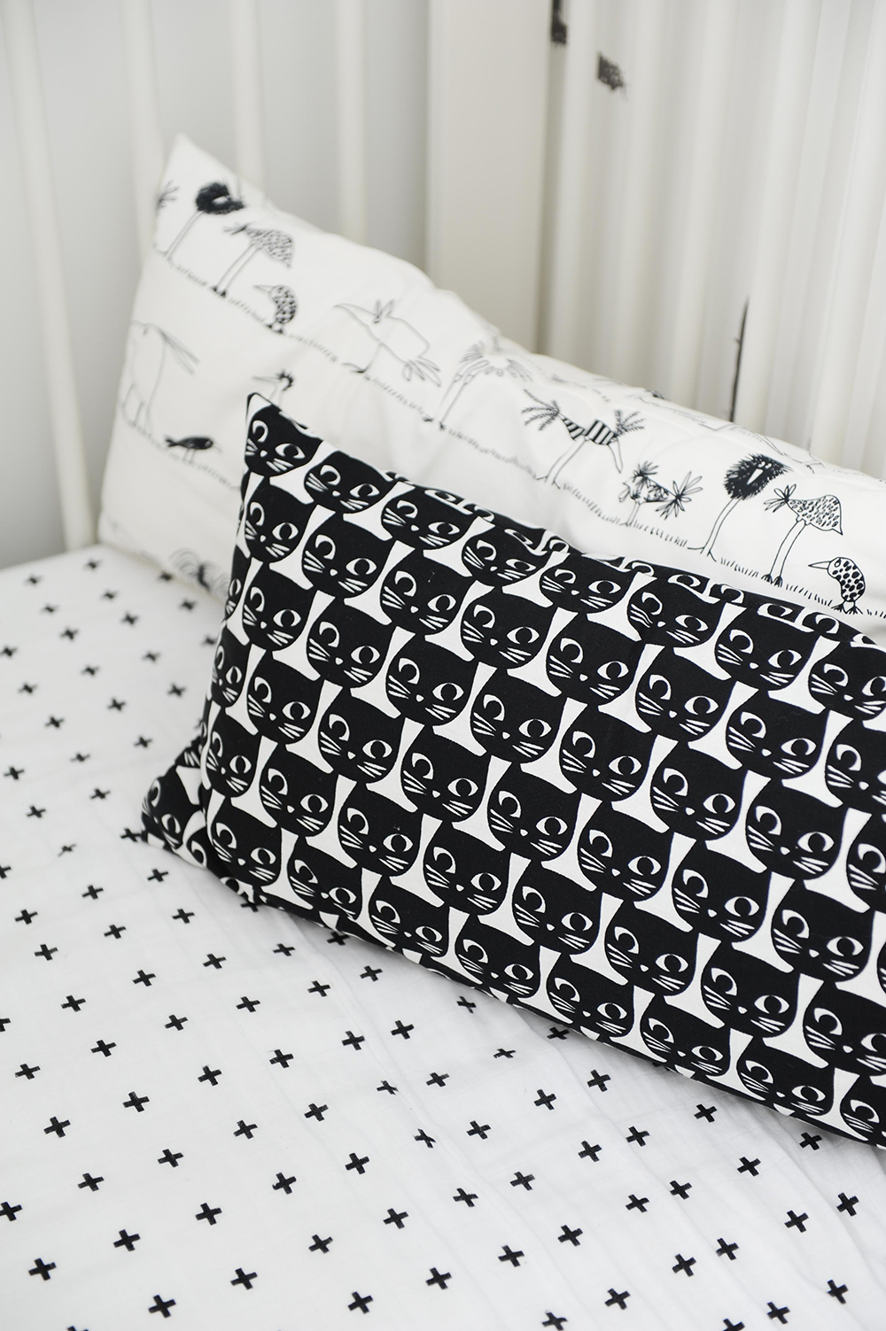
The grown-up and graphic appeal of the classic black and white colour scheme is given a dose of child-like fun with whimsically printed bedding and cushions.
Bedtime Reading
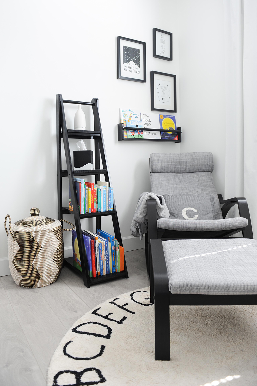
This corner of the nursery – a preferred spot for reading – features a comfy IKEA armchair and footstool. The bright book spines and the organic appeal of the woven basket work colour and texture into the monochromatic space. The ladder-style bookshelf was built by dad specifically for his little boy’s nursery.
Shelf Help
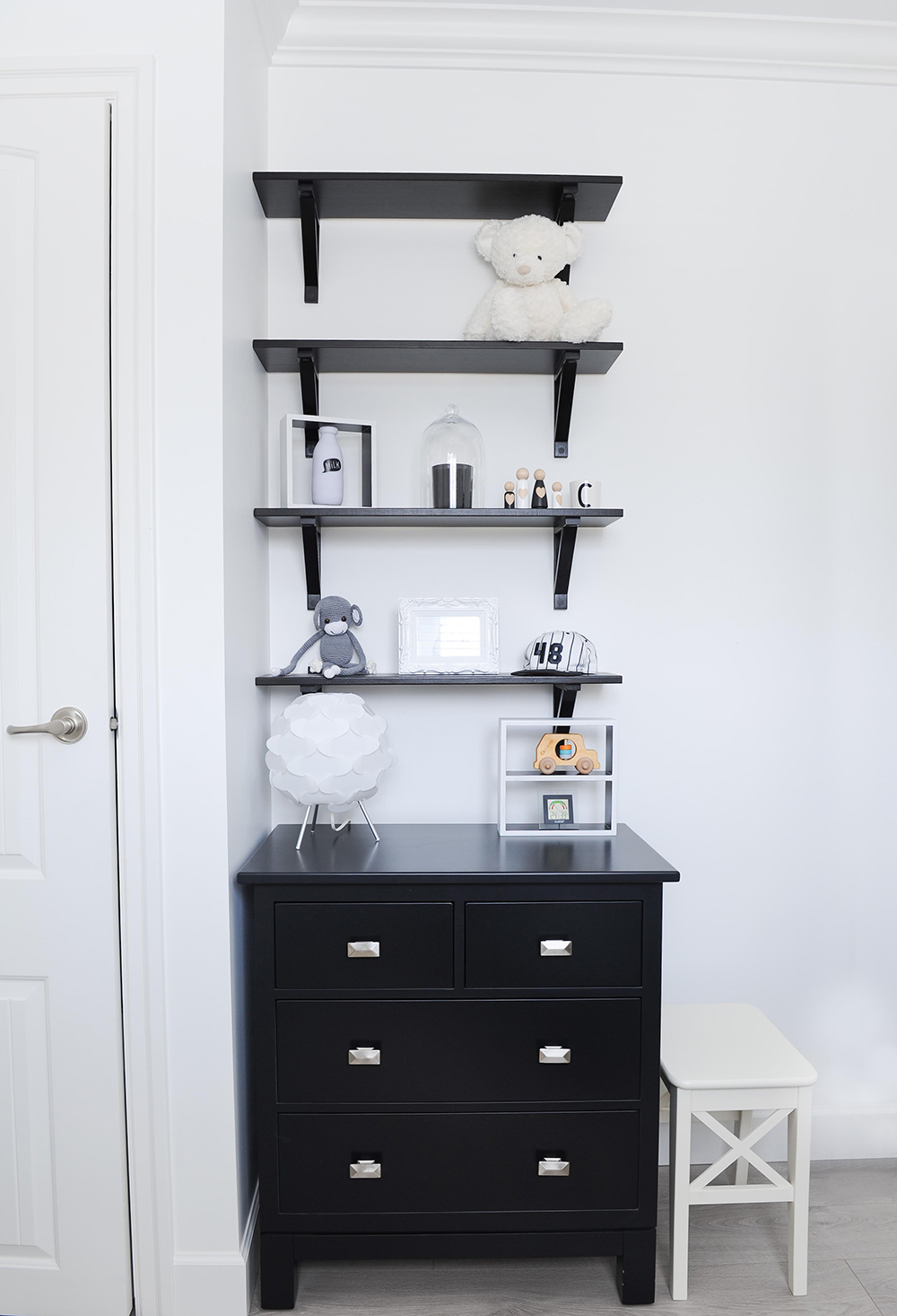
Sleek black wall-mounted shelves from a big-box store sit above a custom-made solid maple dresser from The Spotted Frog. The sputnick lamp adds a bit of fun, while the toys and baseball cap reinforce that this is a little boy’s room.
Sugar and Spice
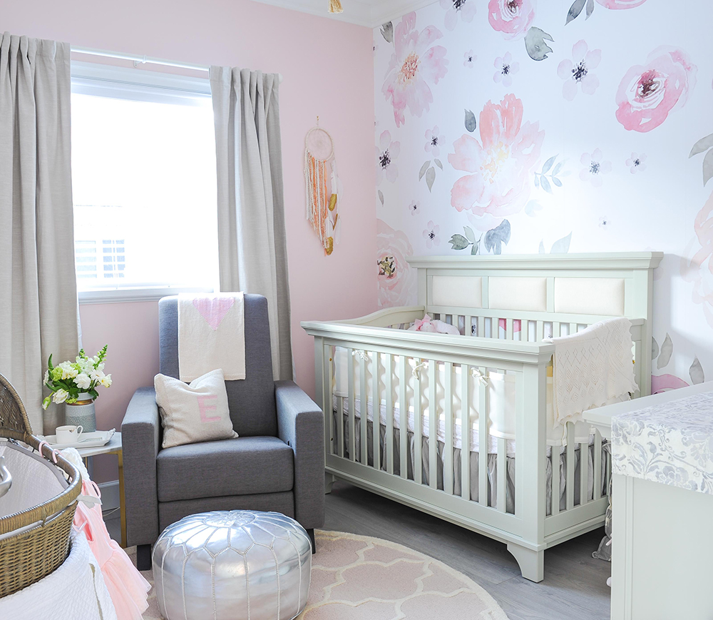
Grey and pink are a no-fail combo, especially when they appear as blossoms in this pretty nursery in Burnaby, BC. A matching dream-catcher, the monogrammed pillow and silver pouffe make for nice eye candy. Tour more of the glam West Coast home here, designed by Huong Nguyen of The Spotted Frog.
The Bead Goes On
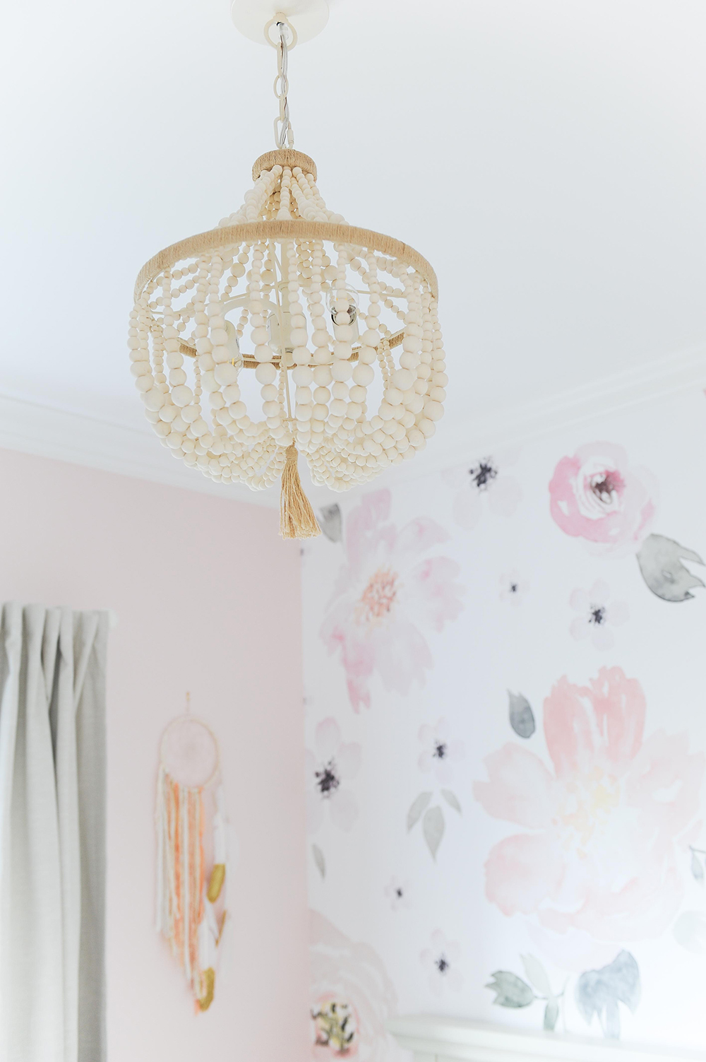
A beaded chandelier from Pottery Barn Kids is so textured and interesting it almost acts as a mobile over the crib. Its cascading form is echoed in the pretty dreamcatcher on the wall.
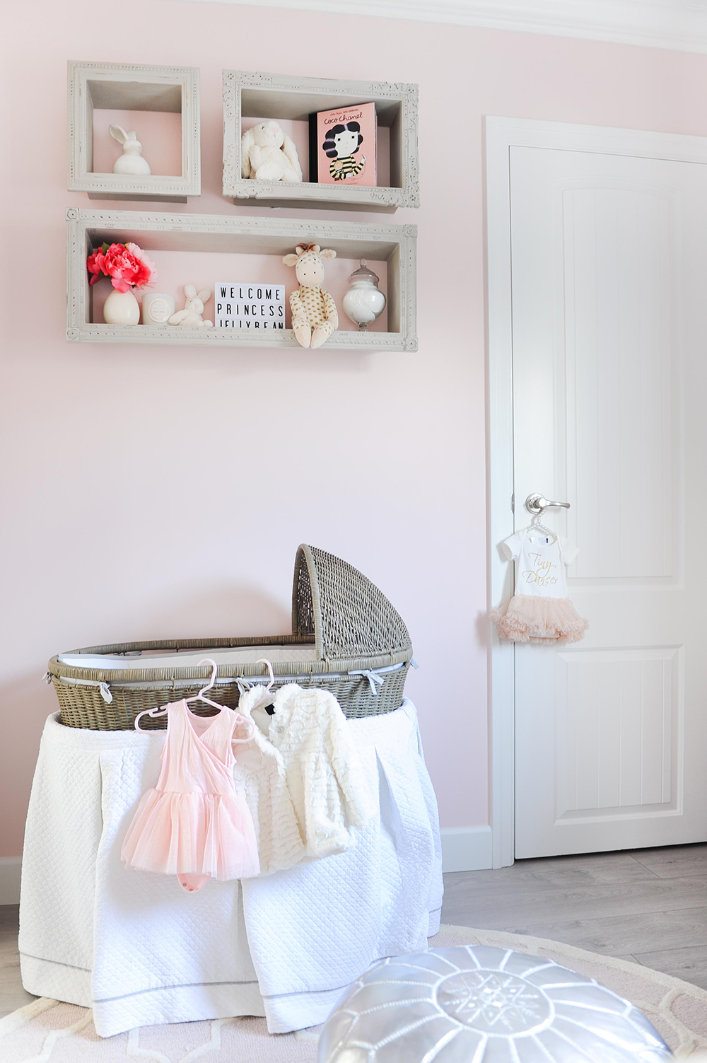
Pretty in Pink
The traditional form of the French vintage-style crib is tempered by this woven bassinet from Restoration Hardware. Functional, it also acts as a display for pretty pink dresses and outfits of the day. The wall colour is April Pink by Benjamin Moore.
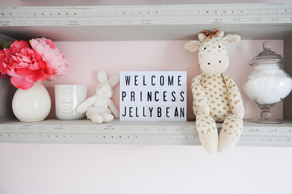
The Royal Treatment
These hand-carved display shelves corral carefully chosen accessories. “Each toy was thoughtfully hand-selected by mom,” says Huong. “There is a beautiful, private story behind each of them.”
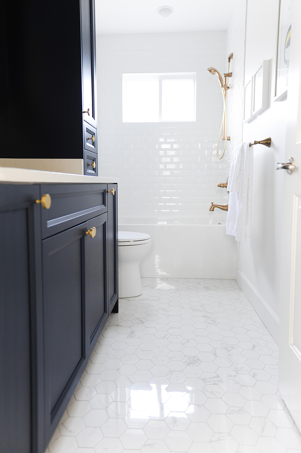
Bath Time
The kids’ bathroom is a showcase of style and functionality. With splashy bath times in mind, Huong lined the tub and shower with subway tiles that have bevelled edges for a soft look and feel. They extend to the ceiling for a waterproof finish.
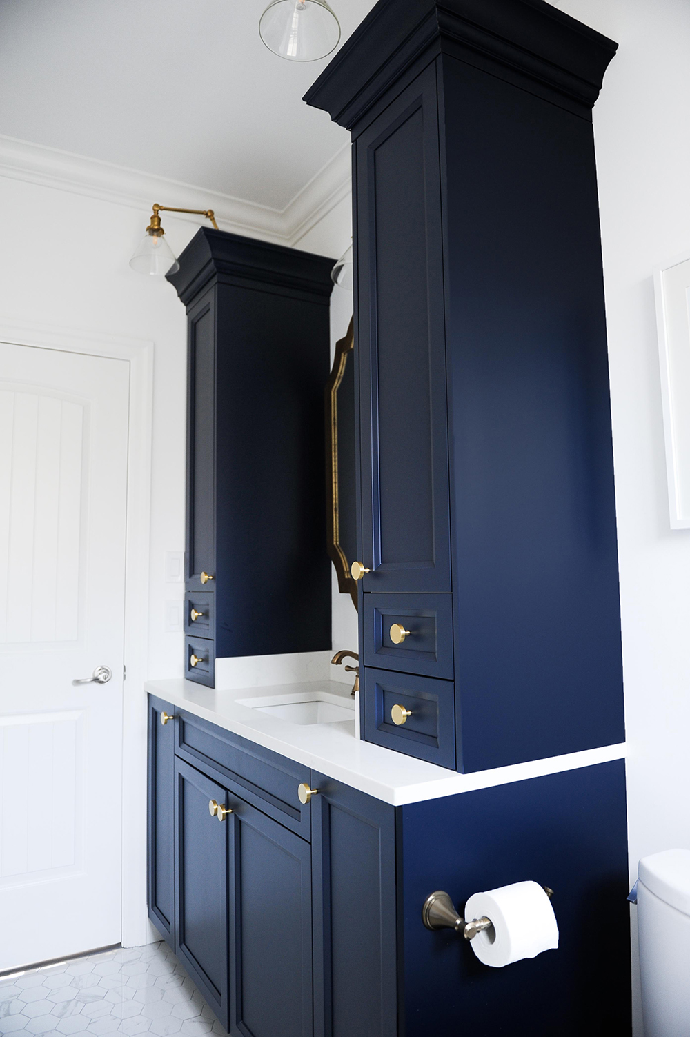
In the Navy
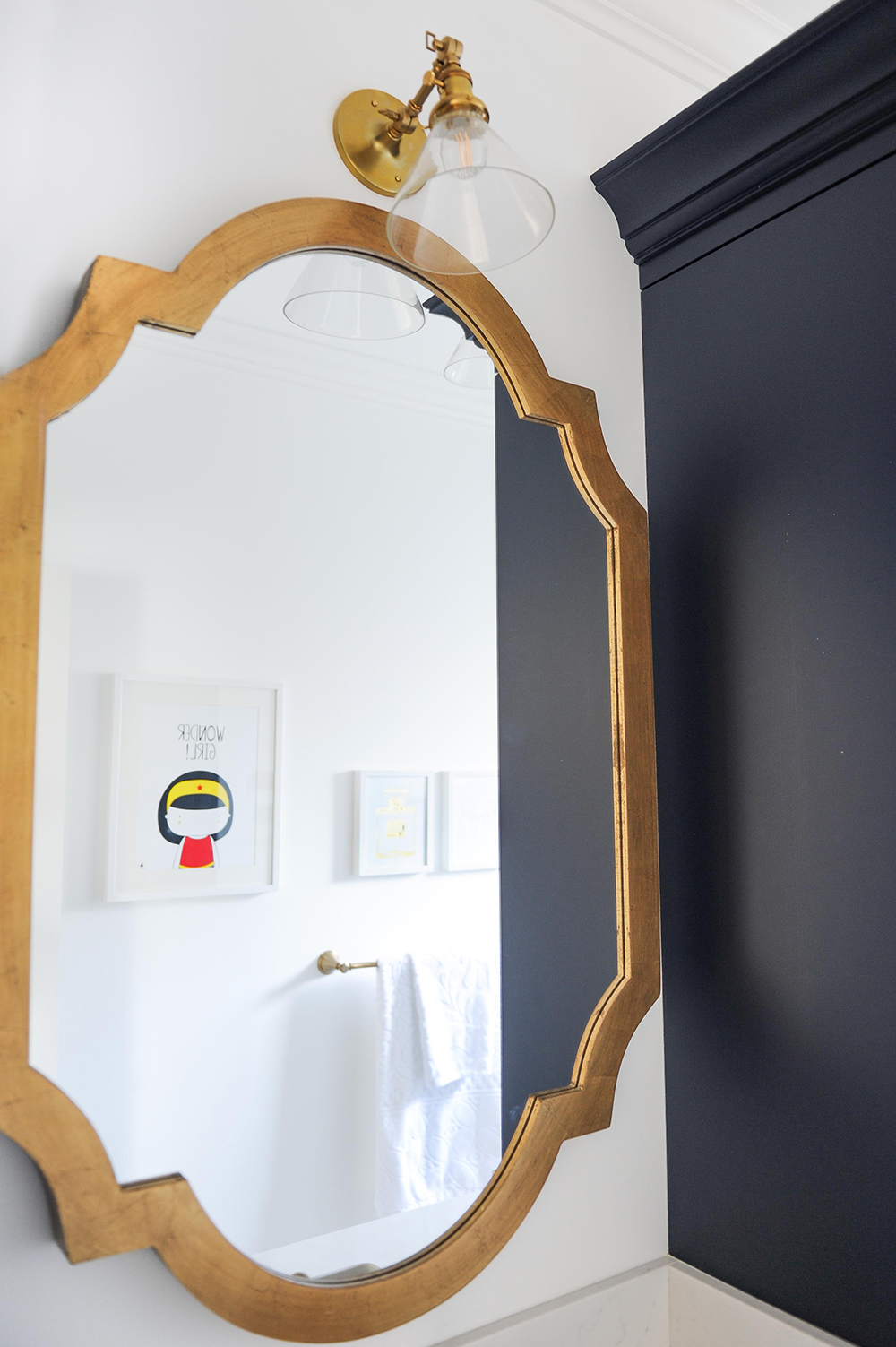
The custom cabinetry in the kids’ bathroom is painted a dramatic shade of blue. “I wanted a bold and dynamic bathroom for the little ones,” says Huong. “I carried through the main scheme of white and light grey but amplified it with navy blue and gold hardware.”
Golden Touch
This gold-framed mirror is a welcome departure from the expected flat mirror panel. Its interesting shape breaks up the lines of the cabinetry and the colour is in snazzy unison with the gold hardware. Graphic artwork, seen in the reflection, reinforces this is a kids’ space.
Isn’t It Romantic?
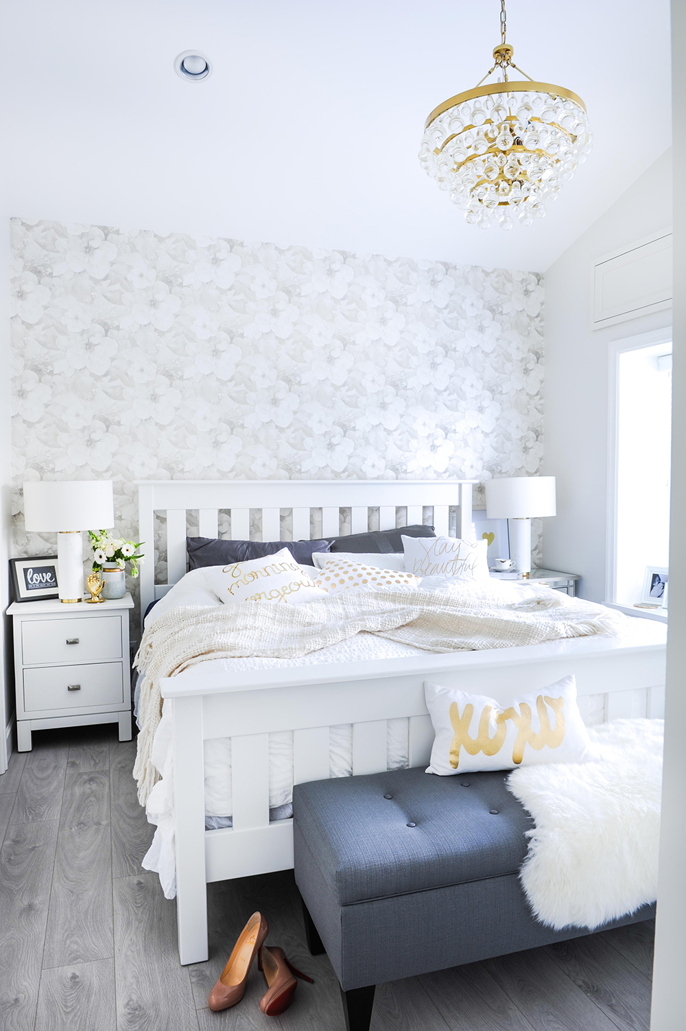
“In the master bedroom, I replicated the home’s colour palette of white and grey accented with gold, but with an extra emphasis on romance,” says Huong. “The vintage-inspired floral wallpaper by Crown Wallpaper beautifully set the tone for this, and the brass Robert Abbey chandelier adds sparkle and glamour.”
White Out
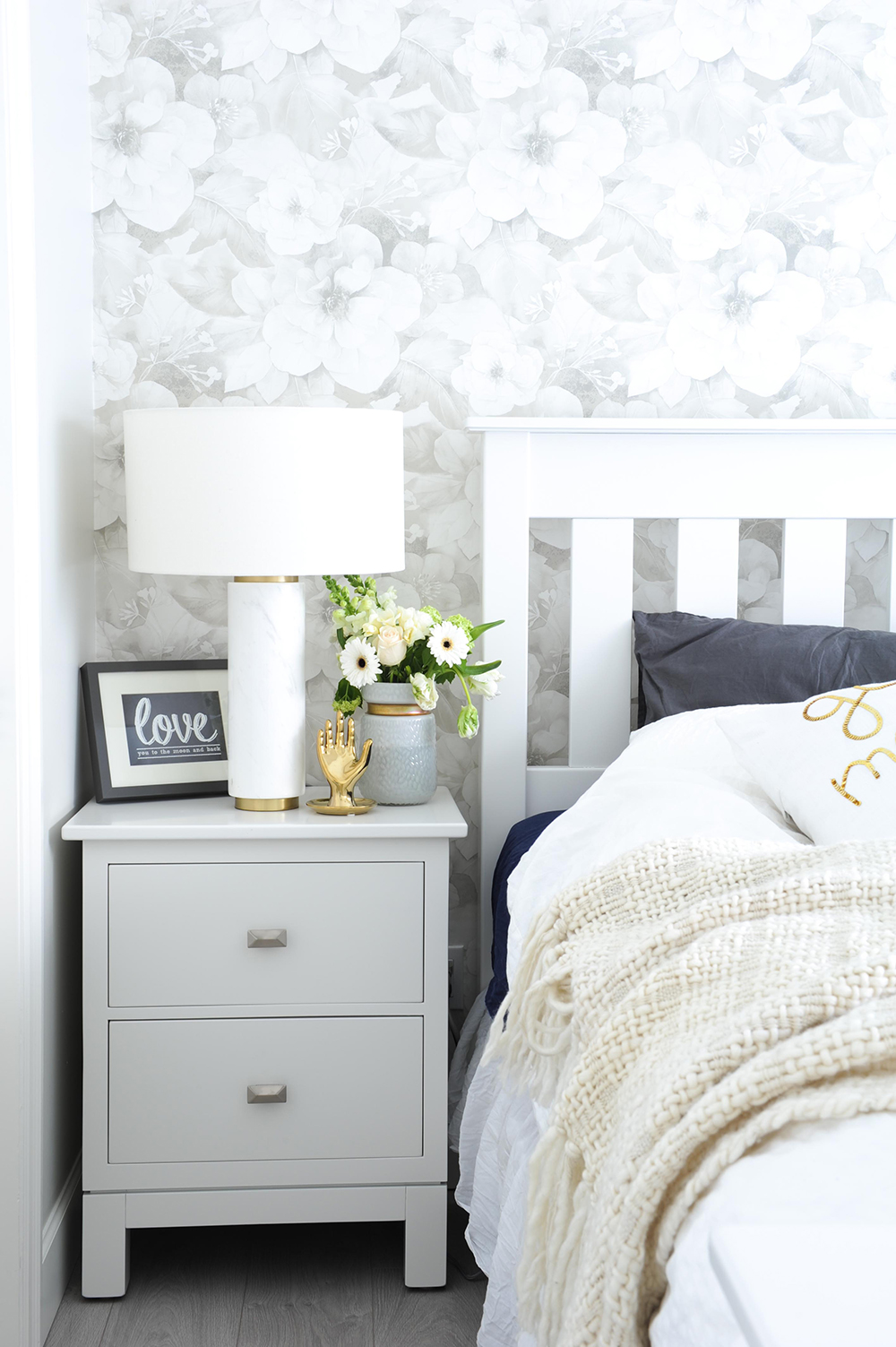
The customized maple nightstands and Mission-style headboard were originally stained in dark espresso. “They belonged to the owners before the renovation,” says Huong. “We kept them but gave them a new lease with a coat of crisp white paint.” The marble table lamps with subtle brass bands are from West Elm.
Soft Touch
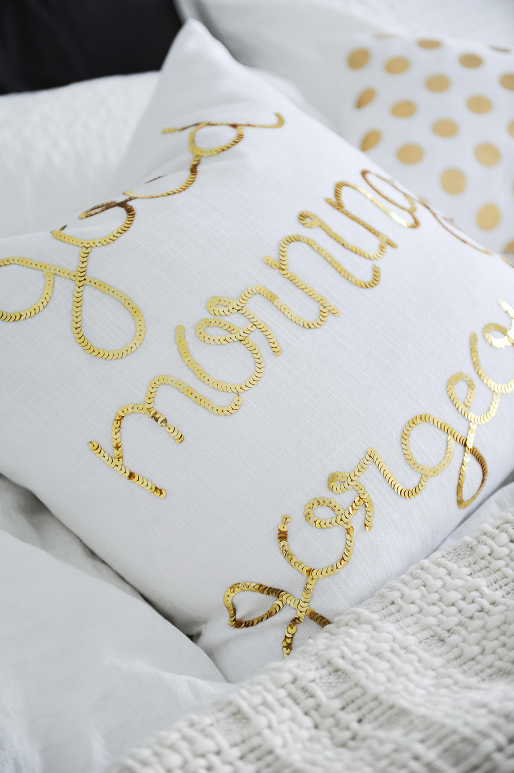
To keep the wallpaper a focal point, Huong chose crisp white bedding that wouldn’t detract from the blooms, then layered in soft, fun accents like these cushions. The gold adds a fresh glint and complements the other brass touches throughout the room.
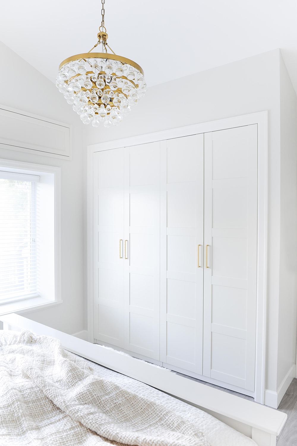
Framework
“The closet is from a big-box store,” says Huong. “It was a budget-friendly solution, and I had my contractors trim it and frame it in for a high-end look.”
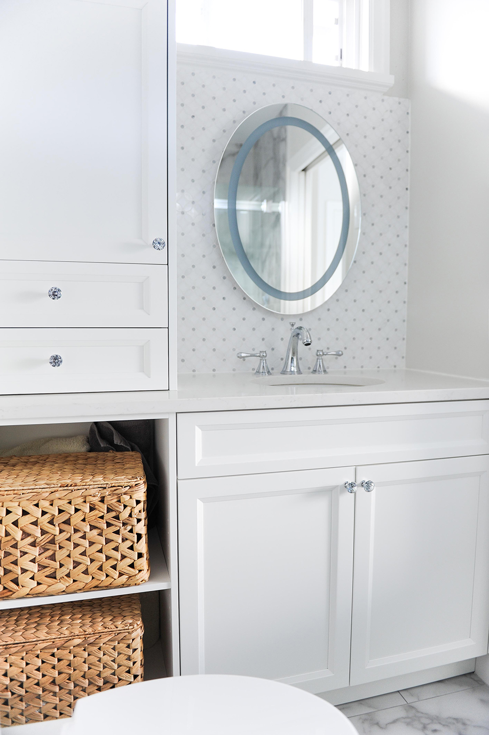
Space Race
Huong admits that the master ensuite posed a design challenge. “It’s an extremely small space and there are elements such as plumbing, electrical and windows that we couldn’t move due to budget constraints.” Her clients also wanted maximum storage. “They were willing to forgo extra countertop space, so I built this custom cabinetry unit instead.”
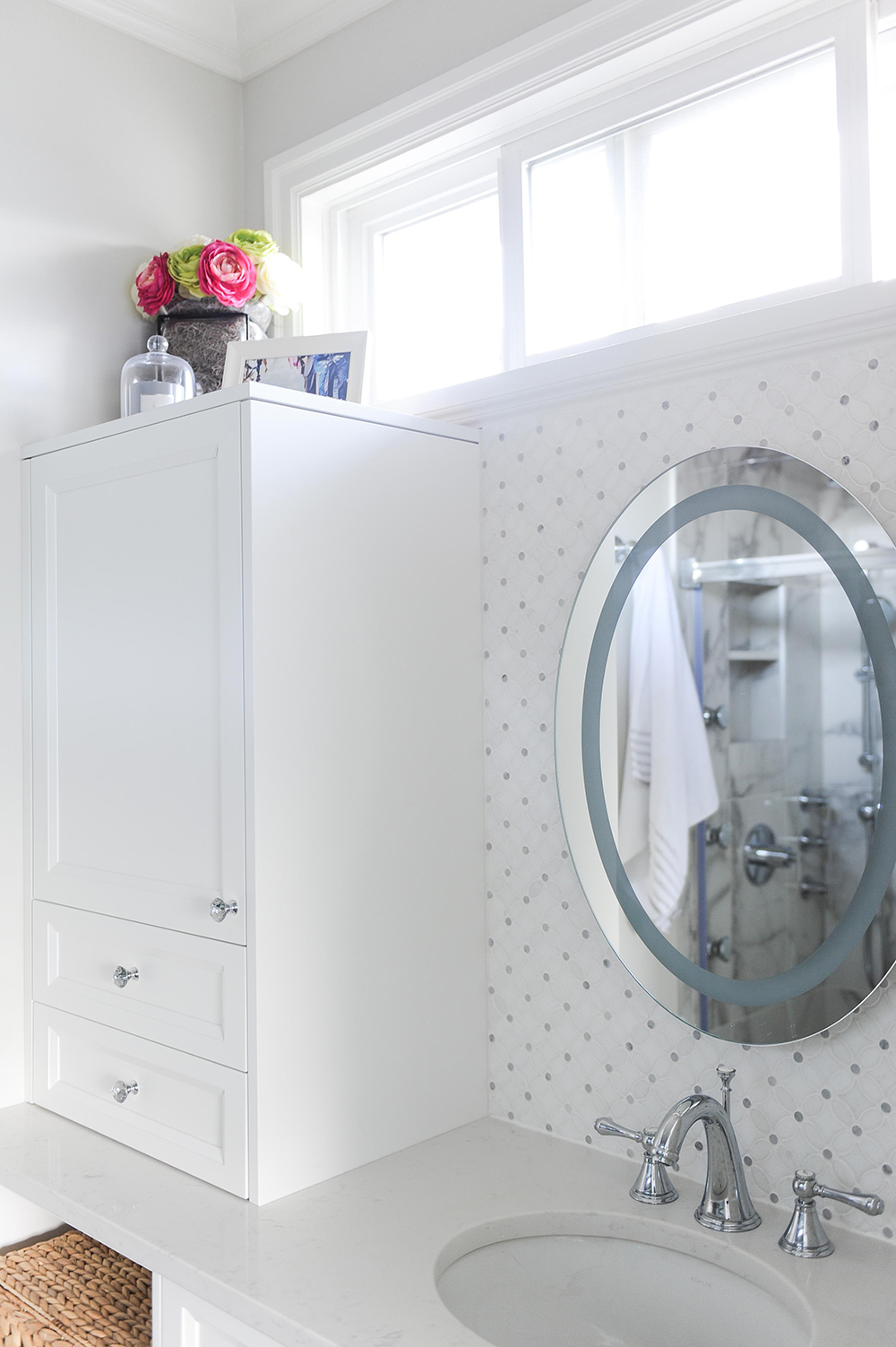
Bright Idea
The lack of space for sconces or hanging pendants did not deter Huong. “This LED mirror was the perfect solution.” It hangs on a backdrop of flower-patterned Bianco Carrara marble tiles. A framed photo, flowers and candle sit above the high cabinet to give it, like the rest of the home, a thoughtfully finished look.
HGTV your inbox.
By clicking "SIGN UP” you agree to receive emails from HGTV and accept Corus' Terms of Use and Corus' Privacy Policy.


