When Mina Starsiak Hawk and her mom, Karen E Laine, see potential in a property, they don’t hold anything back – and the results speak for themselves. This Old Southside, Indianapolis townhouse was run-down, closed off and overflowing with abandoned junk, but it had solid bones. By opening up the layout and embracing a comfy, city-inspired design theme, the Good Bones team totally transformed the 1,100-square-foot townhome into a vibrant New York-inspired dream home.
Watch Good Bones Wednesdays at 10PM e/p on HGTV. Stream HGTV anytime with the Global TV App and on STACKTV. HGTV is available through all major TV service providers.
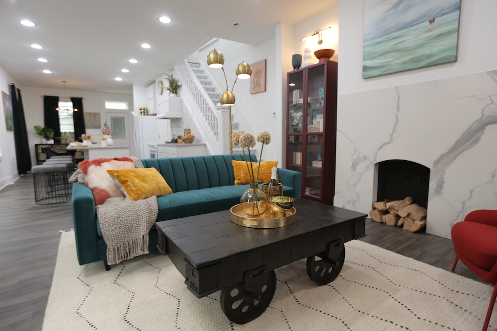
Opening Things Up
Purchased for $30,000, this two-storey renovation had a few major hurdles to overcome. Inside, the layout lacked flow – so Mina swapped the kitchen and dining room and opened up the claustrophobic walls to create an open-concept main floor. Outside, the run-down space lacked curb appeal and required a serious refresh. Overall, the team needed to find ways to bring big-city style into a relatively small space – while keeping the renovation costs (which totalled $160,000) under control.
Related: How to Create Your Own Budget-Friendly Home Reno – Without a Contractor
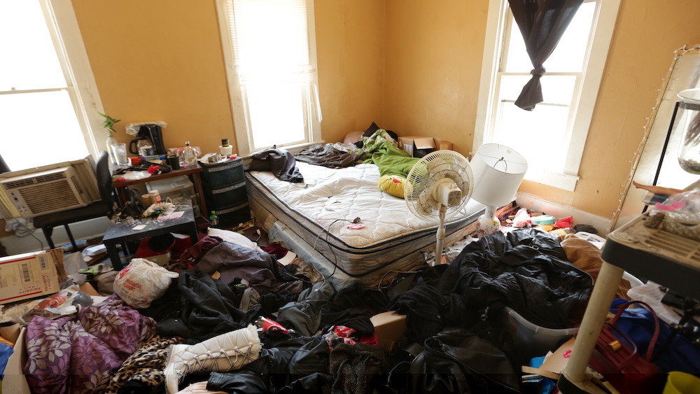
Beyond the Mess
Another issue at the outset was seeing past the rubble in order to coax out the home’s true potential. When they first purchased the three-bedroom, one-bathroom property, it was packed with junk that had been left behind by previous tenants.
Related: 10 Clean and Tidy Homes That Will Inspire You to Start Cleaning
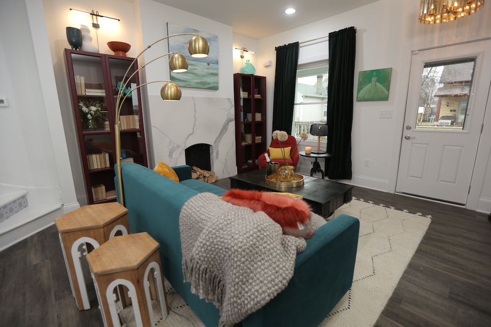
Modern Heat
The centrepiece of the newly open-concept living room was the statement-making fireplace, an original detail that the team gave a dramatic makeover with a matte-finish, faux-marble porcelain surround (which Mina had made from an inexpensive remnant).
Related: The Good Bones Team Create a Cozy Home With Beach-Chic Vibes
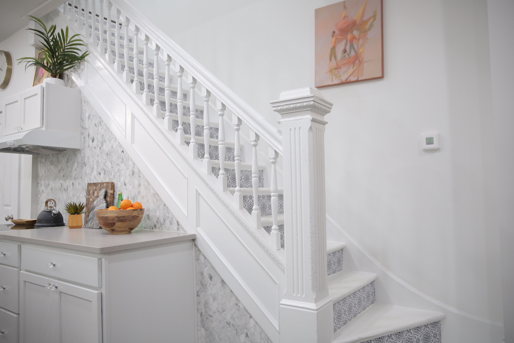
Stepping up the Style Factor
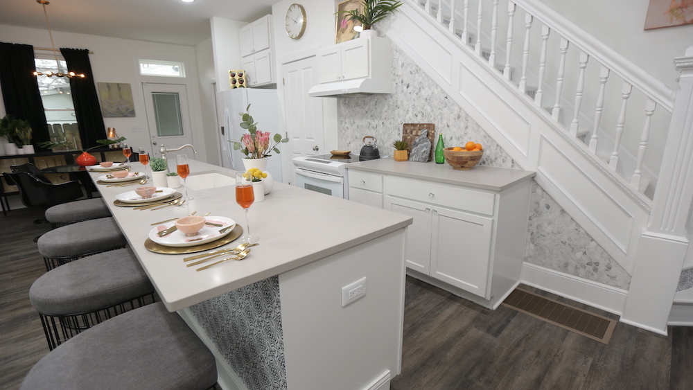
The home’s existing staircase was in good condition and held a lot of character, but it didn’t suit the revamped look of the space. To make the look cohesive with the kitchen, the team painted the staircase white and added peel-and-stick vinyl wallpaper to the risers for a fun and unexpectedly chic twist.
Related: Good Bones’ Mother-Daughter Duo Uncover Charm and Value in Rundown Bungalow
Playful Pattern
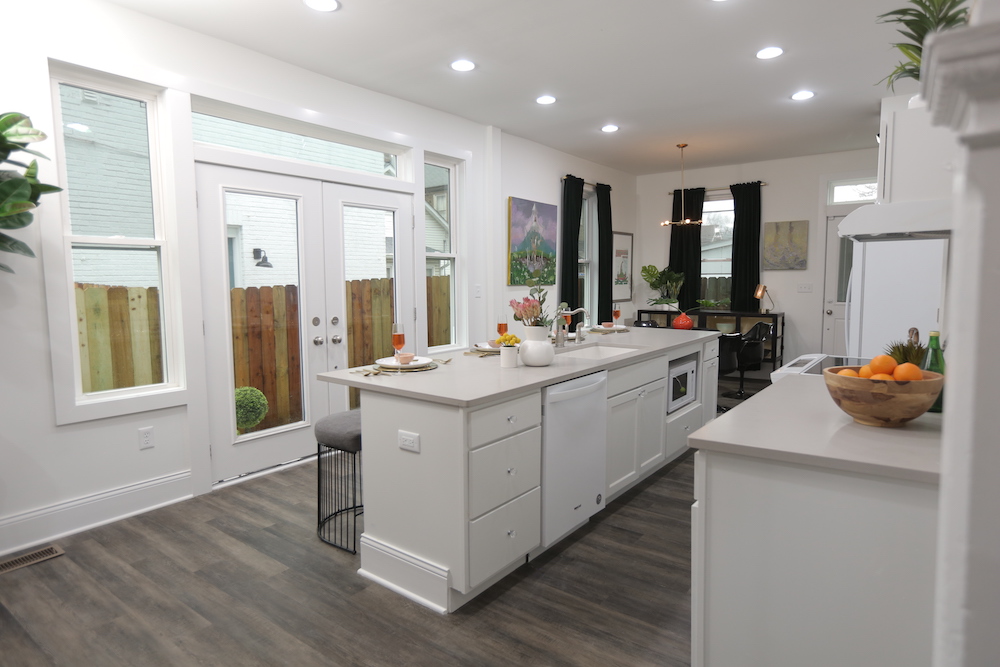
The newly relocated kitchen completely captured the eclectic-meets-elegant tone of the renovation, with bright white cabinets, pops of pattern and a luxe curved tile backsplash that tied together beautifully with the look of the living room fireplace. Concrete-look quartz countertops added an ultra-durable finish to the counter and huge 10-foot island – while also providing a pop of urban-inspired, funky edge.
Related: How to Update Your Kitchen Backsplash: Bryan Baeumler’s 8 Must-Know Tips
Indoor-Outdoor Flow
One of the reasons why Mina decided to go with a city theme for the home’s design was that it lacked a yard (like most New York city apartments), which she saw as a selling point for homeowners looking for a low-maintenance property. She didn’t want to totally eliminate outdoor living from the home, however, so the team added double French doors and a small, fenced-in outdoor area off the kitchen.
Related: Summer Staycation: The Coziest Patio Furniture Perfect for Small Spaces
Masterful Details
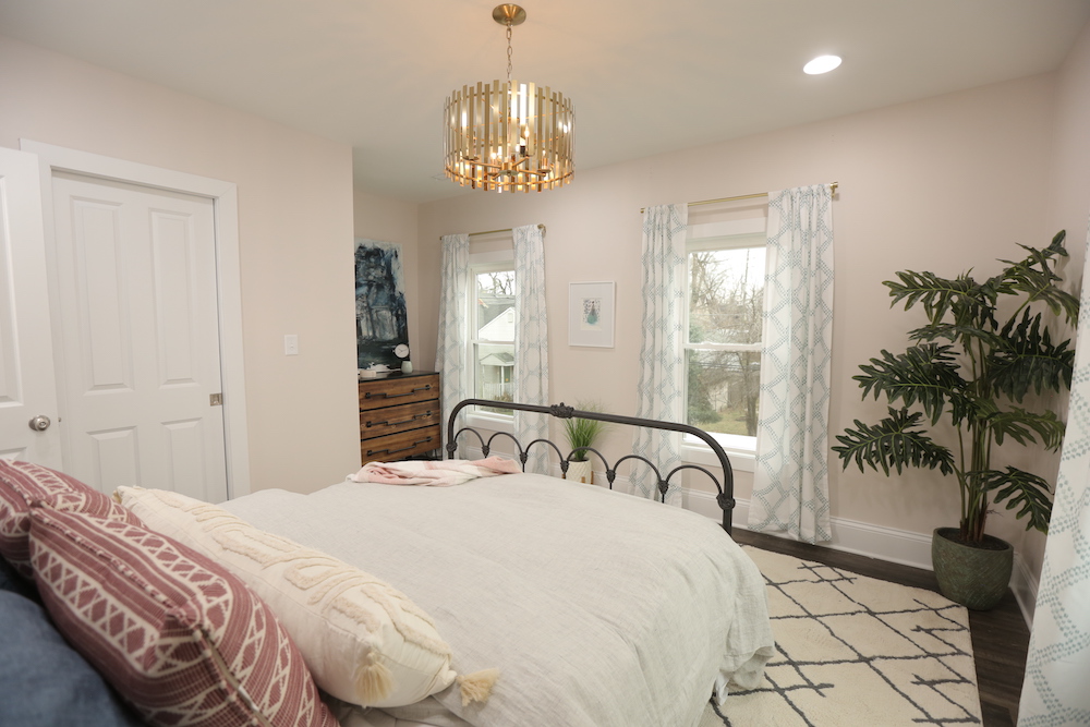
Upstairs, Mina reconfigured the small bedrooms in order to create a true master retreat – complete with space for a king-sized bed, lots of natural light and a brand-new ensuite bathroom.
Related: 18 Rejuvenating Zen Bedrooms That’ll Help You De-Stress
Spa-Like and Serene
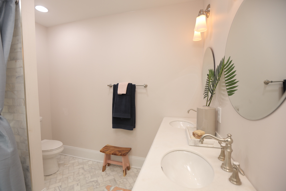
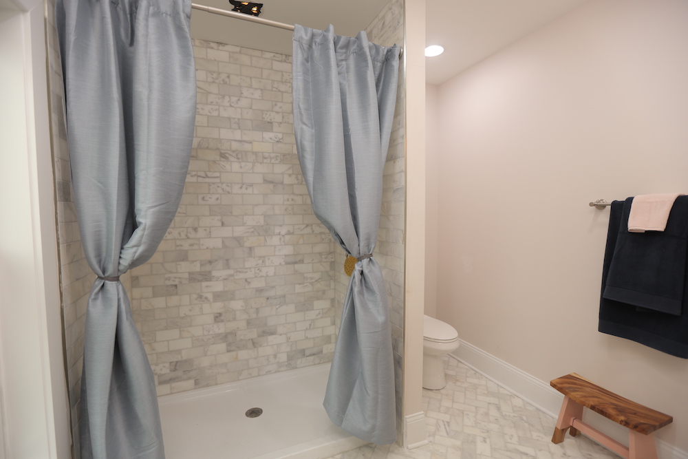
Sophisticated but still a touch eclectic, the new master bathroom offered layers of texture for a spa-like feel. On the bathroom floor, the tiles were laid in a herringbone pattern for a distinctive finish.
Related: Who Needs the Spa? 15 Bathroom Ideas That’ll Leave You in a State of Total Bliss
A Real Retreat
The bathroom’s spacious shower was walled with the same type of tile that was used on the floor, but in a more traditional subway pattern. The result? A unified look with lots of subtle visual interest.
The Bright Side
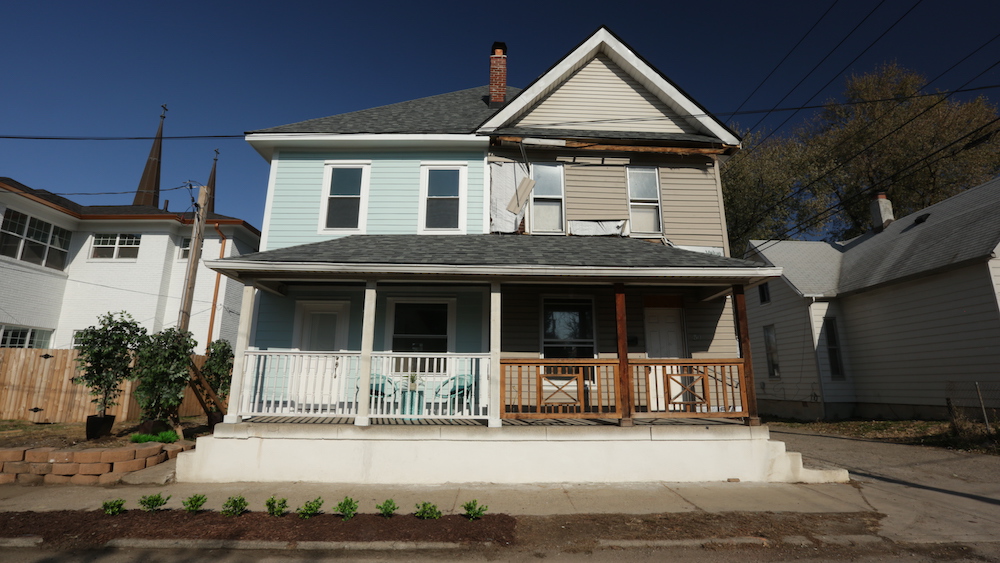
Outside, the contrast between the renovated side and the as-of-yet untouched side of the former duplex (which Mina also purchased for a future renovation) was stark. To amp up the curb appeal, the team refreshed the townhouse’s exterior with a fresh colour combination – a cheerful icy-blue paint finished with bright-white trim.
Related: 12 Ways to Ramp Up Curb Appeal with Nothing But Paint
HGTV your inbox.
By clicking "SIGN UP” you agree to receive emails from HGTV and accept Corus' Terms of Use and Corus' Privacy Policy.


