Chandra and Dan are busy parents of two, which meant that their kids (not to mention their extended family) had easily overtaken their home. Naturally, that also meant the space wasn’t being properly showcased, but thanks to a little renovation help from Jonathan and Drew Scott, an open-concept redesign and a brand new, high-end bathroom, this space eventually sold for enough that Chandra and Dan could move into their forever home.
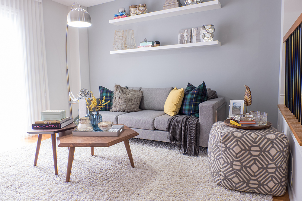
A Neutral, Livable Space
Before, Chandra had a very unique wallpaper adorning this wall. And while she loved the look, it wasn’t exactly appealing to a wide variety of buyers. So the brothers had the homeowners remove it, and they painted the wall a neutral grey colour instead. Then, floating shelves were installed to add instant storage and decor above the grey sofa, making this a universally loveable (and adaptable!) space.
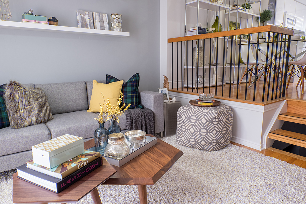
Multiple Levels to Love
Updated hardwood floors throughout add a high-end finish to both levels, ensuring that prospective buyers can picture themselves living here. In order to help facilitate that vision, the existing decor is neutral and simple, with small serving trays, flowers and coffee table books making the rooms feel lived-in and welcoming, but not personalized.
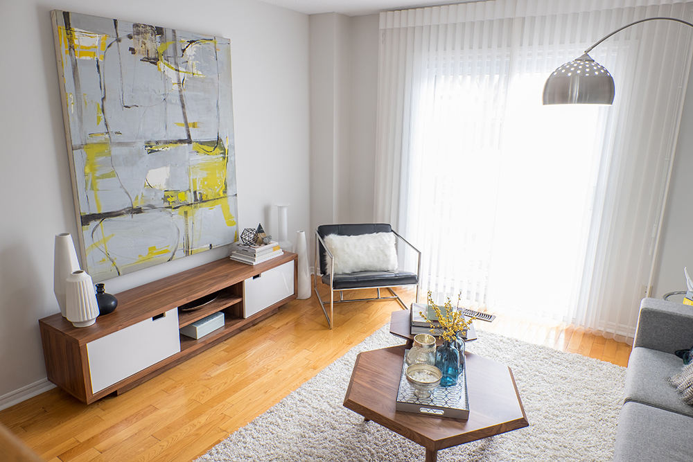
Media Area
While the spot above the media bench is clearly a great place for a television, the brothers staged it with art instead so that the versatility of the room is once again a predominant feature. The large walk-out ensures that plenty of natural light comes in, with simple window coverings adding an easy, open feel.
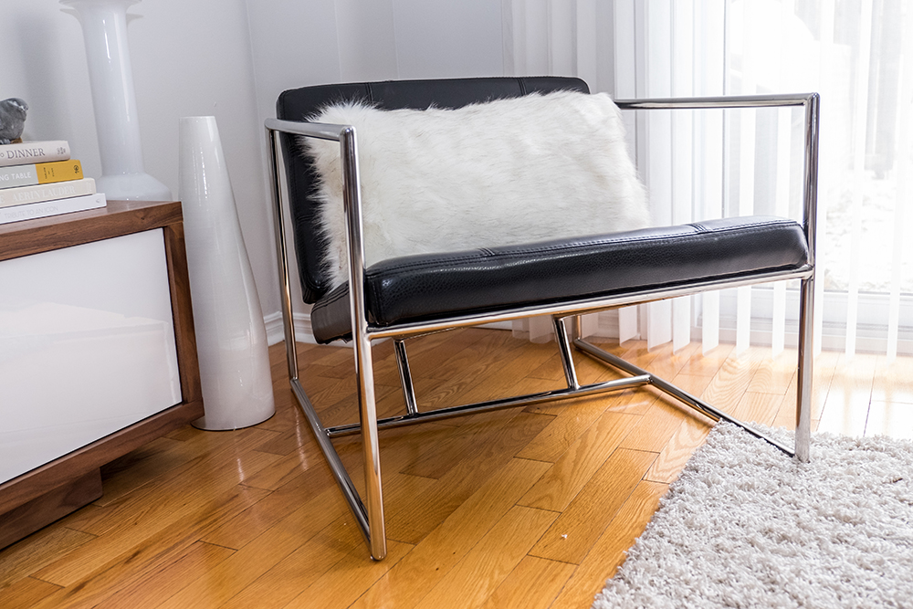
Modern Touches
Small accents like this faux fur toss cushion add modern appeal without extra effort. The result is a room that feels fresh and new, and allows prospective buyers to feel as though they’re getting something truly updated and special.
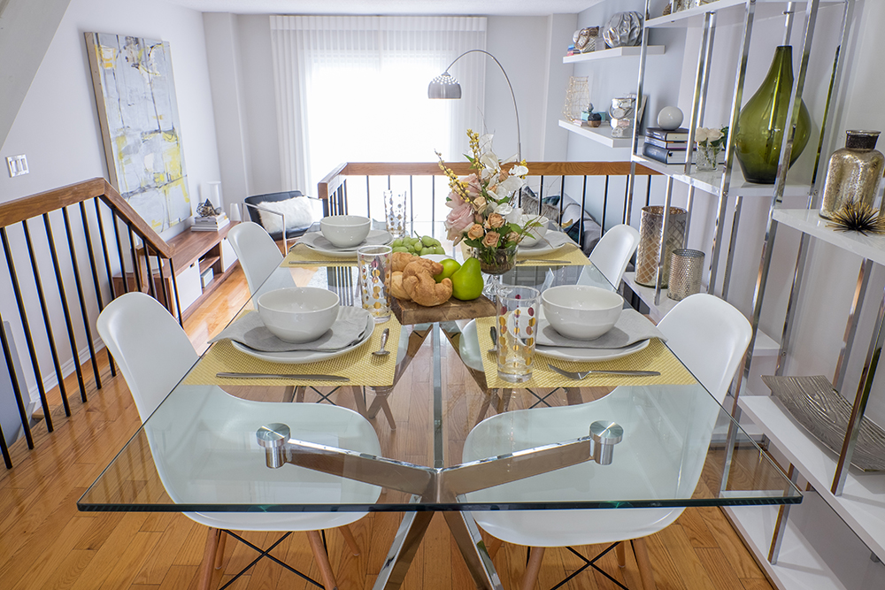
Comfortable Dining
The space at the top of the split doesn’t boast a huge area for a dining room, but the brothers maximized that space with smart furniture choices that fit into the home’s modern new vibe. A large, glass table keeps the room open and modern, while sleek shelves along the back of the wall offer storage and design.
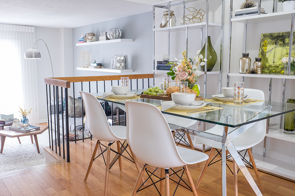
Modern Finishes
These white bucket chairs with their wood and metal structure match the rest of the decor and add more of that modern vibe while also adding plenty of seating potential. Meanwhile, the stainless steel finish on the table and shelving units bring the look together for a streamlined effect that feels purposeful and of course, modern.
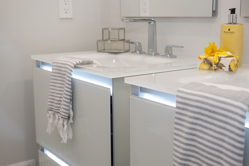
Bright New Bathroom
Even the main bathroom got a modern new redesign thanks to these matching vanities with plenty of storage and some funky under-lighting. Lots of stainless-steel finishes and large mirrors help to open up and unify the space, while the softer greys of the hand towels help tie everything together.
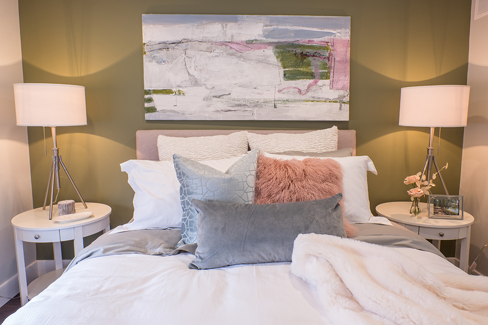
Cozy New Master
The brothers went for a more contemporary look in the redesigned master bedroom, opting for calming greens and pinks in order to make the space feel peaceful and serene. Toss cushions in a variety of textures and shapes help to make the space feel even cozier, while keeping the overall look neutral and appealing.
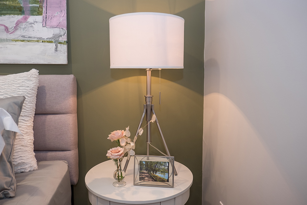
Soft Lighting
Simple, rounded night tables add even more functionality to the space while matching table lamps add soft mood lighting throughout the room. A couple of fresh flowers and a framed photo complete the look.
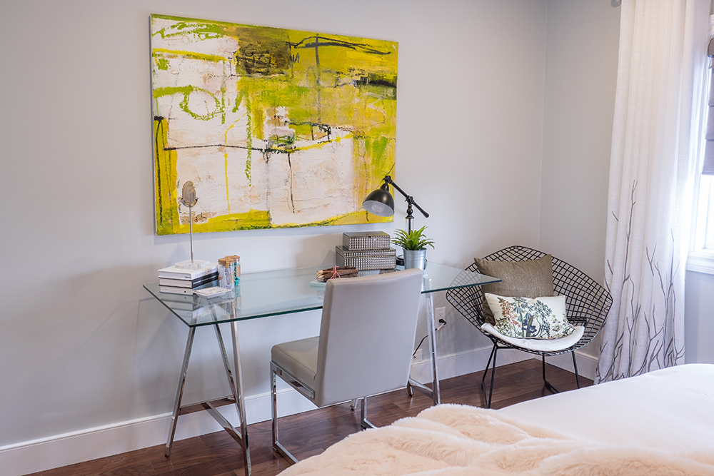
Tiny Office Nook
Because the brothers transformed the third bedroom into a brand new bathroom, they wanted to showcase the potential of the large master. That included crafting a small office nook with a sleek, modern desk boasting stainless-steel finishes, a small chair and another wire-framed armchair beside it to add an additional reading or dressing nook. Another neutral, abstract painting adds more design appeal and finishes off the look.
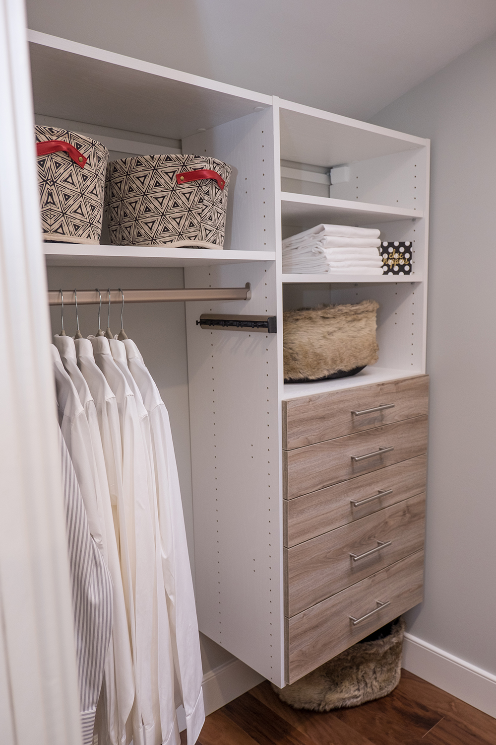
Organized Living
As the brothers pointed out, a large master walk-in closet is one of the most coveted items on a prospective buyer’s checklist. So they made the most out of this closet by adding storage and organization that feels fresh and updated, but also allows for various functions thanks to drawers, hangers and shelves.
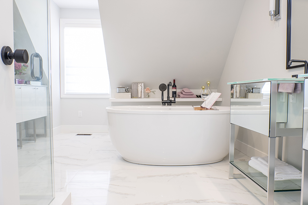
Gorgeous New Ensuite
Where the third bedroom used to stand is now this masterful, large bathroom with plenty of high-end finishes to draw any kind of buyer. New tiling, a large soaker tub and lots of stainless steel and mirrored finishes open up the space and make it feel large and modern, while the slanted ceiling gives the overall room a truly unique look.
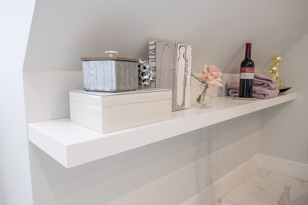
Smart Shelving
Above the tub the brothers added this sleek floating shelf that adds instant storage and a spot to keep a glass of wine or toiletries while utilizing the soaker tub. It’s a smart use of space that once again showcases the room’s potential, allowing buyers to picture themselves in the space.
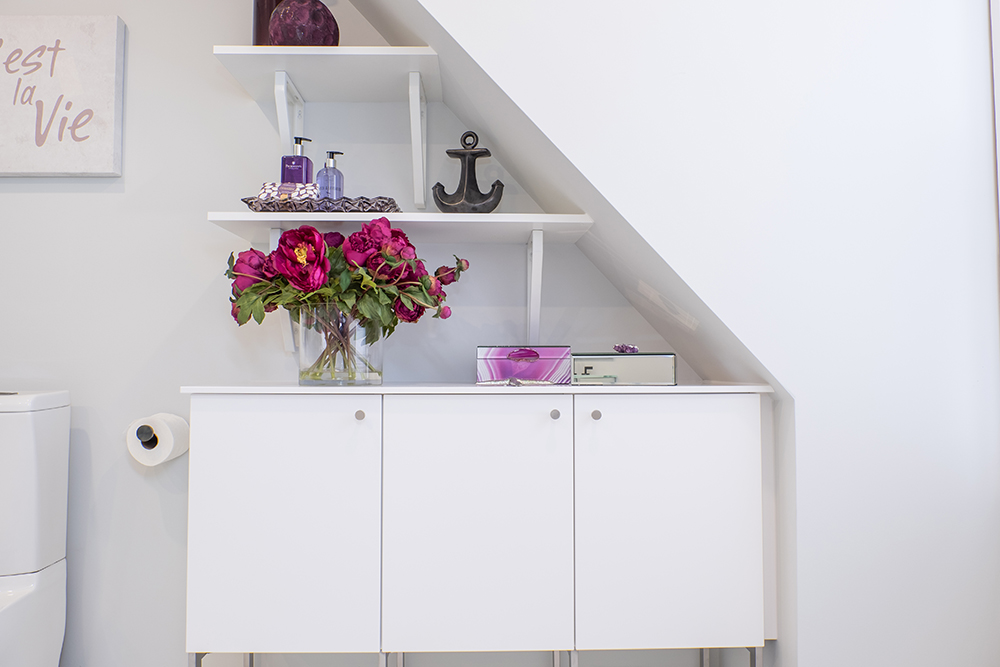
Built-In Shelving
This awkward corner features a small hutch that’s perfect for textiles and toiletries, while the custom shelving above adds extra storage. Now that’s how you take weird dimensions and turn them into something beautiful!
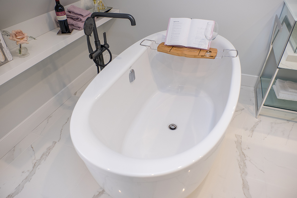
Modern New Unit
This soaker tub is big enough for two and serves as a pretty focal point of the room. The black finish on the statement faucet adds even more design appeal to the overall look, while a crafty stand allows a simple spot to store a glass of wine, book or sponge.
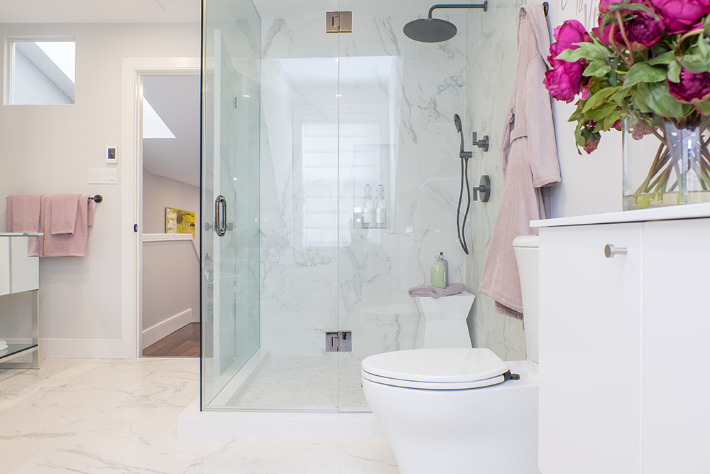
Walk-In Shower
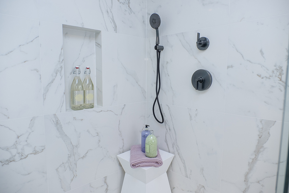
The pretty tiling continues into the large, walk-in shower, which feels even larger thanks to the glass walls and door. Built into the corner it becomes another focal point of the room, making this a truly luxurious escape for any new homeowner. Meanwhile, the soft pinks of the textiles and roses pop against the grey finishes, adding a cozy and feminine touch.
Pretty Touches
The faucets in the shower match those of the soaker tub, adding yet another modern touch to the room. The small bench is perfect for storing extra towels or toiletries, and a cut-out in the tiling itself lends instant storage without clutter.
Seeing Double
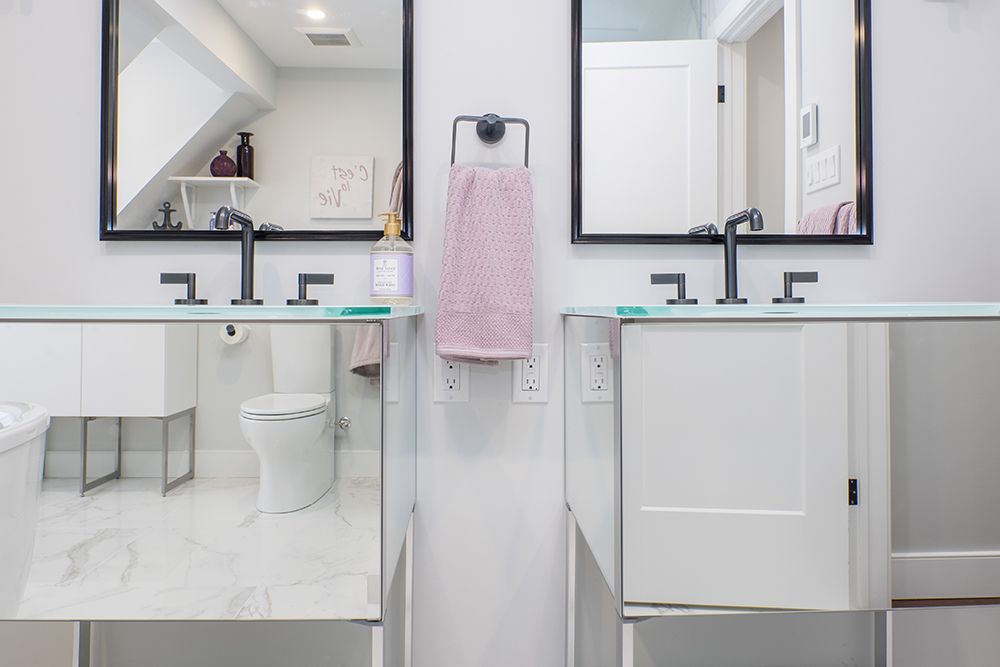
This sleek, mirrored finish on the vanities is completely modern and pretty, and opens up the space even more. Having dual sinks automatically increases the functionality of the room, while the black finish on the faucets and mirror trim above complement the rest of the bathroom’s high-end finishes. With so many brilliant upgrades, it’s no wonder this home sold for top dollars, chalking up yet another overall win for the Property Brothers.
HGTV your inbox.
By clicking "SIGN UP” you agree to receive emails from HGTV and accept Corus' Terms of Use and Corus' Privacy Policy.


