While the setting of this century-old BC farmhouse ticked all the blissful boxes – think 150 acres of rolling hills and blueberry patches – its interior was lacklustre to say the least. Designer Ben Leavitt, creative director for Vancouver’s Plaidfox, remedied that with a fine balance of salvaged materials, historic inspiration and just the right amount of contemporary touches. The result? A pastoral family home anyone would want to live in.
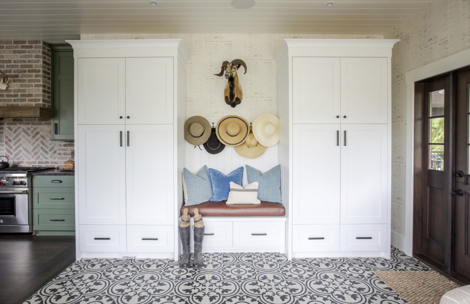
Prints Charming
Ben closed in the Langley farmhouse‘s back deck to create this handsome and well organized mudroom. It’s a powerhouse of prints from the encaustic floor tiles to the bold print wallpaper, which features antique ads for farming equipment. Plaidfox worked with Surrey, BC’s Homestar Building to create the space. The white custom cabinetry is bright and welcoming and provides ample storage, as well as a place to put on shoes. The ram’s head is a family heirloom and the boots are antique. “I didn’t want shiny and new accessories,” says Ben. “Patina is what makes a home feel comfortable.”
Related: How a Toronto Couple Created a Cozy Farmhouse Escape Just Outside of Collingwood
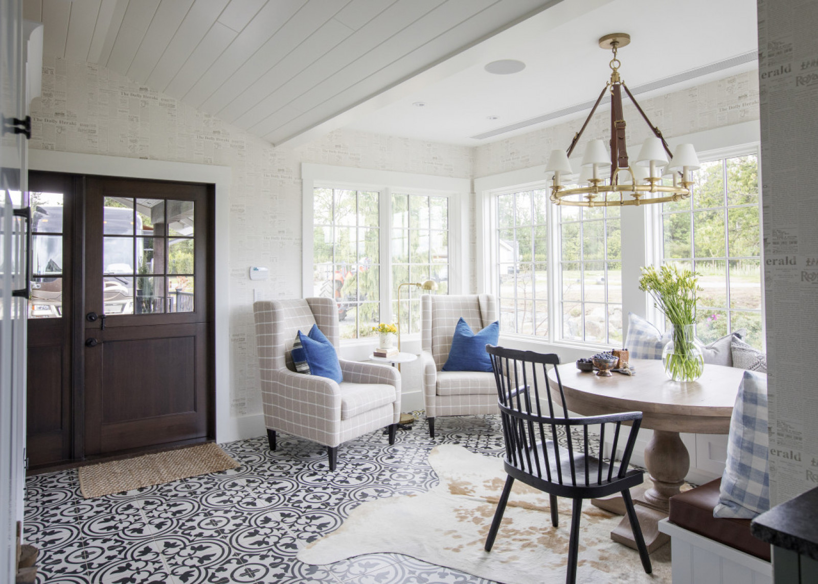
Best Seats in the House
The open-plan breakfast nook continues the pattern on pattern effect and Ben wouldn’t have it any other way. “I believe every room needs, at minimum, four complementary patterns to add texture and movement,” he says. We love the unexpected addition of traditional wingback chairs in a breakfast nook and how they layer in a comfortable, farmhouse country vibe. They’ve also become the family’s fave perch for reading in what they now call the “coffee lounge.”
Related: How a 19th-Century Prince Edward County Estate Embraced Sultry 1970s Design
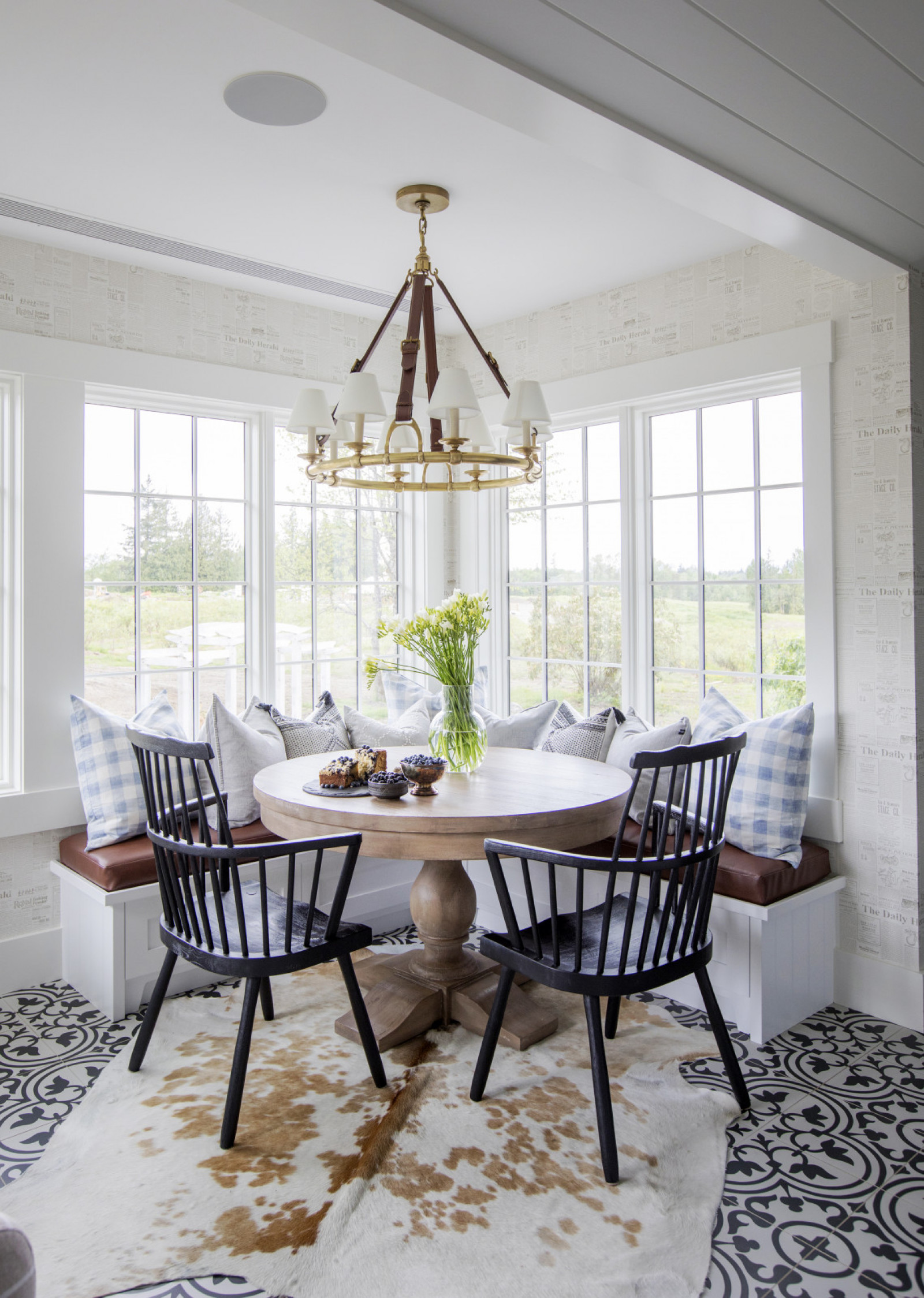
Corner Lot
The space-saving corner banquette is dressed in a tan leather seat cushion that complements the showstopper pendant light from Ralph Lauren. Its equestrian flair (note the bridle details) is perfect for the country and references the family’s love for horses. The round table tempers the angles of the corner, while the hide rug layers in softness, texture and, of course, more pattern.
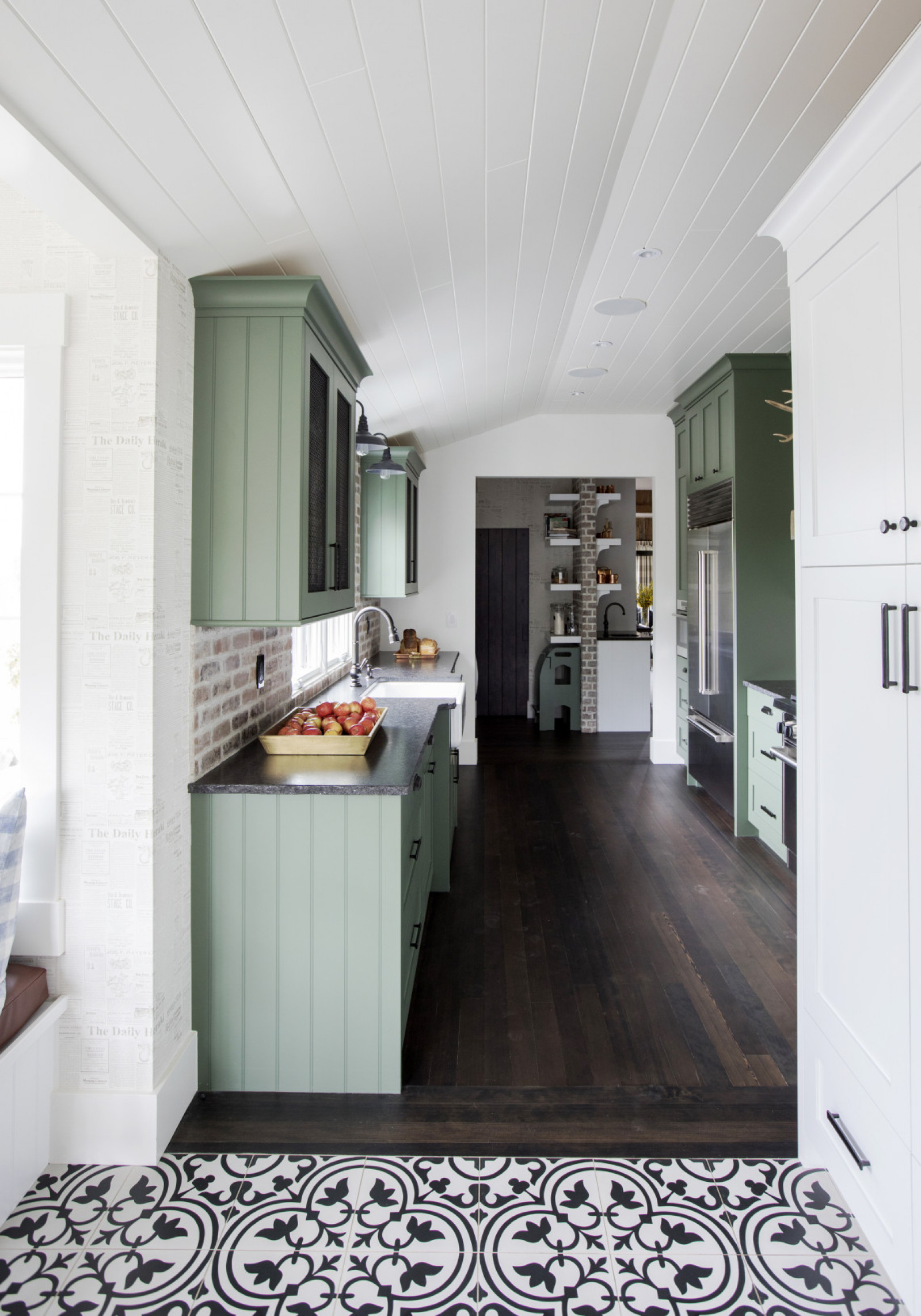
Green Energy
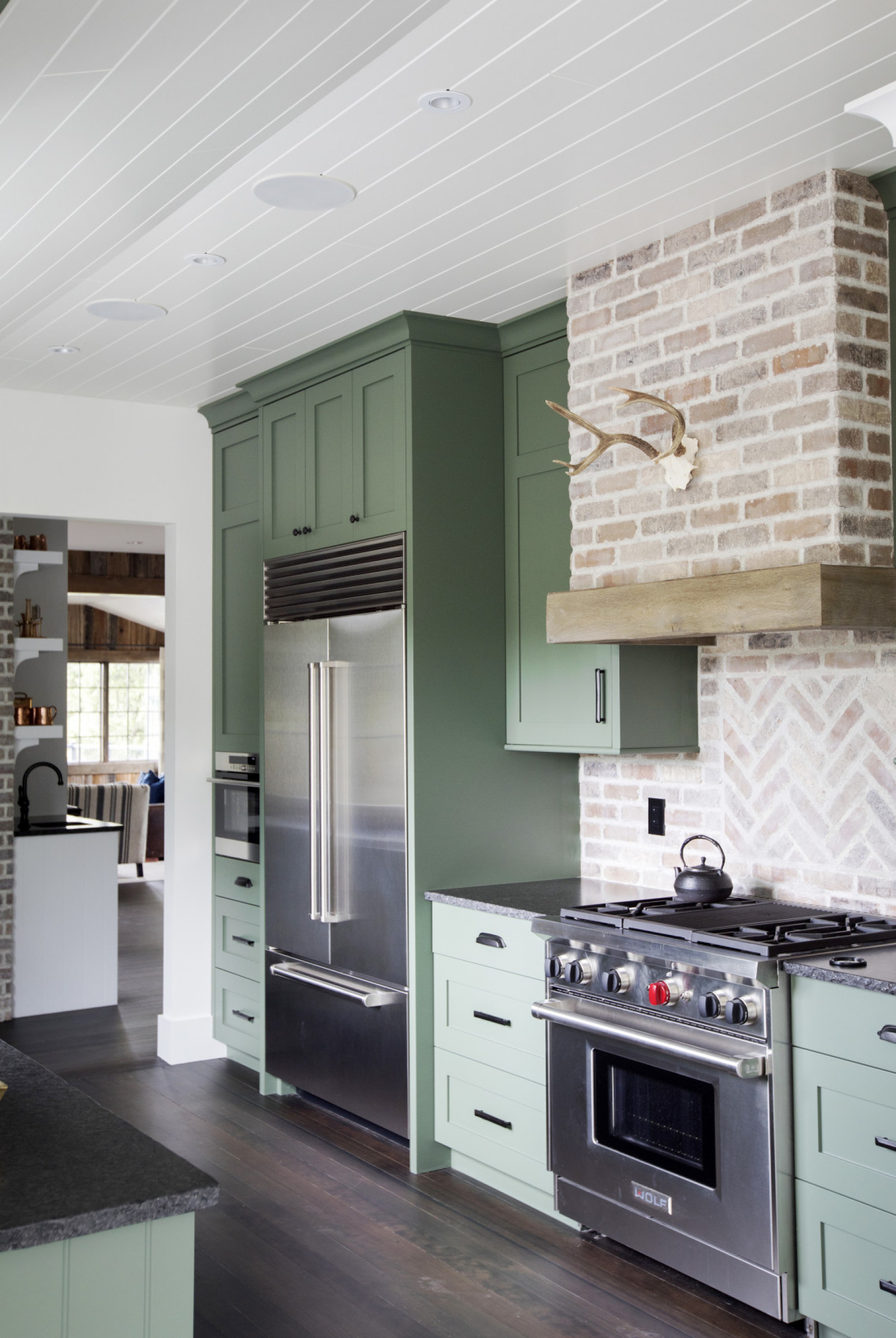
We love how Ben didn’t opt for a white kitchen here. The muted green cabinetry has a true vintage feel, which makes it easy to imagine that the cupboards are farmhouse original. Their old-fashioned charm is amplified by the home’s antique hardwood floors, which were carefully restored and stained.
Brick by Brick
There’s a great dynamic at play in this farmhouse kitchen where historical materials like old bricks are completely in sync with stainless steel appliances and custom cabinetry. The countertops, which have live-edge detailing, are a great idea to copy for a cottage. The salvaged wood that frames the range hood (and the wall-mounted horns) factor in just the right amount of rusticity.
Wine Not?
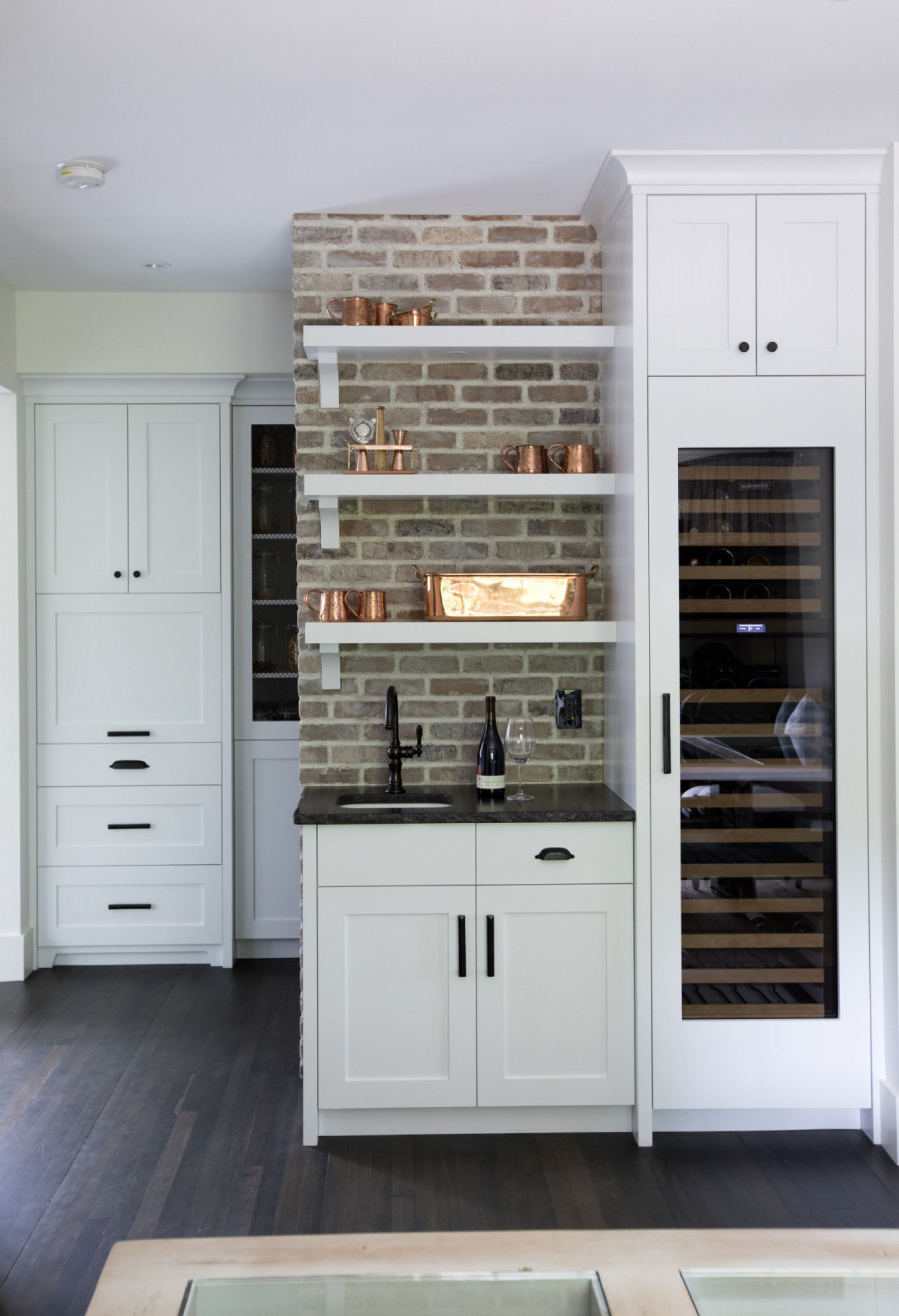
A country setting needn’t negate little luxury’s like an integrated wine fridge. This bespoke beauty works so well thanks to the exposed brick and shiny copper utensils (which scream country kitchen!), as well as the black hardware. “Black hardware is and always should be the go-to when doing a classic country-style home,” says Ben. “Other finishes will come and go, but black has staying power.”
Farm Fresh
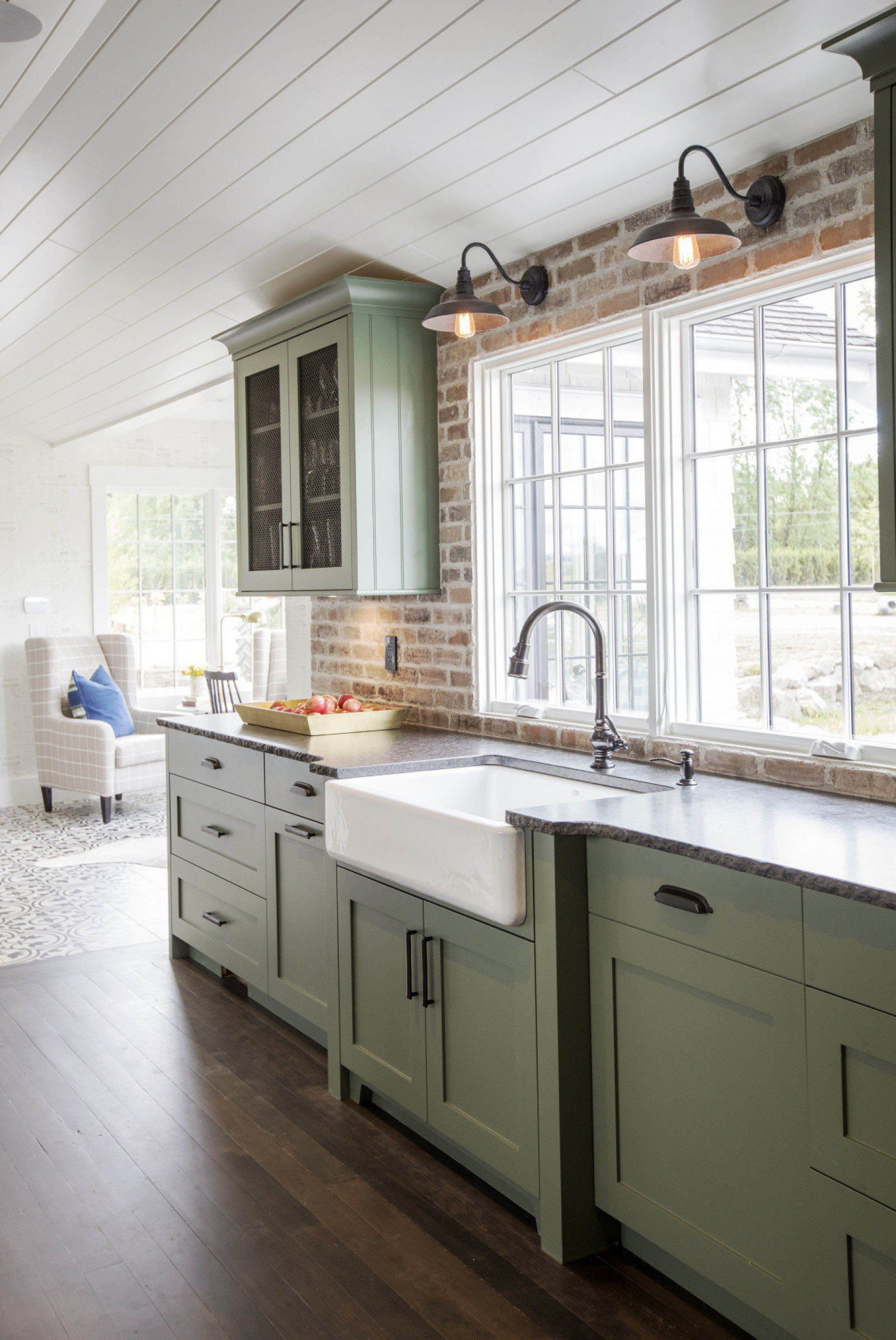
A view like the one out of these windows would almost make doing dishes a pleasure. The choice of an apron sink is perfect for a farmhouse and we like how, thanks to privacy, the windows remain unadorned. The Edison bulb sconces inject a bit of up-to-the-minute industrial flair that’s echoed in the mesh-fronted upper cabinets.
History Lesson
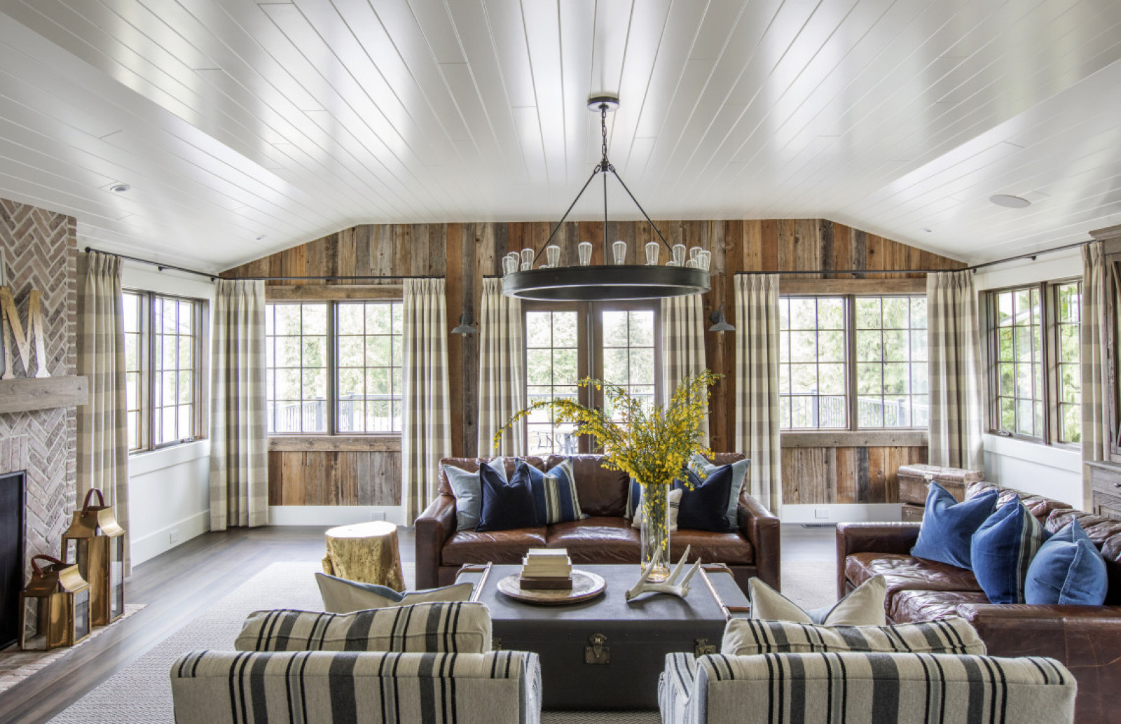
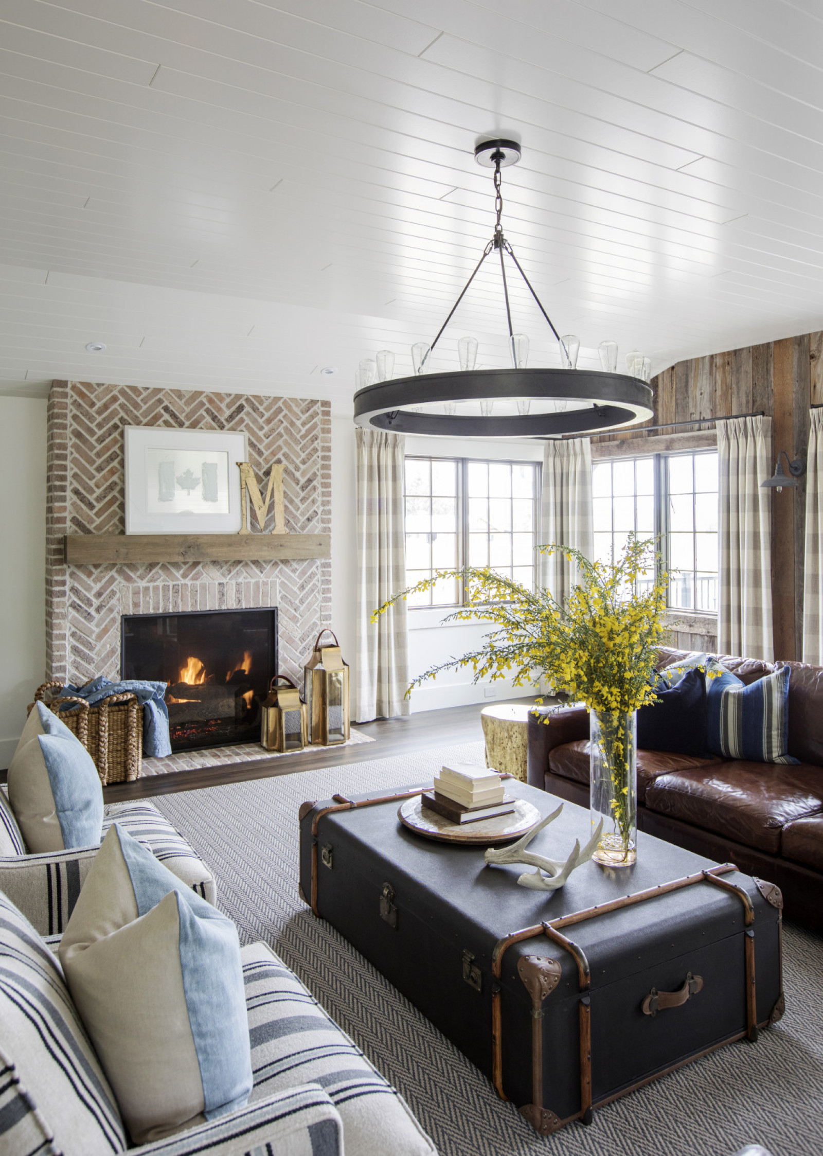
Ben wanted the living room to have a “mature,” almost historical feel. Bright white shiplap ceilings, salvaged wood walls, dark-stained original floors and a brick fireplace-surround achieve that with aplomb. Combined, they also impart a bit of grandness to this warm space. The windows are dressed with heavy plaid drapery that keeps the overall mood cozy.
Related: This Airy Home in a Former Textile Factory is the Quintessential Toronto Loft
Old Meets New
The living room speaks to the owners’ desire for timeless, not trendy. The simple shape of the exposed light bulb pendant and the trunk re-purposed as a coffee table look as though they’ve always been there and will look just as relevant in years to come. The leather sofas are from Restoration Hardware and have a casual durability suited to a farmhouse. Ben worked in antiques, like the “M” from an old sign, to play up the property’s sense of history. The chairs and rug add in lively pattern.
In the Mix
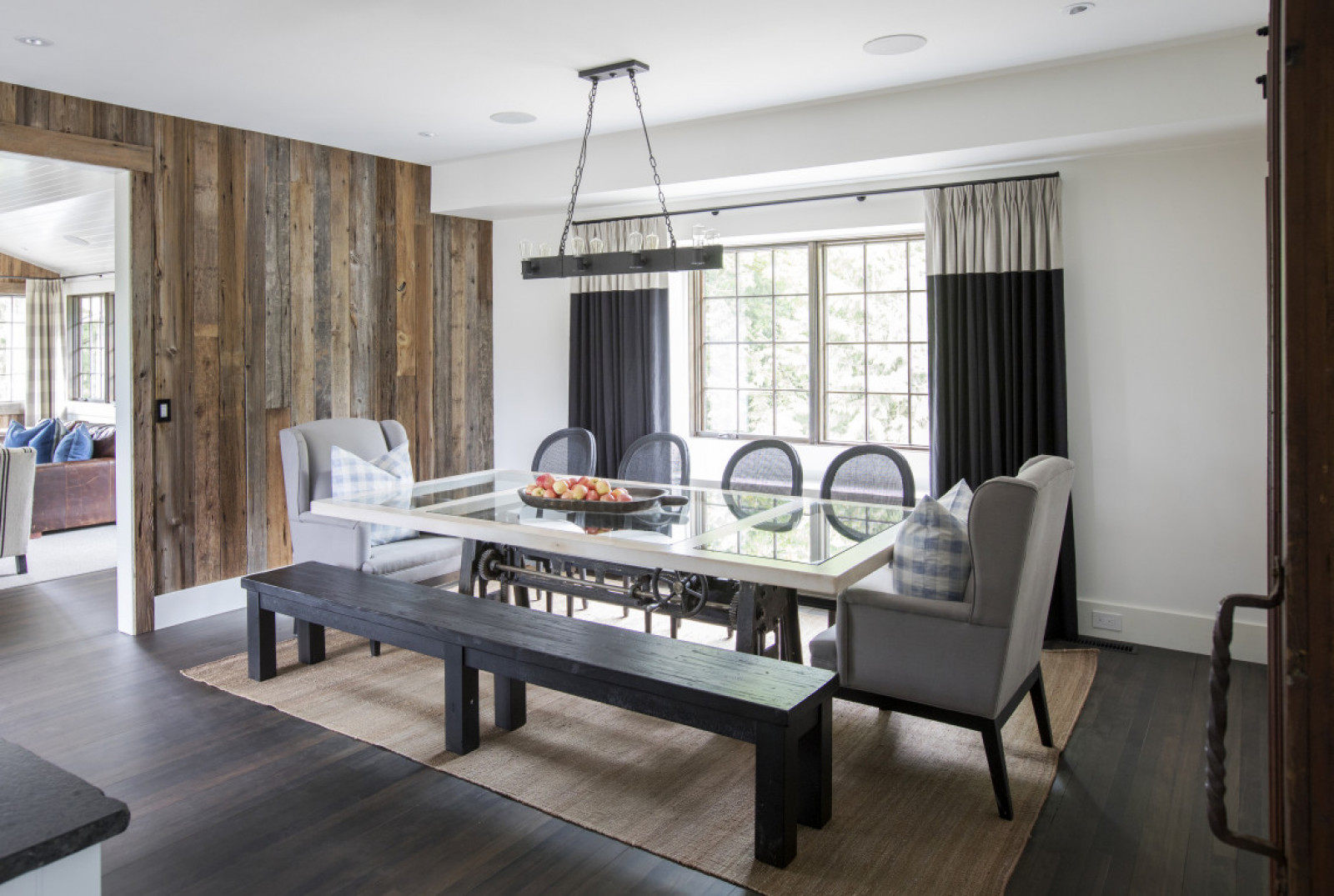
Forget matchy-matchy! “We felt the dining room would have seemed staged and basic if we had surrounded the table with the same chair,” says Ben. Instead, it is charged with contrast thanks to an 8-foot long bench, upholstered wingbacks and cane-back chairs. The custom-made white-oak table has glass inserts to show off the base: an antique cast-iron printing press. The banded drapes add a bit of formal drama.
Room to Grow
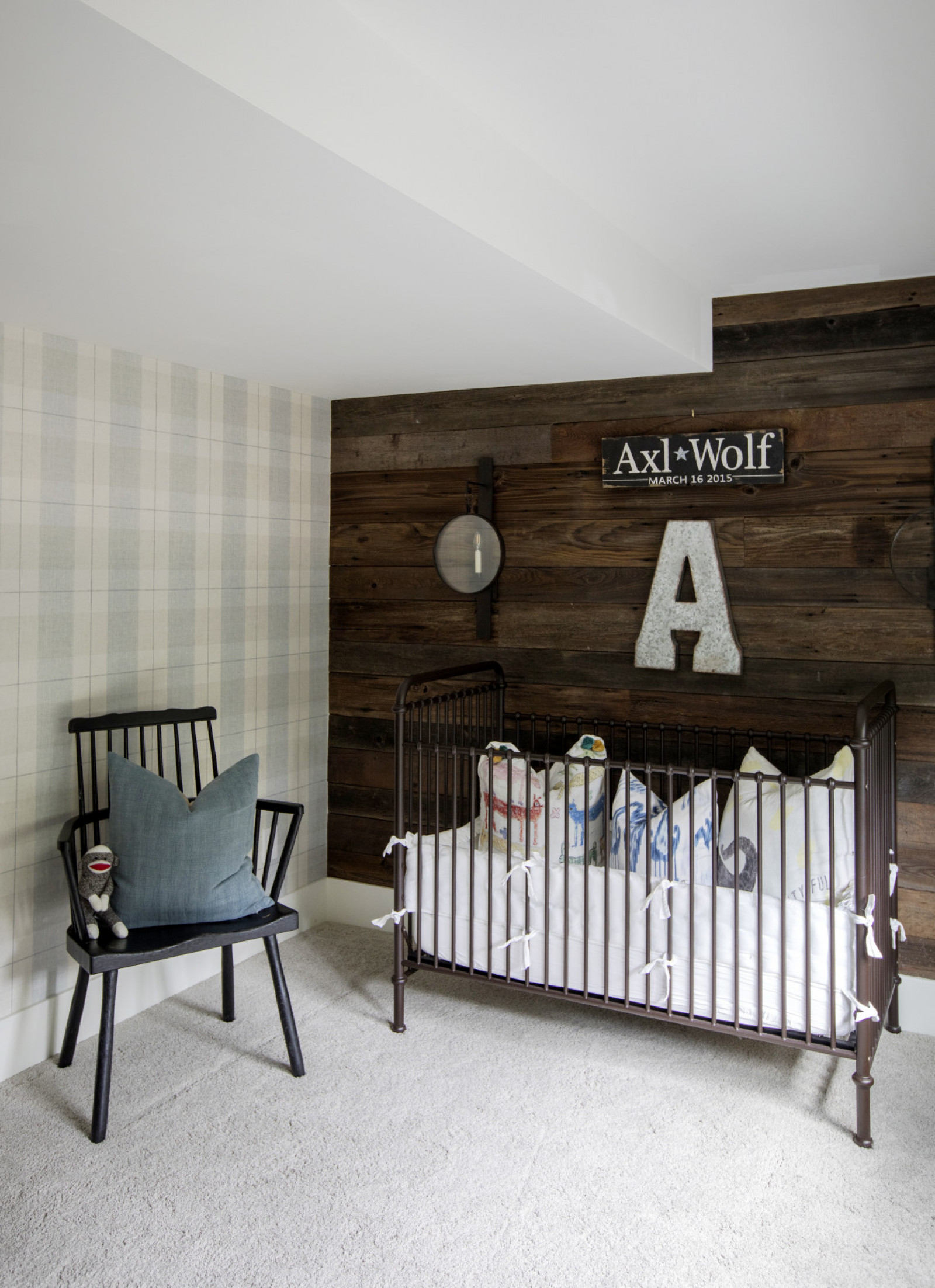
Baby Axl’s room features a focal wall with provenance: the wooden planks were originally part of the property’s barn, then converted to use in the stables and finally left to ruin. The owners salvaged which ones they could for their kid’s space. Here the wood feels classic rather than juvenile, so Axl won’t outgrow it. Youthful whimsy is present though in the fun initial and sign. The plush carpet is soft for baby and warm on cold Langley days. The interesting sconce is from Visual Comfort and the crib is from Restoration Hardware.
Master Class
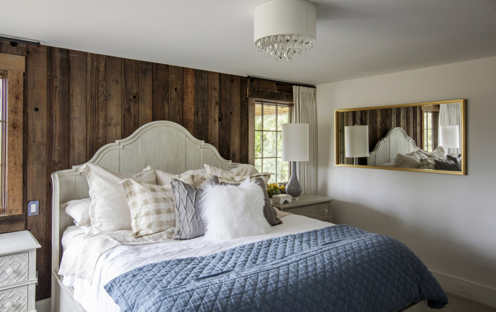
Rustic, cozy and elegant, this is a downright dreamy master bedroom. A rough-hewn wood-plank wall is artfully contrasted by the more modern bedside lamps, which fend off any hunting lodge look. That lightness is continued in the handmade oak headboard and side tables which were painted white. The drapes feel a bit luxurious and were custom-made using Robert Allan fabric. The blue coverlet is a fresh foil to all the earthy tones.
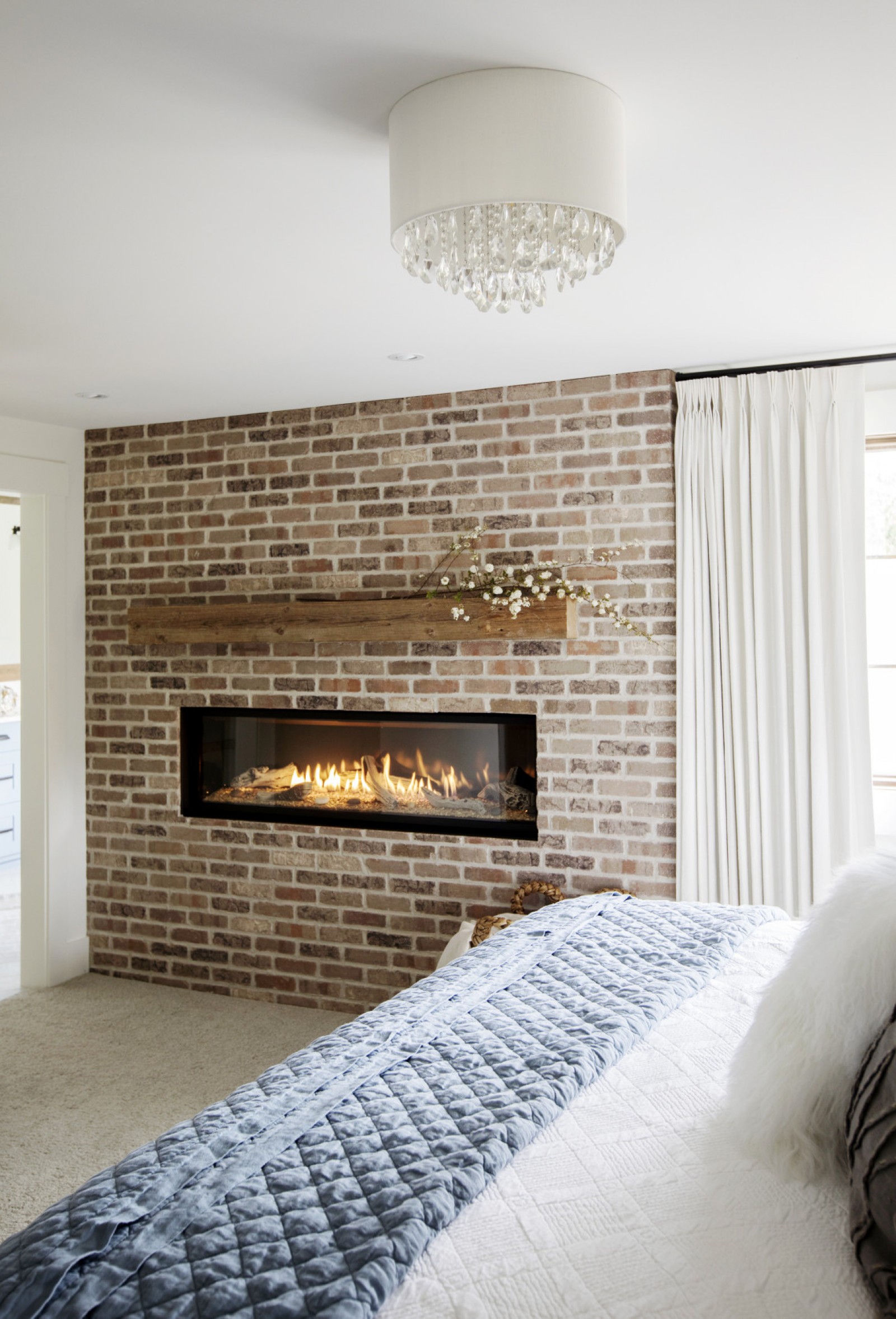
Comfy Cozy
How dreamy is a bedroom fireplace? This linear style gas model is framed with salvaged bricks – with too much patina to be painted – and we love how the designer embellished them with a wooden “mantel.” It breaks up the space and provides a nifty display area (here dressed with flowering branches from the property). The chandelier works in a bit of contemporary sparkle (lovin’ the glinty lighting trend) and, as in the baby’s room, carpeting ensures warmth and softness, an indulgence in any country house.
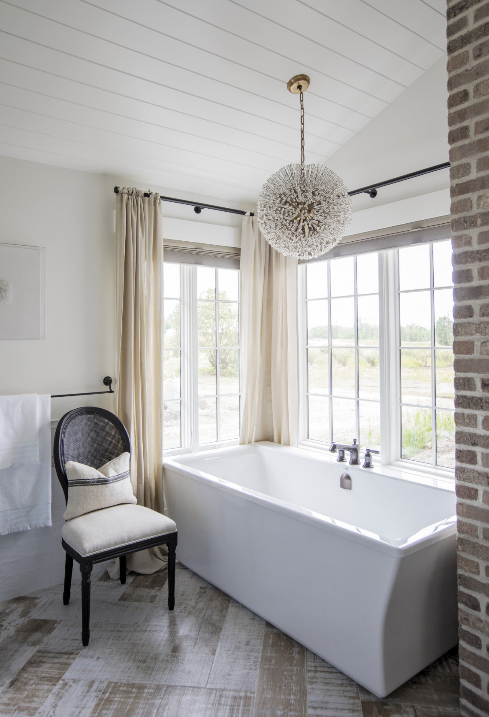
Bath With a View
An addition to the original house, the master ensuite bathroom still retains pastoral charm thanks to the shiplap-clad ceiling and the rustic-look whitewashed floors, which are actually porcelain tiles – a nifty idea to steal for any bathroom. There’s a bit of elegance at play here too in the crystal orb chandelier and the architectural note of the tapered vessel tub. The upholstered chair shakes things up a bit and adds even more visual interest to the space.
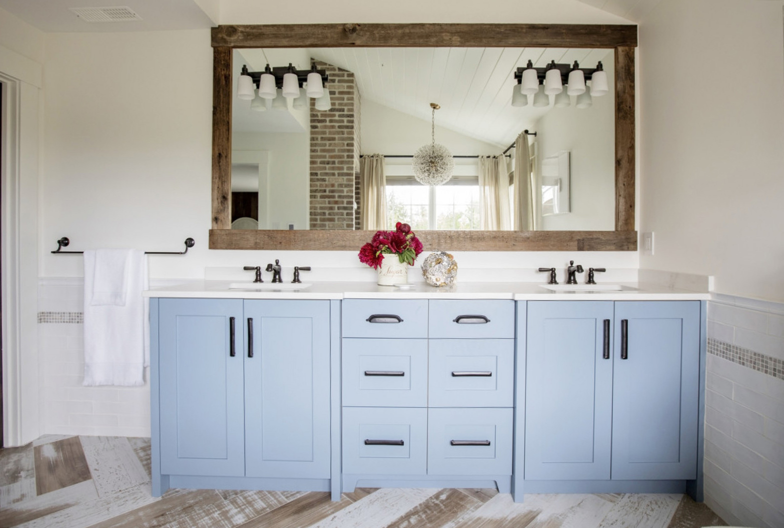
Blue Notes
The bathroom vanity is testament to the power of colour. Imagine the cabinets in beige or white – they would look fine, but certainly wouldn’t have the same fresh impact. Like all well-designed homes, there is continuity throughout the space apparent here in the black hardware and the mirror which incorporates wood in the bathroom. This cohesion, along with the mix of modern elements and vintage appeal, creates a very layered look suited to the history of this gorgeous century-old farmhouse.
HGTV your inbox.
By clicking "SIGN UP” you agree to receive emails from HGTV and accept Corus' Terms of Use and Corus' Privacy Policy.


