When Susie and Karl Reardon wanted to renovate their 1,700-square-foot cottage, they hired a designer who was pretty familiar with their BC island setting: “I grew up on the island next door to them and spent hours crafting with Susie and her two daughters,” says Sarah-Marie Lackey of Sarah-Marie Interior Designs. Her plan: ditch the ’70s elements – think lino flooring everywhere – make it a cinch for easy entertaining and play up its beach-chic charm with a crisp nautical palette.
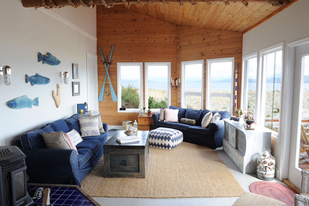
The Blues
While the choice of blue furnishings perfectly complements the Savary Island setting, this powerhouse hue is more than just pretty. “I chose it mainly because it hides dirt and wear and tear,” says Sarah-Marie. “There’s no running water or electricity on the island. Everything is solar-powered, so the washer and dryer are used sparingly. A dark colour was key in this environment, and it looks great too.”
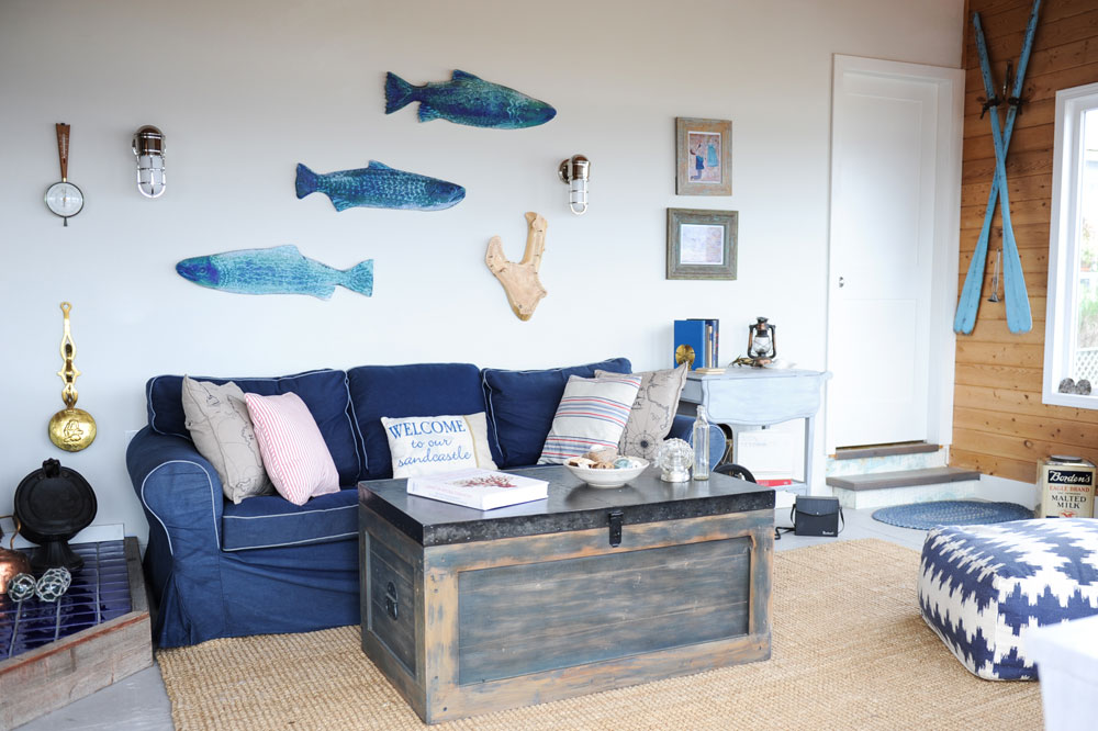
Trunk Show
Like the hardworking blue hues, this trunk coffee table is more than aesthetically appealing. “The owners burn a lot of candles here since there is no electricity, so the table’s metal top is great in case one gets knocked over,” says Sarah-Marie. “Also, this being a cabin, there is always a need for sneaky storage. This piece holds extra bedding and pillows for guests.” Homeowner Susie Reardon picked up the Kay Austin-designed fish at an art gallery in Squamish.
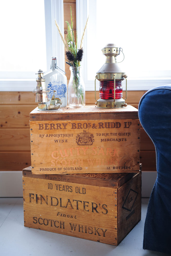
Family Affair
These vintage wine crates belonged to Sarah-Marie’s grandfather, and she knew they would suit the Reardon’s cabin perfectly. Their original wood is almost an exact match to the cabin walls and, like many of the accessories here, they have a rich history and suit being stylishly re-purposed.
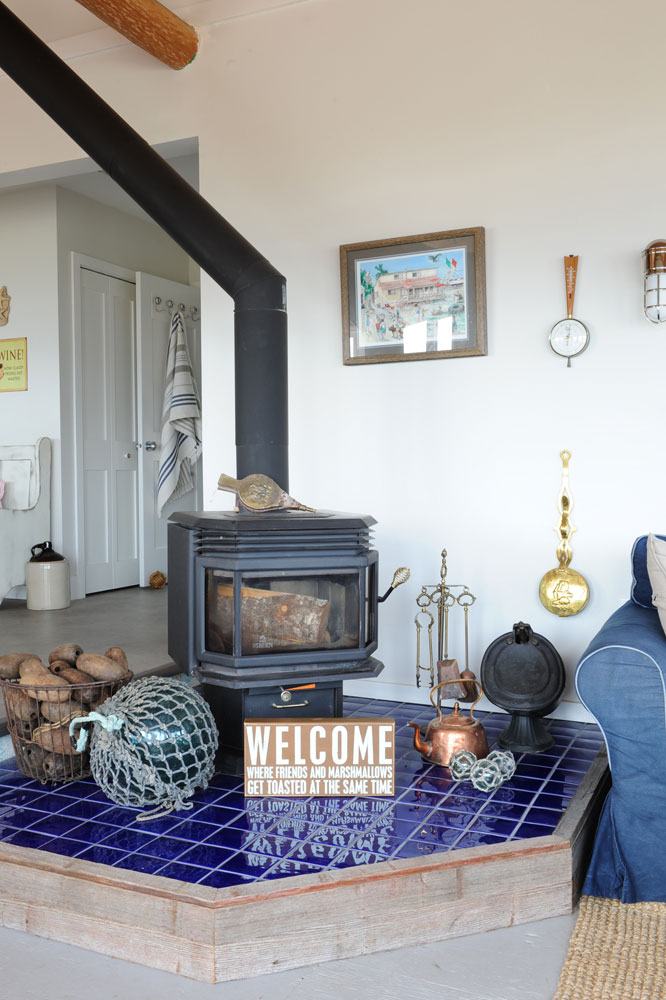
Go with the Flow
The kitchen’s wow-worthy oven (wait till you see it) inspired the choice of tile here. “I wanted some continuity here as you can see the gorgeous blue gas-range from the living room. These tiles complement it nicely and tie in with the sofa’s slip-covers.” The quirky sign, one of many throughout the space, reinforces the Reardons’ love of entertaining.
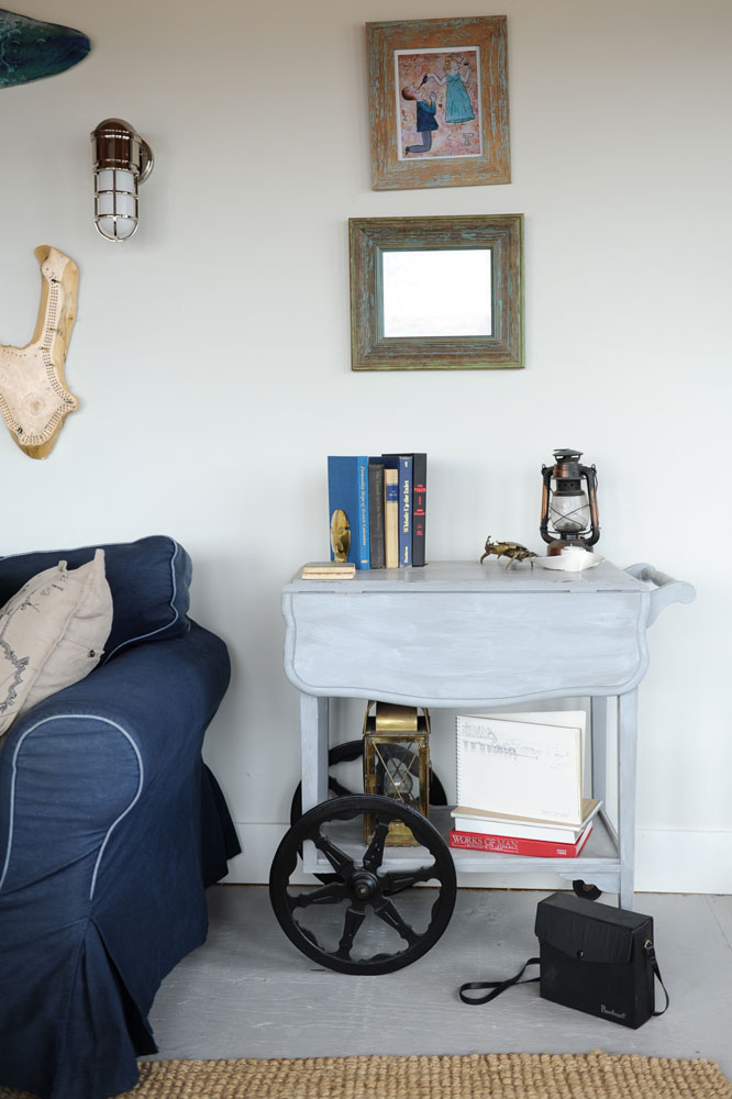
Cart Blanche
The homeowners’ daughter white-washed this old bar cart. “It had been in the family for years and Melanie decided to refresh it with a coat of paint,” says Sarah-Marie. “I love how it looks weathered and makes the dark wheels standout.”
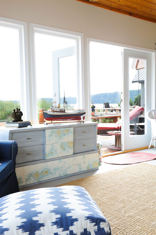
Dressered Up
Inspired by Melanie’s paint treatment of the bar cart, Sarah-Marie copied the look here. “This was another old piece that had been kicking around, so I decided to upcycle it with a fresh coat of paint.” It shares the space with new items like the blue and white ottoman and the nubby sisal rug, all of which create a fresh, casual look.
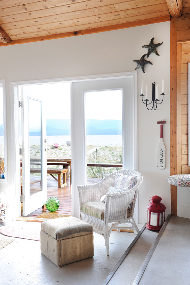
Coffee Fix
The upcycling continues, and this time java is involved. “This wicker rocker was another piece the family had and we wanted to give it a new look,” says the designer. “Their daughter helped me reupholster the seat with old coffee-bean bags.” The ottoman got the same treatment and, if you look closely, you’ll see its top is hinged for more hidden storage. The coffee bags are a unique choice in sync with the cabin’s charming mix of old and new, including the “happy hour” paddle, which again alludes to this family’s love of entertaining.
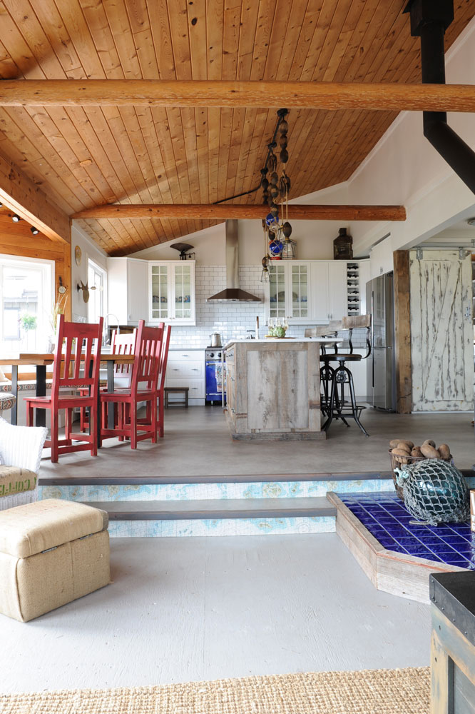
Step Up
While the “paint it out” dictum is now a part of everyday design speak, Sarah-Marie was adamant that the wood-panelled ceilings and walls stay as is. “They are original to the the cabin and really add to its warmth,” she says. From this angle you can see how the gas range influenced the tiled platform leading up to the kitchen.
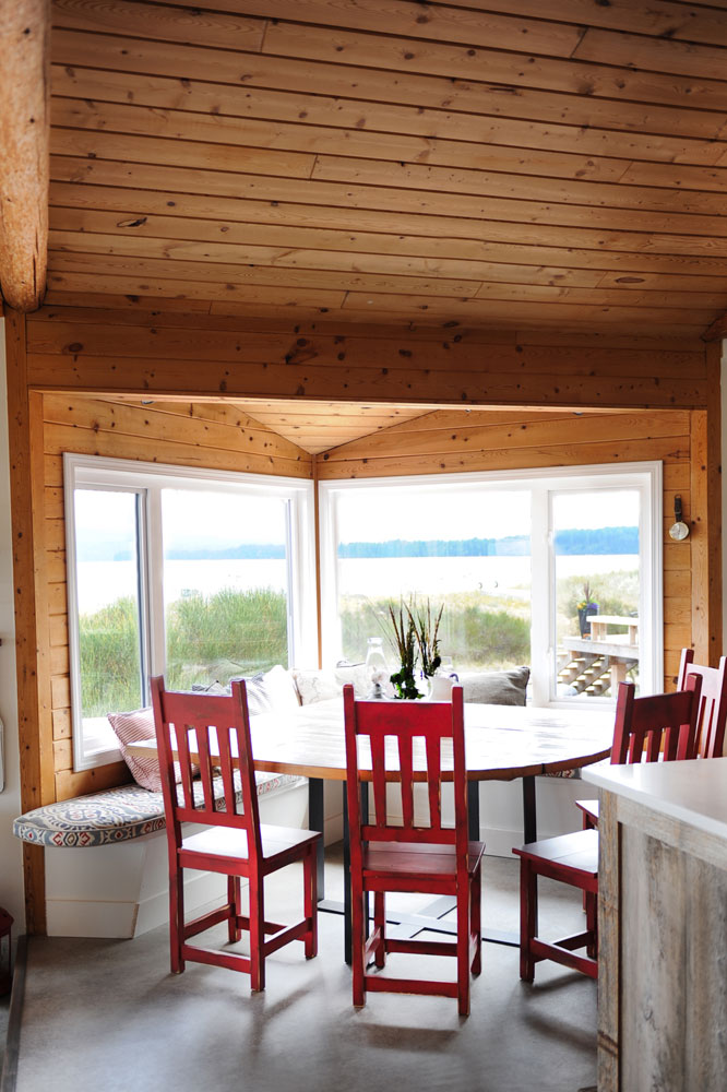
Red, She Said
“Susie loves red. It’s her favourite colour,” says Sarah-Marie of the lady of the house. These red beauties punctuate the eating area and exude a weathered, nautical look. Their fiery hue is picked up in the banquette cushions and acts as a warm counterpoint to the original unadorned wood walls and ceiling.
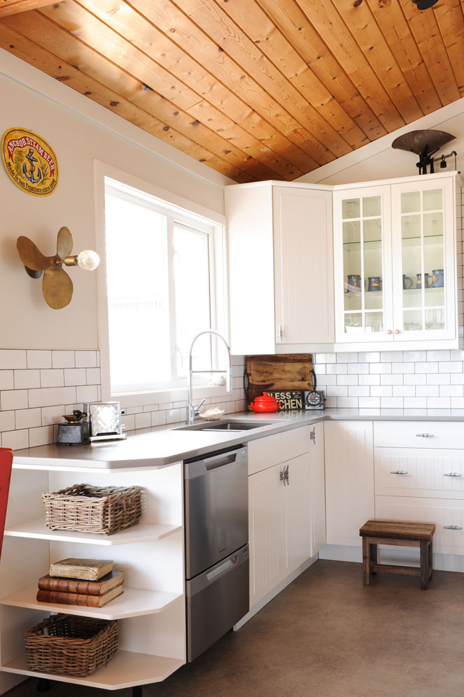
Glass Act
“Because the kitchen is so large, I thought it would be nice it break up the solid cabinetry with something that’s glass-fronted,” says Sarah-Marie. “In addition to this, the homeowners love entertaining and have beautiful wine and margarita glasses that they can now display.” The countertop is Caesarstone in a shade called “stone.”
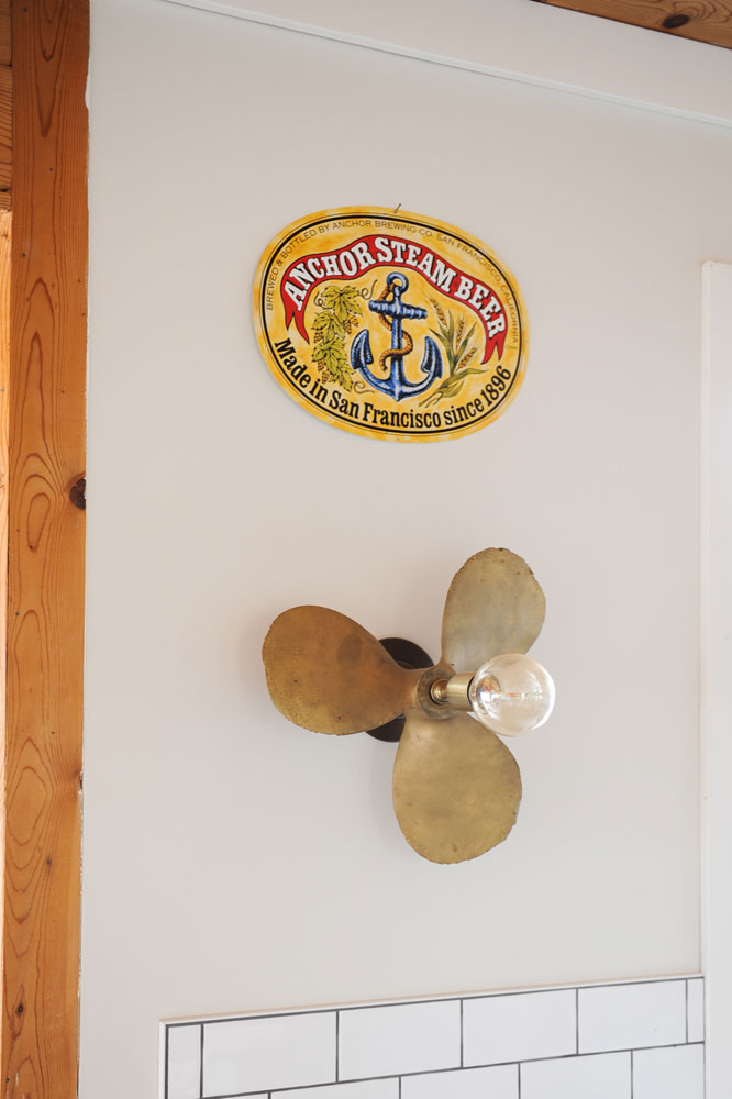
Get Crafty
Sarah-Marie designed this eye-catching sconce with more than the cabin’s look in mind. “Susie and I spent so much time together crafting when I was young that this just seemed right. She was very supportive of all my ideas – especially this propeller light!”
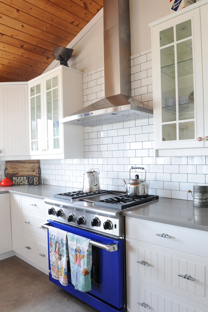
Into the Blue
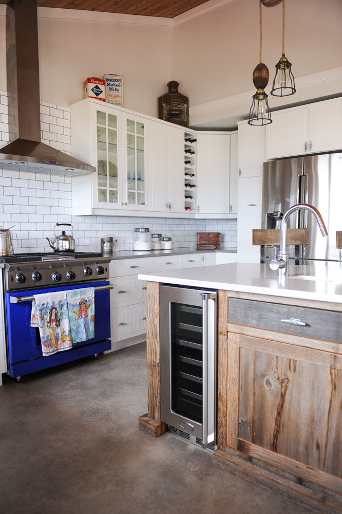
“Cabins should be fun, and I didn’t want a boring stainless-steel stove in this lively setting,” says Sarah-Marie of the lively blue appliance. Note the attention to detail on the drawer pulls – they resemble boat cleats and are a nod to the cabin’s watery setting. The subway tiles, from Olympia Tile, were grouted with a darker shade for easy cleaning.
Ship Shape
“I designed the island with a wood base because I wanted it to look like a piece of wood from an old ship.” Sarah-Marie also incorporated a wine fridge here, taking advantage of otherwise unused space. Open wine storage in the upper cabinetry breaks up the space, and colourful vintage tins reinforce the cabin’s playful charm.
Aw Shucks
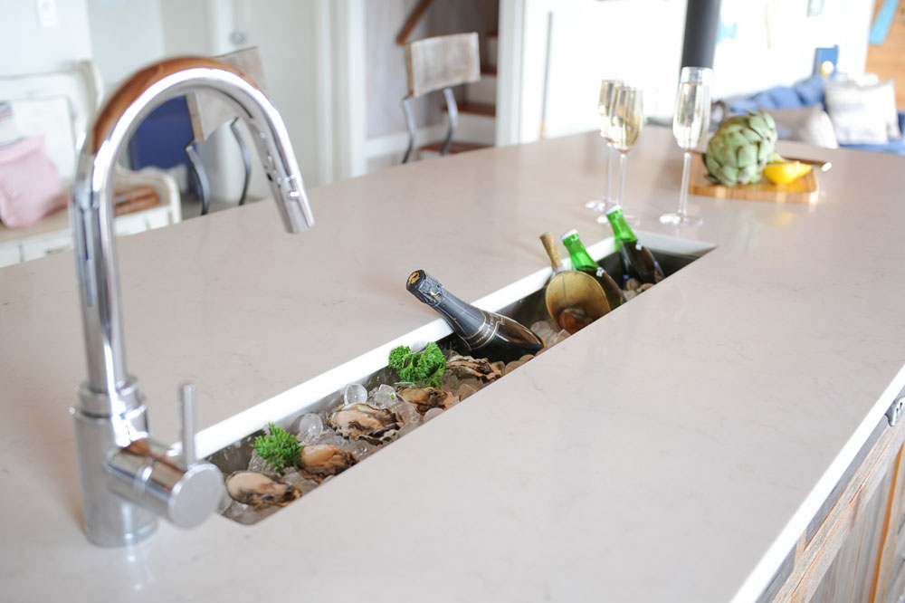
Built-in display for oysters and wine? You bet! “I can’t say it enough – Susie and Karl love hosting get-togethers and especially love casual meals of oysters with wine or beer.” This nifty trough lets the owners entertain in style and is an ingenious idea for any space.
Something Old
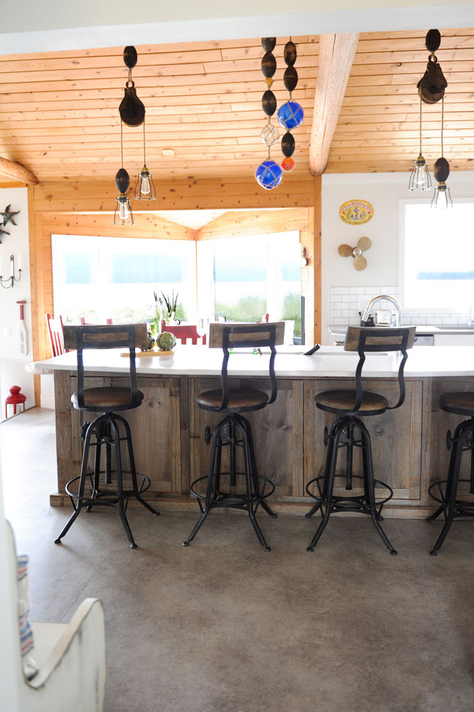
These high-back antique stools (sourced from Sampsons Antique Co.) are extra comfy (perfect perches for slurping oysters) and their mix of wood and metal impart an almost industrial feel that works well in this rustic setting.
Up Above
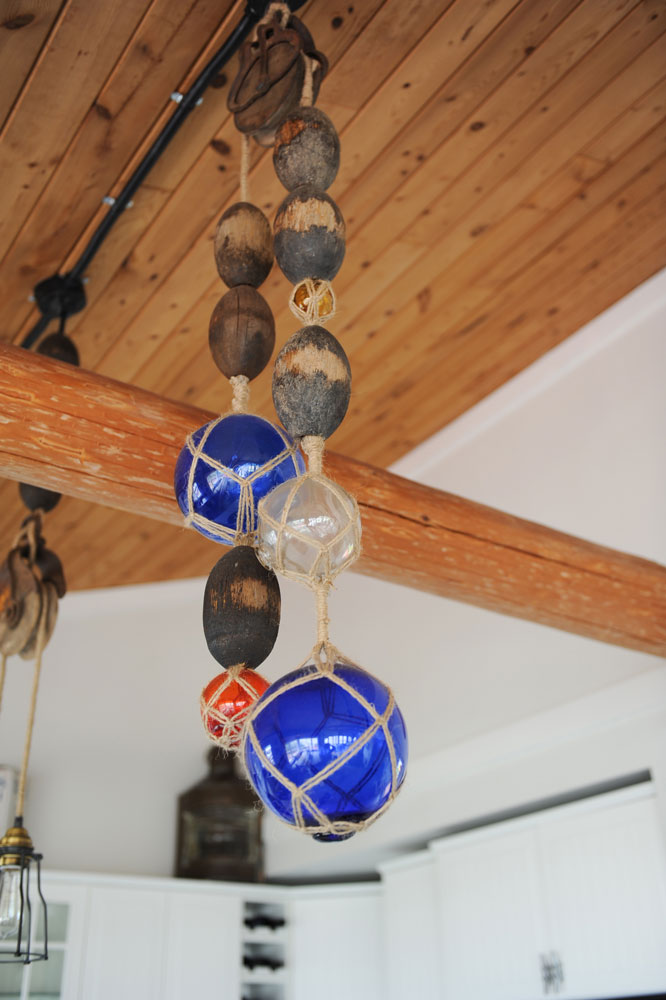
Sarah-Marie and Susie channelled their crafty roots when it came to this conversation starter. “We made these!” says the designer. “I love the mix of colours and shapes. The glass balls and buoys were things Susie had collected or found on the island over time.” The pendant light beside them is from Restoration Hardware.
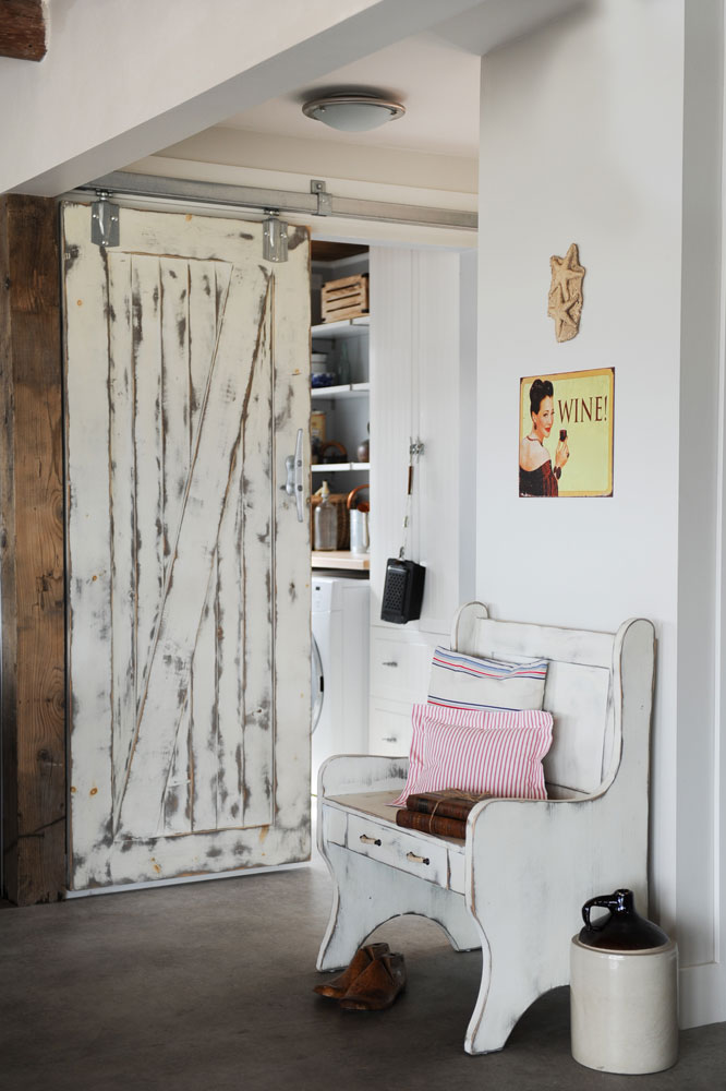
Smart Seating Plan
The entryway’s white-washed bench was custom-made by Shilo Living. “We all joke that guests need to sit to put on their shoes after one of Susie’s margaritas. But there is built-in storage here for small items like sunglasses, dog toys and fishing licenses,” says the designer. The space-saving barn door leads to the laundry room and, like the kitchen drawers, also features a cleat handle.
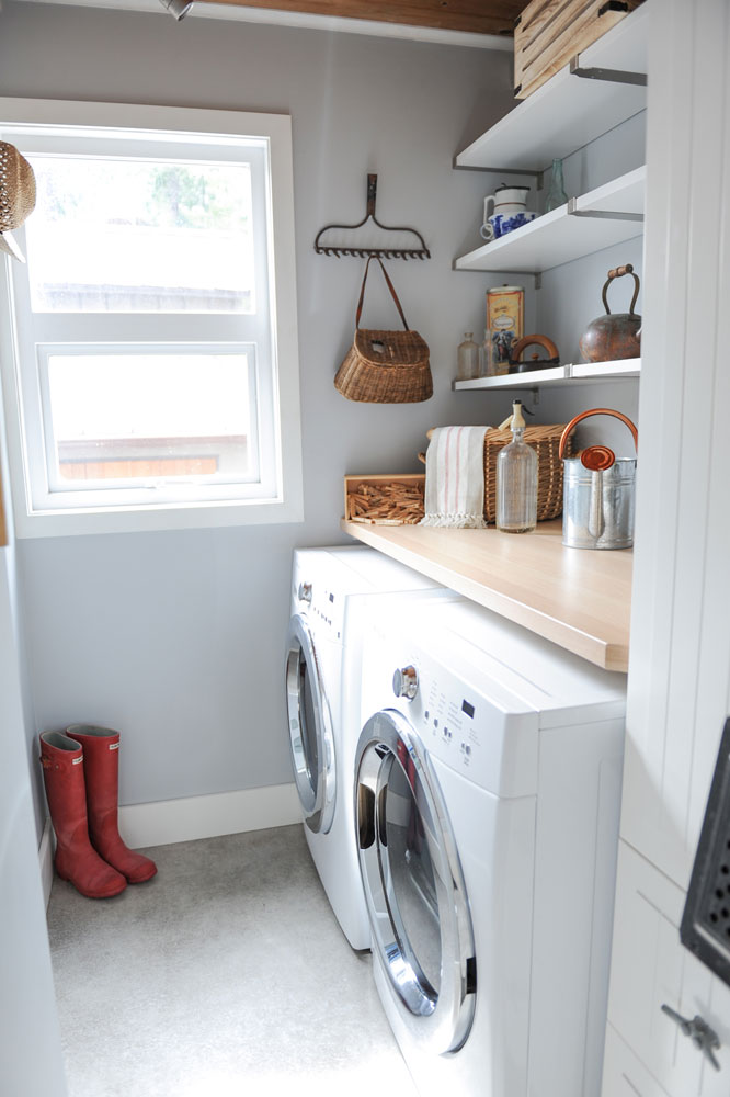
A Place for Everything
Sarah-Marie designed the laundry room to be simple and hard-working. An IKEA pantry cupboard beside the washer and dryer hides household necessities like batteries and candles, while the open shelves are both practical for laundry supplies and pretty for display.
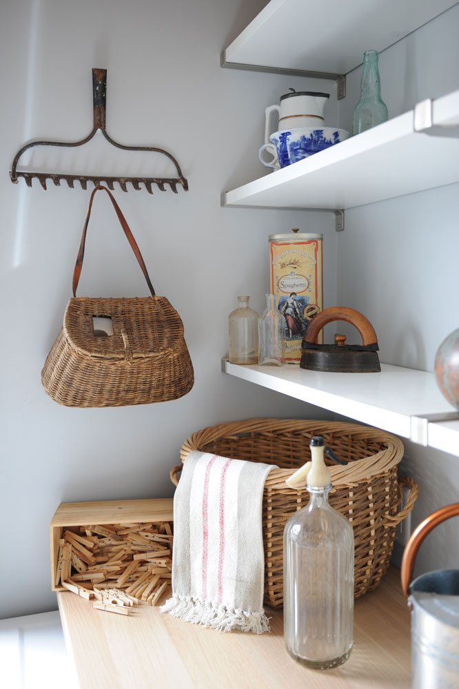
Rake It In
This gorgeous rake head isn’t from a fabulous antique shop, rather something that was found on the beach. “I love how rustic it looks. It’s perfect for hanging baskets, the dog leash or any other small accessories.”
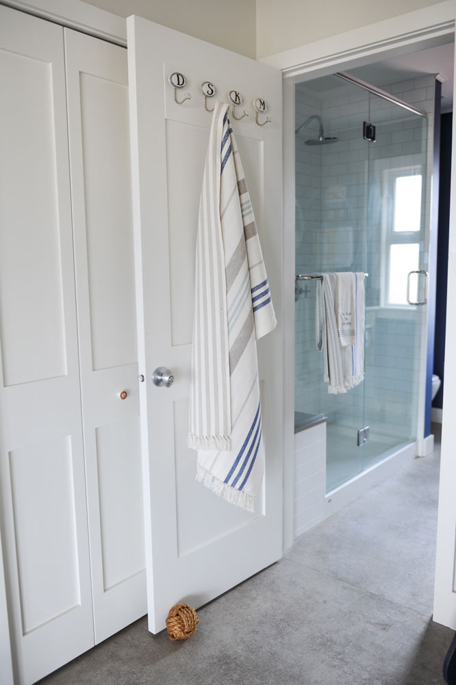
Simple Life
“The owners wanted to keep the bathroom simple. They’re right on the beach and swim a lot, so didn’t feel they needed a tub – just somewhere to rinse off at the end of the day.” We love the initialed towel hooks – a smart and stylish way to organize a shared bathroom.
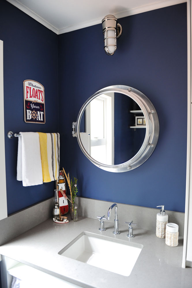
Seaworthy
Ocean-blue walls are a spiffy backdrop to this nautical-inspired mirror, which is fashioned after a porthole and opens up to reveal a medicine chest – again more smart and concealed storage in a tiny space. The striped towels and beachy accessories exude a sunny vibe.
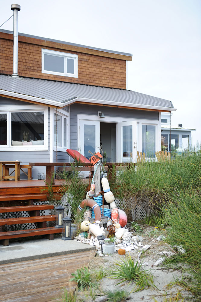
Found Beauty
Original promoters of reduce, reuse and recycle, Susie and Karl pick up anything of interest on their beach walks, and this arrangement by the back deck displays just some of their finds.

Natural Beauty
The cabin’s unspoiled views of Desolation Sound are very much in keeping with the aesthetic that Sarah-Marie gave it: welcoming, beachy and very hard to leave.
HGTV your inbox.
By clicking "SIGN UP” you agree to receive emails from HGTV and accept Corus' Terms of Use and Corus' Privacy Policy.


