Perched on a slope directly overlooking Spanish Banks Beach on Vancouver’s west side, this 4,000-square-foot new-build family home was heavily influenced by its fabulous seaside location. Which is why designer Margot Keate West of Keate & Co Designers kept its walls gallery white (they better showcase the views), its details simple (think Parsons-style millwork) and its furnishings casually stylish (yep, that’s original artwork beside the TV).
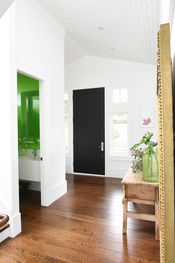
Green Room
A black front door isn’t the only thing that pops in the front hall. “The powder room is one of the only main-floor spaces without a view, so we decided to play up the owners’ love of wild colour by lacquering the walls in Sherwin Williams’ Outrageous Green,” says Margot. “In a house where the rest of the walls are white, it’s fun to hear the reaction of guests when they catch a glimpse as they pass by.” Margot and the owners agreed that an area rug would complicate this space unnecessarily. “The vaulted and planked ceiling provides the texture and interest,” says the designer.
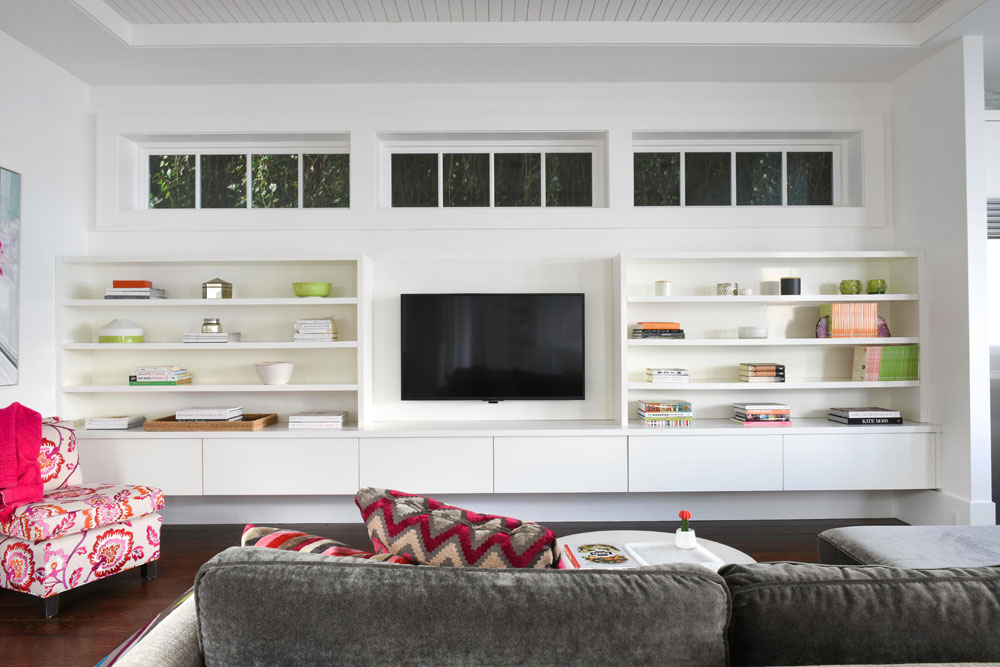
Windows of Opportunity
The family room faces the neighbouring house, but you’d never know it thanks to Margot’s ingenious design. “There’s an established bank of ivy already outside this wall and we liked the idea of bringing that greenery into the space, while still maintaining privacy between the houses,” she says. “I added clerestory windows here to light the space (electric light is required only in the evening, otherwise natural light is sufficient), and arranged the millwork and TV to spread horizontally from wall-to wall below them.”
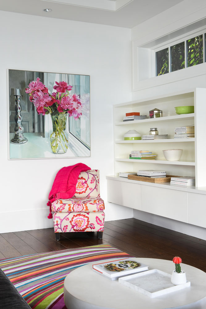
Pretty in Pink
This corner of the family room displays a Keate & Co-designed slipper chair custom-made by Velle’s Furniture. It’s covered in embroidered “Rose Indian” fabric by Manuel Canovas. The bold floral upholstery is a fresh complement to the peony painting by Ann Goldberg. As well as books, the shelves display collected objects for a personal effect.
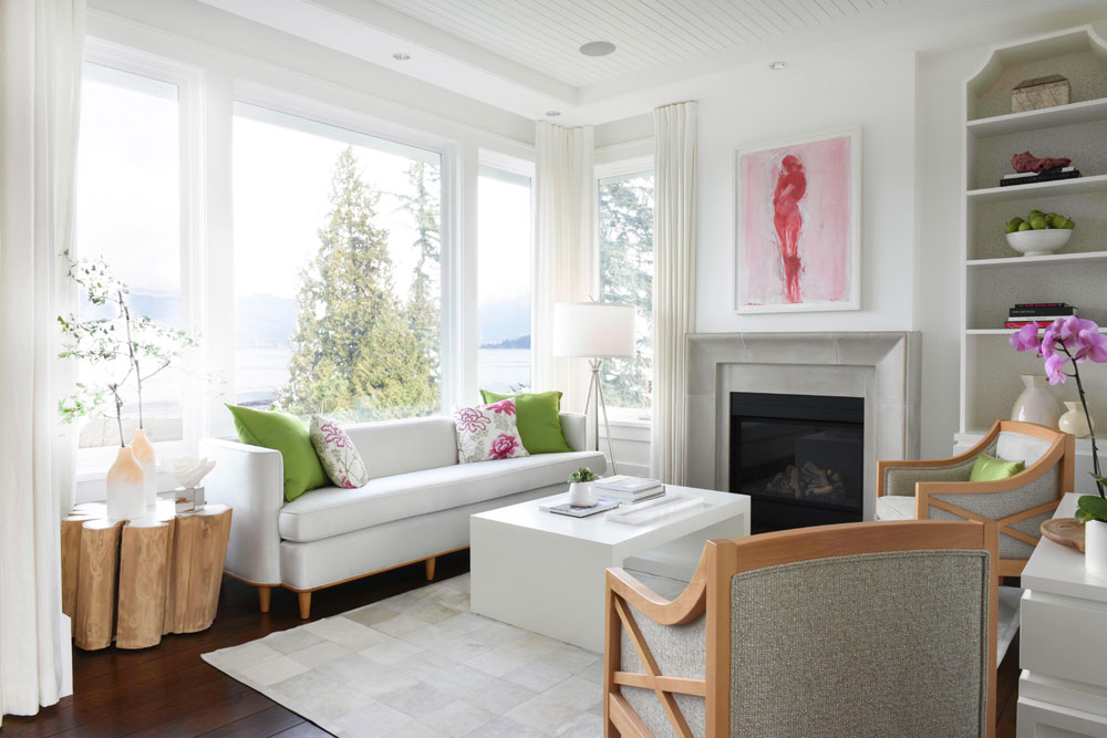
The View From Here
Margot says the living room is a serene spot to sit and take in the view. She supported that serenity with a soft palette, low-profile furniture and, of course, more art. The painting above the fireplace is by local artist Angela Grossmann and we like how its pink tones reference the slipper chair in the adjacent family room.
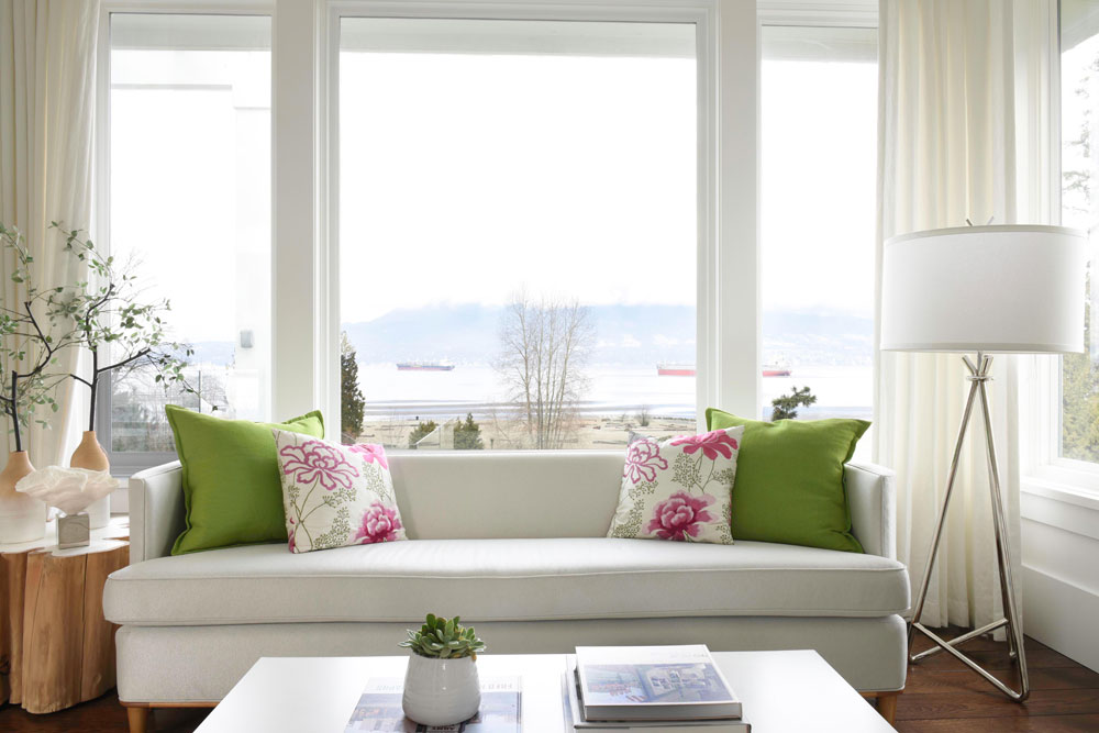
Punctuation Marks
“I didn’t want the upholstery to compete with the art or the view, just support them,” says Margot. “I kept the sofa pale, but introduced some of the same colours found in the art into the cushions and accessories to punctuate the space.” The living room windows overlook English Bay and the North Shore Mountains.
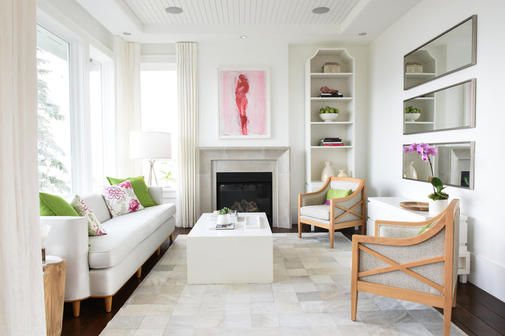
Customized Living
Margot designed the living room’s coffee table, shelving unit and credenza, which were made by Alex Goldie Custom Furniture. “They are all finished in white lacquer and I lined the back of the shelving unit with Designer’s Guild wallpaper for subtle interest,” she says. “With the shelving, I really wanted to reinforce the height of the ceilings and balance out the long vertical lines created by the linen drapery to the left of the fireplace.”
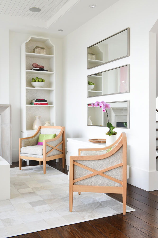
Eye Candy
It’s hard to keep the eye from settling on just one of the many interesting elements in this corner of the living room. The criss-cross raw-wood chair frames are from Lison Art Furniture and the three mirrors hung horizontally are a nod to Vicente Wolf, one of Margot’s favourite designers. “This is a great big wall, but we didn’t want to fill it with more art,” she says. “Rather, we chose to bounce the view back, so that visitors sitting on the sofa could continue to enjoy the view.”
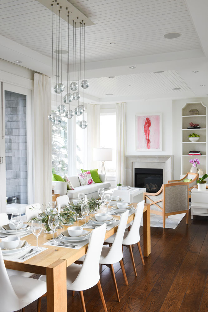
To Be Continued
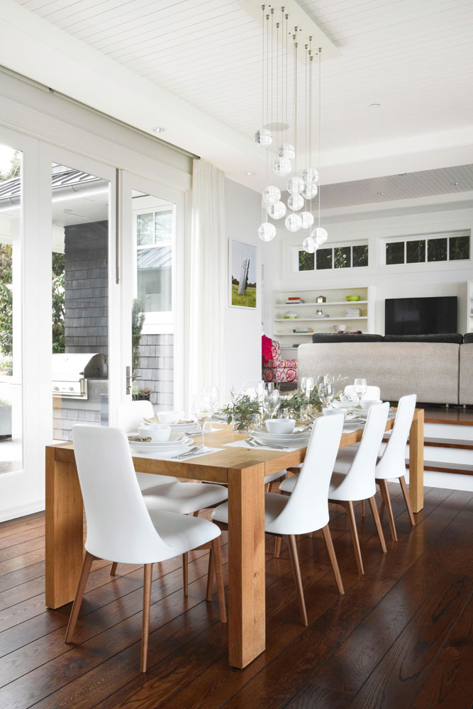
We love the continuity Margot created between the living and dining rooms in the first floor’s open plan. The wood tones of the raw-wood armchairs by the fireplace are echoed in the dining table, and the upholstered furniture’s pale palette carries through to the Etoile chairs in white leather. The overall effect is cohesive and soothing.
Dining Alfresco
You’d almost think you were dining outside sitting here, and it’s an effect that Margot loves. “The table sits between two sets of Eclipse doors, which retract all the way, so that the side walls of the dining room essentially disappear. To the south there is a lovely patio, and to the north another patio overlooking the beach, with views back towards Vancouver’s downtown core. It’s a fabulous spot to take in the annual summertime fireworks competition in English Bay.”
Bocce Ball
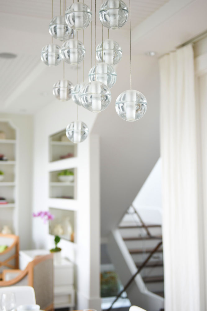
This gorgeous light fixture is from Bocci, the renowned (and homegrown) Vancouver lighting brand. Margot says, “It is sculptural but open and airy so as not to obstruct the view.”
Green Theme
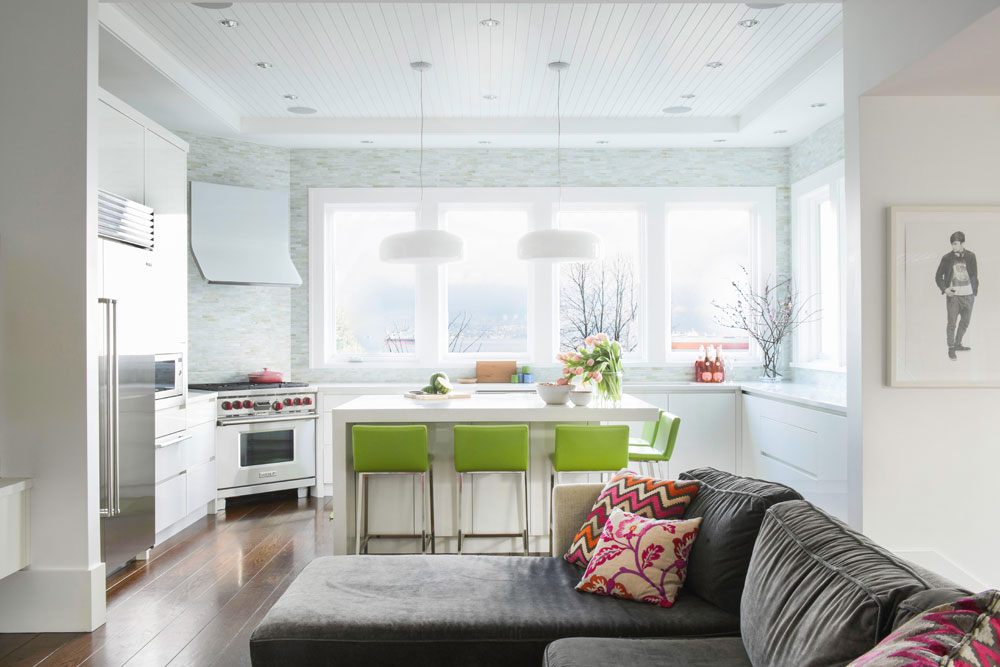
That shock of green first spied in the powder room off the front hall makes a reappearance in the kitchen (again, great continuity) in the form of island stools. “These are custom-upholstered in Pollack ‘Record’ high-gloss polyurethane in Kiwi. So fun and practical!”
Lighten Up
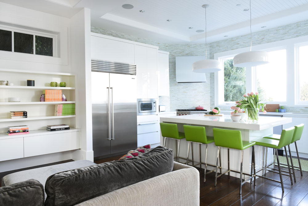
Margot’s expert eye is evident in her choice of kitchen pendant lights – try imagining dark or dramatic options here instead and the whole feel of the room changes. “I love them because they have a diffuser on the underside, which makes it look as though there’s no light source. It appears as though you’re looking up into the shade, but there is no bulb visible. It’s a very clever design and perfect for an island.” The smart accessorizing – echoing the stool’s kiwi tones in the books and votives on the family room’s shelves – will appeal to everyone’s inner stylist.
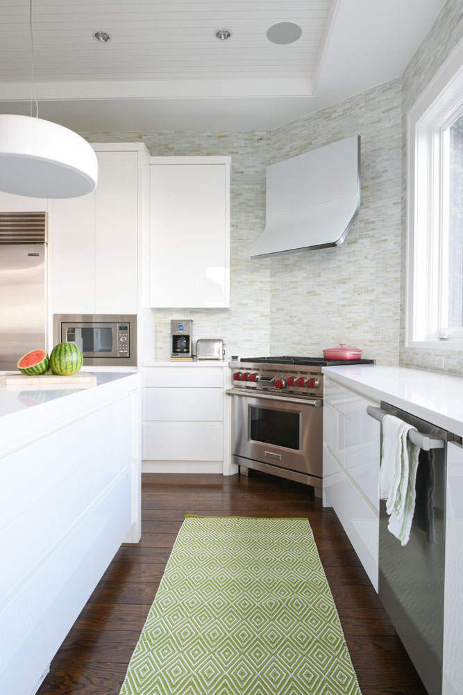
Corner Gas
Margot positioned the gas range and hood in the corner of the kitchen to keep the windows and view to outside the focal point. Glass tiles form the perfect backsplash. “They’re pale and watery in colour and create a soft wave effect, just like the beach outside.” They also let the modern glass hood be the star of the show.
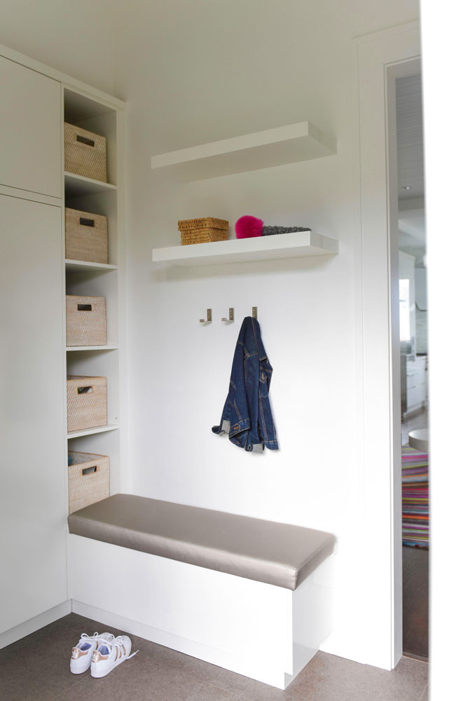
Pretty Neat
Margot’s mudroom design marries form and function for family living. We love the storage options and how tidy it is, but also how practical it is. Baskets look spiffy yet effectively hide casually tossed in items – taking real life (few of us fold up scarves and stack hats) into account.
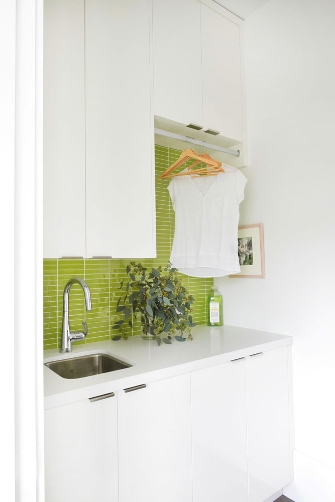
Shiny, Happy Laundry
“The laundry room offered another opportunity for a splash of colour,” says Margot. “Lime-green glass tiles provide some unexpected punch and make the laundry room a happy place. Chores are less chore-like when your surroundings aren’t drab!”
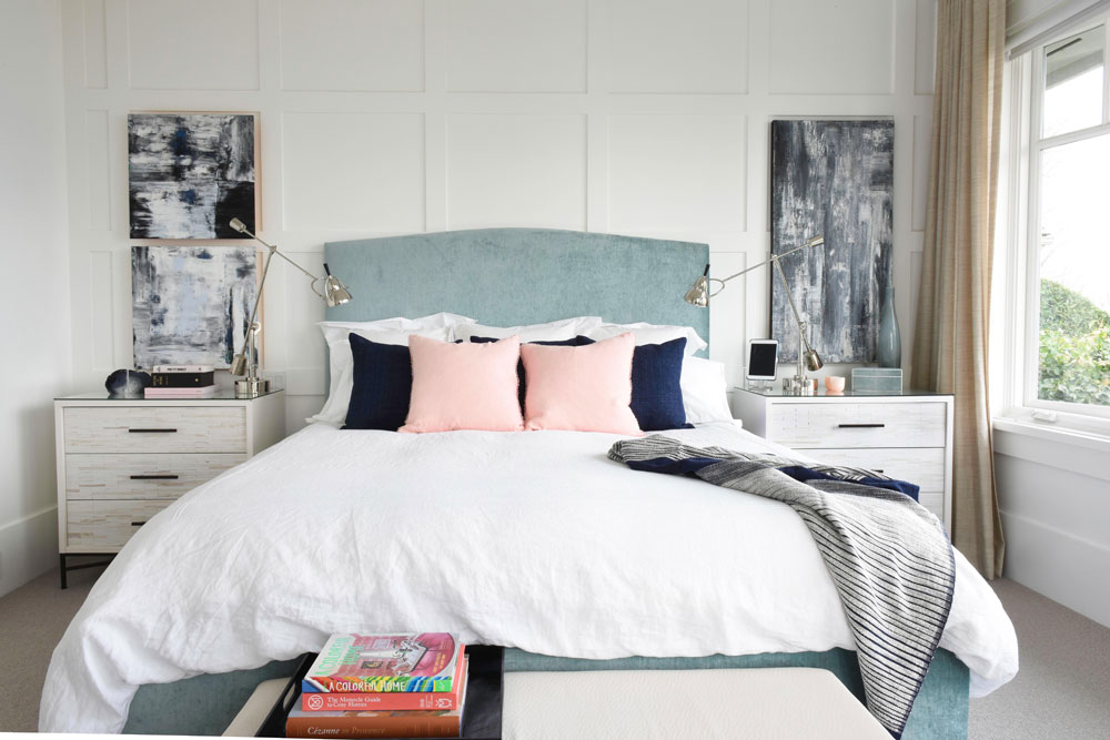
Textural Effect
The master bedroom is a beautiful balance of fabric and furnishings – starting with the custom-made bed and headboard. “I wanted to add the softness of a curve here, but without overwhelming the architecture or view.” It sits in front of wall panelling, which is a savvy addition to almost any room. “Here, it breaks up the great expanse of drywall and, like the ceiling planking throughout the home, imbues the space with a beach-house feel.”
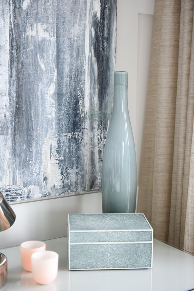
Palette Power
“The owners love strong colour, but we chose a more muted and softer palette for the bedroom,” says Margot. The artwork, which flanks the bed, is by Vancouver-based artist Miriam Aroeste. Its blue shades are complemented by a watery-tone vase, shagreen box and soft pink votives.
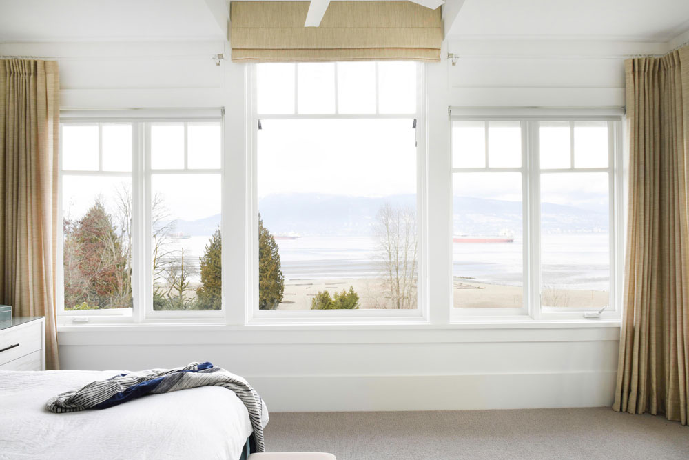
Mix it Up
Don’t be afraid to mix up window treatments as Margot did in the master bedroom. “I wanted to incorporate fabric to warm the space up, and chose a sandy-coloured wool/linen blend for the job,” she says. “The middle window is taller than the others, and I didn’t want to lose any of the view by adding stacks of drapery to either side of it. I chose to break up the drapes with a roman shade just for this one window.” And it works beautifully.
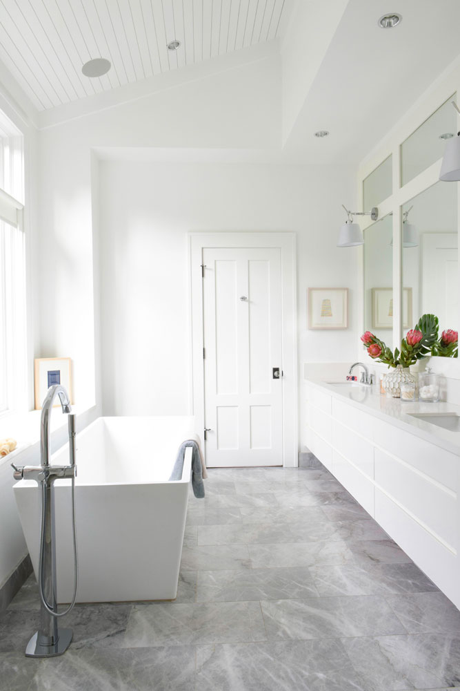
With the Edge
The tranquil master bathroom boasts a showstopper tub from Blu Bathworks. “My clients chose it, and I love how the squared edge makes the space feel more modern.” The marble flooring is from Creekside Tile.
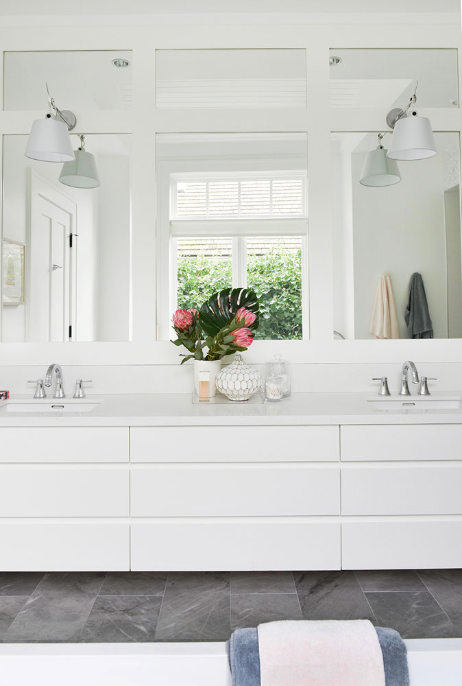
Master Planning
Margot custom-designed the vanity to offer maximum storage, easy clean-up and more. “With a floating vanity, you can incorporate soft under-cabinet lighting on a motion sensor, so that it glows softly if you wander into the bathroom at night.” As in the master bedroom, Margot added panelling here to create an interesting mirror treatment. The countertop is Caesarstone in Organic White and the sconces are Artemide Tolomeo.
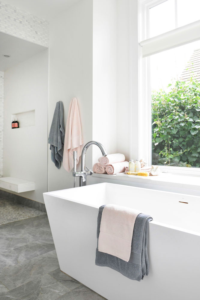
Throw In The Towels
“The ensuite’s pink and grey towels carry through the colours from the master bedroom,” says Margot. “I also really like how the pink softens and warms up this predominantly grey bathroom.”
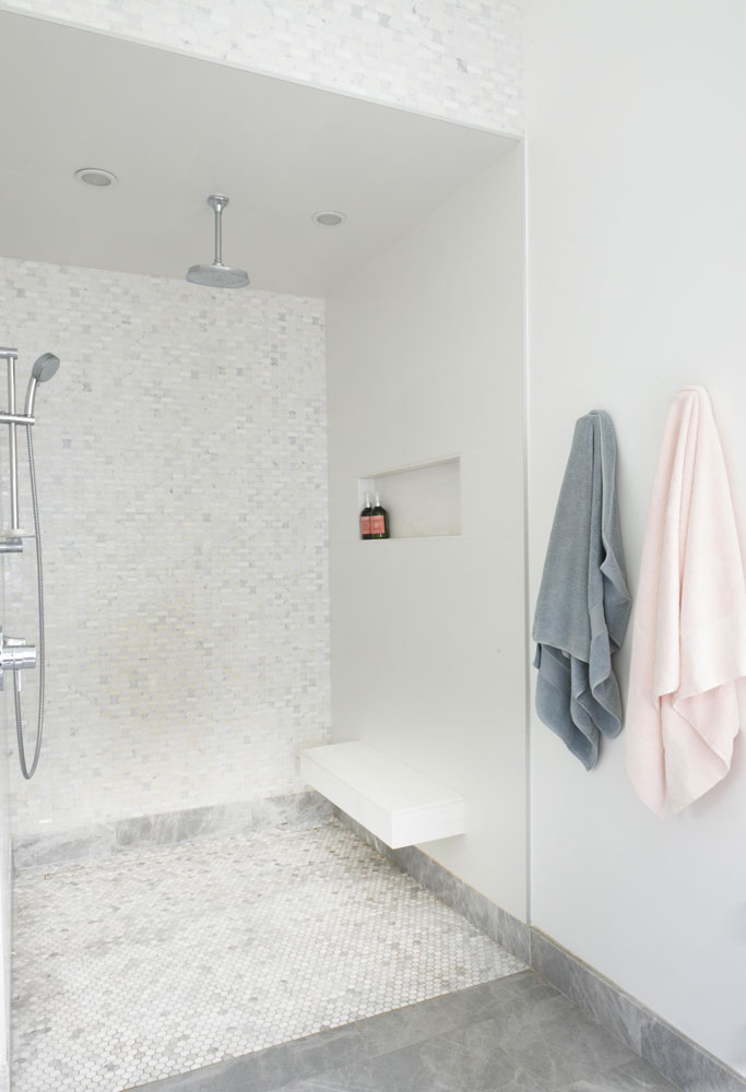
Less is More
Having a curb-less, glass-less and door-less shower allowed Margot free rein with tile selection. “I was able to blend a variety of tiles precisely because there was no worry about the complexity of tiling a curb or working around shower glass.” Practical indulgence: a heated shower floor keeps the open shower from feeling drafty.
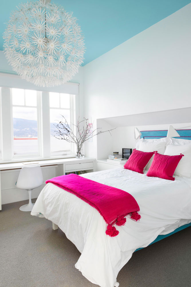
Copy That
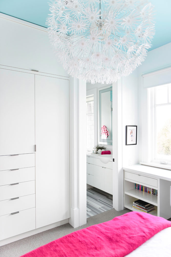
If you’re someone who loves the idea of colour but aren’t sure how to use it, this bedroom design is for you. “The owners really wanted some colour for their daughter’s bedroom but didn’t want it on the walls so I came up with a fun solution: put it on the ceiling!” The IKEA pendant light is playful, kid-centric and on-budget.
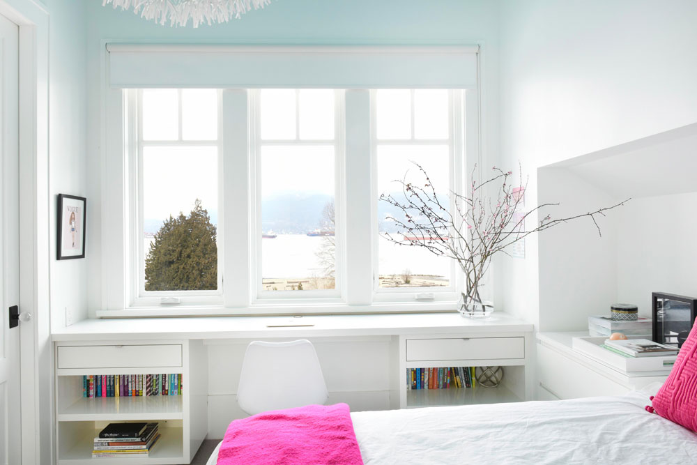
Desk Duty
“What girl wouldn’t kill to do her homework in front of this view?” says Margot. The custom-made desk is from Van Arbour Designs in Vancouver and Margot topped it with Caesarstone. “It makes the desk impenetrable to sharpies, nail polish, whiteout or whatever else comes its way!”
A Case for Storage
“I designed a casework closet with built-in drawers and cupboards rather than a conventional walk-in,” says Margot. “The storage space is better utilized this way, and provided the opportunity to include a huge awning cabinet up above for out-of-season storage.”
Sink In
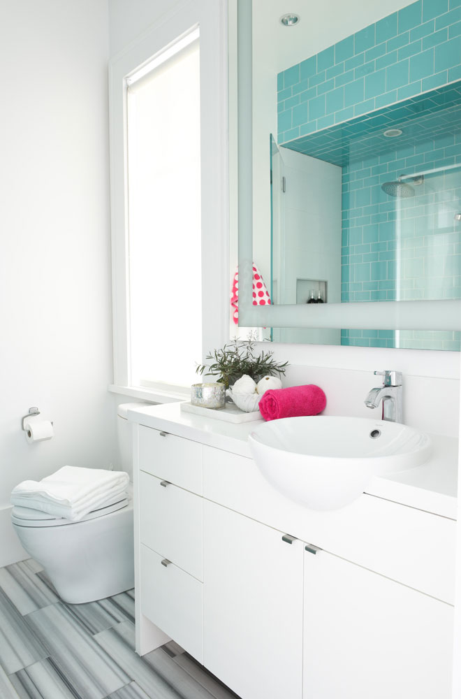
The daughter’s ensuite bathroom is small and the door opens into this tiny space, so Margot had to come up with a design that worked. “The vanity needed to be shallow because of the placement of the door, so I chose a sink that cantilevers out beyond the counter to maximize sink space while keeping the vanity shallow.” It looks great, too.
Pool Party
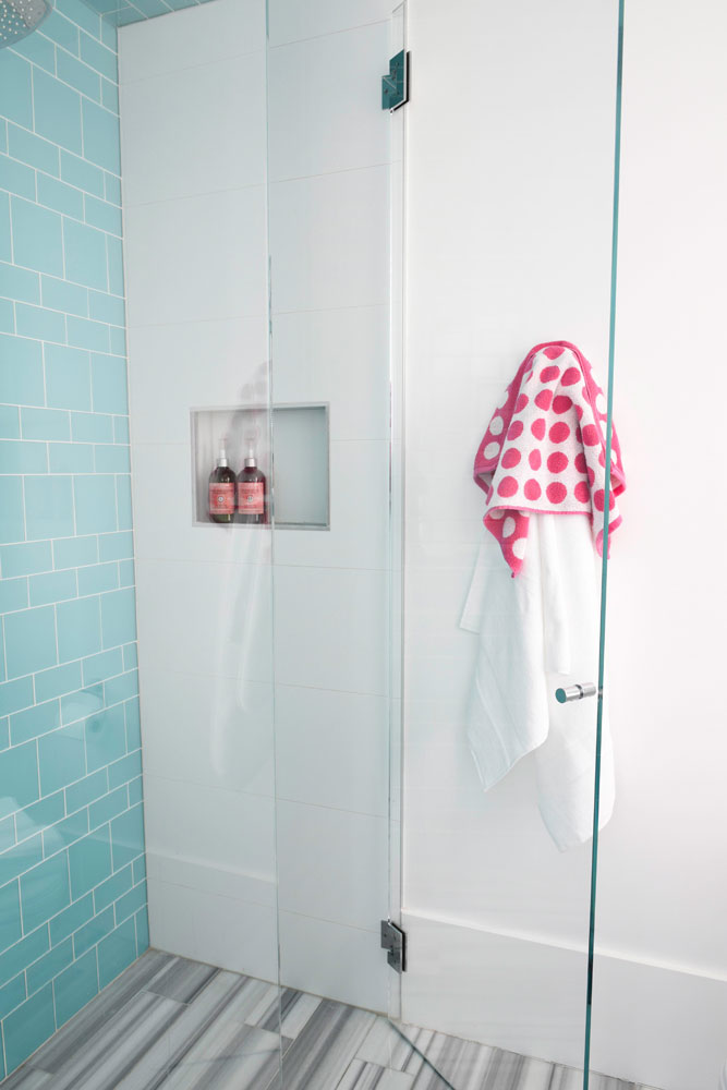
The pool-coloured glass tiles were the daughter’s favourite but Margot didn’t want them applied as standard 3 x 6 subway tiles. “I found these Interstyle ones at Creekside Tile and was able to get them in a number of different sizes in order to create a unique pattern. Keeping the bright colour on one wall (rather than the whole shower stall) keeps it fresh, and also keeps the colour from getting overwhelming.”
Well Crafted
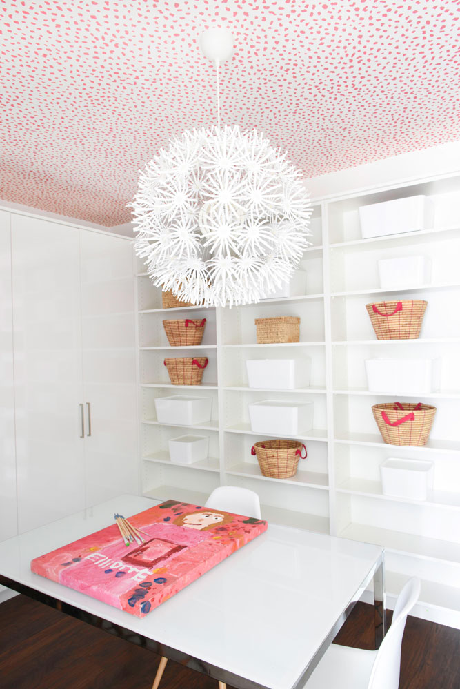
The basement crafts room is small and windowless, but you’d never know it thanks to a ceiling covered in Thibaut wallpaper, built-in shelves with display baskets and a whimsical pendant light. “All of these things, especially the pink dotted wallpaper, make the space fun.” And very much in keeping with the rest of this bright and energetic family home.
HGTV your inbox.
By clicking "SIGN UP” you agree to receive emails from HGTV and accept Corus' Terms of Use and Corus' Privacy Policy.


