With its proximity to the Pacific, “washed up” is a good way to describe this West Vancouver residence before its makeover. The owner (who has three teenagers, one dog and two cats) called in designer Michelle Flemons to resuscitate 3,000-square-feet of space that was drowning in dark and depressing. “A major reno was required,” says the designer. “I wanted it to have an open-plan, a fresh ocean vibe and lots of light.” Dive into the gallery to see how she made it happen.
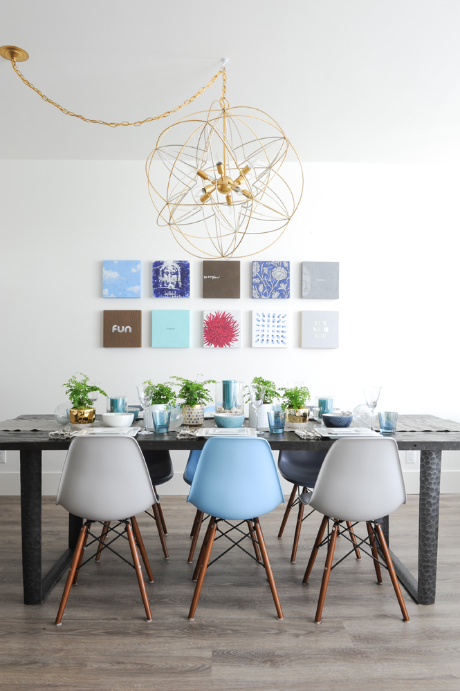
Oh Wow
“The main-floor ceilings are 10-feet tall, so I knew this space could host a magnificent light fixture to ‘wow’ guests,” says Michelle. It does, especially in the new open-concept floorplan where its airiness and curvy lines make a statement (without overpowering) and act as an elegant contrast to the table and artwork.
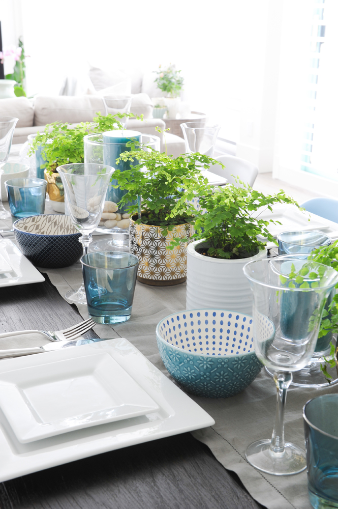
Set the Table
Steal this idea: repeat your home’s colour scheme in your table setting. “My stylist Tina Barkley and I used the space’s neutral palette with varying hues of blue as our guide,” says Michelle. “I love the fabulous patterns of the bowls and the whimsy of ferns placed in gold-accented pottery, which complete the curated, breezy ambiance.”
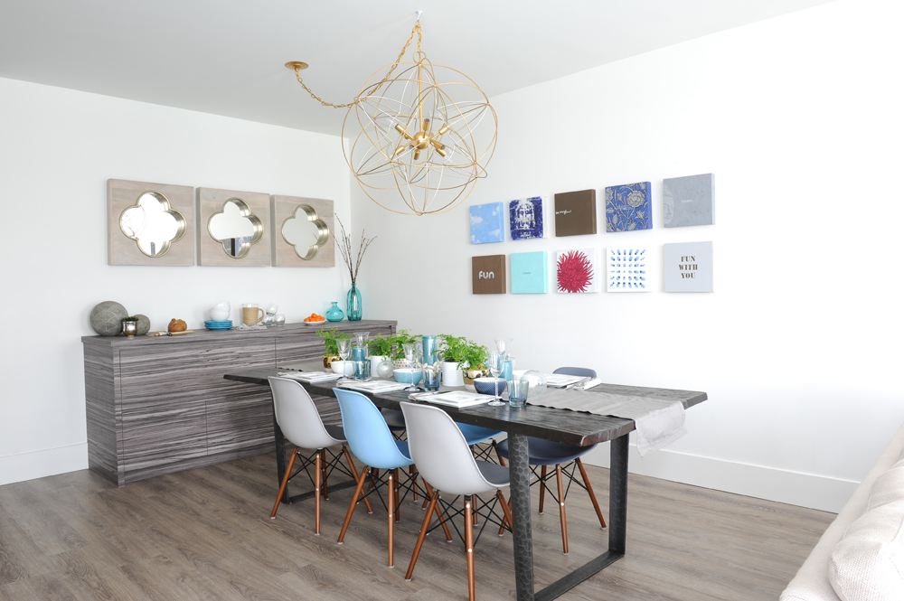
Artistic Flair
The homeowner’s brother, artist Blair Chivers, had painted many original pieces for his sister. “We went through her art collection and selected ones that would complement the dining room,” says Michelle. “All of the walls, doors and trim are painted gallery-white so the artwork pops.” The table’s live-edge finish speaks to West Coast style and the mismatched Eames-style chairs were chosen to coordinate with the art.
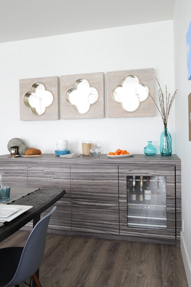
Buffet Station
The open-plan layout influenced the buffet’s stunning design. “I finished it in this striking veneer because its bold character differs significantly from the kitchen’s pale-wood cabinetry,” says Michelle. “The result is a clear distinction between the kitchen and the dining room, even though they share the open space.” The trio of quatrefoil mirrors above are more than just pretty, reflecting natural sunlight during the day and the chandelier’s sparkle at night.
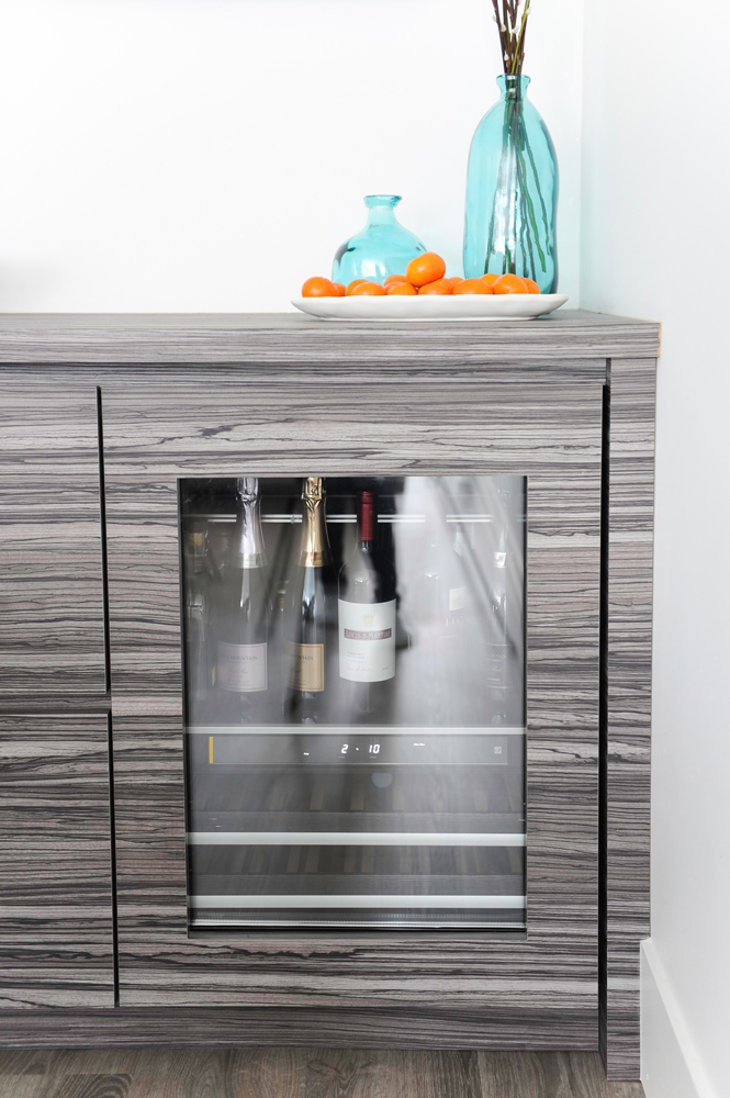
Just Chill
In addition to housing entertaining platters and formal tableware, the buffet also incorporates a discreet bar fridge for easy entertaining – how smart is that?
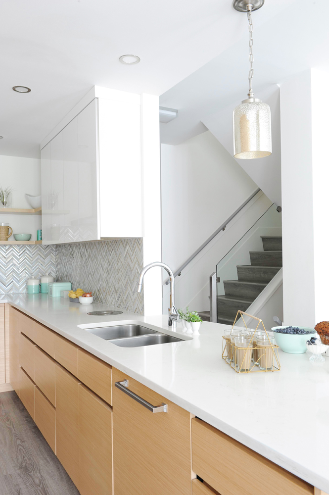
Just Right
The homeowner wanted a kitchen that was fresh and new without being cold or modernist. Michelle devised the perfect solution with the help of Quality Cabinets. “This combination of warm wooden lower cabinets and white high-gloss uppers is the perfect marriage.”
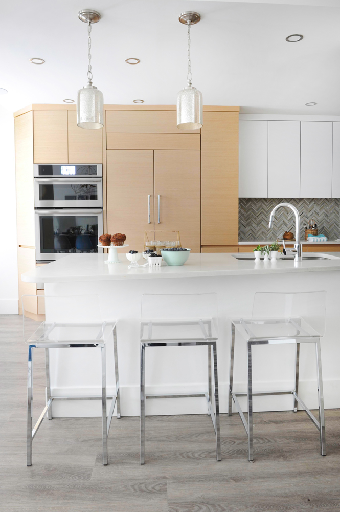
Metal Winner
The kitchen’s Caesarstone-topped peninsula, which acts as a breakfast bar, is illuminated by gorgeous pendant lights. “I am a big fan of mercury glass,” says Michelle. “These warm, silvery gold pendant lights from Norburn Lighting act as the perfect transitional element between the kitchen’s chrome metals and the warmer gold metals throughout the rest of the home.” The clear acrylic stools are easy to care for and keep the look light and airy.
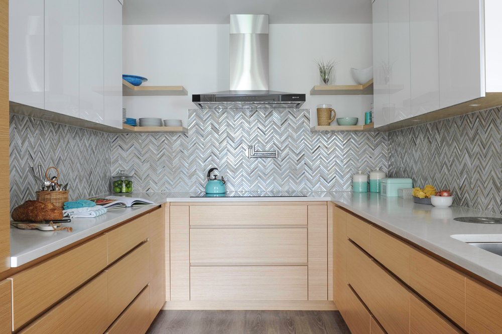
Glass Act
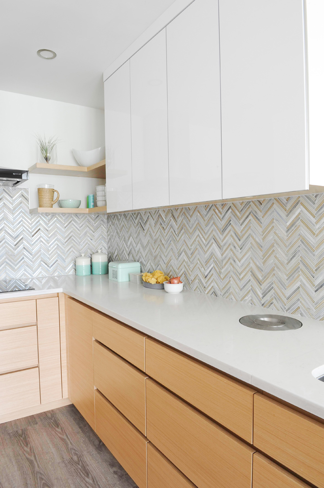
“I was on the hunt for a backsplash with character,” says Michelle. “These glass tiles were a splurge, but the owner earned a gold star for knowing where to get the best bang for her buck.” The chevron pattern is timeless while the range hood adds just enough “clean, modern lines.”
So Seamless
“U-shaped kitchens can feel tight, so I aimed for a clean, seamless look to maximize the visual space,” says the designer. “Flat slab doors are also easier to keep clean than recessed or raised panel ones, and with three teenagers in the house, this choice makes even more sense.” Design envy: did you spot the stainless-steel inset? It’s the opening to a built-in stainless-steel waste bin!
Out in the Open
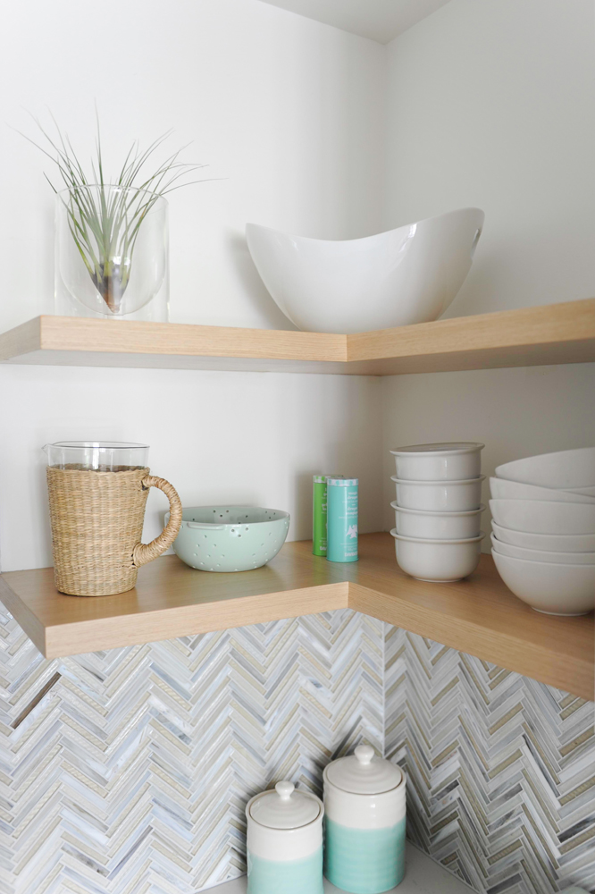
Of the floating shelves that flank the range hood, Michelle says, “Every kitchen needs a bit of open space to break up the wall-to-wall cabinetry. This is a great opportunity to showcase beautiful tableware and other kitchen accessories with a bit of pizzazz.” We like how these objects tie in with the blues and greens of the dining room’s artwork and chairs.
Double Duty
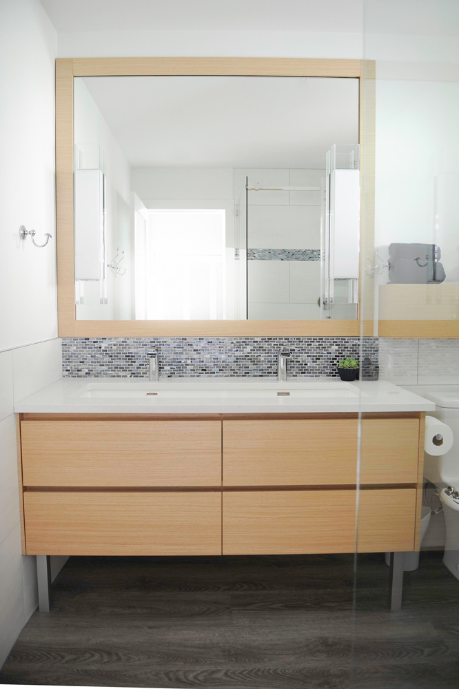
Both the guest bathroom and one for twin teenage boys, this space had to be supremely functional. Thanks to Michelle (and the boys) it’s also great-looking. “The boys’ only request was a trough-type sink and waterfall faucet, thus the double vanity. Easy-peasy and looks smashing – check. Teenage boys with good taste – double check!”
Wood Work
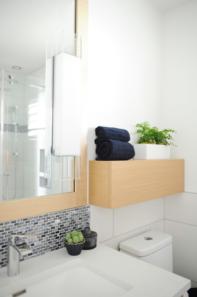
A custom-made floating storage cabinet and a wood-framed mirror inject warmth into this bathroom. To maximize the size of the mirror, the designer mounted the sconces directly onto it.
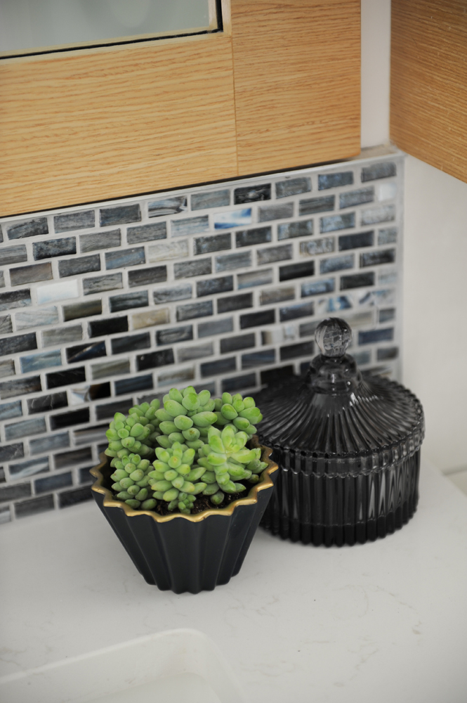
Boys’ Room
“I am obsessed with the bathroom’s mini-brick tiles. They are superb for a boys’ bathroom and make the whole space deliciously rich and masculine.”
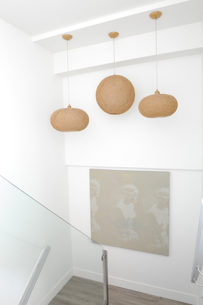
A Light Touch
Textured pendant lights from Norburn Lighting look like an art installation in the bright new stairwell. “Removing the old spindles and installing glass panels with stainless-steel rails was a labour of love – tricky, but a worthwhile endeavor. And I love how the light is reflected through the loose weave of the lamp shades.” The artwork is another original by Blair Chivers.
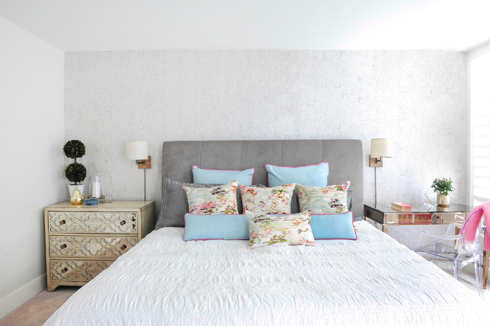
Against the Wall
The focal wall is detailed with the most stunning wallpaper from Tritex. “It’s made from natural birch with gold leaf accents. I had my eye on it for a long time and was just waiting for the right project and client to spoil. When she said ‘yes’ to it, I was so excited I could hardly speak.” We love the way Michelle echoed the textural element in the bedding and mirrored side chest.
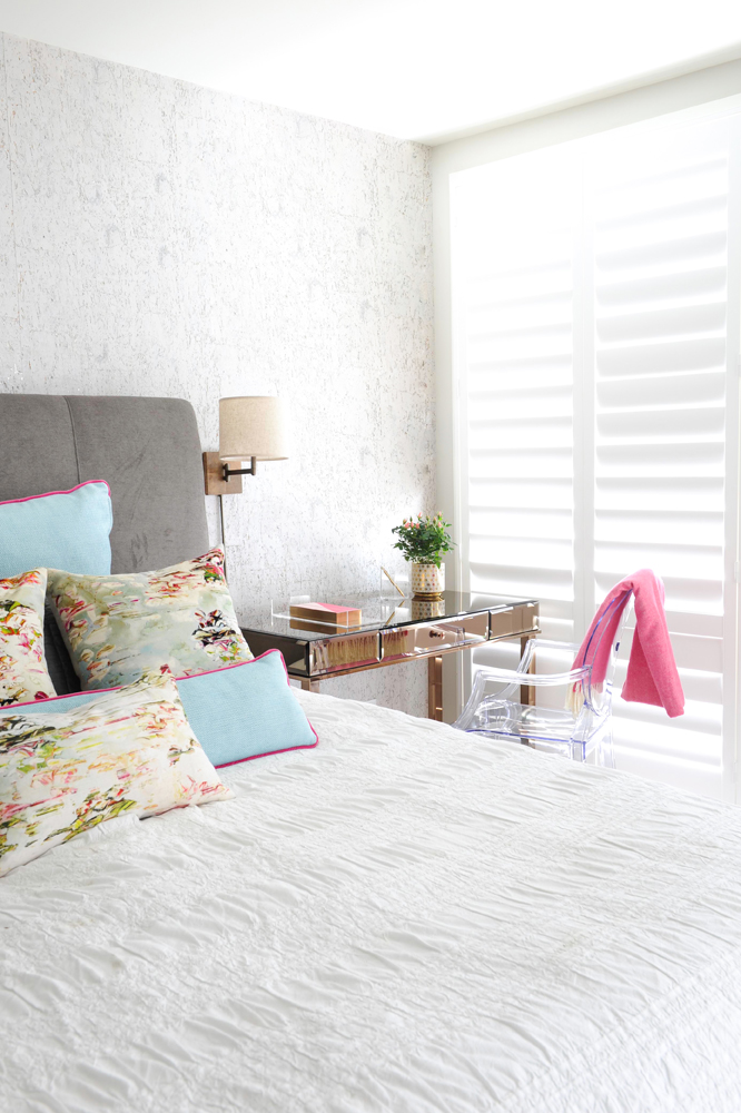
Window Treatment
Michelle chose shutters for all of the home’s window coverings. “They have a simplistic beauty and also hide the window’s teal aluminum frames.” She accented the homeowner’s headboard and layered in colour with a collection of custom-made cushions from Velle’s Furniture.
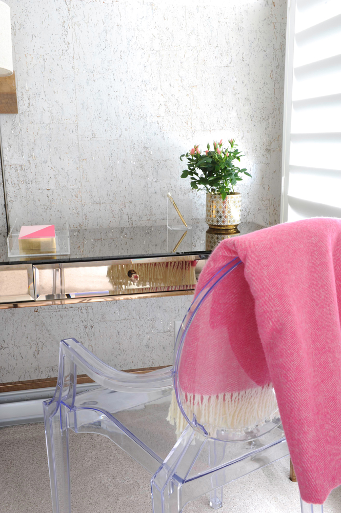
Pretty Practical
Michelle admits it took some effort to steer the homeowner away from twin bedside tables. “Matchy-matchy bedrooms are not my thing,” she says. “I will always try to create something more interesting.” Here, she does it with a pretty mirrored desk, which is admittedly more useful than a side table. The cheerful pink throw stands out against the Ghost chair.
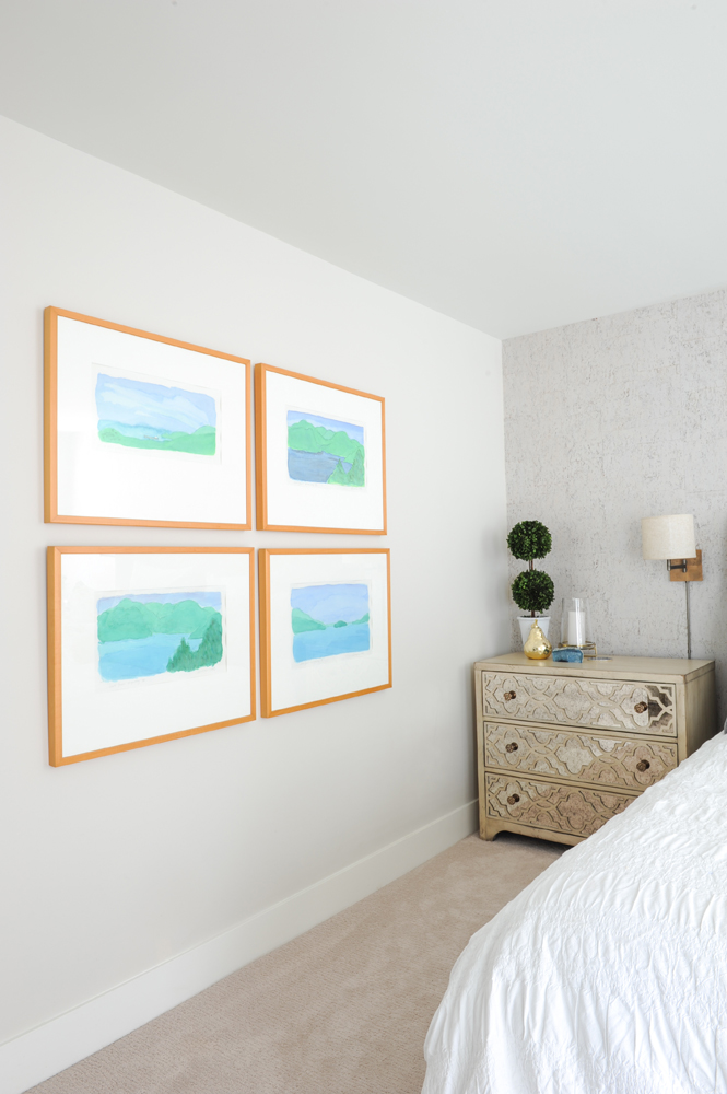
Family Affair
The framed artwork is, once again, courtesy of the homeowner’s brother. “We chose these ones specifically for their calming blues – perfect in a master bedroom.”
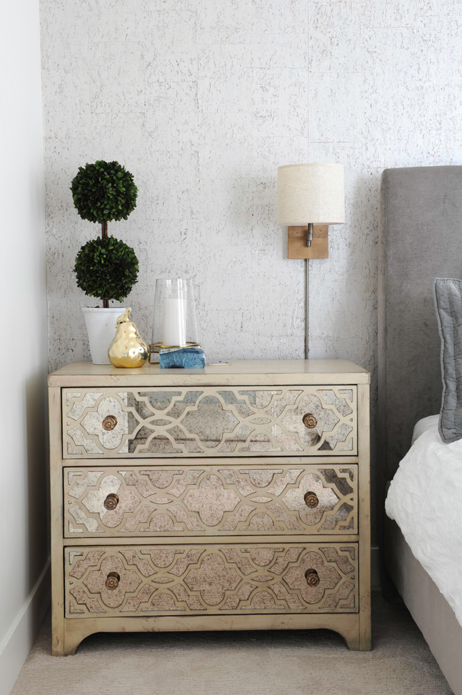
Need to Fret
“I adore fretwork, and this solid wood dresser with an antiqued-mirror front and pearl finish is the perfect complement to the elegant wallpaper.” It also avoids the prescriptive bedside table and provides ample storage. The sconce is super practical and has a swing arm for night-time reading.
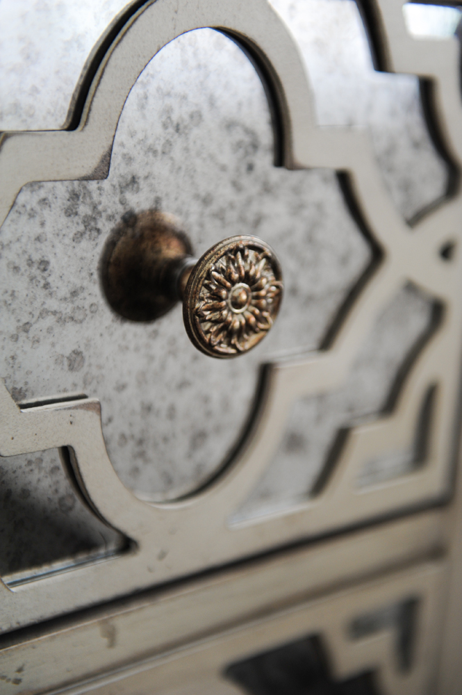
Please Pull
Something as small as a drawer pull can have a huge effect in a room. This intricate one has an old-world feel that’s a nice foil to the room’s modern white shutters.
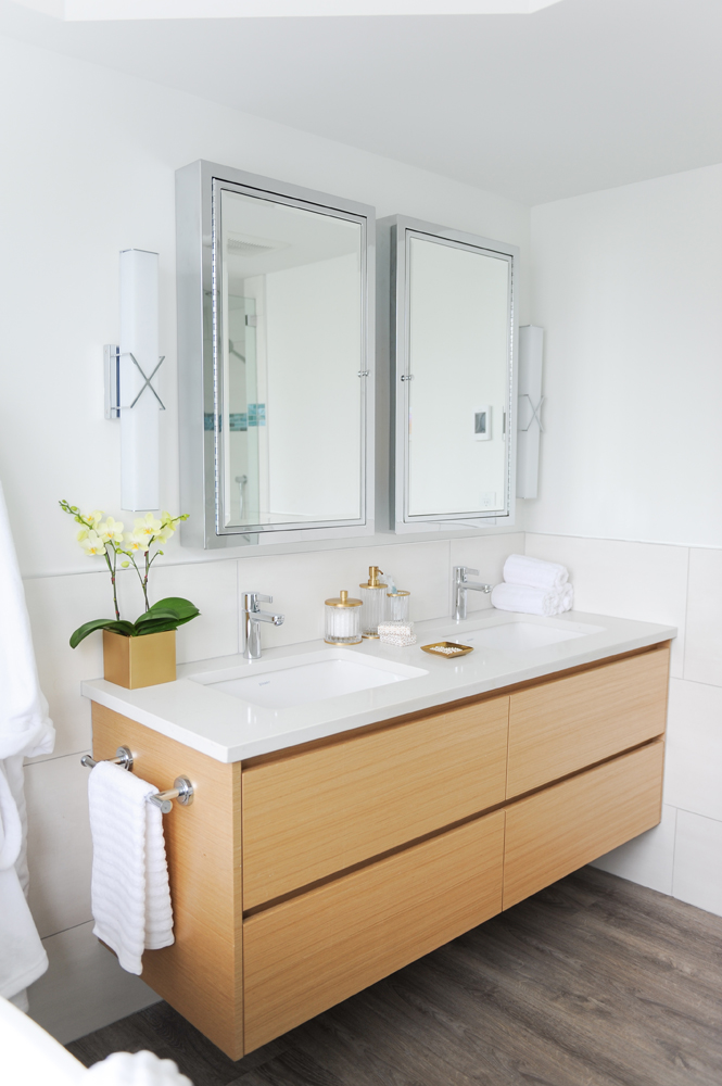
Mirror, Mirror
Another idea to steal, these mirrors are more than reflective beauties. Michelle says, “It was important to find extra storage in the master bedroom ensuite for toiletries. Instead of a flat mirror, I incorporated two medicine cabinets that double as mirrors.” Their symmetry is echoed in the double sinks of the vanity, which is floating to keep the look light.
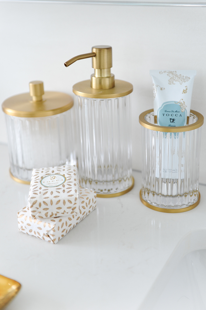
Getting Warm
We love how Michelle chose warm gold-trimmed accessories that are a direct contrast to the ensuite’s chrome fixtures. They feel dynamic here and are undeniably feminine.
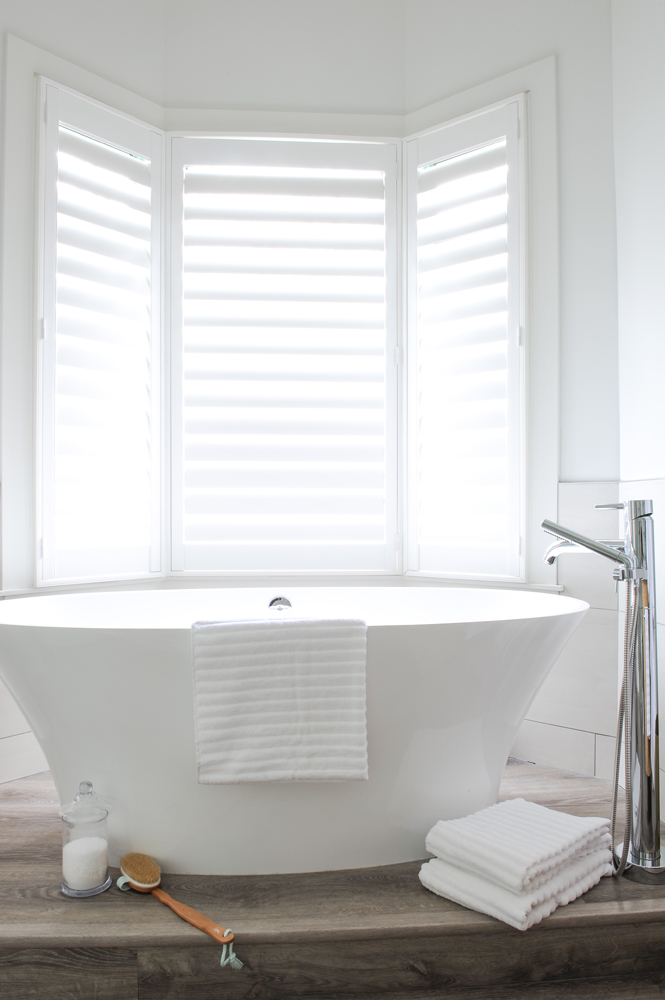
Serenity Now
Of this exquisite Victoria & Albert freestanding tub, Michelle says, “It’s crafted from a unique material that feels warm to the touch and offers exceptional heat insulation and scratch-resistant properties. With three teenagers in the home, the owner needed a restful, luxurious place of her own to relax and recharge.”
HGTV your inbox.
By clicking "SIGN UP” you agree to receive emails from HGTV and accept Corus' Terms of Use and Corus' Privacy Policy.


