Any landlord who’s rented out an apartment has grappled with the same question: is it better to invest in a redesign or to save your money? Sometimes, the answer is in the middle. Michael Berger, who runs the vintage furniture and home decor business Bephi Home, helped a client transform a tired rental apartment into a retro pad inspired by mid-century modern design and boho-chic vibes. Michael sources all his own furniture and knows his way around a flea market, and was able to give the apartment a proper facelift without breaking the bank.
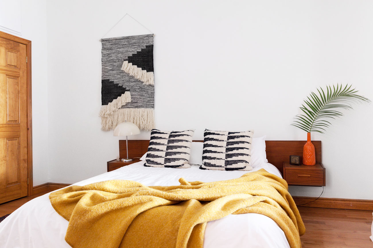
Go Big or Go Home
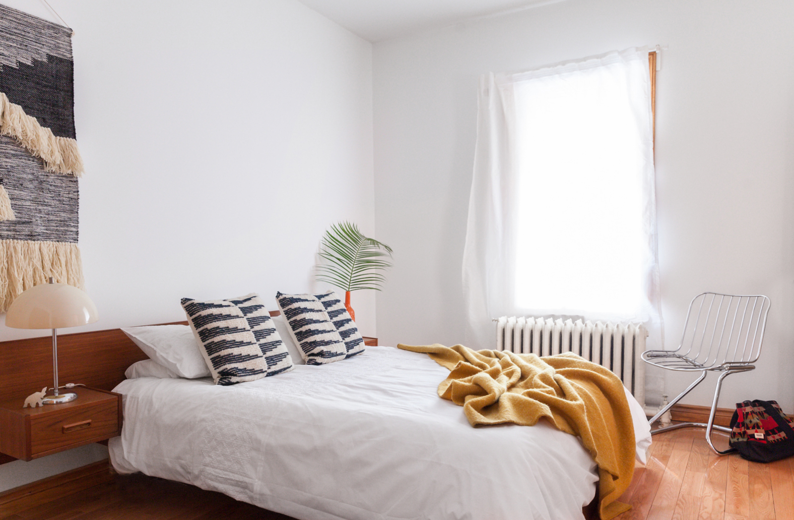
The bedroom is huge, so Michael brought in this large mid-century teak bed with floating side tables. It’s a show-stopper, with an 8-foot-long headboard, and it sits relatively low to the ground. For the bedspread, Michael went with neutral whites and a mustard-gold Kenwood wool blanket. The macrame wall hanging on the wall is from HomeSense; Michael likes how it brings in natural texture to warm up the space.
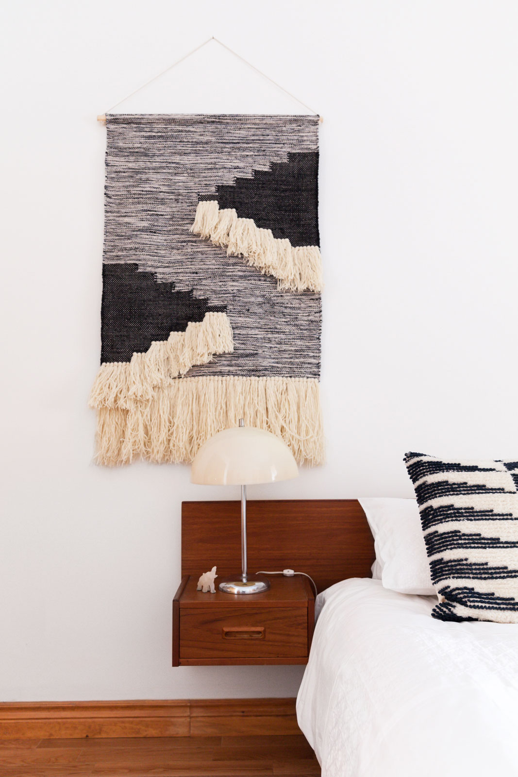
Light it Up
Michael is a pro at vintage shopping, and sourced this retro lamp from a house that was going to be torn down. He loves mixing cold, mod pieces with luxe, textural touches, and this bedside moment defines his design ethos.
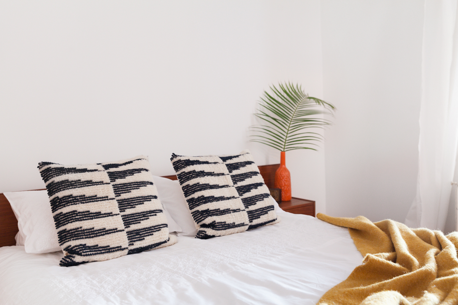
Matchy Matchy
The black-and-white throw pillows were brought in to play off the similar colour palette in the wall hanging. They also add a funky touch to the otherwise crisp bed.
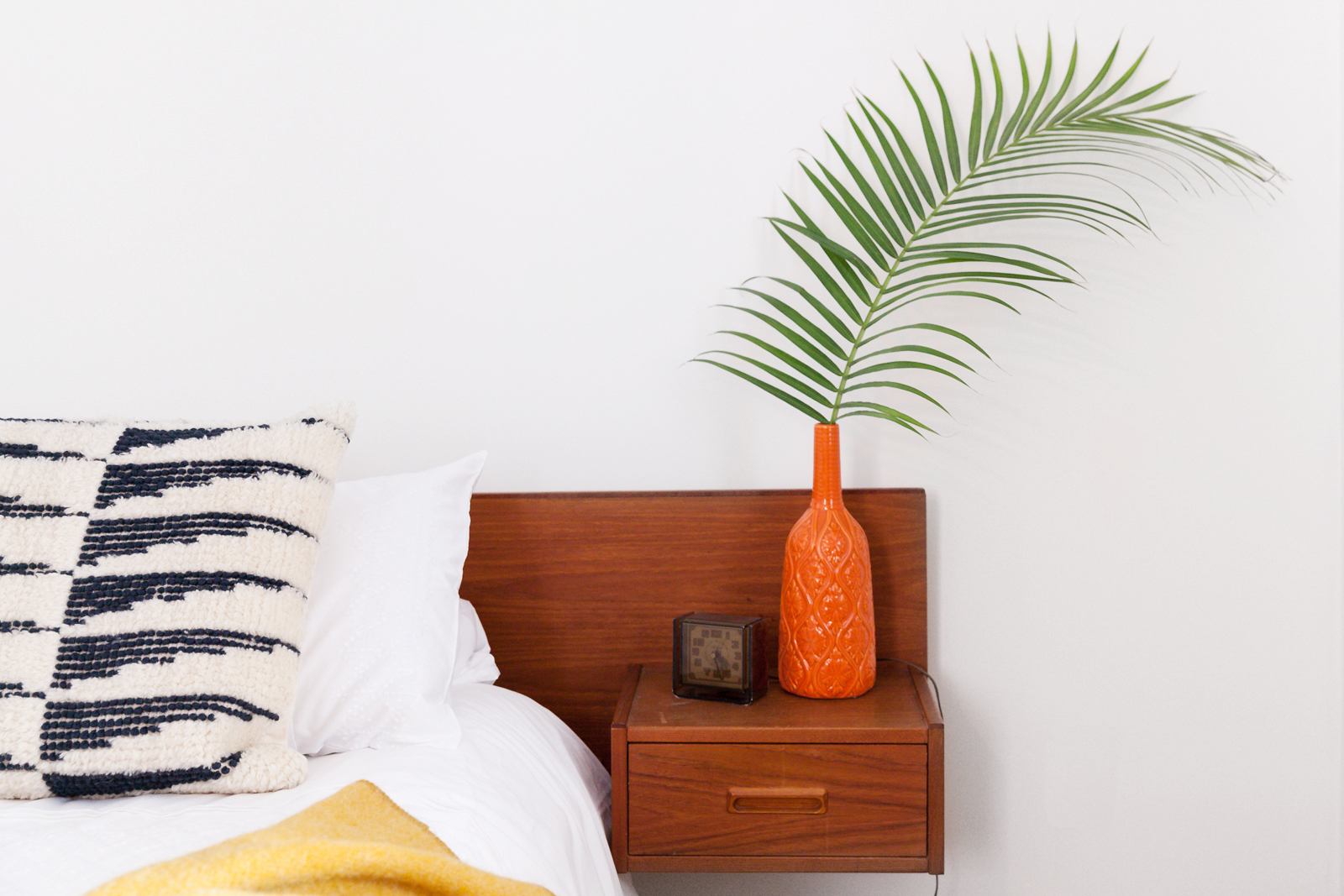
Tropical Oasis
Throughout the apartment, Michael has added fresh pops of tropical leaves. Here, he’s placed a palm frond in a rosy orange vase. They’re ideal for anyone who can’t keep a plant alive. The little clock is a vintage piece he found for $5 at a thrift store.
Good Morning, Sunshine
The space is filled with light thanks, in part, to a fresh coat of paint. Michael painted the entire home with Benjamin Moore’s Chantilly Lace, which – as whites go – is a cooler, crisper tone.
Shell Game
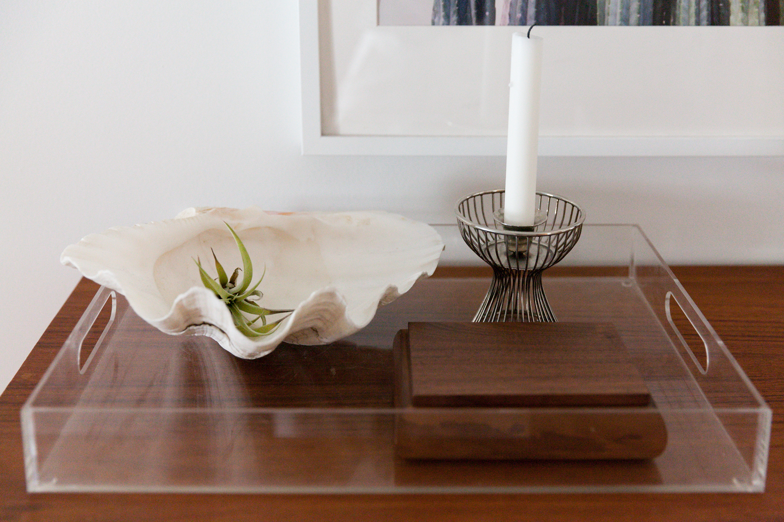
Michael is a pro at mixing and matching pieces to create eye-catching vignettes. On the dresser, he’s brought together natural pieces – the shell, the air plant – with more structural pieces, including the caged candleholder.
Dinner is Served
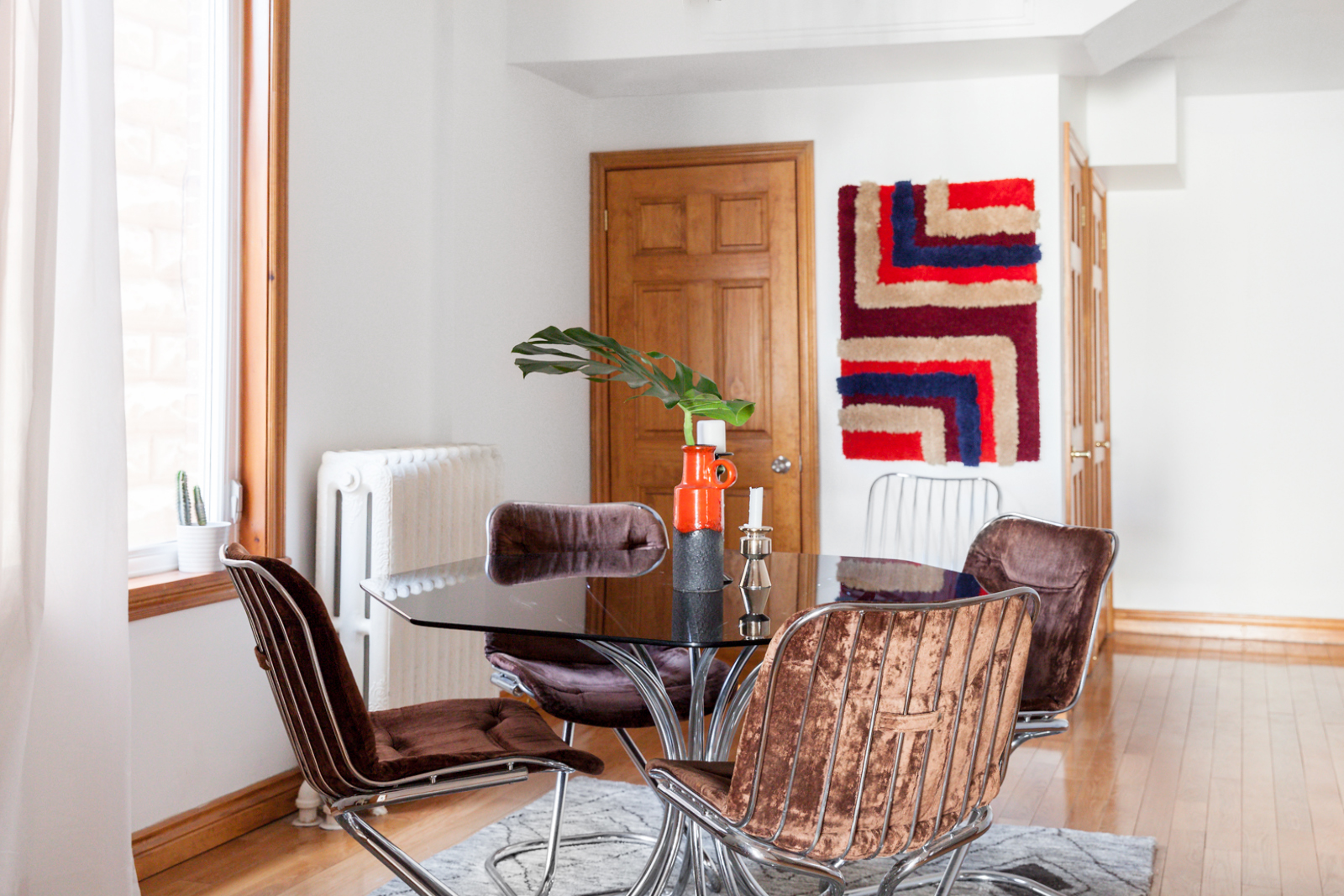
Michael firmly believes that chrome is the new brass, and so he brought in this sculptural chrome-and-glass dining room set. The piece has cold lines, which could be harsh, so Michael balanced it with the fuzzy wall hanging in the background. For a natural touch, he placed a Montserrat leaf inside a vase.
Be Original
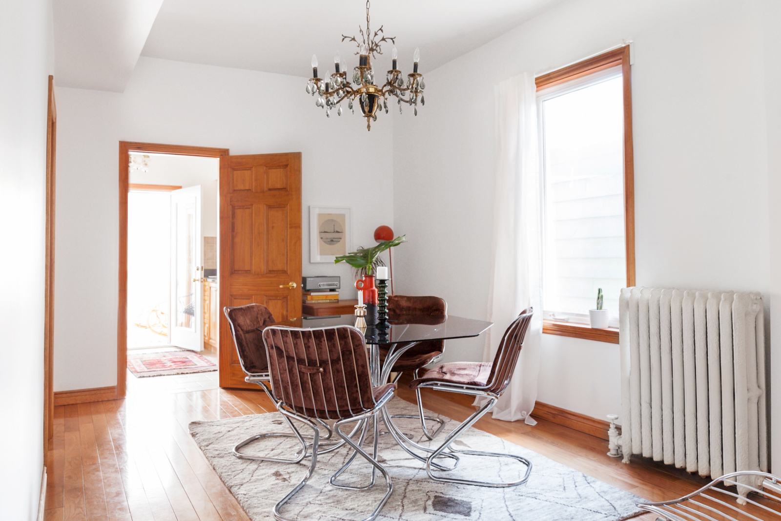
For any redesign, it’s important to know the difference between what needs to stay and what needs to go. The dramatic chandeliers, which add vital punches of personality throughout the home, fall firmly in the “stay” category.
Book Nook
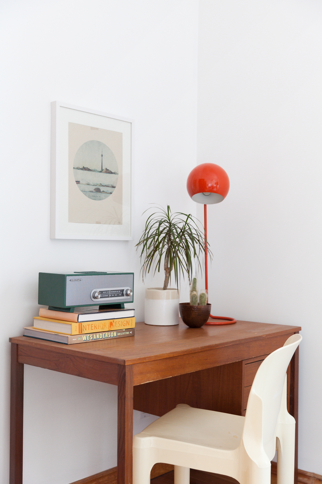
The dining room has a second purpose thanks to this little desk, which elevates an otherwise blank corner of the room. The gorgeous moulded plastic chair is by Giovanni Maur for Treco, and it goes perfectly with the vintage teak desk. The books, plants and artwork help tie in the bohemian vibes seen throughout the space.
Kick Back
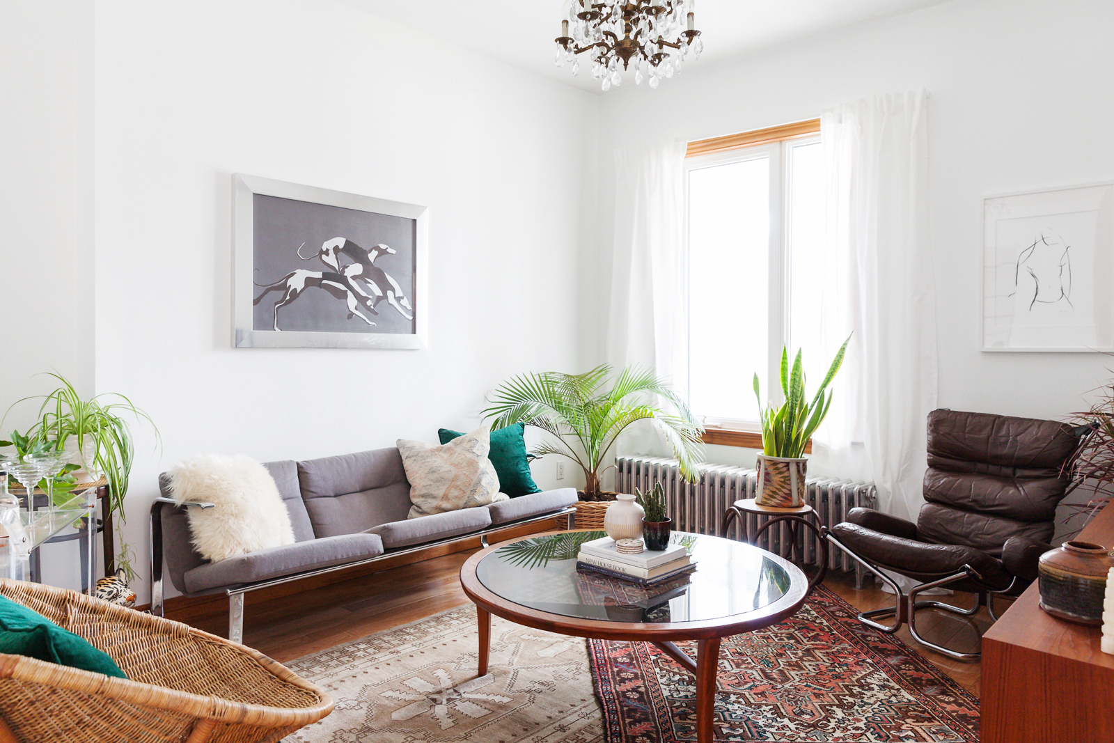
For the living room, Michael brought in all the home’s motifs: chrome, tropical plants, boho chic and mid-century modern furniture. The chrome-framed sofa was spruced up with new, heather-grey upholstery, and it plays off the greyhound art, another thrift store find. The circular, mid-century coffee table is made from glass and teak, and it helps break up the more angular elements in the room. The white curtains, which are seen throughout the home, are a simple trick to frame the space and make the ceilings look even taller.
Floating Bar
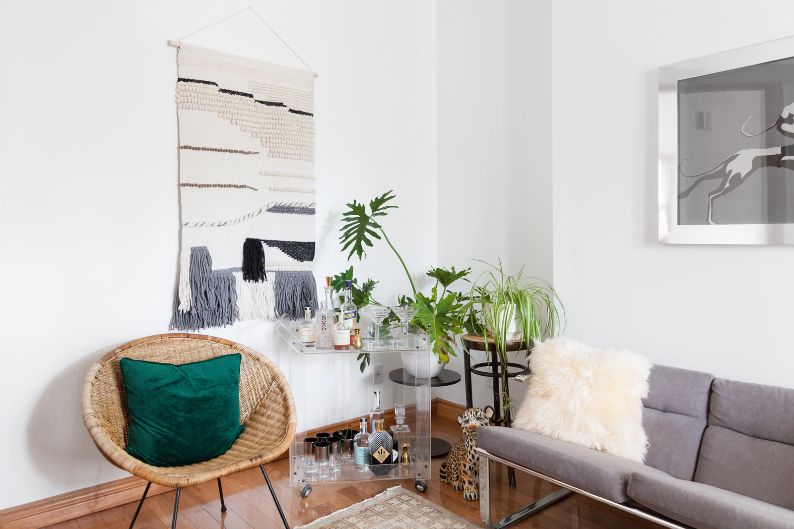
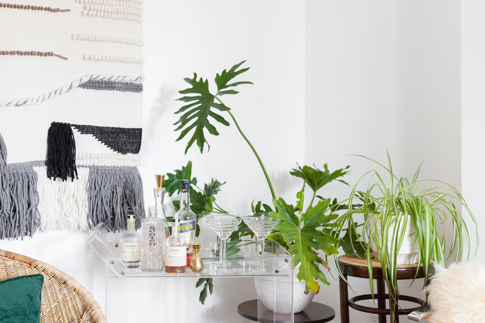
One of the most unique pieces in the space is this transparent acrylic bar, which adds an icy accent to the otherwise warm space. Michael amped up this contrast with the wall hanging, another woven piece from HomeSense, and the furry white pillow. For a touch of whimsy, Michael tucked a little ceramic cheetah at the foot of the bar.
Hey, Cutie
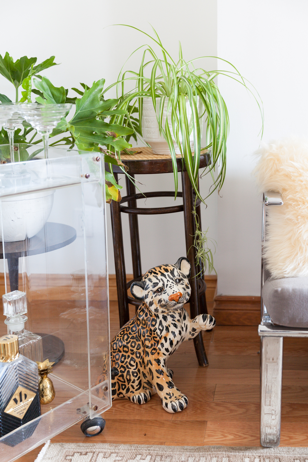
Here’s a closer look at the cheetah.
Plants on Plants
And here a closer look at the bar, and the pops of greenery that add a little life to the corner.
Hey! Over Here!
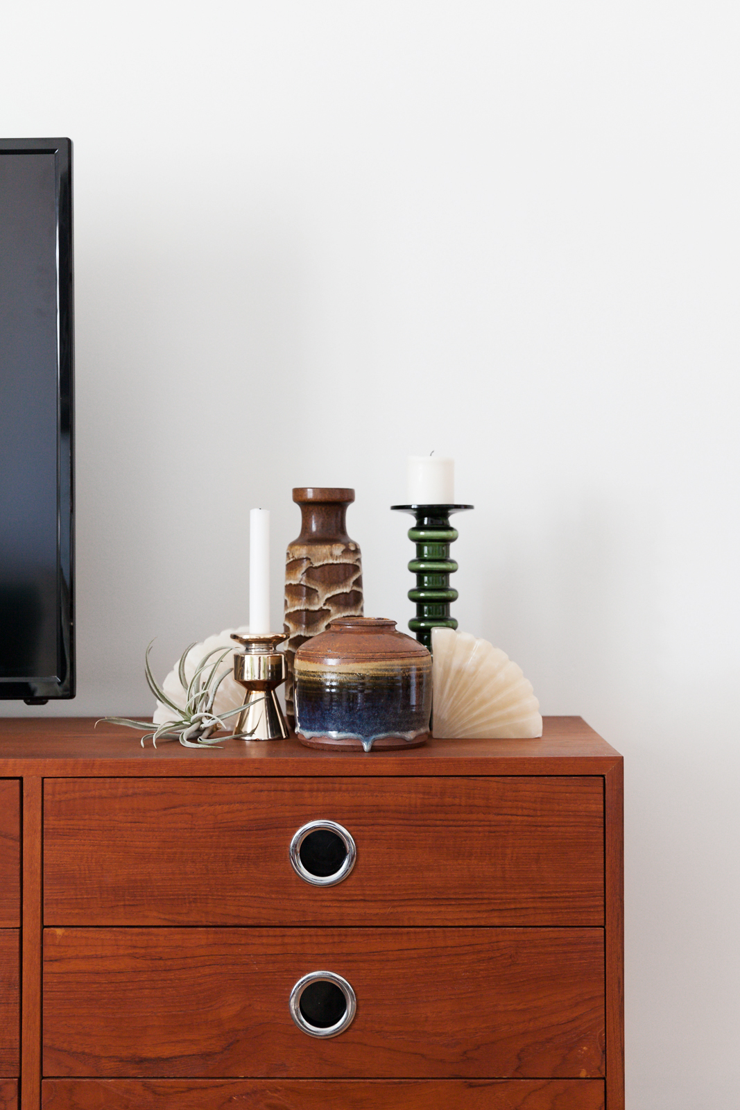
Let’s get real – a big television can be an eyesore in a well-designed space. To avert eyes away from the big black box, Michael created this little vignette of West German pottery, candles and an air plant.
Redefining the TV Stand
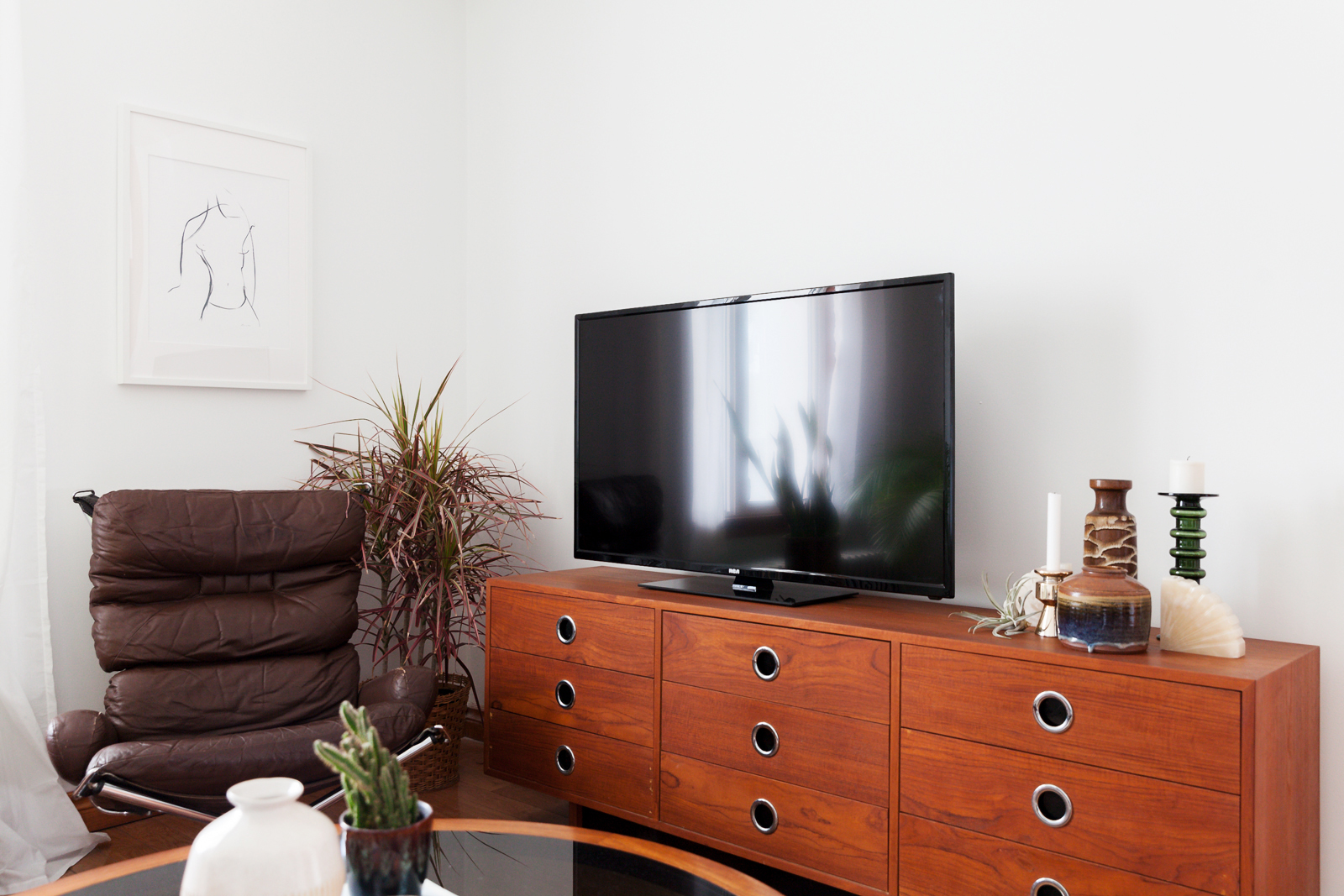
Rather than go with a classic TV stand, Michael opted for this beautiful, vintage teak dresser. The metallic knobs help tie in the chrome theme.
Power Clashing
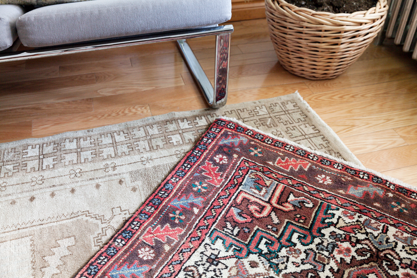
All the rugs in the space are from Casa Alma, a little shop that Michael knows through Instagram. He layered two pieces atop each other for a luxe touch.
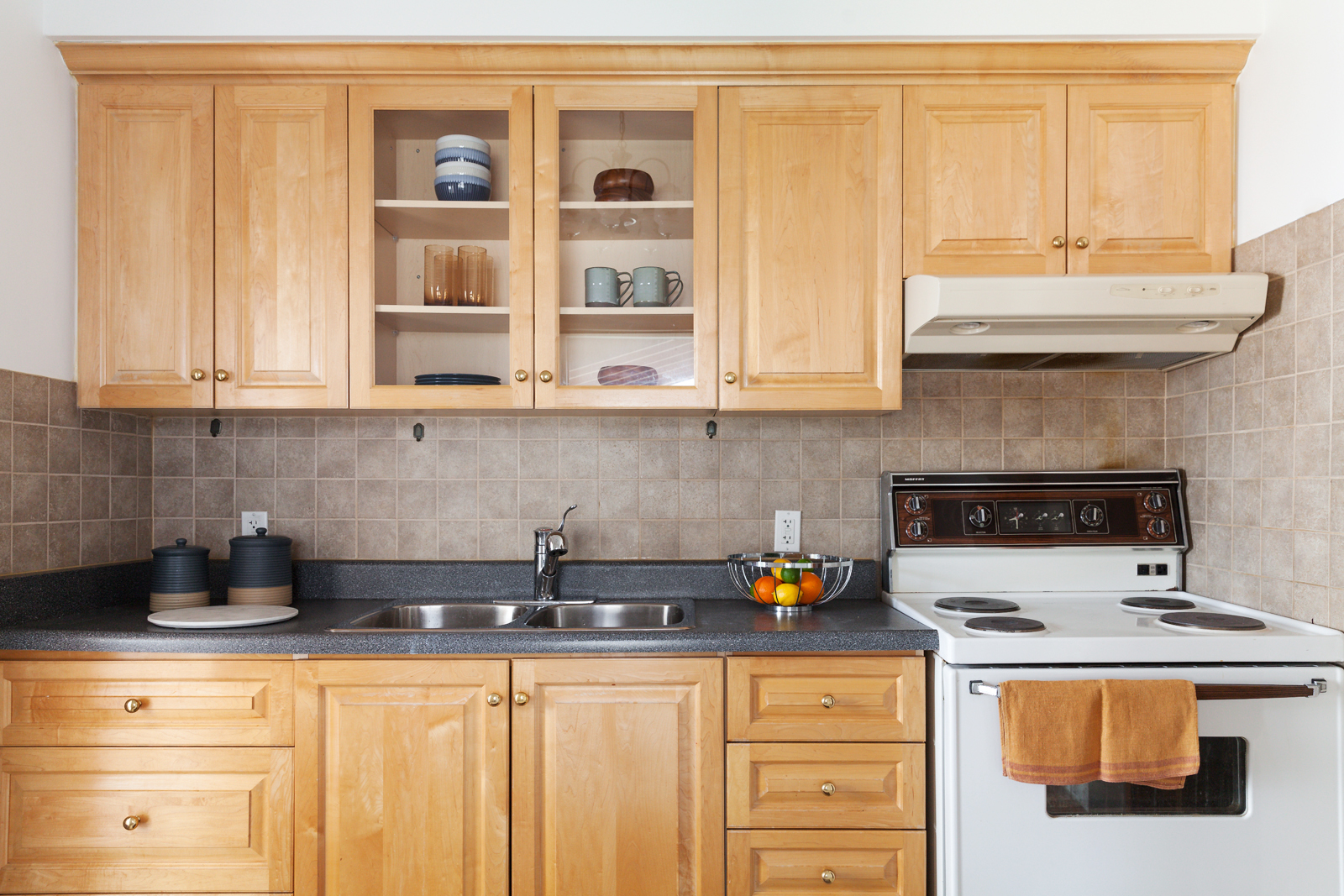
Keeping it Simple
Renovating a kitchen can be expensive, so Michael decided to work with what he had. Playing off the blue countertops, Michael brought in blue bowls, mugs and pottery. This way, the design seems intentional. For a bright pop, he added a bowl of citrus fruit.
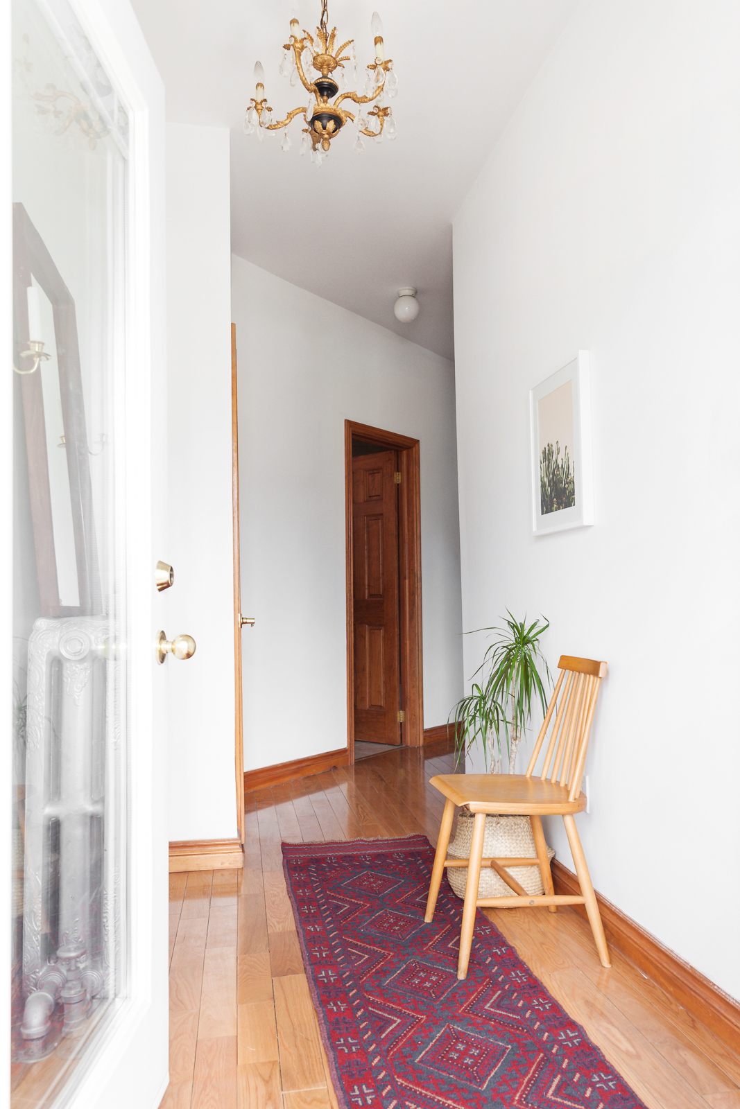
Grand Entrance
The front hallway in the home is anchored by a geometric runner in deep jewel tones, also from Casa Alma. The chair adds a bit of function to the space, either as a landing pad for coats or as a place to lace up your shoes.
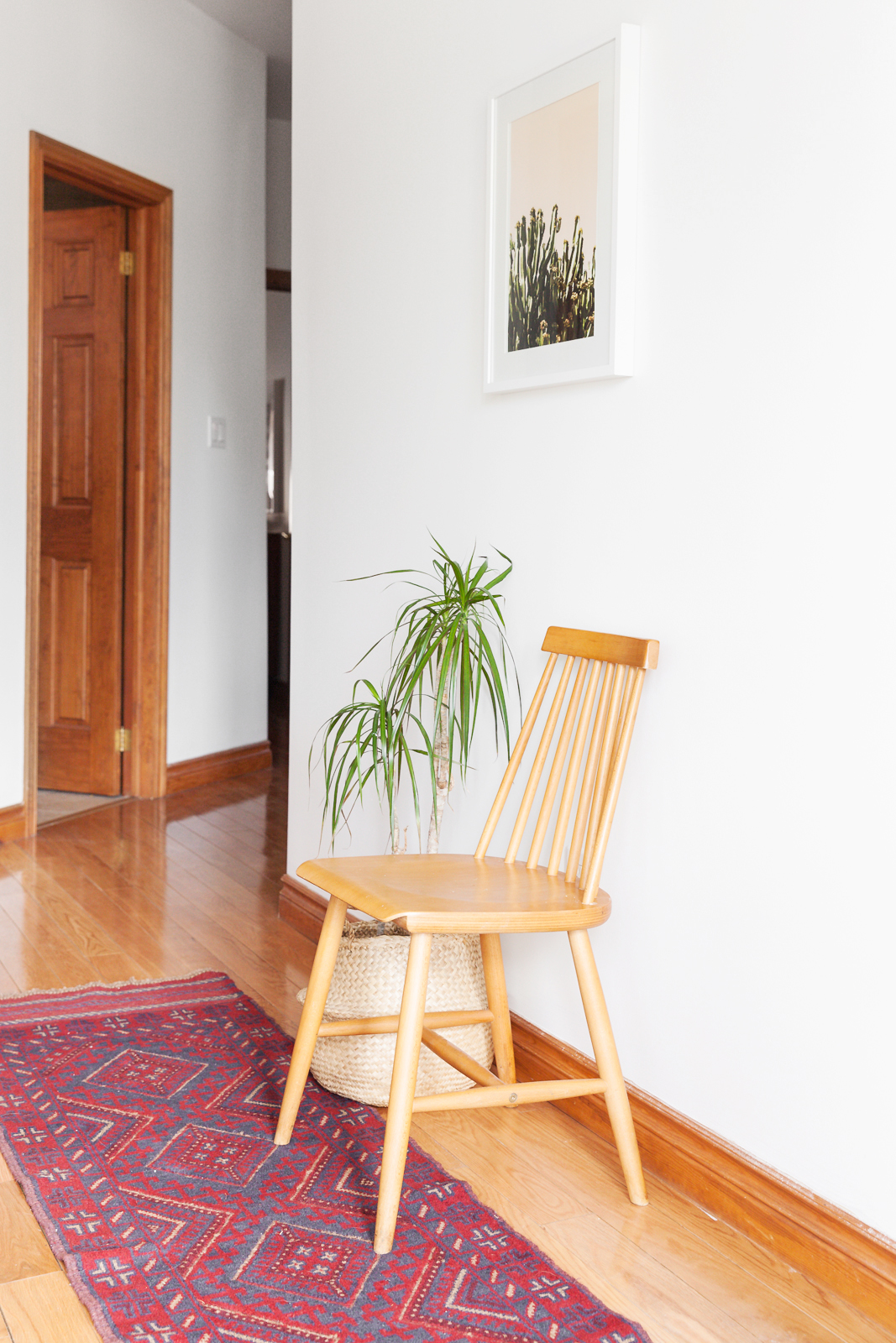
Au Naturel
Framed pictures of botanicals, like this cactus, are seen throughout the home. Michael likes picking up his frames from IKEA, both for the sake of visual consistency and for the price tag.
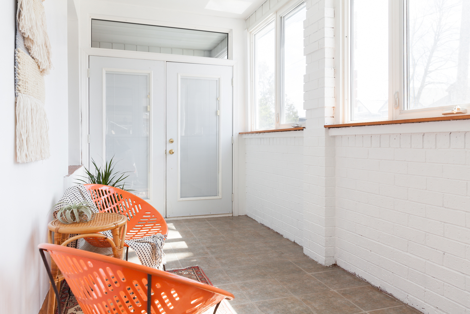
Painted Brick
Michael gave the entire space a coat of white paint, including the red brick in the front sunroom, which cranks up the sunlight even on the dreariest winter afternoon.
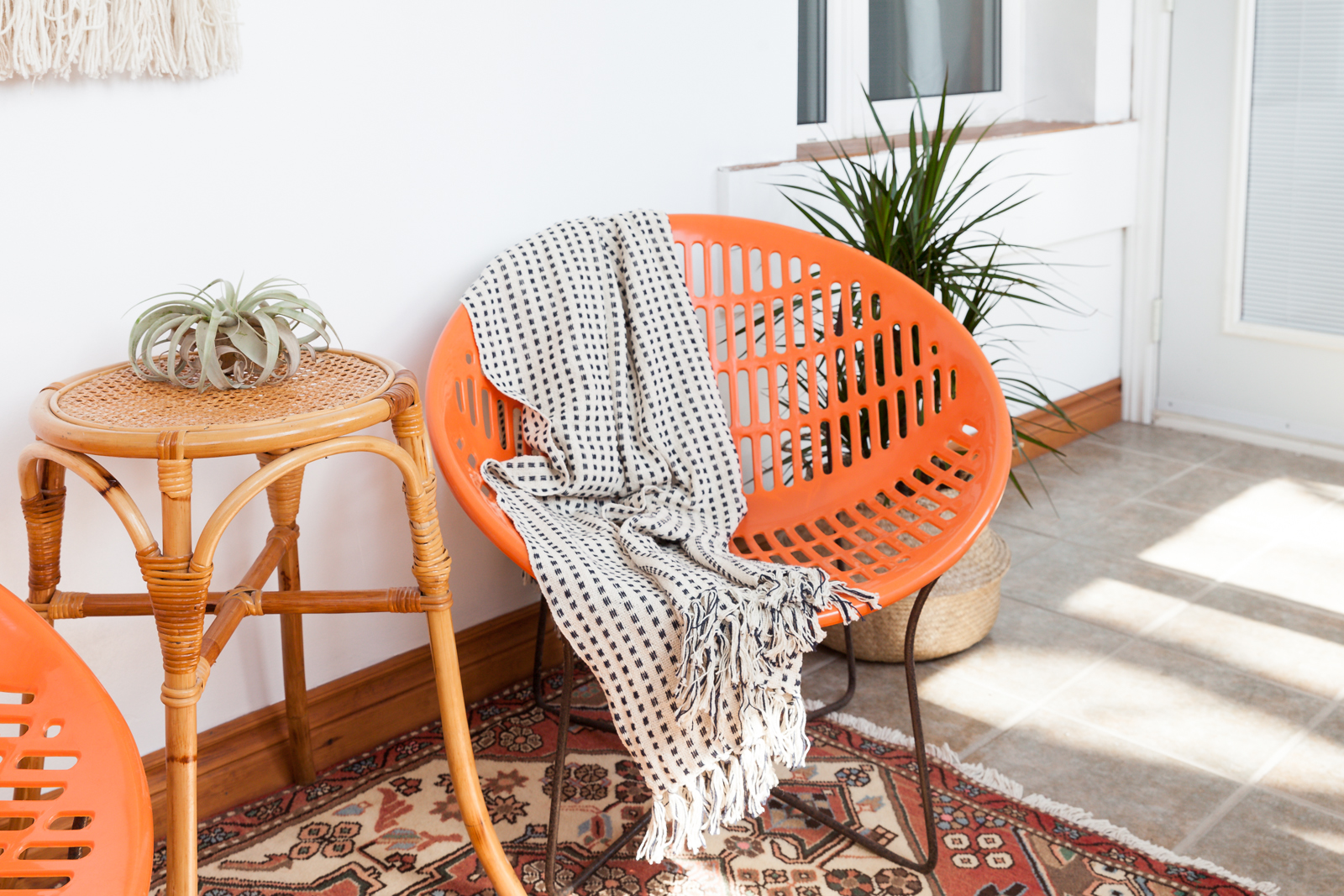
Orange You Digging This Chair?
A pair of vintage orange chairs from Solaire created the ideal spot for a morning coffee or a good book. Another rug from Casa Alma brings in the home’s boho vibes.
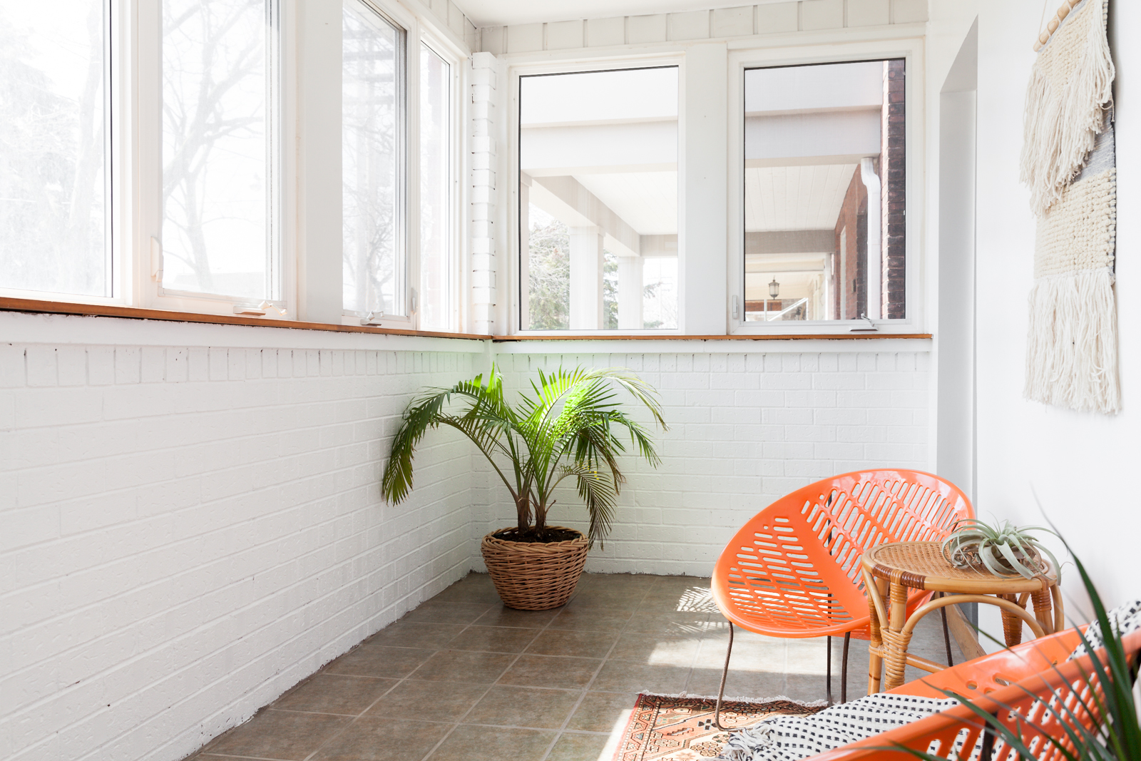
Neighbourhood Watch
Here’s another look at the sunroom, which certainly isn’t short on horticulture.
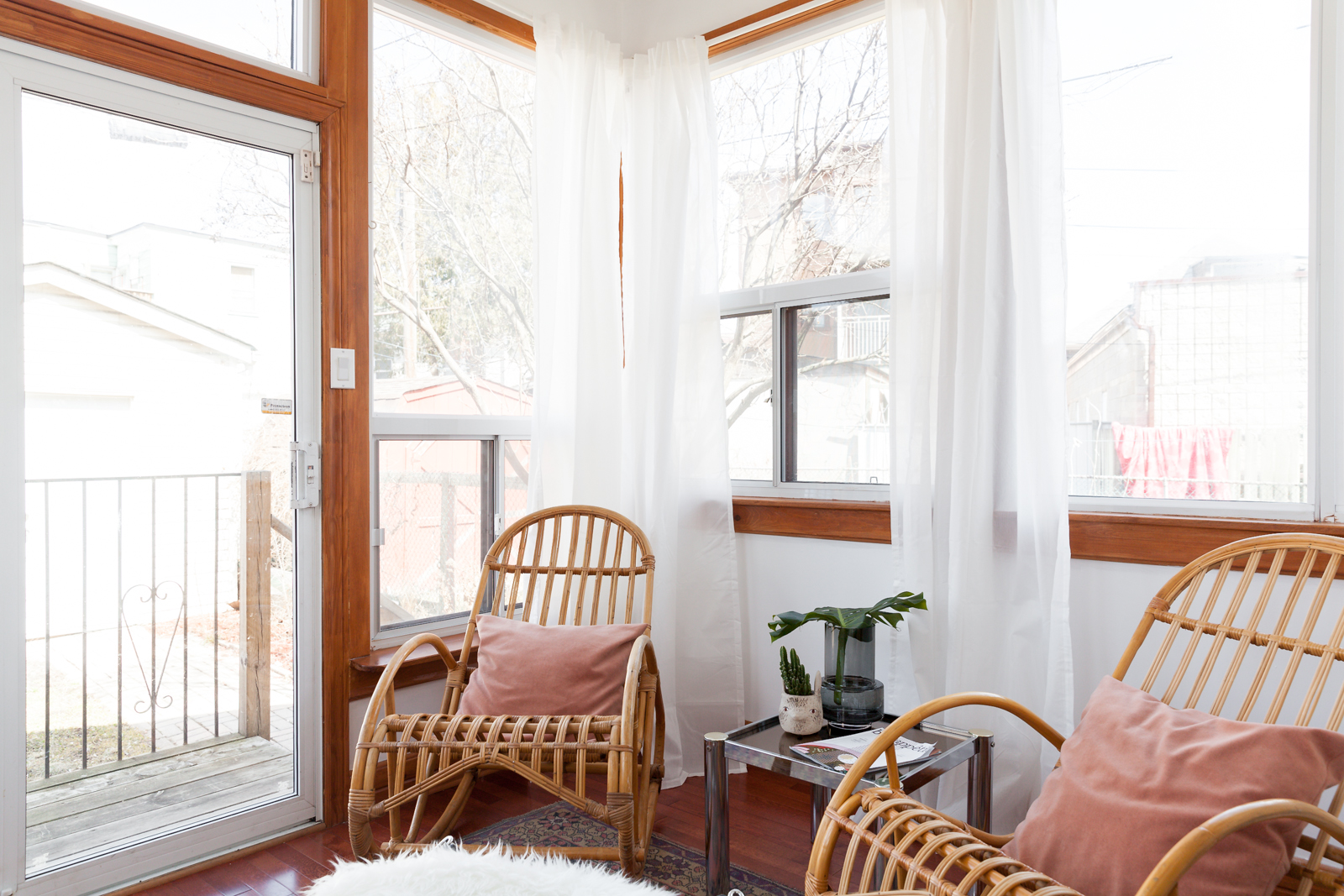
Sunroom No. 2
Most homeowners are lucky to have one sunroom. This place has two. The solarium has a softer touch than the rest of the home, with white curtains from IKEA (for $15) making the space seem airy and luxurious. The vintage rattan rocking chairs add a retro feel to the space, which plays perfectly off the chrome side table.
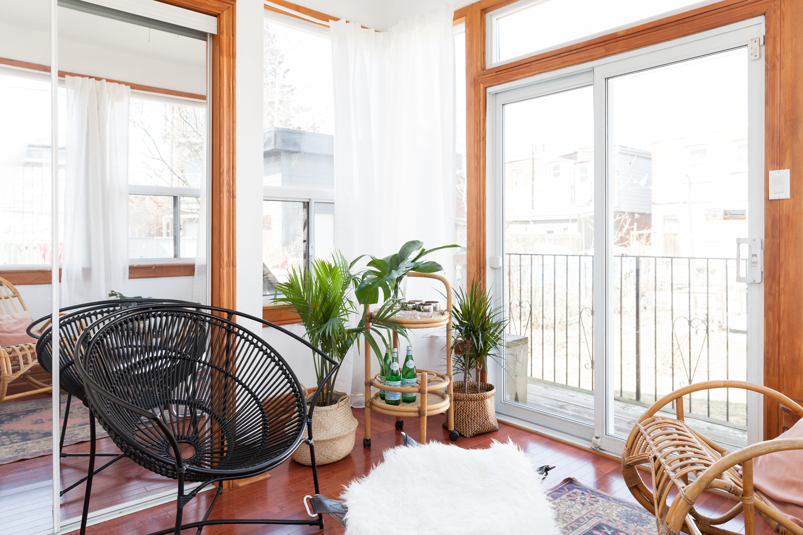
Bar Hopping
Much like the living room, the solarium’s centrepiece is a bar cart. Michael has been collecting vintage pieces for years, and he’s never seen another bar cart quite like this one.
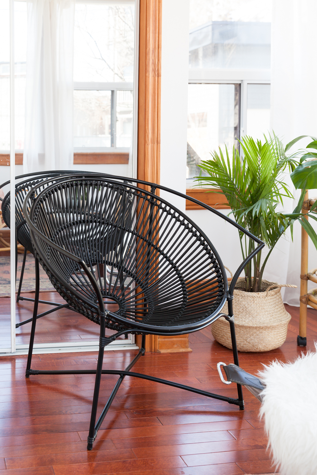
Black Lace
To balance out the space, Michael brought in this bold black Jardin de Ville lounge chair, which contrasts perfectly with the solarium’s soft edges and neutral tones.
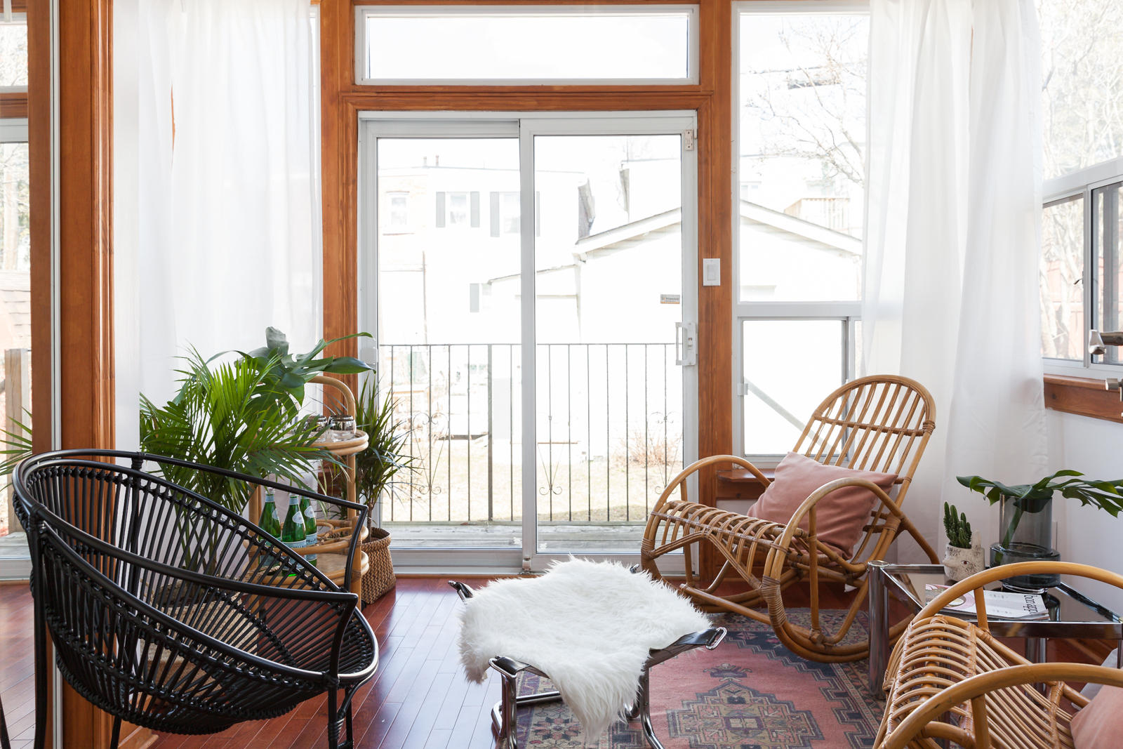
Faux Sure
In the centre of the solarium, a chrome ottoman is topped off with a faux sheepskin throw, to accent the room’s soft glow.
HGTV your inbox.
By clicking "SIGN UP” you agree to receive emails from HGTV and accept Corus' Terms of Use and Corus' Privacy Policy.


