Jonathan and Drew Scott have dealt with their fair share of hands-on buyers and sellers over the years, but they met a new challenge with David and Siobhan on the most recent episode of Property Brothers – Buying and Selling. While the couple wanted their home to sell for top dollars, they also didn’t want to obliterate the original structure and charm in order to do so. Here’s how the brothers collaborated with the crafty couple in order to secure the best offer possible without losing any of the home’s integrity.

A Modern New Entry
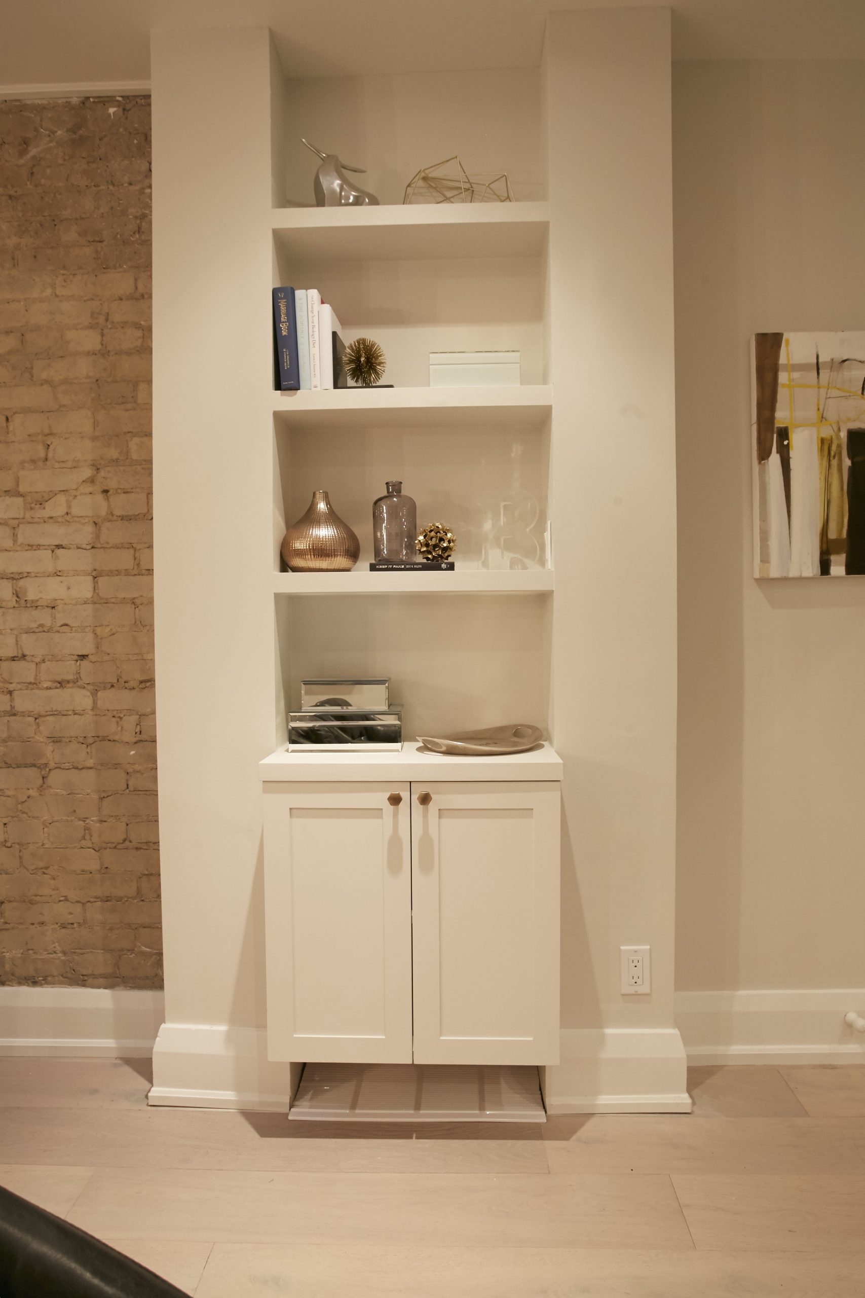
At the front door Jonathan and Drew turned this built-in shelf into a modern offering by building out the framework and painting the unit a fresh white colour. Paired with oversized baseboard trim and upgraded hardware on the doors, this shelving nook feels bright and contemporary but with all of that old-school charm.

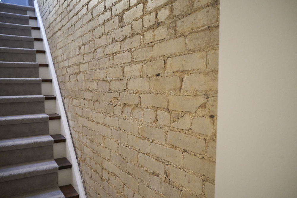
Exposed Brick
Nothing wows a buyer more than an exposed brick wall. The owners themselves ripped away the wall hiding it in order to show off the natural charm, and insisted on maintaining some of the original wood finish on the stairs beside it to really showcase the original features. Meanwhile painted white trim and risers polish off the look and makes it slightly more bright and modern.

An Upgraded Living Room
Soft oak wood floors help to update and lighten the space throughout, especially in this small living room. A neutral colour on the wall also adds to the brightness and helps the fireplace to stand out as a stunning feature. Meanwhile furniture and decor in contemporary colours and materials helps to make this a more modern showroom and really highlights the potential of the space.

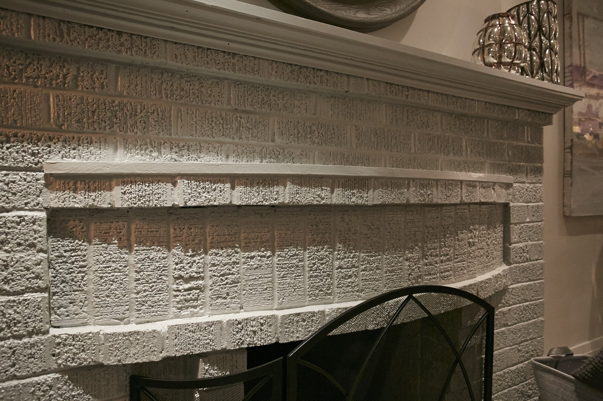
A Natural Finish
The homeowners were again insistent on keeping the original brickwork on this wood-burning fireplace, rather than facing it out and upgrading it to a gas or electrical unit. In the end, the soft bricks work with the upgraded mantel, giving the room an updated but worldly vibe that feels cozy and purposeful.

Neutral Colours
Jonathan and Drew kept the neutral colours on the window coverings as well, installing oversized blinds and soft white drapery that help to tie the room together and add even more brightness. A small sofa fits into the space perfectly, while pops of metallic on the coffee table and corner lamp help polish off the room.

Some Modern Features
Adding an instant, modern upgrade to the living room is this bar cart complete with metallic accents and glassware that show off the entertaining potential of the space. Overhead an abstract painting pulls in all of those colours while keeping it soft thanks to the pale purples and browns.

An Upgraded Kitchen
In order to maximize this space Jonathan and Drew reconfigured the door to the basement, creating a larger area with a better flow. That same new floor continues here to help transition the open-concept look, and a large centre island adds tons of extra counter space and function.

Modern Conveniences
While plenty of potential homeowners love a charming, original vibe to a home, they still want modern conveniences like upgraded appliances, countertops and cabinetry in their kitchen. The brothers delivered on all of these points, and further modernized the look with finishing details like this faucet and the pendant lights, above.

Playing With Colour
The marbled finish on the countertops feels rich and contemporary, but it’s a look that’s softened by the beige-grey finish on the cabinets along the back wall. Meanwhile a gleaming white brick backsplash adds another instant upgrade, especially behind the matching floating shelves.

An Easy Transition
It’s hard not to notice how pretty the subway tiles are next to even more of that exposed brick, helping to create yet another easy design transition in the space and incorporating more of those original elements that make the home so charming in the first place. Antlers, a few sprigs and other decor items on the shelves help tie it all together and polish off the look.

A Cooking Nook
Over the upgraded stainless steel oven and range the brothers switched out the colour of the upper cabinets in order to create a more defined, dramatic effect. Meanwhile that same subway tile backsplash and lower cabinets in that beige-grey colour easily tie the area into the rest of the space.

A Pretty New Master
In the master bedroom the brothers were given a little more leeway to create a modern effect, which is why there are more contemporary elements like this petal-inspired chandler and a cabinet with upgraded gold hardware.

Contrasting Colours
Rich greys and soft pinks play off each other to bring a contemporary but romantic look to the room. A dramatic headboard against the softer walls creates a feature focal point, while toss cushions and a plush bedspread add instant comfort and design appeal. Soft drapery adds to the romantic effect and adds yet another subtle hint of contemporary design.

A Complete Oasis
A couple of wood night tables and some lamps finish off the space and add soft lighting, completing this home’s transformation into a show-stopping abode that combines original features with upgraded finishes. It’s no wonder David and Siobhan were able to get top dollars in the end, easily allowing them to transition into their own next dream home.
HGTV your inbox.
By clicking "SIGN UP” you agree to receive emails from HGTV and accept Corus' Terms of Use and Corus' Privacy Policy.


