Paul and Darcie Chutter’s home in Vancouver’s tree-lined Douglas Park neighbourhood had all the space and room to grow that the young couple desired. But it was severely lacking on one front: “It had no personality,” says Gillian Segal of Gillian Segal Design. She was entrusted by the pair to invigorate the home with decor that felt glam and contemporary, yet still embraced tradition. She did that, and more.
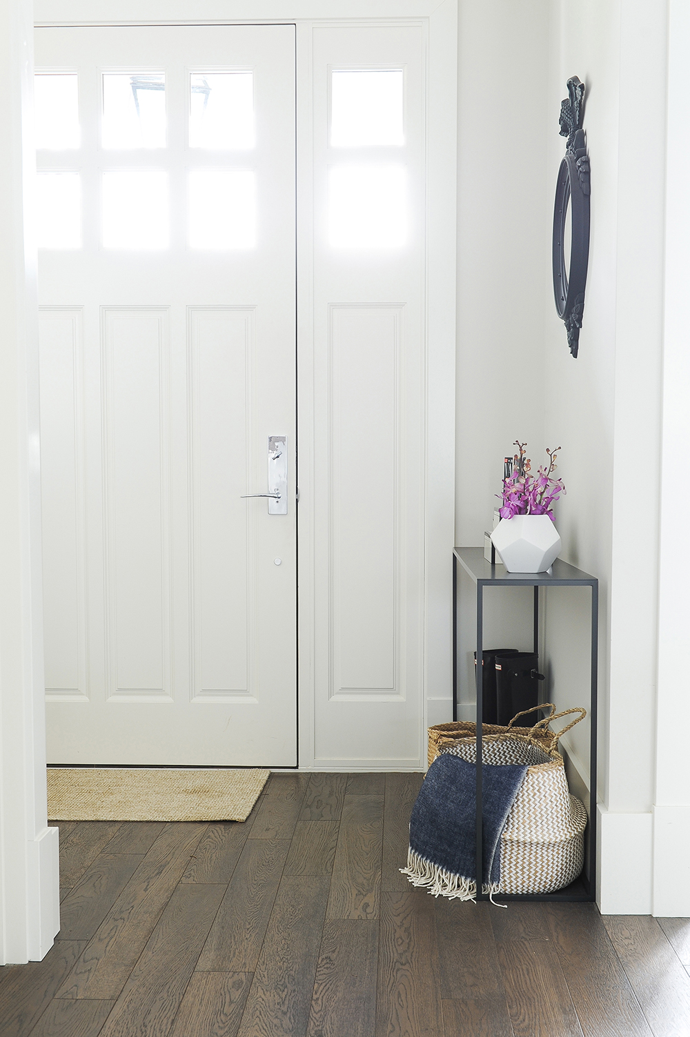
Narrow Margin
The entryway’s furnishings are attuned to the scale of the area. “This is a tight space, so I didn’t want the furniture to take up too much room,” says Gillian. Her solution was this sleek console table, from retailer The Other Room. With a streamlined profile, it sits neatly between the door’s trim and wall and looks as though it was custom-made for this spot.
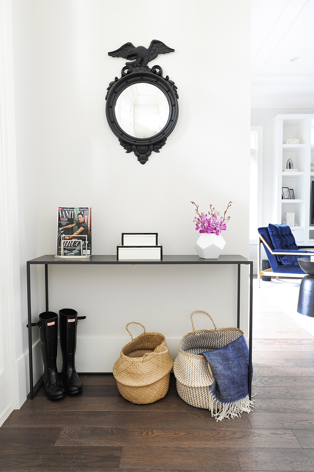
Basket Case
These woven baskets from EQ3 do more than layer in texture and organic appeal. “They are entirely practical,” says Gillian. “They offer quick and easy storage for doggy towels and any other random bits that need a place to live.” The bold black mirror, along with the tabletop’s geometric vase and decorative boxes, are dramatic counterpoints that keep the overall look tailored and sharp. The mirror is from Alfies, a famous antique market in London, England.
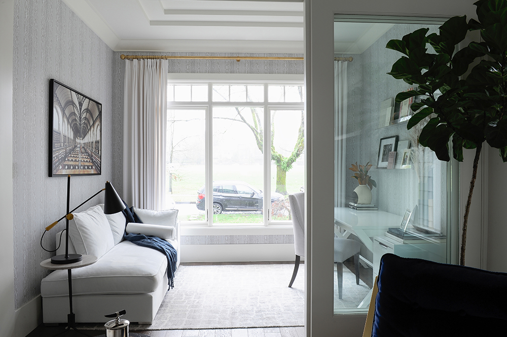
Office Space
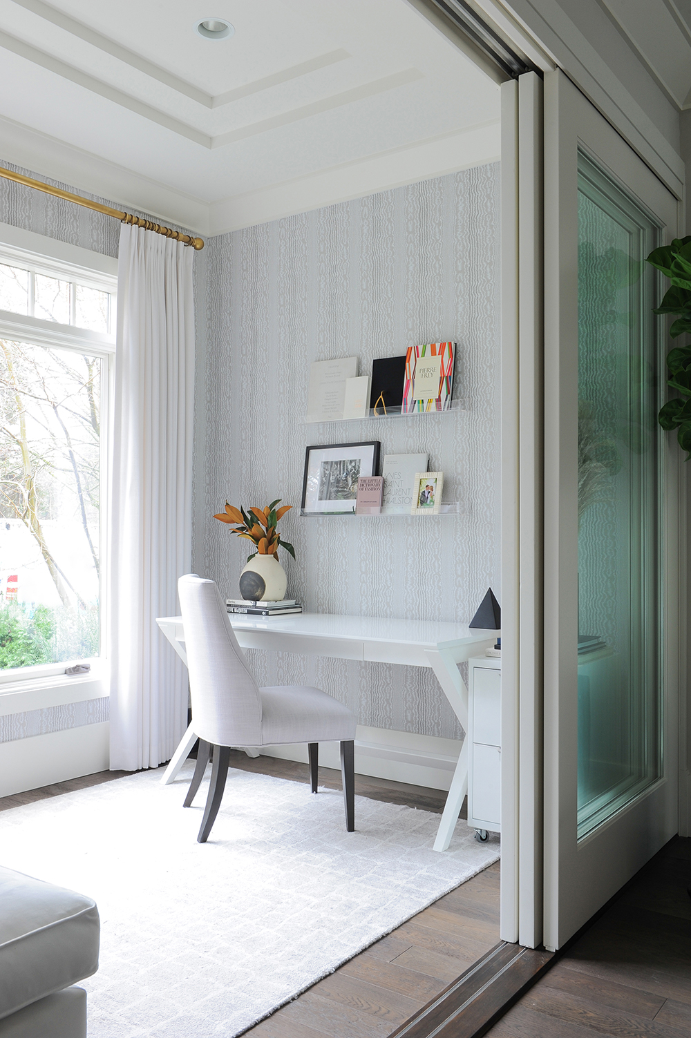
“When I began this project, this space off the entryway was rarely used,” says Gillian. “I thought that was a shame because it has a beautiful view to the park. My vision was to transform it into a home office that was also a cozy little nook for reading and relaxing.” She chose a palette of soft colours for a subtly luxurious effect and added custom drapery with brass hardware both to frame the window and impart warmth.
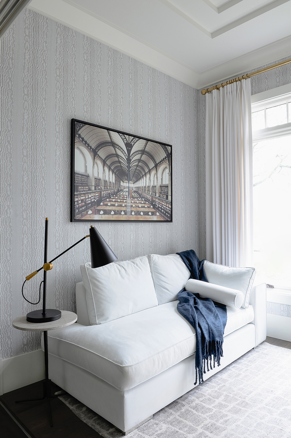
Paper Weight
Gillian used a Nina Campbell wallpaper to elevate the home office and effortlessly channel a traditional aesthetic. “I love its subtle texture and warm undertones,” she says. The framed photograph of the Sainte-Geneviève Library in Paris by Franck Bohbot is apropos in this reading nook.
Mix It Up
The home office is a snazzy blend of traditional and contemporary. The Crate & Barrel desk feels modern, while the upholstered chair layers in a classic element. The area rug softens the space, which can be closed off with sliding doors that are original to the home.
Clearly Beautiful
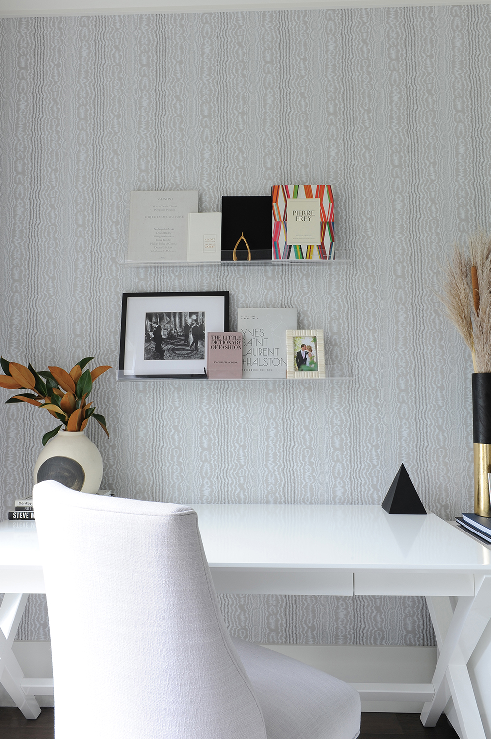
“These floating lucite shelves from CB2 are the perfect storage solution here,” says Gillian. “They display pretty and practical items without taking away from the beautiful wallpaper.” We love how the chair’s upholstery quietly references the paper’s textured finish. Magnolia leaves picked in the backyard make for a no-fuss (and no-expense) arrangement.
Blue Period
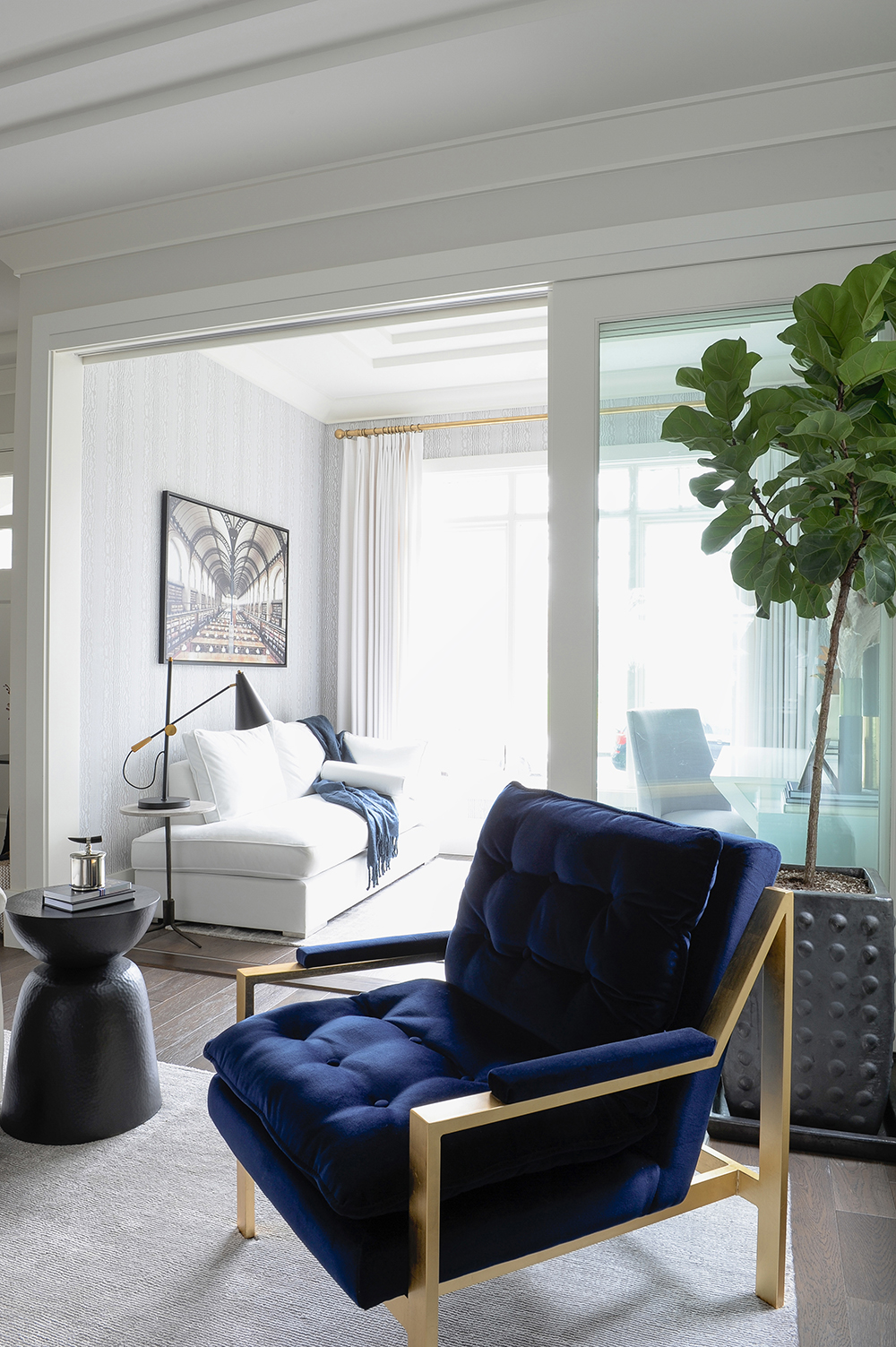
Gillian punctuated the overall neutral space with two of her favourite colours: blue and black. “They’re gender neutral hues that appeal to most people, and they add interest and depth to this room,” she says. “Since they’re cool colours, I focused on introducing them in plush and inviting textures, like the velvet on the chair from Peridot Decorative Homewear.” Its brass frame nicely echoes the drapery hardware in the home office.
Personal Stylist
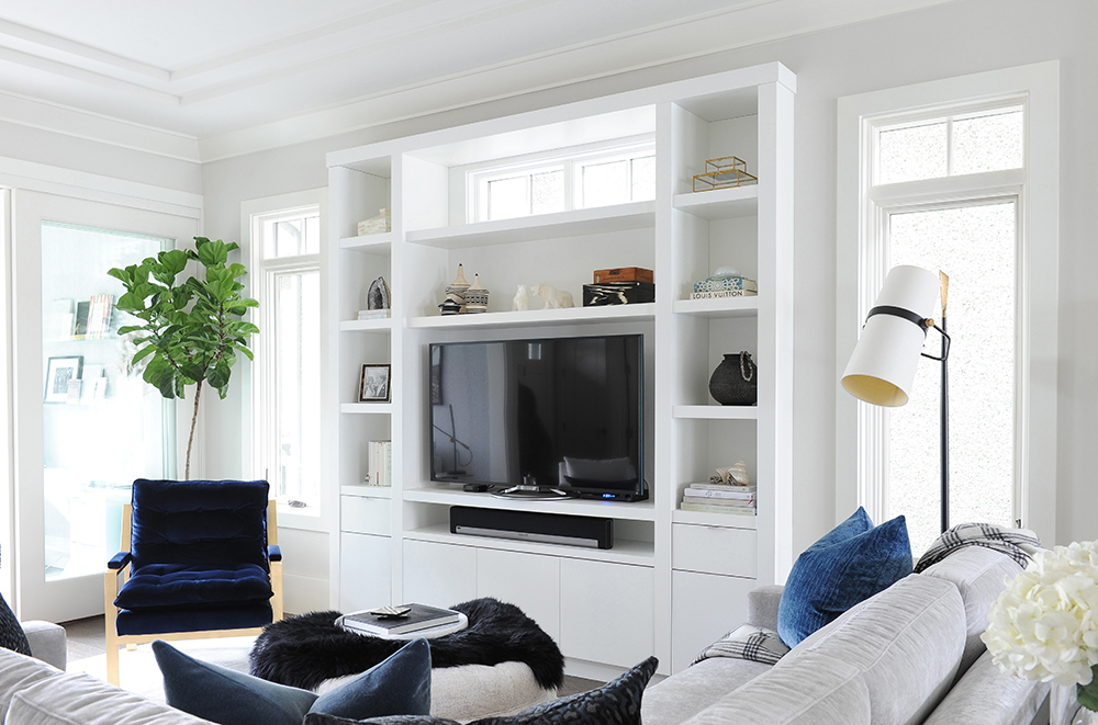
Gillian personalized the living room’s built-in shelving, which was already in place when she was hired, with a mix of artful accessories. “I also made sure to include pieces that belong to the owners so the display has meaning for them and looks like it was collected over time rather than just styled.”
Perfect Fit
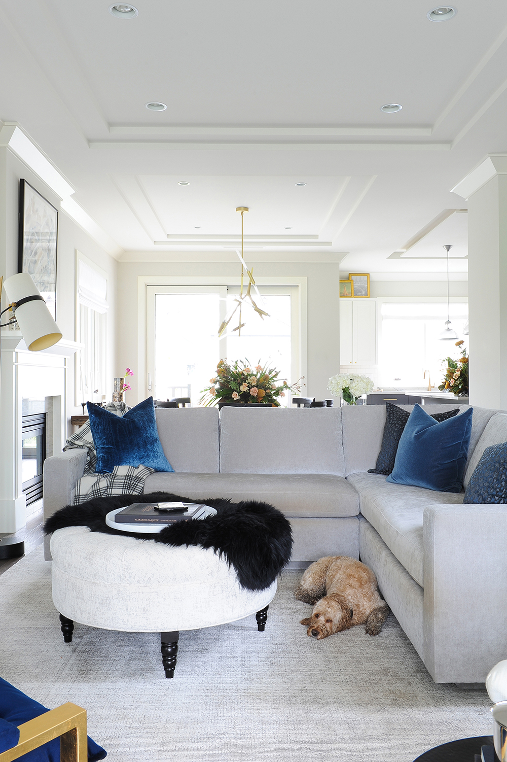
If it looks like the furniture was made for the living room, that’s because it was. “I designed the sectional to work with the dimensions of the space and to maximize seating,” says Gillian (even if Dex, the family’s cocker spaniel-poodle mix, prefers the floor). It’s covered in a polyester velvet from Designer’s Guild that’s both soft and durable. Gillian gave the ottoman a semi-customized treatment by reupholstering it with a linen-look fabric.
Black and Blue
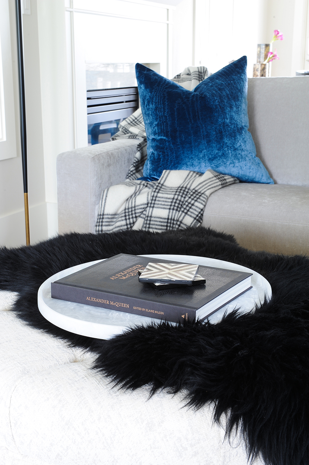
The designer extended her favourite accent colours from the furniture through to the accessories. “Again, these cool tones take on an inviting warmth when they’re presented in lush fabrications like faux sheepskin, thick wool and plush velvet.”
Plain Sight
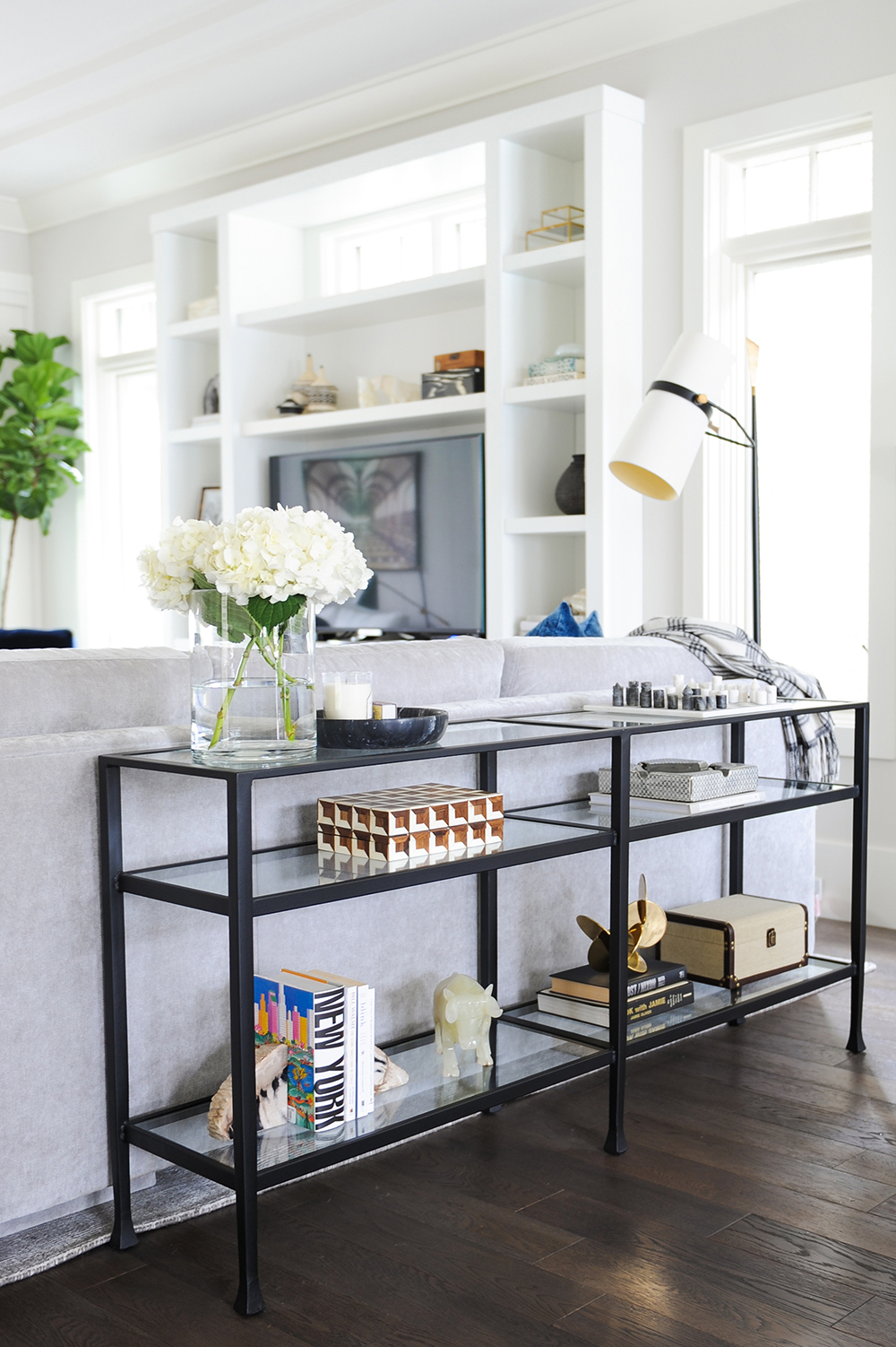
Because the back of the sectional is visible from the dining area, Gillian dressed it up with a streamlined console table from Pottery Barn. Like the shelving around the TV, it showcases personal mementoes and books, and provides a perch for accents such as fresh blooms.
Colour Coded
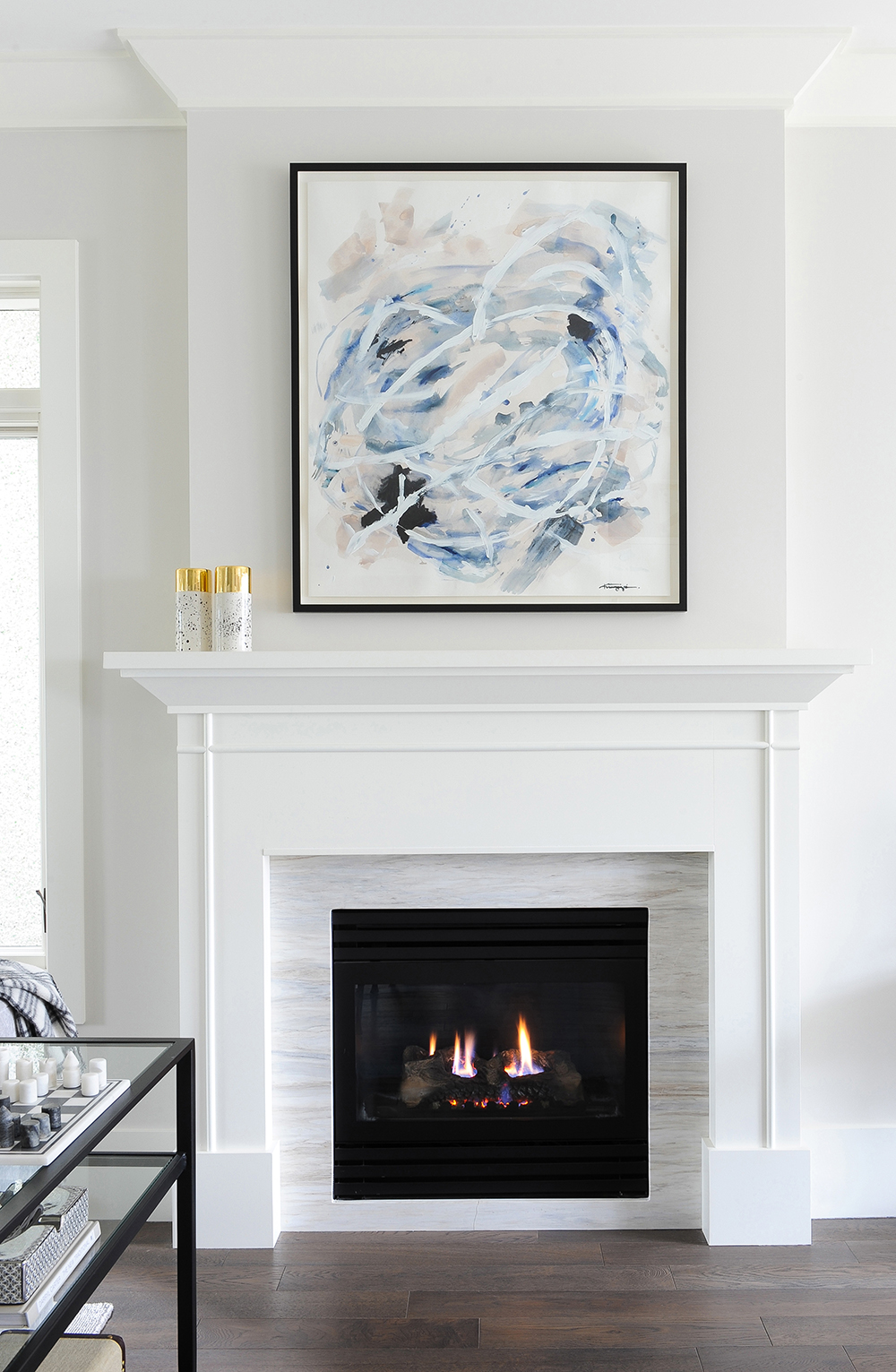
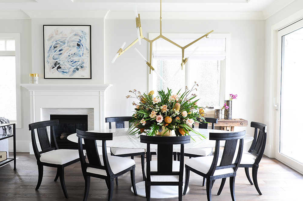
Gillian commissioned this paint on paper abstract from US-based NG Collective Studio. “For this piece, I asked them to work with blues and black to bring together the home’s colour scheme.” The clutter-free mantel, unadorned but for two candles, keeps the art the focus.
In Black and White
“I love the high contrast of black and white,” says Gillian. “It always looks so chic.” Here, a custom white tulip table topped in marble (a definite splurge) is paired with black Restoration Hardware chairs. “I love the shape of them – they remind me of ancient Greek Klismos chairs. With dining in mind, I upholstered them with indoor/outdoor fabric, so they’re easy to wipe clean.”
Cool Warmth
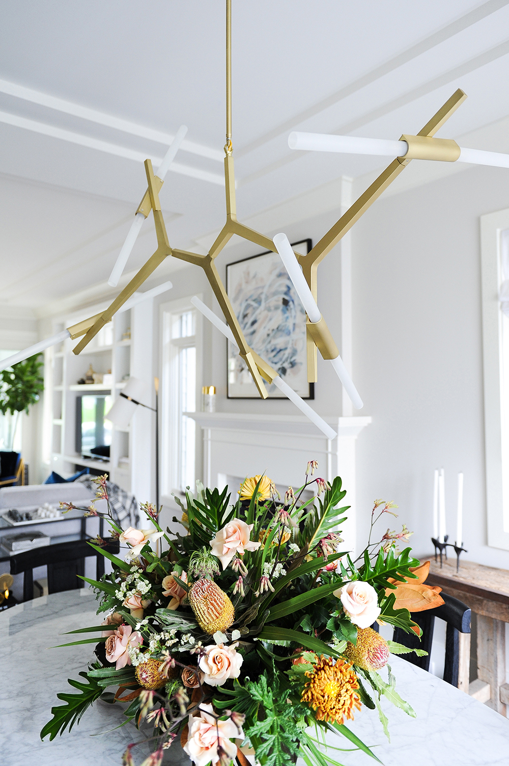
This resolutely contemporary light fixture from Avenue Lighting is softened by its warm finish. The dynamic between the edgy silhouette and the gold feels fresh and sophisticated, and is much more interesting here than a traditional chandelier. It also neatly references the brass accents that Gillian has incorporated throughout the home.
Antiques Roadshow
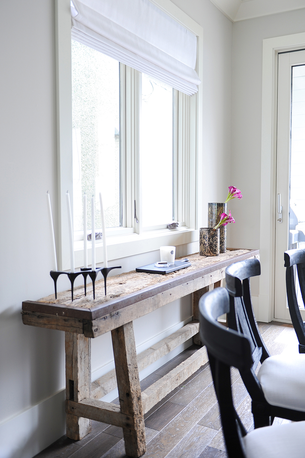
The homeowners purchased this beautifully rough and aged table at an antique market in Sunbury, England. It layers in personal meaning and its rustic profile is enlivened by contemporary accessories.
Going Grey
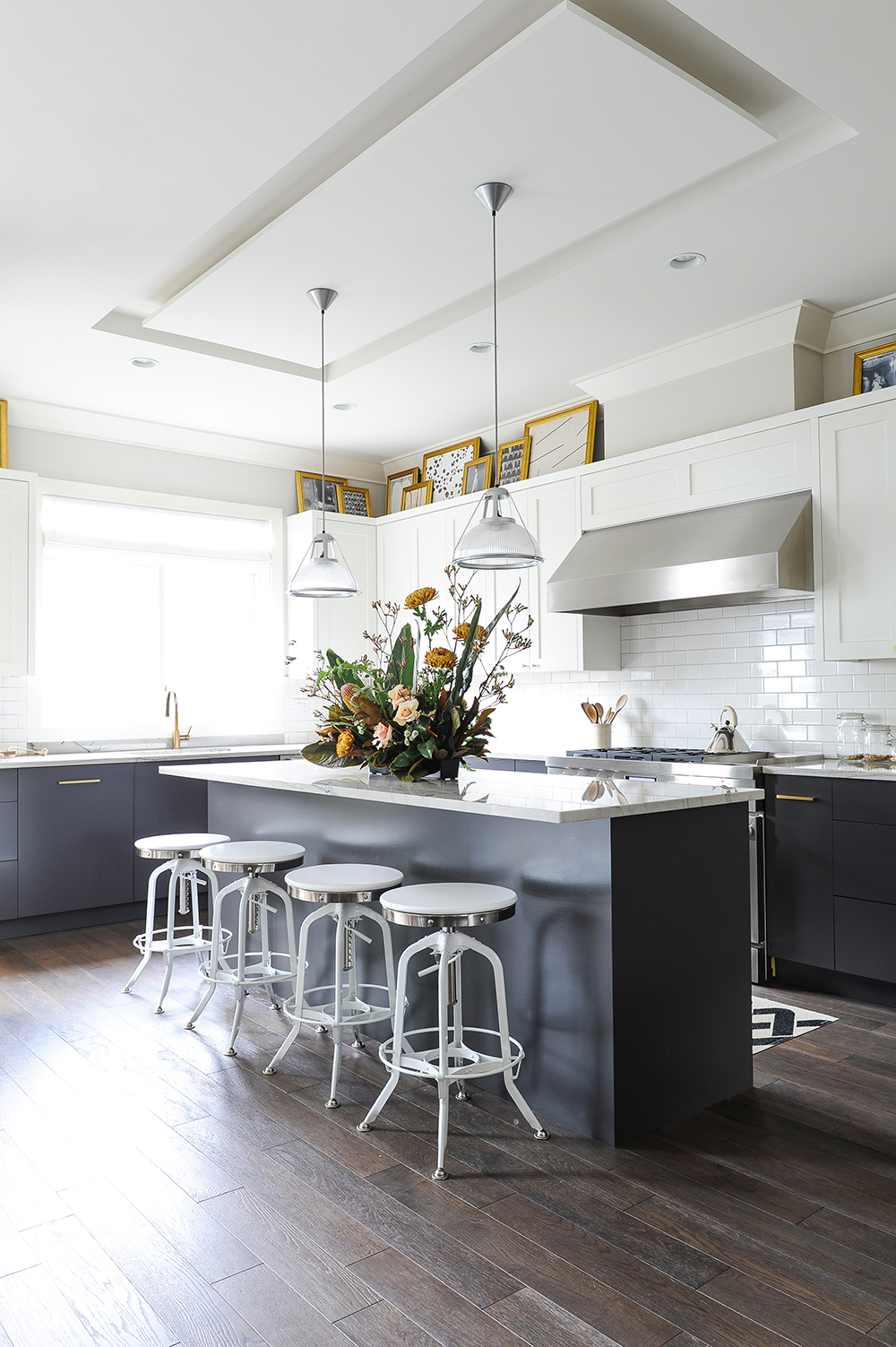
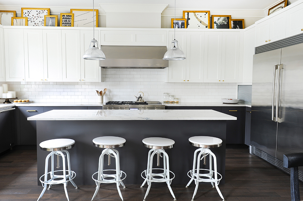
Gillian felt that the all-white kitchen, though well-designed and functional, needed some contrast. “I had the lower cabinets and the base of the island painted grey. I actually find dark colours quite warm. Here, the grey makes the space feel finished and even a bit cozy.”
Top it Off
“I wasn’t a fan of how the original kitchen cabinetry stopped short of the ceiling,” says Gillian. “Why waste potential storage space and have dust collecting on a shelf? However, I embraced this design challenge rather than ignoring it by placing gold-framed artwork along the top. It fills in the void and adds personality to the kitchen.”
Two Tones
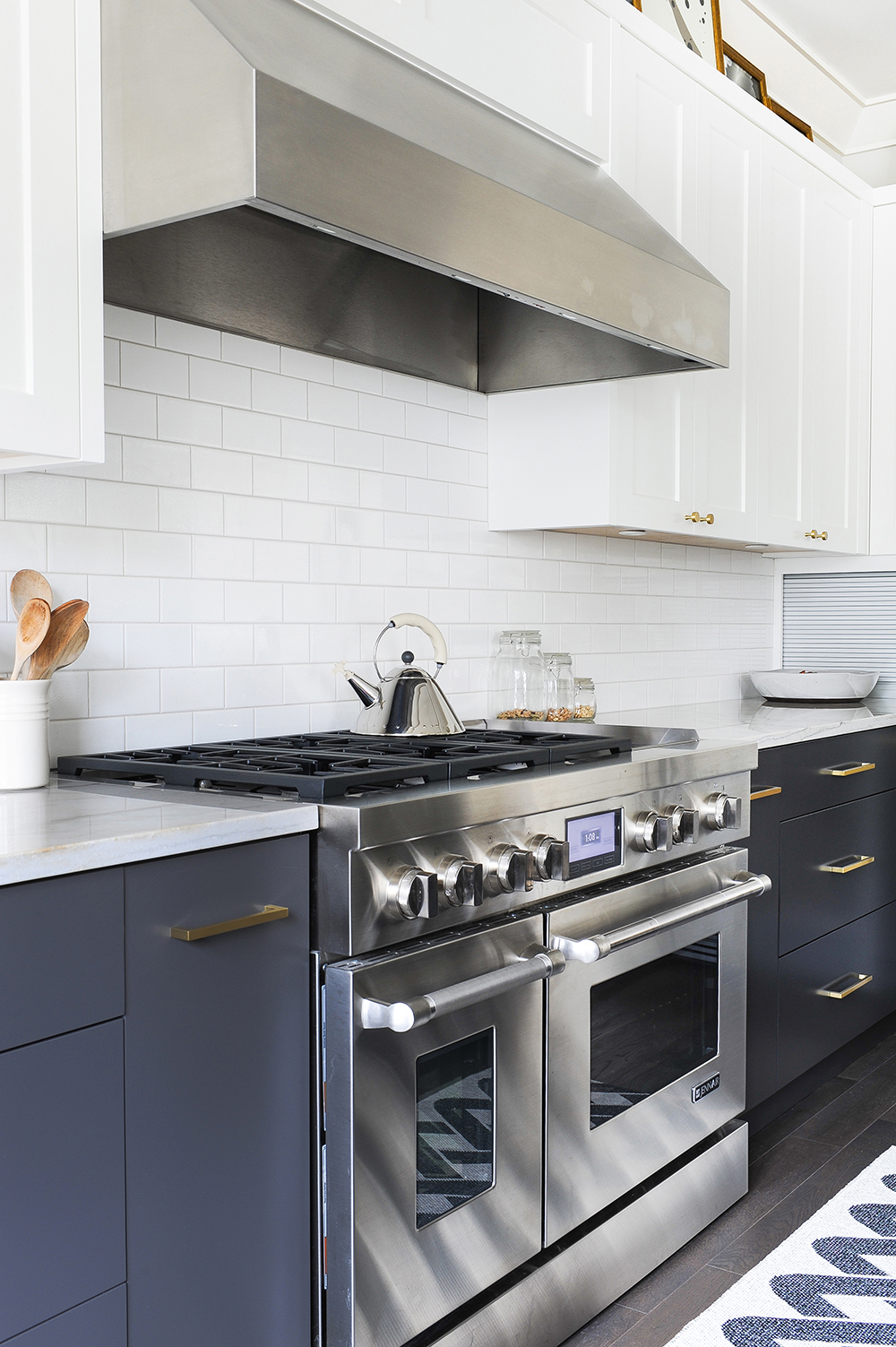
“I consciously decided to contrast the existing stainless-steel appliances with new brass pulls from Schoolhouse Electric. I love mixing metals and think it’s great when not everything matches perfectly. Brass also adds so much warmth.”
Finishing Touches
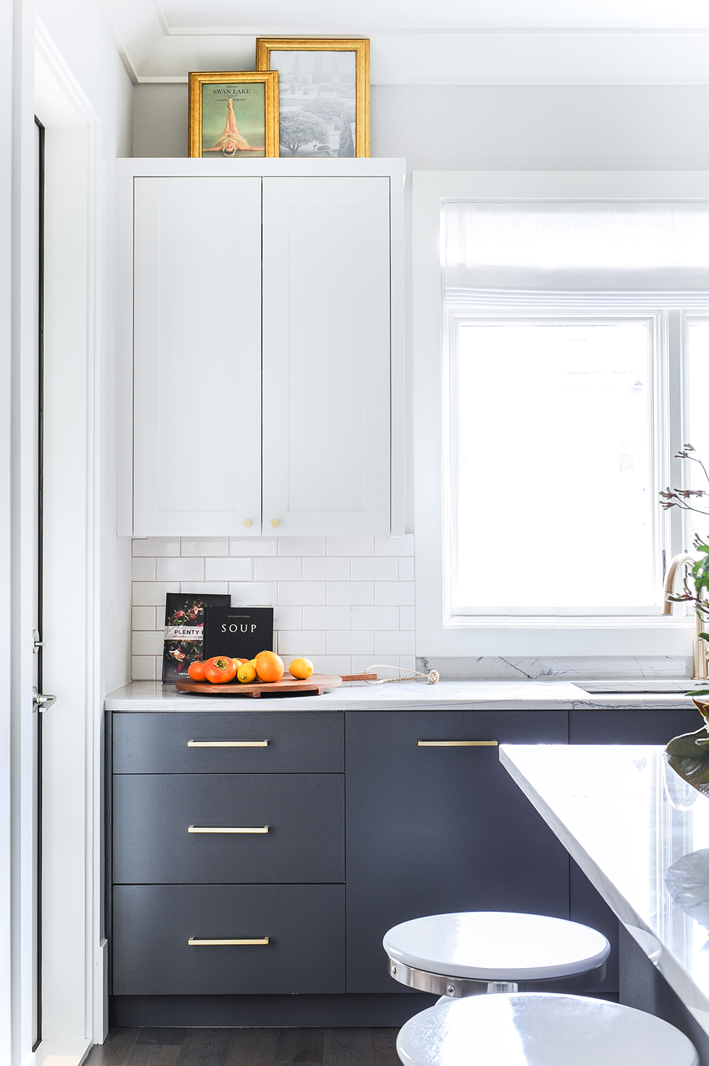
Gillian styled the countertops with warmth, colour and purpose in mind. A wooden cutting board, fresh fruit and favourite cookbooks are practical additions that fend off a cold, showroom effect.
Those Eyes
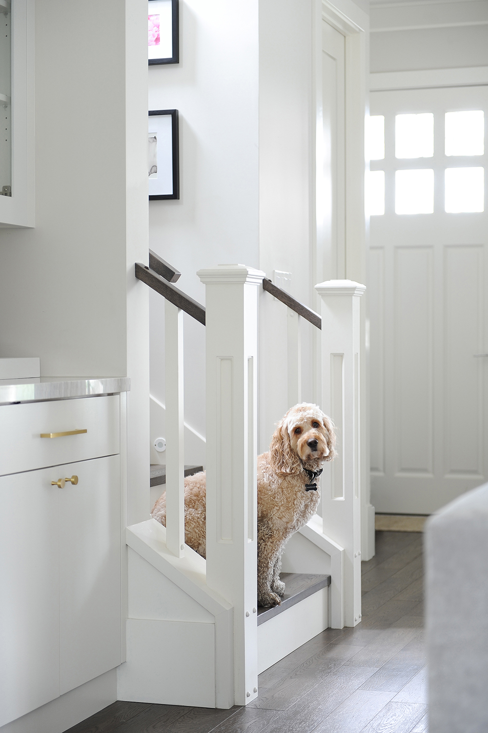
It’s hard to compete with Gillian’s expert makeover, but sweet Dex somehow manages.
Step Up
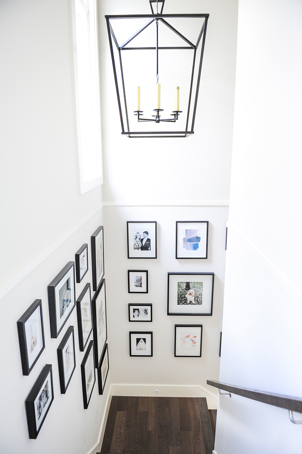
“The staircase was empty when I started, except for a small and unimpressive light fixture,” says the designer. To make a feature of the space, she created a gallery wall consisting of affordable prints mixed with the homeowners’ own photos. She polished off the look with an oversized lantern-style pendant from Circa Lighting. We love the way the black picture frames and light fixture add depth.
White Out
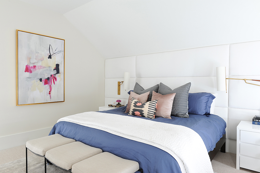
Before Gillian arrived, Paul and Darcie had a traditional headboard that looked piddly in the room. “The slanted ceiling makes the space awkward, and the original headboard just drew attention to that,” says the designer. In order to make it look as seamless as possible, Gillian custom-designed this headboard. “It fills the space, the white blends in and it’s upholstered in luxurious white velvet.” The framed print was a budget-friendly buy from Leftbank Art.
Sleep Well
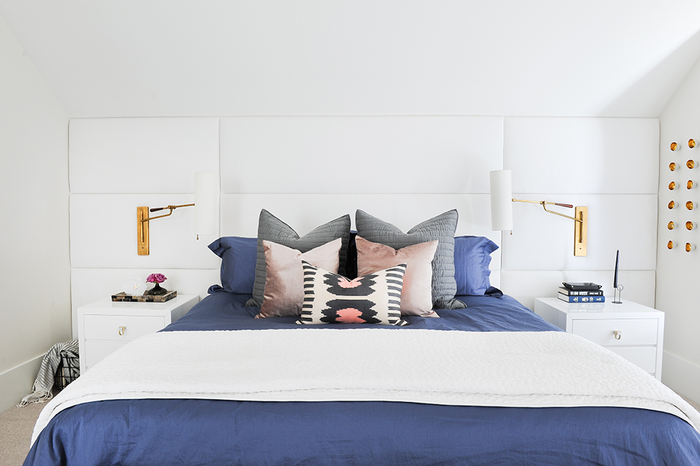
Gillian admits that the bedding was a big splurge. “I had it custom-made, and it has a crazy high thread count. I like how the blue is different from the other blues in the home but still carries the colour palette through to the bedroom.” The pink cushions are from West Elm, the patterned one from Da Vinci Home and the handsome brass sconces were sourced from Circa Lighting.
Golden Touch
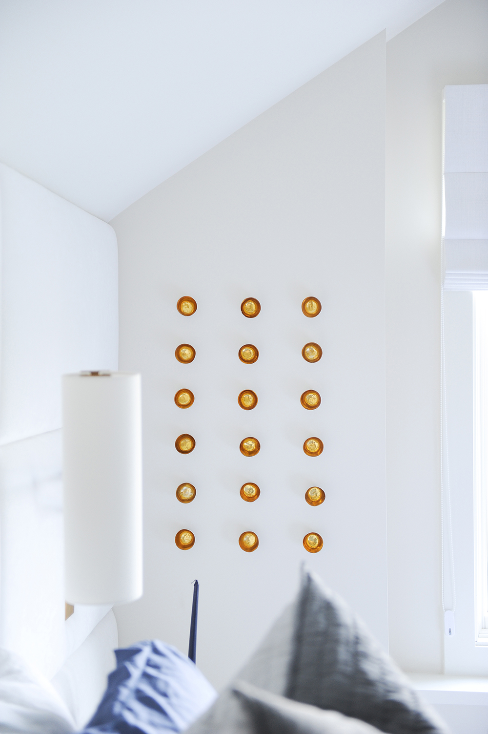
“These are small porcelain egg-like sculptures from Peridot Decorative Homewear,” says Gillian. “They’re white with gold-leaf inside and have screws at the back that make them super easy to install – I actually did these myself! I opted for a clean grid pattern, but you could install them in a more organic shape as well. I love that they add a different medium of art into the mix.”
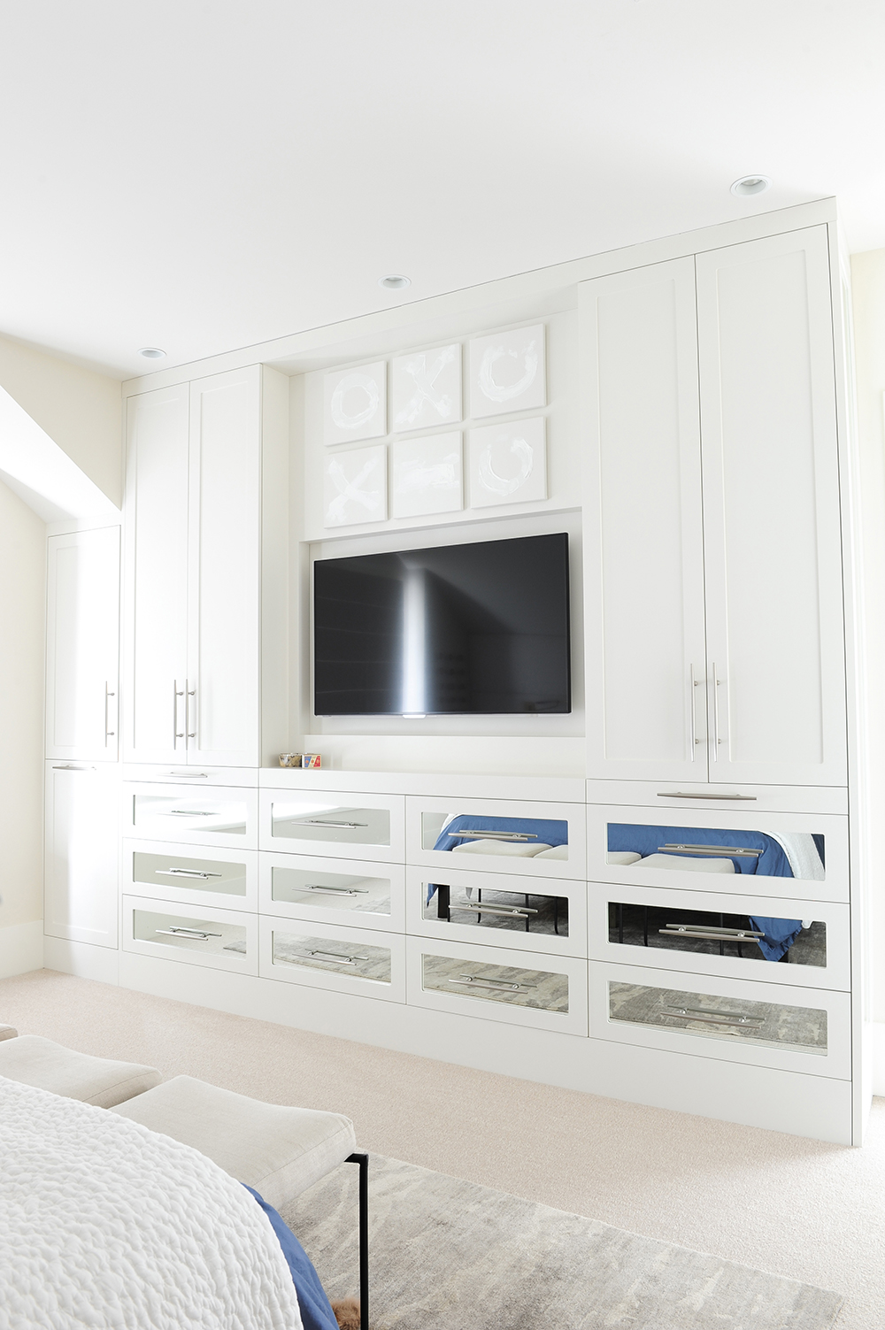
Closet Case
Paul and Darcie were desperate for more closet space, so Gillian ditched their small dresser and designed this showstopper custom unit. “They were concerned a built-in would overwhelm the room and make it feel smaller. But painting the millwork white and facing the drawers with mirrors mitigated this effect. In fact, the space felt bigger as soon as this was installed.”
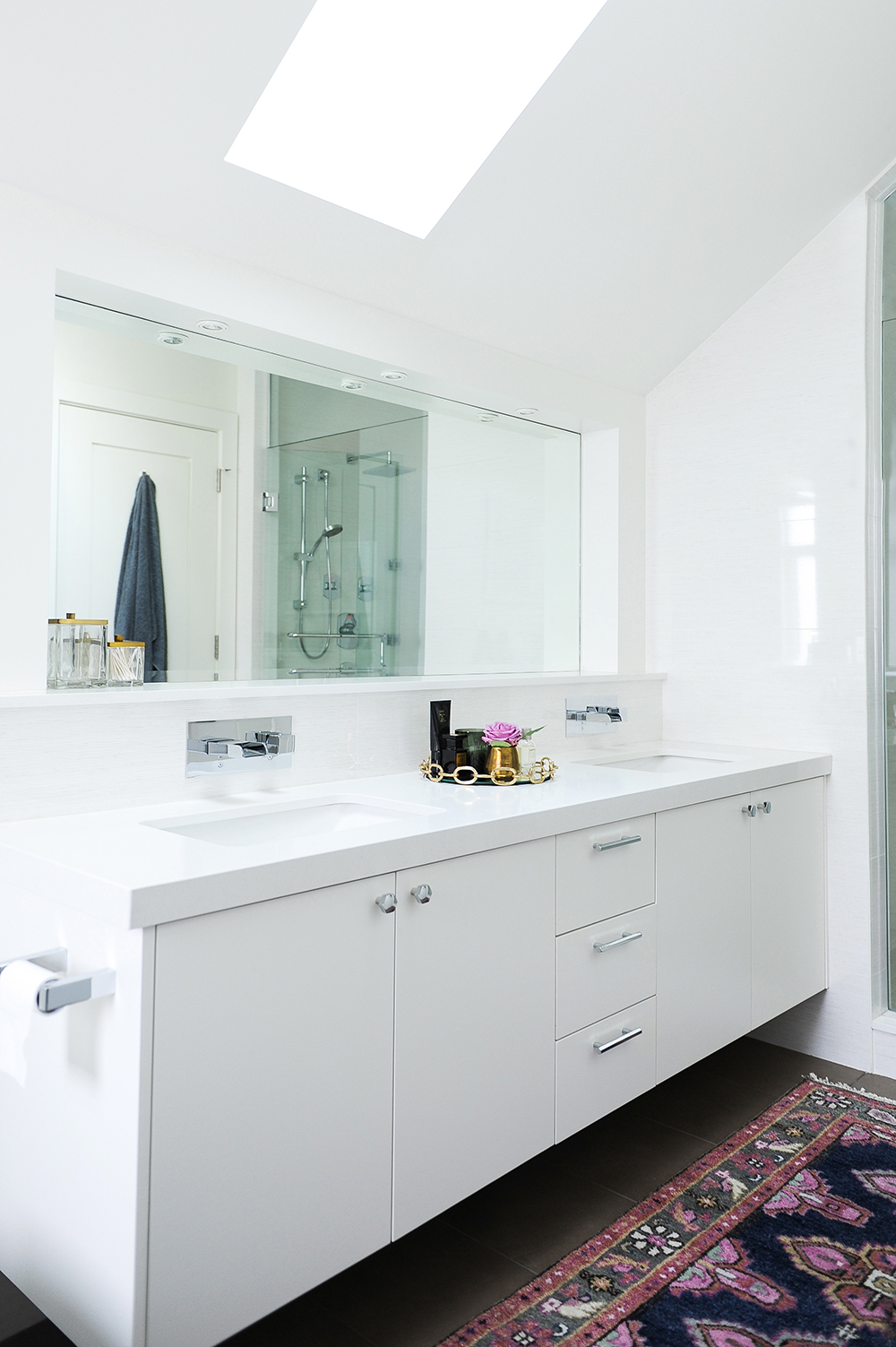
Touch Up
Gillian gave the ensuite bathroom what she calls a lipstick makeover. “The vanity was a lacklustre wood tone, so I had it repainted a crisp white.” A brass tray corrals pretty toiletries and a woven rug introduces pattern and colour.
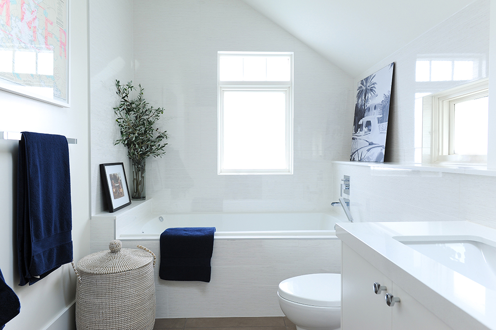
Gallery Effect
“Artwork in the bathroom always adds personality and creates a nice lived-in effect,” says Gillian. Here, a framed poster shares the space with photos that flank the tub – the small framed one is of Paul and his sibling when they were kids. Navy towels are a nod to the blue theme, while the woven hamper adds a natural element.
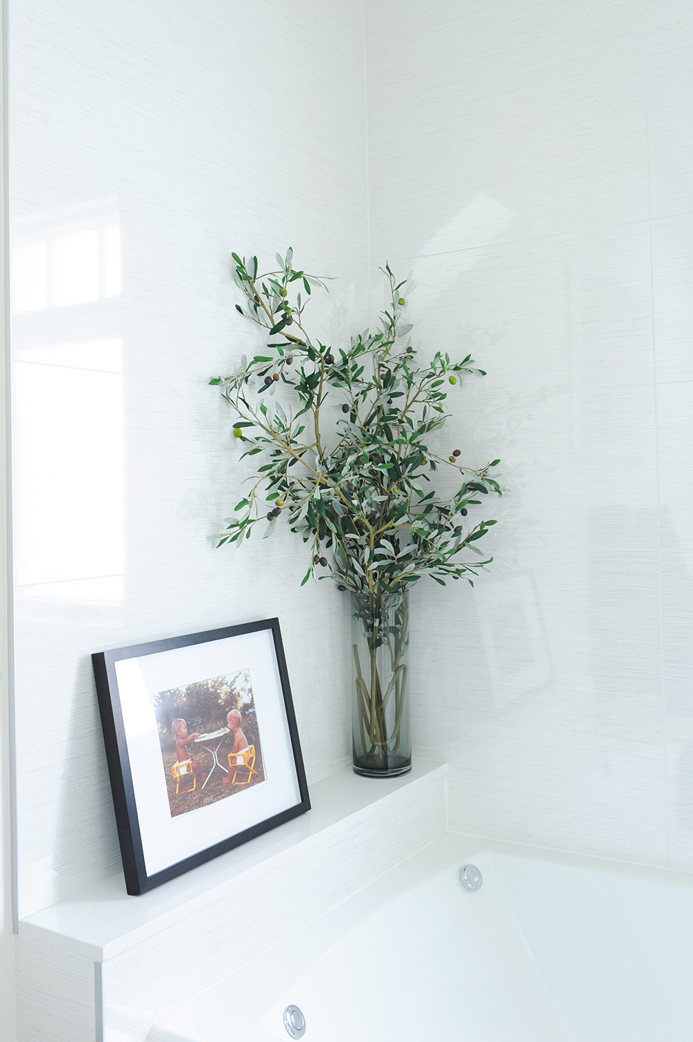
An Olive Branch
This hyper-real looking olive branch is actually faux. “I love its ease here – it looks great, is no-maintenance and you certainly don’t have to worry about leaves dropping in the tub!” It’s also a great analogy for the rest of home: beautiful to look at, totally practical and designed with real living in mind.
HGTV your inbox.
By clicking "SIGN UP” you agree to receive emails from HGTV and accept Corus' Terms of Use and Corus' Privacy Policy.


