Victorian-era homes are undeniably beautiful, but their layouts aren’t always practical for today’s families – as was the case for a busy family of four whose 120-year-old home’s second floor needed a major revamp. By reconfiguring rooms and enhancing the existing architecture, the Save My Reno team maximized the space while keeping the budget intact.
Save My Reno airs Tuesdays at 9 and 9:30PM e/p on HGTV Canada and on HGTV.ca.
Growing Pains
Homeowners Shawna and Andrew’s Victorian-era home was beautiful, but the second-floor layout was far from functional for them and their two growing kids. With a set $80,000 budget, they tasked Save My Reno designer Samantha Pynn and contractor Sebastian Clovis to rethink the cramped space.
Related: The Victorian Era is Still Alive in This 106-Year-Old Carriage House in Montreal
Dark and Dingy
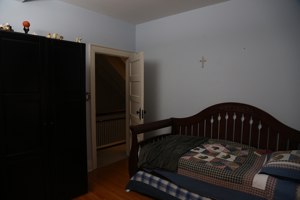
The home’s second floor needed to accommodate a lot of people and purposes, housing both kids’ bedrooms, a cramped shared bathroom, Shawna’s underutilized office and a shared homework space that spilled into Andrew’s office. While the couple’s first instinct was to gut the space to build a better layout, the Save My Reno team came up with a more cost-effective solution: shifting people into different areas for better functionality and use of space.
Related: 10 Design Elements that Maximize Your Square Footage
Space to Grow
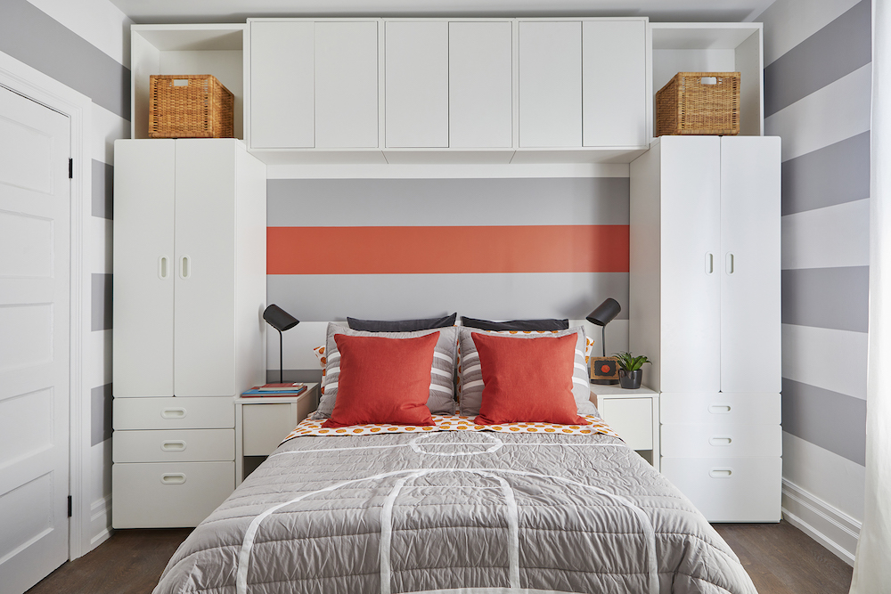
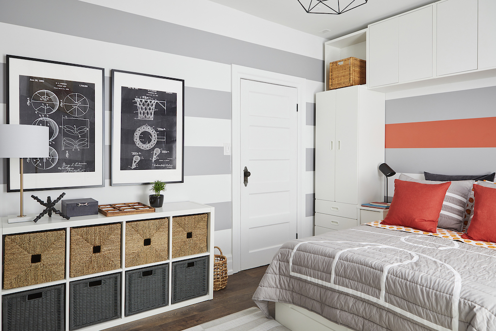
The couple’s son Keaton’s bedroom was tight and lacked storage. By moving one of the walls a couple of feet back into what was previously daughter Ella’s room, the room unlocked more space to play with. Making full use of the extra square footage, the team added cost-effective store-bought cabinetry around and over they bed – giving Keaton’s room the storage it needed while respecting the reno budget.
Slam-Dunk Style
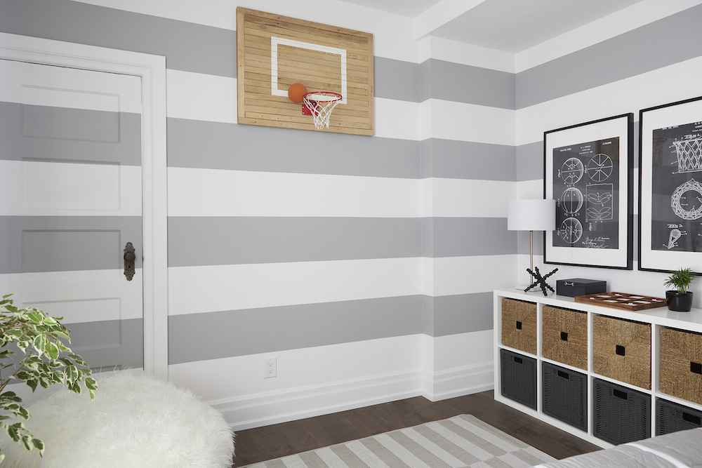
While tearing down the wall between the kids’ rooms, Sebastian and Andrew uncovered lath wood strips – which came in handy for a special upcycling project. With an assist from Keaton, Sebastian and Andrew built a custom backboard for Keaton’s basketball-themed bedroom.
Related: 12 Thrifted Home Decor Ideas to Inspire Your Second-Hand Decorating Dreams
Painting Sporty Stripes
To give Keaton a room that will stay fun and stylish as he moves through his tween and teen years, Samantha choose a neutral grey-and-white colour palette. To keep things playful, the design incorporated bold painted stripes on the walls and bright orange accents.
A New Purpose
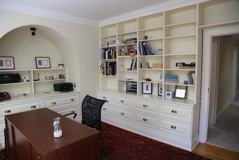
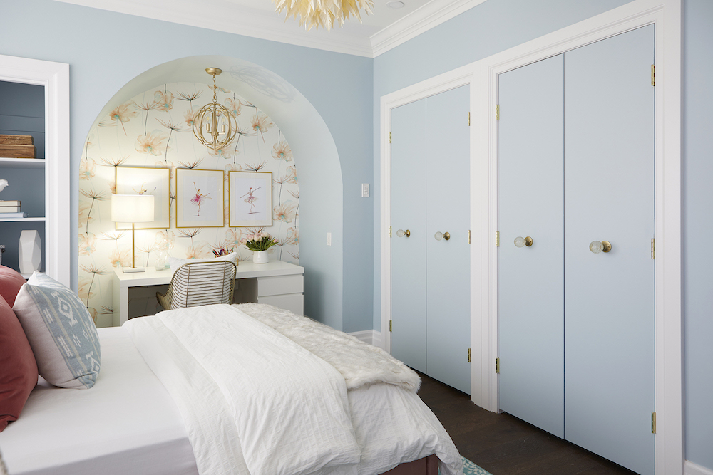
The key to maintaining a budget-friendly revamp that still met the family’s needs was in rethinking what rooms were used for what purpose. For example, to give their dancer daughter Ella more space, the couple moved her from her compact bedroom to the large room that was previously Shawna’s office.
Related: 10 Design Tricks to Make a Small Bedroom Look Bigger
A Room Worth Dancing Over
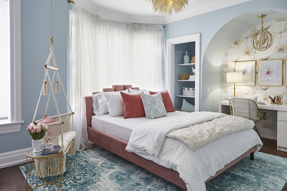
The team transformed the office into a beautiful bedroom for Ella by playing up the room’s existing details – like painting the fireplace white, adding floral wallpaper in the alcove and creating double-door closets. The crowning touch? A paper-feather pendant light – DIYed by Samantha, Shawna and Ella – adds a dreamy touch to the room while saving big bucks from the budget.
Privacy Please
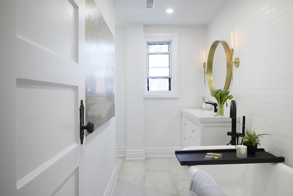
The shared second-floor bathroom felt cramped and caused plenty of traffic jams while the kids were getting ready in the morning. As a budget-friendly solution to the problem, the team decided to divide the bathroom into two private spaces.
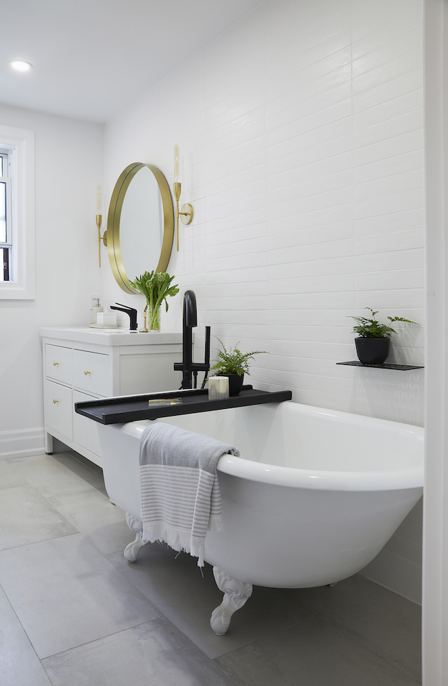
Bath Time
The main bathroom space also got a revamp with new matte-black accessories, new floors and a fresh white palette. Saving money and calling back to the home’s classic feel, the team sprayed and reused the beautiful clawfoot tub.
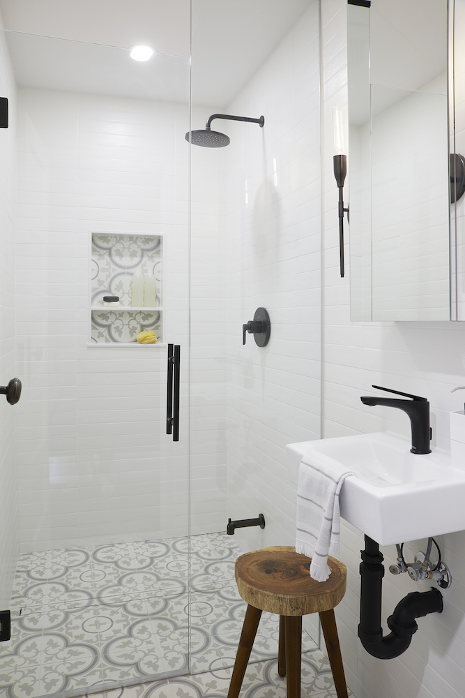
Smart Separation
Beside the main bathroom, the team built a private shower room. Complete with a shower, petite sink and elegantly tiled floor, the shower room makes the most of the smaller space.
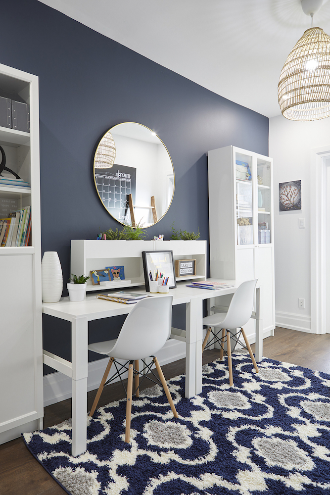
Study Time
To give the kids a space all their own for studying and homework, the team transformed the general multi-purpose area with shelving, desks and a fun organizational wall.
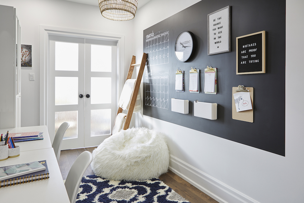
Office Space
While Andrew’s home office stayed put, the team added frosted French doors to separate his work space from the kids’ – enabling the whole family to be more productive when they need to be.
Related: 15 Insanely Stylish Small Home Office Ideas to Copy
HGTV your inbox.
By clicking "SIGN UP” you agree to receive emails from HGTV and accept Corus' Terms of Use and Corus' Privacy Policy.


