Underused and underappreciated, one family’s Kawartha Lake cottage was going to waste in more ways than one. By playing up the lake-front location and using his five vacation house rules as a guide, real estate expert and renovator Scott McGillivray helps transform this tired cottage into a fun, fishing-themed family retreat.
Watch Scott’s Vacation House Rules on HGTV.ca, now also available through STACKTV with Amazon Prime Video Channels, or with the new Global TV app when you sign-in with your TV service provider details. HGTV is also available through all major TV service providers.
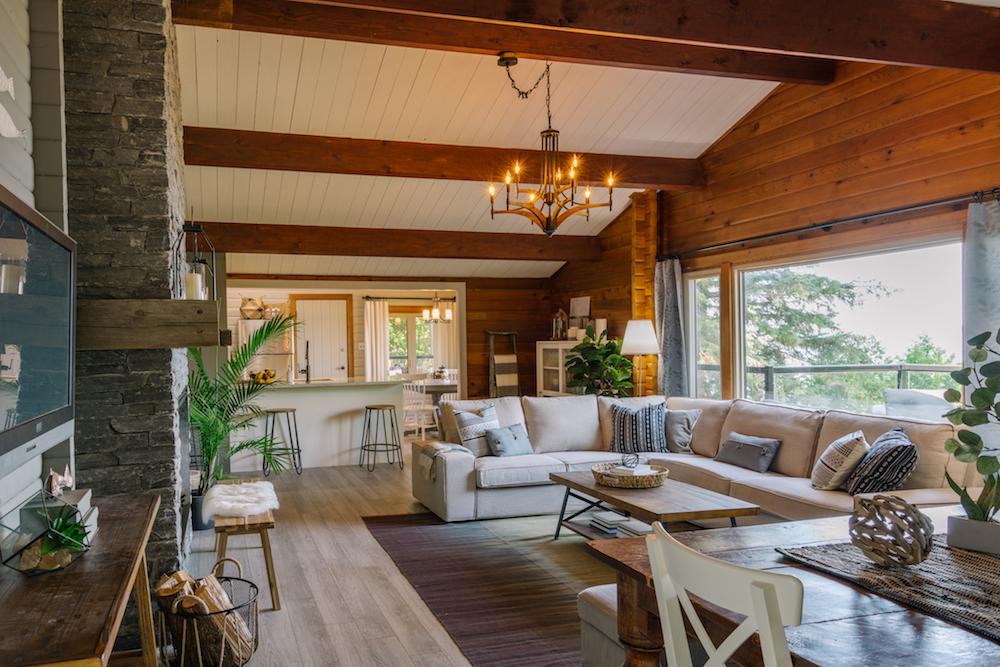
Cottage Life
Tania and Selwyn bought their Kawartha Lake cottage seven years ago, but haven’t gotten much use out of it thanks to its run-down finishes, dark interior and impractical details. Now, with their two sons about to go to university, they’re hoping Scott can help them make it ready for rentals.
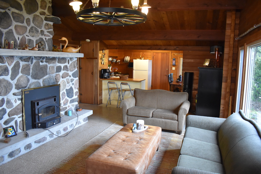
Rental Potential
To know just how much profit could be hidden in their outdated cottage (see furniture in this image), Scott helped Selwyn and Tania do their homework with his first rule, “Do Your Research.” The average rental rate for a three-bedroom property in the Kawartha Lake region is about $300 per night. If the couple rents their vacation house for just half the year, they could make $50,000 a year in rental income – which would go a long way towards helping them send their sons through university.
Related: 50 Fresh Cottage Decorating Ideas
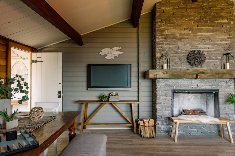
Catching Chic Design
In order to make smart renovations and stay on budget, Scott used his fourth rule, “Plan Your Design,” before making any changes. With the help of designer Debra Salmoni, the team envisioned the cottage as a stylish log cabin retreat with a fishing theme – perfect for renters looking for a lake-front vacation. In the living room, this plan included painting the space, swapping the outdated light for a modern fixture and replacing the bold oversized fireplace with a chic stone design.
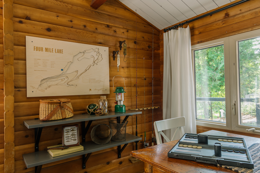
Reeling in the Theme
To help drive the theme home and increase the cottage’s marketing potential, Scott and Debra transformed a dark, empty living room wall into an homage to the region’s fishing. Debra, Tania and Selwyn shopped for curated antique fishing gear to add stylish dimension, while Scott made a unique 3D map to complete the space.
Related: Sabrina’s Tips for Mixing a Modern Home with Antique Decor
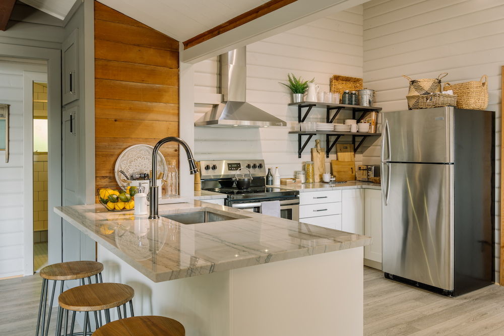
From Fear to Function
One unique design challenge? When it came to planning the refreshed kitchen, Tania’s fear of spiders meant no upper cabinets. Getting creative with storage, the team added shelving to keep the essentials on hand for guests.
Related: The Most Popular Kitchen Designs From Around the World
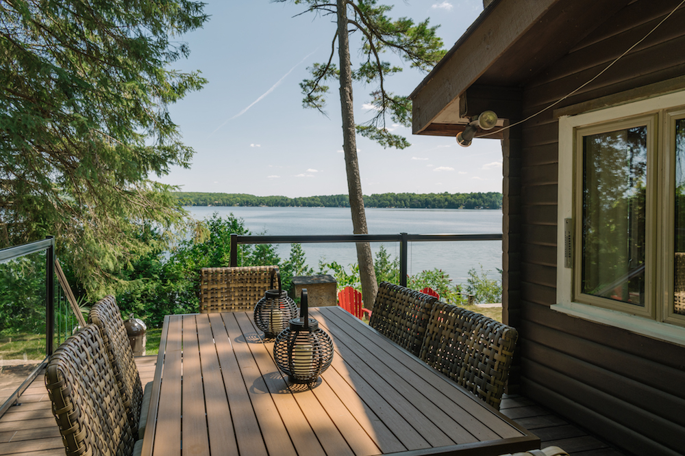
The Advantage of Views
There’s no doubt about it: This cottage’s lakefront location is its competitive advantage and the key to Scott’s third rule, “Get Noticed.” To make the cottage stand out from the online crowd, Scott designed an incredible outdoor entertainment space with multiple zones including a new deck, dining area and two lounge areas.
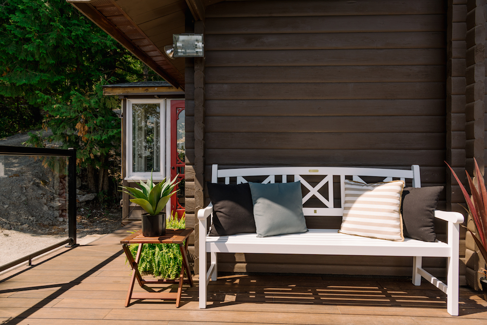
Outdoor Living
An important part of the outdoor area is the expanded deck, which Scott built to wrap around the entire front of the cottage – creating the ideal flow for entertaining and enjoying the outdoors. The richly hued bamboo composite decking was a bit more of an upfront investment, but is perfect for a rental property thanks to its low-maintenance design and durability.
Related: 10 Things to Consider Before Building Your Own Deck
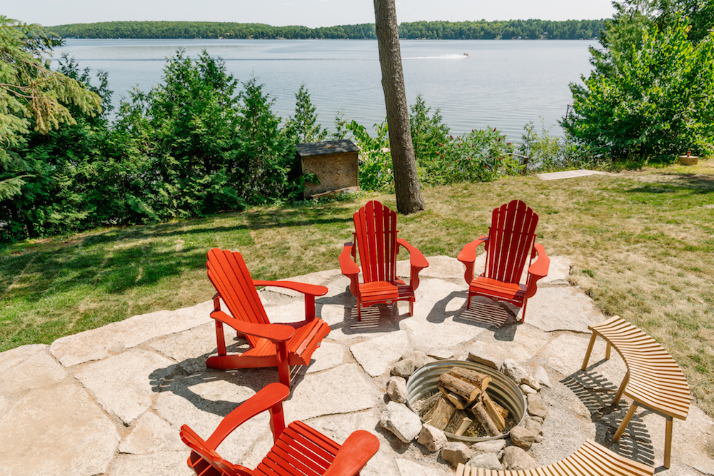
Campfire!
Putting his fourth rule, “Roll Up Your Sleeves,” to work, Scott had the whole family come in to help complete one of the biggest updates to the cottage: the outdoor space. By working on the fire pit, Tania, Selwyn and their sons cut down on overall costs for the renovation.
Related: 16 Low-Cost Ways to Make Your Backyard Feel Like a Permanent Staycation
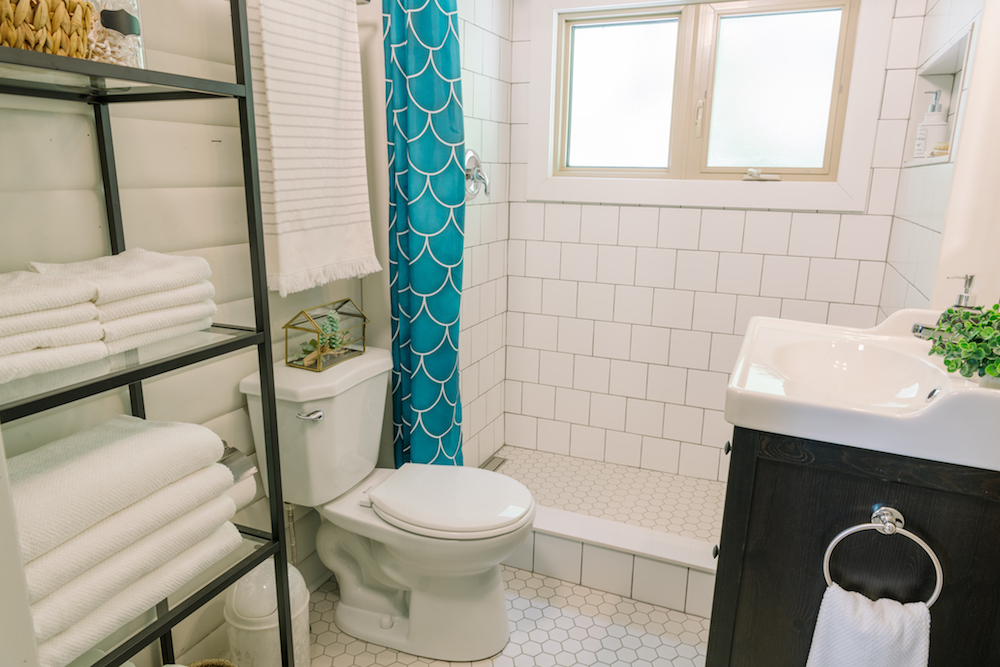
A Spa-Like Space
In order to be a great host, renters like Tania and Selwyn need to keep their guests’ experience in mind. To help, Scott used his final rule, “Be Your Guest” in the cottage’s updates – transforming the dark bathroom into a spa-like oasis, complete with a luxe shower and all the amenities guests could ask for.
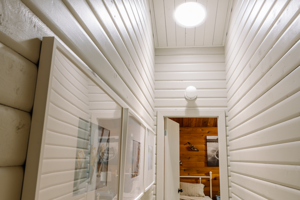
Bright Idea
Previously, the cottage’s tight-spaced hallway was dark, dreary and not very welcoming to guests. Painting the walls and ceiling in light colours created a brighter feel, while small sun tunnels in the ceiling – designed to channel the sun for maximum light – let natural light stream in to give renters a sunny feel.
HGTV your inbox.
By clicking "SIGN UP” you agree to receive emails from HGTV and accept Corus' Terms of Use and Corus' Privacy Policy.


