When people are planning their dream vacation, what they’re really looking for is an escape – not to be trapped in a dark, dingy dungeon of a property. Unfortunately for one couple, their family’s beach house was so dreary that it was literally scaring away potential vacation home renters. Luckily for the family, real estate expert and contractor Scott McGillivray used his vacation house rules to formulate a game plan – transforming the sad vacation house into a year-long renters’ playground.
Watch Scott’s Vacation House Rules on HGTV.ca, now also available through STACKTV with Amazon Prime Video Channels, or with the new Global TV app when you sign-in with your TV service provider details. HGTV is also available through all major TV service providers.
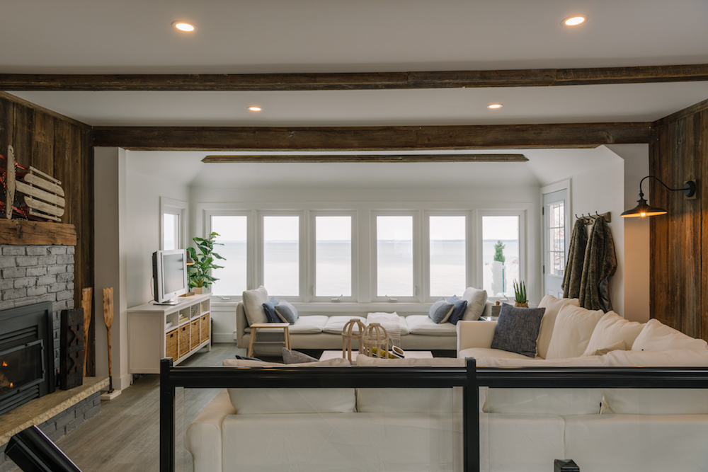
Beach-Front Blunder
Along with family members, Cassandra purchased a Wasaga Beach property with high hopes of vacation home rental potential, but the results fell way short of their expectations. While the property is perfectly situated on a private beach, the home’s interior was gloomy, cramped and frighteningly outdated. To turn things around, Cassandra and partner Kelsey took the lead to see if the investment could be salvaged – with Scott’s help and an $85,000 renovation budget.
Related: Malibu Beach Living Meets West Lake With Scott’s Vacation House Rules
Year-Round Opportunity
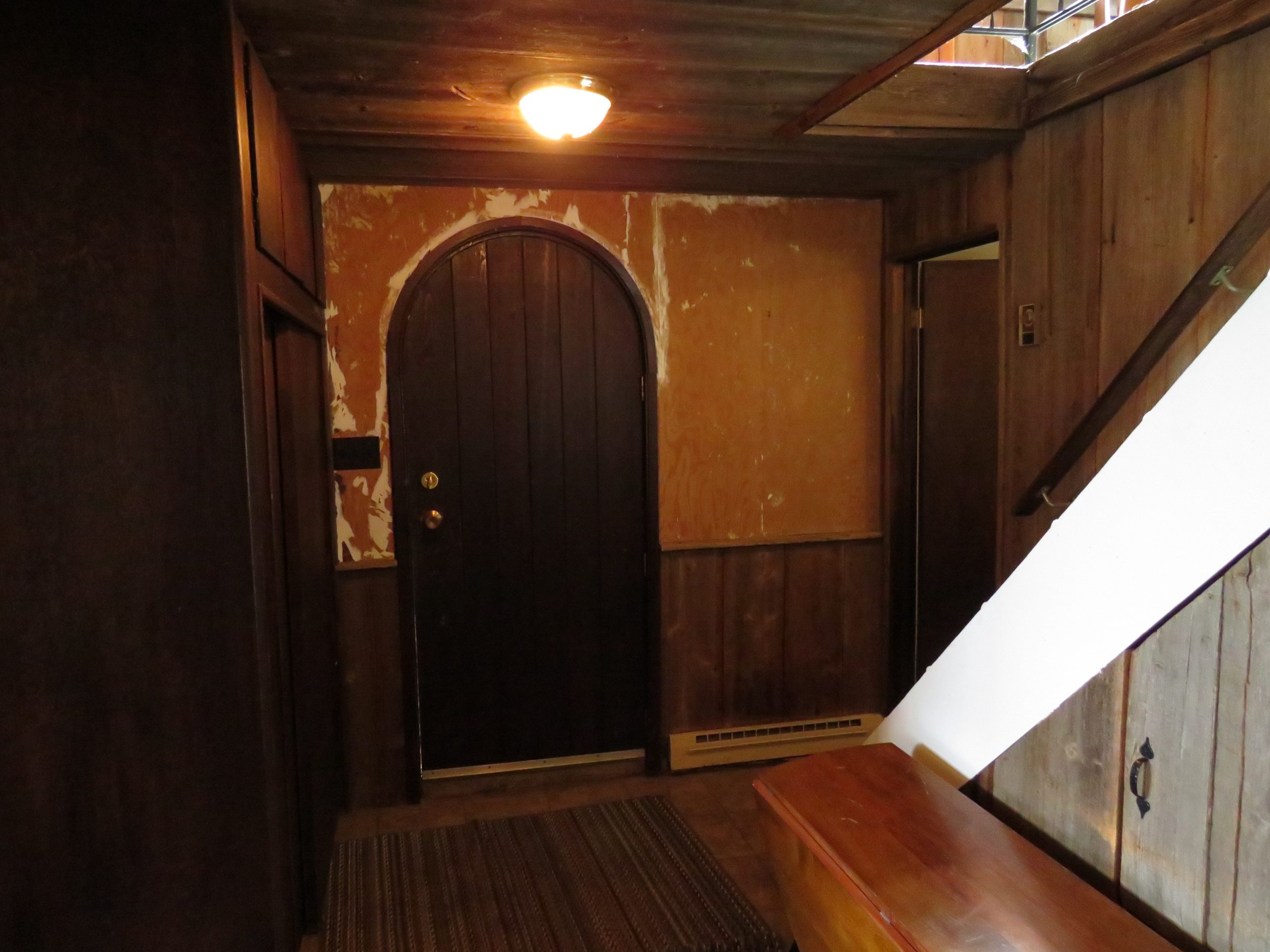
Before Scott starts a vacation house renovation, he uses his first rule, “Do Your Research,” to assess the market potential. While many beach houses can only attract renters in the sunny season, Scott saw unique potential to create a four-season retreat. Nestled in one of the best short-term vacation rental markets in the country, the cottage’s location is perfect for beachgoers, mountain bikers and hikers in the summer – while nearby hills attract skiers in colder months. Because three-bedrooms in the area rent for about $250 per night, the income opportunity was low-hanging fruit with the right upgrades. This dungeon-like foyer was a must-change space.
Related: 6 Questions to Answer Before Buying a Vacation Home
Let in the Light
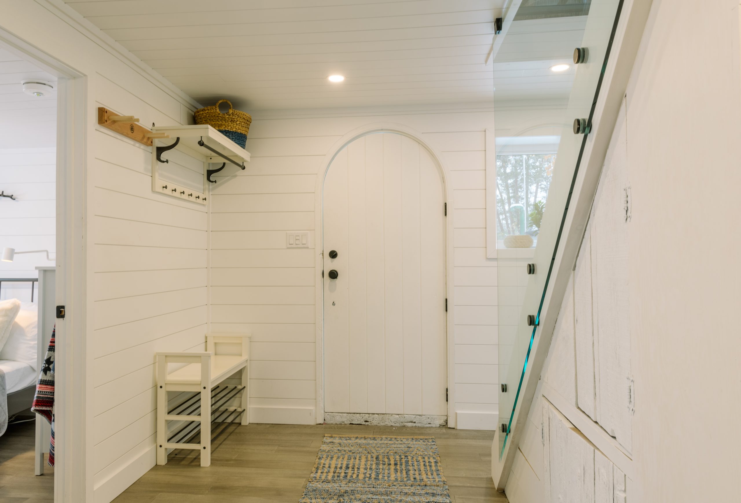
In order to save this vacation home, Scott’s third rule, “Plan Your Design,” was key. With the help of designer Debra Salmoni, the team played up the property’s incredible lakefront views and year-round appeal. To start, Debra painted the dark and cramped foyer a bright white to add a light, clean feel.
Related:
10 Tips to Help You Choose the Perfect Shade of White Paint for Your Room
A Vacation Playground
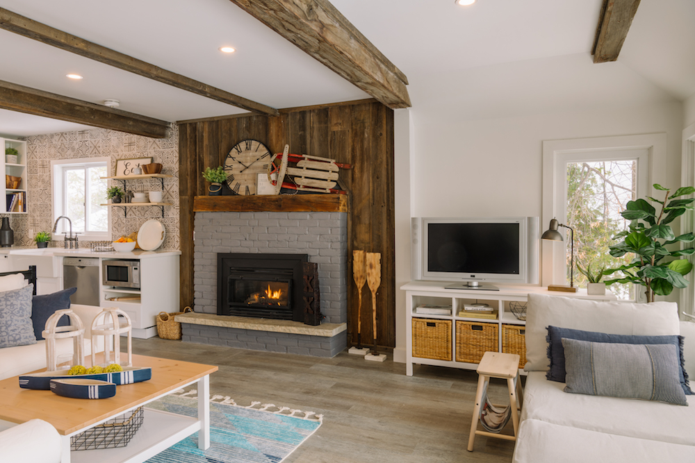
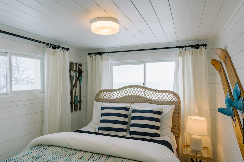
To showcase the vacation home’s four-season charm, the team came up with a sporty theme so that they could market the cottage to renters as a year-round home base for outdoor adventure. Inside, Debra incorporated antique sports to add character and highlight the theme.
Related: Scott McGillivray’s 10 Things to Know About Your Rental Before Cold Weather Hits
Space to Cook
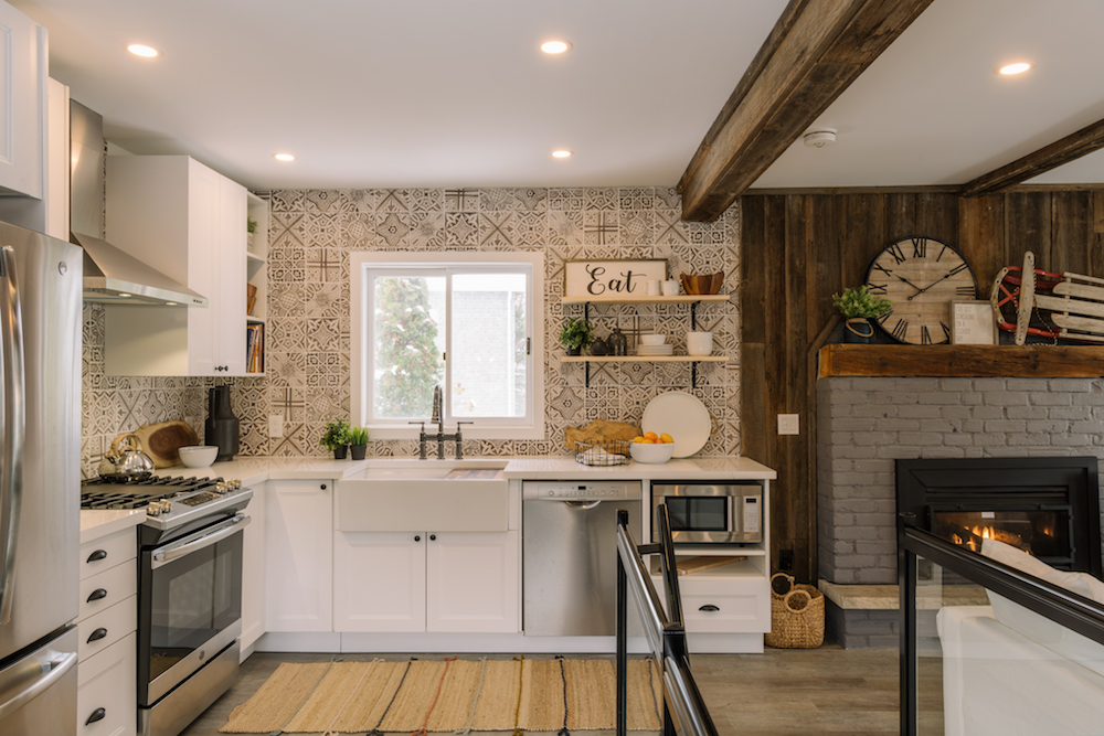
Renters on vacation need room to comfortably prepare their meals, so the cramped kitchen layout (with no counter space beside the oven) wasn’t ideal. To make the space more functional for guests, Scott built a wrap-around kitchen and a comfy banquette dining area. Debra added cozy character with distinctive graphic-patterned ceramic tiles.
Related: 10 Ways to Use Reclaimed Wood in Your Kitchen Design
Sauna-Inspired Sanctuary
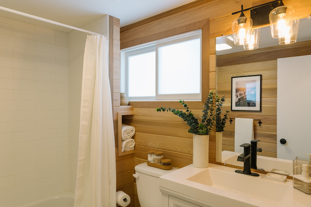
Because the beach house only had one bathroom, it was important that it be a stunning one. To make the bathroom more appealing to renters, the team removed the ugly patterned wallpaper and replaced it with cedar plank walls and a white subway-tiled shower for serious spa-like vibes.
Think Outside the Boat
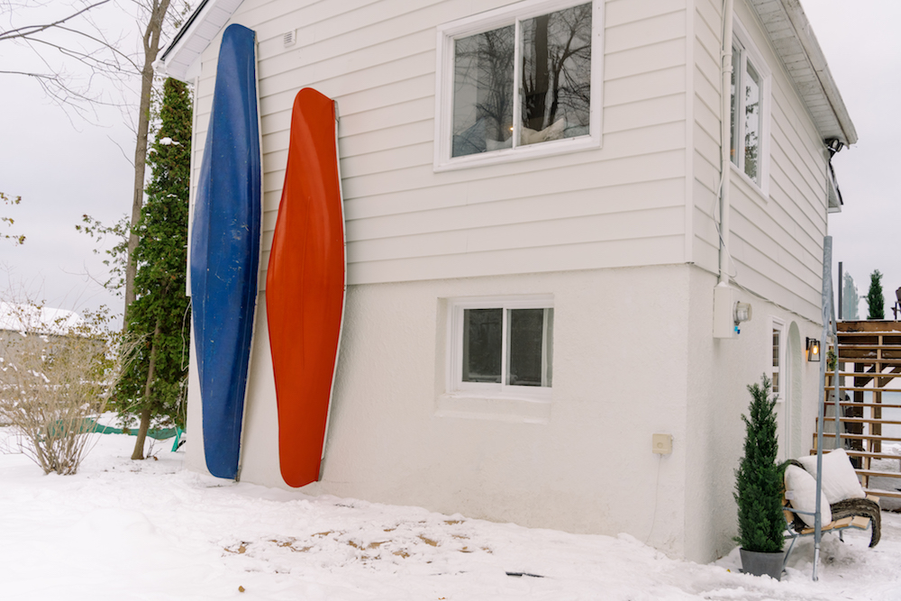
While the all-season activity theme and the incredible lakefront location gave the cottage an instant competitive advantage on the rental market, Scott used his third rule, “Get Noticed,” to help ensure the beach house doesn’t get overlooked. Attention-grabbing, theme-enhancing features help vacation homes stand out when people are scrolling. So, to add curb appeal and a clean look, he refreshed the exterior with cream-coloured siding – which he accentuated with bright blue and red canoes for a touch of whimsy and sporty charm.
Related: 9 Exterior Upgrades That Will Save (or Make) You Money
Enjoy the View
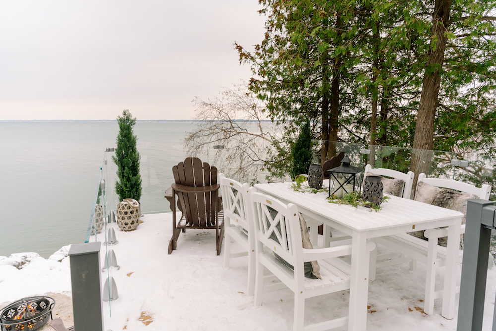
The private beach is the biggest draw for the property, and key to getting the vacation house noticed. To give renters that incredible outdoor experience, Scott removed the rickety, oddly-shaped decks and replaced them with a stunning new balcony that would allow renters to enjoy the view any day of the year.
Related: 5 Backyard Upgrades That Will Provide the Best Return on Your Investment
Ski Lift
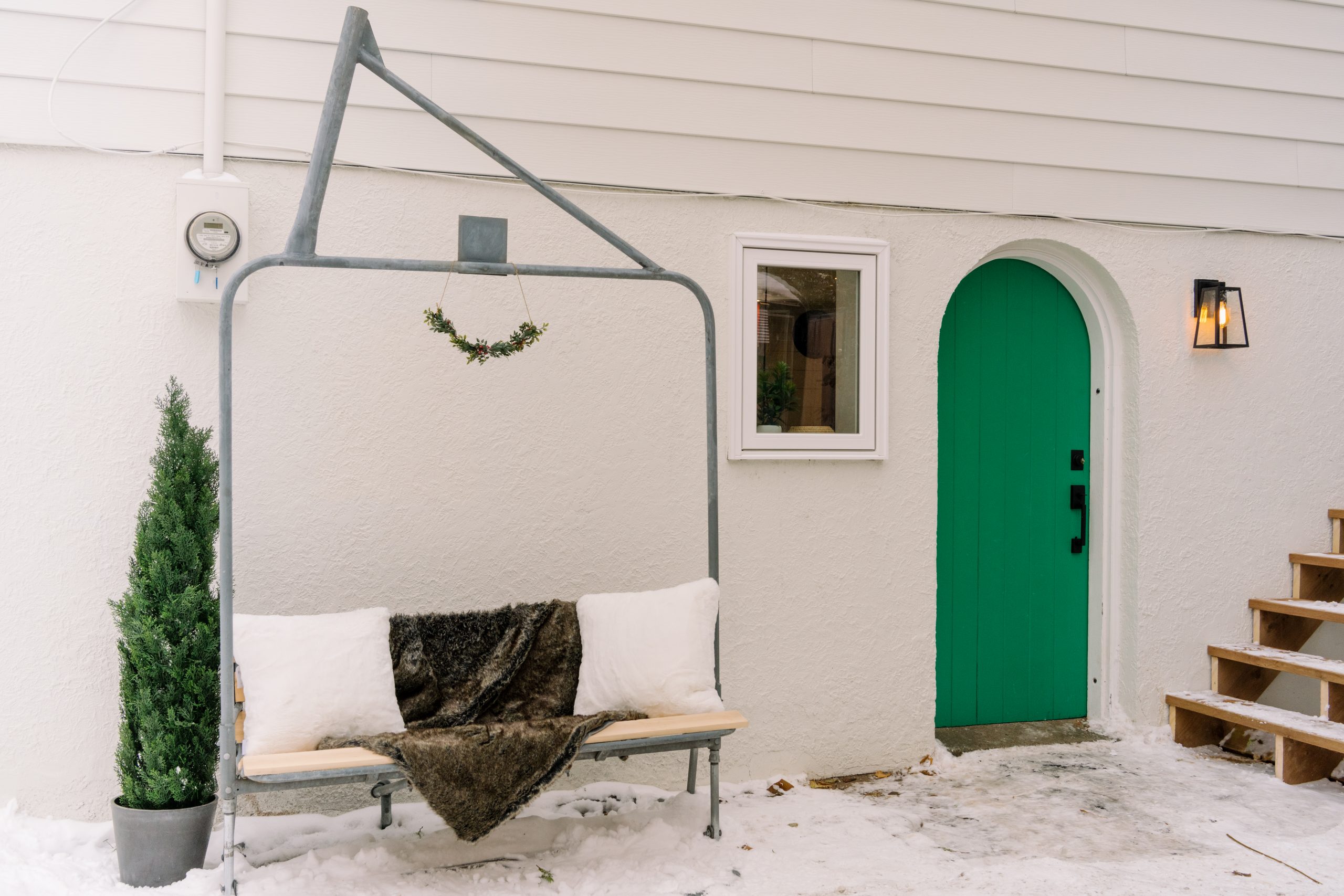
Adding unique details enhances your vacation home’s theme and help it stand out in online listings. Because of the cottage’s proximity to local ski hills, Scott repurposed an old chairlift into a novel front bench. Instead of converting it himself, however, he enlisted Cassandra and Kelsey to help. By using Scott’s fourth rule, “Roll Up Your Sleeves,” and taking on part of the job, Cassandra and Kelsey helped cut down on costs while feeling more involved in their project.
Related: A New Record! Whistler Ski Chalet of Your Dreams Sells for $17.5M
A Theme for Each Bedroom
As Scott’s final rule, “Be Your Guest,” shows, addressing details that give renters a better experience means more positive reviews – and more bookings. Because the bedrooms were on the smaller side, Scott and Debra found ways to make them feel more spacious and luxe. To start, Scott removed excess built-in storage and replaced it with smaller dressers – short-term renters don’t need a lot of closet space, and they’ll appreciate the extra room. For an element of on-theme fun and excitement, Debra decorated each bedroom to a different concept: winter, sports and garden.
Related: Scott McGillivray Transforms a Run-Down Cottage Into a Pet-Friendly Vacation Rental Paradise
HGTV your inbox.
By clicking "SIGN UP” you agree to receive emails from HGTV and accept Corus' Terms of Use and Corus' Privacy Policy.


