Jonathan and Drew Scott have had plenty of experience giving couples their dream homes on Property Brothers Forever Home. But when they met Jeremy, Sam, and the couple’s adorable daughter Avery, they were tasked with creating an open-concept family home that had lots of room for entertaining guests, family, and friends. Read on to see how the brothers delivered a bright and modern space that still feels like home for this brood-and all on a $142K budget.
Watch new episodes of Property Brothers: Forever Home Mondays at 9PM on HGTV Canada, now also available through STACKTV with Amazon Prime Video Channels, or with the new Global TV app when you sign-in with your TV service provider details.
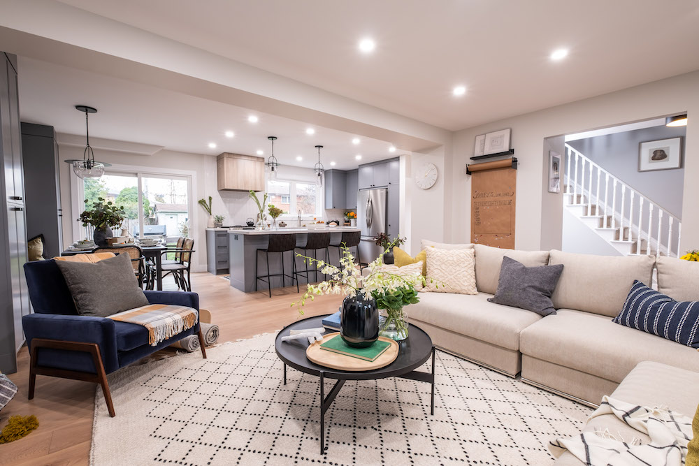
The Perfect Entertaining Space
Sam, Jeremy and Avery are a tight-knight family, so they wanted to be able to hang out with each other no matter where they were in the house. It was also important for them to have ample storage and space to entertain guests for meals, board games, and all of those life moments in between. In order to do that the brothers opened up their main floor and relocated the ducts to one central beam, allowing clean sightlines throughout the entire floor plan.
Related: These 20 Canadian Backyards Were Meant for Summer Entertaining
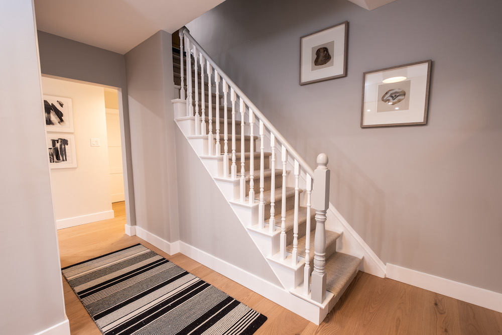
An Easy Transition
From the second you walk into the new space you get a feel for the clean and modern farmhouse vibe that Drew and Jonathan were going for. The updated staircase feels bright and open thanks to a coat of white paint, while the light floors and grey walls add immediate contrast and personality. Add in an eye-catching rug and a few framed modern paintings, and this entranceway packs as much of a statement as it does a welcome.
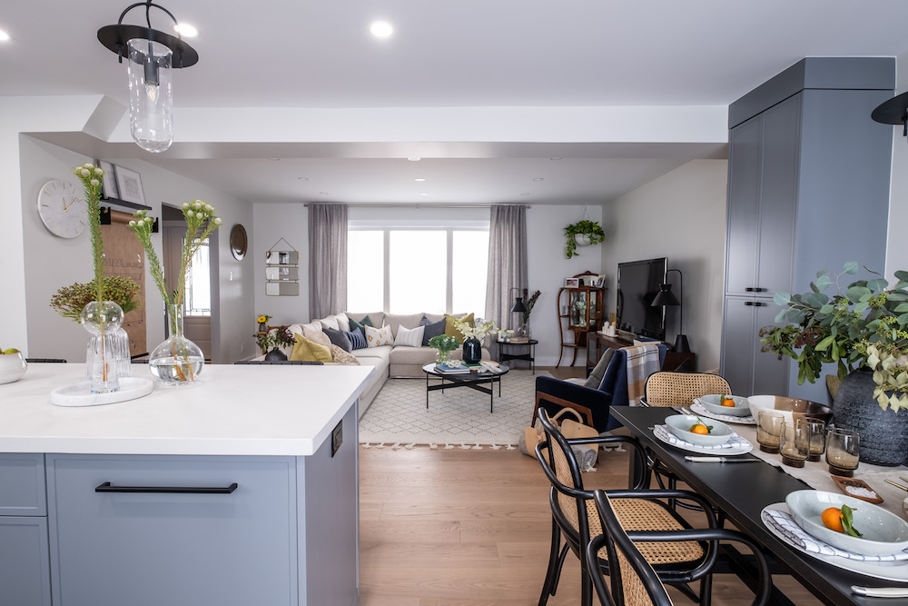
Creating the Perfect Separation
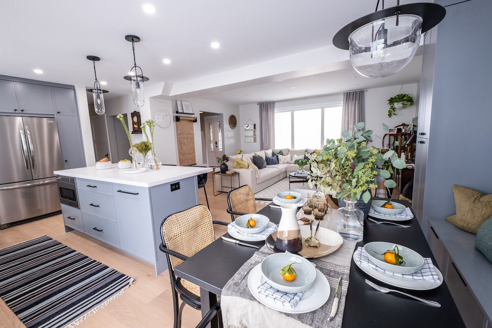
In order to piece together a clean-looking, open-concept space, the brothers used the same flooring and paint throughout. They also unified and brightened the look with pot lights, but then they separated the spaces with key pops of colour, furniture and accent rugs. By framing separate dining, living, and kitchen spaces the home still feels functional and delineated, but when hosting company this family will never feel like it’s missing out on any of the action.
Related: 10 Downsides to Open-Concept Living You’ve Never Considered
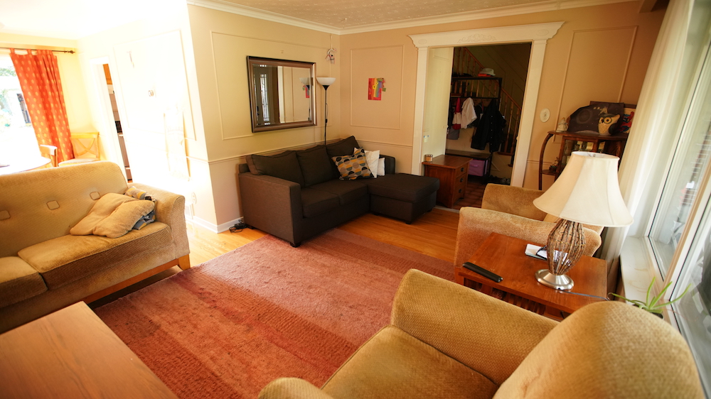
A Bright Transition
Check out the living room space before the renovation. While the large room was certainly big enough for the family and a couple of guests, the clunky layout made it hard to hang out in without feeling cramped and confined. It was not the most welcoming of spaces, to say the least.
A Family Space
At the end of the day, this is a family that still wants to be able to sit down together and enjoy one another’s company, so it was important that Drew and Jonathan give them a dining or eat-in area. To maximize space the brothers offered up banquet seating and chairs, framed by even more storage so that “open concept” never feels like “cluttered concept.”
Related: 15 Kitchen Renovations That Real Estate Agents Hate
A Separate Affair
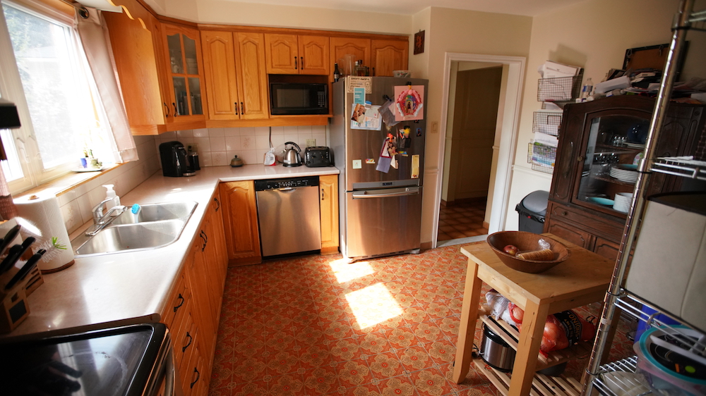
Before the renovation the kitchen was one-toned and dark thanks to wooden cabinets that matched the orange flooring below. And while most tiling holds up for many years, it was definitely time for this family to upgrade theirs into a more modern look.
Pops of Modern Colour
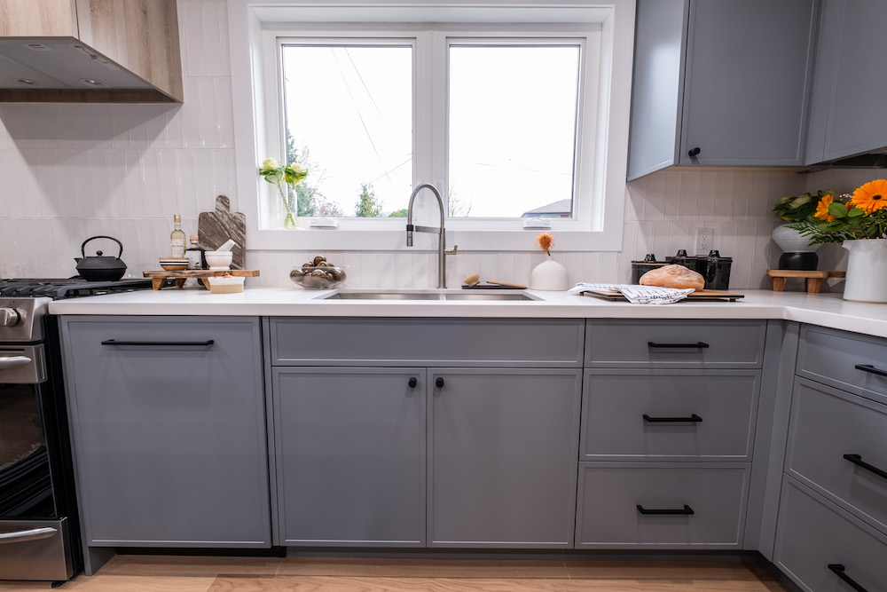
The new kitchen cabinets feel modern and clean thanks to the cool grey colour and pops of black. And, because the brothers knew they were going with a bolder colour on the cabinets they made sure to paint the wall a more toned down and neutral shade throughout the rest of the house, adding a bit of a dramatic effect to the overall look.
Related: The 8 Best Uses For Your Wallpaper That Don’t Involve Walls
That Coveted Island
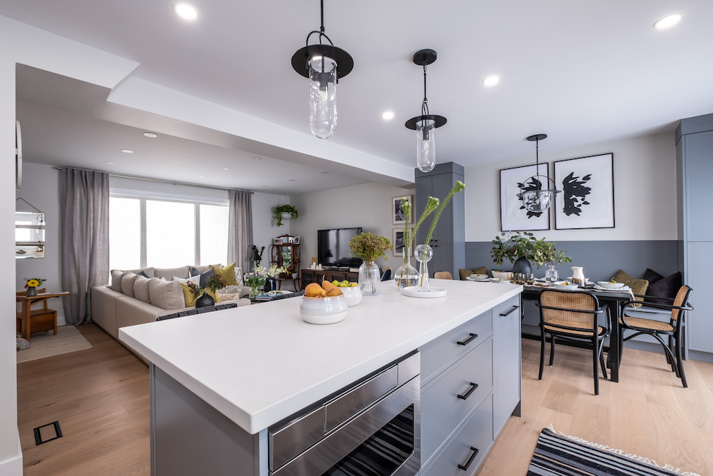
This family enjoys being able to hang out together while cooking, so an island was key. But while they were all about adding function to the piece, they didn’t want to clutter the look by having a sink smack in the middle of it. The end result is a clean line that offers plenty of space for snacks when entertaining, which is what was most important to the family in this particular Forever Home design.
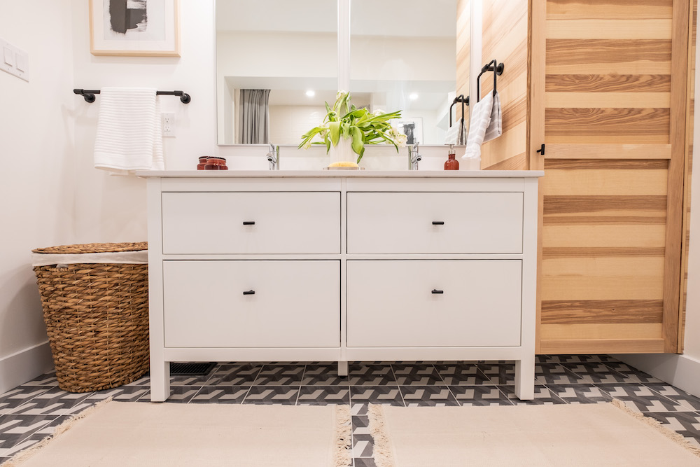
Ditching Custom in Favour of Cost
Upstairs the brothers also redesigned the family bathroom to give them a bit more space. The bright new design is modern and bright, but it isn’t 100 per cent custom. In order to save a bit on the renovation budget and give the family all of its wants, this pre-fab vanity only required a little bit of assembly… something the brothers should be totally used to doing together by now, right?
Related: 9 Easy DIY Projects From HGTV Canada Stars That’ll Make Your Home Look Expensive on a Budget
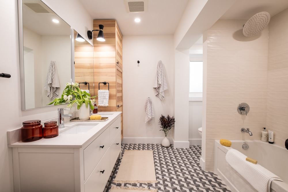
A Spa-Like Space
The brothers don’t often do bathrooms, but when the result is a spa-like space such as this one, you have to wonder why. The fun flooring adds instant personality, the custom wood lockers add tons of storage potential, and the glossy oversized brick tiling in the shower feels clean and modern. It’s no wonder this family absolutely loved their brand new Forever Home-all the way from the top to bottom.
HGTV your inbox.
By clicking "SIGN UP” you agree to receive emails from HGTV and accept Corus' Terms of Use and Corus' Privacy Policy.


