When Natalie Balen-Cinelli, a photographer and lifestyle blogger, and her husband, realtor David Cinelli, bought their Etobicoke home in 2011, it was more or less an empty box. The neighbourhood, Stonegate-Queensway, is known for brand-new houses with show-stopping designer kitchens and bathrooms. But the previous homeowners filed for divorce while the house was being built, so they opted to cut corners. When Natalie and David walked into the unfurnished space, they saw a blank canvas for their modern, monochromatic dream home.
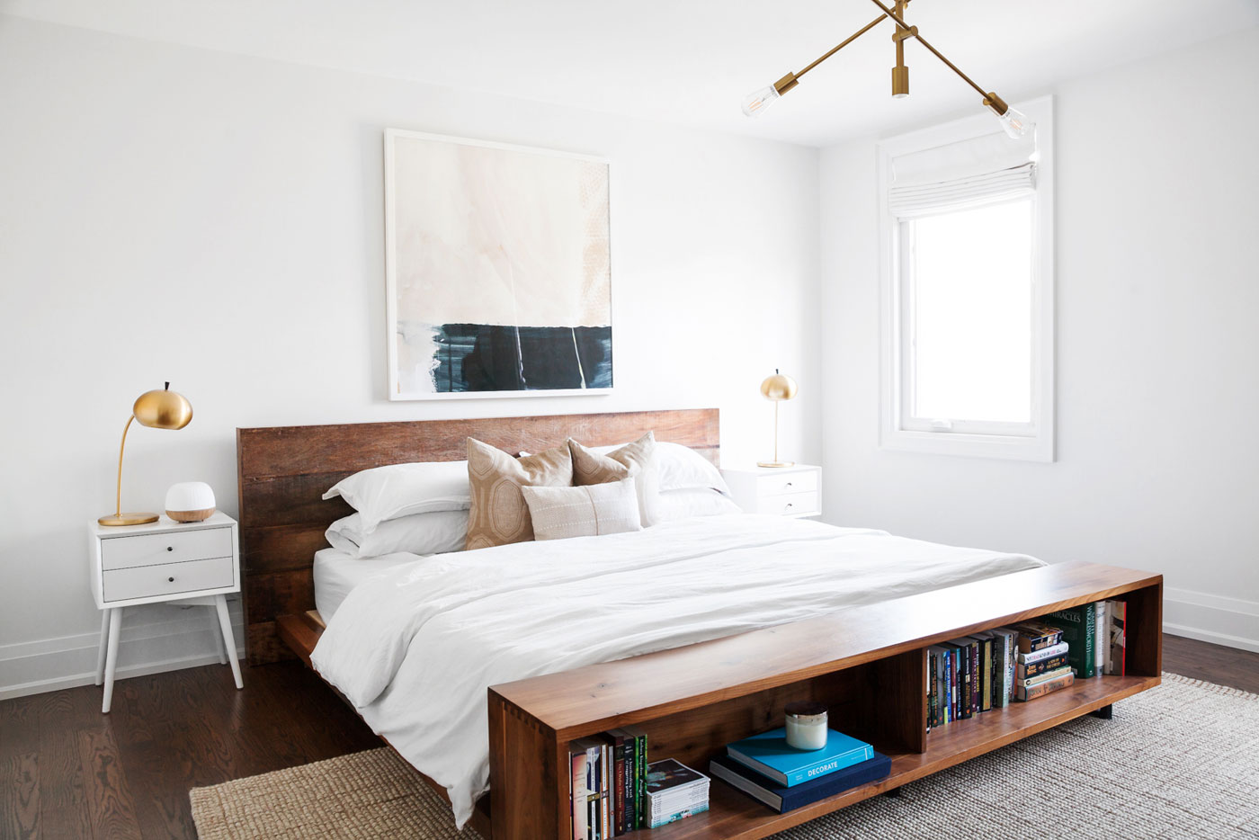
The Library is Open
The bed frame, from Crate & Barrel, doubles as a bookshelf. It was one of the few signature pieces that made the move from Natalie and David’s previous house.
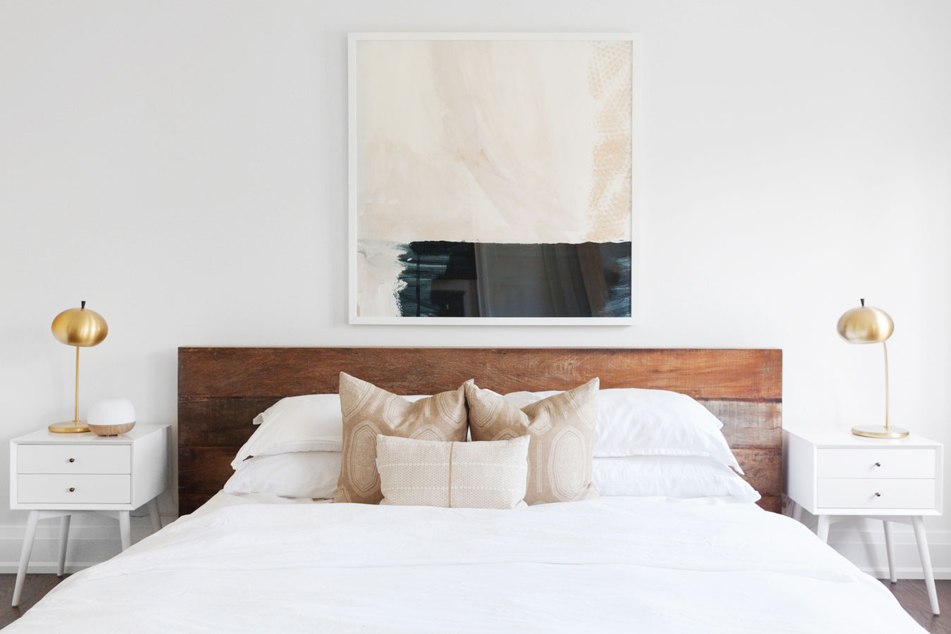
Call in the Troops
Natalie’s business was ramping up when it came time to design the master bedroom, so she hired Kate + Amanda design to freshen up the space. Their storyboard included two matching gold lamps, the sleek white side tables and the soothing abstract art. Natalie gave a thumbs up to everything.
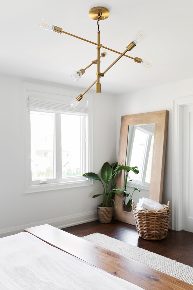
Mirror, Mirror
The angular gold light fixture was picked up from West Elm and (spoiler alert) it makes a second appearance elsewhere in the home. The tall, wood-framed mirror is from Home Sense.
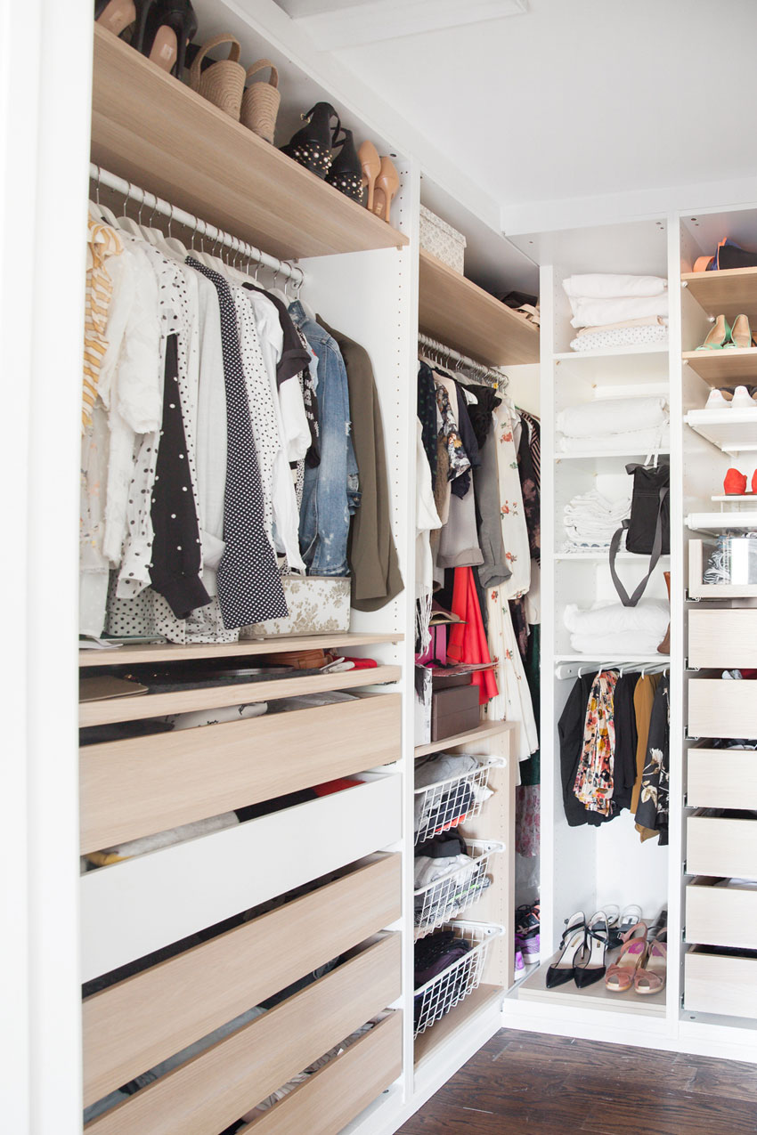
In-House Runway
To get their own walk-in closet, Natalie and David redesigned the layout of the second floor and essentially stole a closet from their daughter’s room. (She didn’t mind.) They bought IKEA’s Pax wardrobe system to create an airy but organized space.
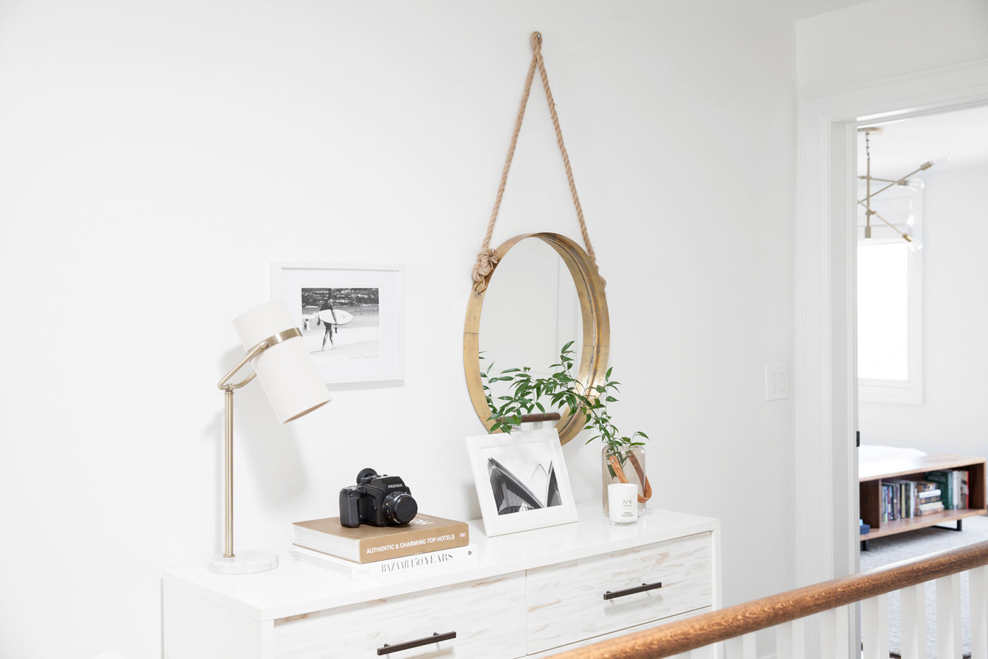
Space Between
The second-floor hallway was wide enough for a dresser, which moonlights as a linen closet. It also profiles some black-and-white photos Natalie shot while studying in Australia, including a portrait of a surfer and a shot of the Sydney Opera House. The gold mirror and matching lamp are both from Home Sense.
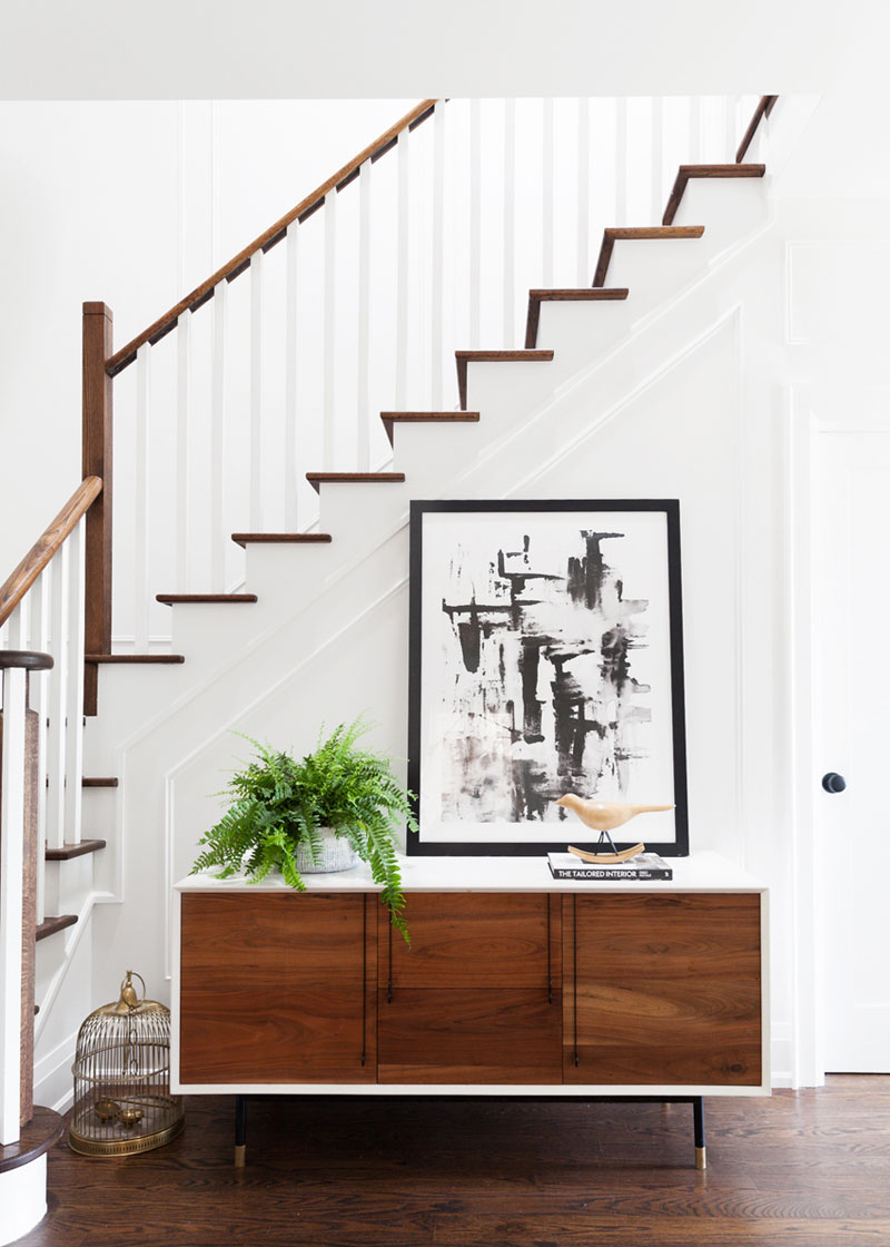
Put a Bird on it
The credenza in the front foyer has a midcentury-modern vibe, but was purchased brand new from Shelter Furniture. It’s topped with a lush fern from Islington Nurseries and a piece of accent art from Minted. To tie in the home’s metallic motif, Natalie brought in a brass bird cage her dad salvaged from a junk yard.
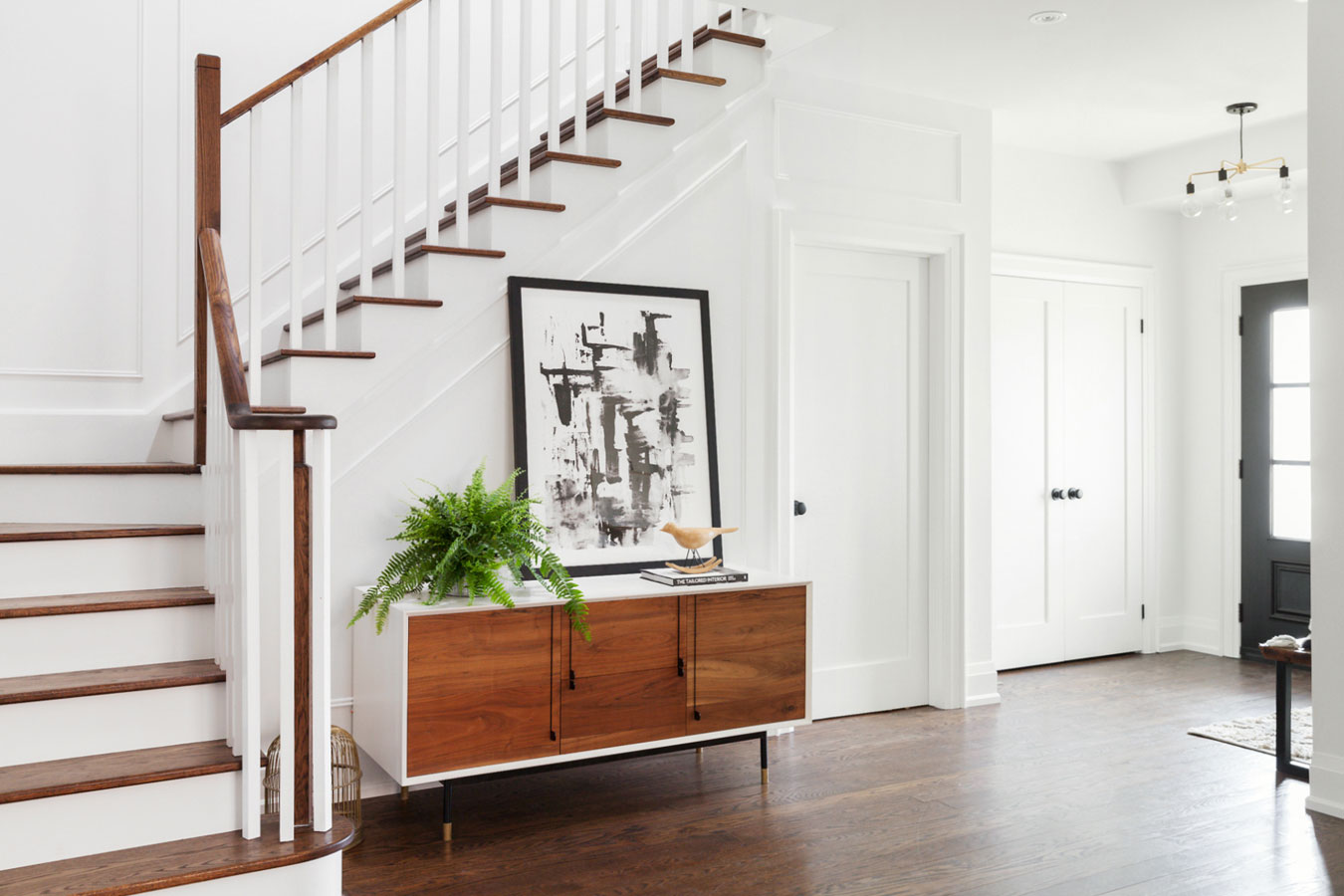
Step by Step
The white-and-wood staircase is one of the most striking style choices in the home, and it’s illuminated by a sun tunnel – essentially a tubular skylight – from above.
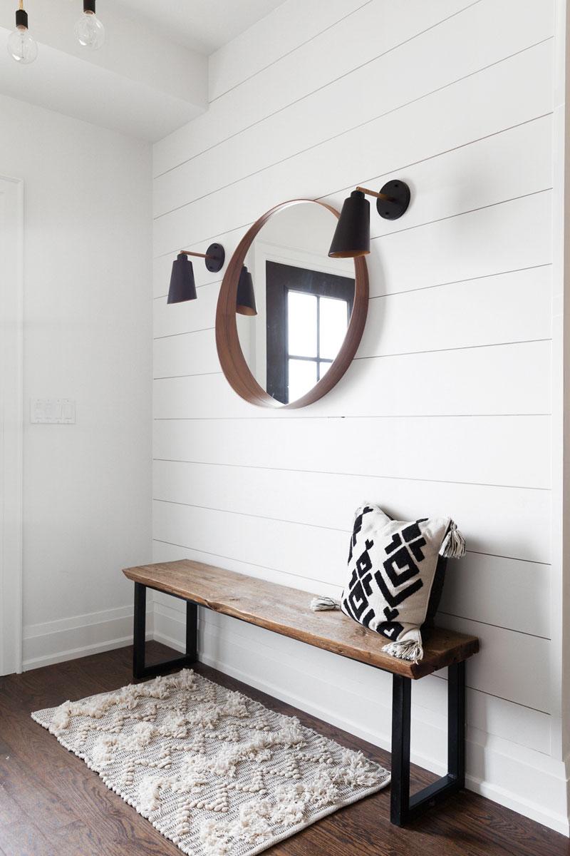
Ship Shape
The shiplap in the front hallway builds on the modern farmhouse aesthetic that Natalie and David were going for. The bench was handmade by Two Board Guys, a husband-and-wife deign duo, and the Ikea mirror offers a handy ledge for keys and sunglasses. The plush rug and cushion are both from HomeSense.
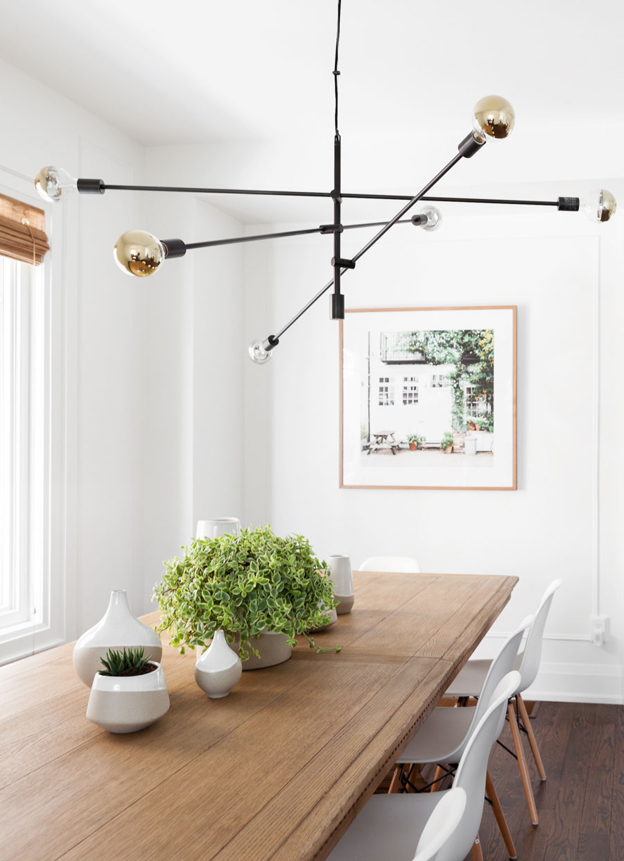
Deja Vu
Look familiar? This light fixture is the same one in the bedroom, just a slightly larger version. For a touch of luxury, the bulbs are capped in gold. The rustic wood table is from the Restoration Hardware Outlet, and it’s counterbalanced by a set of sleek white chairs from Structube. A set of matching pots and vases from West Elm comprise the tablescape, and the photo on the wall is a shot Natalie snapped while on summer vacation in London.
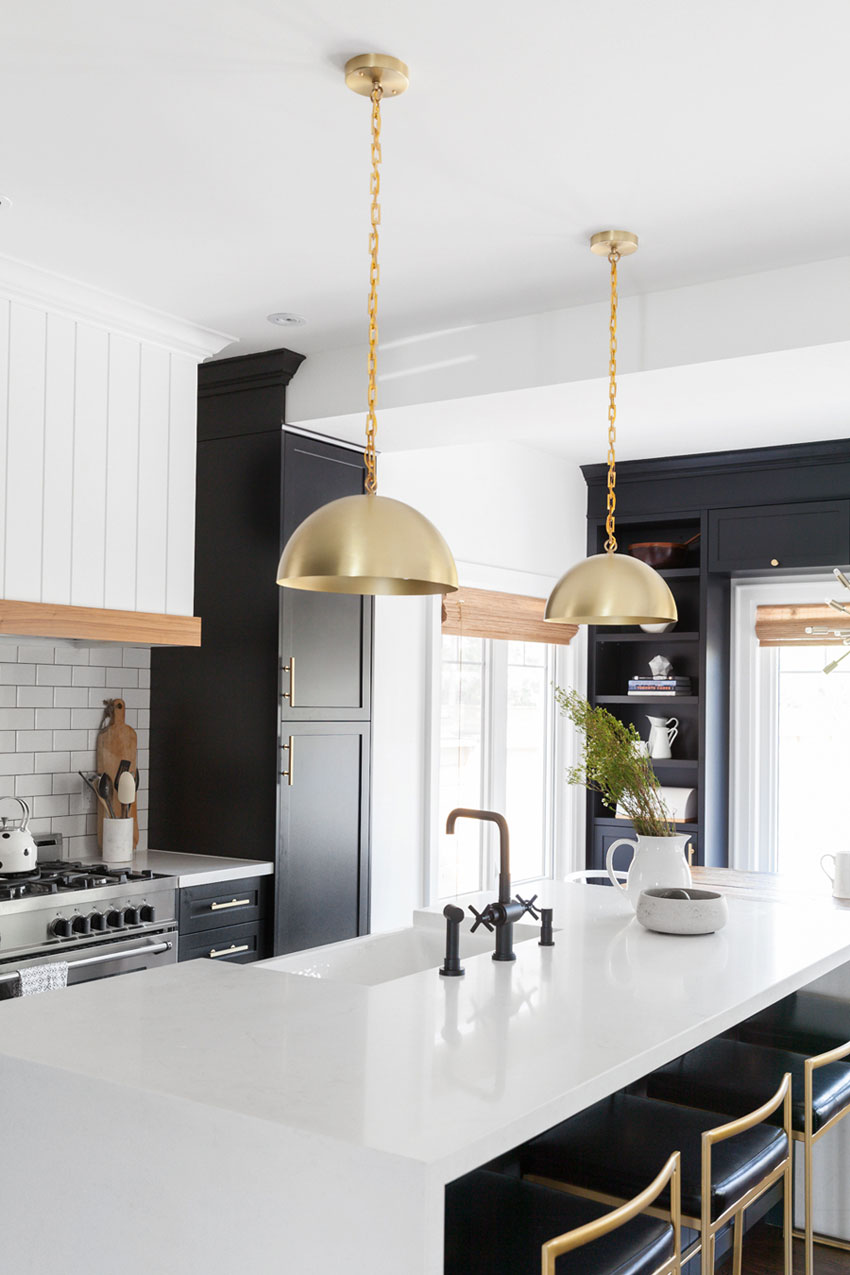
From Drab to Fab
The kitchen was once relatively simple, with rather unremarkable white finishes. Natalie and David hired Kate + Amanda, the same design team who tackled the bedroom, to spearhead the kitchen. Gold accents, shiplap, subway tile and matte black cabinetry are combined to make the kitchen one of the home’s biggest show-stoppers. Even the smallest touches – such as the brassy Rubinet faucet – add to the French farmhouse vibes.
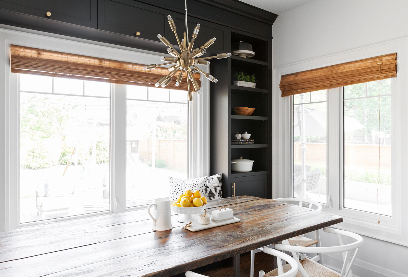
Old and New
The breakfast area is grounded by this long hardwood table, built by Living Wood Design, which sat in the backyard for about three years. The wood became naturally weathered, and Natalie and David decided to bring it indoors to balance out the ultra-polished room. The white and rattan wishbone chairs pair perfectly with the table, and mid-century light fixture, from Shelter, is another nod toward the home’s vintage spirit.
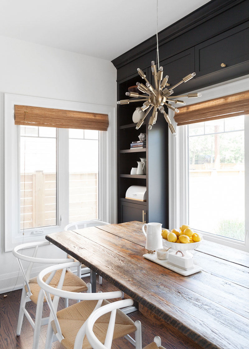
The Perfect Shade
The shelving unit was painted in Benjamin Moore’s Black Iron. Black can sometimes be heavy, but Natalie finds this particular shade is surprisingly soft.
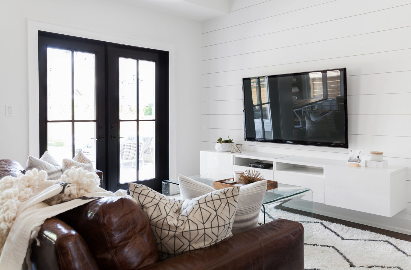
Snuggle Up
The monochromatic look of the kitchen extends to the living room. Shiplap is again used here to make the space feel bright and airy, and the floating TV stand from IKEA helps hide clutter. On cool summer nights, the set of dramatic, black-framed French doors open up to the backyard.
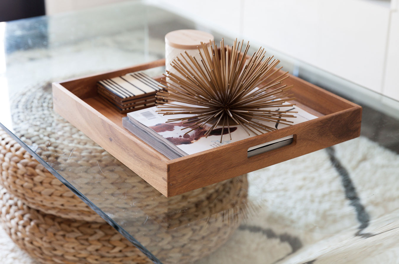
Mix-and-Match Textures
The stark black-and-white design is offset by touches of earth tones, as seen on the woven coffee table stand, wooden West Elm tray and spiny, urchin-like piece from Target.
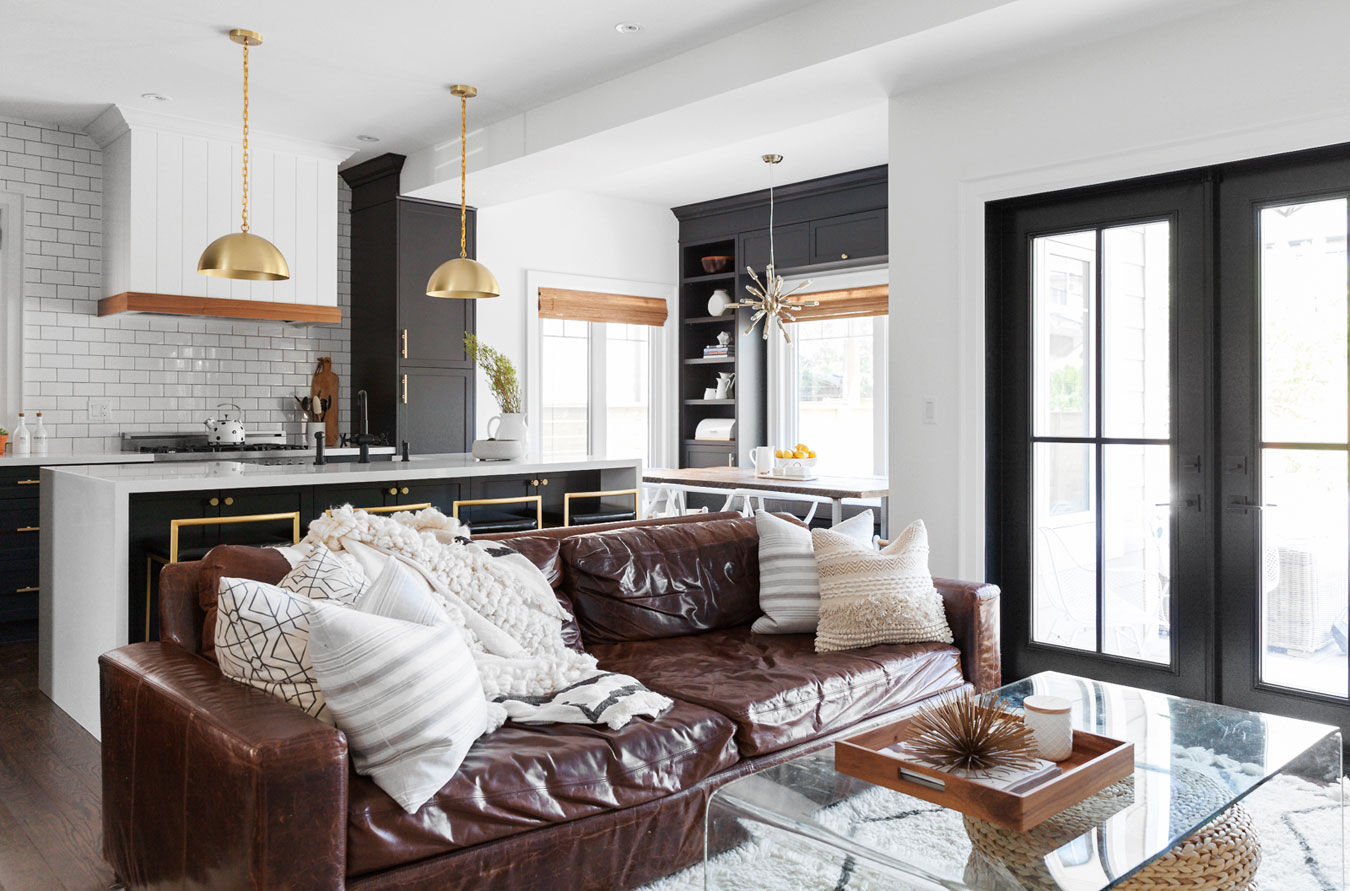
Aging Gracefully
David had his eye on this leather couch since before he and Natalie tied the knot, and they bought it as soon as they could afford it. The entire family can fit on it, and the more it gets beat up, the better it looks. To keep things cozy, Natalie added a plush throw from Anthropologie and a set of pillows.
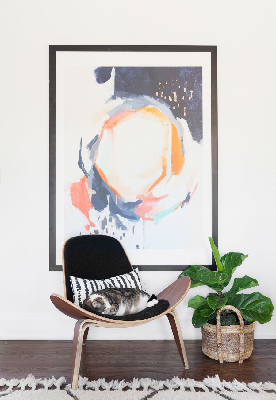
Go Big
This ultra-mod chair is from Shelter, and it comes cat-approved. The large piece of art is from Minted, and a tiny fiddle-leaf fig tree adds a pop of green.
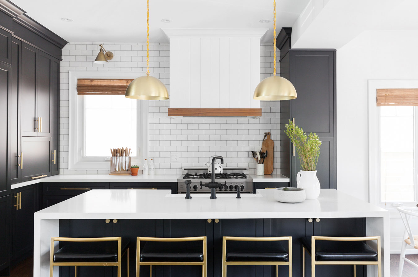
Golden Isle
Here’s another look at the kitchen, including a set of four black-and-gold stools from Wayfair. The stove is from Bertazzoni, a company that offers high-quality stoves at a relatively low price point.
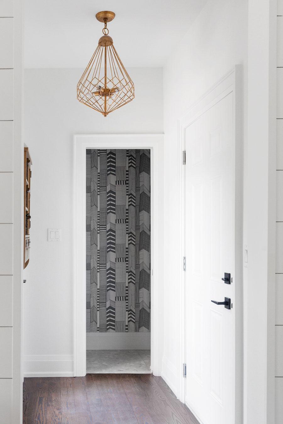
Know Your Angles
This corner used to be a bit dark, so this gold-sprayed light fixture was brought in to make the space pop.
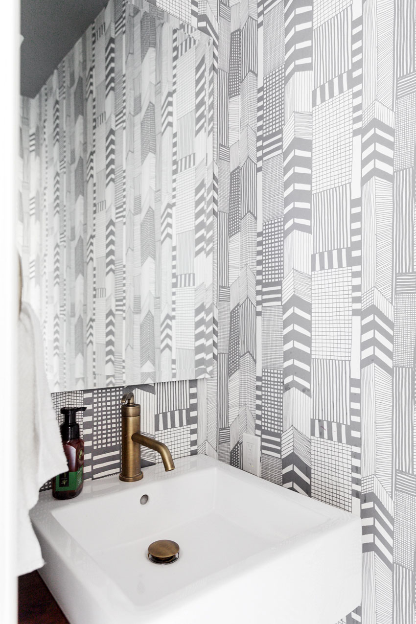
Patterns on Patterns
Natalie and David decided to have fun with the powder room and brought in this bold Marimekko wallpaper. It was originally meant to only go behind the mirror, but they loved it so much that they wrapped the entire space in it.
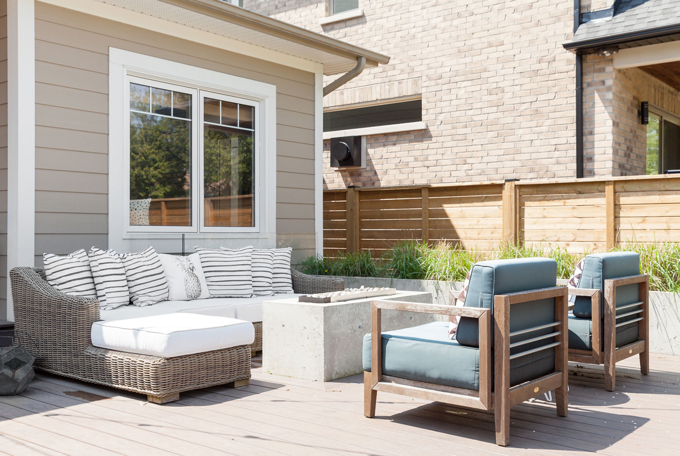
Party Time
Natalie and David love to host parties, and the back deck – complete with a gas fire pit – gives them the ideal summer hangout. Avenue Design was the brains behind the project, and they wanted the outside space to feel more farmhouse than modern. Exposed concrete, wicker touches and fluttery grasses do the trick.
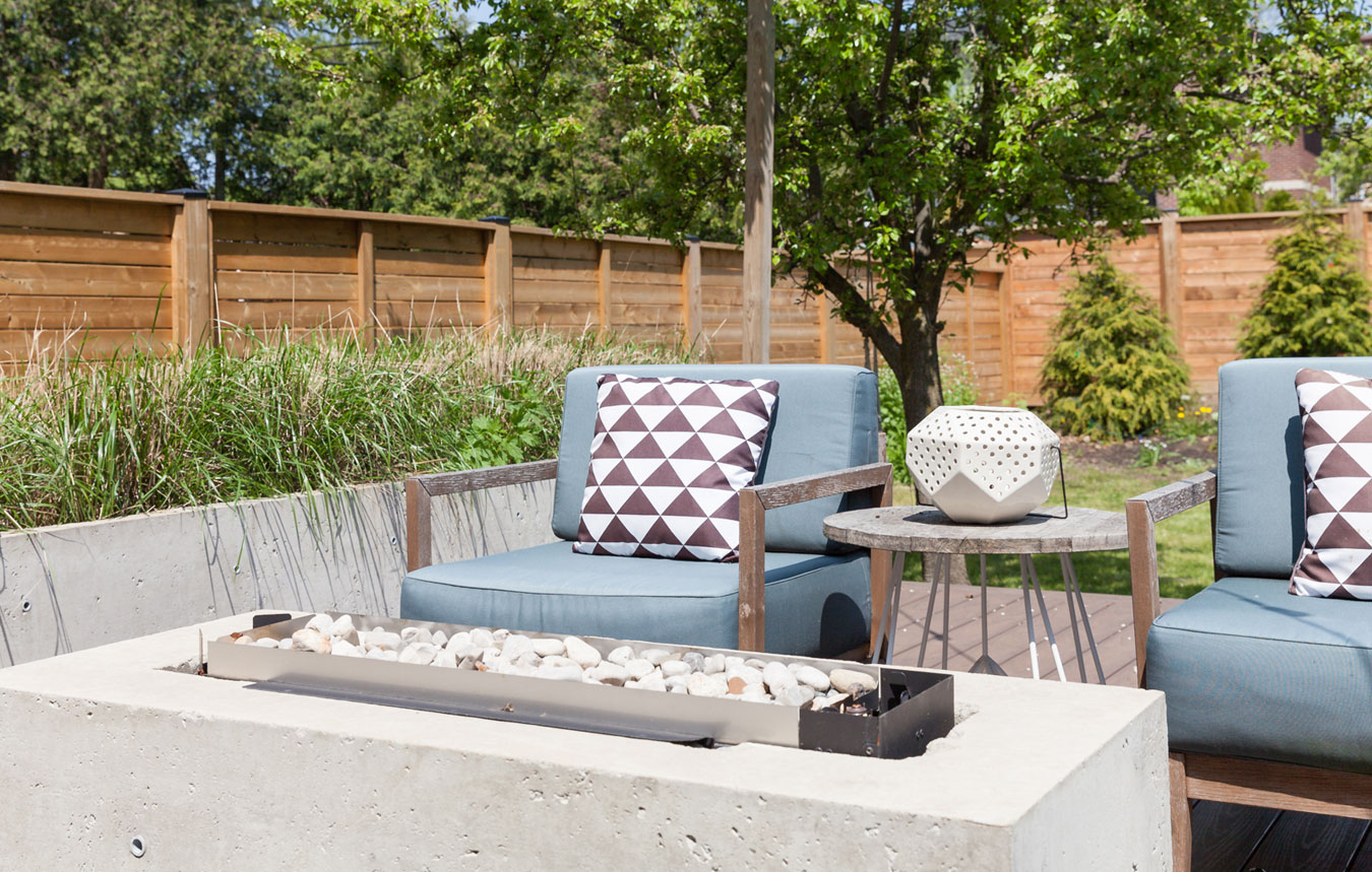
Light it Up
The set of blue chairs from HomeSense are beautifully worn and able to withstand Ontario’s temperamental weather. The little white lantern from HomeSense is a modern wink to the home’s interior.
HGTV your inbox.
By clicking "SIGN UP” you agree to receive emails from HGTV and accept Corus' Terms of Use and Corus' Privacy Policy.


