After a decade of living in what was meant to be a starter home, partners Aleksandra and Vincent (who now have two kids) were more than ready to trade in their split-level’s chopped-up layout, outdated kitchen and cramped main floor bathroom for something far more functional. And who better than the Love it or List it Vancouver team to help them refurbish? By reconfiguring the floor plan and outfitting the space in contemporary-meets-coastal elements, designer Jillian Harris not only convinced the homeowners to stay, but brought them to tears. Here’s an inside look at the ultra-chic space.
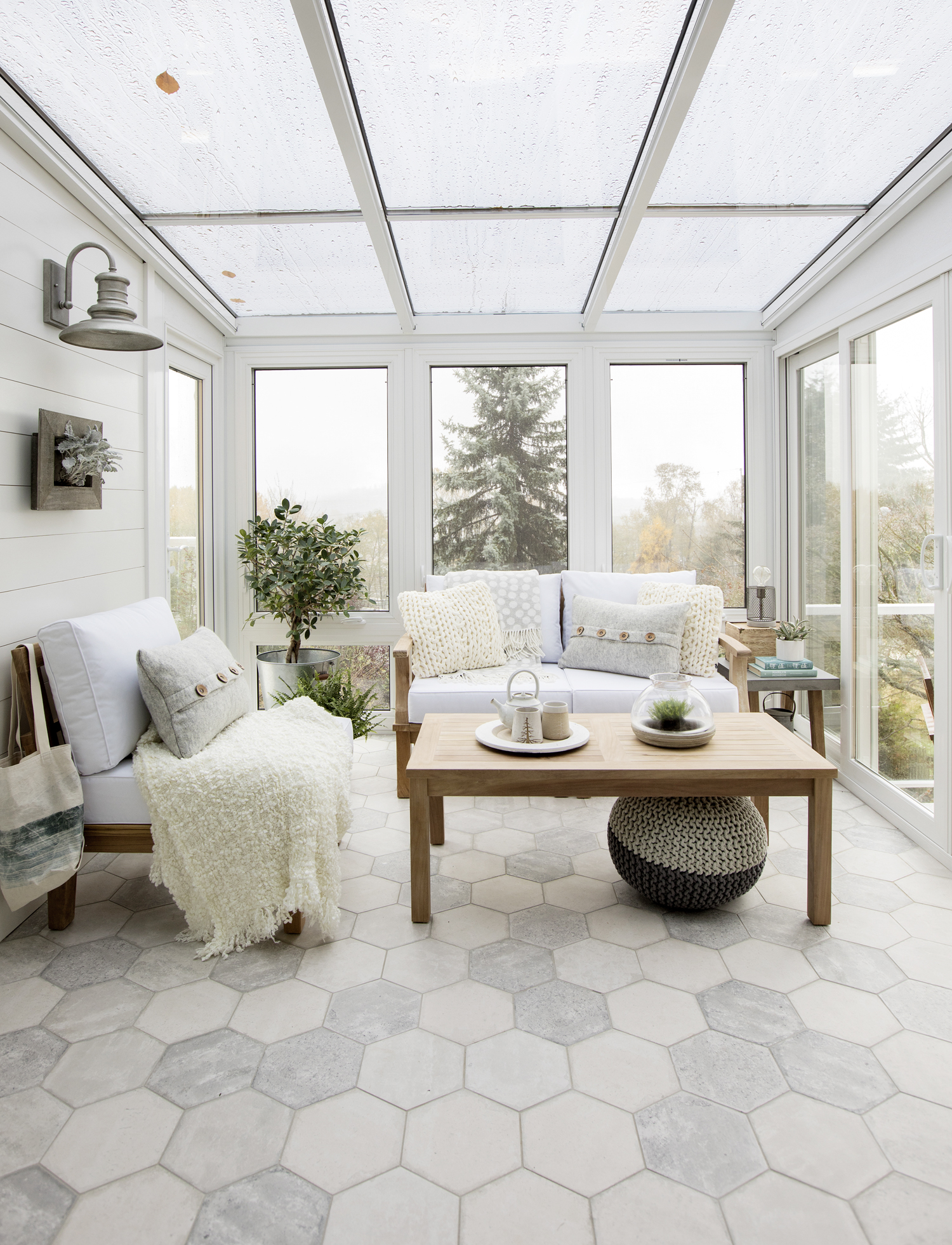
Sunny Update
Pre-reno, this sun room was impossible to enjoy due to outdated window fittings, poor insulation and a wasp problem. Designer Jillian Harris tackled these issues by installing brand new windows and heated honeycomb flooring, as well as adding plenty of comfy seating. Now, the homeowners can enjoy the space year-round, treating it as a restful and romantic retreat.
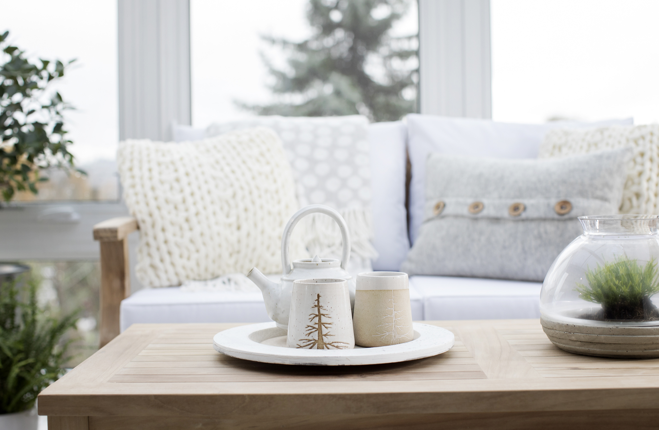
Earthy Additions
Jillian opted for lots of light wood elements, pairing them with soft whites and creams to take advantage of the room’s natural light. Plenty of greenery, from potted plants to tiny terrariums, reference the natural landscape beyond.
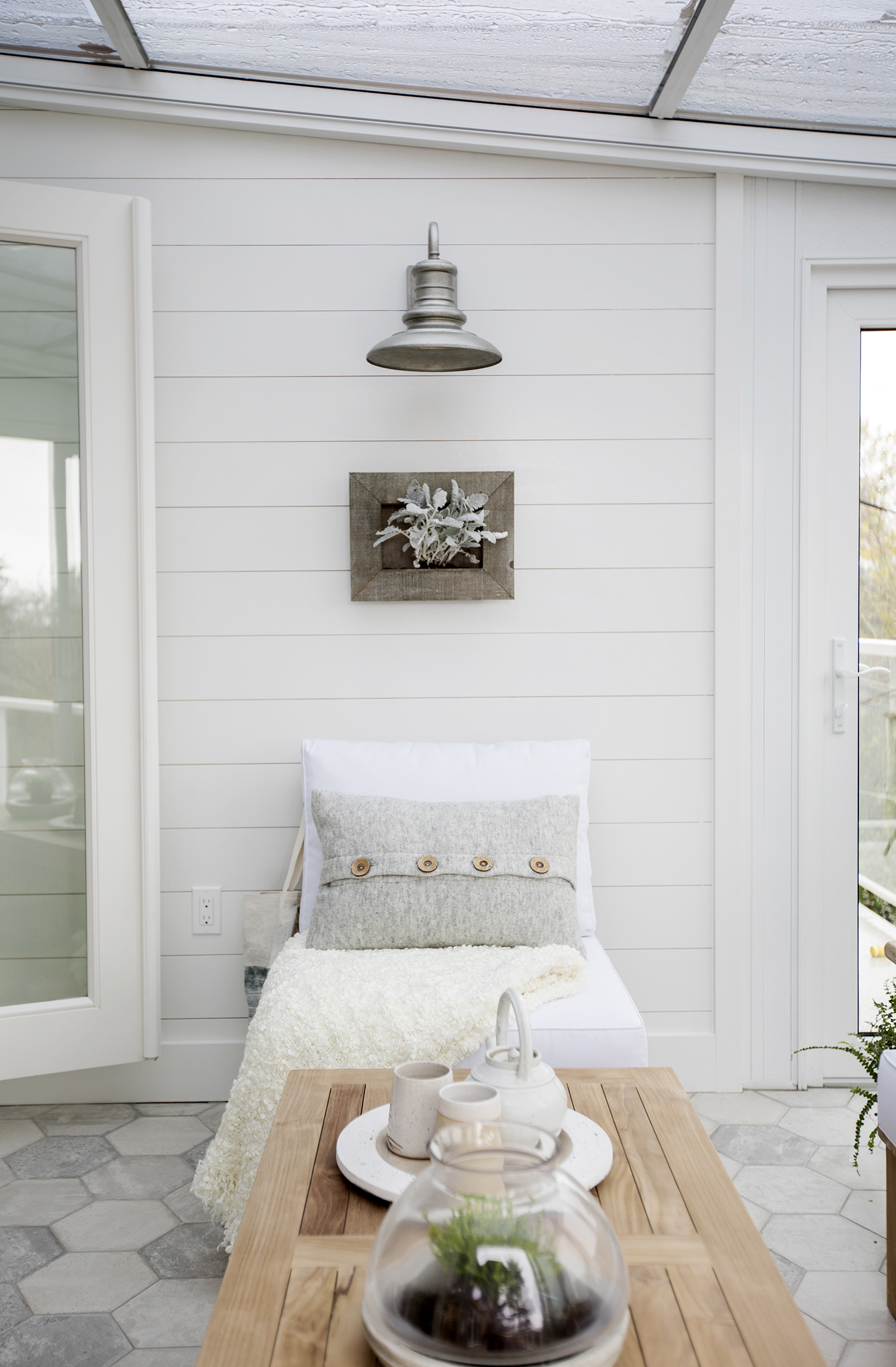
Outdoors In
Shiplap walls and a statement sconce makes this sun room feel like an outdoor deck, yet it’s still a natural extension of the indoor living space. Textured additions like this button throw pillow and fuzzy blanket lend a cozy feel, while the treated glass roof ensures the room never gets too hot under the sweltering sun.
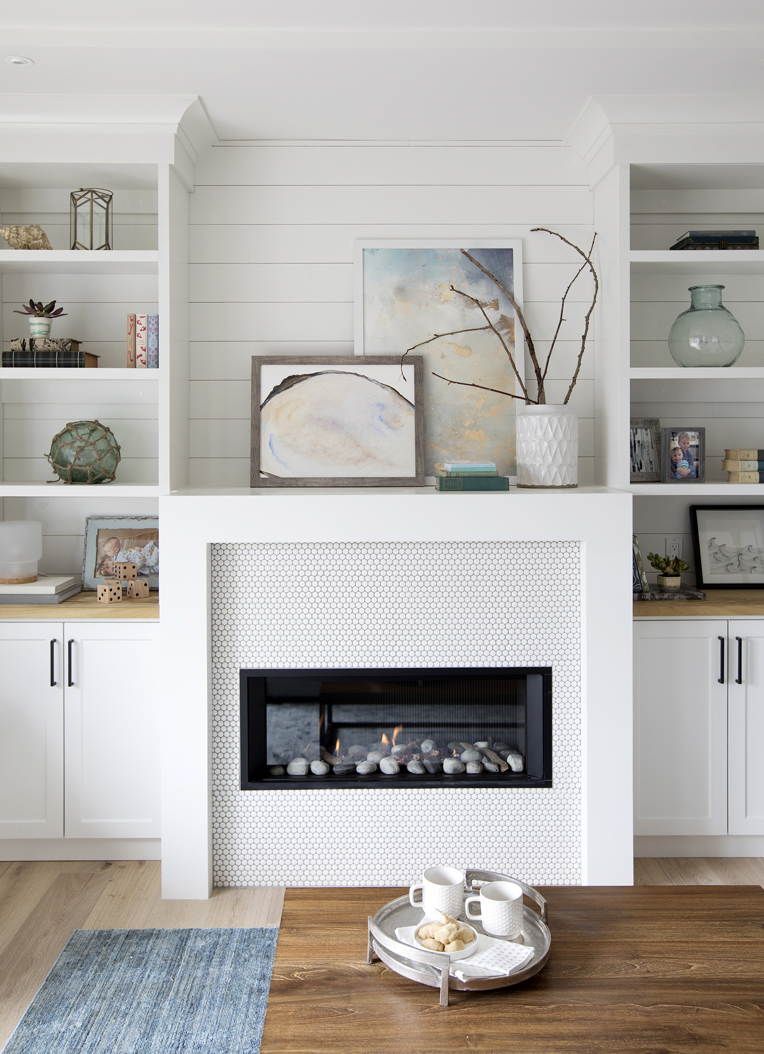
New Feature Wall
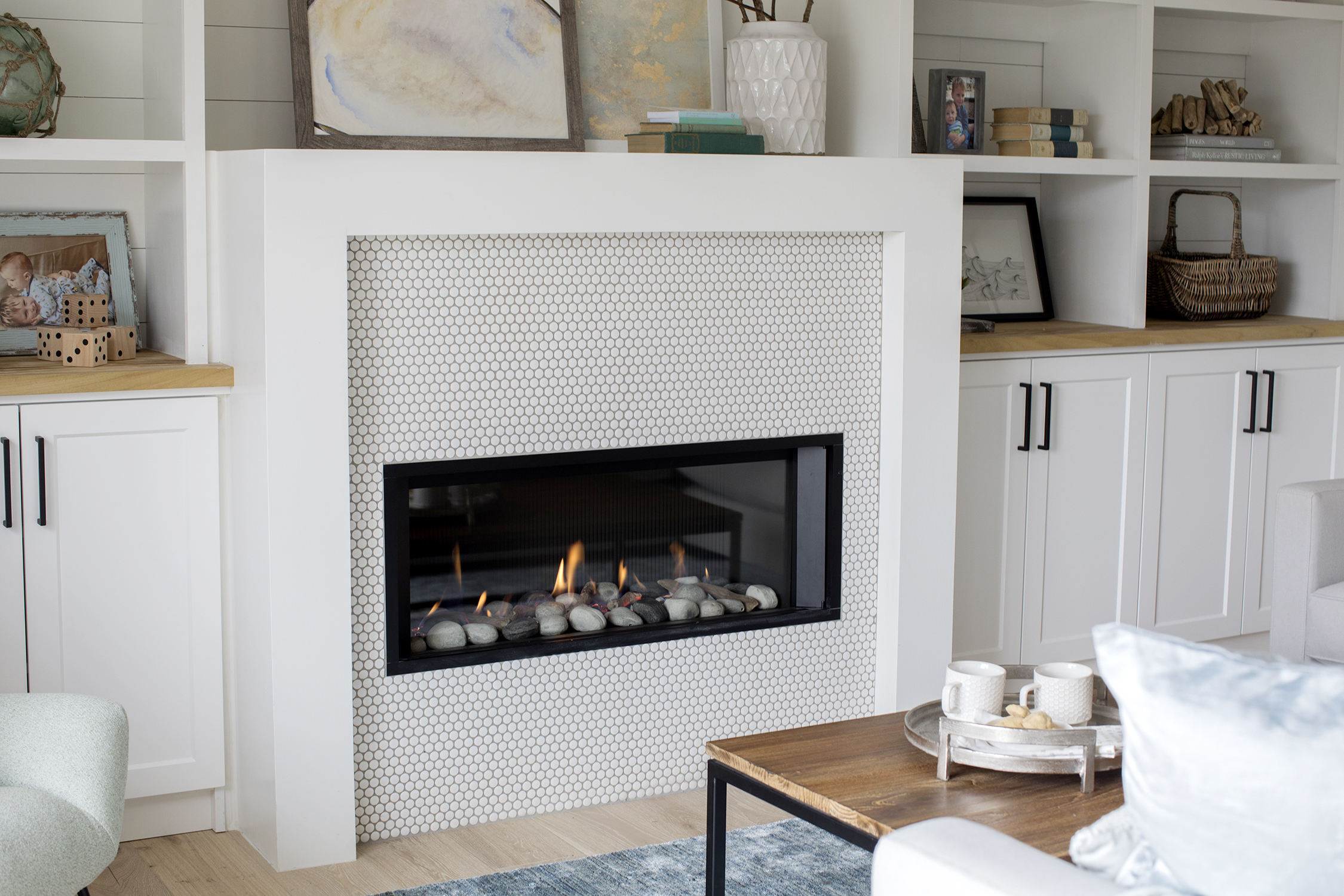
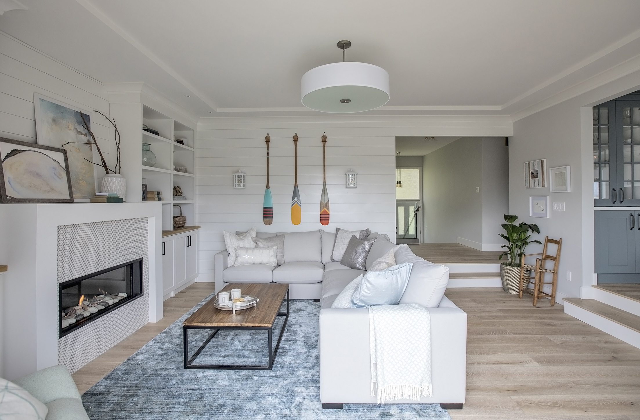
The living room got a complete overall, from the gorgeous planked hardwood flooring to the beautiful built-in fireplace and shelving unit. The white-painted shiplap wall provides texture and continuity, while simple decor features (like the watercolour artwork and vase of branches on the mantel) lend a calm and earthy feel.
Fantastic Fireplace
The modern fireplace turns on with the flick of a switch – and also packs a huge design punch. The surround’s monochromatic penny-tile design makes a subtle statement, injecting just enough interest and texture without overshadowing the other artful elements in the space.
Storage Solutions
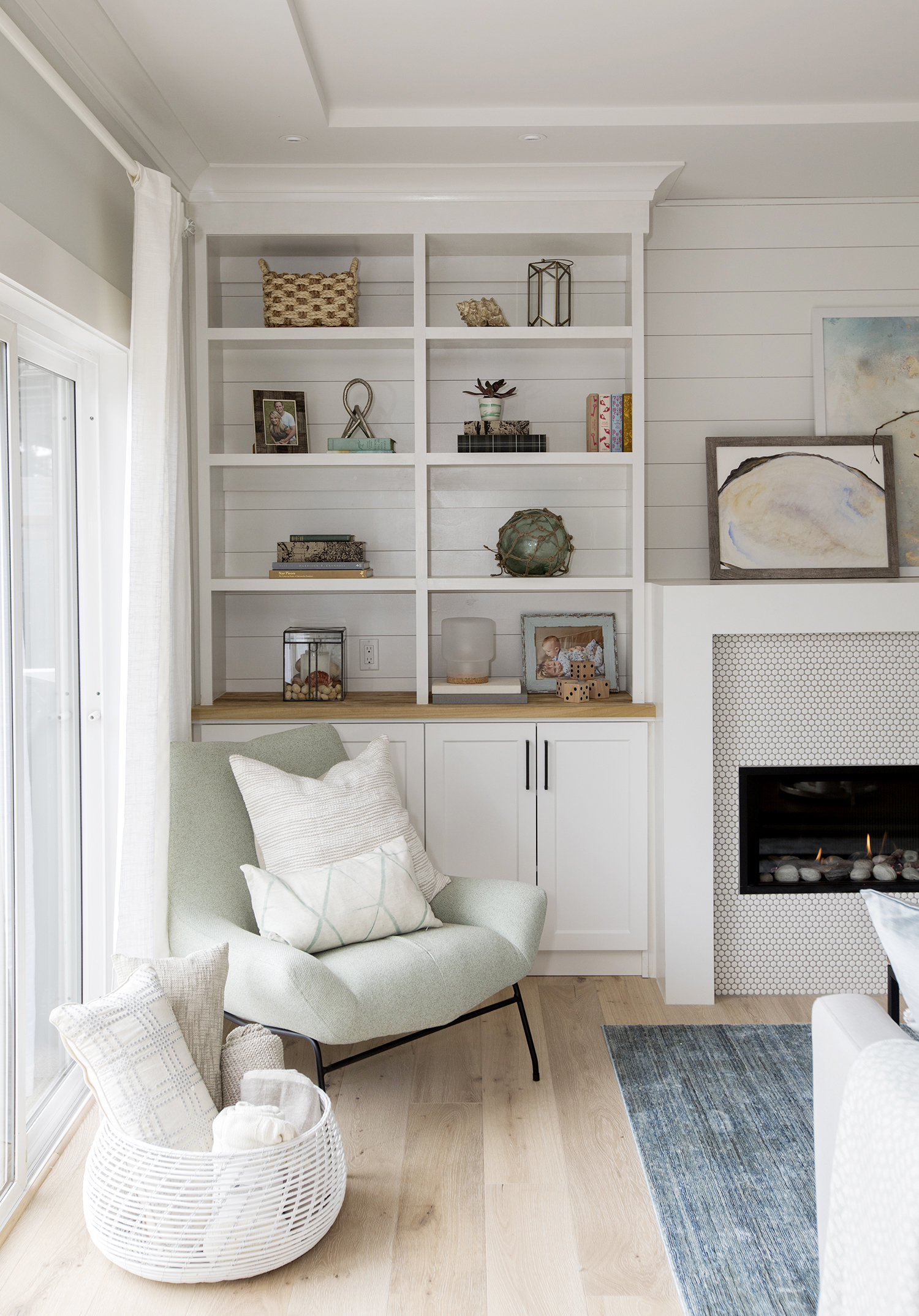
There’s plenty of storage now thanks to the built-in units in the living room that Jillian had installed. Unsightly items can be stored in the cabinets below, while the couple’s beautiful knickknacks can be proudly displayed on the open shelves.
New Flooring
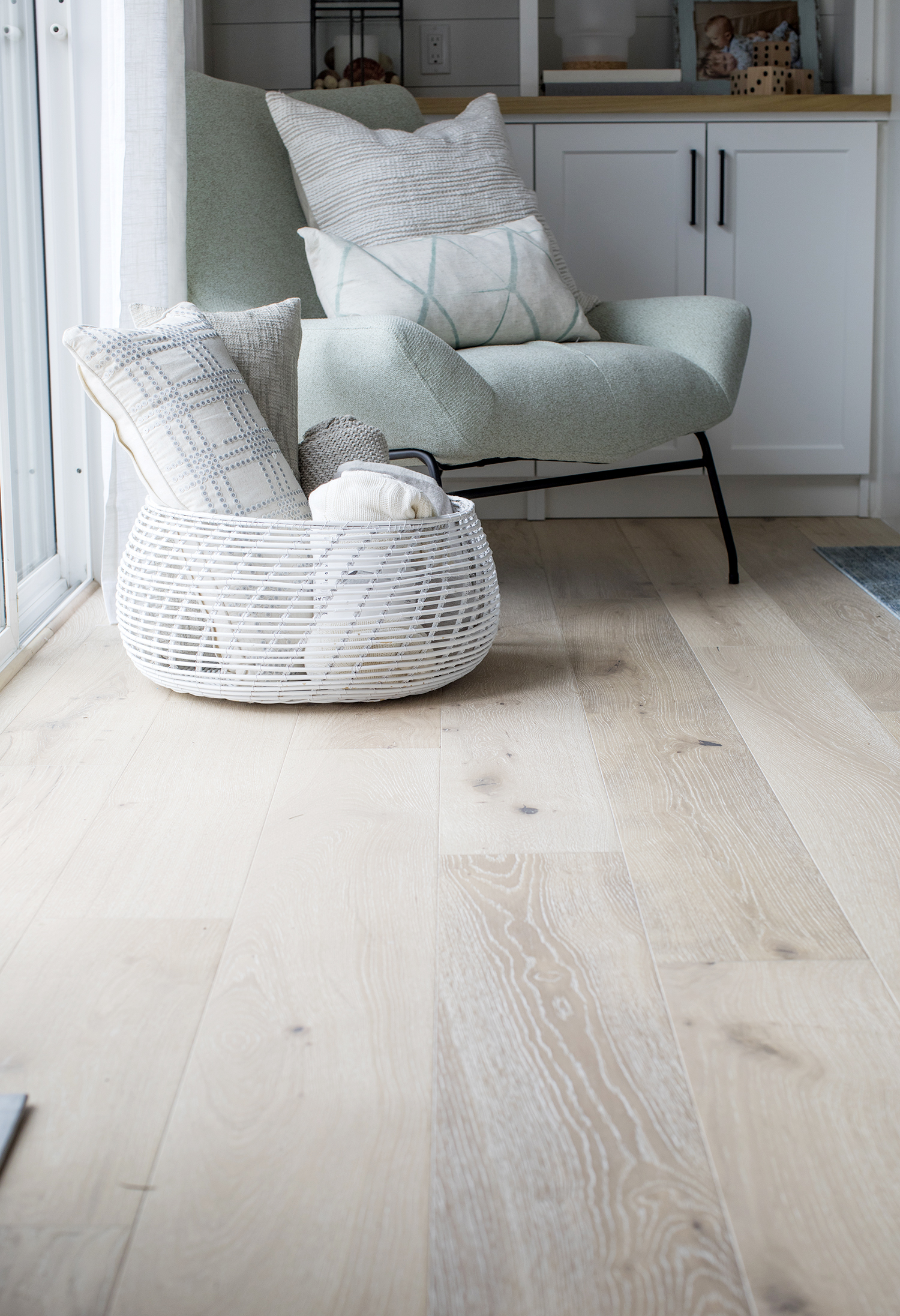
The light hardwood flooring brings a welcome burst of warmth to the predominately white space.
Family Space
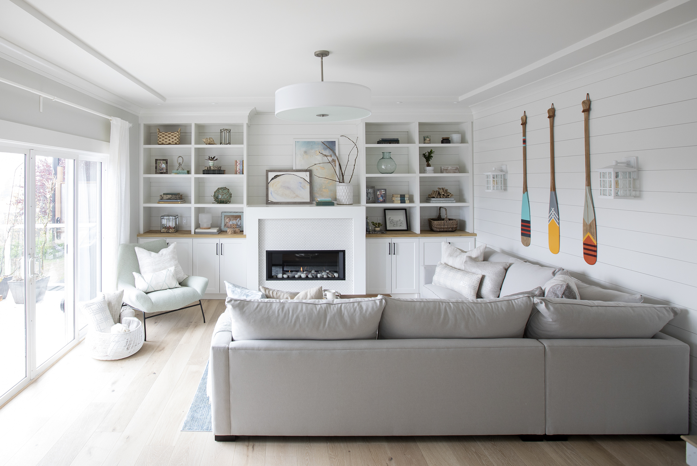
The beautiful shiplap wraps around the living room, helping to define the space and add to its warm, contemporary feel. A large sectional ensures there’s plenty of room for the entire family, while the textured ceiling polishes off the look.
Eye for Design
The split levels flow naturally into one another thanks to the same floor treatment used throughout. Meanwhile, finishing touches like the decorative wall paddles and corner area outfitted with paintings, a potted plant and a wooden chair help to elevate the aesthetic.
Brighter Kitchen
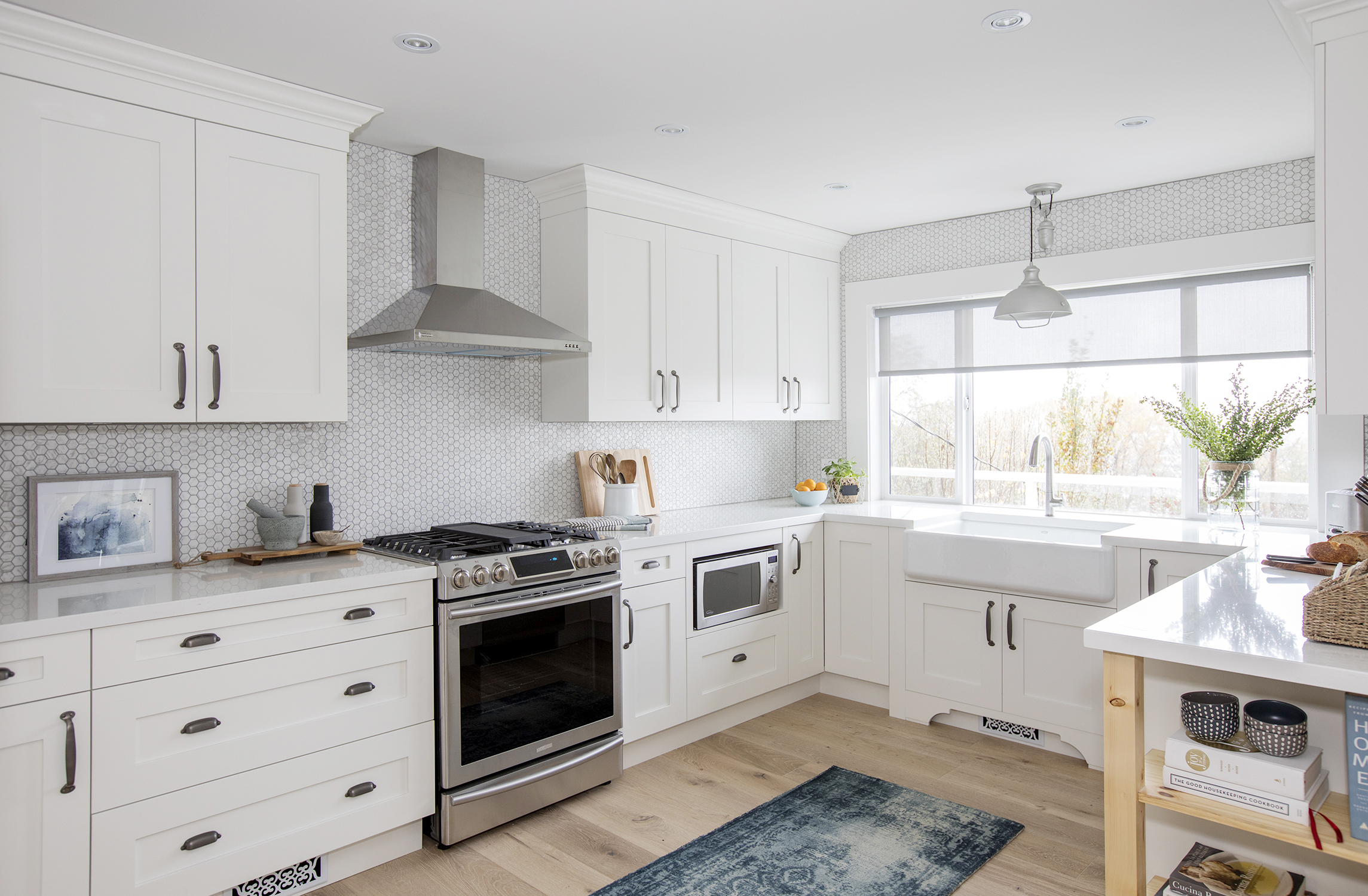
Jillian gave the kitchen a much-needed makeover with gorgeous new cabinetry, modern appliances and ample counter space.
Wrap-Around Design
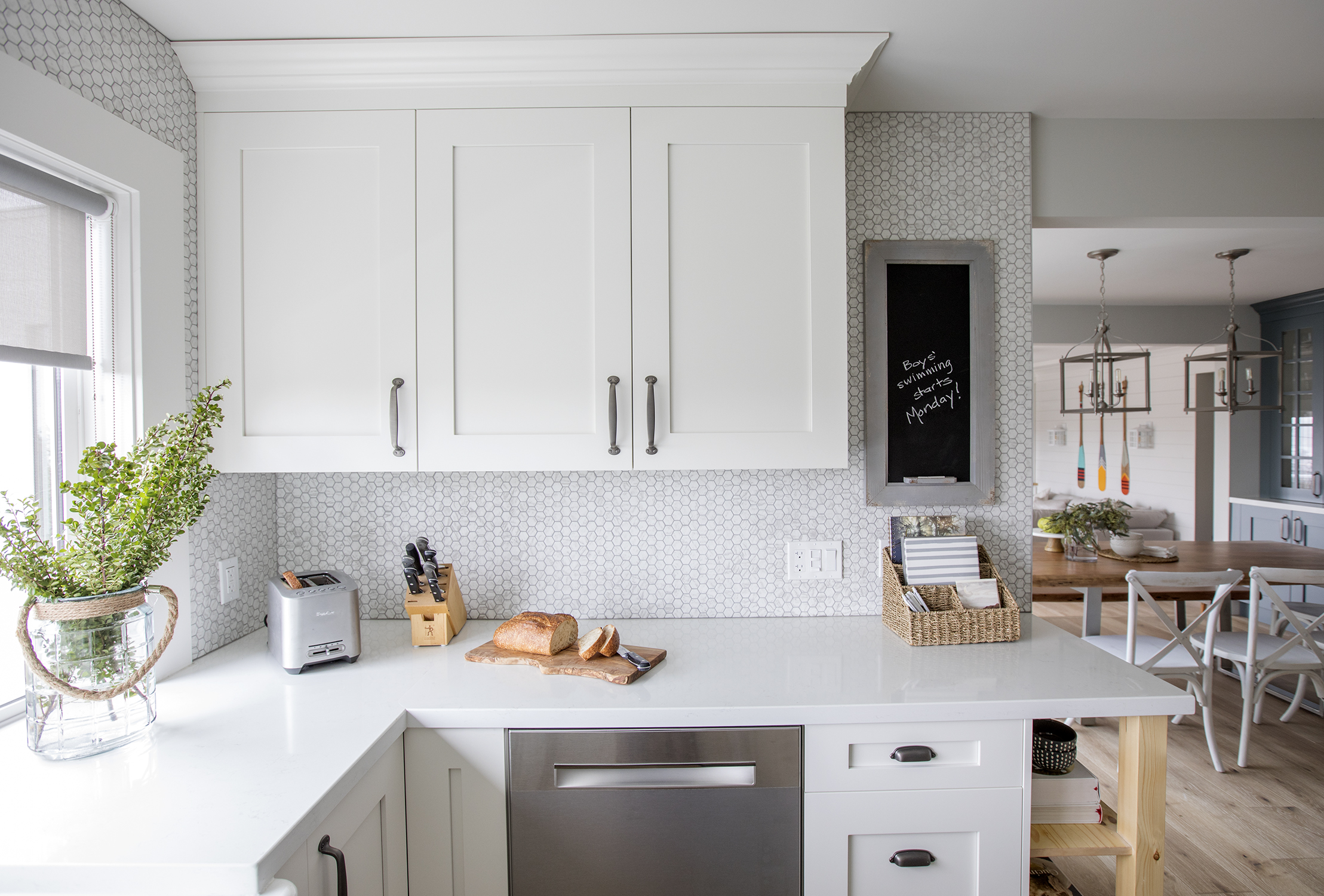
The kitchen’s cabinets and countertops wrap around the entire kitchen, with a small command centre built into the design so that homeowner Aleksandra, a teacher, can stay up-to-date and organized.
Better Backsplash
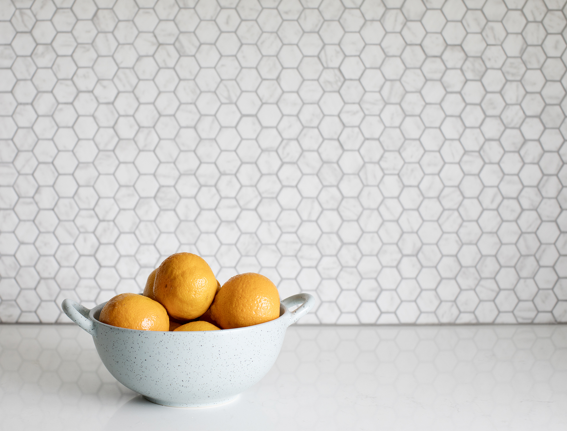
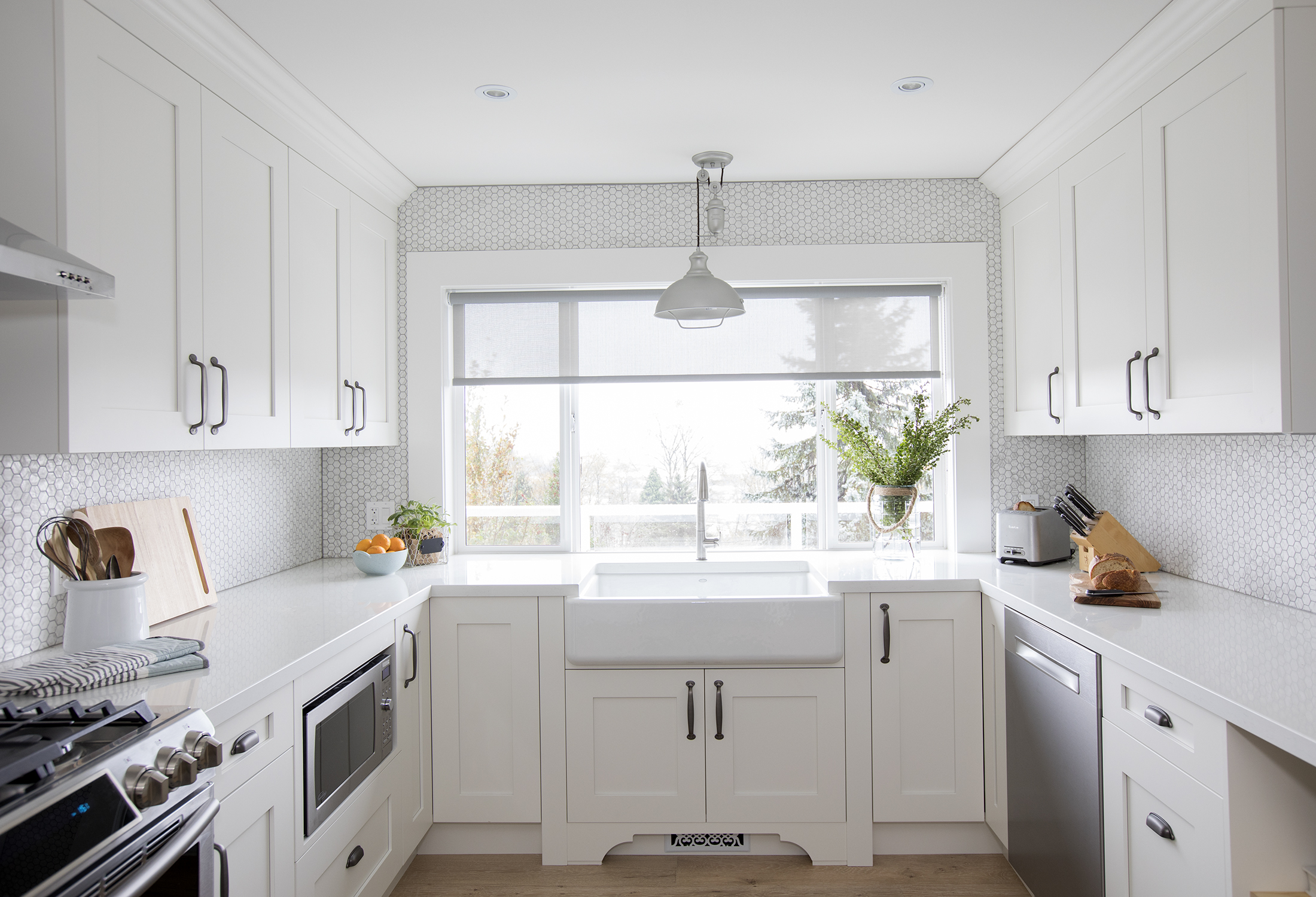
A stylish honeycomb backsplash adds texture and dimension to the mostly white kitchen. Repeating patterns throughout a home (in this case, honeycomb floor tiles can be seen in the sun room and bathroom) is one of the easiest ways to create cohesion.
Kitchen With a View
We love the way Jillian positioned the large apron-front sink underneath the large window. Now whoever is stuck washing dishes can do so with a beautiful view, and with a little extra lighting thanks to the pretty lamp above.
Open Concept
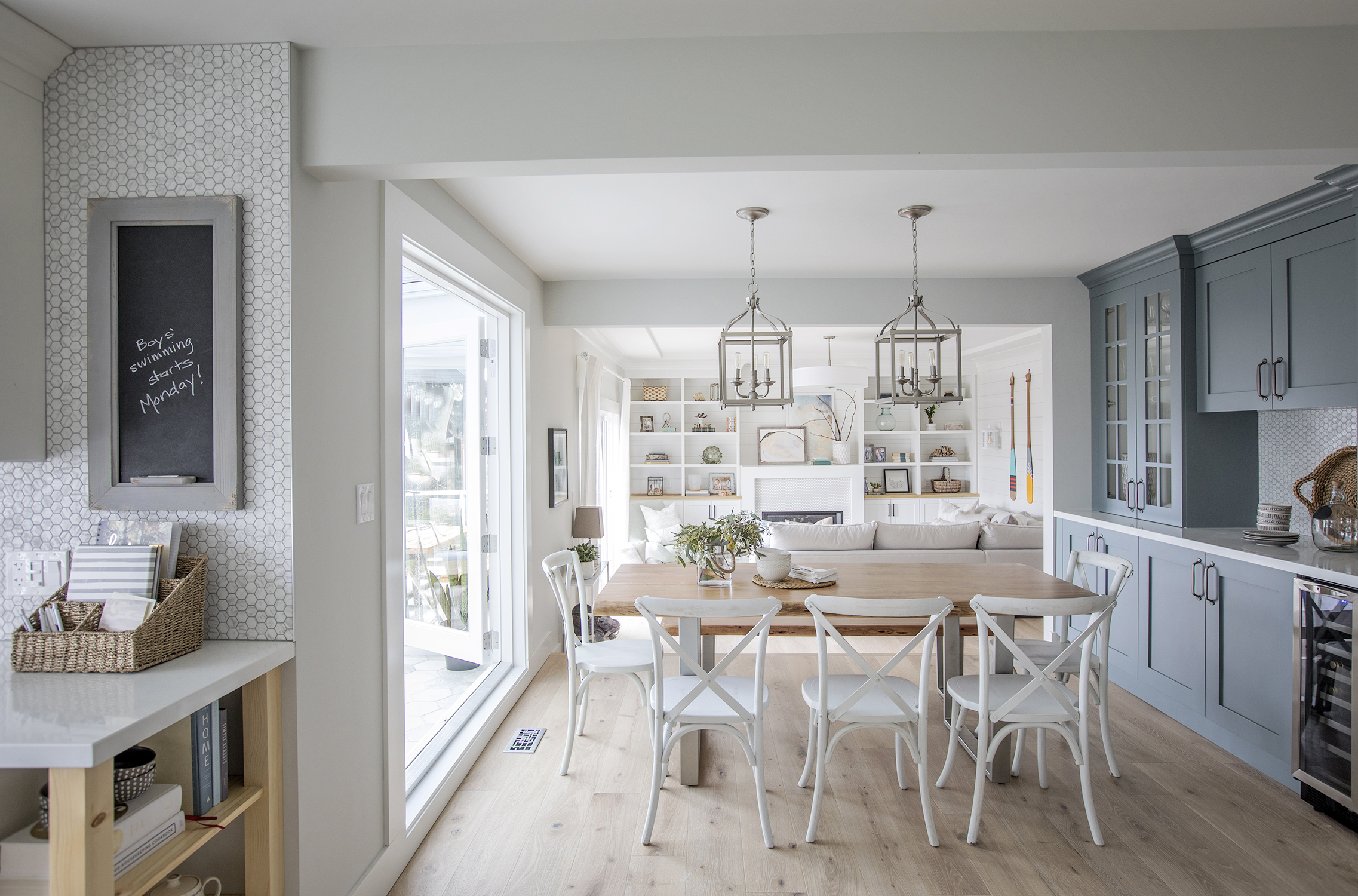
Thanks to the way Jillian reconfigured the floor plan, whoever is in the kitchen can converse with those in the dining and living area. The gorgeous dining room setup with painted grey-blue cabinetry serves as a natural extension of the cooking quarters.
Built-In Hutch
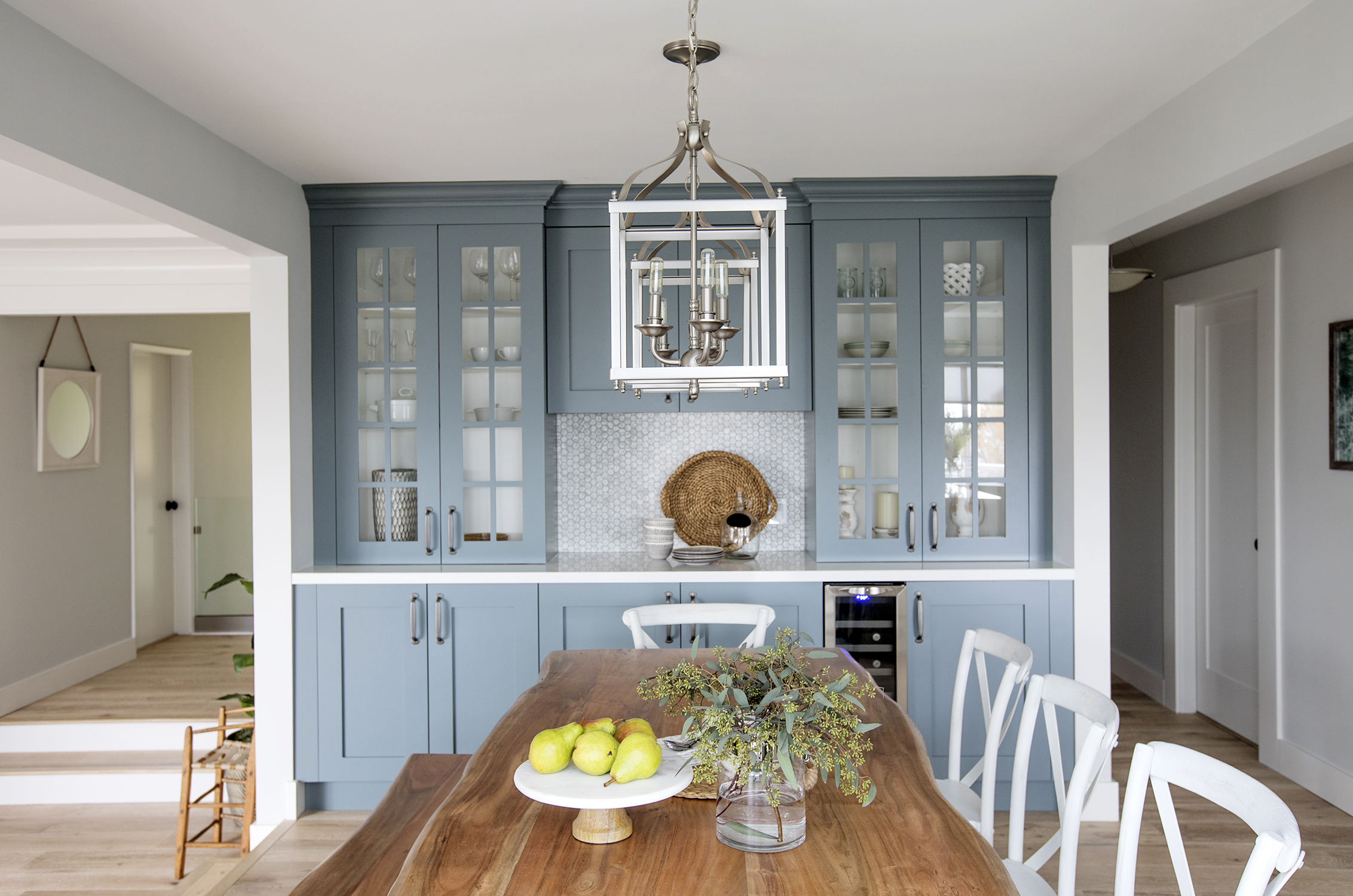
Jillian maximized the dining area’s storage space with a built-in hutch that even boasts a tiny wine fridge. Now, the area is perfect for entertaining with ease or for having a classic low-key family dinner.
Custom Seating
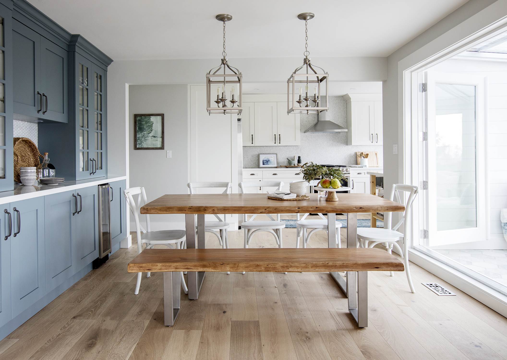
A custom wood dining table and matching bench incorporate more nature-inspired elements into the home, while simple white chairs give the setup a contemporary edge. With the sun room just off to the side, this light-soaked spot is hard to leave.
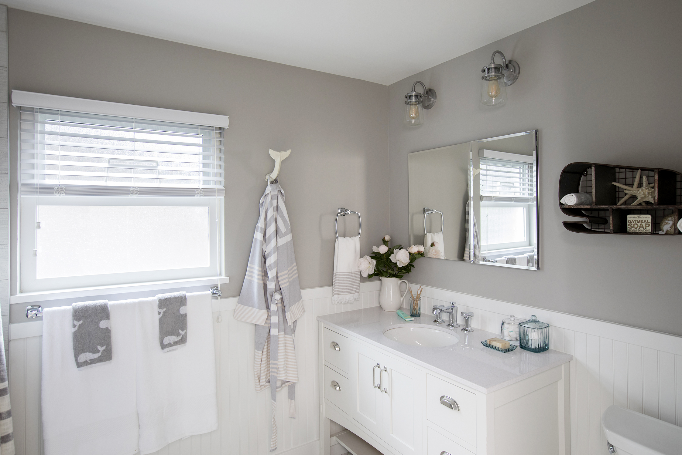
Main Floor Bathroom
The designer continued the contemporary-meets-coastal look in the master bathroom with a soft grey and white palette. The two-toned wall gives texture and soft elegance to the look, while the simple vanity adds extra storage.
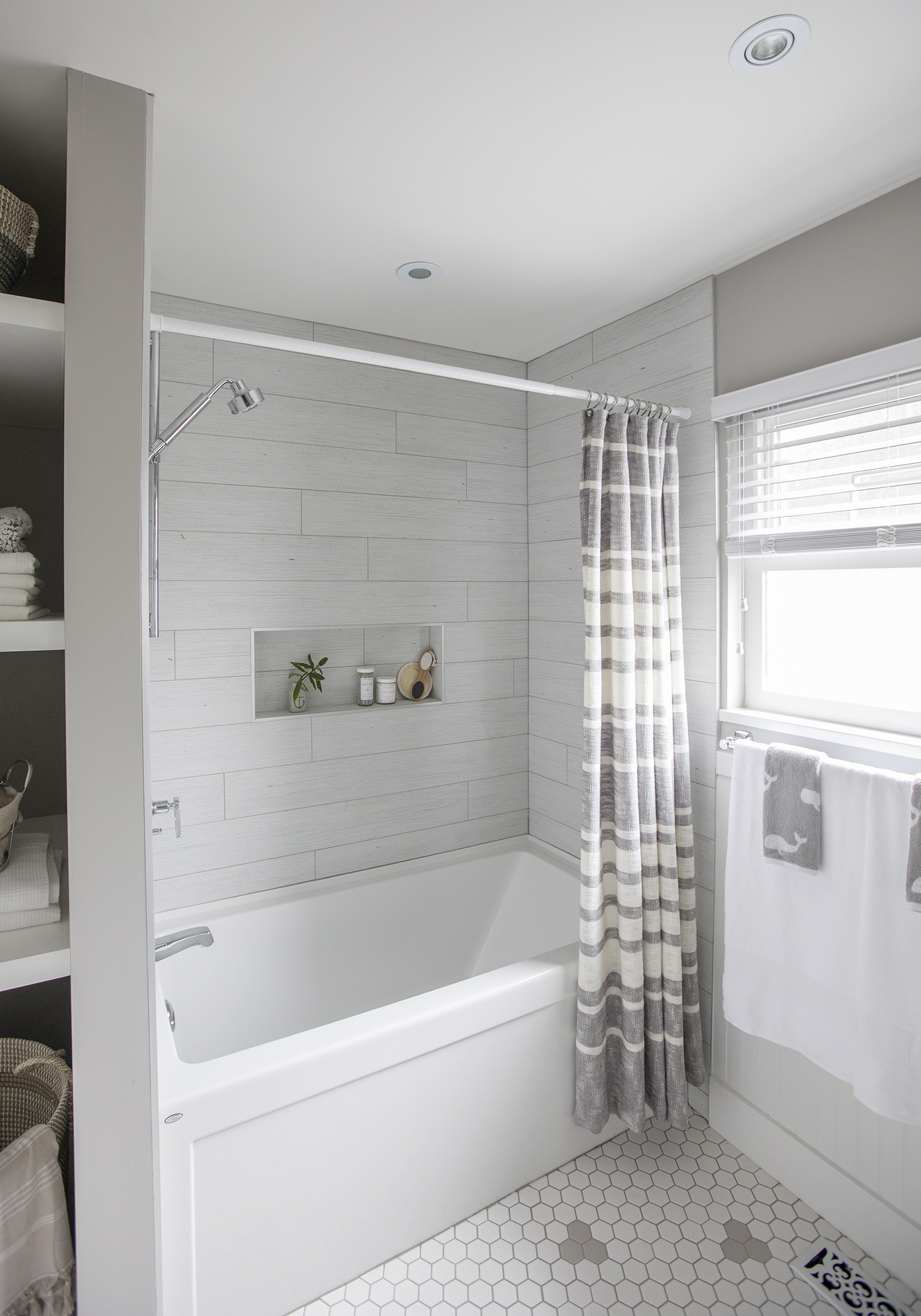
Bathroom Oasis
We love the bathroom’s beachy vibe. The shower tiles, for instance, remind us of the shiplap featured elsewhere in the home. The small cubby built into the design ensures toiletries can be tucked away without interrupting the design’s flow.
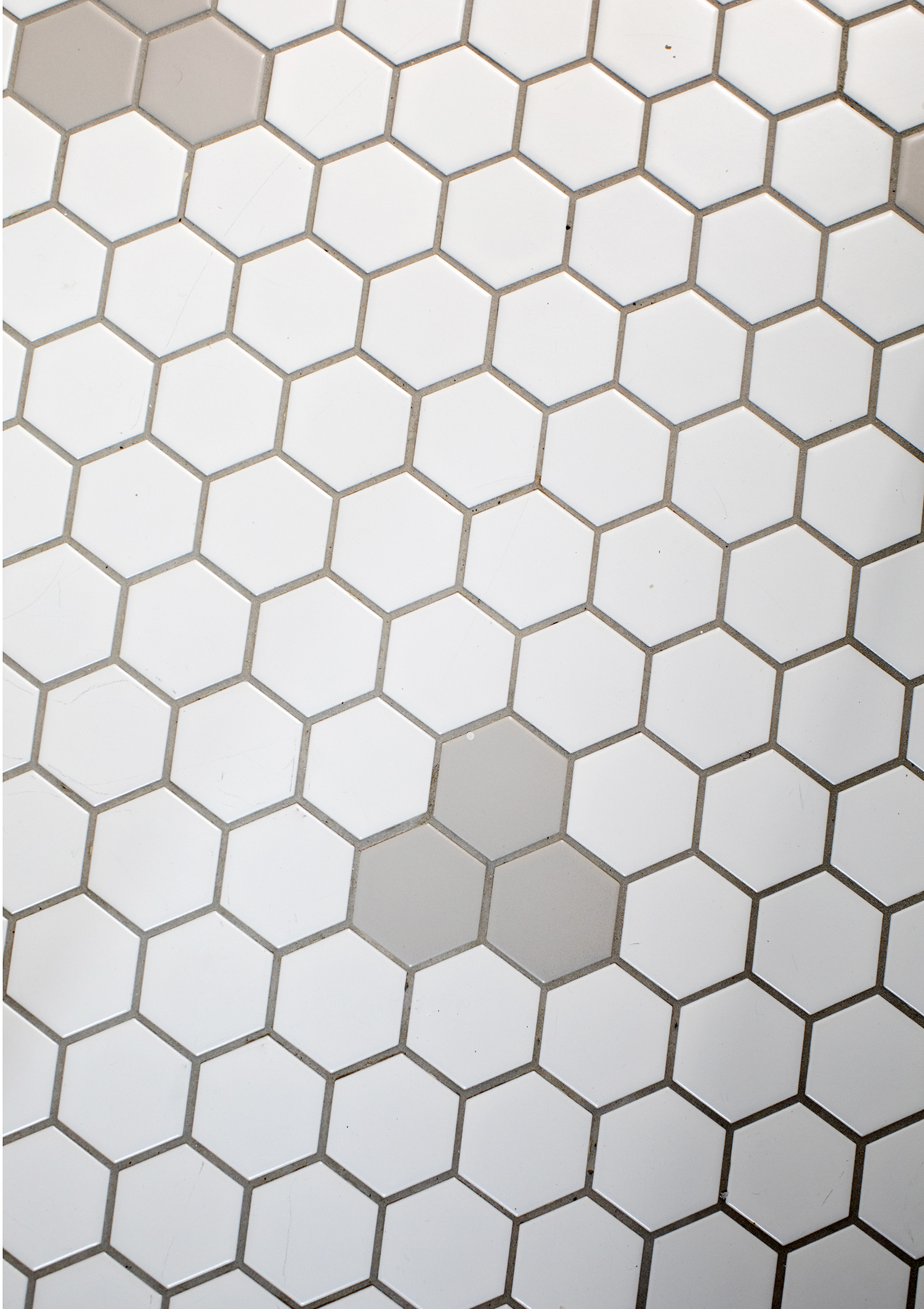
Tile Master
The white hex floor tiles in the bathroom feature fun pops of grey for a burst of character. It’s finishing details like this that give the entire home a cohesive and contemporary feel. With so many beautiful elements, we can’t help but agree with the homeowners’ decision to reclaim the newly designed home as their own private oasis.
HGTV your inbox.
By clicking "SIGN UP” you agree to receive emails from HGTV and accept Corus' Terms of Use and Corus' Privacy Policy.


