When it comes to designing spaces with modern and timeless style, Jonathan Scott is something of an expert. And on a recent episode of Property Brothers, newly engaged (and couch-surfing) couple Andrew and Phil were after exactly that. But between the pair’s personal tastes and specific must-haves for their dream home, the brothers still had their work cut out for them. In the end, however, they were able create a stylish industrial-inspired space the young couple will never want to leave. Here’s why.
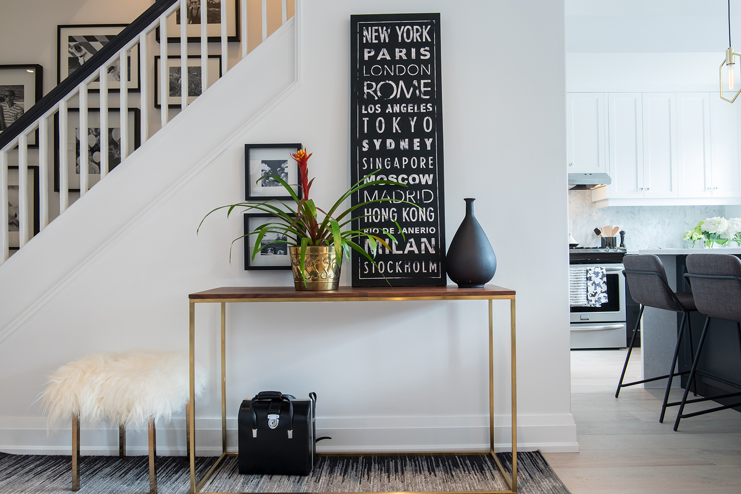
Sleek and Simple
When it came to the decor, this couple was all about sleek lines and bold design elements that felt clean and modern. That meant a monochromatic colour scheme of black, white and grey punched up with hits of brassy gold.
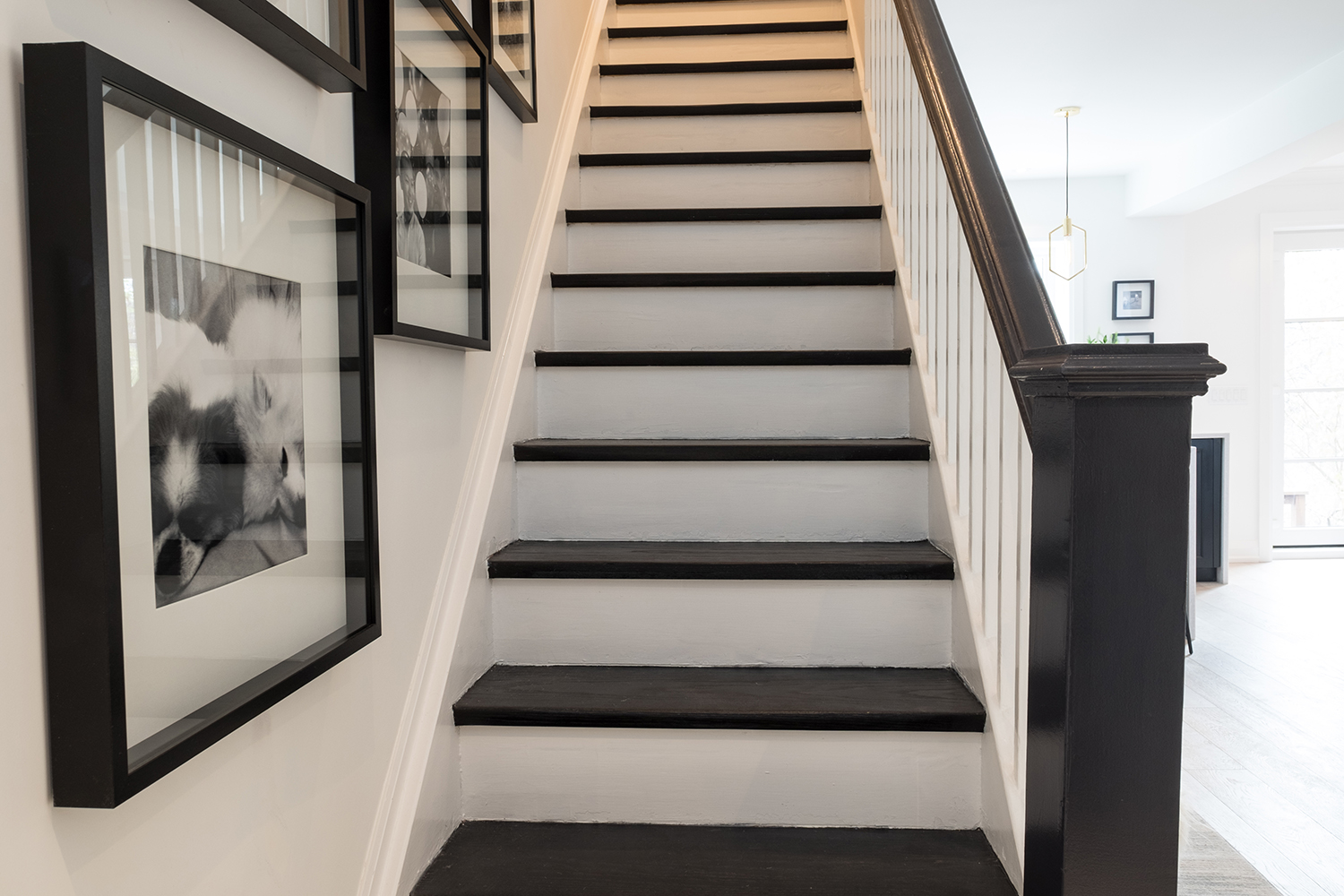
Bold Basics
Jonathan wanted to incorporate rich, dark hues into the design without it feeling cottage-like or rustic. So he added striking black features like this dramatic staircase. The area is enhanced further by framed black-and-white photos of the couple’s beloved pets, which lend a personal touch.
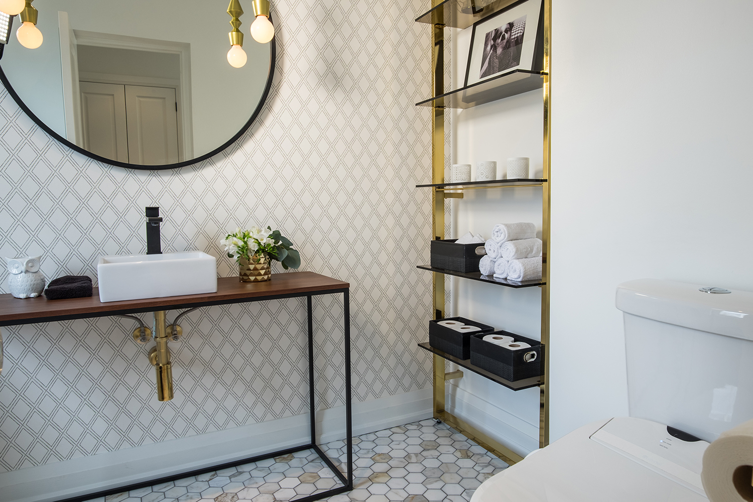
Modern Powder Room
Honeycomb flooring and a diamond-patterned feature wall add tons of interest and dimension to the powder room. Shiny brass elements were introduced through everything from the display shelves to the exposed plumbing.
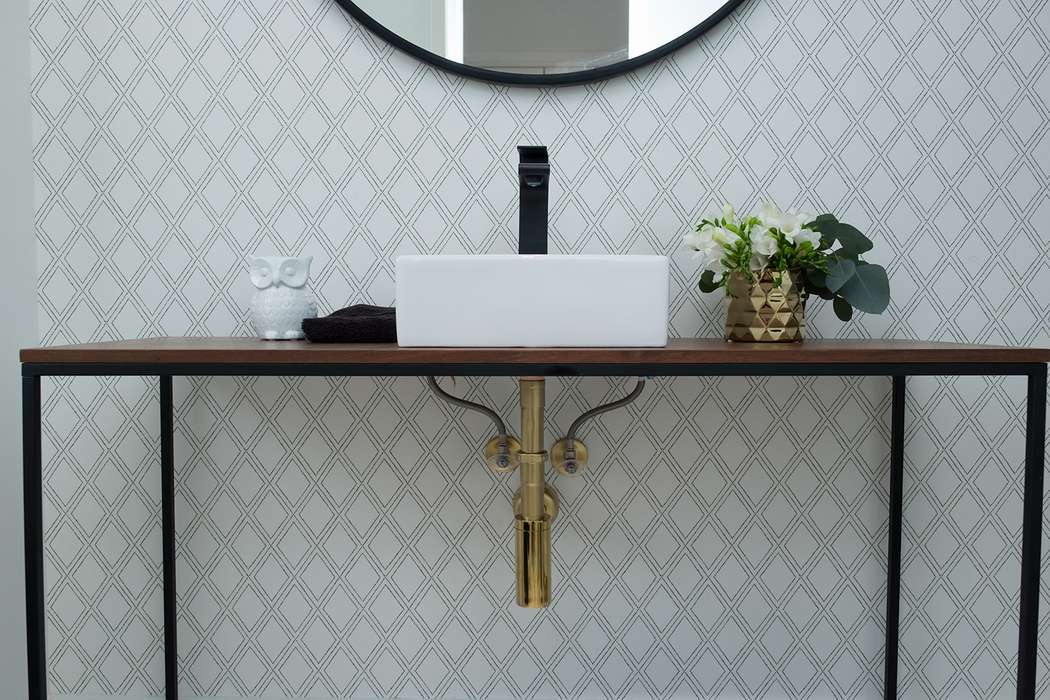
Custom Vanity
Jonathan showcased his crafty side by installing a sink into a modern console table. With its sleek lines and minimalist appeal, the custom unit is a glam industrial-style staple.
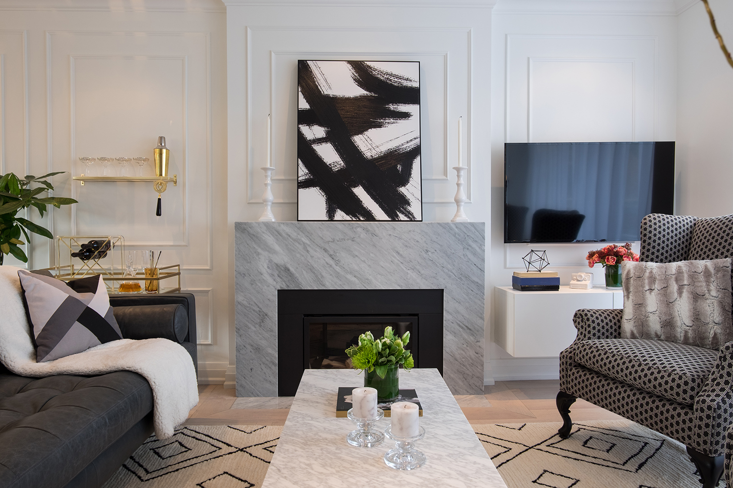
Central Fireplace
Since fireplaces are a necessity in any great living room, Jonathan gave this couple a sleek gas version. He then amplified the look with a modern slate surround and custom wainscotting on the wall above. Refreshing pops of greenery along with cozy elements like the patterned area rug lend warmth to the space.
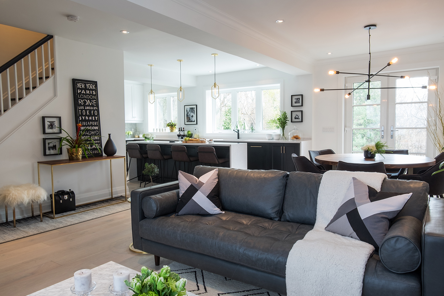
Touch of Texture
This rich leather sofa makes a bold statement, but it also feels cozy thanks to graphic throw pillows and a fluffy blanket. The sofa was strategically placed to section off the living room from the eating area, making it an ideal spot for entertaining.
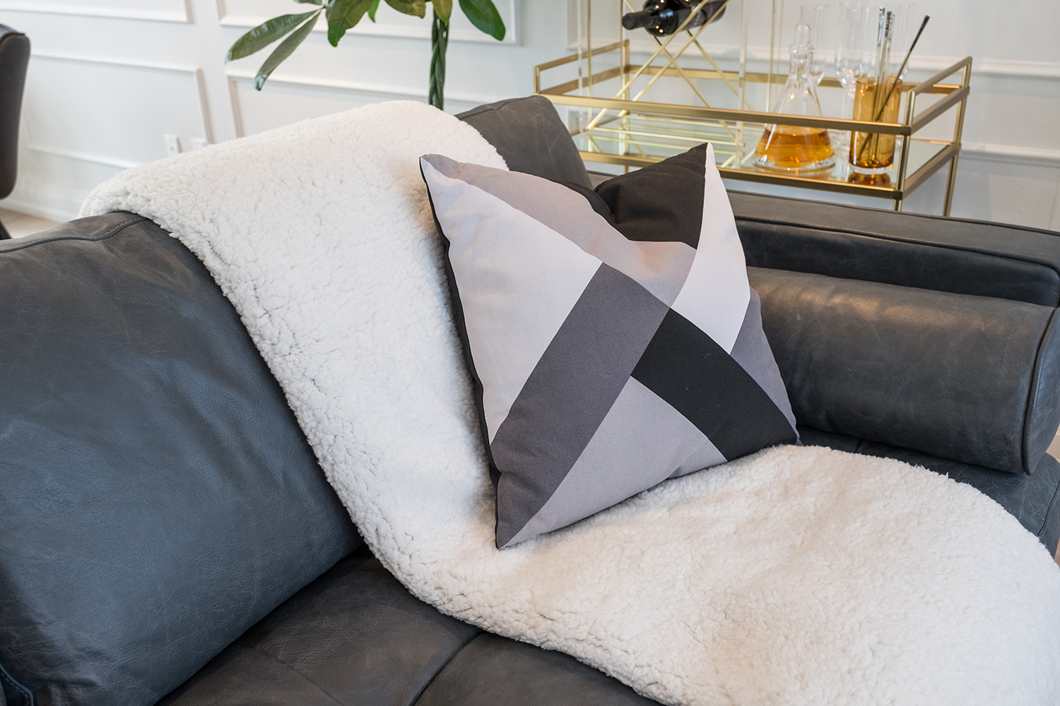
Matching Textiles
Since the home boasts a monochromatic scheme, Jonathan created plenty of interest and depth by playing with textures, such as this plush throw paired with the smooth leather sofa and throw pillow.
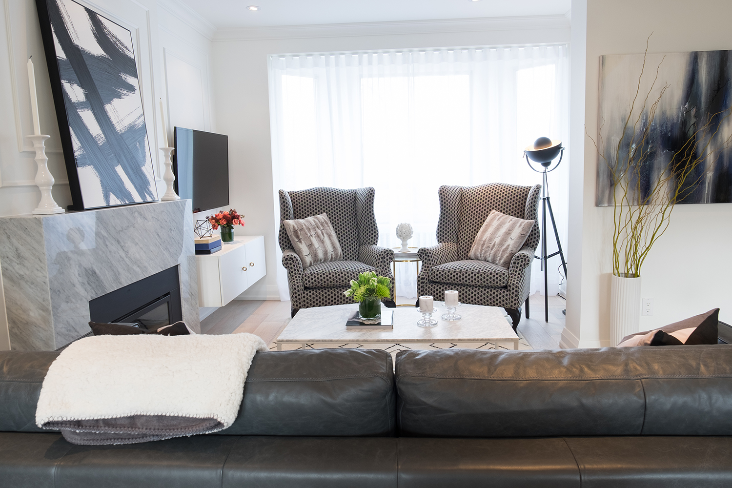
Updated Look
These large armchairs belonged to one of the homeowner’s mothers. Jonathan gave them new life by upholstering them in a punchy fabric, making them a real focal point in the living room. Elements like the interesting modular lamp and bold abstract art add instant personality.
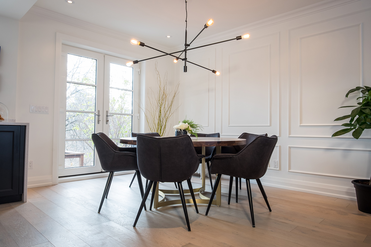
Artful Dining Room
This dining room looks like a piece of art thanks to the striking table and chairs together with the custom wainscotting on the walls. Light hardwood floors feel modern and fresh and are a perfect counterpoint to the dark furniture.
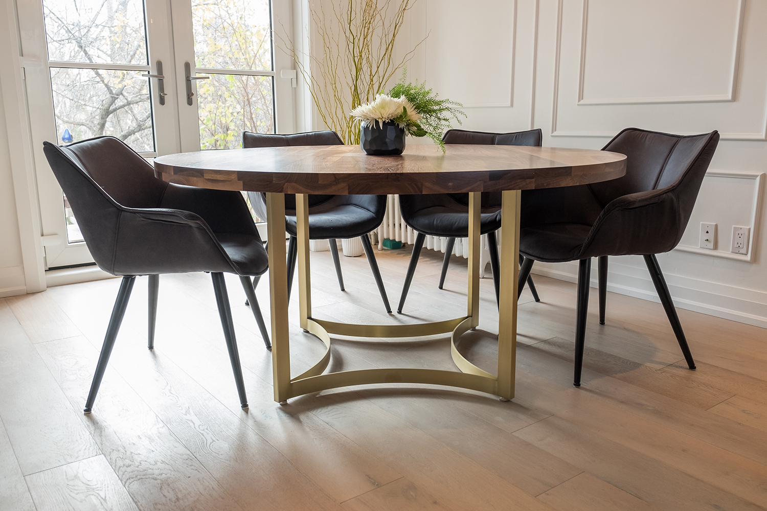
Custom Table
This custom table with brassy gold legs is a beautiful centrepiece, especially thanks to the table’s rich walnut top. The structural chairs ensure there’s plenty of seating to go around, making this a luxurious space that’s perfect for entertaining.
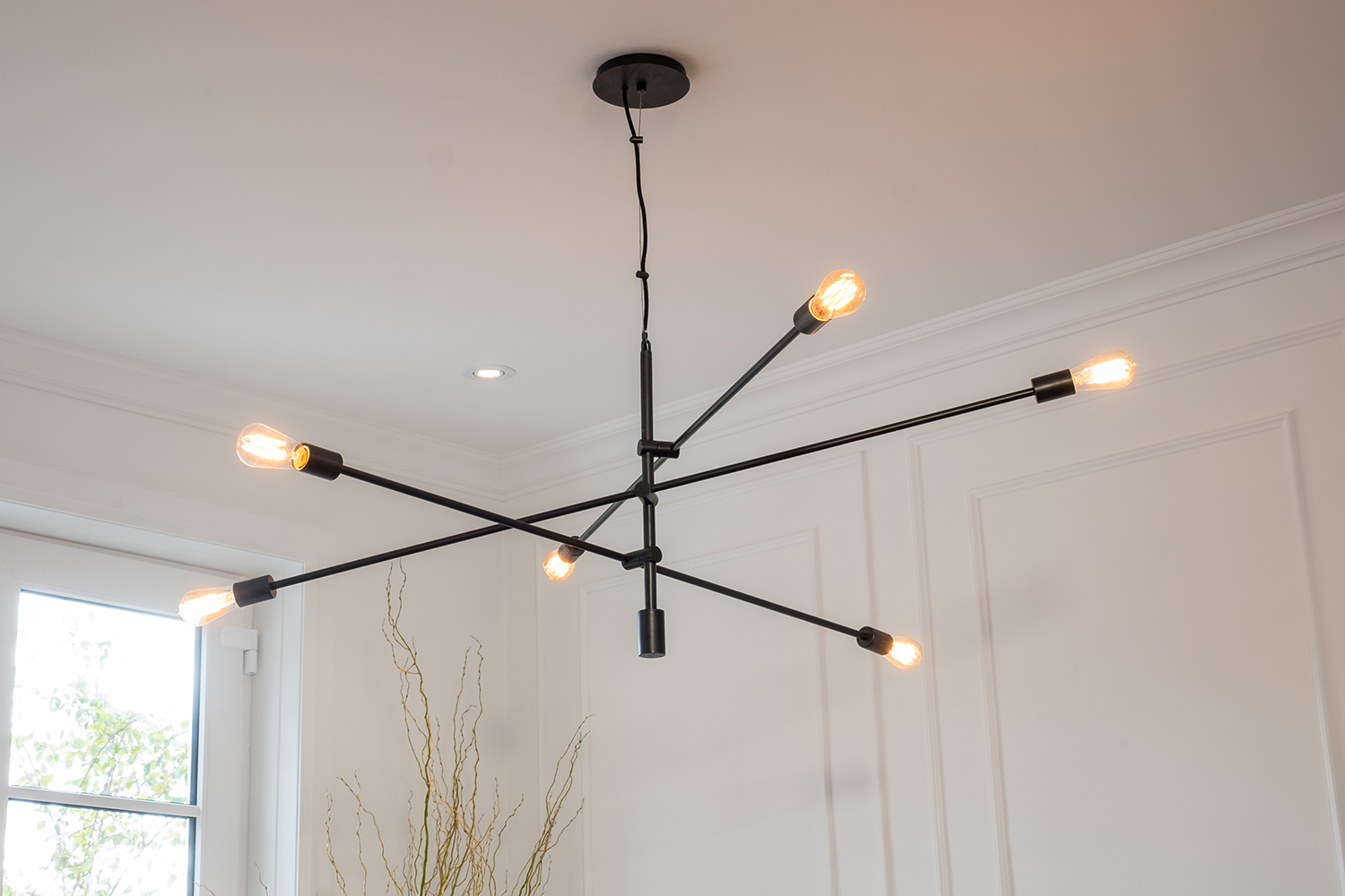
Striking Chandelier
We love the industrial look of this minimalist stick-inspired chandelier. Its simple design still adds loads of personality to the space while keeping sightlines open.
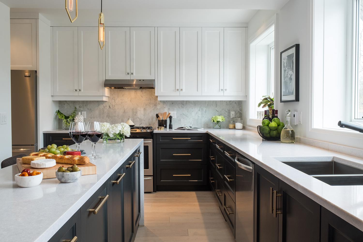
Monochromatic Kitchen
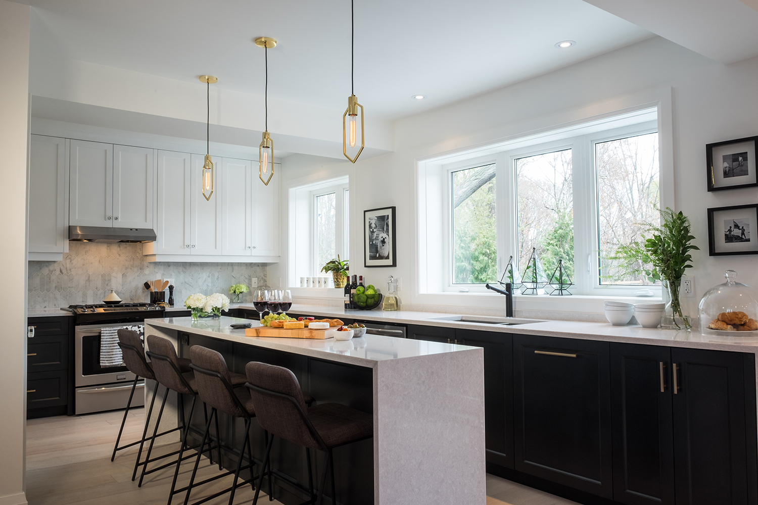
There’s plenty of storage in this two-toned kitchen. The rich black cabinetry with glam gold hardware is brightened up thanks to the white countertops and upper cabinets. The centre island adds even more functionality, while plenty of windows ensure that natural light spills into the space.
Island Addition
The sleek island with a waterfall edge feels like a natural extension of the countertops. The modern streamlined stools also tuck neatly into the island to stay out of the way.
Pops of Gold
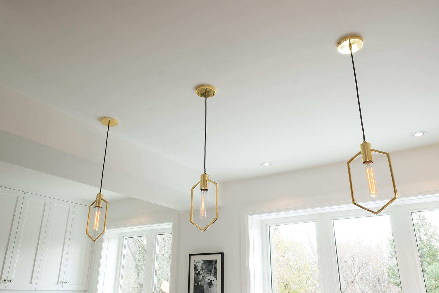
Jonathan added more chic hits of gold with these glam pendant lights that boast a stretched hexagonal shape. Similar to the eat-in area’s stick-shaped chandelier, these fixtures draw the eye without adding visual clutter – yet another artistic touch worth commending.
Clean and Modern
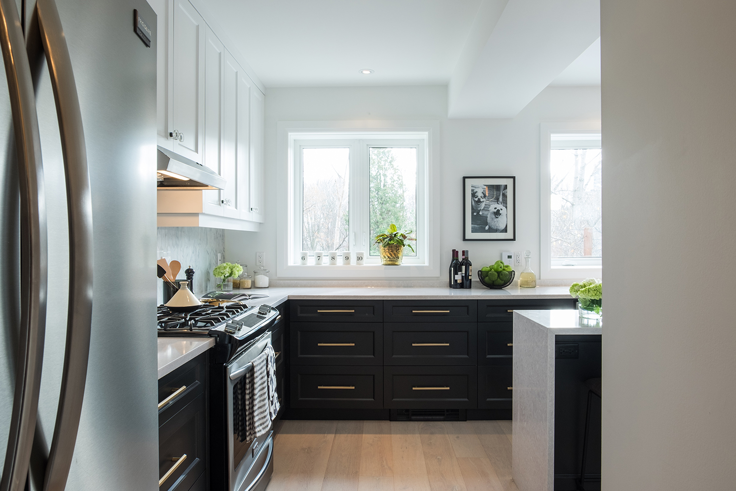
Stainless-steel appliances and dark cabinetry contrast the soft-hued hardwood floors, which soak in natural light and give an overall modern feel to the room. Meanwhile, small personal touches (like the framed photo of the couple’s two pups) make the space feel warm and lived in.
Dual Sinks
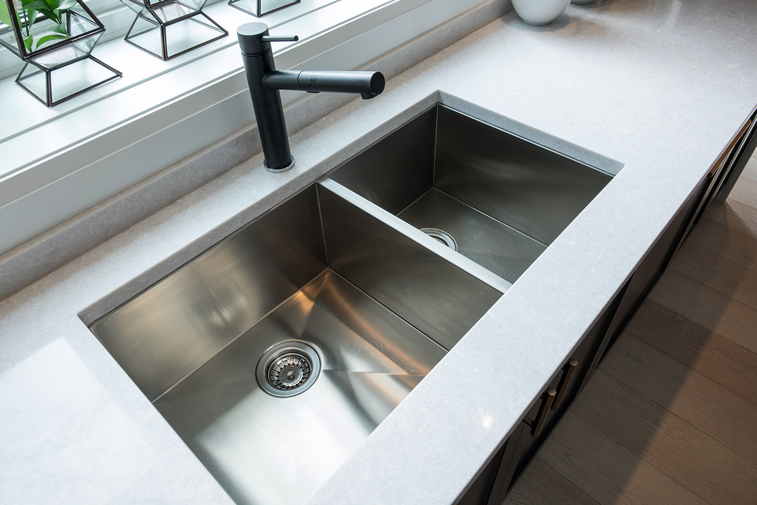
With so many gold and stainless-steel accents, Jonathan was careful to not have the elements compete with one another. That’s where the sleek black faucet comes into play; it ties into the cabinetry below but still feels modern and fresh. The dual sinks are large and functional – perfect for cleaning all the dishes that are sure to pile up from the anticipated guests.
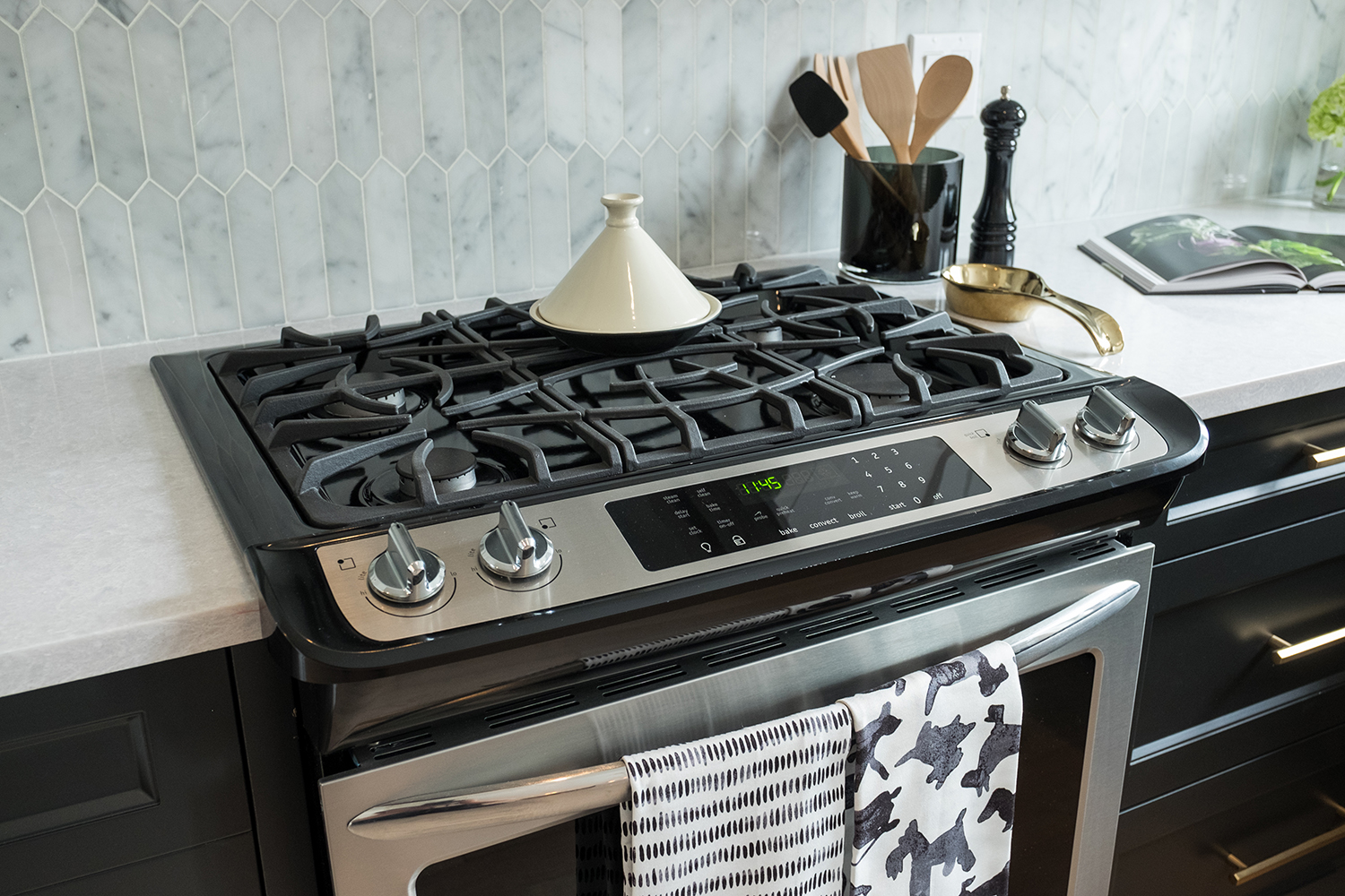
Neutral Backsplash
This range oven is perfect for whipping up gourmet meals. Not to mention, it looks like clean-up will be a breeze thanks to the low-maintenance backsplash. Jonathan and the homeowners went with a soft grey marble finish to maintain a light and airy feel.
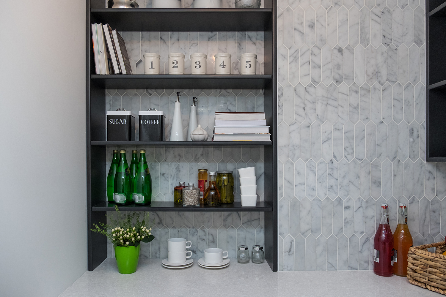
Butler’s Pantry
Just in case the homeowners felt they didn’t have enough storage space, Jonathan added this gorgeous butler’s pantry. The exposed shelving unit is perfect for extra drinks and dishware, while the countertop below provides space for small appliances and serving dishes. It’s just another touch that makes this house feel industrial and modern, where the homeowners will forever feel perfectly at home.
HGTV your inbox.
By clicking "SIGN UP” you agree to receive emails from HGTV and accept Corus' Terms of Use and Corus' Privacy Policy.


