When high school sweethearts Rave and Michelle sold their condo to move in with his parents and save money, they knew the situation was only temporary. But when the couple finally began searching, they struggled to find a home within their budget that boasted an appealing floor plan for themselves and their two little ones. So the pair called in the Property Brothers for help. After Drew tracked down a promising home in an attractive neighbourhood, it was up to Jonathan to transform it into a family-friendly space that checked off all the couple’s needs – including a few unique design ideas of their own. Here’s what the brothers came up with.
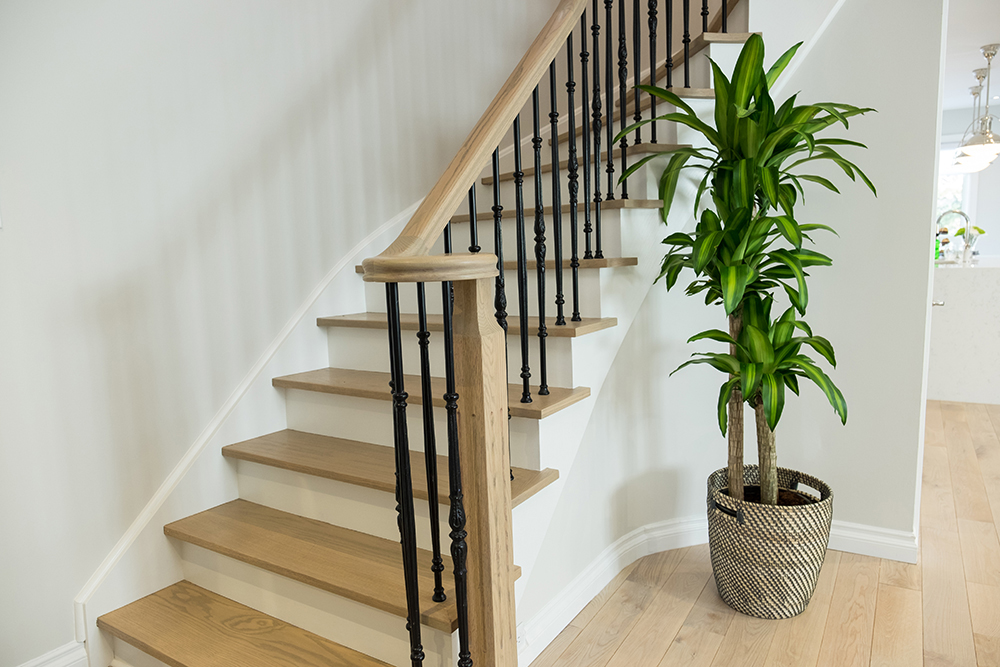
New Staircase
The homeowners were adamant about opening up the main floor without interrupting the home’s overall design. Jonathan began by updating the staircase, adding a hardwood look to each step to warm up the front hall.
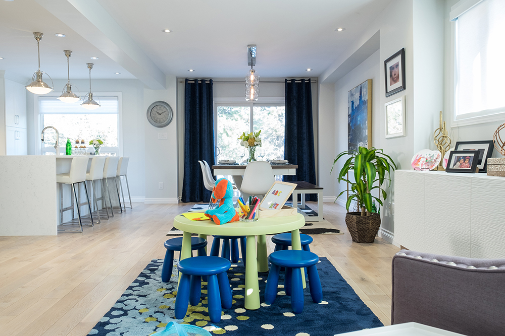
Kid Central
The couple’s two tots were given a play area of their own. Thanks to the home’s new open-concept design, Michelle can now keep an eye on her little ones while cooking dinner or finishing other tasks.
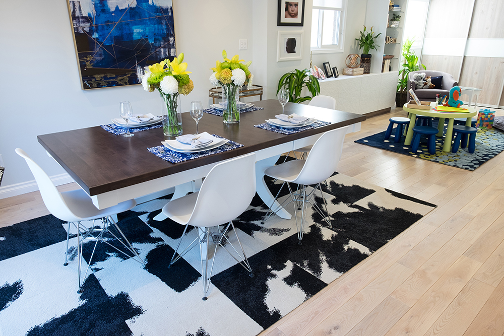
Fine Dining
The dining room may be small, but it makes a big impact thanks to bold, modern design elements like the cowhide-inspired rug and funky wall art. While elegant and edgy, the space also exudes a playful quality to suit the entire family.
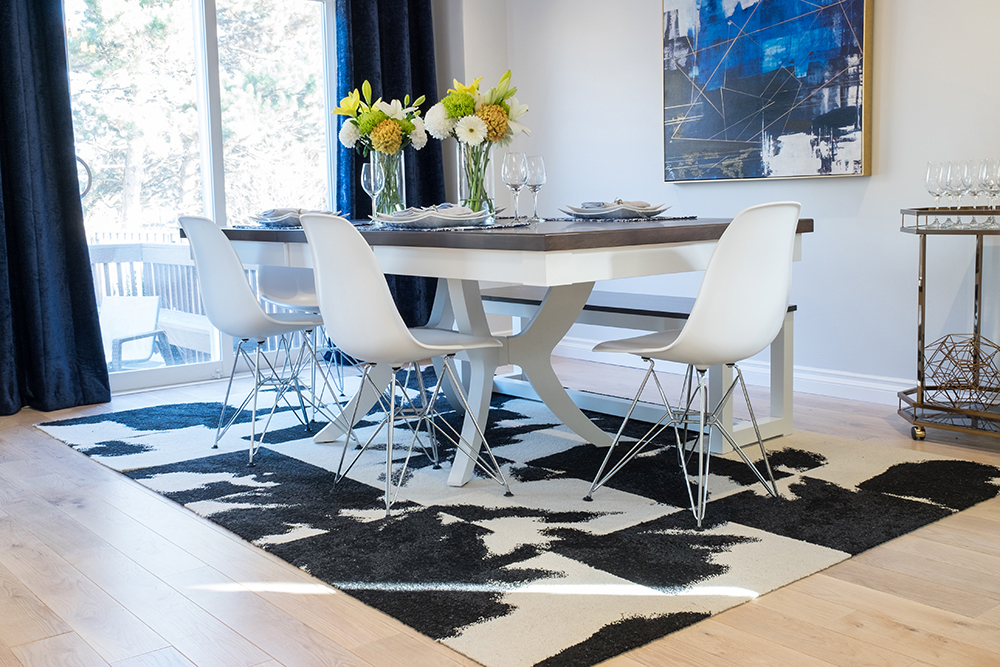
Small Extras
A large dining table with molded plastic chairs are perfect for the whole family. But Jonathan went even further, adding a customized bench that the kids can use with ease. Bonus points for all the space it saves.
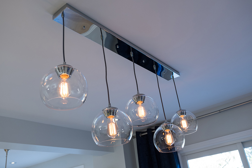
Whimsical Lighting
This whimsical fixture, featuring five globe-shaped lights hanging at varying lengths, adds to the home’s modern vibe.
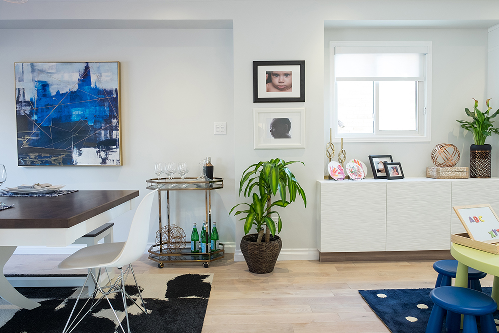
Easy Transition
One of the best aspects of this redesign is the open-concept layout. It encourages a smooth visual transition between rooms, and an opportunity for space-saving solutions. Take this area, which features a bar cart and a credenza. Both elements add plenty of function (and style!) without bogging down the flow.
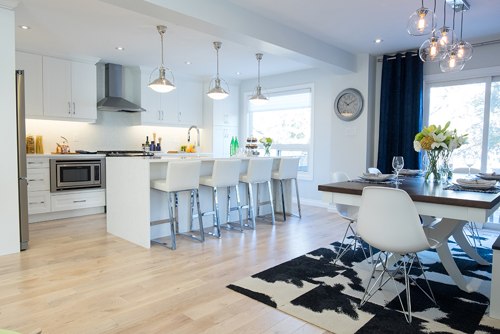
Brilliant Hardwood
At first, Jonathan was slightly uncomfortable when Rave announced he had already sourced the home’s hardwood. But as it turned out, the homeowner knew what he was doing. The soft wood flooring is pretty, durable and even affordable. Crisis averted, Jonathan.
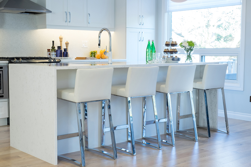
Bar Stools
These simple white bar stools certainly satisfy the homeowners’ desire for a bright white kitchen with modern finishes. They’re also the perfect height and shape for tucking into the waterfall-edged island.
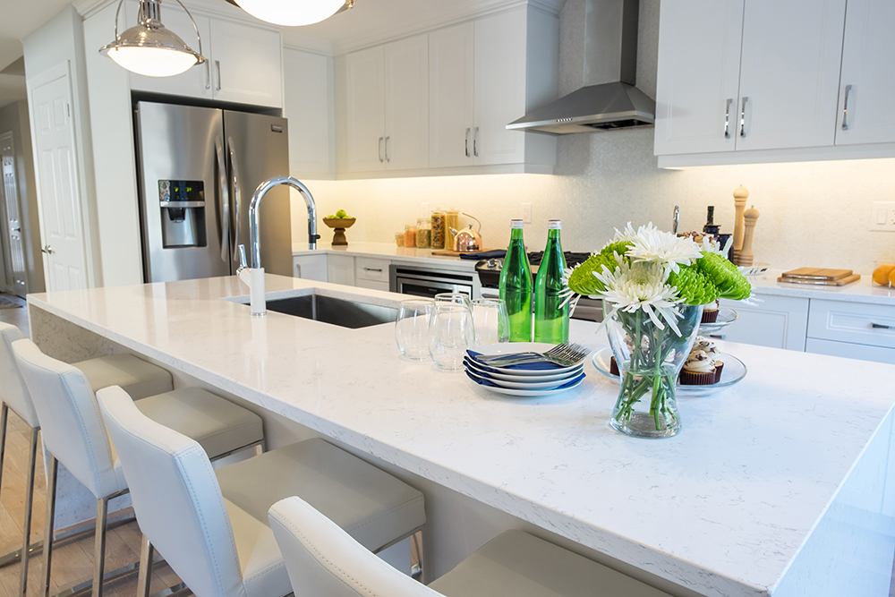
Surface Areas
This large island encourages company. The overhang allows for more counter space, which can function as an additional prep surface. It also makes for a great homework spot when the kids grow older.
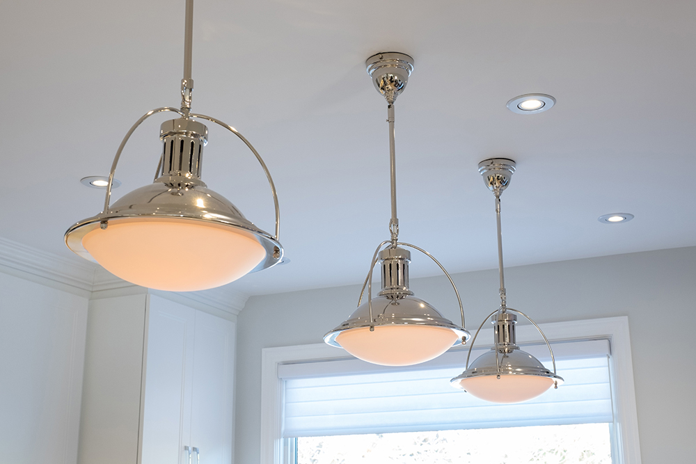
Modern Appeal
The trio of industrial-style pendant lights above the island add interest without taking away from the space’s white scheme. The extra-large bulbs also offer plenty of ambient lighting.
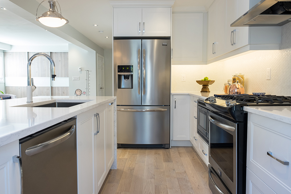
Modern Appliances
When you’re cooking for an entire family, owning state-of-the-art appliances makes all the difference. These stainless-steel models help the white, bright kitchen gleam even more.
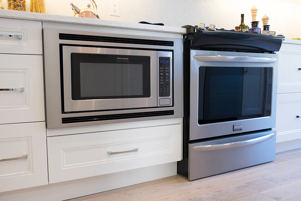
Built-in Design
Admit it: a microwave isn’t the prettiest of appliances. The ultimate design solution? Integrate it into your cabinetry. Having all that extra counter space (not to mention a more streamlined look overall) is definitely worth giving up a cupboard or two.
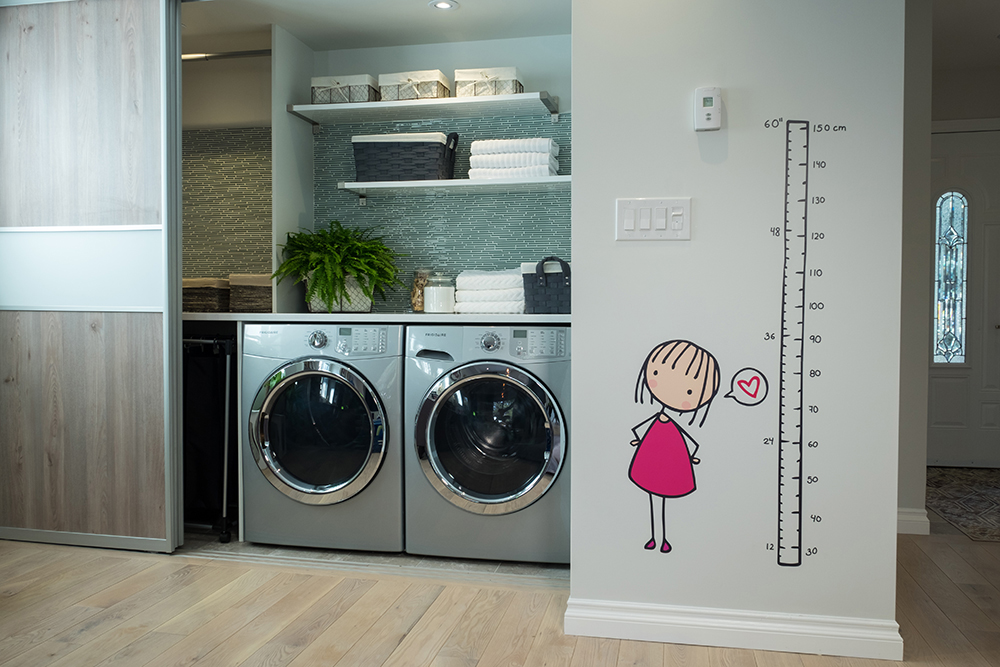
Growth Chart
We’ve seen some pretty cool growth charts through the years, but this decal version is particularly unique and playful. Meanwhile, the modern washer and dryer can be concealed when not in use thanks to brilliant sliding doors.
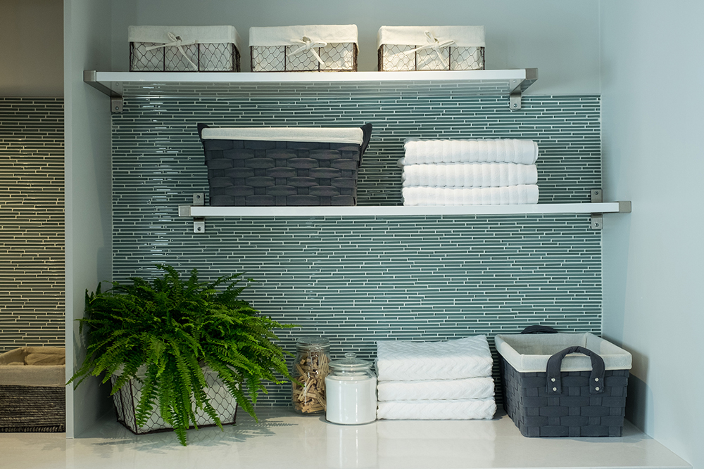
Lovely Laundry
We’re in love with the aqua-hued glass backsplash in the laundry closet, which provides a spa-like feel. Add in a few open shelves and lots of folding space and it becomes a place we wouldn’t mind doing laundry in.
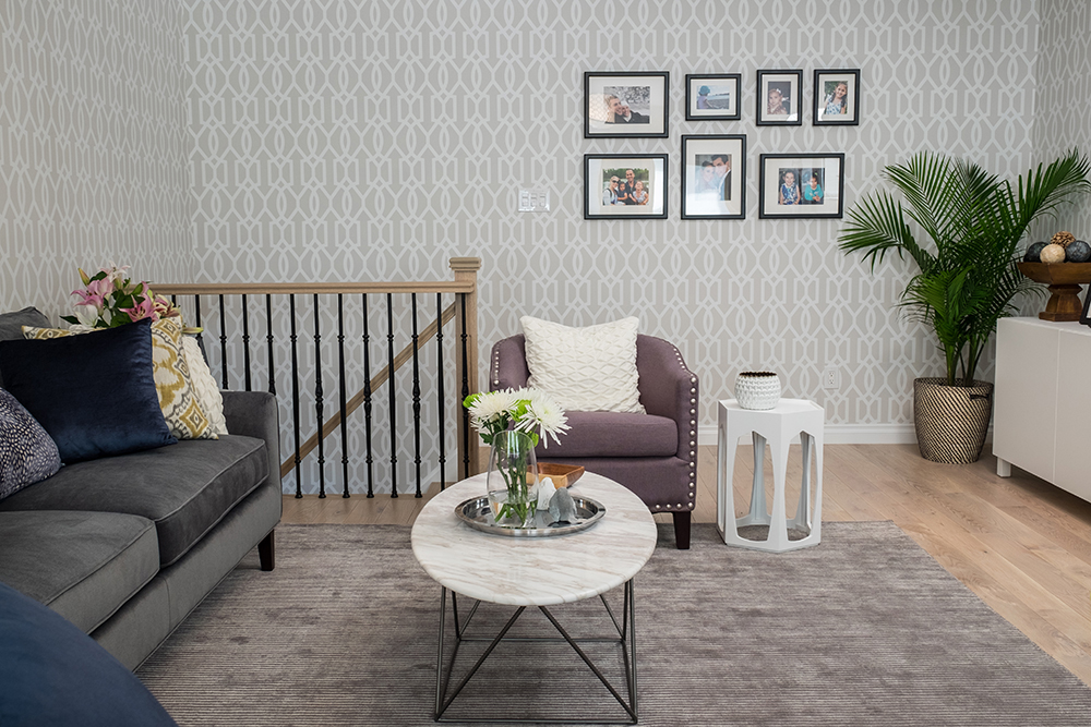
Bonus Space
Rave and Michelle were set on having an adults-only space in their new home, so Jonathan transformed this bonus room into a sophisticated and stylish nook for grown-ups.
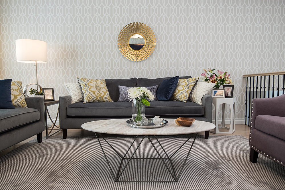
Wallpaper Effect
We don’t often see wallpaper on all four walls anymore (thanks to the rise of the accent wall), but it works like a dream in this living space thanks to its subtle hue and pattern. Modern accents like the sunburst mirror and geometric coffee table together with textured finds like the area rug and toss cushions complete the energetic aesthetic.
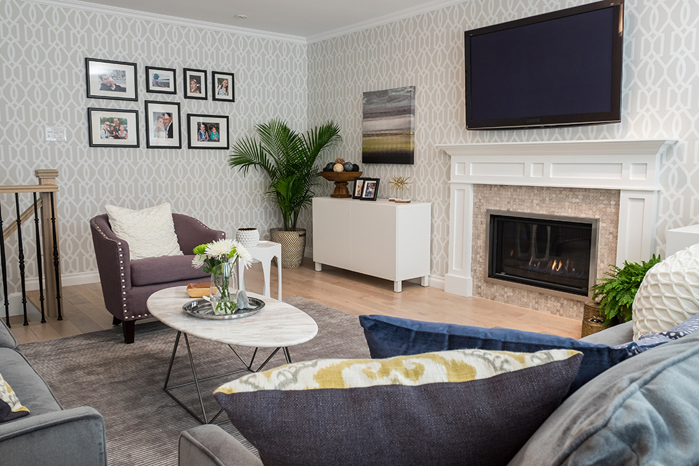
Hidden Oasis
The entire “adults” room boasts a different vibe than the main floor; it’s softer and a little cozier, as any den should be. There are still modern elements at play, but they’re toned down when paired with warm grey accents and a fabulous fireplace.
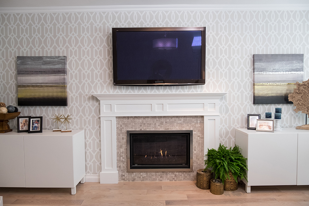
Mounted Entertainment
Every home needs a large flat-screen for entertaining. Jonathan incorporated this one into the design by mounting it above the gorgeous fireplace. The fireplace surround also received a modern facelift with gorgeous mosaic tiling and trim work. An adult escape, a few kid-friendly zones and a floor plan that works for everyone? We’d say Jonathan hit it out of the park for this family of four.
HGTV your inbox.
By clicking "SIGN UP” you agree to receive emails from HGTV and accept Corus' Terms of Use and Corus' Privacy Policy.


