Wendy Lau and her husband were looking for a fresh start. Wanting to be closer to their family and community, the couple bought a well-loved, but out-of-date 1970s home just outside of Toronto – and totally transformed it into the light, plant-filled, boho-inspired space of their dreams. Bonus: check out the video of the jaw-dropping space.
Community Connections
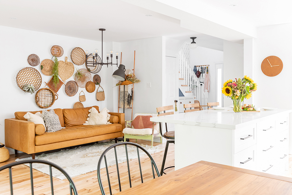
In October 2017, Wendy and her husband chose their home in Markham, ON to be closer to family after the loss of her mother-in-law. However, that desire to be physically close to their community meant selecting a home that needed a lot of work in order to suit their bright style. “The neighbourhood where my family is from is old, [the homes typically were] built in the 1970s or ’80s, which is why this particular home needed a gut job,” Wendy says. As the renovation process started, Wendy found herself looking for collaboration and discussion about the design process – which led to the growth of her home-focused Instagram account, thekwendyhome.
Related: Video: A Plant-Filled Ontario Home With Genius DIY Touches
A Stroke of Architectural Inspiration
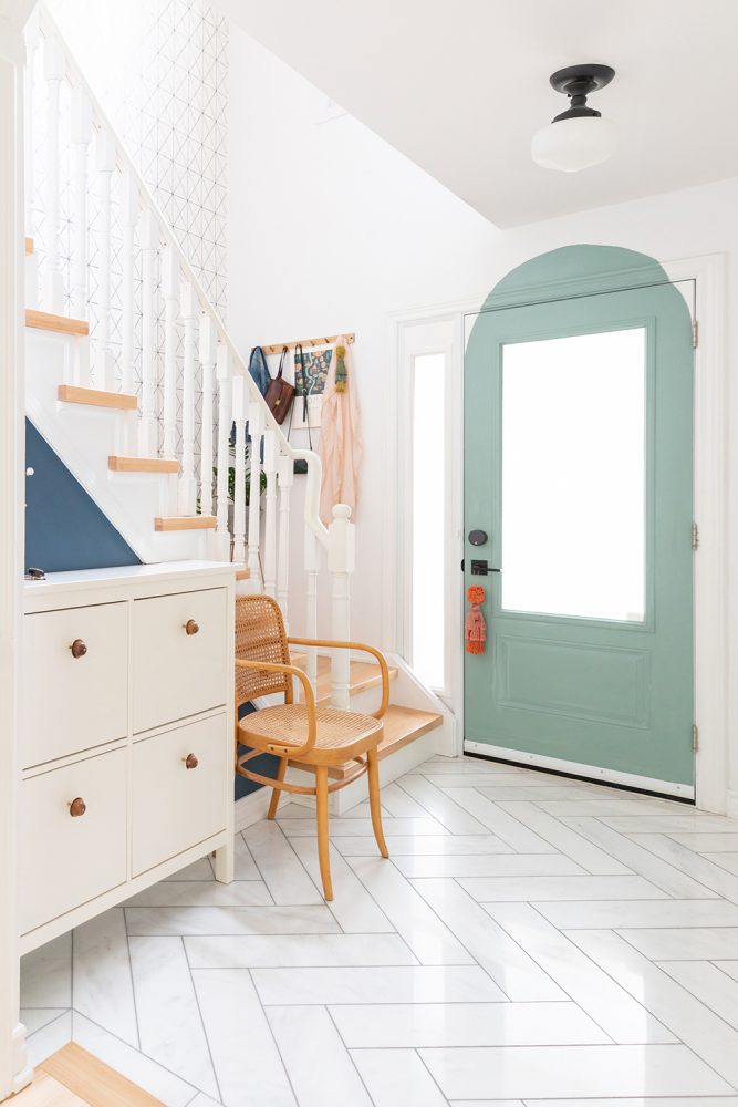
The front entryway previews the light-filled look and strategic whimsy that are found throughout the home, with a distinctively painted door making a confident first impression (it’s so distinctive, in fact, that it went viral after Wendy posted it on TikTok). The trend-right arch is a new – and free – addition to the space. “I just wanted a change,” Wendy explains. “I was stuck at home during COVID, I wasn’t going out for paint supplies, so I actually mixed the paint colour myself from what I had.” For the flooring, Wendy chose marble tile in a chic-yet-playful herringbone pattern – a little splurge that made a major impact in the relatively smaller space.
Related: 25 Eye-Catching Entryways That Make the Ultimate First Impression
Beyond-Basic Baskets
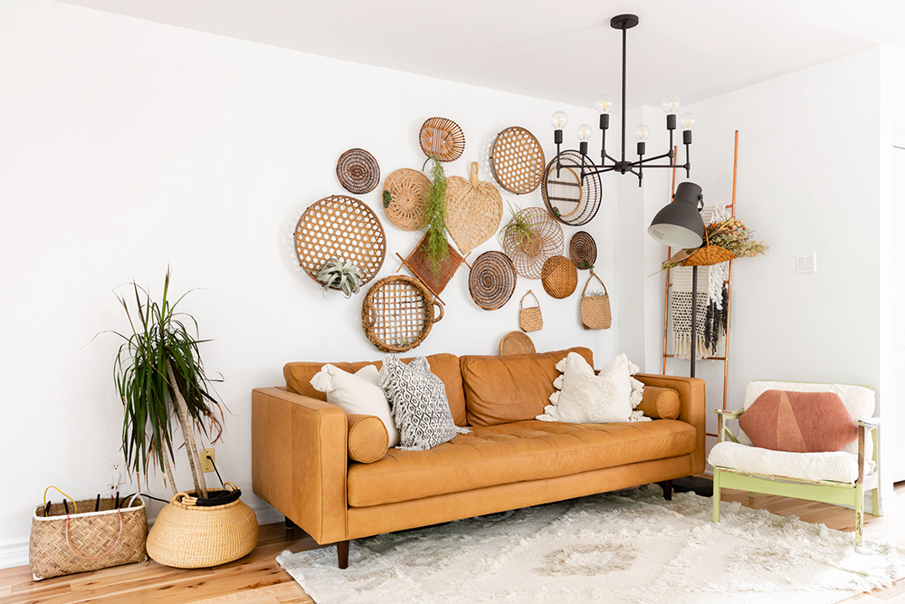
In the living room, Wendy opted for a fresh, multi-dimensional take on the classic gallery wall by hanging an array of second-hand and vintage baskets sourced her travels or from small businesses. The result is a lot of visual interest on a budget, and decor that can be moved, rearranged and even used on a whim. “It’s great,” Wendy says. “Because when I need a basket for something, I can literally take it off the wall.”
Related: 15 Canadian Vintage and Antique Shops to Find the Perfect Piece for You
Sweet Signage
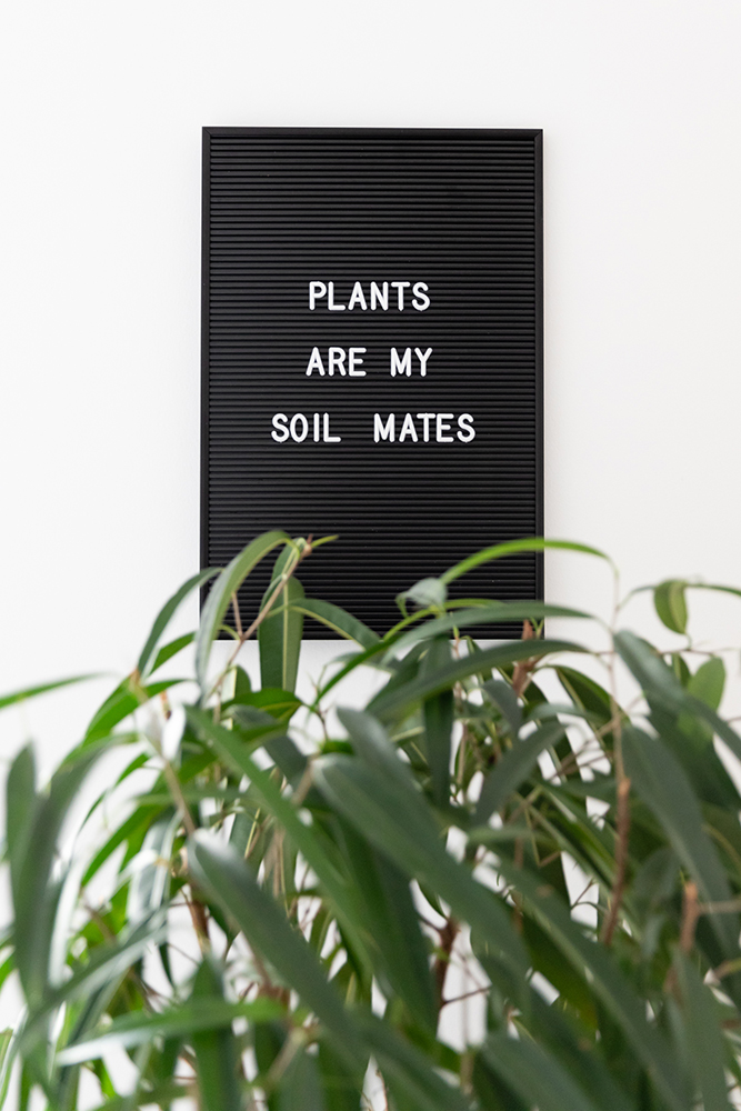
As a flight attendant, Wendy travelled the world – and found many of her home’s budget-friendly treasures to bring home – like this playful letter board, which serves as a textual ode to her appreciation for plants and greenery.
Related: Support Local: The Best Online Plant Stores in Canada
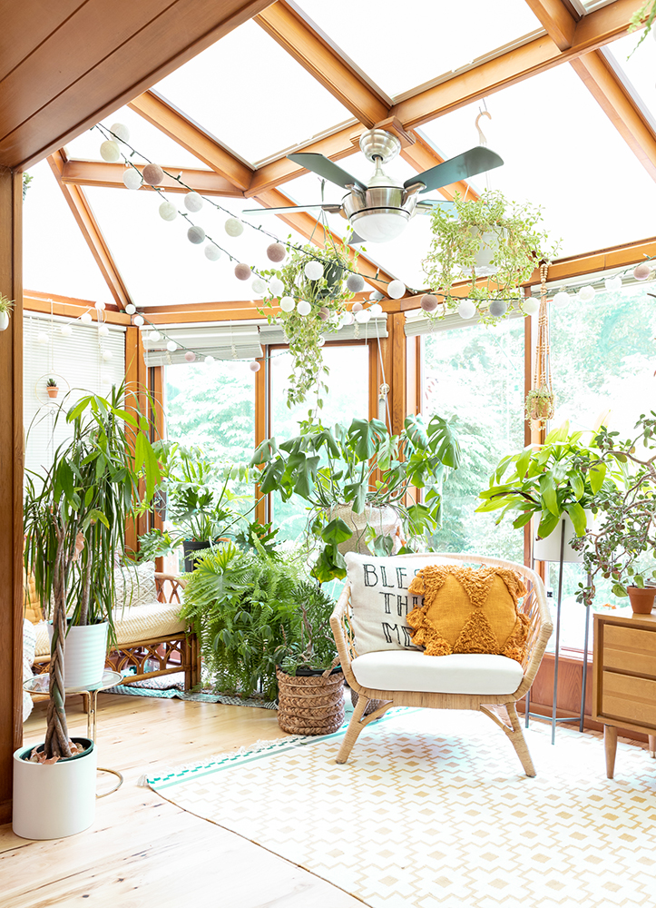
Sunny Days
Greenery is a common denominator throughout the home, with Wendy’s plant collection growing rapidly in large part due to the light-filled, north-facing sunroom. “I think I started accumulating plants in this house because of the sunroom,” Wendy says. “I no longer know the number, but I’m pretty sure we’re at over 100.” In addition to the plethora of plants – many of which are passed down from Wendy’s mother – the sunroom is decked out in a mix of rattan and wood furniture, including a repurposed mid-century modern nightstand that she literally found abandoned on the street.
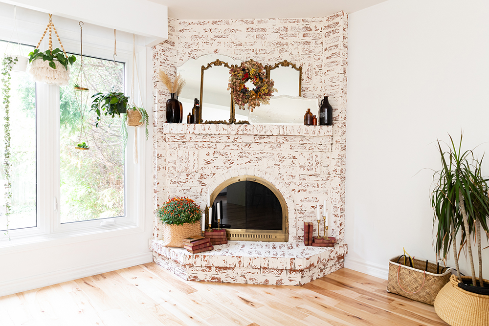
Stylish Smear
The home’s fireplace was originally a vibrantly hued brick, which Wendy describes as “a very angry fire-engine red” – that stood out amidst Wendy’s light and bright aesthetic. Without a big budget for changing up the fireplace, Wendy turned to a unique “German smear” DIY technique that uses inexpensive spackling to create a weathered, distressed look that mimics the aesthetic of old-world European building exteriors.
Related: 20 Gorgeous Fireplace Mantel Decorating Ideas That’ll Keep You Cozy
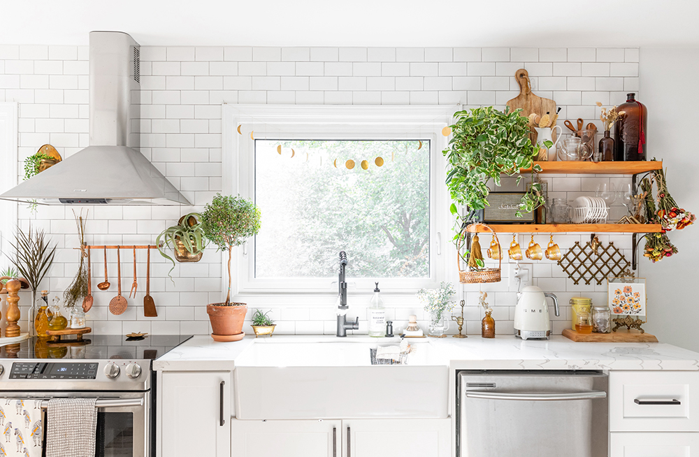
Romantic Cottagecore Vibes
The open-concept white kitchen is bright, airy and full of plants. While the space ties in with the boho feel of the rest of the home, practical touches like white subway tiles offer a subtle nod to farmhouse styling that leans a touch more towards a cottagecore aesthetic to Wendy. “I feel like it’s a romanticized version,” she says.
Related: Backsplash, Tile, Cabinetry: The 15 Top Kitchen Trends for 2021
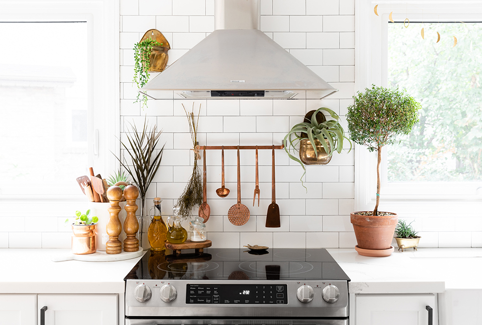
A Dream Kitchen
To Wendy, having plants and herbs was always part of her dream kitchen aesthetic. Fulfilling that ambition, pops of green enhance the fresh feel of the clean, white kitchen design.
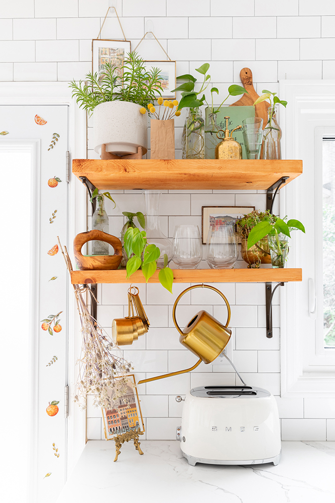
Seasonal Shelving
At once functional and beautiful, the kitchen’s open shelves play to Wendy’s love for styling, and restyling her space. “Because it’s an open space, you can see them from all angles when you walk into the home – so it’s become a showcase of sorts,” she explains. While the shelves can and do store kitchen items most of the time, the shelves also allow her to play with styling the space for occasions, seasonal changes – and just for fun and a place to channel her creativity.
Related: 20 Gorgeous Kitchens That Will Inspire You to Embrace Open Shelving
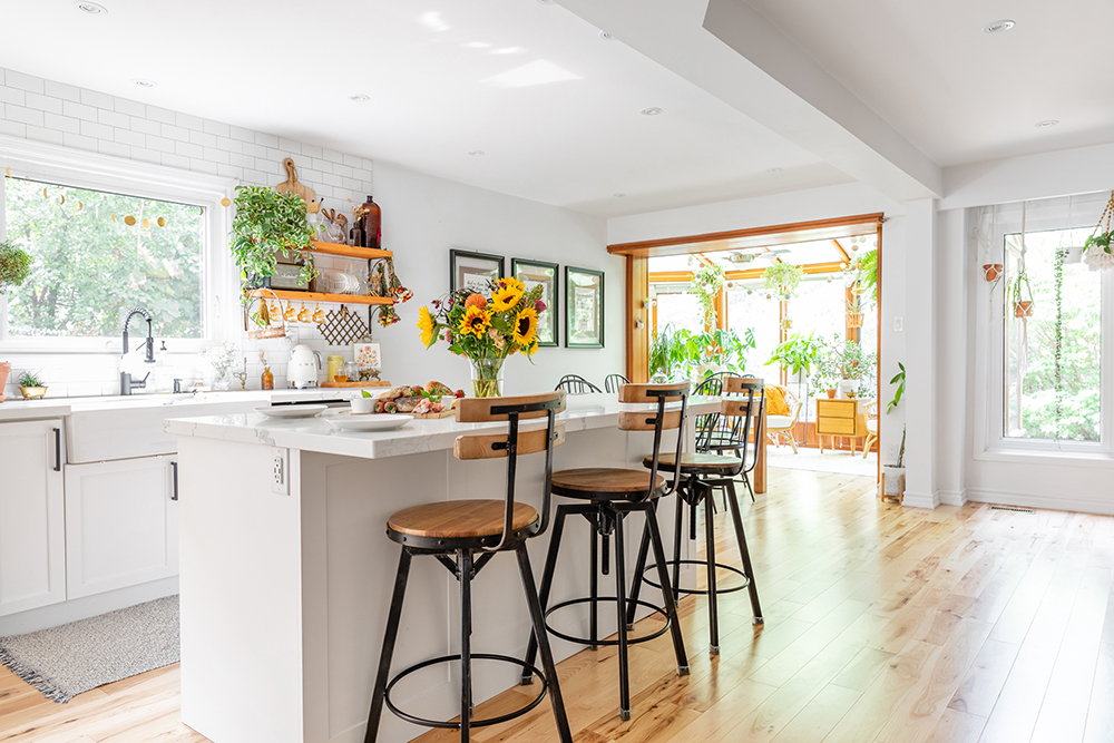
Smart Seating
The trio of stools at the kitchen island provide a subtle echo of the warmer wood tones in the kitchen’s shelving, while also being incredibly functional. Because Wendy and her husband love to entertain, she intentionally chose height-adjustable stools with a back that would be comfortable for lots of different people. The stools also coordinate with the hickory flooring, which they used throughout the home top to bottom, both for their durability and beauty.
Related: 25 Show-Stopping Kitchen Islands You’ll Want to Replicate
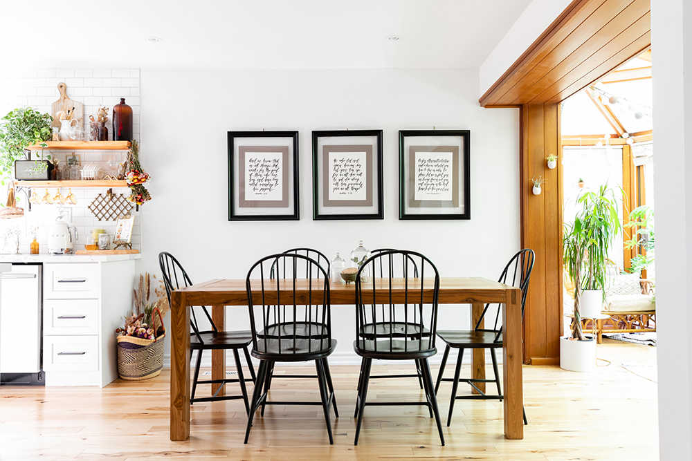
Unifying Details
The dining room perfectly connects the kitchen and sunroom by using white walls, warm woods and black accents – while also incorporating meaningful personal details into the home. The large dining table, for example, was a one-of-a-kind refurbished piece – crafted from an old bridge in India – that was chosen by Wendy’s husband. Above the table, trio of hand-calligraphed art pieces showcase some of Wendy’s husband’s favourite Bible verses. “I commissioned those from a friend because we really do want to support small businesses,” Wendy notes.
Related: 10 Ways to Use Reclaimed Wood in Your Kitchen Design
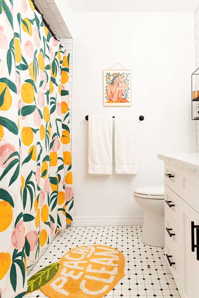
Just Peachy
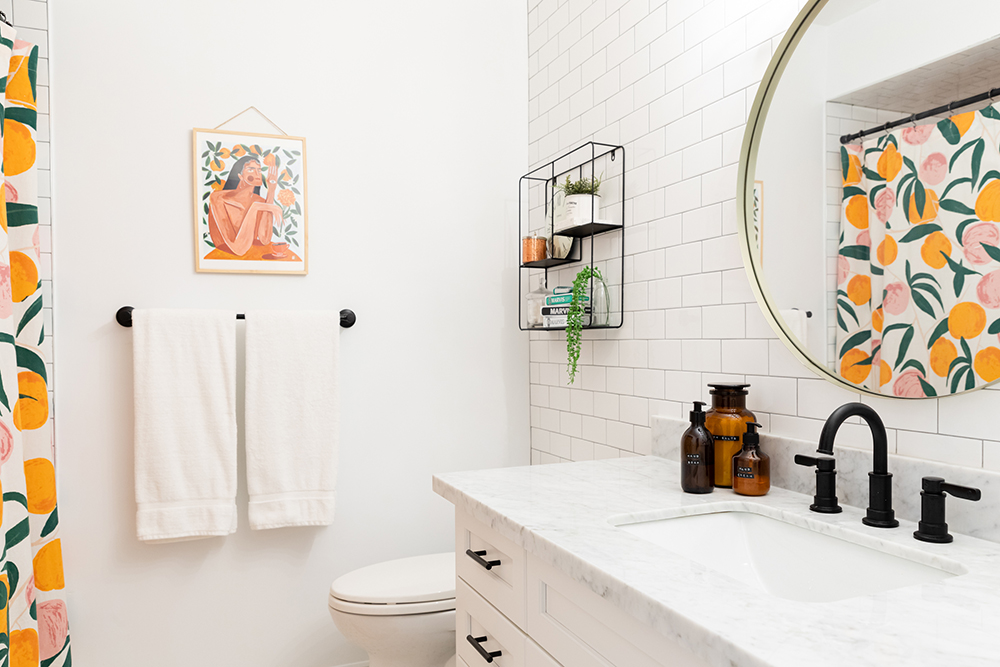
Instantly evoking playful vibes, the home’s secondary bathroom is packed with personality. The playful shower curtain and bath mat are Urban Outfitters finds, while the perfectly coordinated art is from Wendy’s friend, illustrator Maggie Stephenson.
Related: 13 Ways to Stylishly Store and Organize Your Toiletries
Durable Design Details
While the styling in the washroom is super fun, Wendy points out that – when you strip away the decor – the room was designed to be versatile and functional. They chose affordable subway tile (which they used all the way up to the ceiling for added splash-resistant durability). The one splurge in the room? Marble counters for a touch of lasting style.
The DIY Guest Room
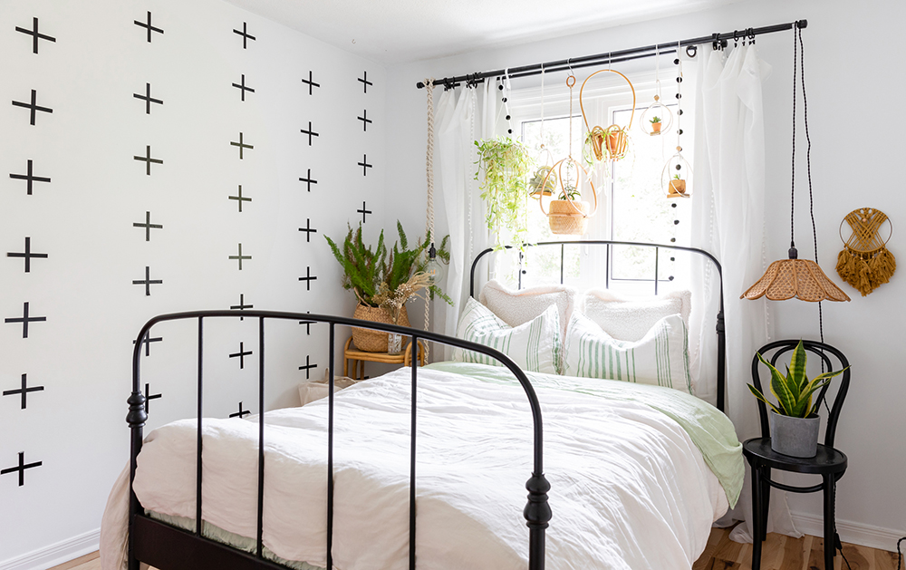
In the spare room, Wendy used a mix of clever low-cost and handmade pieces to stay on budget and showcase her creativity. “This was a challenge I gave myself: to make a guest spare bedroom where everything was DIY or thrifted,” Wendy explains. To craft a feature wall, for example, Wendy used Washi tape for a bold look. To mirror the luxe style of the window treatments she used in her master bedroom, Wendy glued pom-poms on inexpensive curtain panels for a simple DIY upgrade. The bed is thrifted from Facebook Marketplace, while the thrifted lampshade was a find from her travels to Ireland as a flight attendant.
Related: 12 Thrifted Home Decor Ideas to Inspire Your Second-Hand Decorating Dreams
A Bold, Modern-Boho Bedroom
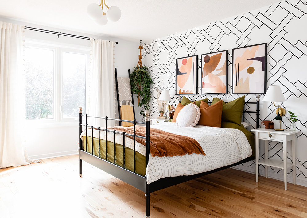
The master bedroom might now be a sophisticated mix of Wendy’s signature white-and-black and boho details, but it started out as a fairly basic white room. Over time, Wendy has gradually added in upgrades to suit her taste, as her budget allowed. “You work with what you’ve got, make it beautiful for what it is, and then when you’re able to, start incorporating those pieces,” she says. Those updates include new lights, artwork and nicer bedding in warming tones of rust and olive greens. The artwork above the bed was gifted and perfectly matched Wendy’s evolving bedroom aesthetic.
Stylish Sconces
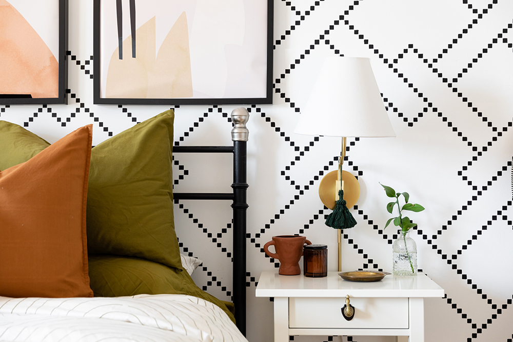
The chic bedside lighting came through a collaboration with Mitzi. “I really like the sconces because the bedside table itself is very small, so the sconce frees up bedside table for styling, for water, for whatever,” Wendy says. And, while the wall-mounted design looks luxe, it’s actually a clever, easy-to-incorporate design. “It looks way more custom, like I hired an electrician to put it in, but you literally just screw it on – it’s a plug in,” she explains.
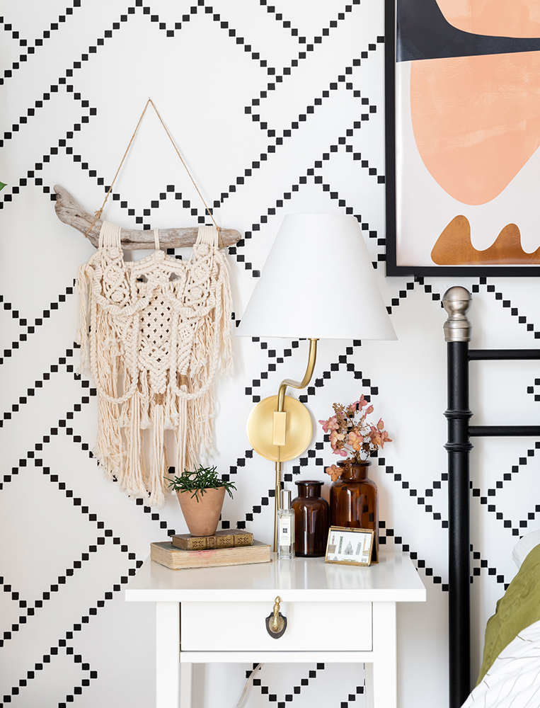
Wow-Worthy, Not Wallpaper
Initially, Wendy used a luxe (and expensive) wallpaper in her master bedroom – but the look didn’t work for her and her husband. Because she’d already spent her budget, she opted for an genius DIY that complete the room: after painting the wall white, Wendy used a stencil and water-based Sharpie markers to create a chic-and-cheerful customized feature wall.
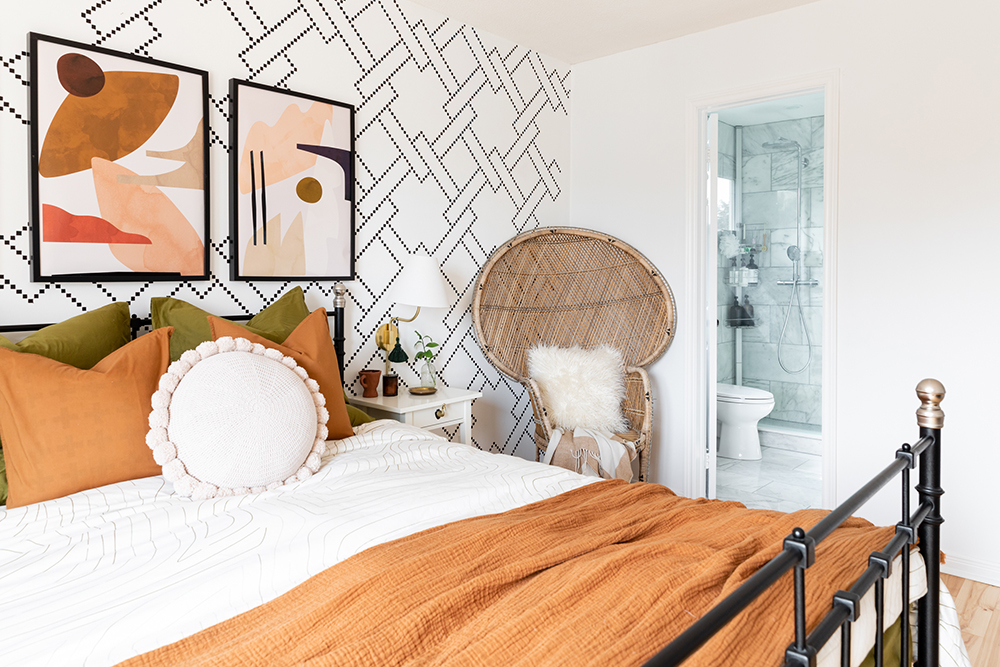
A Boho Seat
The stunning peacock chair in the master bedroom is another second-hand find that adds a pop of bohemian style, and seating, to the space. “When I was embracing the bohemian, I scoured Kijiji for it,” Wendy says.
Related: 10 Super Easy Ways to Add Character (and Value) to Your Bedroom
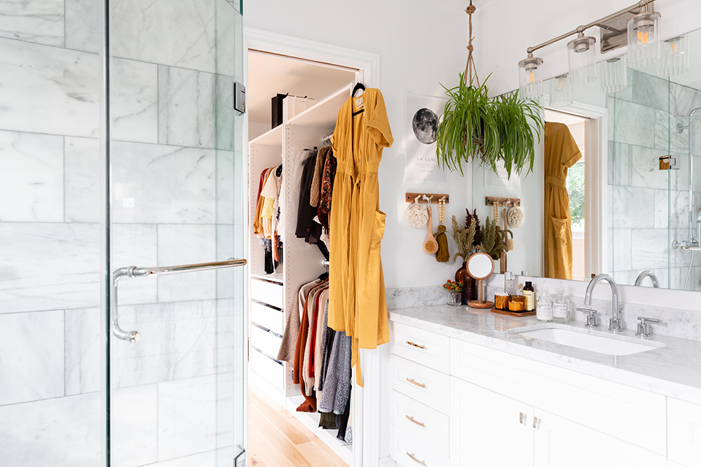
A Chic Sanctuary
While she was conscious of the renovation budget, the master bathroom was a smart space to splurge on luxe materials.
Related: Our 10 Most Popular Bathroom Design Ideas on Pinterest
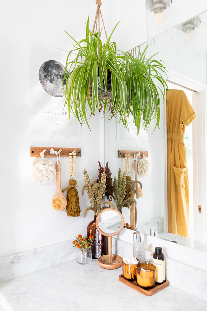
Little Luxuries
Because the space was smaller, Wendy and her husband were able to incorporate dream details (like marble, chrome hardware and a rainfall showerhead) while staying on track. The result is a touch of everyday luxury that stays true to the couple’s bright, fresh style.
HGTV your inbox.
By clicking "SIGN UP” you agree to receive emails from HGTV and accept Corus' Terms of Use and Corus' Privacy Policy.


