Colour brings character into our homes, and one of the most effective ways to introduce it is with paint. Which room, wall or nook in your home could use a colourful makeover? Prepare to be inspired as we explore this year’s most popular paint colours.
Published Mar 12, 2021, Updated Apr 2, 2022
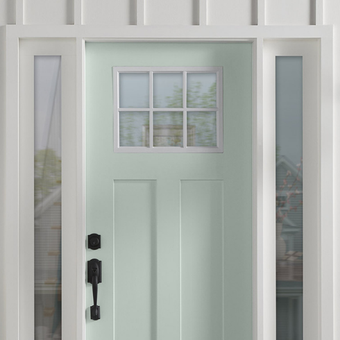
Easy Breezy
BEHR’s minty-cool colour of 2022 is this fresh, pale seafoam paint called Breezeway. We love how its used on this front door to make a gentle but strong statement.
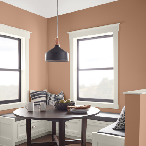
Grand Canyon
We’re still not over BEHR’s 2021 colour of the year: Canyon Dusk. This is a particularly good choice for rentals, in order to warm up a space without picking a colour that’s too jarring or controversial. Pair with white trim for a clean vibe. We love how this breakfast nook also incorporates black and dark woods to add visual weight and dimension.
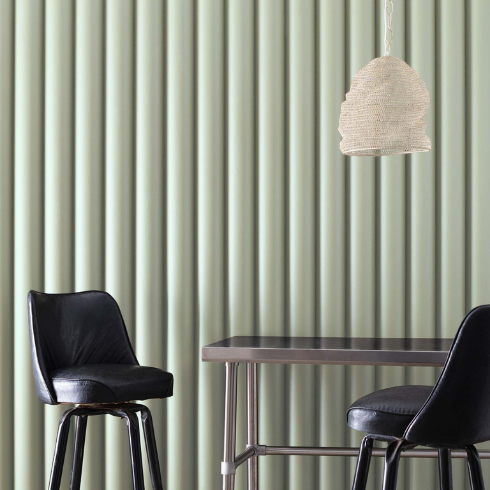
Not Over Green
We saw green all over the place in 2021 (Dakota Johnson’s kitchen, anyone?). And we’re clearly not over the green-fever yet.
Benjamin Moore’s colour of 2022 is this stunning, soft sage paint called October Mist. We do get soft, misty vibes from this one, making it perfect for breezy entryways, calming nurseries, spa-like bathrooms or home offices you can actually focus in.
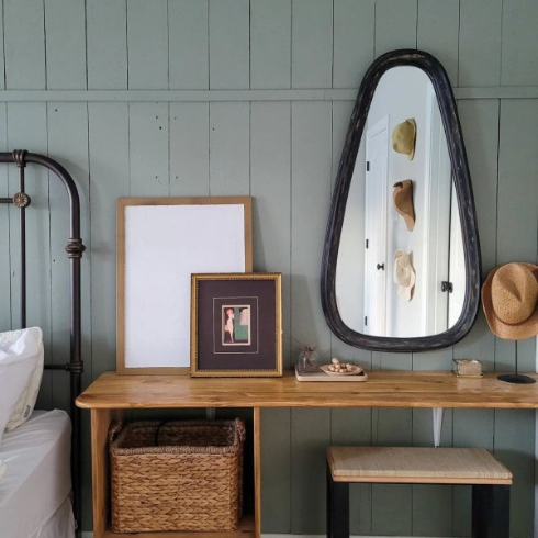
Same-ish Colour, New-ish Vibes
Both in is green-based colour and its weather-based name — Evergreen Fog — Sherwin Williams’ 2022 colour of the year seems to echo Benjamin Moore’s pick. But the vibes with this one are a little different, with a little more mood and warmth. This is perfect for more rustic settings, like the cottage-esque bedroom seen here.
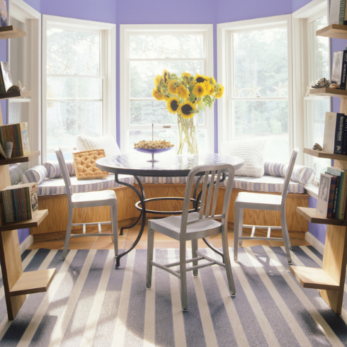
Periwinkle Pretty
Pantone is deviating from the norm with their 2022 colour of the year: A stunning bluish-purple paint called Very Peri. We love how this unique paint choice imbues this dining nook with cheery femininity. Sunny rooms such as this one are perfect for this sumptuous colour.
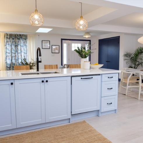
Barely-There Blue
If the prospect of repainting all of your cabinets feels overwhelming, consider cutting your work in half and just sticking with the lower set. A light, barely-there shade of blue is right on trend. Notice how fresh and airy this room looks? Take cues from the decor and pair your baby blue with white paint, wood accents and ample indoor greenery.
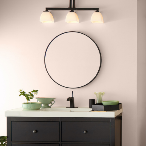
New Neutrals
Bored of white but want to stick to clean, calming neutrals? Consider BEHR’s beautiful blush pink shade, romantically titled Seaside Villa. Reminiscent of pink sandstone, this is the perfect colour for a door or accent wall in an otherwise all-white room.
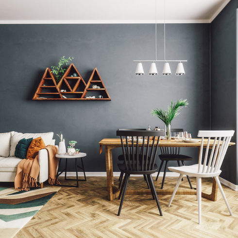
Grey Expectations
This year, greys are going dark… really dark. This nearly-black shade of grey creates a cozy, Scandinavian-inspired space. Bring on the hygge!
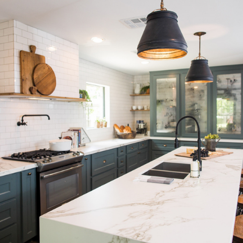
Prince of Cyan
One of the most popular kitchen paint trends this year? No more white cabinets! This rich cyan colour creates contrast with the white quartz countertop, letting its grey and gold veins shine.
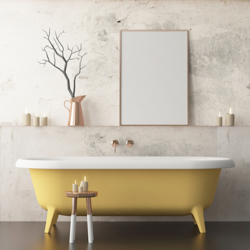
Buttercup Yellow
A standing tub is a statement in itself, but you can up the ante with a coat of paint. We love the notion of bringing cheer to bathtub with the happiest colour on earth: Yellow. This creamy butter-yellow colour in particular is the toast of the town, especially when paired with the warm whites, greys and copper featured in this stunning bathroom.
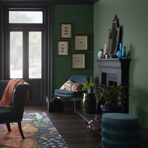
Hunting Lodge
We’re harkening back to 2021 with more greens — this time, a moodier shade: BEHR’s Royal Orchard. For borderline-gothic coziness, pair with black, as seen here with the fireplace painted a deep slate from Behr called Broadway. To keep things fresh, opt instead to pair with white.
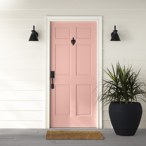
At First Blush
We’re crushing on all the blushes from Behr. First, the stunning Seaside Villa, and now, this youthful, bright shade of light pink: BEHR Bubble Shell. Painting your front door this happy shade isn’t just trendy and easy, we promises it’ll put a smile on your face every time you come home.
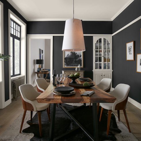
Back in Black
Once thought of as an oppressive shade, black is now highlighted by white trim and warm accessories to complete its cozy-room effect. The warm black used here is BEHR’s Broadway. We also love how the white used for the trim (BEHR’s Smoky White) is also used to paint the bar hutch, for continuity. You just can’t go wrong with black and white!
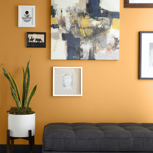
Spice it Up
When looking for the perfect feature-wall colour, head to the spice rack for inspiration. We love this soul-warming, spicy yellow from BEHR, aptly titled Saffron Strands.
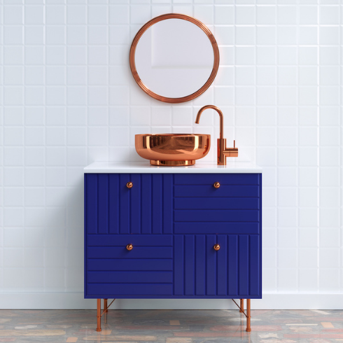
Unbolt Cobalt
A DIY paint project doesn’t have to be a massive undertaking. Start small and bold. This cobalt-blue vanity is the perfect example of taking a popular paint colour and integrating it as a statement in your interior design.
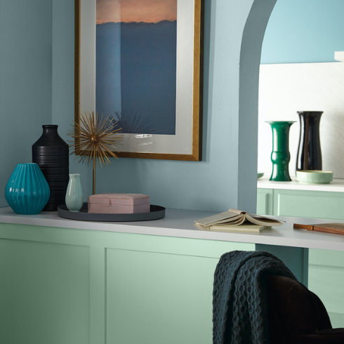
Mint Madness
We’re gaga for the green magic seen in this sleek, retro-ish home office. BEHR’s Wishful Green, used here, is a creamy mint colour that breathes new life into any tired interior and challenges old rules on “appropriate” indoor paint colours. Keep it feeling fresh by pairing with colours in the same family, as seen here.
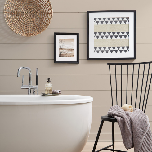
Marzipan Makeover
BEHR’s Almond Whisp is the sweetest neutral in this creamy, dreamy bathroom reminiscent of marzipan.
This shade of brownish-beige pairs perfectly with soothing cream tones. Try this winning combo in your own bathroom, or even extend the calm vibes to your bedroom, living room or baby nursery.
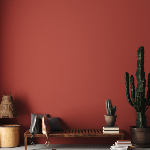
Not That Rusty
Finding inspiration from the U.S. Southwest, this impressive, deep red-rust colour adds depth and warmth. While it may be too deep and bright for conventional bedrooms or bathrooms, its the perfect bold entryway colour. If you’re feeling brave, splash it onto your kitchen or dining room walls — red increases appetite!
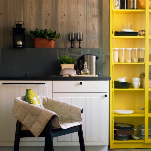
Canary in the Coalmine
This intense canary yellow is the coolest small-budget kitchen update ever! We love how it adds modernity to the otherwise-classic kitchen cabinetry and fixtures. An old cabinet is the perfect subject for this paint-based makeover. Pick a cheerful colour that makes you happy and don’t be afraid to go bold. Sometimes a small splash of a single colour in a small area is all you need.
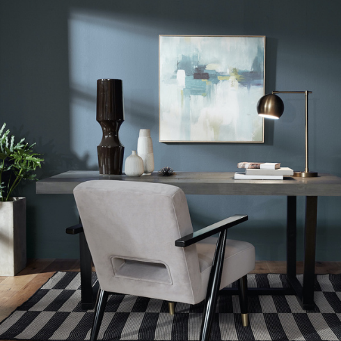
Feeling the Blues
Associate with building trust and increasing calmness, blue is one of the best colours you can use in a home office, as seen here. This particularly blue, BEHR’s Jean Jacket, somehow manages to be soberly dark yet calmingly light at the same time.
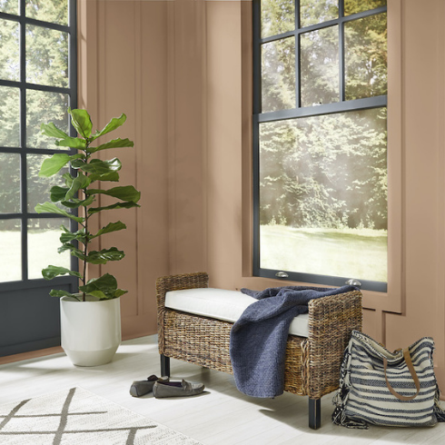
High Sierras
The entryway is the first place we see when coming home, and painting it a warm, light neutral can help put us instantly at ease. If you have great natural light in your entryway, such as pictured here, pick a colour that doesn’t distract from the view. Look for natural neutrals like BEHR’s Sierra.
HGTV your inbox.
By clicking "SIGN UP” you agree to receive emails from HGTV and accept Corus' Terms of Use and Corus' Privacy Policy.


