It’s easy to be drawn to a home with an affordable price tag, but live with a shaky foundation and an awkward floor plan for long enough, and suddenly it doesn’t feel like such a bargain. That’s exactly what one couple, Elana and Brian, were dealing with on the latest episode of Love it or List it Vancouver. Needless to say, the homeowners were ready to consider the alternatives: buy new or refurbish the old? Enter Jillian Harris and her equally talented team, who transformed the home’s entire main floor into an entertainer’s dream in hopes of convincing the owners to stay. Here’s an inside look.
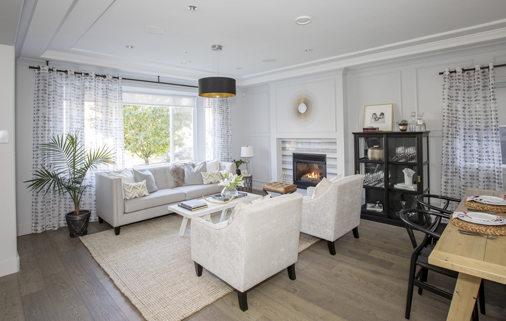
Living Large
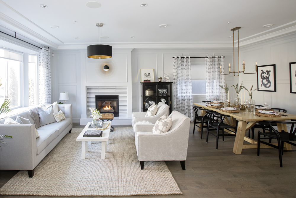
Walk through the front door and you’ll be greeted by this eye-catching setup. The open-concept layout features a gorgeous sitting area that’s punctuated by expansive windows and a modern fireplace with a beautiful striped surround.
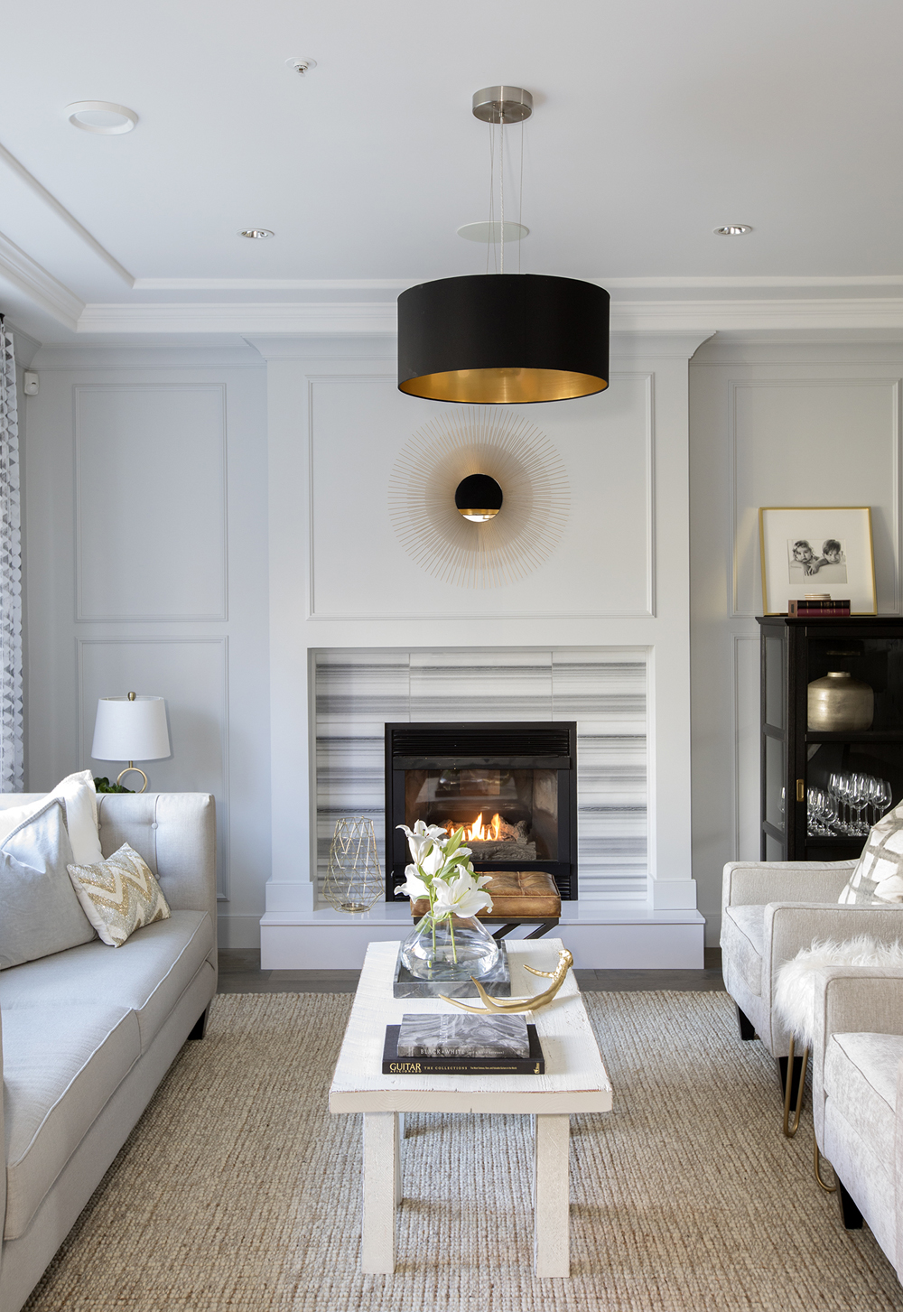
Contemporary Glow
Designer Jillian Harris chose a simple and contemporary design for the main living space, opting for a soft palette of creams, greys and whites. While we love the worn-wood coffee table and textured rug, the real show-stopper is hands down the modern fireplace with its pretty tiled finish.
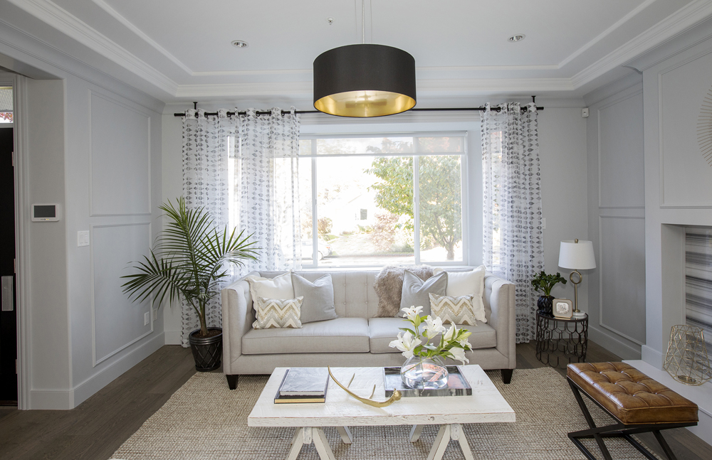
Thoughtful Extras
To add architectural interest to the neutral living area, Jillian had wall mouldings installed. The patterned curtains and dark-hued accents (like the planter and drum pendant light) lend subtle contrast to help anchor the look.
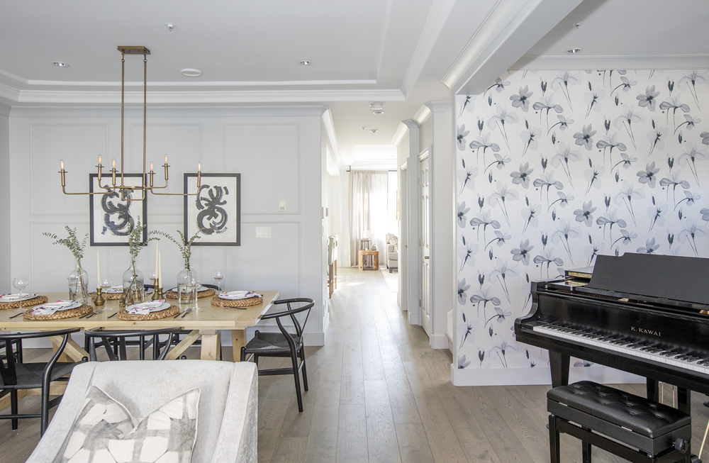
Grand Entrance
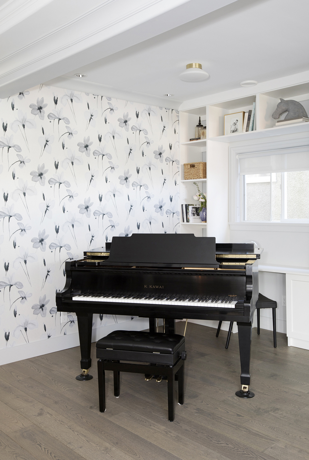
In the original home, there wasn’t much of an entrance to boast about. But when Jillian had the office removed, she created enough additional space to squeeze in a dining area and a grand piano.
Musical Nook
We love everything about this configuration, from the decorative floral wallpaper to the built-in study space. There’s tons of storage potential too, which is always music to our ears!
Entertainer’s Dream
There’s such a great connection between the living and dining spaces, which makes entertaining a breeze. Now, the homeowners can go straight from happy hour to dinner, or have a cozy spot to relax in after a great meal.
Aspirational Dining
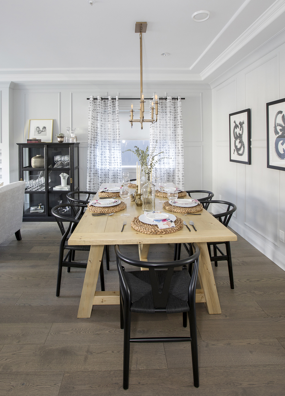
The picnic-style table may be casual, but when paired with beautiful black wishbone chairs, the overall look takes on a more sophisticated feel. Add in chic brass and black elements, and you get a stylish space where great conversation and even better meals are practically a given.
Artful Additions
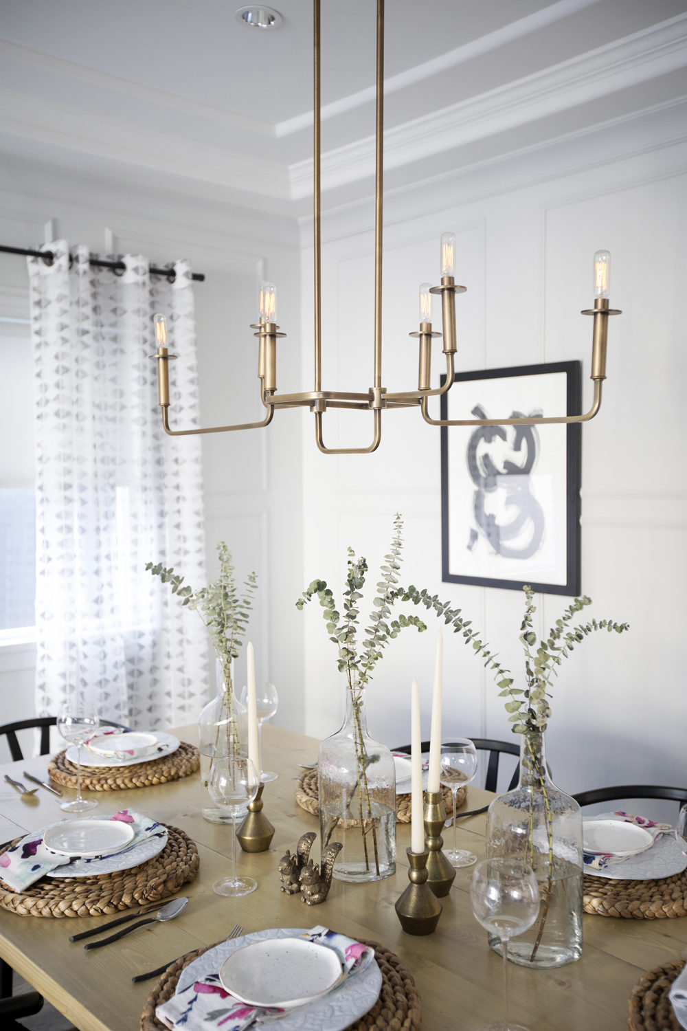
The modern brass chandelier doubles as an art piece. It ties in nicely with some of Jillian’s staging below, from the sculptured candle holders to the playful squirrel objects.
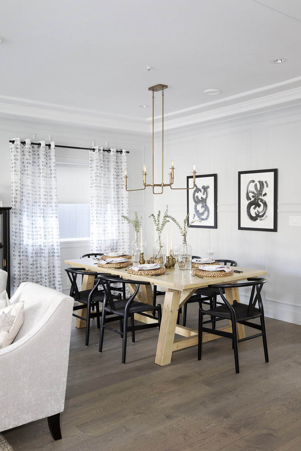
The Polished Look
The wall adorned with graphic black-and-white art pieces originally featured an awkward doorway. Talk about a transformation!
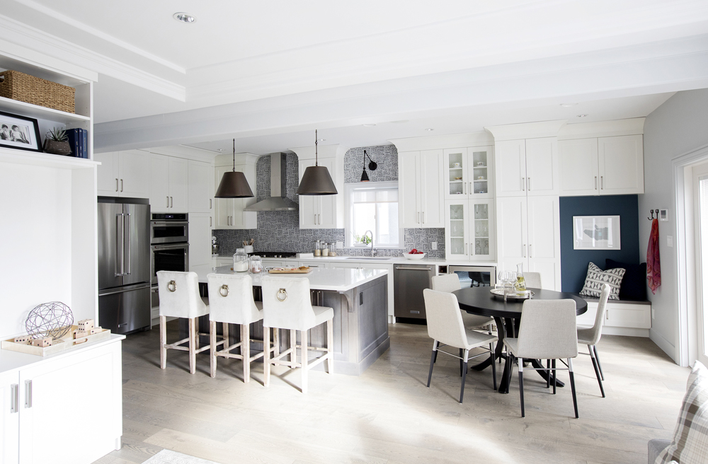
Heart of the Home
The back half of the home was also transformed into a functional open-concept space. It features a kitchen complete with an eat-in area, a mini mud room and a second living area.
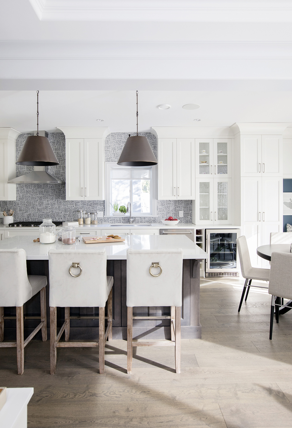
Modern Kitchen
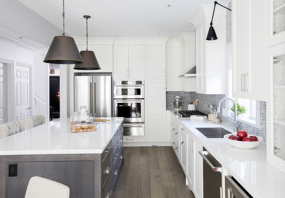
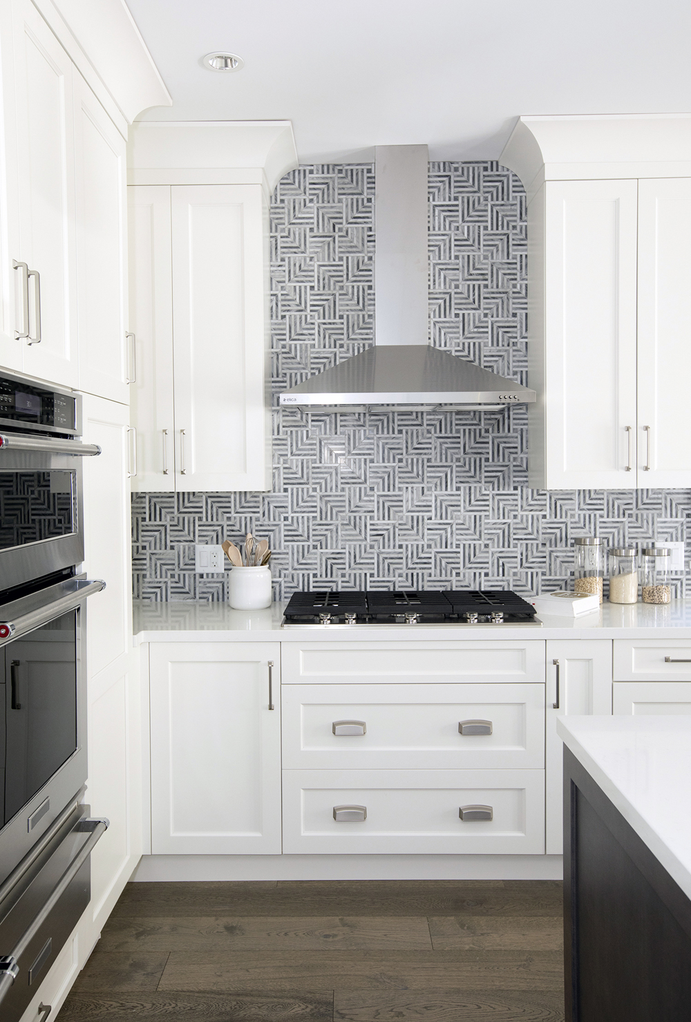
Now this is a contemporary kitchen to write home about – from the hypnotizing backsplash to the soft brown hardwood flooring to the gleaming white island.
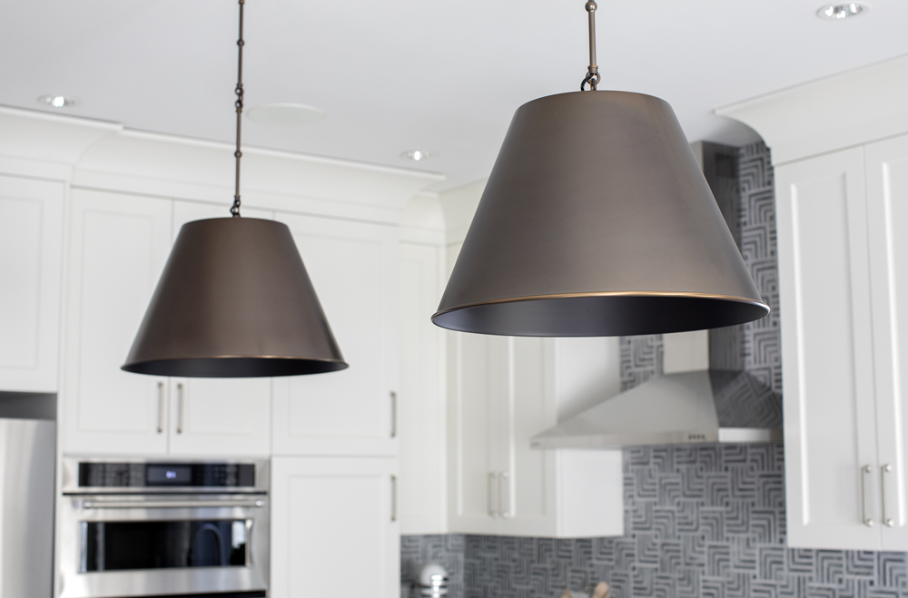
Light Fixtures
We love these cone-shaped pendant lights that hang above the island. Although they’re a traditional shape, the dark hue ties in with the hardwood flooring to anchor the look and tone down all the white.
Storage Solutions
There’s plenty of storage to see here, from the upper and lower cabinets to the drawers integrated into the kitchen island.
Psychedelic Backsplash
On its own, the backsplash runs the risk of feeling too retro or bold. But in a predominately white space, it adds just the right amount of colour and pizzazz to kick this kitchen up a notch.
Bright and Airy
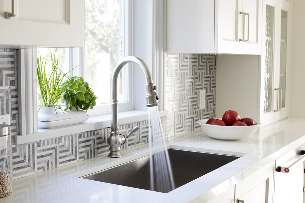
There’s plenty of natural light streaming in from the windows, which is amplified further thanks to the kitchen’s bright white palette.
Bonus Lighting
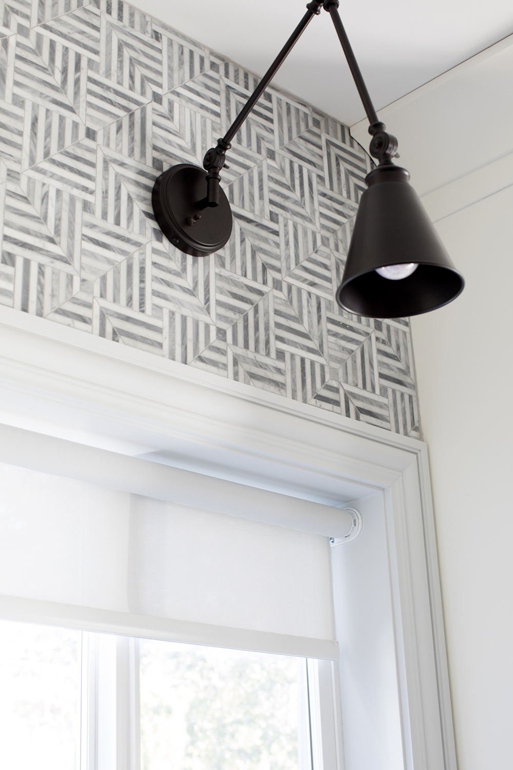
There’s no shortage of lighting in the kitchen, from the natural sunlight to the pendants above the kitchen island to this sleek spotlight that hangs above the sink (ideal for doing dishes after dark).
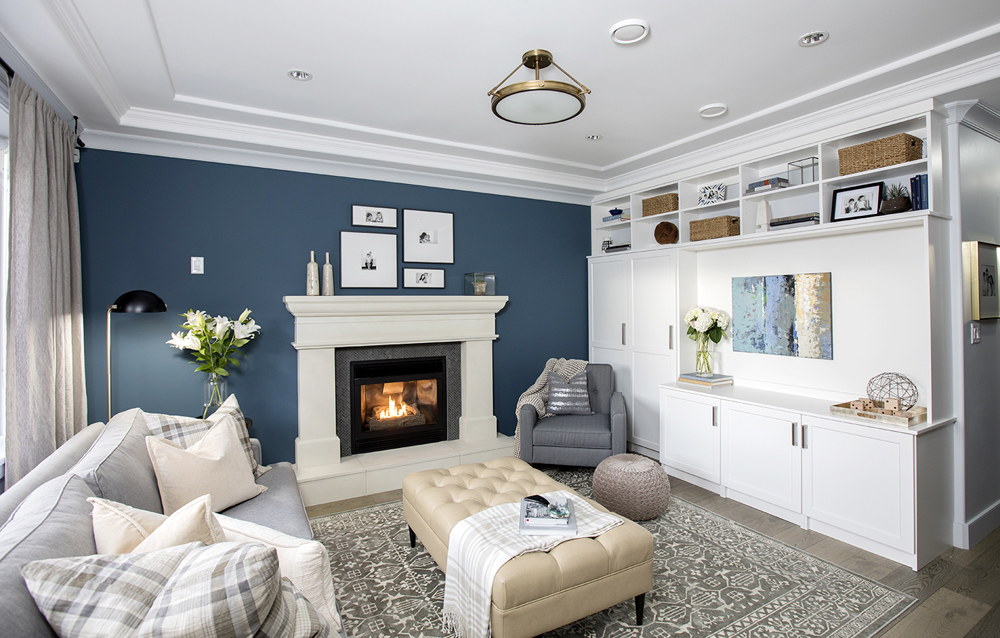
Family Gatherings
The second sitting area makes a bolder statement than the front living space thanks to the brilliant blue feature wall. A built-in storage wall keeps everything streamlined and tidy, while the soft patterns and plush furniture placed throughout encourage cozy evenings spent by the roaring fireplace.
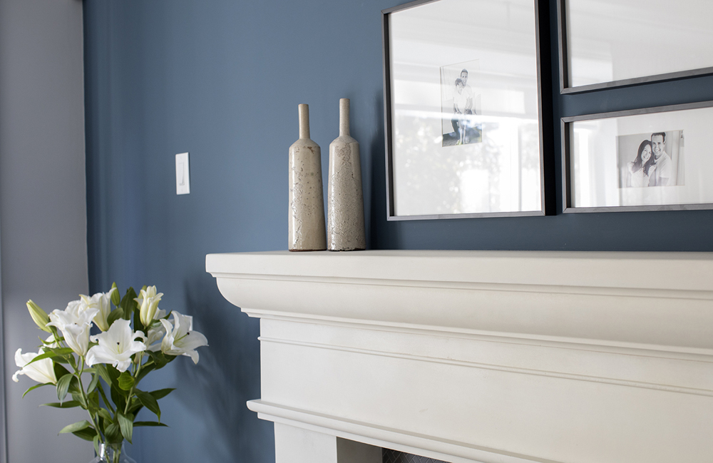
Traditional Mantel
The traditional fireplace mantel lends a grand presence. We especially love the collection of black-and-white family photos above, which offer a subtle personal touch.
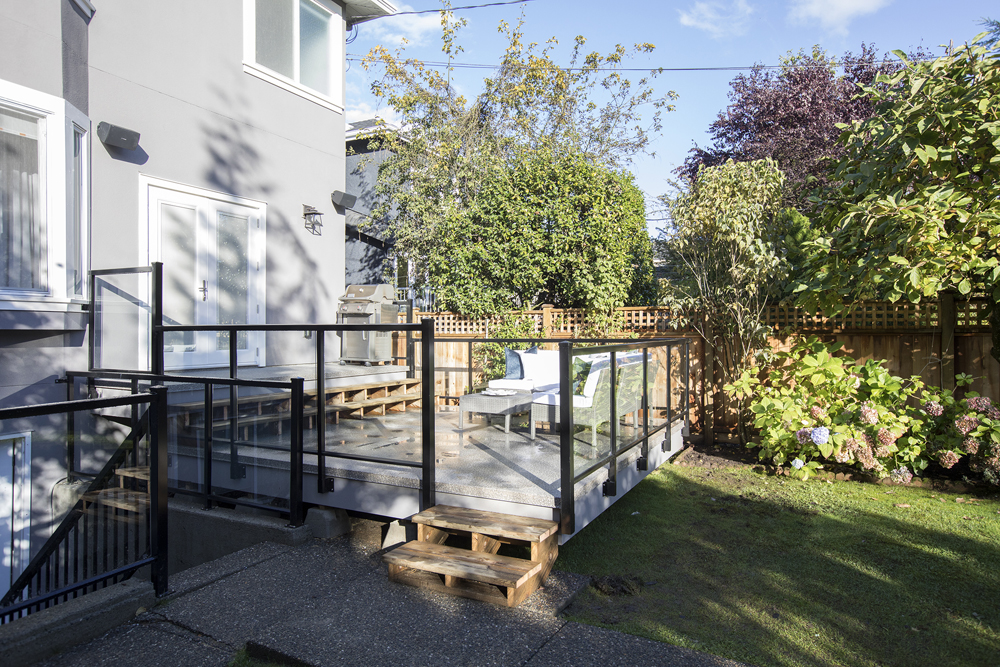
Better Deck
City bylaws may have prevented Jillian from extending the preexisting deck, but she found a clever workaround with a drop deck instead. The pretty glass railing panels add a contemporary vibe, making the area feel like a natural extension of the outdoors.
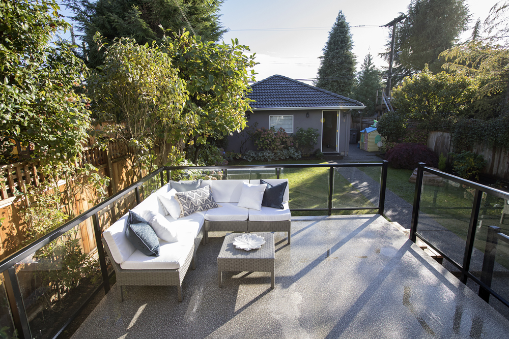
Happy Outcome
The spacious deck definitely helped Jillian check off more boxes on the homeowners’ long list of wants, but in the end, it was realtor Todd Talbot who won out when he found this couple a home they just couldn’t turn down. And after the redesign Jillian gave to this space, we have no doubt there are plenty of buyers already lining up in hopes of soon calling it their own.
HGTV your inbox.
By clicking "SIGN UP” you agree to receive emails from HGTV and accept Corus' Terms of Use and Corus' Privacy Policy.


