Soon-to-be married couple Jamie and Marcus knew that they couldn’t kickstart married life with a kitchen as drab, tired and dysfunctional as the one they currently had. But with a super tight budget, plenty to save for and renovation quotes well beyond their means, this couple knew they had to call in help. Contractor Sebastian Clovis and designer Sabrina Smelko were more than happy to oblige. Here’s how they transformed the space into a colourful, happy kitchen that both homeowners loved, at thousands of dollars below their original kitchen reno quotes.
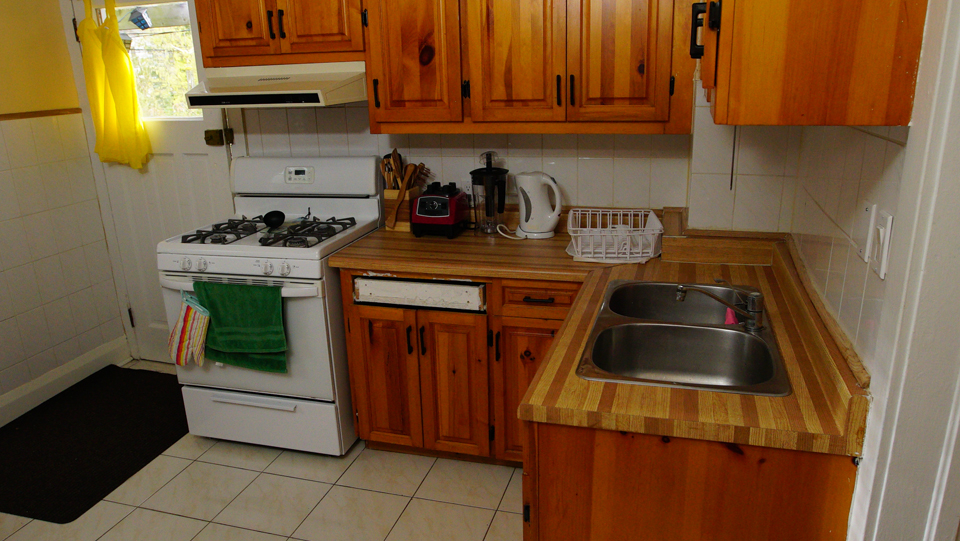
Before: Knock on Wood
There was absolutely no colour in this drab space, and with tired wood cabinets Jamie and Marcus both felt embarrassed by their kitchen. Enter Sabrina and Sebastian, who were ready to give this room an epic overhaul at thousands of dollars less that what the homeowners were originally being quoted.
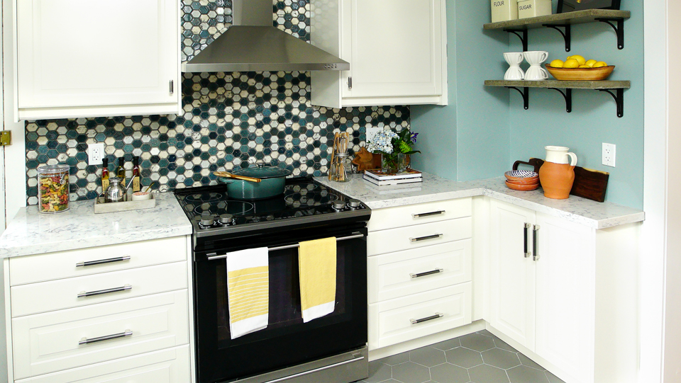
After: A Melding of Personalities
While Jamie loved colour, Marcus was more of a monochromatic traditionalist. So Sabrina selected this colourful backsplash and paired it with inexpensive, neutral prefab cabinets, giving each party a bit of what they really wanted. Now that’s what we call compromise.
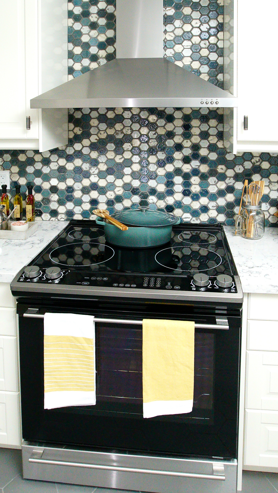
After: Modern Appliances
Sabrina was quick to point out that sometimes less expensive appliances have a lot of the same features as newer, high-end models with heftier price tags. And since the homeowners were able to sell their own appliances before the reno started, the overall cost was lowered even further.
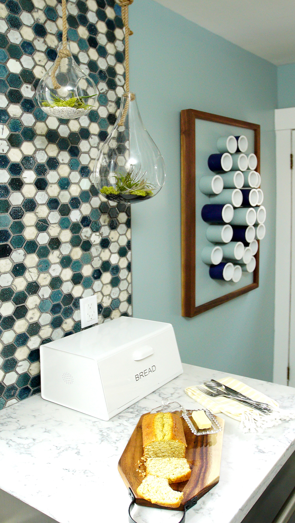
After: DIY Decor
This couple needed some sort of space to put their random items like keys and cell phones when they came in through the back entrance. Enter this DIY tubing, which doubles as storage and art.
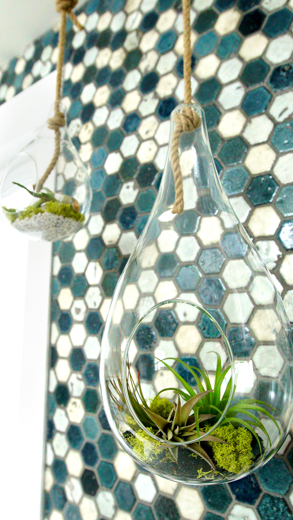
After: Simple Decor
Why spend hundreds on pieces of art when you can make your own installations for a lot less? A couple of inexpensive vases are hung and transformed with a small DIY garden, giving this kitchen an extra pop of design and colour.
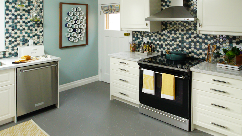
After: New Floors
Sabrina and Sebastian are obviously fans of engineered hardwood, but in this case they went with an even less expensive tiling for the floors. The hexagonal pattern tied in nicely with the backsplash above, while also helping to define the kitchen as its own space.
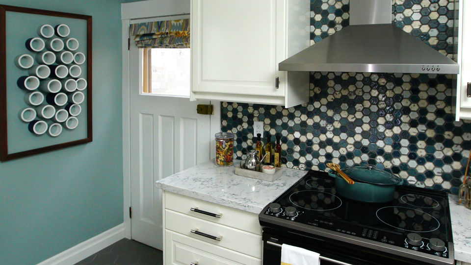
After: A Better Entrance
Before the back door would open right onto the stove, knocking hot things all over the place. Afterwards thanks to a little reconfiguration the same space is made entirely more functional. Who knew moving the stove would have that much of an impact? Plus, these guys get bonus points for adding even more prep and storage space.
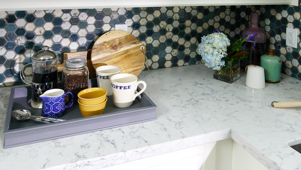
After: New Counters
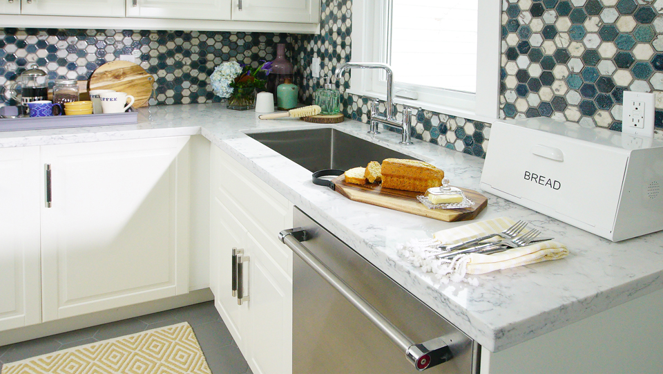
Sabrina and Sebastian saved these homeowners lots of dough by selecting quartz countertops rather than a more expensive material. The veining in the finish still gives it a rich look, and it ties in nicely with the blue backsplash above for a purposeful, pretty look.
After: New Windows
When Sebastian decided to move the sink underneath the window that meant taking out the larger, preexisting window in order for it to all fit. Luckily Sabrina and Marcus were able to save lots of money on a secondhand window that they sourced from a storage locker instead, adding to their overall savings.
After: Staging Techniques
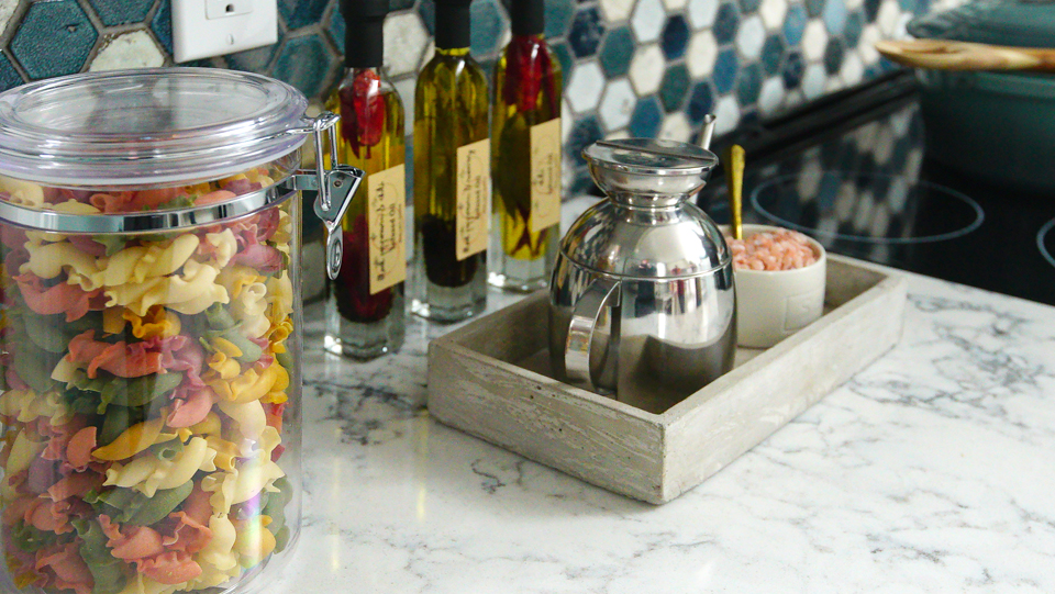
An easy way to make a kitchen feel like it has even more high-end finishes is by staging it with simple accessories. Fun bottles of oil, a small crate to hold knickknacks or inexpensive pantry jars are all great ways to add a homely, lived-in touch. With extra touches like these, Jamie and Marcus are well on their way to newlywed bliss. And now, thanks to Sabrina and Sebastian’s help, they have a little more money in the bank to spend on their wedding, and not their reno.
HGTV your inbox.
By clicking "SIGN UP” you agree to receive emails from HGTV and accept Corus' Terms of Use and Corus' Privacy Policy.


