Cooking with gas is a breeze. Finding a snazzy range hood to do so? Not so much. That’s why we’ve rounded up some inspirational styles to steal. Whether with a blast of colour, a textural treatment or a play on scale, these beauties circulate beyond their dutiful role and provide a menu of interesting options.
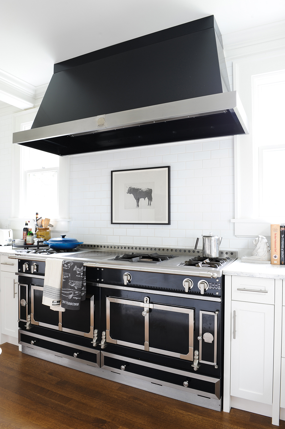
In Black and White
A swoon-worthy La Cornue range needs a hood that can keep up with it, and this black and stainless-steel style fits the bill. The dramatic black delineates the cooking area in the mostly white kitchen and its industrial quality gives it a high-performance look that is welcoming and reassuring. Tour the entire home here.
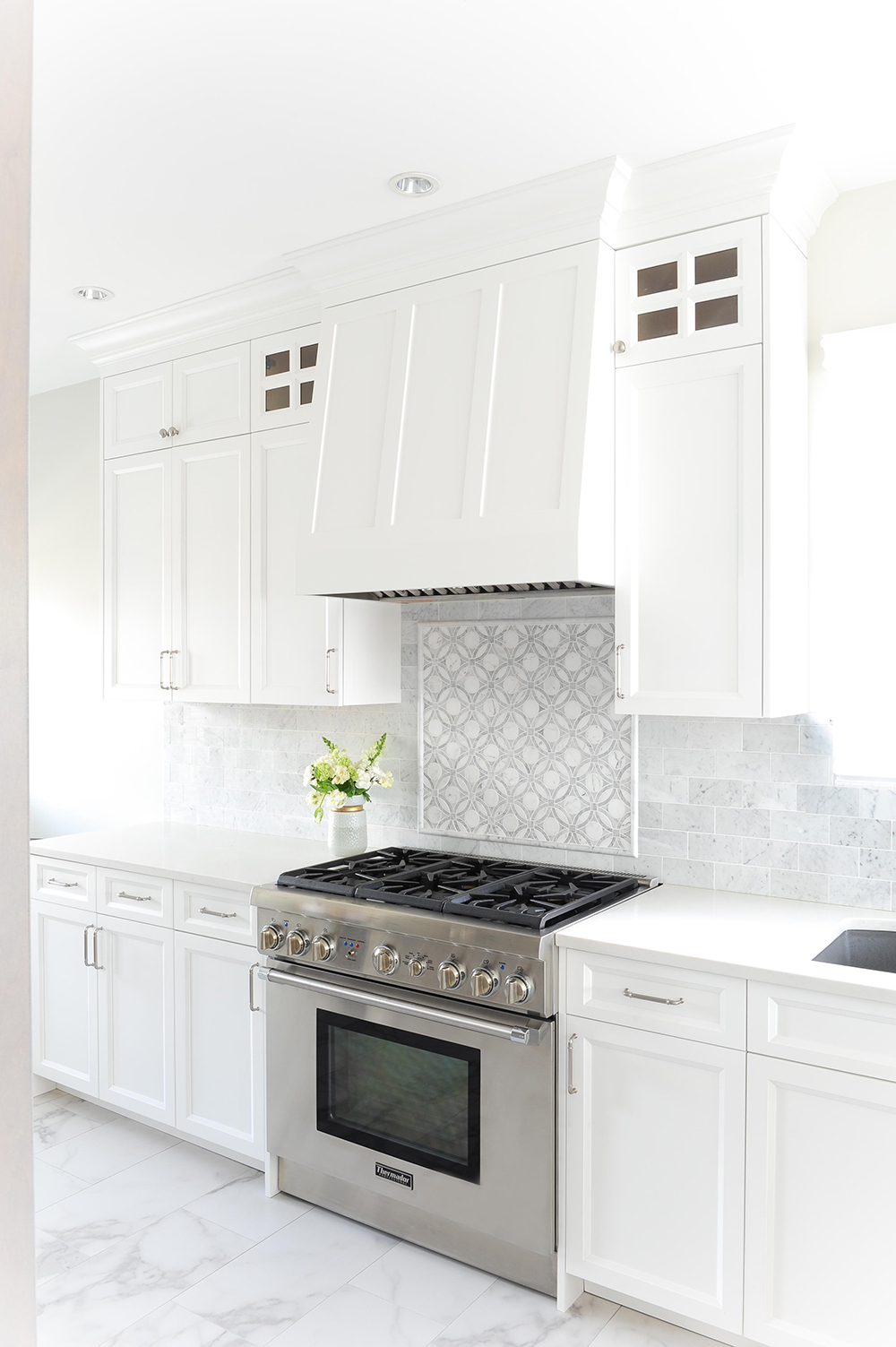
Shake(r) and Bake
Range hoods don’t have to be a focal point, and if you’re seeking a less conspicuous treatment, let this one be your guide. Kitted with the same Shaker-style facade as the cabinets, it has seamless appeal (and works with any style of cabinetry). See here for the full tour.
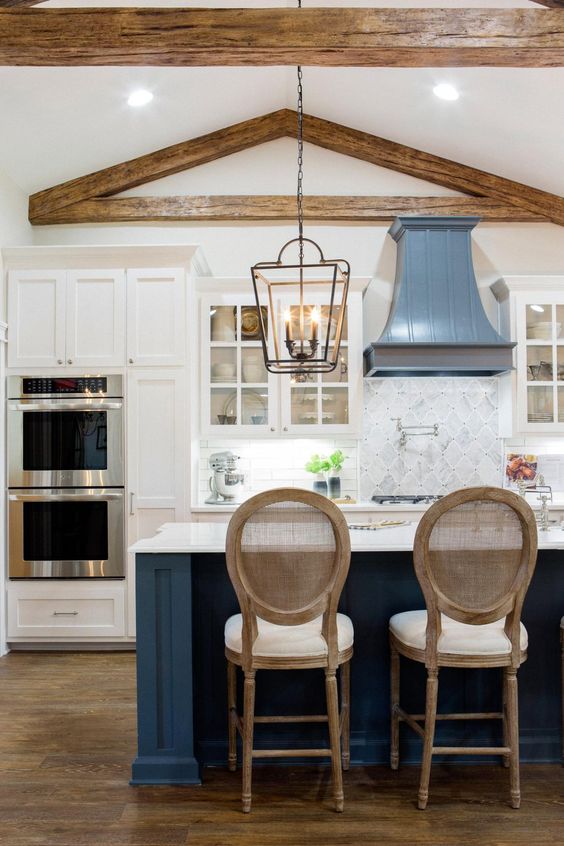
Blue Note
Use the range to introduce colour into your kitchen. This one, designed by Fixer Upper‘s Joanna Gaines, is presented in a beautiful shade of cerulean, so it’s on trend now, yet still has a timeless, classic feel. The bold blue of the island’s base is a nice nod to the hue without being matchy. Both provide a cool counterpoint to the warm wood accents. See here for Joanna’s most memorable kitchen designs.
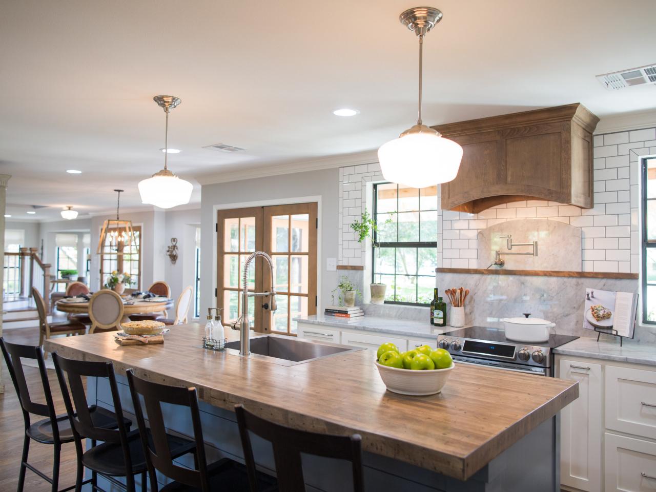
Curves Ahead
Joanna Gaines upends the notion that hoods need to have a straight edge. This hood’s curved treatment is an energetic foil to the straight lines of the subway tiles and the Shaker-style cabinetry. She smartly echoed this subtle treatment in the pasta tap’s marble backsplash.
Kitchen Couture
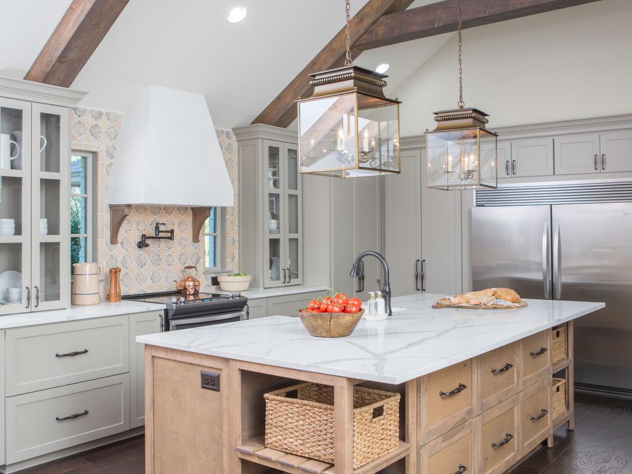
In this Joanna Gaines-designed kitchen, the hood has a bespoke look, as though it was specifically tailored for this spot. It’s a great silhouette and keeps the pretty tiled backsplash and dramatic pendant lights the stars of the show.
Colour Block
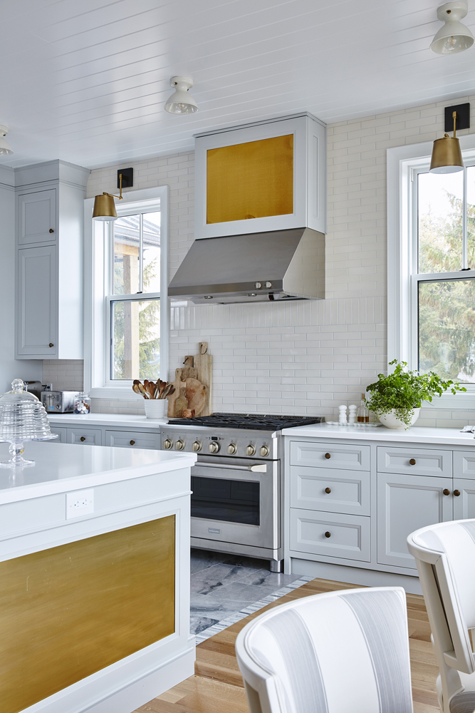
We all know how much Sarah Richardson loves colour, so it’s no surprise she incorporated it into the kitchen of her off-the-grid home. We love the insets on the hood and island and how they can be easily painted a new shade if desired. See here for the full home reveal.
Wood You?
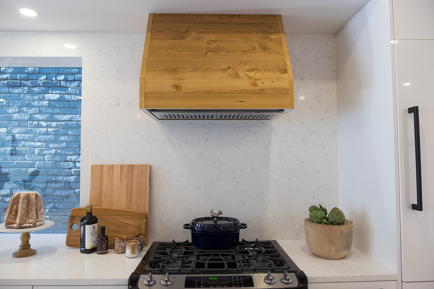
Leave it to the Property Brothers to think outside the box. While clad in unexpected wood, this hood is anything but rustic. In fact, it’s almost sophisticated when paired with luxurious marble-look walls and countertops. Drew and Scott got the balance just right, and we love the way they played it up with simple wooden accessories. Tour the rest of this outdoor-inspired space here.
White Now
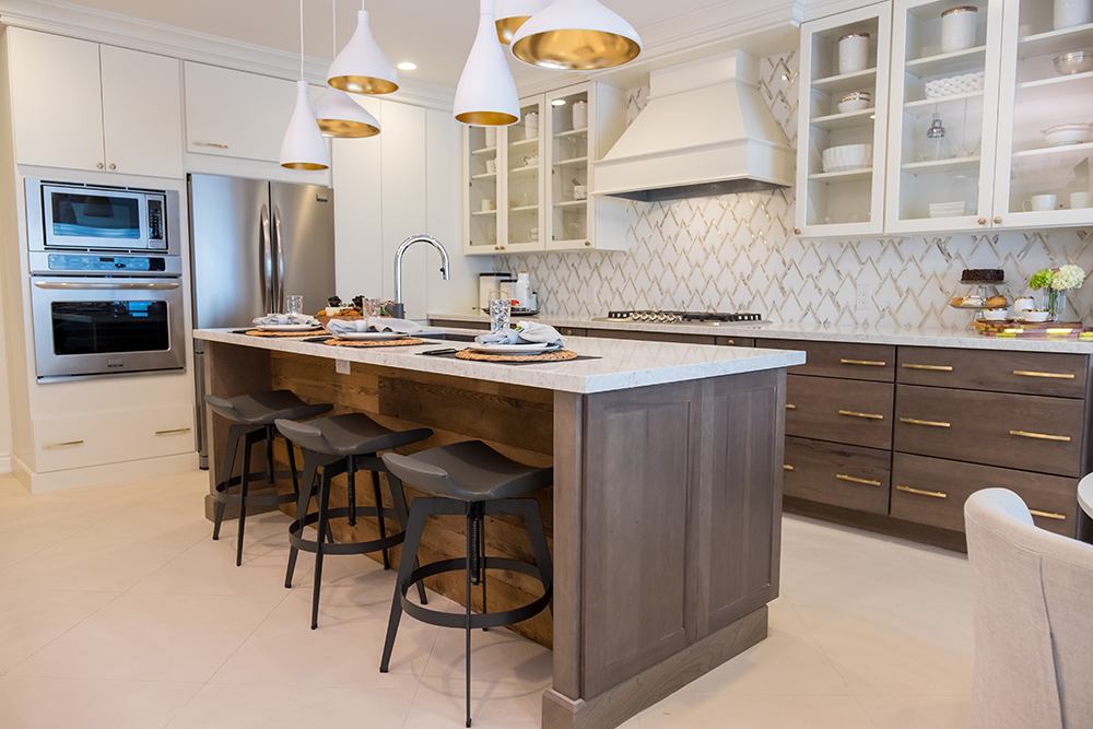
Moving from wood to all-white, the Property Brothers again incorporate the perfect finish. This white hood, with simple trim, works especially well with the white uppers and lets the space remain grounded by the dark lower cabinets and island’s base.
Nailed It
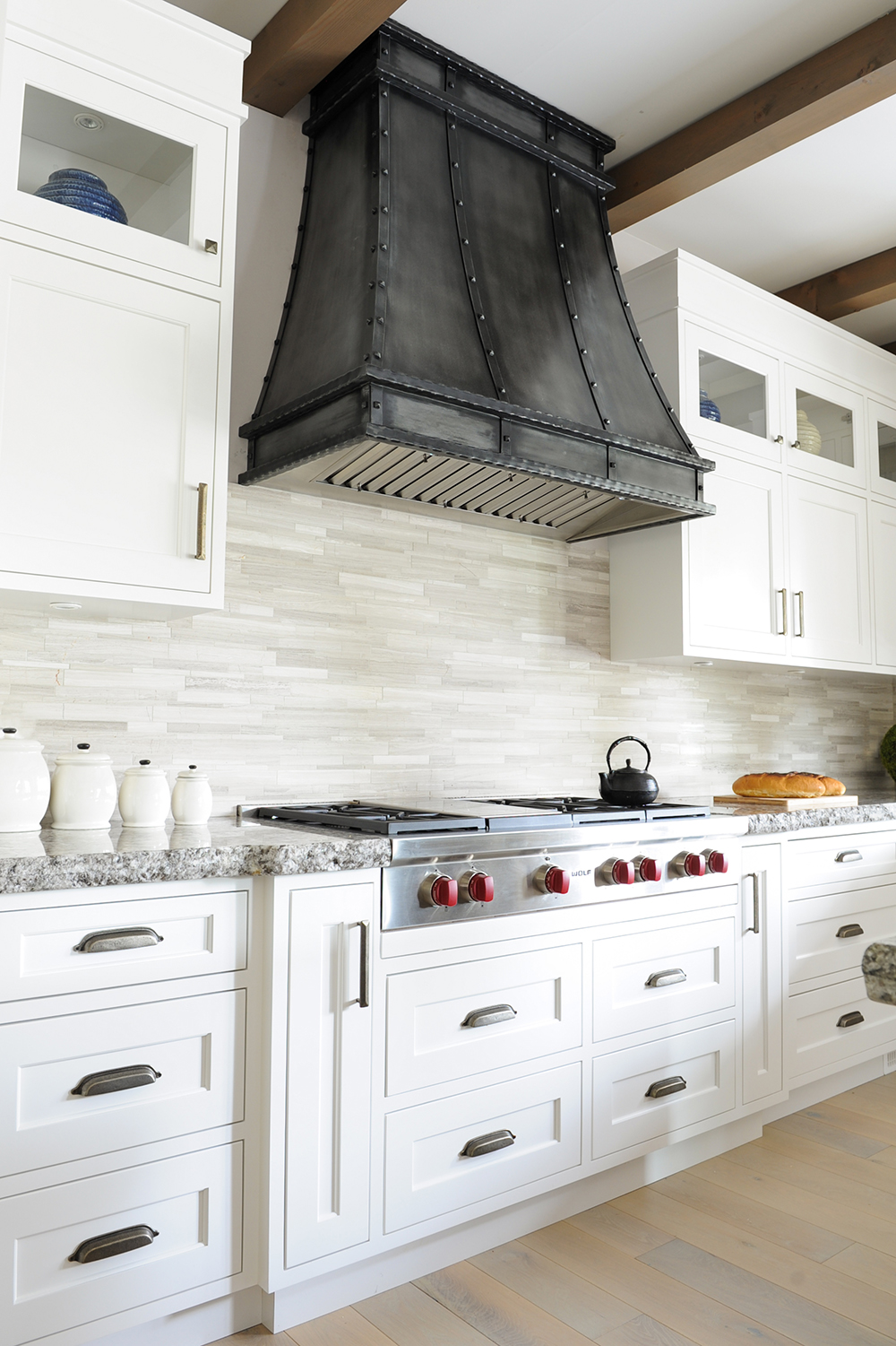
Nail-head details aren’t just for upholstered furniture. The finish of this dramatic burnished iron hood makes it a focal point. It shares the space nicely with other bold accents, like the Wolf range’s signature red knobs and the drawers’ pewter pulls. See here for the grand tour.
Under Over
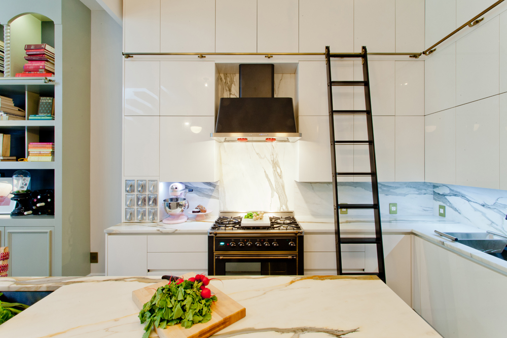
HGTV Canada star Genevieve Gorder takes her design expertise home with her. For her own kitchen (see it here!) she gave this over-the-range hood an undercover treatment by concealing most of the venting with cabinetry rather than leaving it exposed. The look is seamless and feels fresh and dramatic.
Panel Report
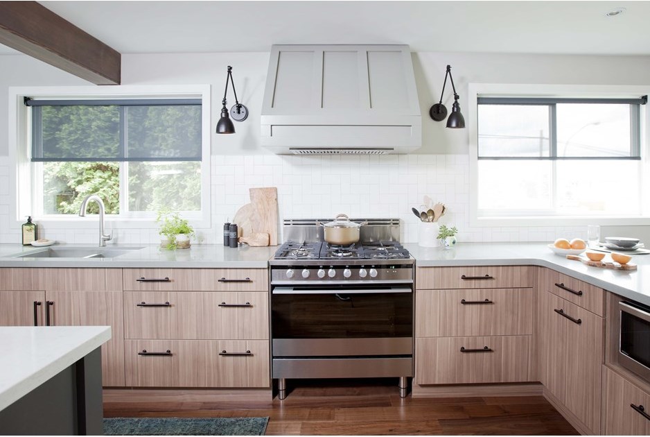
Jillian Harris of Love it or List it Vancouver knows that adding something as simple as panelling can elevate a hood from utilitarian to you-have-to-see-this. Her genius treatment continues in the hood’s pale grey paint; if it were white it would disappear into the wall, and if it were darker it would compete with the cabinets below.
Modular Magic
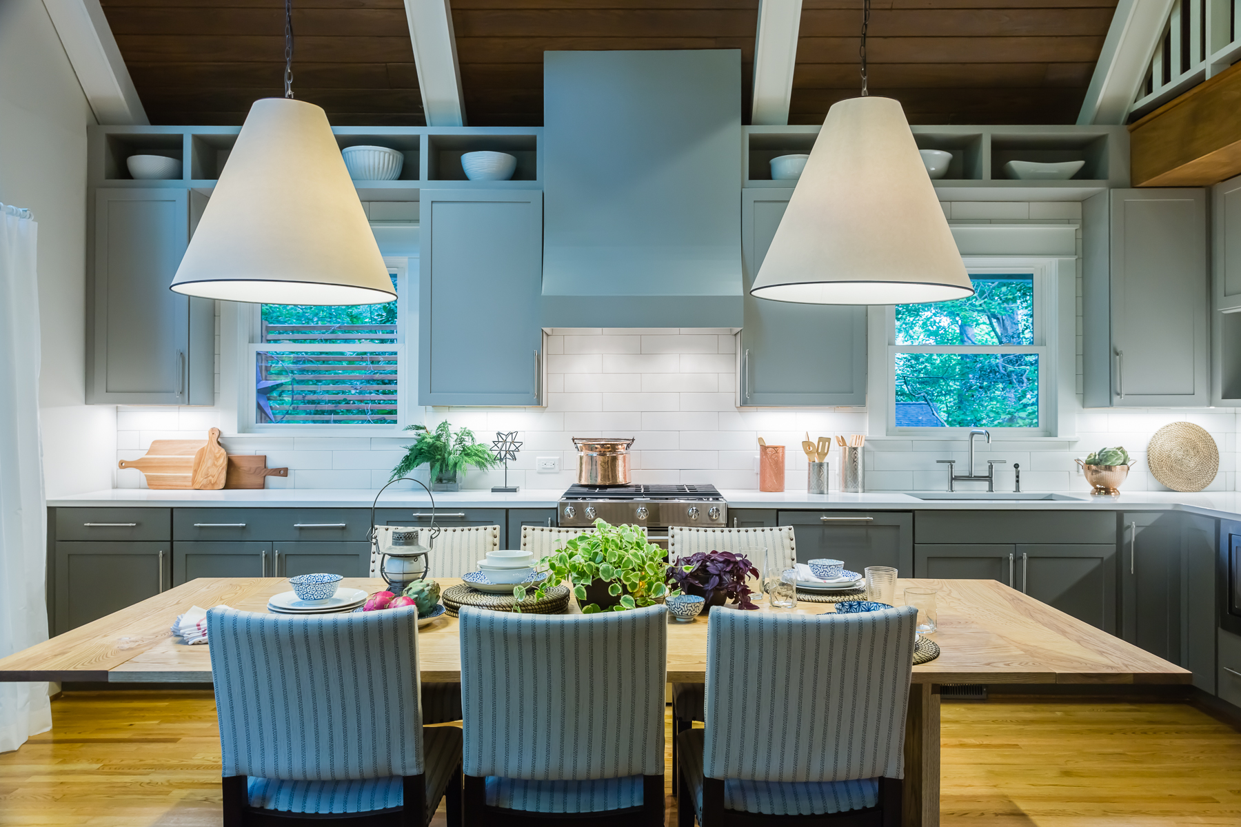
from Love it or List it gets cabinet creative. The streamlined hood looks like a piece of cabinetry and its modular effect has a modern edge that’s deftly tempered with a shade of blue you might find in a country kitchen.
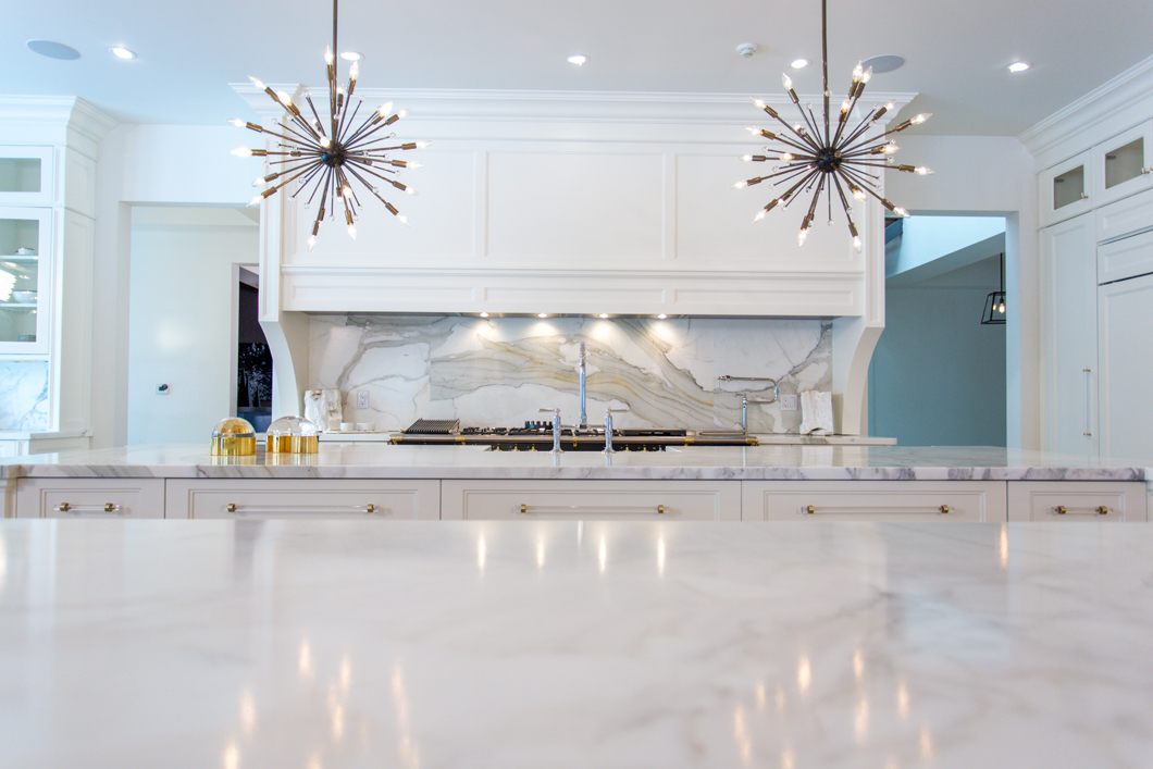
Lengthy Statement
It’s easy to covet Bryan and Sarah Baeumler’s kitchen for many reasons, not least the range hood. Its substantial elongated scale and beautifully finished, yet uncomplicated, profile define the cooking area without detracting from the sparkly pendant lights and heavily veined stone.
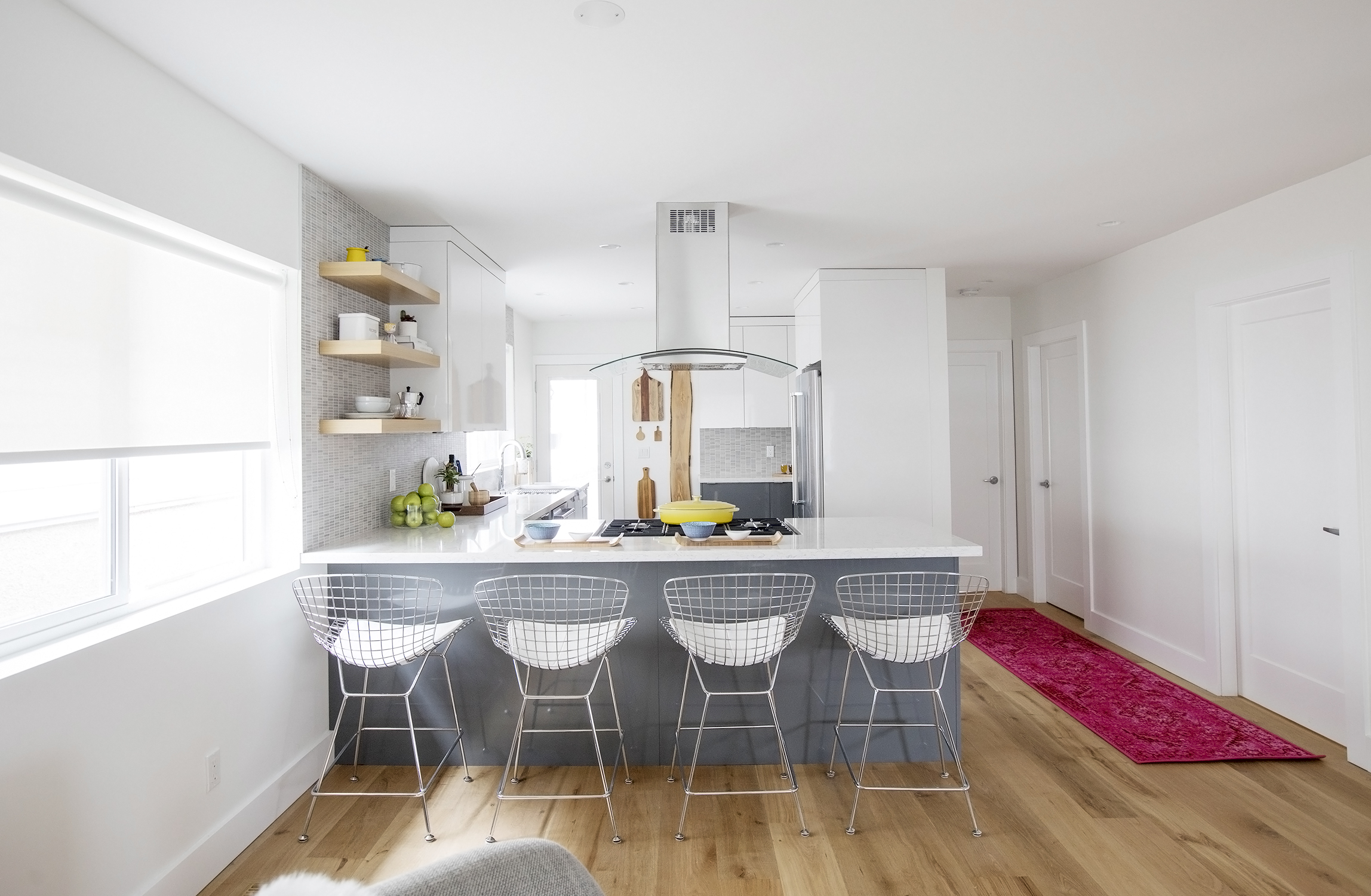
Centre Stage
What to do when the hood isn’t against a wall? Follow the lead of HGTV Canada’s Mickey and Sebastian of Worst to First. Here, they opted for a streamlined metal and glass style in keeping with the cool palette and casual layout of this apartment. See here for the full transformation.
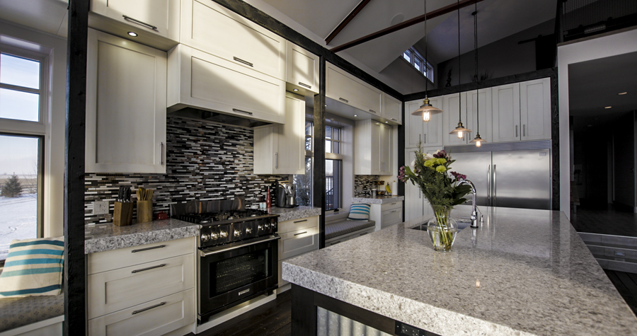
Some Front
This kitchen, part of a genius barn conversion in Calgary (tour the space here), has one of the most original hood treatments we’ve seen. We love how the hood blends in with the rest of the uppers, right down to the pulls.
HGTV your inbox.
By clicking "SIGN UP” you agree to receive emails from HGTV and accept Corus' Terms of Use and Corus' Privacy Policy.


