When Meisha and Brian bought their forever home, it was with the assumption that they’d occasionally work from home and have their parents move into the basement. But with mounting renos and a space that was anything but functional, they needed some professional help. Enter Kortney and Dave, along with the Making It Home team. Here’s how they gave this couple a jaw-dropping, two-floor renovation on a $153,000 budget.
Watch all of your favourite HGTV Canada shows through STACKTV with Amazon Prime Video Channels, or with the new Global TV app when you sign-in with your TV service provider details.
Originally published on February 13, 2020
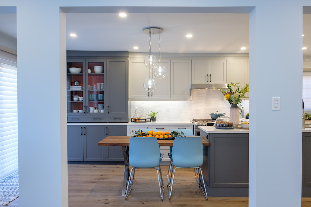
A Semi Open-Concept Plan
Meisha and Brian were hoping for an open-concept floorplan on the main floor, but taking out the support wall was going to be a costly venture. So rather than opening up the space completely and inserting an expensive ceiling beam, Dave and Kortney went for large pillars and expanded the doorways to give the illusion of an open concept. The result is an airy space with a tiny separation into the kitchen.
Related: 10 Downsides to Open-Concept Living You’ve Never Considered
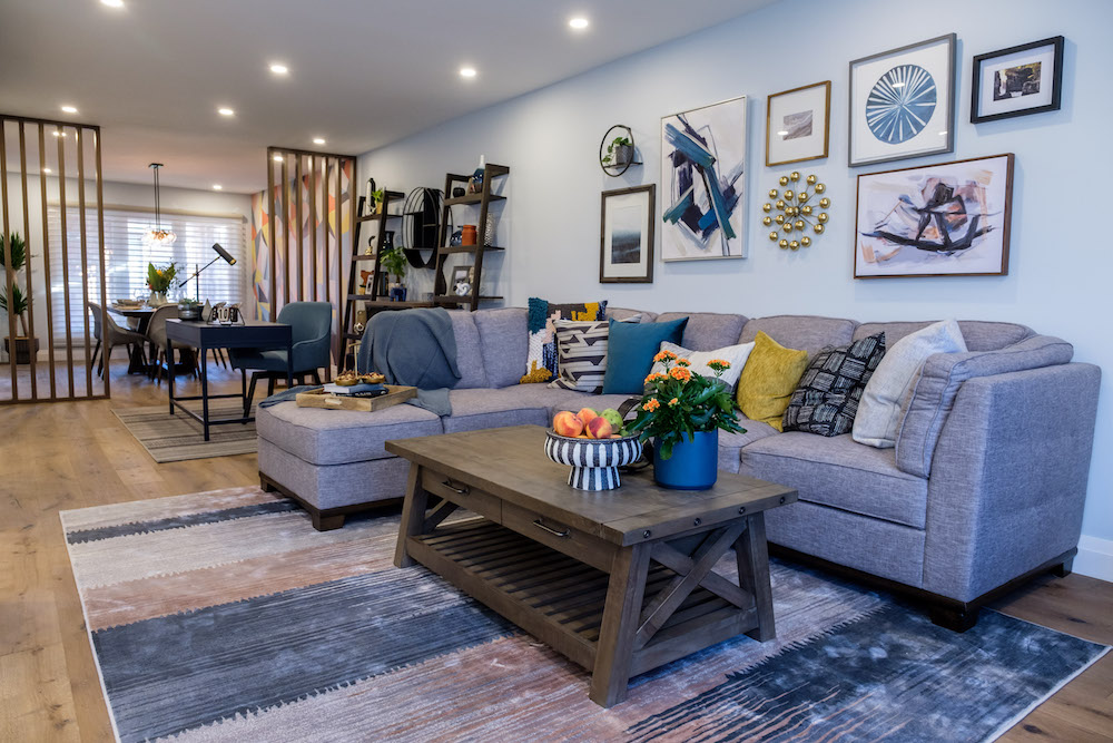
An Inexpensive Solution to a Long Space
With a long room that needed to be broken up into three sections-a dining room, living room and office – Kortney needed to find a way to delineate the space so that it didn’t appear cluttered or jumbled. Enter these inexpensive slat dividers, which add instant design and function. Because of the way they’re built the eyeline is still drawn straight through, but now there are clear spaces in which to identify the different sections.
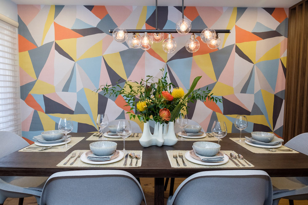
Balancing the Bold
Meisha and Brian revealed early on in the process that they preferred pops of colour to the more neutral greys favoured by some designers, so Kortney and Dave went for a bolder wallpaper pattern in the dining room. It’s an inexpensive way to add a ton of personality, and Kortney made sure to balance it out by picking more neutral tones for the kitchen across the way.
Related: 20 Bold Print Wallpaper Ideas That Will Transform Your Space
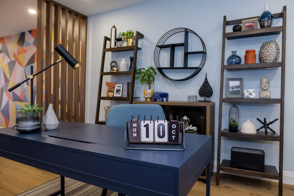
A Flexible Workspace
Built-in cabinets definitely add value to a home, but they’re also a cost to consider. So when crafting the office area, Kortney opted for some open shelves and a storage-filled desk that gives the homeowners a practical design. This way the desk can also be rearranged if Meisha or Brian prefer it against the wall or eventually want to switch up the look.
Incorporating Existing Furniture
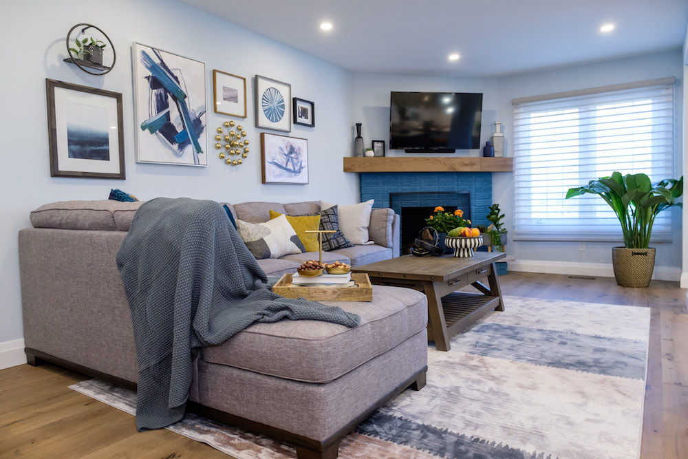
Working with what you have is always an important start when it comes to planning out any budget, and Meisha and Brian had just been gifted this brilliant sectional for their wedding. So, Kortney designed the room around the piece, mounting the TV over the existing fireplace and painting the bricks to give the space a more modern and vibrant feel.
Related: 12 Sectional Sofas That Will Transform Your Living Room
Unifying the Space
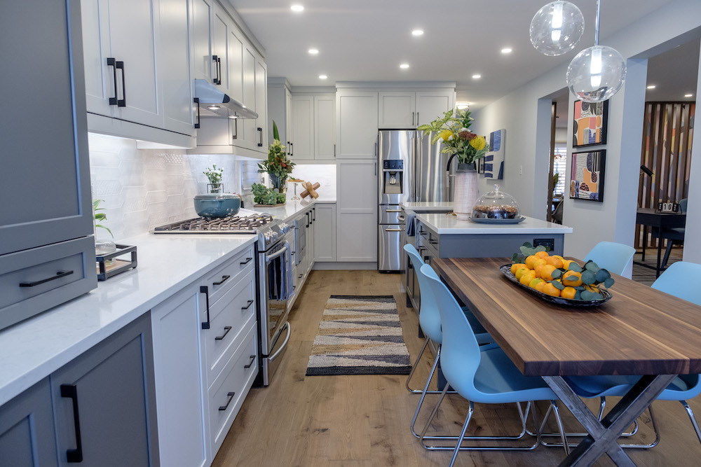
The engineered oak hardwood is a less expensive option than regular hardwood, but it still puts value back into the home should Meisha and Brian eventually decide to sell. Meanwhile the wide planks and neutral colour also help to unify and modernize the space throughout, giving it a bright and updated feel.
Dark and Dull Beginnings
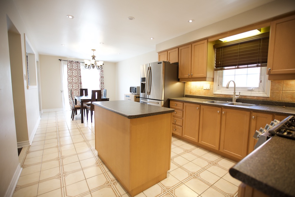
Before the reno, the main floor kitchen was dark and outdated, and had barely any storage space at all. Add in tired tiles and a lackluster eat-in area, and this space wasn’t doing anything to up the home’s overall value.
Where to Spend the Most
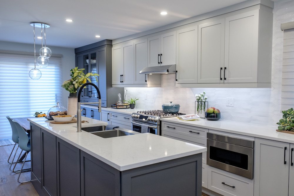
Afterwards, thanks to the new floors and extended cabinetry, this is a high-end kitchen that feels unified and adds a ton of value to the home. Dave and Kortney say that the kitchen is the best place to spend the biggest chuck of any budget, not only because it’s what potential buyers are interested in down the road, but because that’s where most people tend to congregate and hang out these days.
Related: Bryan Baeumler on Where to Splurge and Save in Your Kitchen
A Bright New In-Law Suite
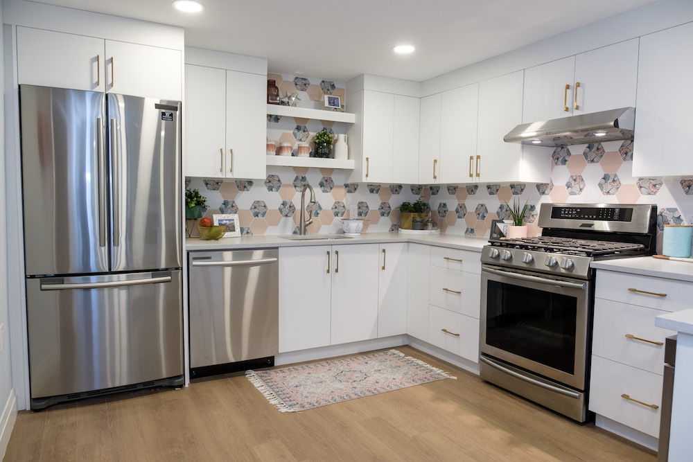
In the basement in-law suite, Kortney and Dave put just as much attention into making the kitchen a fabulous space, but with a budget in mind. They saved big by using the existing layout and recycling the newer appliances from the upstairs kitchen. They then added big (but inexpensive) personality by installing a unique backsplash.
A Mismatched Space
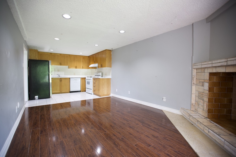
Before, the suite was clunky and uninviting. But, an inexpensive vinyl floor easily helped to remedy that situation, while a coat of lighter paint added instant brightness to the room.
Reworking What Was There
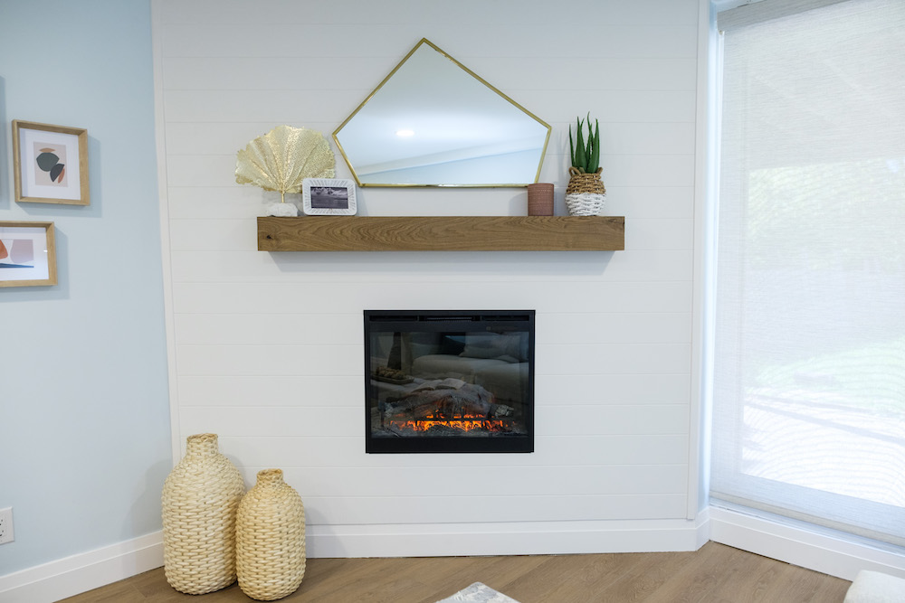
Meanwhile, Dave and Kortney saved big by working with the existing fireplace, taking down the stones and building it back up with inexpensive shiplap. The wide, horizontal slats make the space look even bigger, while the mantel was equally budget-friendly after being recycled from leftover flooring. Add in an electric fireplace, and the homeowners also now have a cost-effective way to heat up the room.
Related: 25 Gorgeous Fireplace Mantel Decorating Ideas That’ll Keep You Cozy
An Ensuite For Everyone
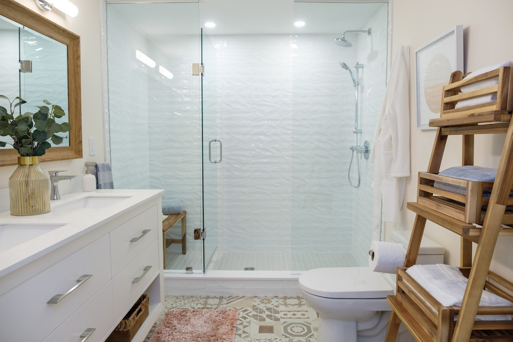
Last but not least is the basement bathroom, which will serve as the ensuite for Meisha and Brian’s parents. A lot of the budget for this remodel went into fixing shoddy workmanship behind the walls, but with some creative pieces (that double sink), a smart layout (no tubs here), and a touch of warm wood, this is a modern and comfortable space that makes basement living feel like a high-rise condo.
HGTV your inbox.
By clicking "SIGN UP” you agree to receive emails from HGTV and accept Corus' Terms of Use and Corus' Privacy Policy.


