Meghan and Matt had finally found their forever home in their dream neighbourhood. The only problem? It needed more than a few updates in order to truly feel like home. They had a vision, but with two young children and a baby on the way in a matter of days, they needed help. So they called the Make It Home team for a little assistance.
With a $160,000 budget and a checklist of items this couple needed in order to create a safe and functional space that truly felt like theirs, Kortney and Kenny had a tough task ahead of them. Of course in the end, they totally came through. See how they transformed this outdated, 1980s house into a light and airy home with plenty of room for this family of five to grow.
Watch Making it Home With Kortney & Kenny Wednesdays at 9 p.m. ET/PT on HGTV Canada. It is also available on the Global TV App and on STACKTV with Amazon Prime Video Channels. HGTV Canada is available through all major TV service providers.
Creating the Dream Layout
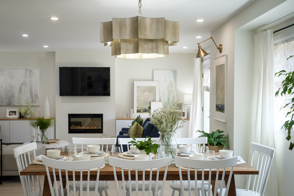
The first thing Kortney and Kenny needed to do was to reconfigure the existing space and flow to really make it work for Matt and Meghan. With little ones underfoot, it was important to keep open sightlines throughout the main floor, while keeping a functional family space in mind. That meant comfy textiles, sturdy furniture, and lots and lots of storage space.
Related: 25 Home Renovations That Will Not Increase the Value of Your Home
A Bright New Design
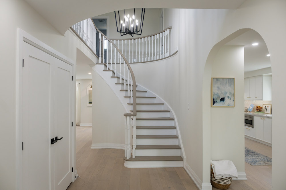
From the second you walk into this home, everything feels modern, fresh and bright. To achieve that look, Kenny refinished the existing stairs, which were actually in great shape and gave everything a fresh coat of paint. Meanwhile, the light floors below keep things airy and bright, all while hiding any potential dirt those kiddies may bring in! That’s exactly what this couple was hoping for in their new home – a happy and cheerful space to raise their family.
Read more: Kortney and Kenny Rescue A Structurally Unsafe Home With an Uplifting Modern Renovation
A Modern Entrance
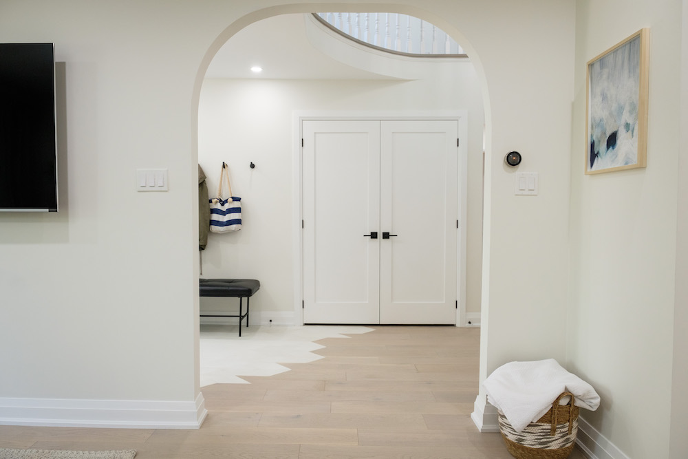
Speaking of floors, the homeowners really wanted a tile entrance, but they also didn’t want a jarring transition between the tiling and the hardwood. So Kortney came up with this creative and unique design, which she loved so much she said she might steal it for her own. It’s another modern and bright update that adds instant personality to the space, really making it feel like home.
Related: Buying Furniture 101: How to Ensure You Are Buying Ethically
Creating New Function
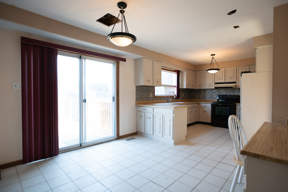
Before the renovation, the kitchen area was large and open, but it definitely wasn’t bright or what this couple was looking for in their space. They’d been dreaming about a white kitchen with plenty of room for their family to hang out in, plus a lot more storage and seating than what the old layout offered.
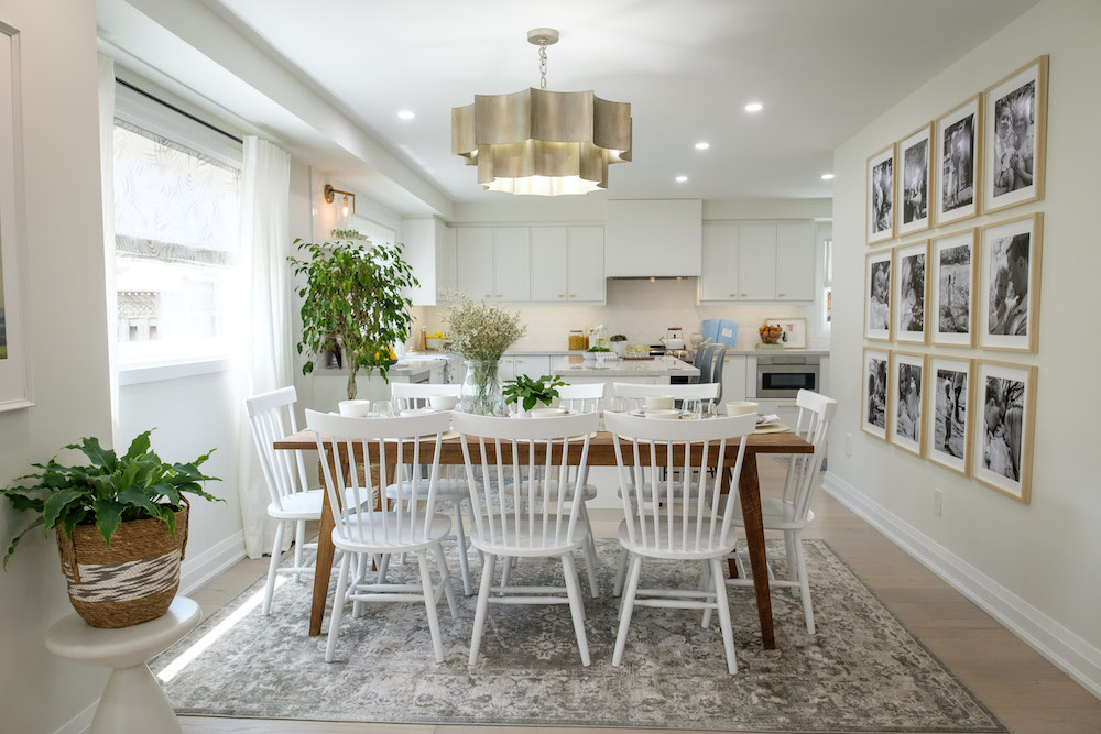
A Personalized Dining Area
By removing the old sliding door and putting in a large window, Kortney and Kenny kept the natural light flowing into the room and opened up the space for a large dining table with plenty of seating. Kortney surprised the couple with a black-and-white photo collage of their sweet family on the wall to make the house feel even more like home.
Related: Picture Perfect: A Foolproof Guide to Hanging Your Pictures Perfectly, Every Time
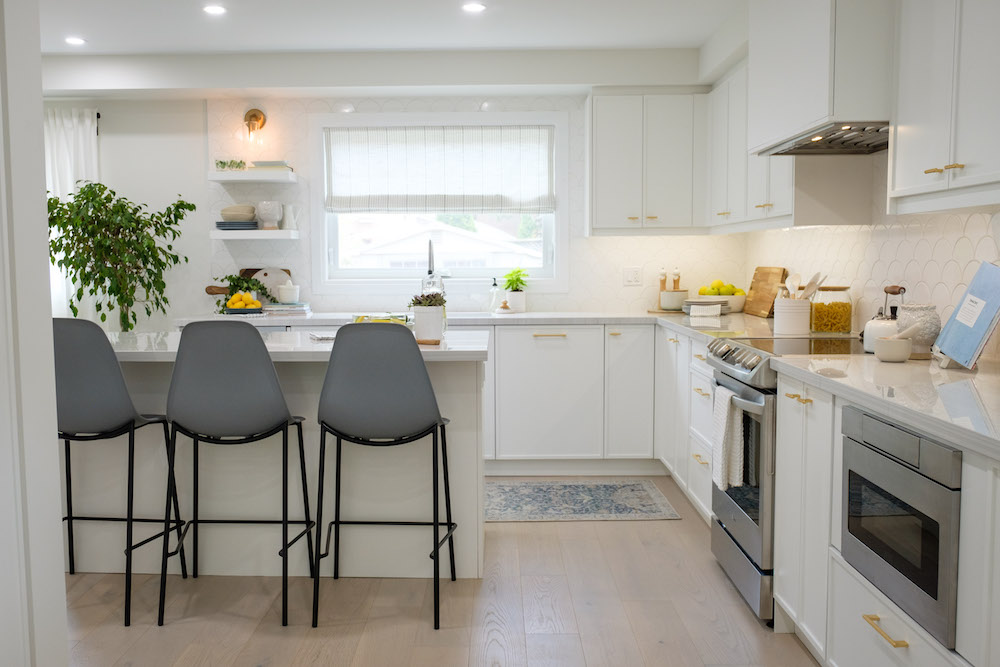
A White and Bright Kitchen
This couple really wanted an island, which Kortney and Kenny were able to deliver for extra seating while still keeping a bright and open flow. The timeless kitchen features lots of white touches and finishes, including the cupboards, backsplash, and countertop. Those same hardwood floors below keep the flow going, while gold hardware adds a modern and elegant look.
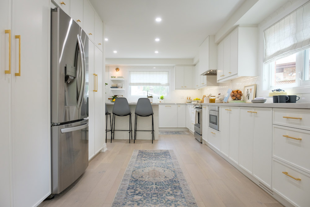
Endless Storage Potential
By opening up the walls and extending the kitchen, Kortney and Kenny gave this couple lots of extra counter and cupboard space. Sleek stainless steel, built-in appliances and pot lights help achieve that modern flow, while another large window keeps the area soaked in natural light. Even more importantly? This new structure gives the couple an instant sightline to the brand new playroom.
Related: Kortney and Kenny Create the Ultimate Home for Entertaining Large Crowds
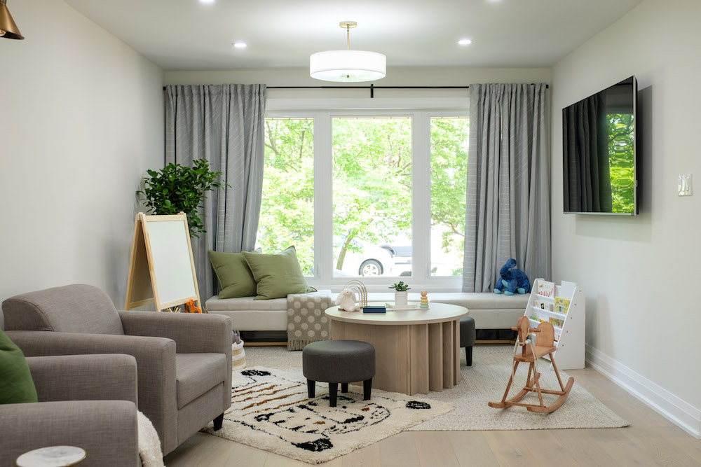
A Functional Flex Space
Meghan and Matt really wanted the kids to have a place of their own to play and hang out in, so Kortney and Kenny created this area that any child would love to have. There’s an art station and a custom table that Kenny built with storage and play potential. Plus, the moveable bench seating along the back wall doubles as even more storage (big win!). Last but not least, Kortney added these comfy armchairs so that supervising adults have a nice space to hang out in too.
Watch: How to Make Your Own Desk Organizer with Kortney & Kenny
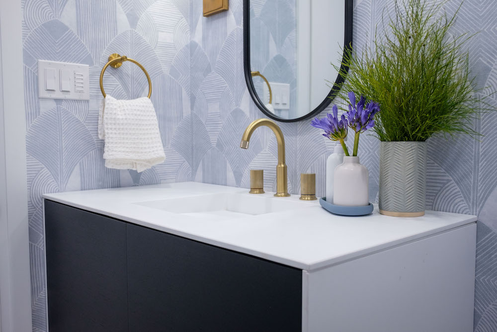
A Pretty New Powder Room
Kortney and Kenny broke up the white theme but kept it completely light in this brand new powder room, which is full of personality thanks to the calming blue wallpaper and sleek white finish on the top and side of the vanity. It still fits in with the rest of the home’s flow thanks to those gold finishes and the overall soft and welcoming vibe, but it’s also a little more playful with the darker trim on the mirror and dramatic vanity cupboards.
Related: Bathroom Design Idea Trends for 2022 That Will Stand the Test of Time
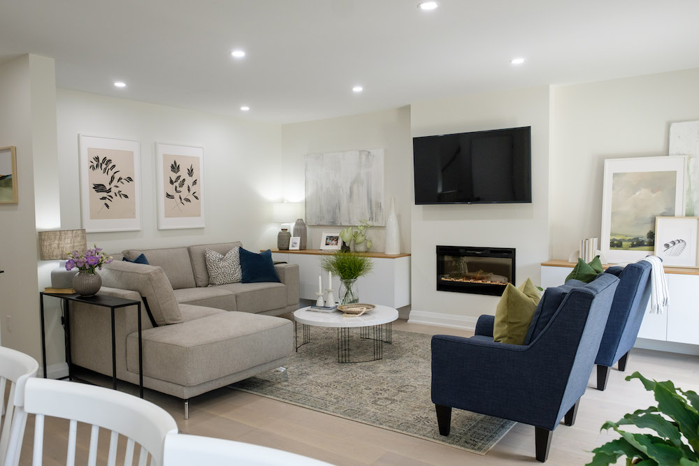
A True Family Space
Lastly, Kortney and Kenny created this family-friendly living room that’s perfect for movie nights with the whole squad or a little alone time after the kids have gone to bed. There’s still tons of storage and even a cozy fireplace, all of which combine to make this house a bright and beautiful space that the family can now call home.
HGTV your inbox.
By clicking "SIGN UP” you agree to receive emails from HGTV and accept Corus' Terms of Use and Corus' Privacy Policy.


