When Stephanie and Chris bought their dream home in Nashville, they knew it needed a ton of work. And while they had spent a lot of time and money upgrading the house’s exterior, it still didn’t feel like a home within. So they called up Kortney, Kenny, and the rest of the Making It Home team.
See how the contractor-design duo transformed this space into an updated family home full of rustic finishes, all on a $130,000 budget.
Watch Making it Home With Kortney & Kenny on the Global TV App and on STACKTV with Amazon Prime Video Channels. HGTV Canada is available through all major TV service providers.
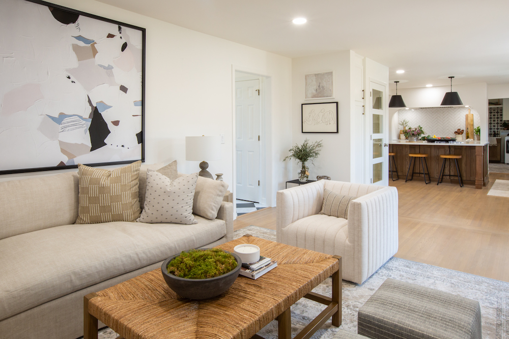
Opening Up the Flow
One of the first items on Kortney and Kenny’s agenda was to open up the flow within the main floor so that Stephanie and Chris could easily keep an eye on their two kids. That meant installing some beam work to keep everything structurally sound and create an open and airy space that feels entirely more like the couple.
Related: How to Make an Old House Feel New Again, Using Nothing but Paint
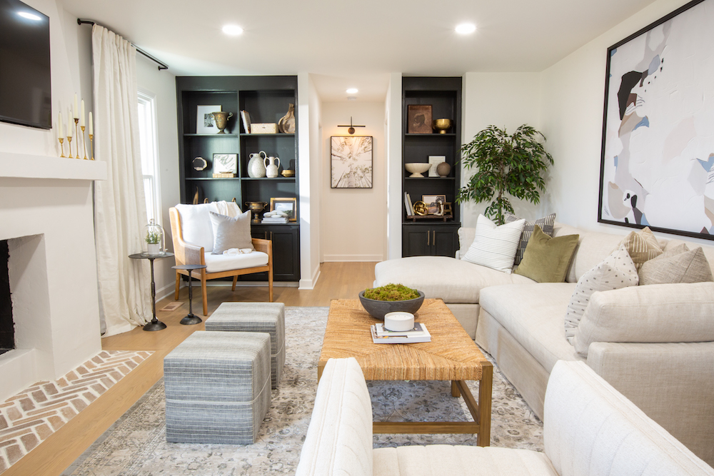
Creating Extra Storage
To keep things neat and tidy (especially with two boys running around!) Kortney and Kenny included extra storage potential wherever they could. In the living room, that meant built-in bookcases, stylishly painted a darker colour for even more design appeal. Against the brighter furniture, floors and walls, they definitely add a fun and dramatic tone to the room.
Related: 10 of Our Favourite Canadian Furniture Stores in 2021
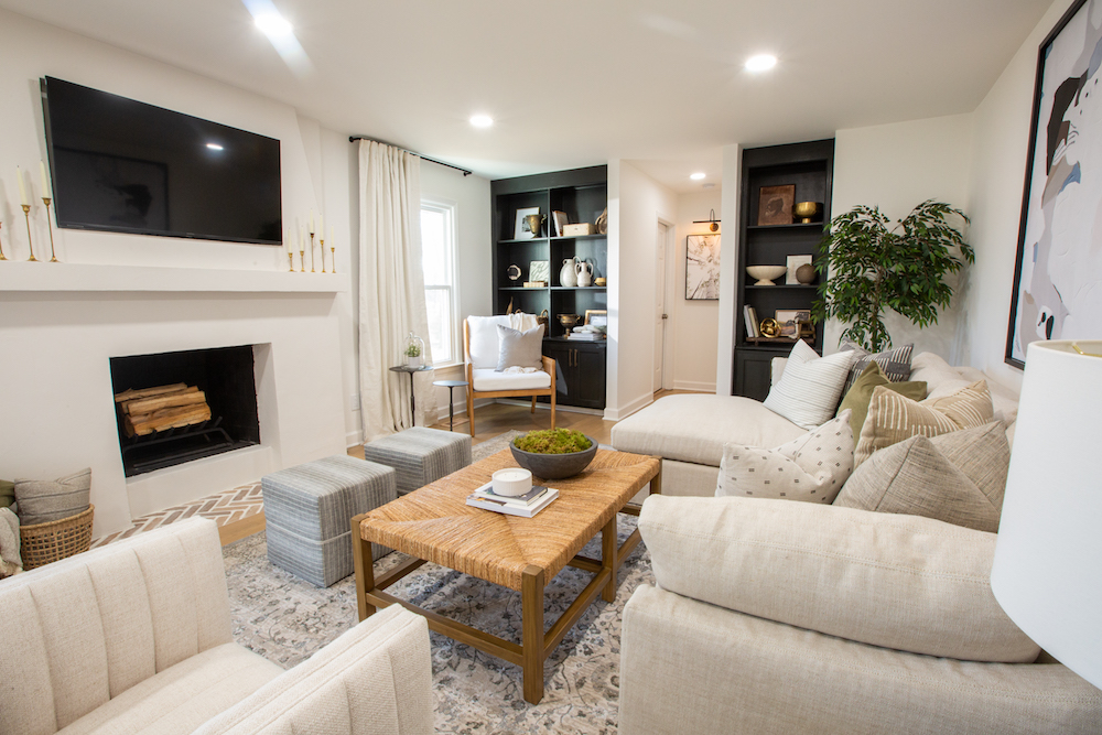
Updating the Fireplace
While original stonework on a fireplace can be charming, it can also feel out of place in a modern redesign. So Kortney and Kenny covered up this fireplace with a plaster wall painted white to create a better overall flow. Then they added new brickwork below to keep that rustic charm and a wide white mantel above.
Related: Hot Topics: 15 Gas, Electric and Wood Fireplaces for a Cozy Fall and Winter
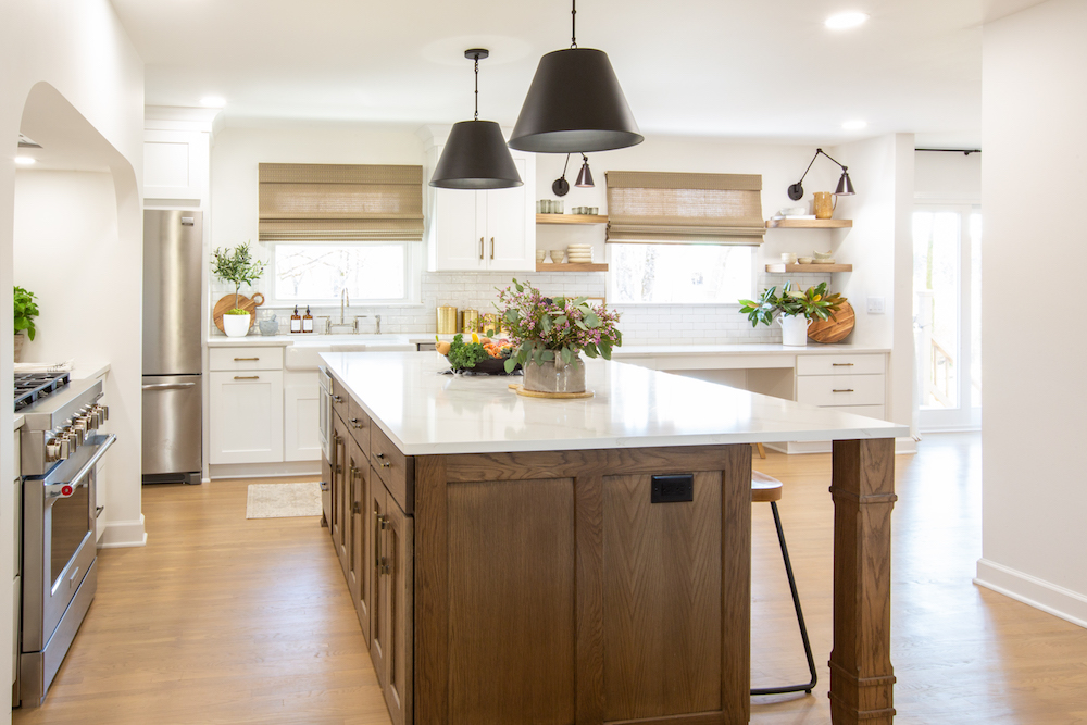
A Giant Cooking Space
In the kitchen, Stephanie really wanted a large island where her family could congregate and where she could cook large meals with them. Kortney and Kenny definitely delivered with this giant island, which doubles as even more storage space thanks to the built-in drawers and cabinets. Meanwhile, the wood finish on the island feels rustic without adding too much darkness to the room, and it plays well off the lighter wood finish on the floor.
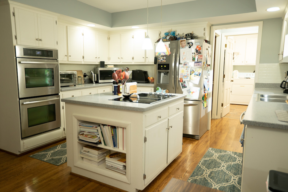
Before the Redesign
As you can see, Kortney and Kenny were already working with a large kitchen footprint before the redesign, but just because you have a lot of space doesn’t mean it’s functional. The flow here is anything but conducive to whipping up a quick weeknight family meal, and the island feels bulky and as though it’s actually cluttering up the space.
Related: The Top Kitchen Paint Trends to Adopt in 2021 (We See You, Smoky White!)
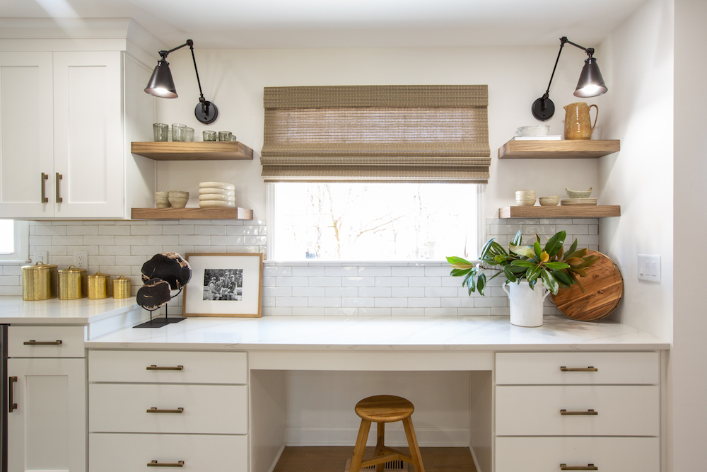
Expanding the Space
By reconfiguring the kitchen Kortney and Kenny were able to make a dedicated family space. With so much storage elsewhere, the team was able to install this flex space desk. Here, the couple can keep track of their bills, or the kids can hang out and do their homework on weeknights before dinner.
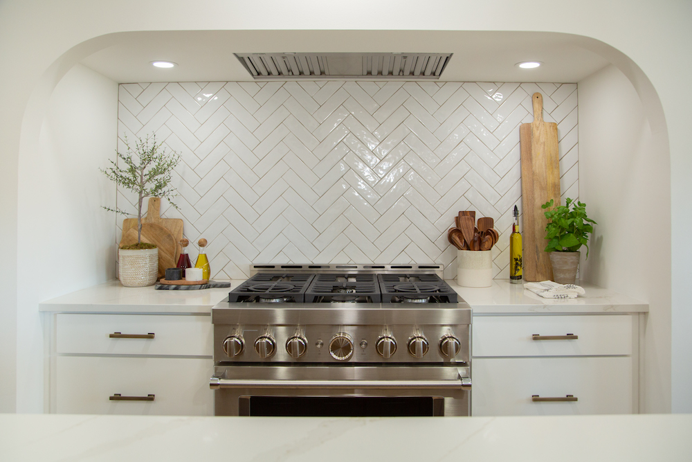
Creating Personal Touches
The true standout in this new kitchen, though, has got to be the custom arch that Kortney and Kenny created for the oven range. The piece really centers the kitchen and creates a unique focal point that feels rustic in shape and modern overall, thanks to the chevron tiles and stainless steel stove.
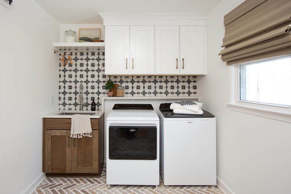
Having Fun With Laundry Day
Kortney and Kenny kept that rustic charm flowing into the new laundry room with the addition of these brick tiles, which are the same design as the living room’s new fireplace footing. Then, the fun tiling above helps modernize the space, creating a bright but functional laundry room that may even make the chore a little more fun to do in the future.
Related: Kortney and Kenny Rescue A Structurally Unsafe Home With an Uplifting Modern Renovation
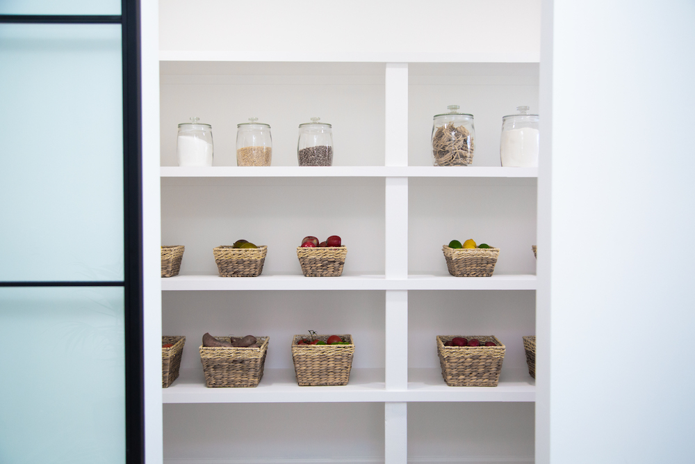
A Picture-Perfect Panty
On the other side of the laundry room, Kortney and Kenny borrowed space from the old office to create this show-stopping, walk-in pantry that looks like it’s been stolen from Pinterest. The space is bright and features plenty of open-concept shelves to hold all the things, which is also kind of key when you’re feeding two growing boys.
Related: The Dreamiest Walk-In Pantries That Will Make You Want Your Own
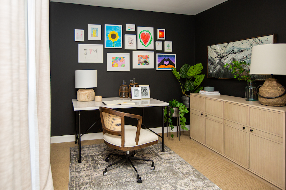
A Room of Her Own
Kortney and Kenny really wanted to do something special for Stephanie, so as the final piece to this renovation, they redid her office space. Rather than continue the bright but retro flow from the rest of the house, the duo decided on black walls and lighter furniture, transforming the room into a dramatic but pretty space. Last but not least, they hung up some of the kids’ art to truly make the room feel like Stephanie’s and for this house to finally feel like the family’s forever home.
HGTV your inbox.
By clicking "SIGN UP” you agree to receive emails from HGTV and accept Corus' Terms of Use and Corus' Privacy Policy.


