When Emily and Tyler welcomed their third child, they knew they needed a larger space for their family. So they invested in this century-old Toronto home, complete with awkward nooks and hazardous electrical wiring. Needless to say, they were in over their heads, so they called in Kortney, Kenny and the rest of the Making It Home team for help.
With a $192,000 renovation budget and a seven-week timeline, see how the duo transformed this space into a bohemian-minimalist abode that the family can now enjoy for years to come.
Watch Making it Home With Kortney & Kenny Wednesdays at 9 p.m. ET/PT on HGTV Canada. It is also available on the Global TV App and on STACKTV with Amazon Prime Video Channels. HGTV Canada is available through all major TV service providers.
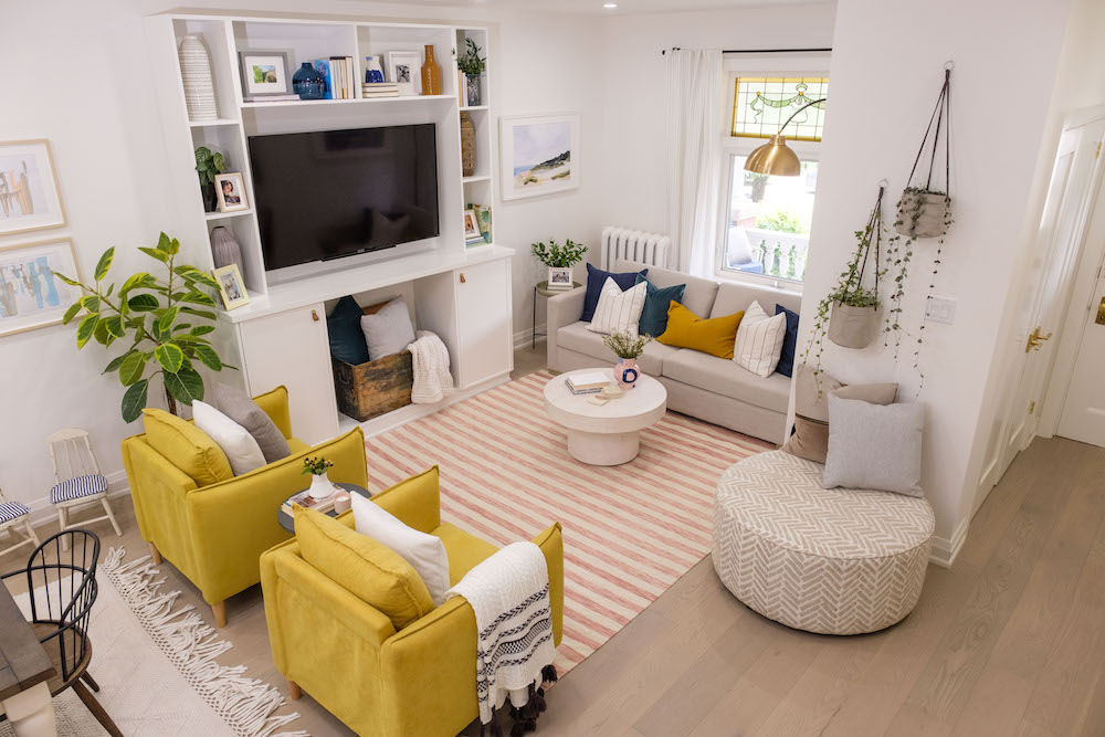
A Family-Friendly Space
Kortney is all about designing spaces that work with each individual family. In the case of Emily and Tyler, that meant a family-friendly living room with lots of built-in storage for organizing and keeping kid things off the floor. Kenny did a custom build around the TV and Kortney opted for no fireplace in order to achieve that goal. They completed the cozy look by adding lots of space for seating and family time, whether that’s with a board game or cuddling up for a movie night.
Related: 10 Decorating Mistakes That Are Making Your Home Look Cluttered
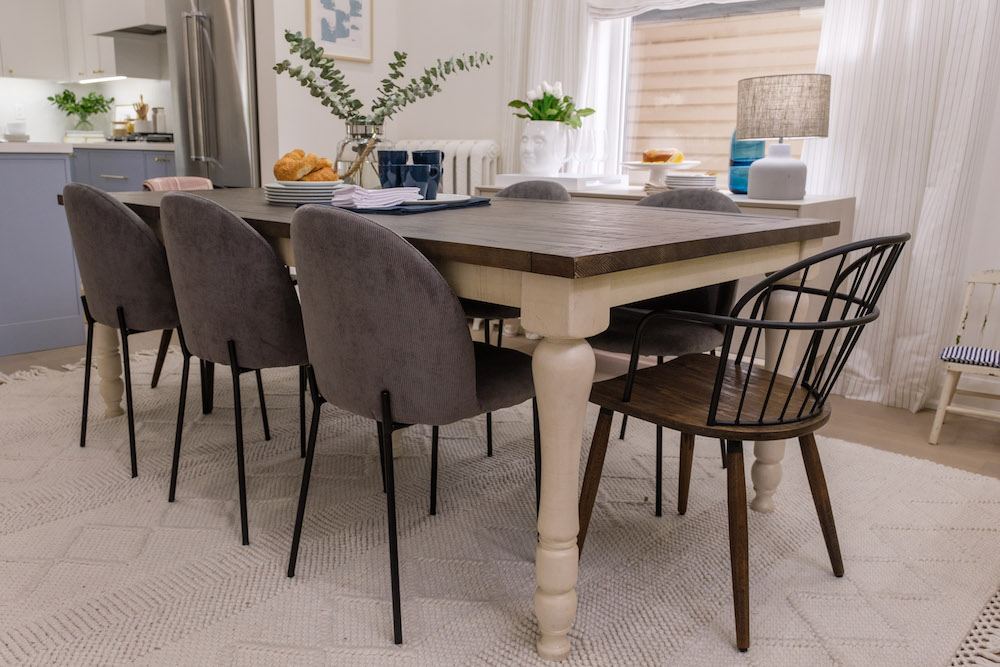
When Bohemian Meets Minimalist
It was a bit of a challenge for Kortney to pull together this couple’s conflicting design preferences, but she managed with light and airy finishes and small bursts of colour where necessary. This new dining room table, for example, features an interesting design paired with a more traditional tabletop. Plus, these easy-to-wash fabric chairs will stand up to lots of wear-and-tear for the busy family of five.
Read more: Making Your House a Home: 10 Questions to Ask Yourself Before Renovating
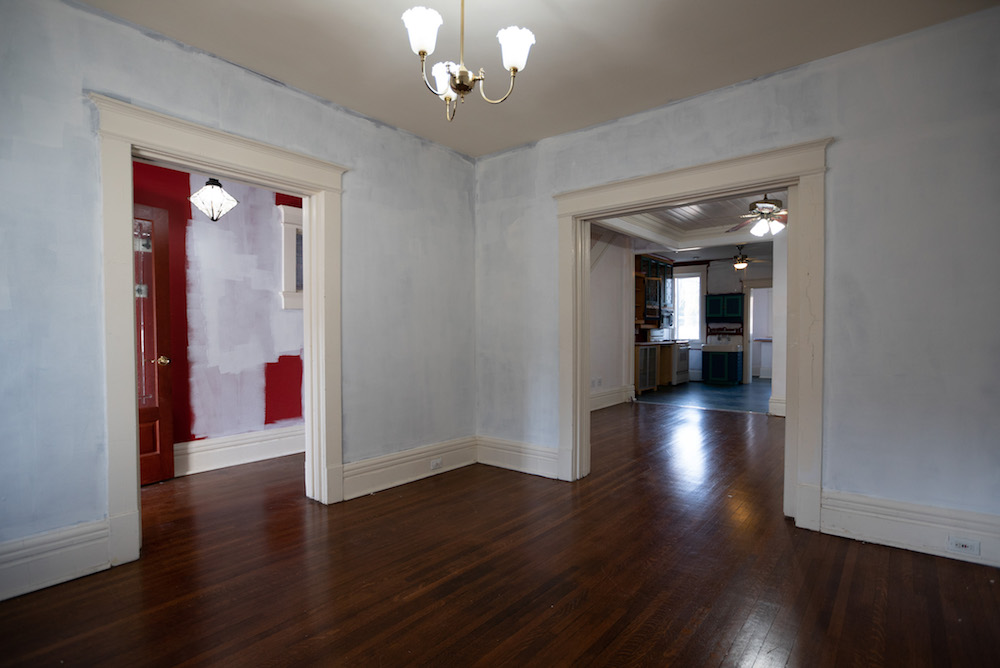
Before the Design
When Kortney and Kenny first arrived at the house, the couple had already painted primer over the bold colour design to envision what the renovation could look like. As it turns out, they needn’t have bothered because what they really wanted was a flowing, open-concept space where they could keep an eye on their entire brood no matter what part of the main floor they were on.
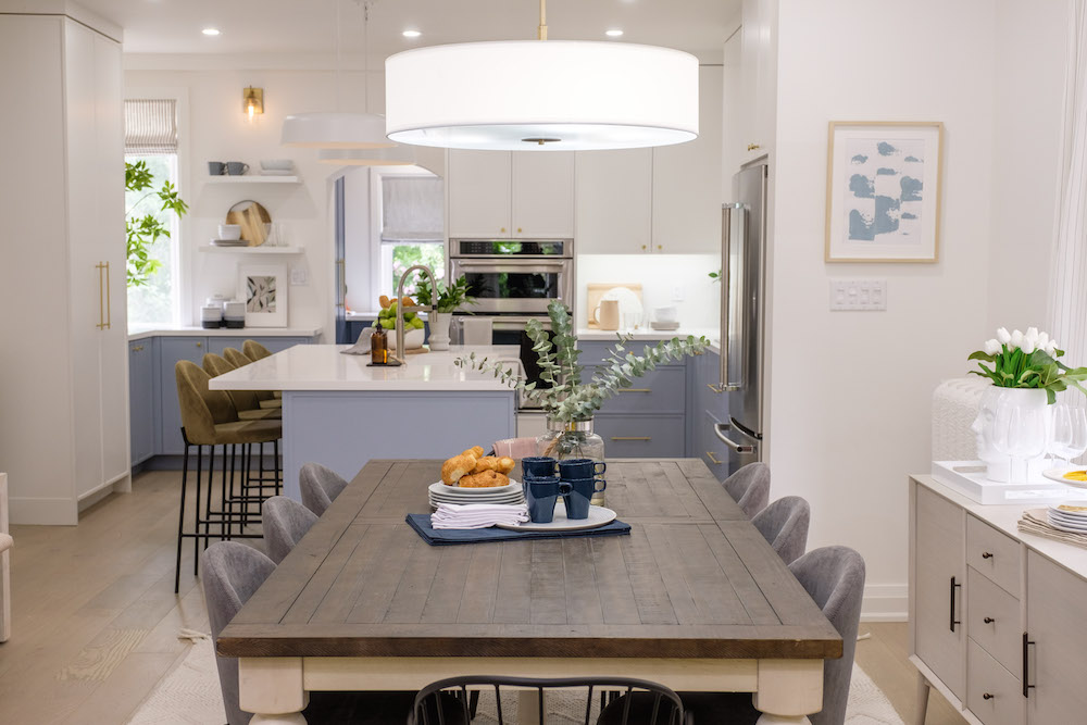
An Open-Concept Flow
With a few walls gone, Kortney and Kenny were able to extend the living space with an open-concept flow. Now, the kitchen, dining room and living room flow seamlessly together, with each area delineated by strong design choices and featured furniture. The result isn’t just a great layout; with all of that extra seating, this space is a large family’s entertaining dream.
Read more: Meet Kenny Brain: 10 Things You Need to Know
Keeping Bits of the Old
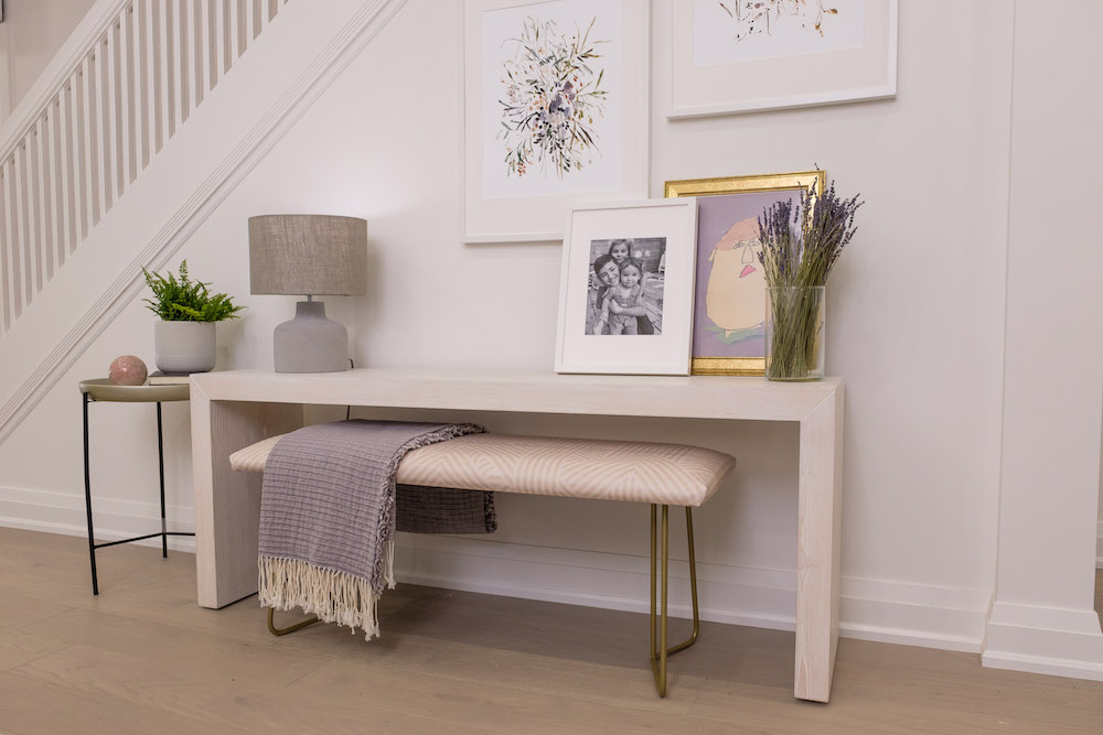
When you’re renovating a 100-plus-year-old home, you definitely need to upgrade things like the plumbing and electrical to keep up with today’s standards and eliminate any safety hazards. But to keep some of the home’s original charm, you also want to highlight those small details that made you fall in love in the first place. That’s why Kortney and Kenny opted to paint and upcycle the gorgeous original stairs, blending them into the overall design but keeping that charm intact. Then, Kortney added even more functionality with this table and bench that doubles as a study space.
Related: The 16 Most Popular Interior Design Styles Explained
Smart Finishes
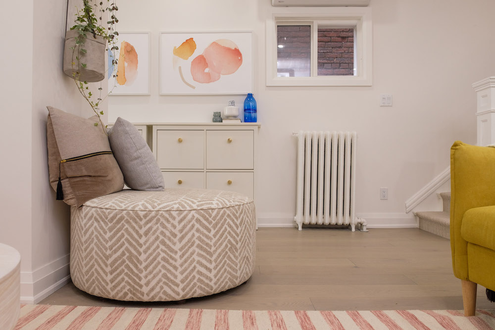
To maximize storage and space, Kortney added features like these shoe racks, which are snug right up against the wall. She also added extra seating with furniture like this ottoman, which can be pulled into the living room or used as a bench when putting on shoes. Even the radiator got a fresh coat of paint, giving us yet another example of when old charm meets new design!
Read more: Catching Up With Kortney Wilson
Upgraded Appliances
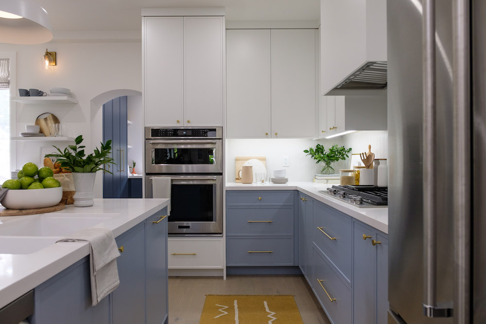
Another thing any forever home needs is a great space to cook and congregate in. Kortney and Kenny provided that with this gourmet kitchen, which features high-end appliances, plenty of counter space and even more of that coveted storage the family made clear they wanted (and desperately needed). The large island provides yet another area for the kids to sit and do homework and for guests to hang out during gatherings.
Related: 16 of the Best Alternatives to the Biggest Eyesores in Your Home
Blending in Colour
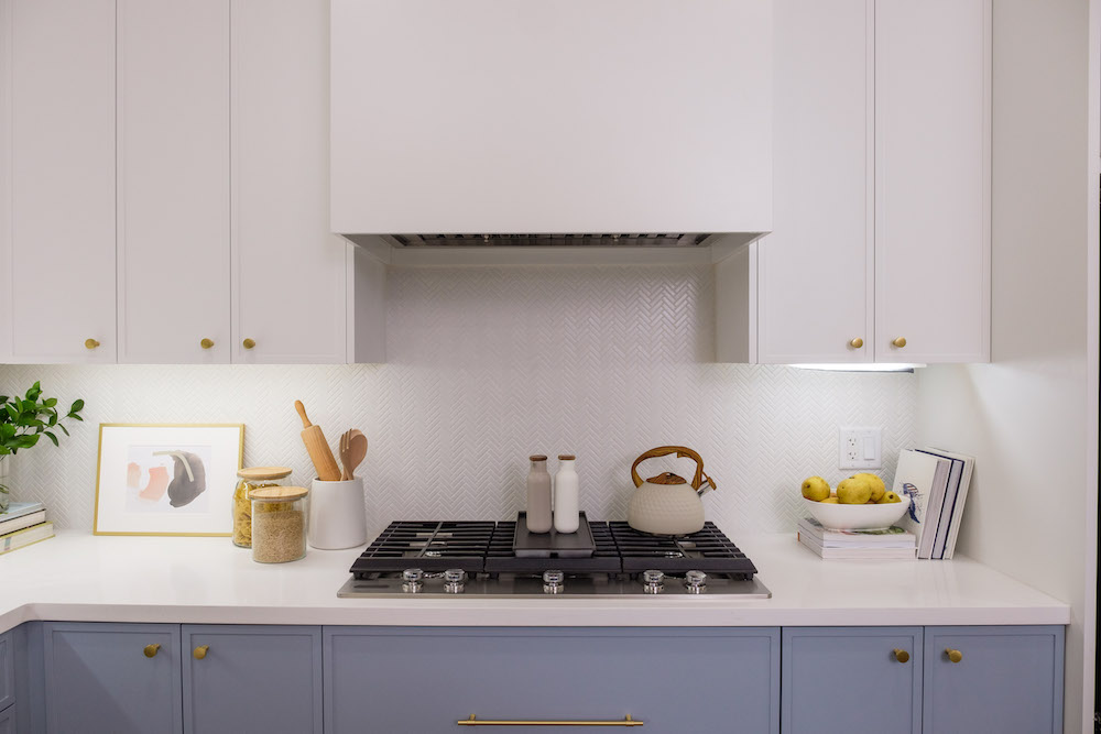
Kortney was a little nervous in choosing the baby blue cupboards below, given Tyler’s penchant for minimalist finishes, but she balanced out the look with solid white countertops, white upper cabinets and a detailed but minimalist backsplash in a beautiful chevron pattern. Add in the muted gold hardware and cooking top, and this space is the perfect blend of colour and basics.
Related: 14 Colour Palettes That Go Surprisingly Well Together
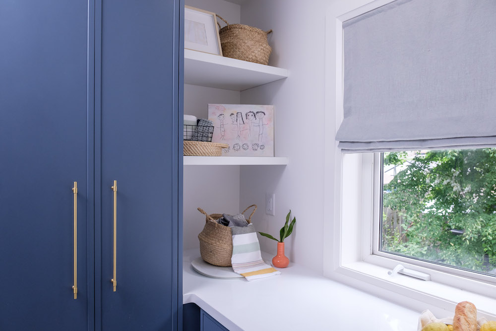
Using Every Last Corner
Behind the kitchen, Kenny and Kortney crafted this “flex space” mudroom that’s also a pantry. By adding cabinets in a slightly darker but complementary colour, this feels like a natural extension of the kitchen itself, and it features tons of extra storage thanks to the hidden shelves and bonus counter space.
Related: How to Brighten Up Your Home When it’s Getting Darker Outside
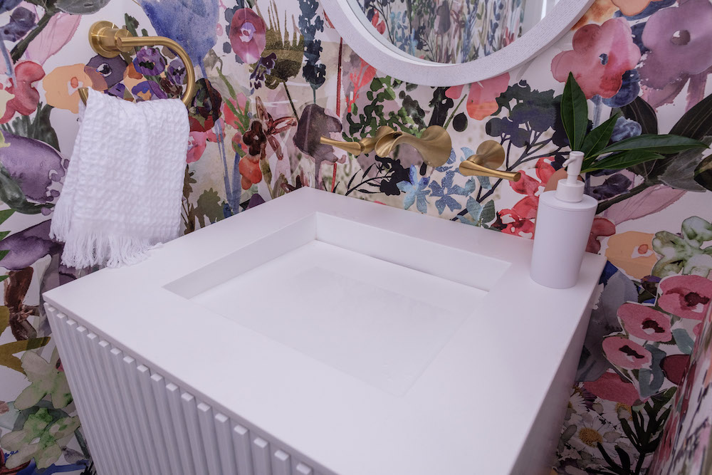
A Half-Bath With Personality
Kortney decided to go bold in at least one space, with this gorgeous floral wallpaper in the half-bathroom off the mudroom. To neutralize it, she went with a charcoal hex tiling below and white finishes elsewhere, creating an impactful room with plenty of personality. Even Tyler surprised himself by loving it in the end. Everyone agreed that with an estimated extra $408,000 in resale value post-renovation, making this house a safe and functional family home was totally worth it.
Don’t miss new episodes of Making it Home With Kortney & Kenny every Wednesday at 9 p.m. ET/PT on HGTV Canada and check HGTV.ca for bonus clips, reveals and exclusive tips from K&K.
HGTV your inbox.
By clicking "SIGN UP” you agree to receive emails from HGTV and accept Corus' Terms of Use and Corus' Privacy Policy.


