When Andy and Benjamin found their dream house, nestled on a beautiful tree-lined street, it was just that, a house. The two, and their adorable daughter Sadie, moved in and began turning it into their dream home. Wanting a sophisticated design, they began doing what they could. On the upper floor, installing hardwood and creating spaces to suit their needs, but still they faced some more substantial issues. A battered kitchen, underutilized rooms, and a dated monster tub were problems that were beyond them. That’s why they decided to call in Kortney, Kenny, and the rest of the Making It Home team.
See how Kortney and Kenny blend both modern and the traditional design to make this family’s dream house a dream home – all on a budget of $150,000.
Watch Making It Home with Kortney and Kenny Tuesdays at 10 p.m. ET/PT on HGTV Canada. Also available on the Global TV App and STACKTV with Amazon Prime Video Channels, fuboTV, Rogers Ignite TV and Ignite SmartStream.
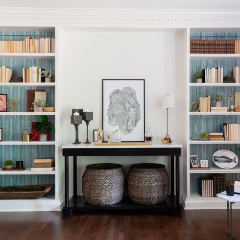
From House to Home
It takes more than a house to make a home. Andy and Benjamin bought their dream house in one of Kortney’s favorite neighbourhoods. It had a lot going for it, it was on a beautiful street, the area was quiet, and the house seemed perfect… on the outside. On the inside, things weren’t quite as dreamy. The kitchen was rife with issues, the bathroom felt cramped and outdated, and the layout left whole rooms underutilized and empty. It fell to Kortney to not only make these spaces function but feel like home. She did so by incorporating objects of significance into the design, like this stunning handmade bar from Andy’s father.
Related: How to Build a Self-Serve Bar
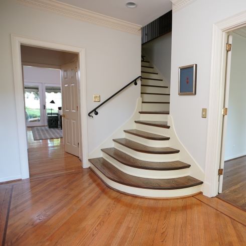
Underutilized and Underwhelming
Some spaces just don’t feel right. That was the case for the living room and entryway in this home. Thanks to a disjointed layout, the space lacked definition. To make these spaces work and function seamlessly with the others, the team ran hardwood throughout the whole of the main floor. By finding a stain that matched that of the stairs, they created a sense of connection and continuation throughout the entirety of the home. Now the home feels natural and creates an experience right from the front door.
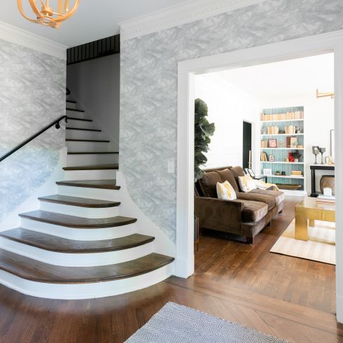
An Entryway with Something to Say
Function over fashion isn’t always the right choice. Originally the entryway to the home had a closet across from the stairs. Normally additional storage space is a plus, but when having it makes a space feel cramped and unspectacular, the trade off isn’t worth it. To solve this problem Kenny and the team simply removed it and opened the space. There was adequate storage throughout, and it added a sense of drama as soon as you entered the house.
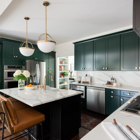
Green with Envy
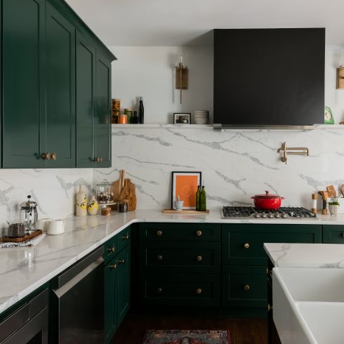
Doing the dishes is never fun, doing them twice is even worse. Thanks to some lazily installed HVAC work that is exactly what Andy and Benjamin were dealing with in their rundown kitchen. Constantly dirty plates, broken floor tile, and cabinets falling off their hinges don’t make for an enjoyable cooking space. That’s where Kortney and Kenny came in. By gutting the kitchen, removing the peninsula, and opening the space, they were able to create a stunning cooking space. With dark green cabinets, accented with gold hardware, matching countertops and backsplash and a massive new island, the team created a space that excites and intrigues. We wouldn’t mind doing the dishes here, even twice.
Related: The 15 Top Kitchen Trends for 2023
A Kitchen Full of Tastes
When designing a space, the first thing Kortney needs to do is understand her clients’ tastes. In the case of Andy and Benjamin, that was easier said than done. Benjamin enjoyed modern designs in the home, while Andy preferred a more traditional aesthetic. To blend their differing styles, she needed to find where their tastes overlapped. Both partners enjoyed a more subdued sense of design, shying away from loud or bold colours. In the kitchen this was achieved through painting the classic cabinets a rich, deep green, while brightening the space with light and crisp countertops that extended up the backsplash.
Tub of Terror
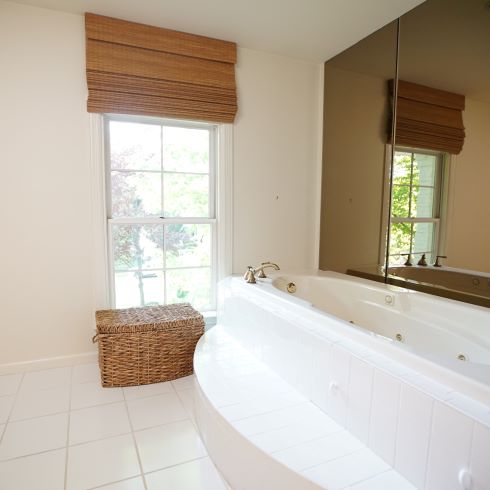
Bathroom space is always at a premium. That’s why the couple was so frustrated with their primary bathroom and the dated monster tub that took up most of it. Being that neither of them had used the bath in the house, even once, they decided to remove the tub to make more room for a double vanity and large standing shower. With their new plan of attack, the team began tearing down the primary bath.
Who Says Vanity is a Bad Thing?
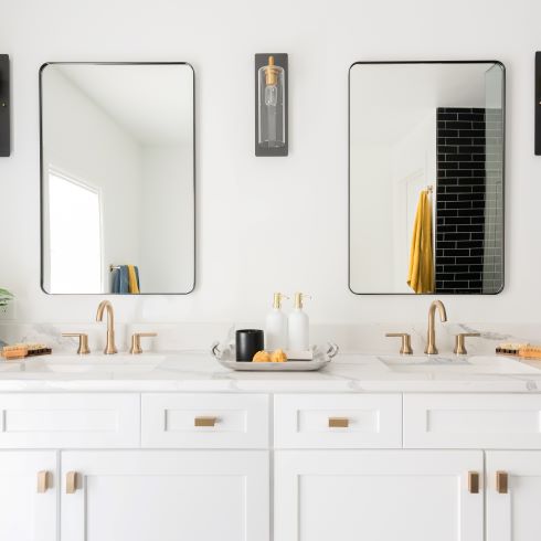
As anyone who has shared a bathroom will tell you, you need your own area. It’s for this reason Kortney chose to install this sleek and stylish double vanity. After removing the unused tub, she was left with a healthy open footprint to work with. She wanted to make a space that would work seamlessly even if both Andy and Benjamin were using it. The white cabinetry and walls, coupled with the gold fixtures and contrasted with the dark bold shower tile, made for a sophisticated design that would make anyone glad to have their morning routine here.
A Bold Bespoke Shower
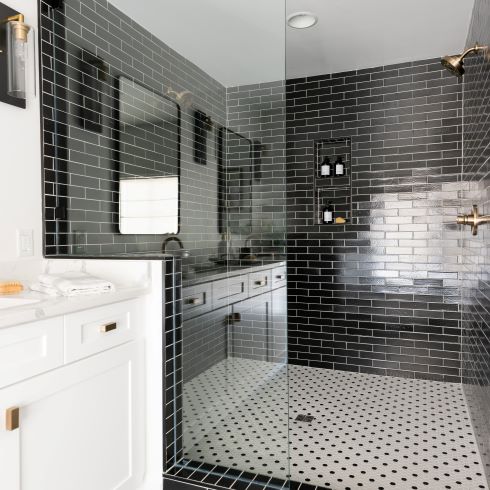
For the shower, Kortney wanted to give them something bold and unique. After finding a local tile maker that made all their tiles by hand, and even making some herself when she went there with Kenny, she decided on a bold, monochromatic aesthetic with contrasting tile. The result was gorgeous. With dueling showerheads, a large footprint and beautiful handmade tiles, the shower transformed into a functioning art piece. In this space showering isn’t a chore anymore, it’s an event.
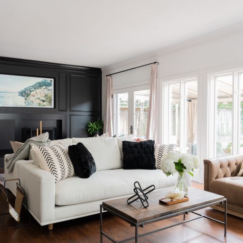
A Modern Living Room
Once Kortney and the team had connected and tied together the living spaces and kitchen, it was time for styling. Not only did she have to combine modernity for Benjamin and traditionalism for Andy, but she needed to make this a space that would work for growing Sadie. By covering the old fireplace wall with a façade of traditional paneling, painted black for a modern contrast, she filled the space with furniture that would suit them both. With a three-year-old, the white couch was a risk but Kortney created a play space and toy chest to keep her entertained. (Disclaimer: We cannot confirm the safety of said white couch at this time)
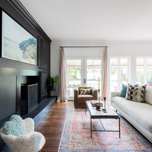
With Traditional Influence
Being faced with the task of blending differing needs and styles in a single space can be daunting. When designing any space shared between multiple people, you must be open to a bit of give and take. By doing so, you can really create a dream home to be embraced and enjoyed by everyone. Compromise is key!
Love this transformation? Shop the look here!
HGTV your inbox.
By clicking "SIGN UP” you agree to receive emails from HGTV and accept Corus' Terms of Use and Corus' Privacy Policy.


