Tatum and Michael had been putting off renovations to their dated 80’s home for eight long years. Instead, they’d been investing their reno budget into Tatum’s non-profit for aiding in the medical costs of musicians. All that hard work paid off and the couple was able to save up again. That’s when they called Kortney, Kenny and the rest of the Making It Home team!
See how Kortney and Kenny transformed this drab and dated home, into the perfect, unique space for this family — all on a $150,000 budget.
Watch Making It Home with Kortney & Kenny Tuesdays at 10 p.m. ET/PT on HGTV Canada. Also Available on the Global TV App and on STACKTV with Amazon Prime Video Channels and Rogers.
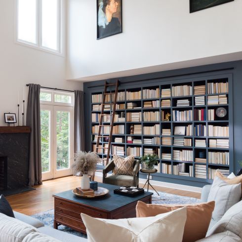
The Pursuit of Knowledge
Being a professor, Michael not only valued his books but used them daily. Because of this Kortney, took it upon herself to not only incorporate as much book shelving as possible but to also make it beautiful and functional. By installing a functioning sliding ladder not only did Michael’s books become easily accessible but they became a stunning feature of the living room itself. This is one library you won’t mind studying in.
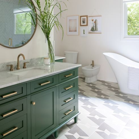
The Bold and the Bathroom Floor
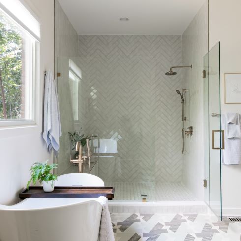
Tatum and Michael didn’t want to play it safe with their designs. Thanks to this passion for pizzaz and their complete trust in the team, Kortney was able to take more chances with bold colours and daring patterns. In the couple’s bathroom Kenny installed some unique tile flooring that gave that room a true sense of drama and theatre.
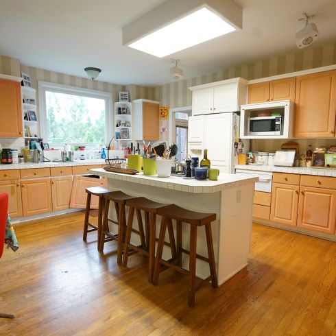
Dated and Deflated
The kitchen, like much of the rest of the house, was stuck in the past and feeling its age. The peach-tone cabinets had seen more than their fair share of wear and the space was growing harder to function in. With a young daughter who has a passion for baking, the space was no longer living up to the family’s needs. Through a complete overhaul and a reconfiguration of appliances, Kortney was able to bring out the full potential of both the space and Molly’s pastries.
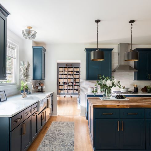
An Open and Comfortable Kitchen
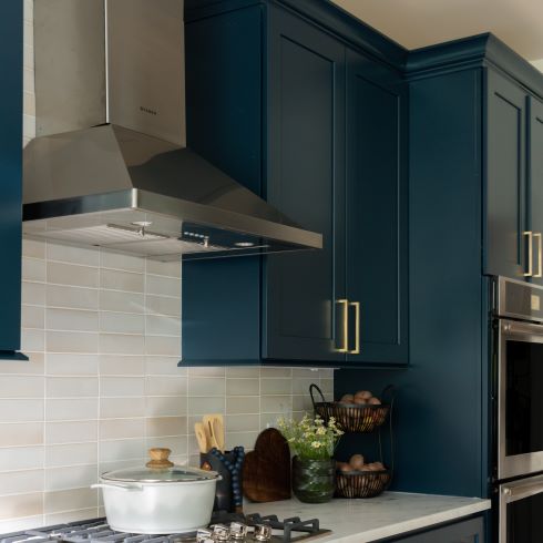
In many ways the kitchen is the heart of the home. After a full gut job of the kitchen, Kortney and Kenny installed dark blue cabinets accented with warm and light countertops to give the space a relaxed, open, and comfortable atmosphere. Where Tatum had previously felt cluttered and disjointed, was now a stunning gathering place that the family could enjoy together.
A Range of Problems
During the overhaul and rework of the kitchen, Kenny discovered that with the new floorplan, venting the range hood would be nearly impossible. Despite this they were determined to find a solution. After some discussion, and a bet over some questionable food products, Kenny ventured into the crawlspace to find a creative ventilation route. In the end they succeeded, only slightly eating into the cabinet storage space, to give Michael his beloved gas cooktop. Where there’s a will there’s a range!
A Livingroom in Need of New Life
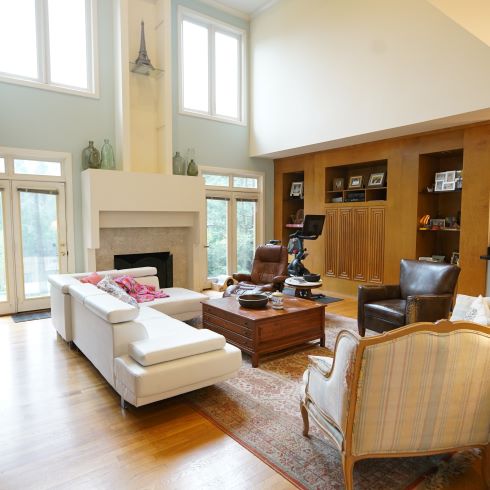
Being such busy and hardworking individuals, Tatum and Michael should have a space to unwind at the end of the day. This was not the case. Their living room, although functional, was lacking in personality and warmth. The exception being a rubber chicken clinging to the ceiling, 30 feet up. So, Kortney and Kenny set out to make the space somewhere the family relax. By making the fireplace façade less austere and creating the ideal bar for entertaining, the space became the ideal room for both living and entertaining.
Related: Keeping Up With Kortney and Kenny
A Bar Worthy of Showing Off
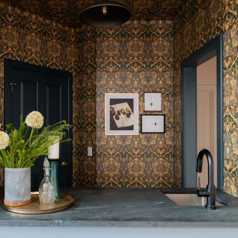
Everyone loves a good party. Tatum and Michael were no exception, Tatum being the social butterfly of the two and Michael manning the bar. Because of their love for entertaining and daring design style, Kortney was able to design this wet bar with truly unique elements. Bold wallpaper, a cool concrete countertop, and framed pieces of family history made the space one of a kind.
Colour Correction
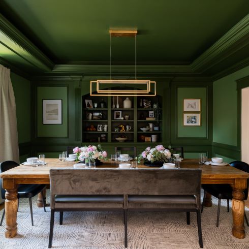
The dining room in Tatum and Michael’s home didn’t make them eager to spend much time there. The room felt outdated and dull. However, Kortney saw the potential in the intricate trim that covered the wall. By getting rid of the disjointed colours and painting the walls two complimenting shades of green, she was able to add the sense of drama and elegance the room had been missing. Who doesn’t love a little green and gold?
A Fun and Functional Bathroom
Tatum and Michaels bathroom used to be a lesson in how not to use space. The tub took too much room, the shower too little, and the toilet had its own time-out corner. Thanks to Kortney and Kenny, the space if now balanced, functional and beautiful, with a spacious standing shower, light and clean designs, and a tub that doesn’t remember what a pager is.
Bedroom Bliss
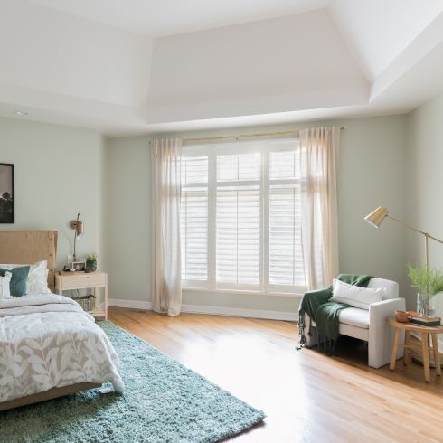
Your bedroom should feel like an extension of you, but you can’t let too much of your life clutter your space. That was the problem in Tatum and Michael’s primary bedroom. The books and shelves had taken over too much of the room. To solve this and reclaim their sleeping quarters, Kortney added stunning built ins and created an open, clutter-free space where the couple can feel at ease after a long day of work.
Love this transformation? Shop the look here!
HGTV your inbox.
By clicking "SIGN UP” you agree to receive emails from HGTV and accept Corus' Terms of Use and Corus' Privacy Policy.


