When Grant and Miguel had their son, Jasper, they knew they needed to leave the condo life behind in order to give the entire family more space. So they purchased a home in the heart of the city. Unfortunately, a bad flow and a shower next to the kitchen were the least of this couple’s concerns. With asbestos and a super dangerous structure that could have collapsed at any time, they needed the pros. That’s where Kortney, Kenny, and the Making It Home team came to the rescue. See how they reconfigured this living space into an open concept dream home on a $170K budget, all while sticking with the couple’s unique but opposing tastes.
Watch Making it Home With Kortney & Kenny on the Global TV App and on STACKTV with Amazon Prime Video Channels. HGTV Canada is available through all major TV service providers.
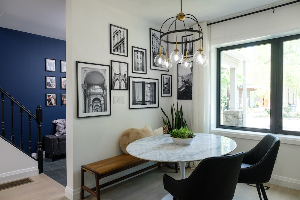
A Corner Café
By the time Kortney and Kenny built back up the walls in this renovation, they’d lost quite a bit of room in the dining room space. No matter, though, because the team was able to deliver a chic nook that feels more like a European café. A circular table and bench maximise space and seating potential. Dark accents on the windows and light fixture offer plenty of drama, and black-and-white photographs feel on-theme and like a downright story in this space.
Related: 10 Coffee-Making Stations That’ll Make Your Morning Cup Feel Like a Cafe Experience
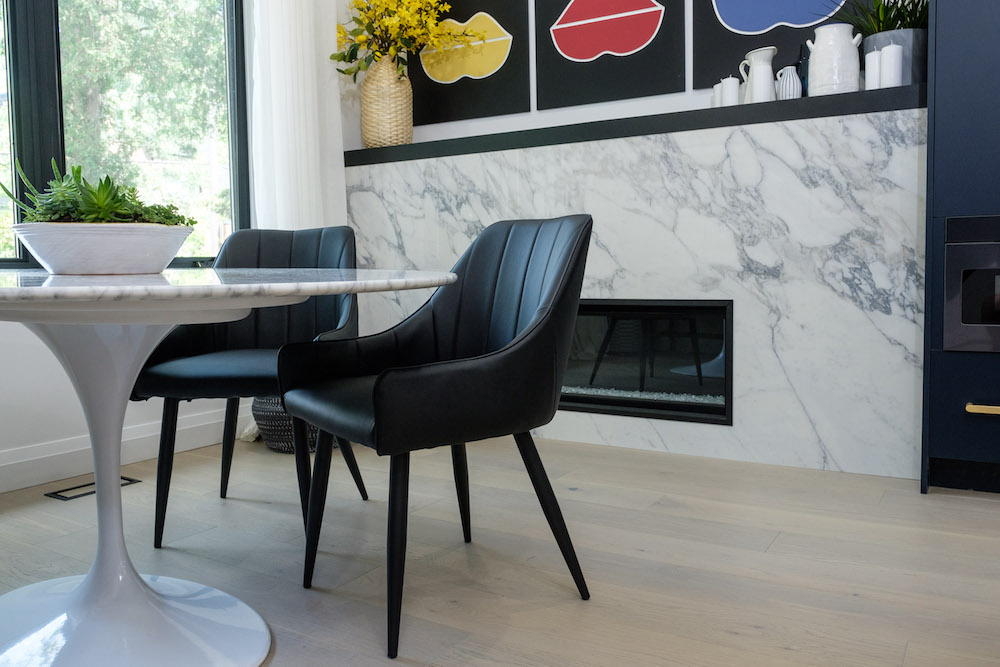
Lighting it Up With Personality
Grant and Miguel wanted a fireplace with personality, which Kortney and Kenny delivered in spades thanks to this new marble piece with an elongated mantel. The monochromatic design features are totally in line with Miguel’s personality, while the small pops of colour on the lipstick art above help bring Grant’s persona into the room as well. Below, neutral floors tie everything together and keep it feeling warm and cozy.
Read more: 14 Colour Palettes That Go Surprisingly Well Together
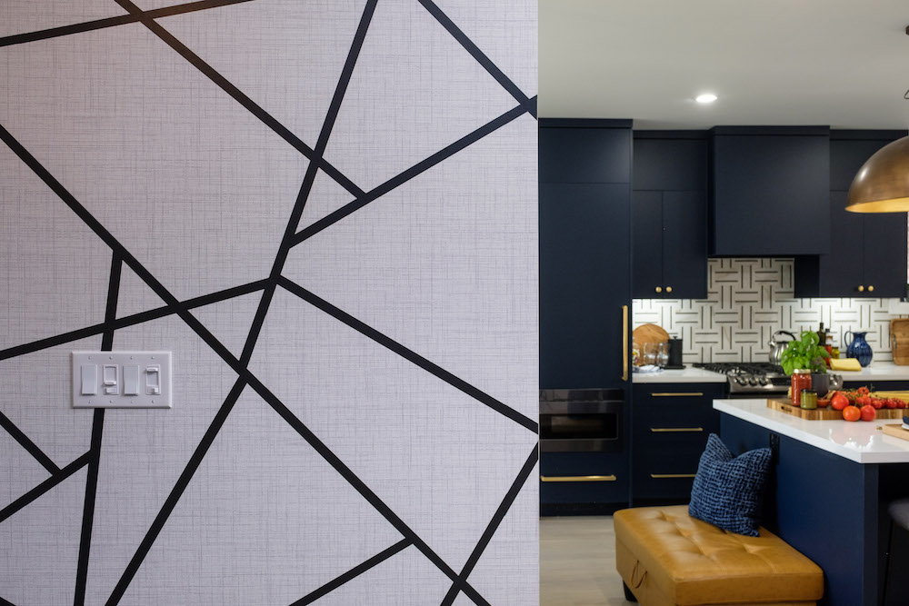
Mixing and Matching Personalities
Miguel’s penchant for black and white, combined with Grant’s love of everything colour, was a head-scratcher for Kortney. But she came up with a plan that incorporated bold blue with funky elements like this graphic wallpaper, which adds interest and layers to the space without throwing bright and abrasive colours in your face.
Related: These Designer Paint Secrets Will Completely ‘Wow’ Your Next Guests
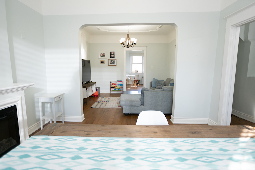
A Major Transformation
For context, this is what the space looked like before the renovation (and before Kortney and Kenny pulled back the walls to reveal all of the damage within). The lack of overall flow was definitely a problem for the couple, who had fled condo living to feel less boxed in.
Related: Kortney and Kenny Deliver a Functional Bohemian Forever Home with Minimalist Appeal
An Open Flow
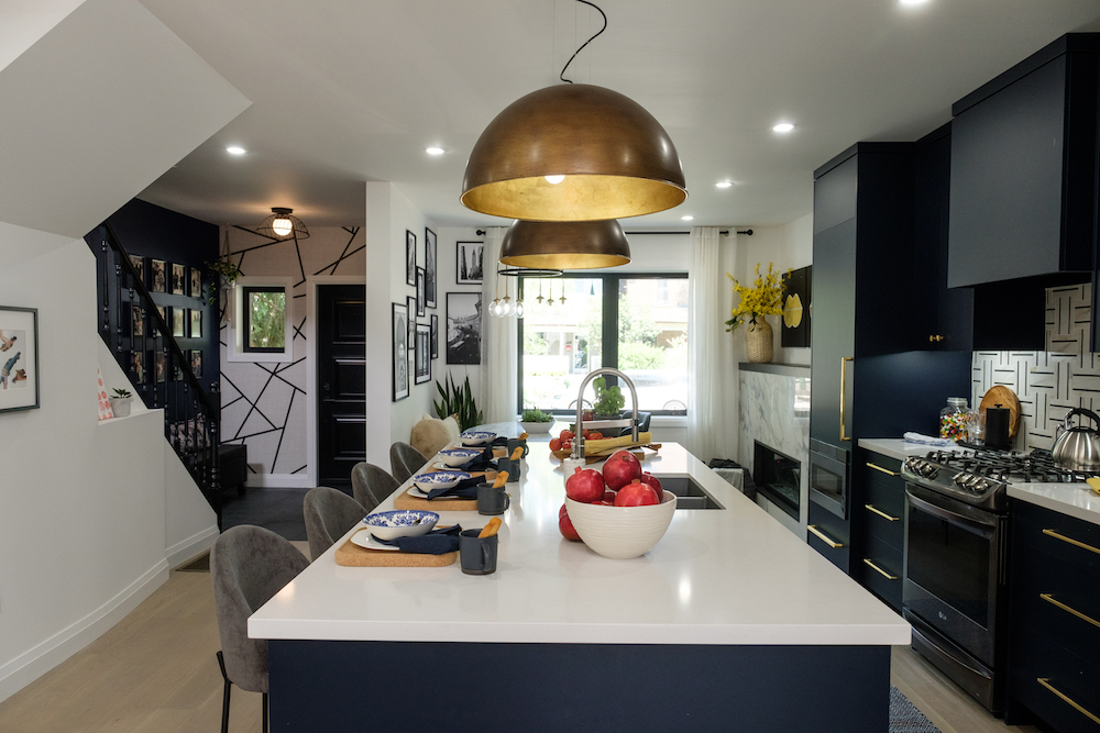
Here you can see just how much Kortney and Kenny opened up the space, making the new and large kitchen the focal point when you walk in. Having a large island was a top priority for this couple, so it centers the room without feeling in the least bit cramped. The result is a space that goes from a boxed-in nightmare to an open-concept flow with all of the high end touches you’d expect to find in a bigger floorplan in the suburbs.
Related: 10 Decorating Trends That Are on Their Way Out for 2022
Blue and Black
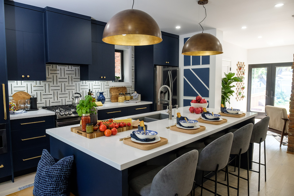
Blue was the only colour the couple could agree on, so Kortney went dramatic in the cupboard design with a blue so deep it almost looks black. Paired with that interesting backsplash and pure white counters, however, the blue pops and looks even more modern and rich. Add in some gold finishes with the light fixtures and hardware, and this is a polished, pretty and modern space.
Modern Living
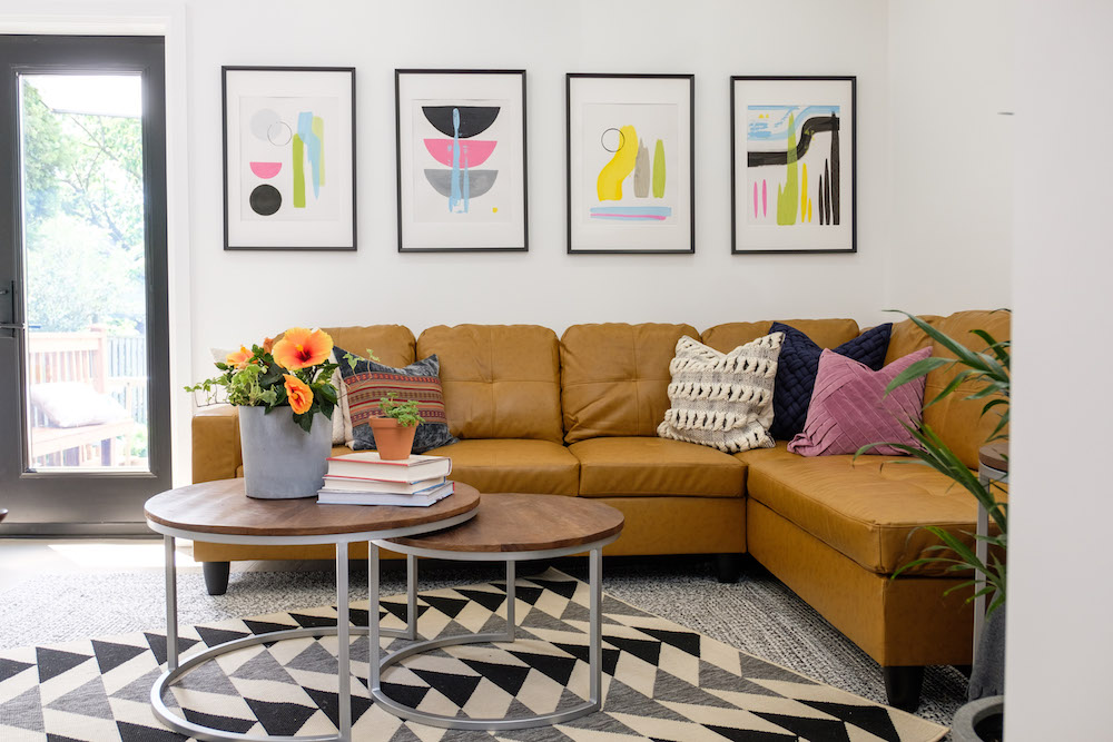
In the living room, Kortney and Kenny decided to stick with a modern appeal but toned back the dark colours with some brighter pieces of furniture. This room still features monochromatic finishes, but it also brings in some of that colour Grant was craving. After all, when you’re putting together a space for the family, you have to compromise and try to give each family member a bit of what they want.
Related: 12 Sectional Sofas That Will Transform Your Living Room
Keeping Original Charm
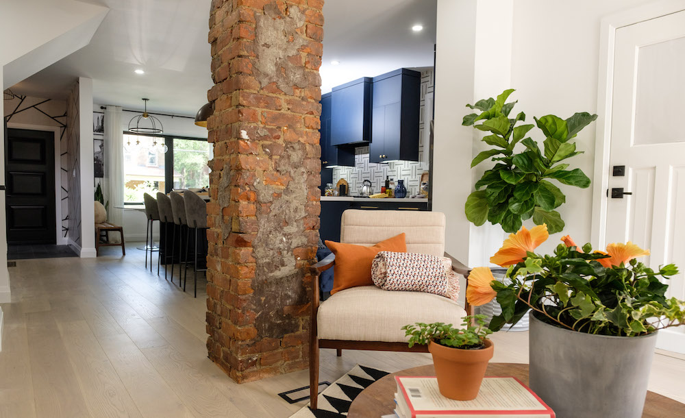
It would have been costly to remove this original stack. After fixing so many structural issues already, the couple just didn’t have the extra cash to do so. In the end, that might have been the right decision because now they’ve got an original piece that tells the story of the home and how old it really is. Of course, the stack itself looks a little better thanks to the repair work that went into it, but it still adds charm and character to the space.
Read more: This is What $1 Million Gets You Across Canada Right Now in Real Estate
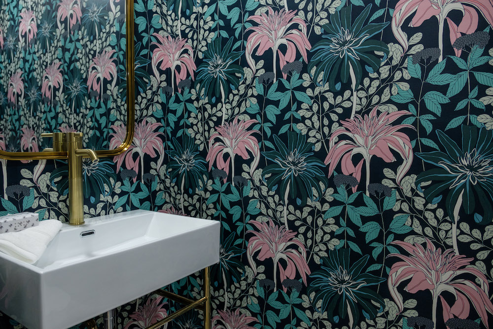
A Room For Grant
To keep Grant happy and inject a ton of personality into at least one space, Kortney chose this pretty wallpaper loaded with character. In the end, Miguel didn’t mind having the powder room feature a bit of extra colour, especially since it’s still modern and sleek like the rest of the new main floor design.
Related: Bathroom Design Idea Trends for 2022 That Will Stand the Test of Time
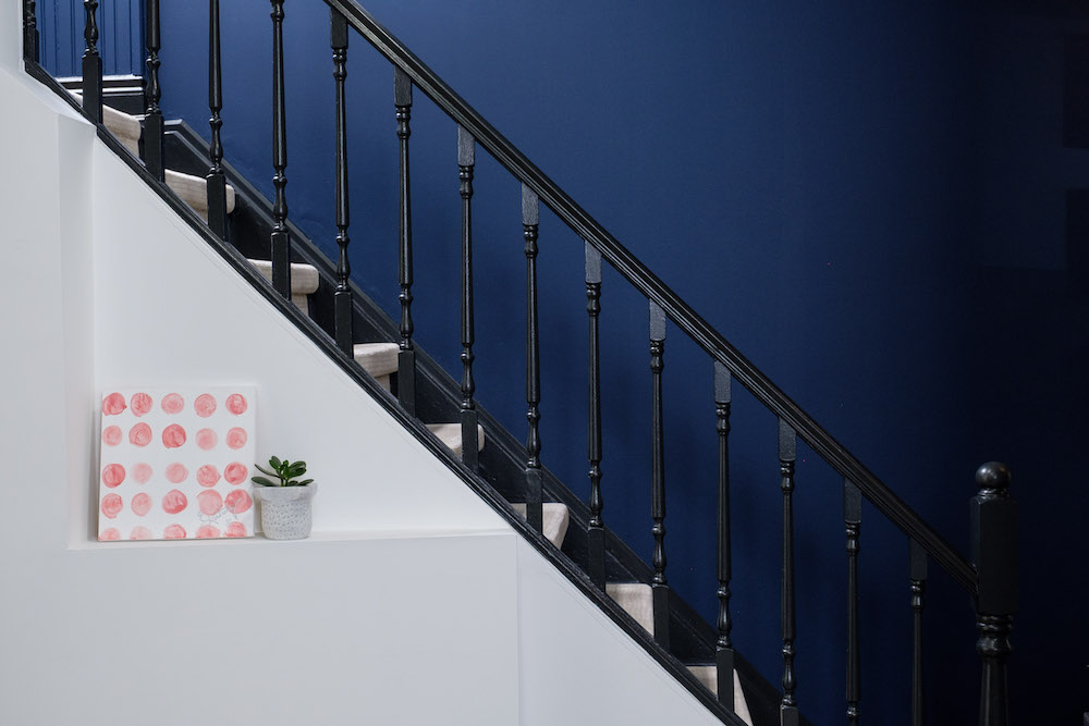
Stepping Up the Renos
Last but not least, the stairs got a bit of a facelift as well, with a bold new black finish and a new white runner that keeps things safe and sturdy. In the end, Miguel and Grant may have had to spend a little bit beyond their initial budget to have a structurally safe house, but thanks to Kortney and Kenny’s touches, it definitely feels like a home.
Watch: 5 Questions with Kenny Brain
Catch K&K on Making it Home With Kortney & Kenny, Wednesdays at 9 p.m. ET/PT on HGTV Canada.
HGTV your inbox.
By clicking "SIGN UP” you agree to receive emails from HGTV and accept Corus' Terms of Use and Corus' Privacy Policy.


