Single mom Carla had been through a lot over the past year. She had been bedridden for four months after surviving a shooting, and while she recovered from the traumatic event, she had a lot of time to stare at her walls and reconsider her living space. In the end, Carla knew she needed a dramatic transformation to make the house feel like a home in this new chapter of her life.
Enter Kortney, Kenny, and the Making It Home team. See how they transformed Carla’s old New Orleans house into a white and bright spa-like space, complete with modern finishes and serene vibes. Considering they had just seven weeks and a $115K budget to work with, we’d say it’s one of their brightest renovations yet.
Catch up on the latest season of Making it Home With Kortney & Kenny on the Global TV App and on STACKTV with Amazon Prime Video Channels. HGTV Canada is available through all major TV service providers.
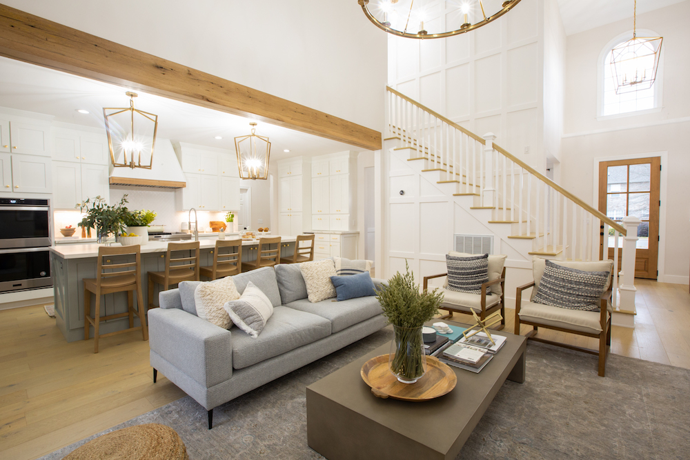
A Neutral and Bright Space
Carla was pretty clear that she wanted white and bright and that when it came to pops of colour, she wasn’t exactly a fan. Enter this open-concept design, which features large white walls, natural wood finishes and shades of blue-ish grey to draw out those serene vibes. Is this a newly renovated main floor or the waiting room of a spa? You be the judge.
Related: 10 of Our Favourite Canadian Furniture Stores in 2021
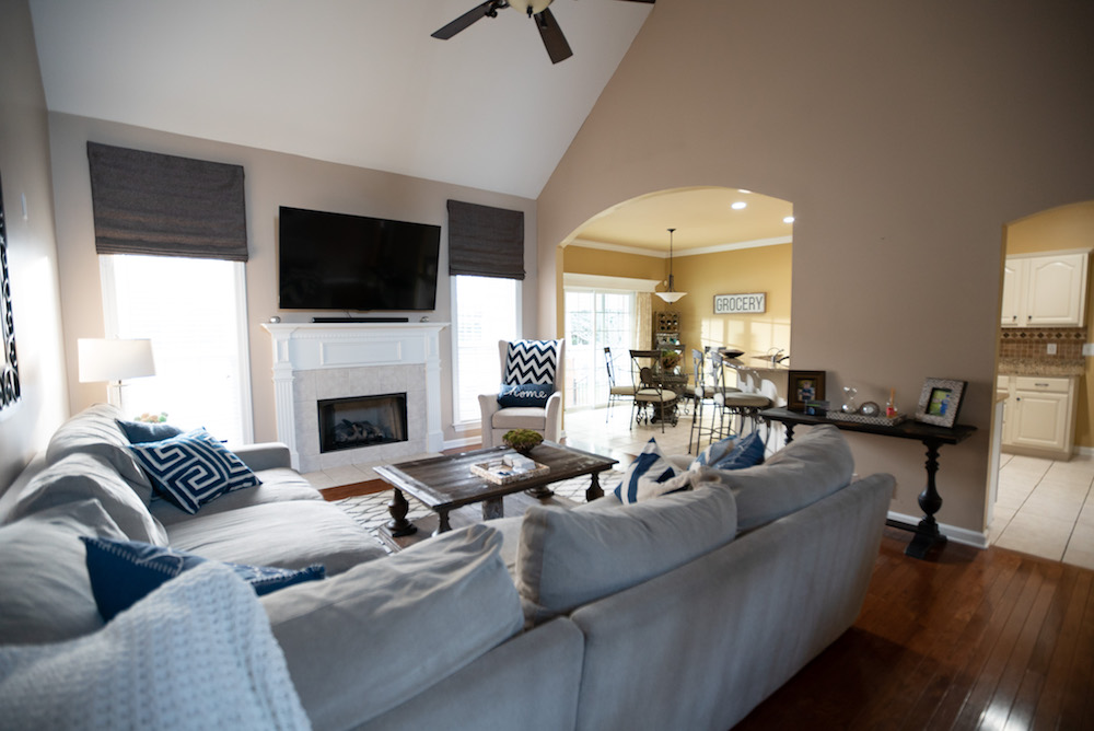
The Bland Before the Reno
Roughly 17 years ago, these arches would have given off more modern vibes than they do in the space today. Add in darker floors, a lack of proper lighting and an outdated yellow kitchen, and it’s no wonder Carla felt as though it was time to make this house the home she truly wanted.
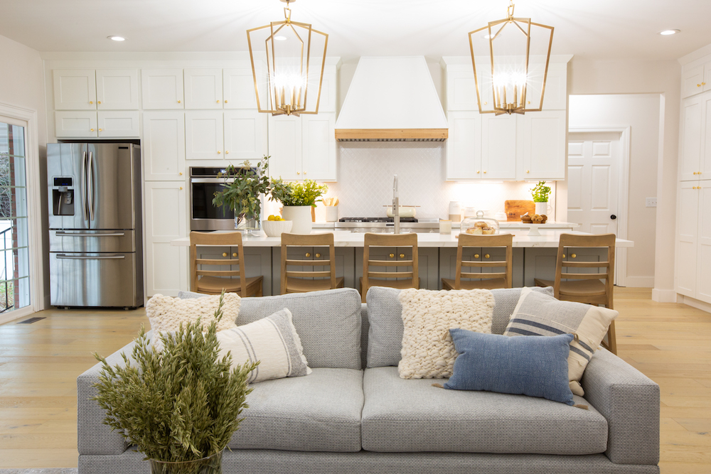
Finally! A Functional Kitchen
Carla definitely wanted a large kitchen to entertain and cook in, and we’d say Kortney and Kenny delivered with this gorgeous take. There are wall-to-wall cupboards that take advantage of the high ceilings and create tons of storage, plus the new enormous island doubles as an eating area. The muted grey on the island is just the right amount of colour to make the space pop, while gold-accented hardware keeps everything feeling modern and fresh.
Related: How Much Should You Actually Budget for Your Kitchen Reno?
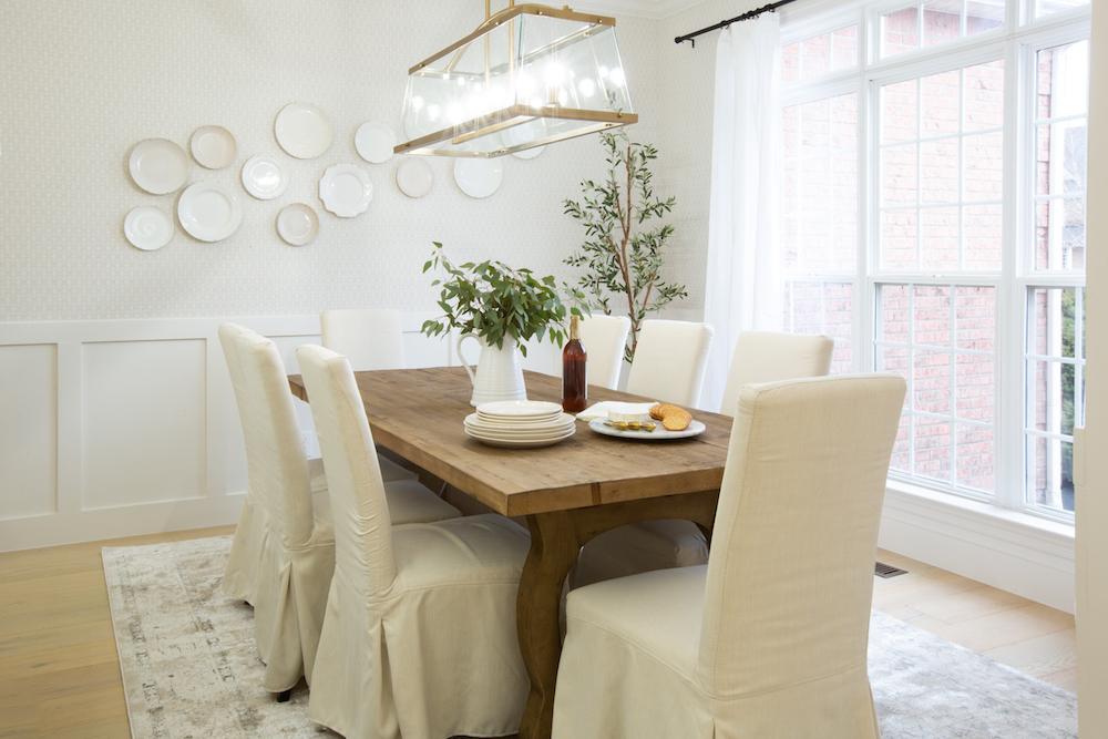
A Separate Dining Space
For those times Carla doesn’t want to entertain at the kitchen island, Kortney and Kenny set up this newly reconfigured dining room with the same modern touches. The flooring continues below and the white walls keep things bright and airy, while the wainscoting work on the lower portion of the walls feels updated and fresh. The table itself feels sturdy and slightly rustic but also elegant thanks to the chairs and swoon-worthy chandelier.
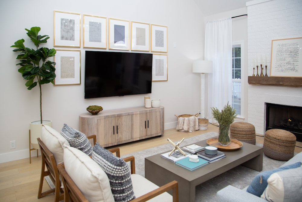
Living in Cozy Comfort
To really make the fireplace a focal point when you walk into this open-concept design, Kortney and Kenny moved the TV to another wall and continued the white brick all the way up. The wood mantle adds a bit of warmth, as do the well-chosen pieces of furniture, which offer ample seating and interesting angles that add character to the space.
Related: 5 Easy Touches to Make a New Space Instantly Feel Like Home
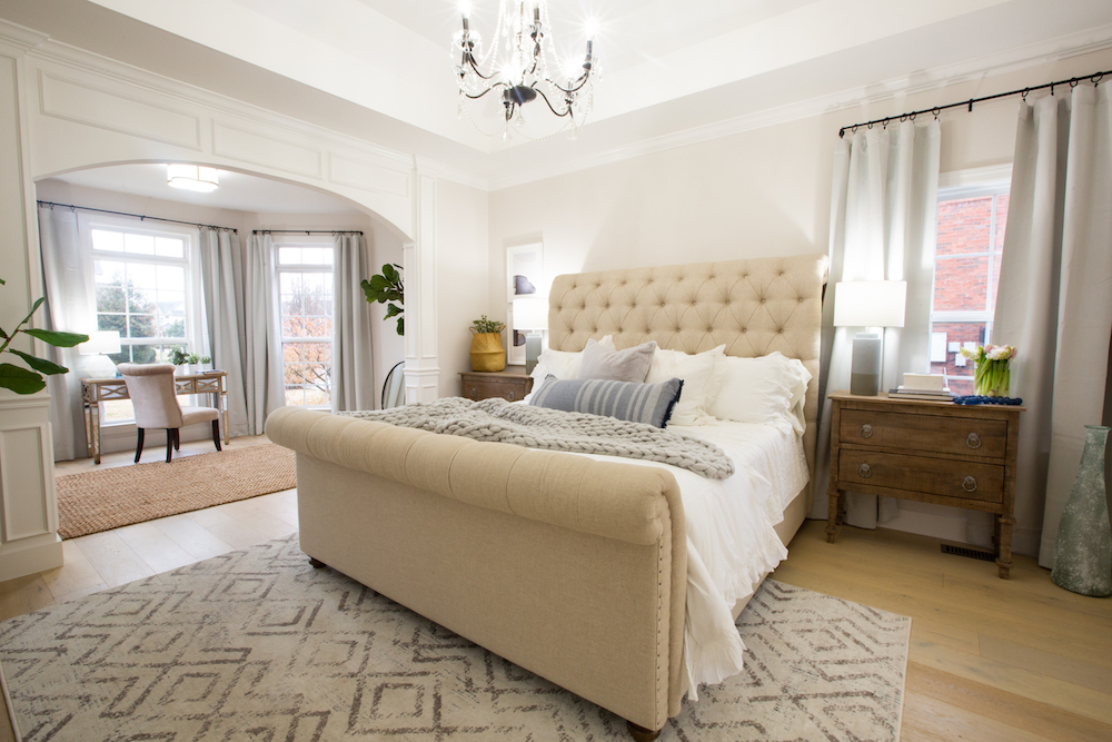
A Luxe Primary Retreat
Carla wasn’t expecting Kortney and Kenny to tackle the primary bedroom. However, they didn’t see why they should update the rest of the space and not her room. Besides, they wanted to create a sanctuary where Carla could rest and unwind after a long day in complete and utter comfort. So they did the same floors below and picked some furniture worthy of royalty, complete with this elegant chandelier.
Related: Kortney and Kenny Create Rustic Charm in This Family Home
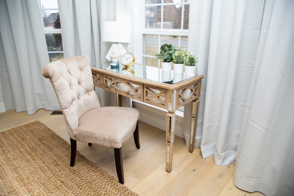
A Stately Alcove
Even the primary bedroom sitting area got a touch of glam thanks to this beautiful vanity and chair set. It can be used as a desk or as a make-up station, where Carla can take advantage of all the natural light floating in from the window behind.
Read more: 10 Cozy Home Office Ideas That’ll Inspire You to Work This Winter
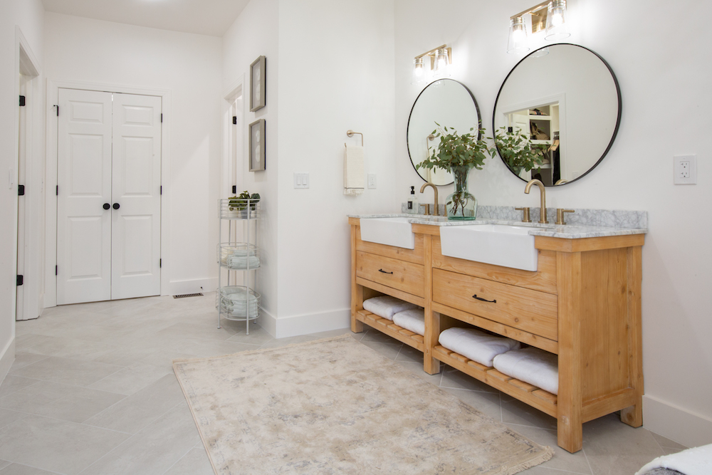
Enlarging the Bathroom Space
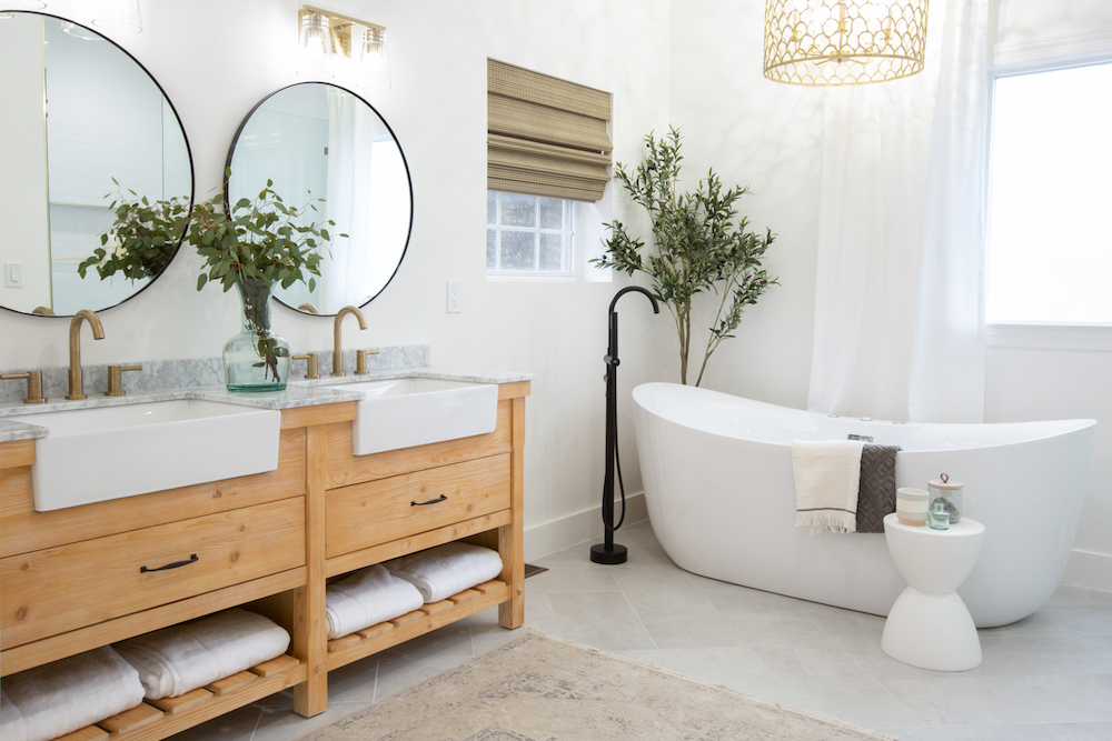
Getting a new main floor is great and all, but when you’re talking about a true spa-like space, everyone knows it’s the bathroom that really counts. Kortney and Kenny made sure that Carla’s new primary ensuite was one to write home about, from the adjoining walk-in closet to the beautiful dual vanity.
Related: 10 Natural Ways to Keep Bathroom Tile and Grout Free From Mould
Magazine-Worthy Tub
This large, soaker tub is straight out of a magazine, what with the standalone faucet, the hanging chandelier, and the pops of foliage to make it all feel even more tranquil and serene. Meanwhile, the white and wood accents continue to give the space continuity with the rest of the house, and modern but light grey tiling below add just the right amount of warmth.
Related: Bathroom Design Idea Trends for 2022 That Will Stand the Test of Time
Walking Into the New Spa
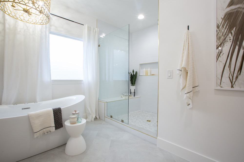
Last but not least, Kortney and Kenny delivered this beautiful walk-in shower complete with a bench, built-in shelves, and a glass door to keep the open flow. Because when you have a crew like this come in and make your house feel like the spa-like forever home you’ve always dreamt of, you want to keep every beautiful detail on full display.
Read more: These 12 Renos Will Have the Biggest Impact on Your Home
HGTV your inbox.
By clicking "SIGN UP” you agree to receive emails from HGTV and accept Corus' Terms of Use and Corus' Privacy Policy.


