If you’re Kortney Wilson, what’s better than having one space to redesign and stage for a flip? Having two spaces in one, of course. That’s the situation Kortney and Dave faced when they took on a duplex on a recent episode of Masters of Flip. Sure, the couple may have extended their timeline, but in the end they were able to create two modern yet classic spaces with beautiful pops of red that not only attracted a fair share of potential buyers, but landed them top resale dollars too.
Coming Home
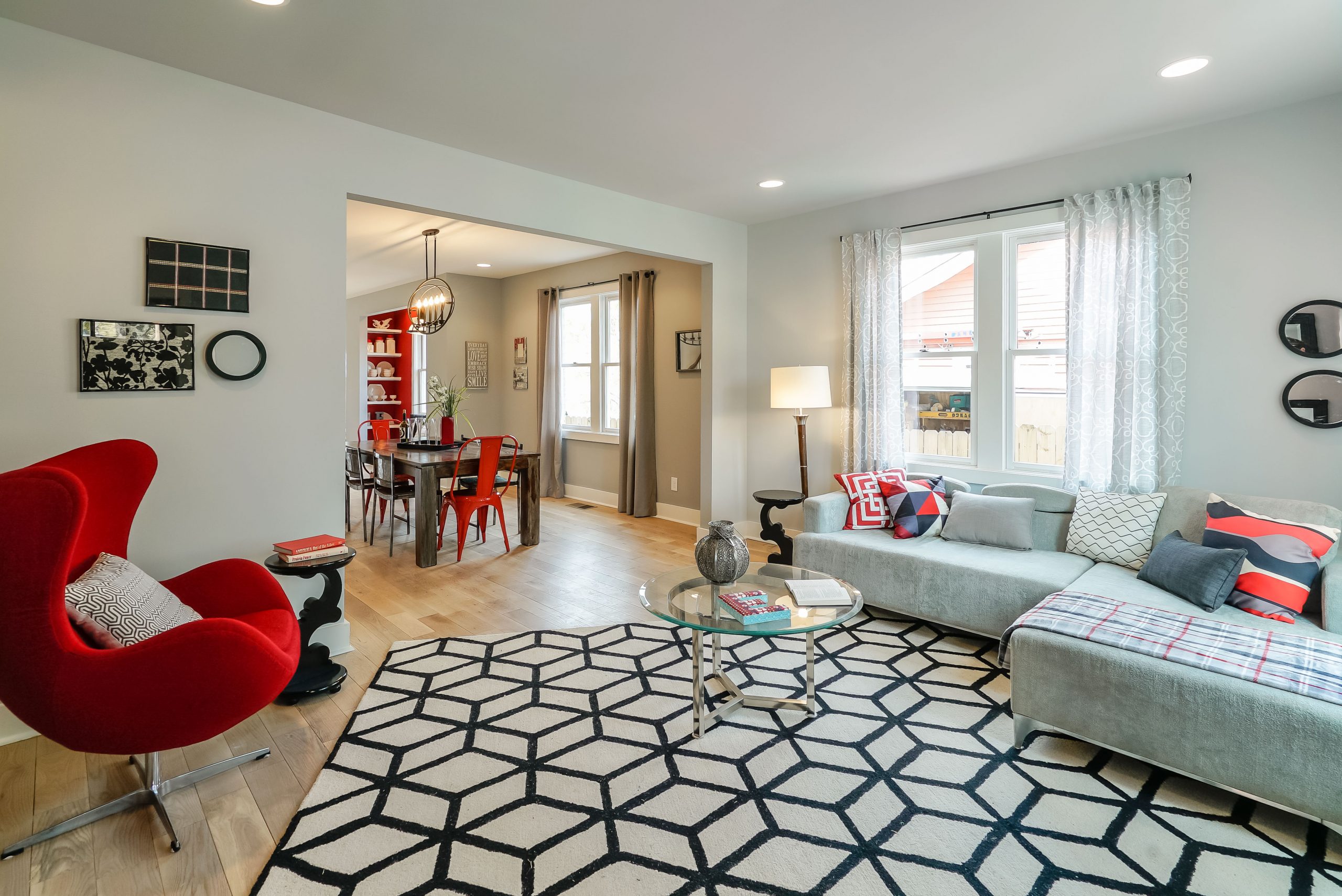
To make a lasting first impression as soon as you walk through the front door, Kortney added a fun, geometric patterned area rug to the main living area, which lends modernity to the classic hardwood floors. Furniture pieces like an oversized sofa, a bright red armchair and a glass coffee table complete the look.
Seeing Red
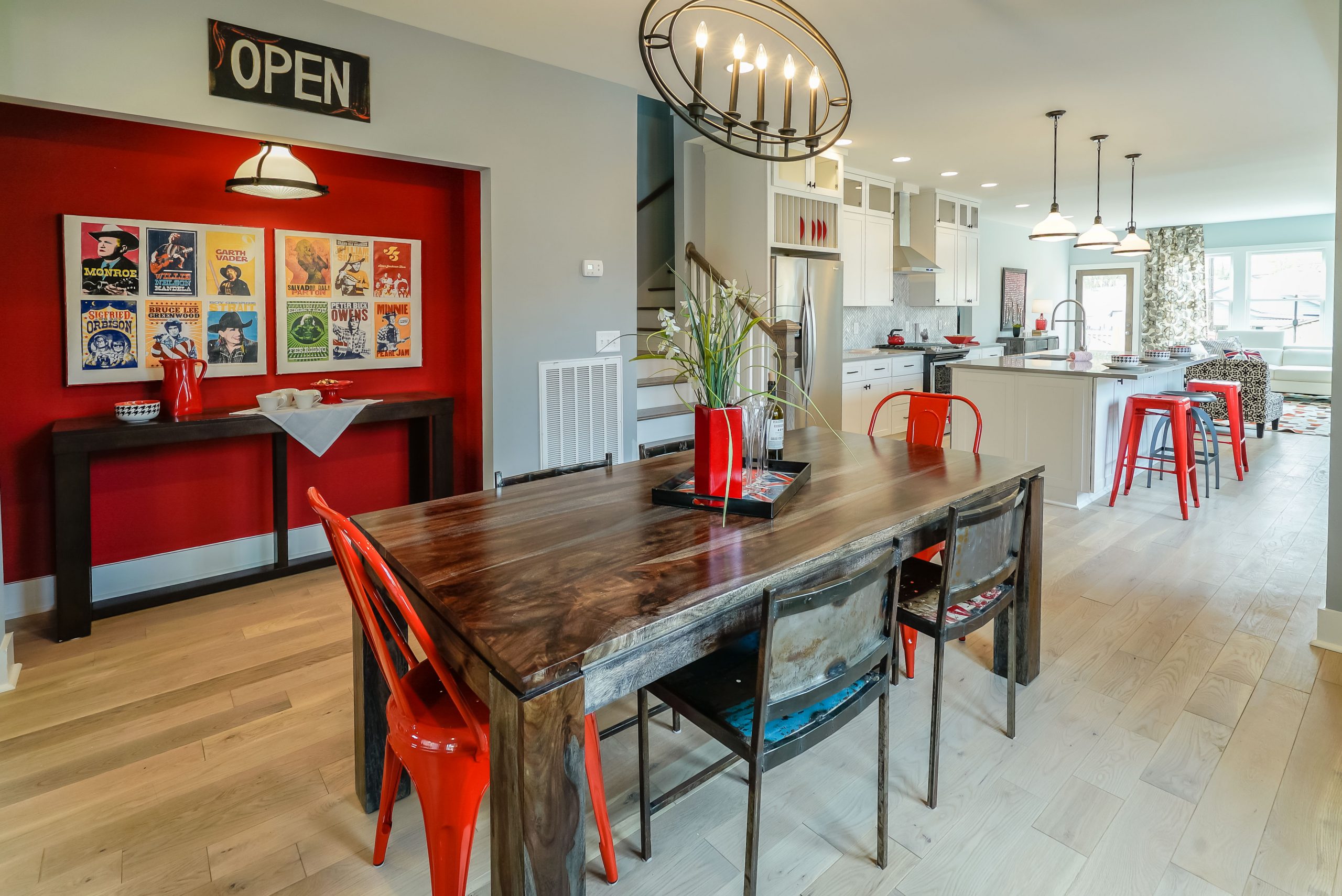
What started out as a closet made the perfect nook for a pantry, a bar or extra storage in the dining room. Kortney tied the red walls back into the main space with bright red chairs and table accessories, but kept the overall look classic thanks to the dining table’s dark wood finish. Add in a few modern-meets-rustic light fixtures overhead (we love the candle-inspired chandelier!) and it becomes a space we’d definitely dine in.
Bright and Airy
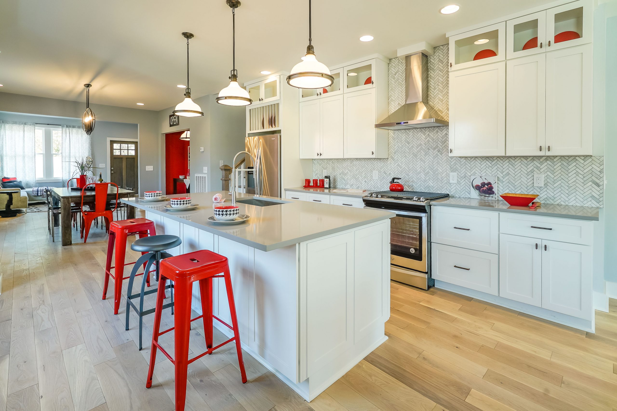
The red theme continues into the open-concept kitchen thanks to bright bar stools and the dinnerware displayed on the countertops and cabinets above. A large island adds function, automatically creating a breakfast bar and giving homeowners more counter space for meal prep. Meanwhile, large white cabinets and a statement herringbone backsplash soak in and reflect the space’s natural light.
Pretty Pantry
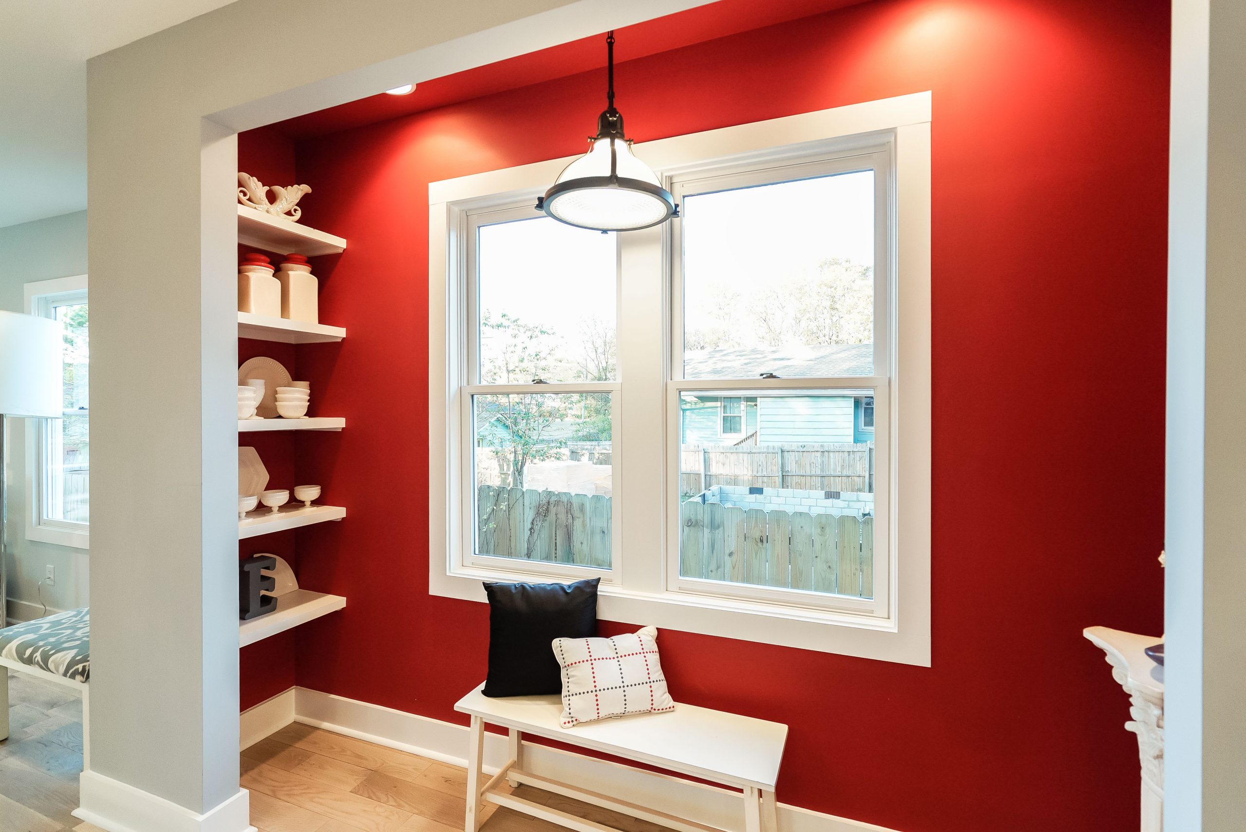
On the opposite side of the kitchen, Kortney added a second red nook, tying the concept together and giving it a more uniform feel. Homeowners can make use of the extra shelving for an open-concept pantry, or add a bench for additional seating.
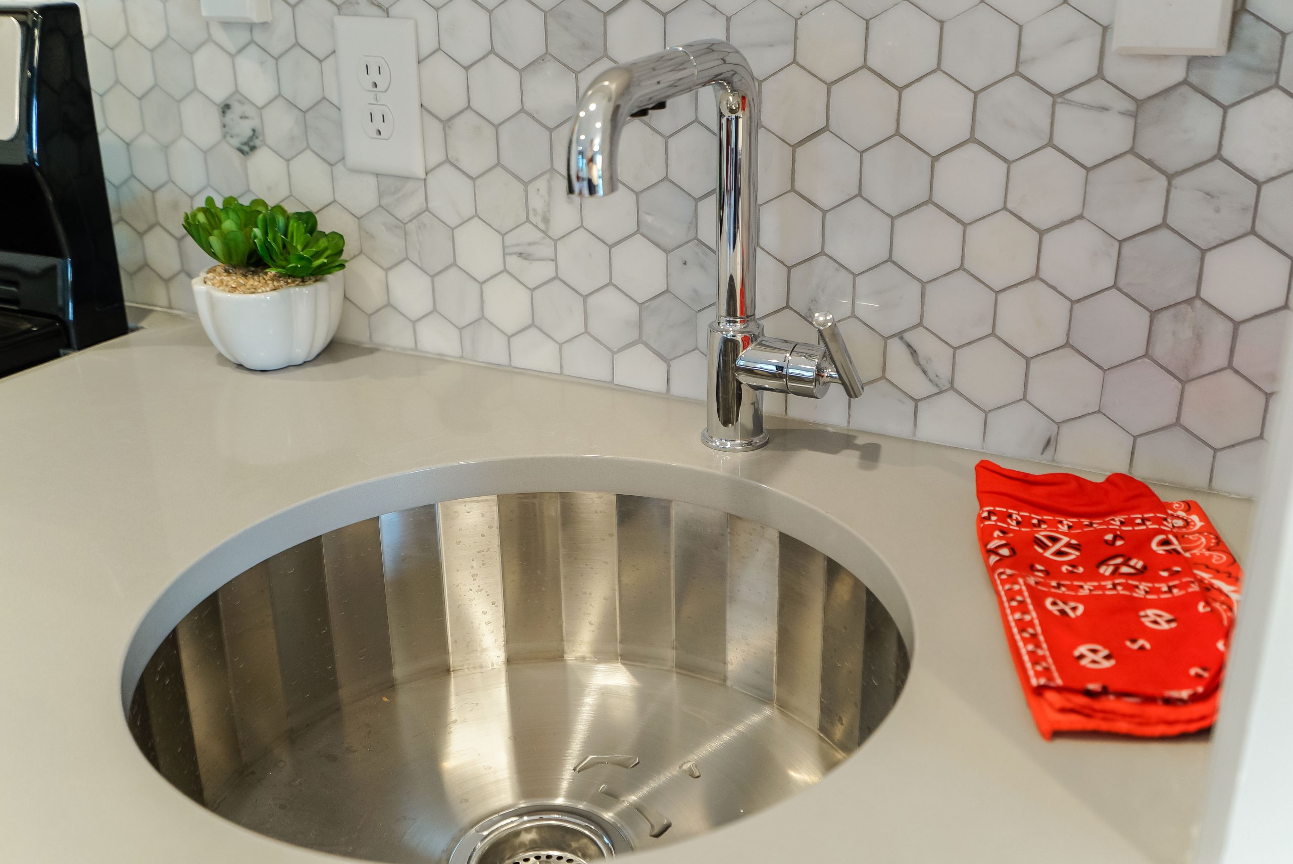
Stainless Steel and Sleek
High-end stainless steel finishes like this edgy sink add an extra layer of modern luxury. Coupled with the updated appliances, this well-equipped kitchen feels like a space designed for a chef.
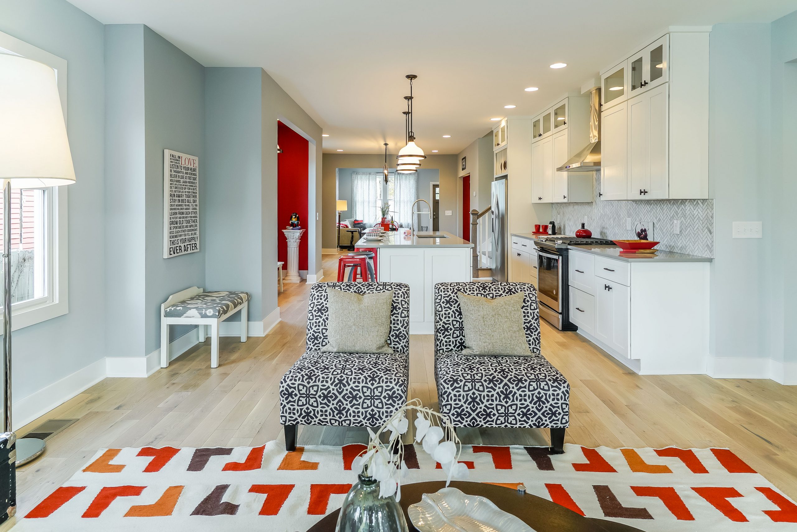
Warm Undertones
The second sitting area is less formal than the first and boasts a warmer colour scheme. Rather than continuing with the bright red hues, Kortney incorporated burnt orange shades and neutral walls in order to create a cozier, more contemporary space fit for the whole family.
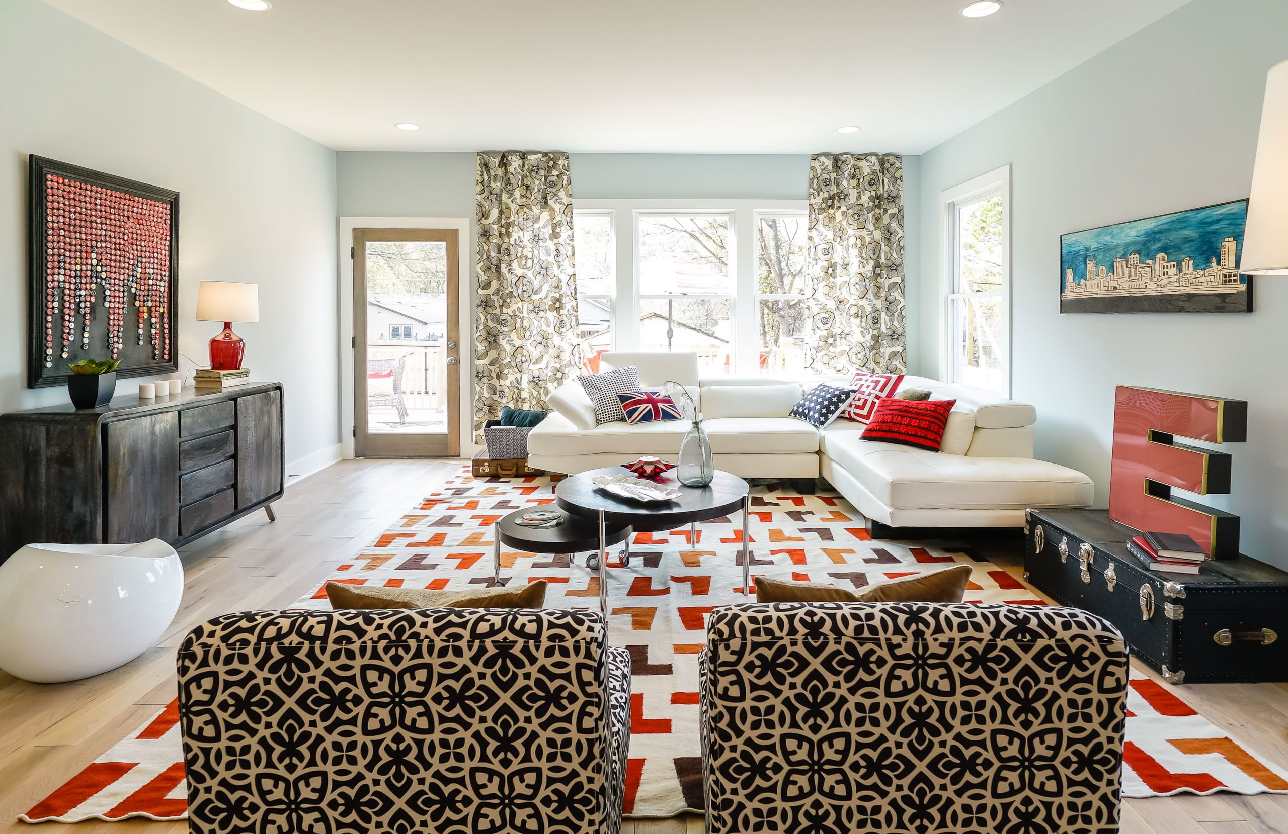
Natural Light
Red is still present in this space, just toned down in favour of other interesting colour combos like the earthy hues seen in the area rug and artwork above the stained cabinet. The room also lets in plenty of natural light and leads to a gorgeous deck, making it a great main floor for entertaining.
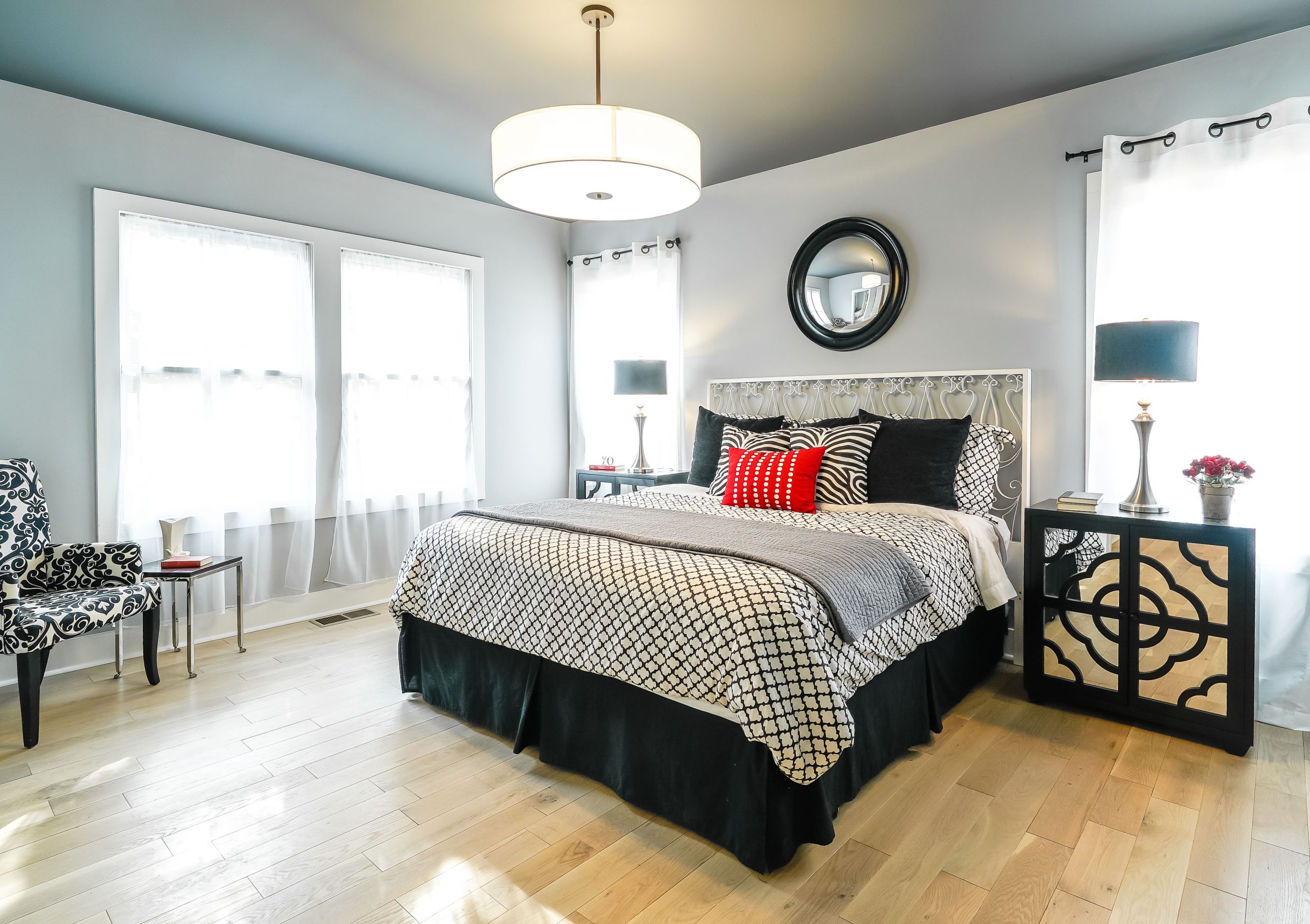
Main Floor Master
The master bedroom is cleverly located on the main floor and features many classic finishes, such as the aforementioned hardwood and traditional baseboard and trim. Black and white textiles create a textured look, while smaller pops of red tie the room back to the rest of the house.
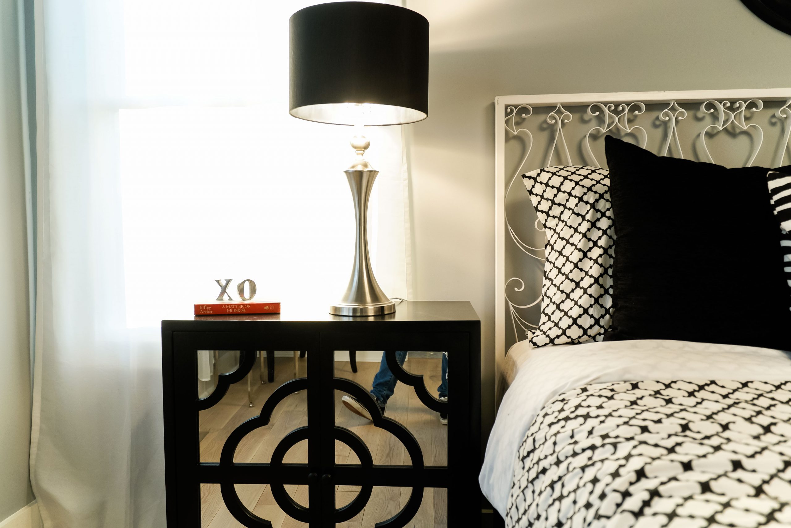
Modern Nightstands
These modern night tables feature a playful design on a mirrored surface, which helps open up the room while keeping the overall look sleek and sophisticated.
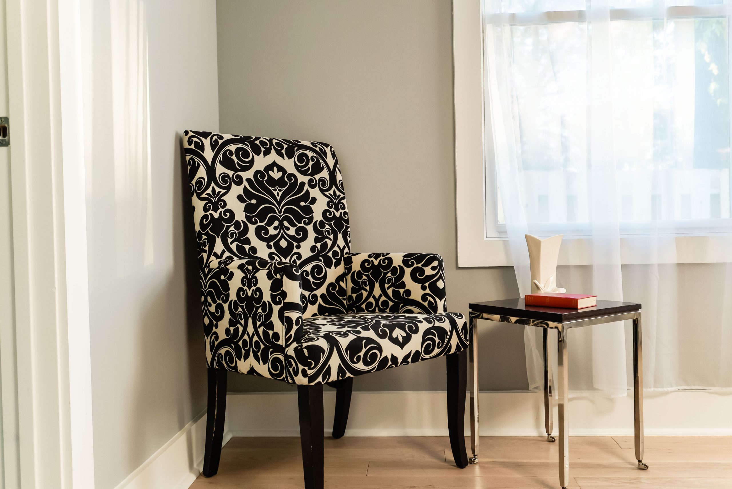
Reading Nook
No corner in this house is wasted; in the master bedroom, Kortney created a small reading nook with this classic armchair and coffee table combo. The chair’s playful design complements some of the other fun elements in the room, as do the table’s reflective legs.
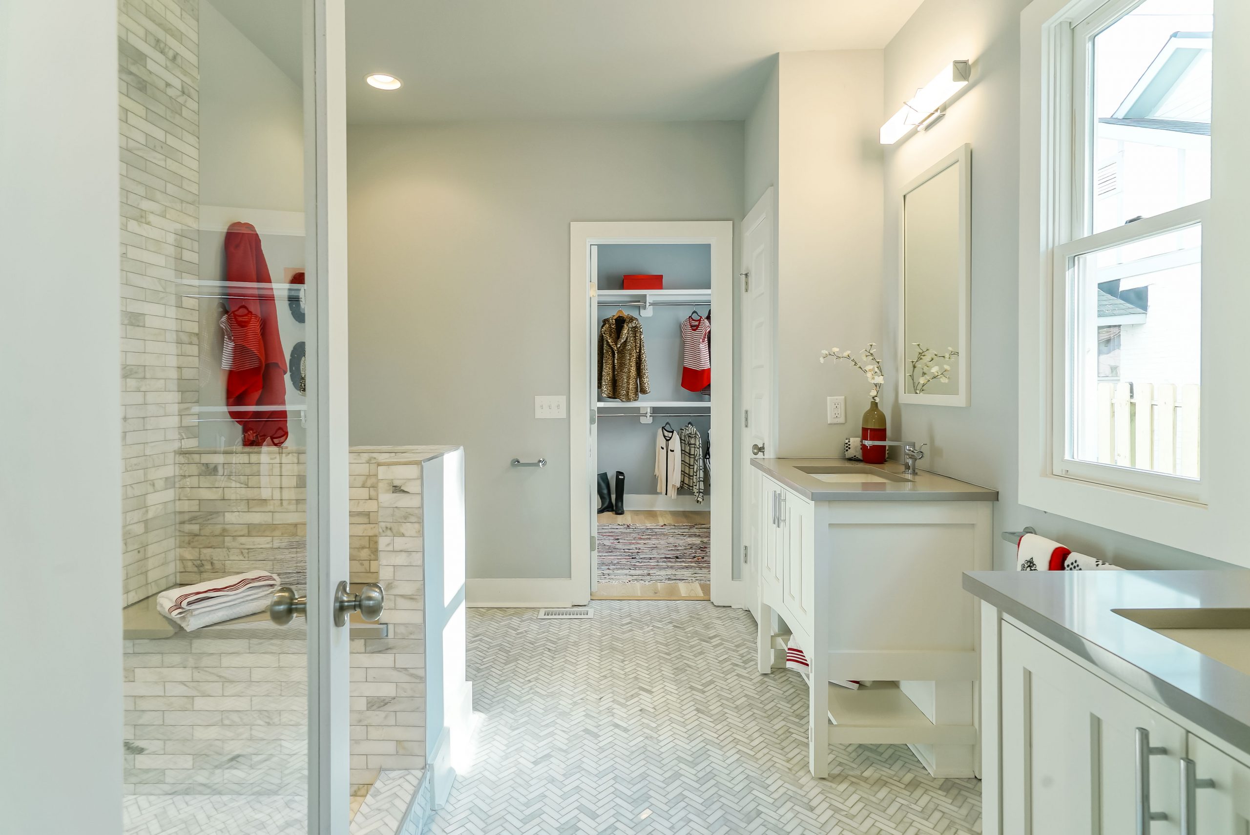
Flowing Ensuite
This ensuite is bright, big and beautiful thanks to the herringbone floor tiles and open-concept shower. The shower bench is an additional touch of luxury that any homeowner would love, while the two vanities provide ample storage and help to elongate the space.
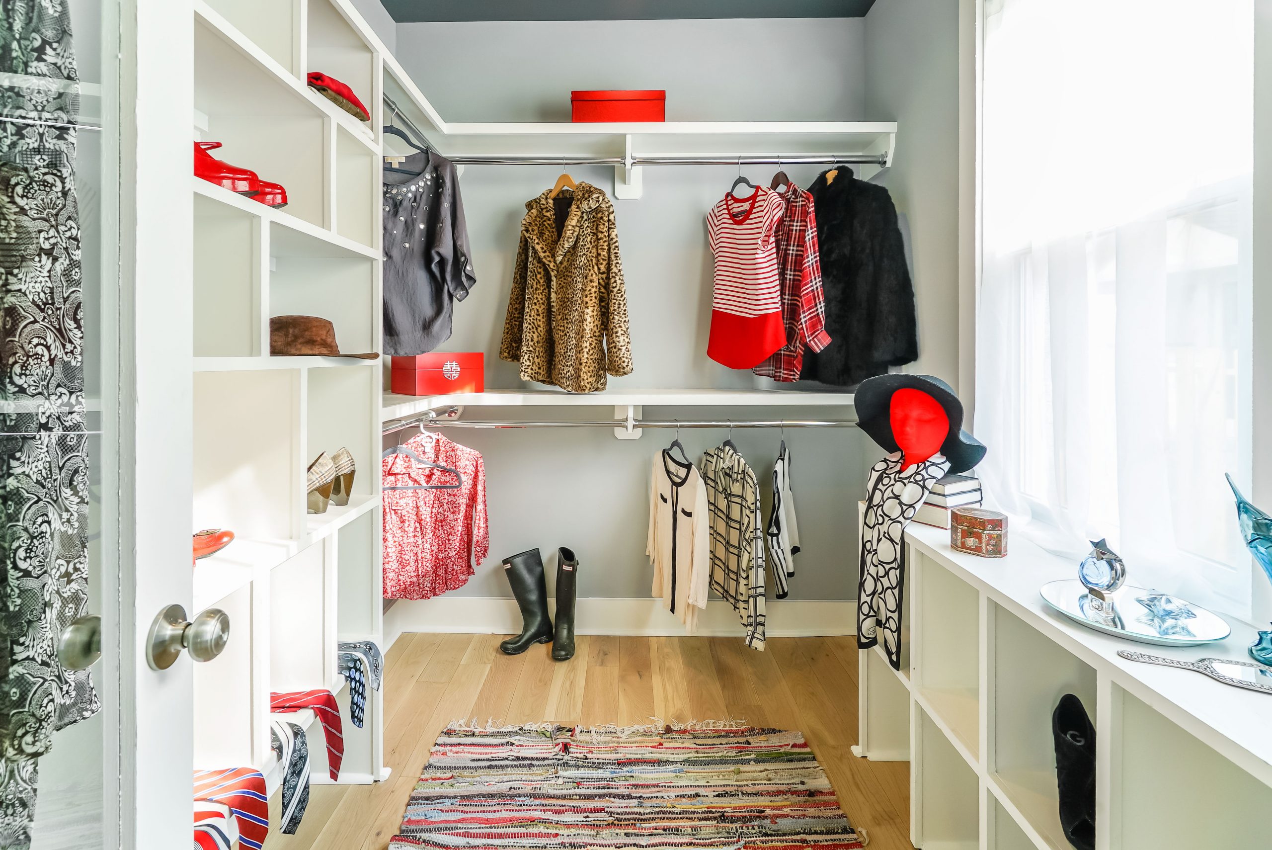
Organized Living
The master closet is just as prettily done up thanks to pops of red, black and white. But the real selling feature is the shelving, which encourages instant organization. Of course having a window in your closet never hurts either.
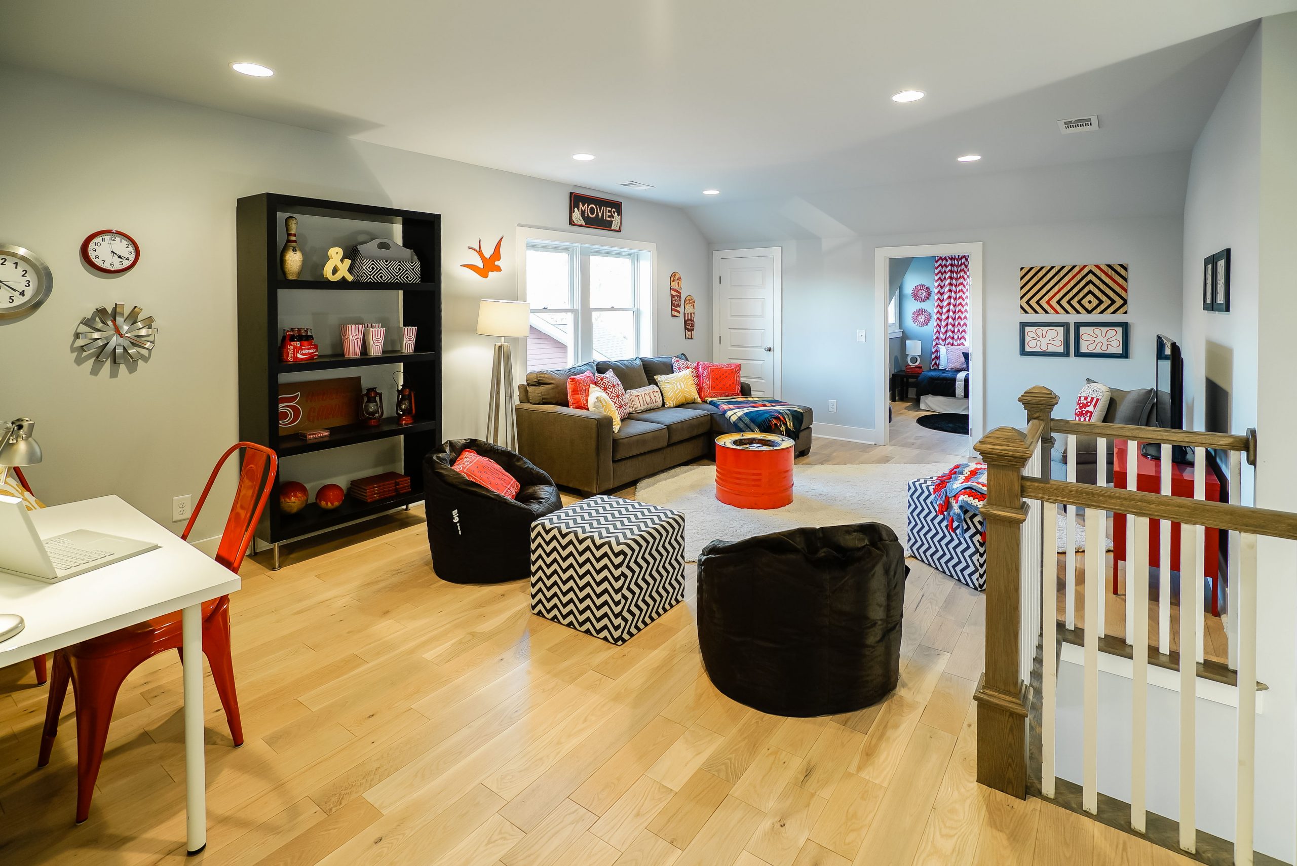
Double Dens
Because two sitting areas aren’t enough, Kortney maximized the upstairs by adding what she calls a “bonus room” that’s perfect for TV marathoning or as a kids’ play space. The red theme continues here too with accents like the industrial-style chairs and coffee table. The addition of mismatched furniture helps to create a more lived-in vibe.
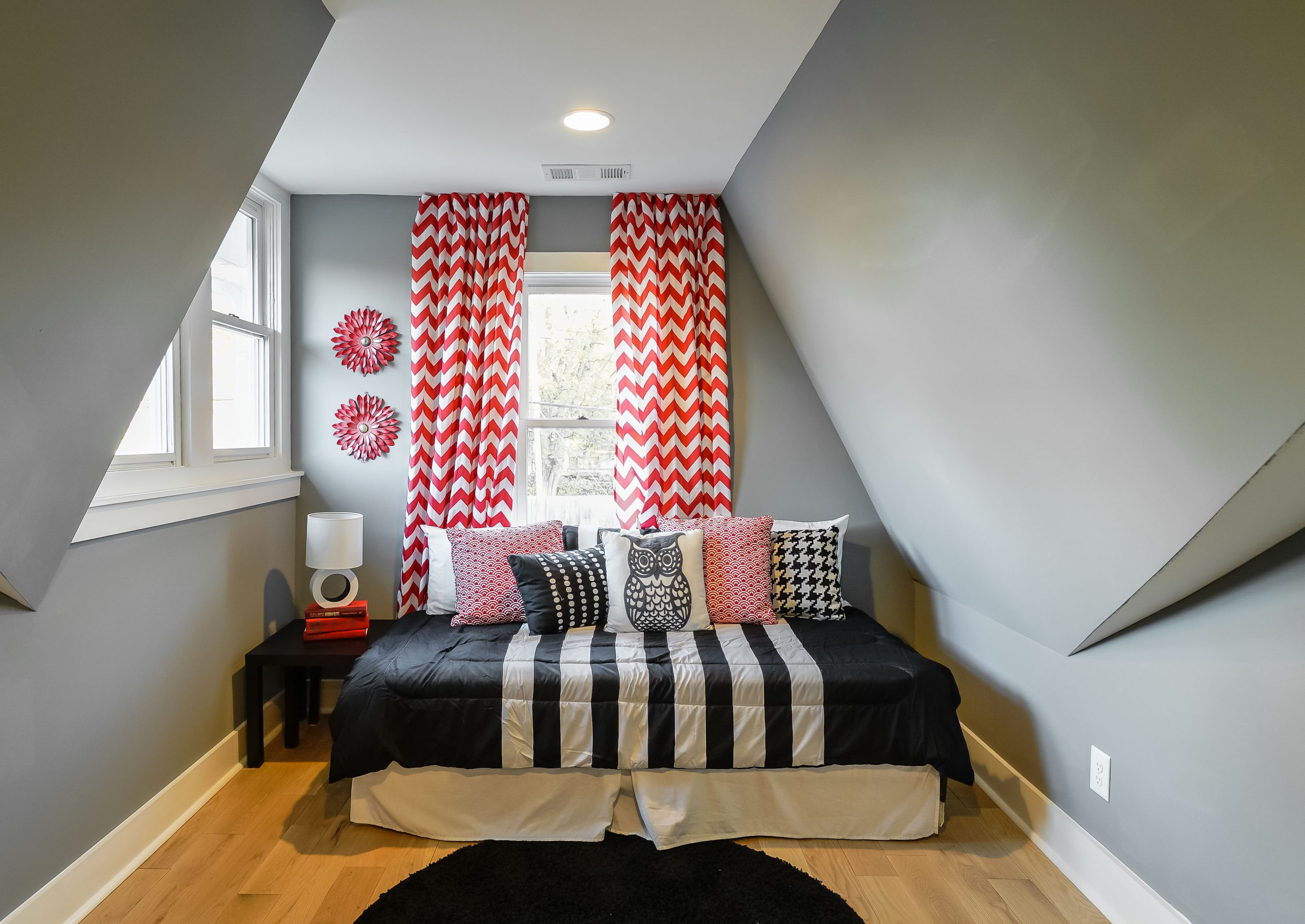
The Convertible Room
Off to the side of the den is this third bedroom, which is small enough to serve as a guest room, nursery or even an office. Or, as Dave pointed out, it could be a man cave for big and small men alike.
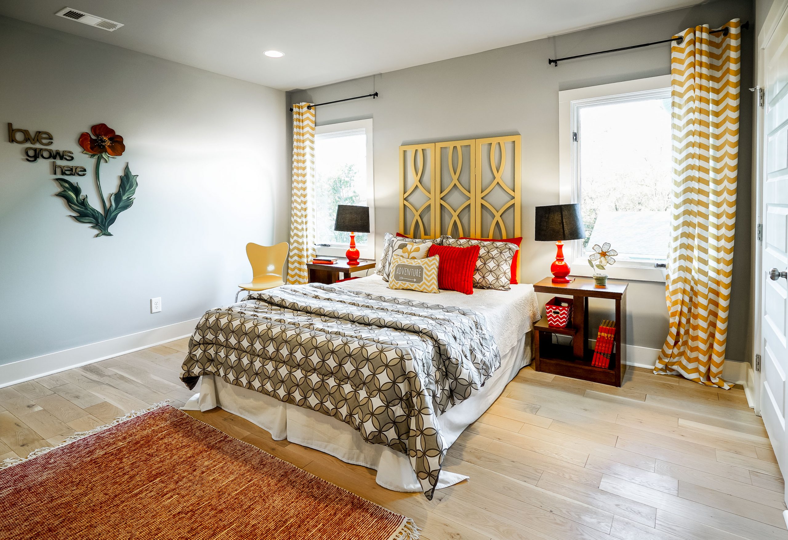
A Touch of Yellow
In the second larger bedroom, Kortney punched up the red scheme by introducing fun yellow elements like the headboard and striped curtains. The result is a youthful space that still suits the home’s overall palette, but feels bright and contemporary as well.
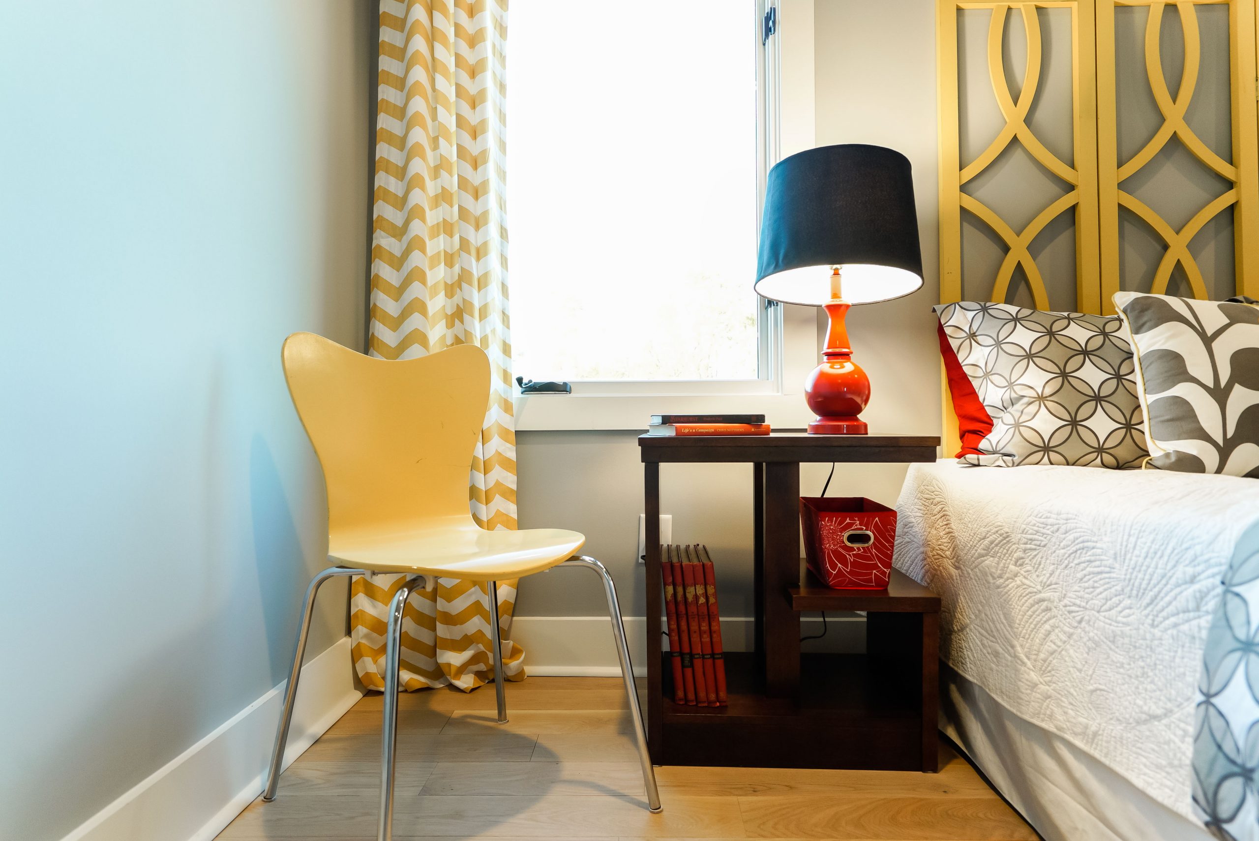
Finishing Touches
Kortney proves that you don’t need to repeat the exact same shade to create a cohesive look and make a statement. Here, various hues of yellow and red play off and complement one another.
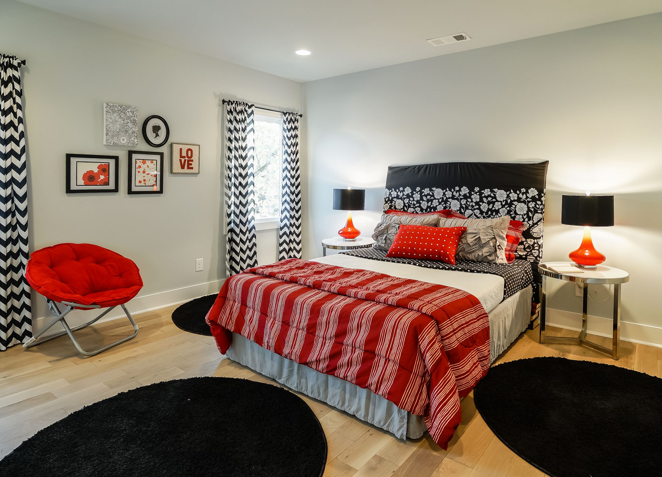
Neutral Staging
The first bedroom continues the red theme thanks to the bedspread, sofa chair and ombre lamps, but again Kortney demonstrates that red doesn’t rule all. The designer opted for fun, playful elements like the black round rugs and chevron curtains, creating a gender-neutral room sure to capture anyone’s imagination.
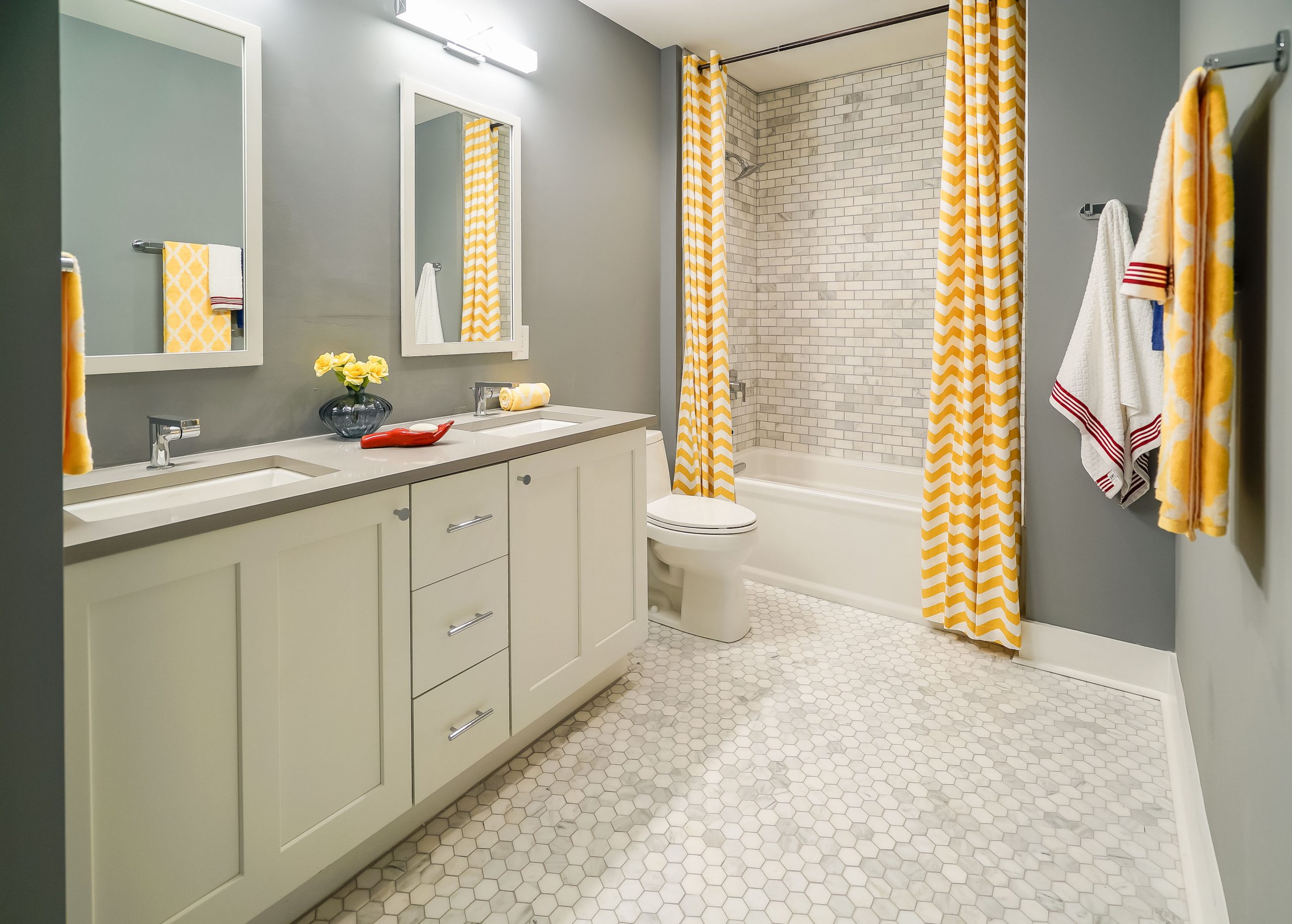
Shades of Grey
The upstairs bathroom may tone down the home’s red theme, but it’s still just as bright and modern as the other rooms. The hexagonal floor tiles provide texture and instantly catch the eye, as do the coordinating wall tiles in the shower. Add in some fun hits of yellow and you end up with the perfect space for children and guests alike.
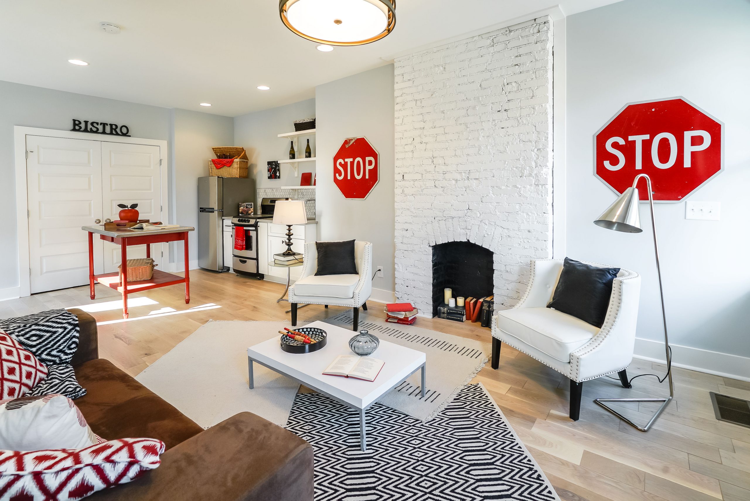
A Renter’s Dream
Next door, Kortney and Dave created the ultimate floor plan by keeping two levels for potential renters. The main floor also benefits from a red-inspired design, one that still features natural elements like this painted fireplace. Geometric patterned textiles lend a modern feel to the space, while more classic pieces like the armchairs and couch balance it all out.
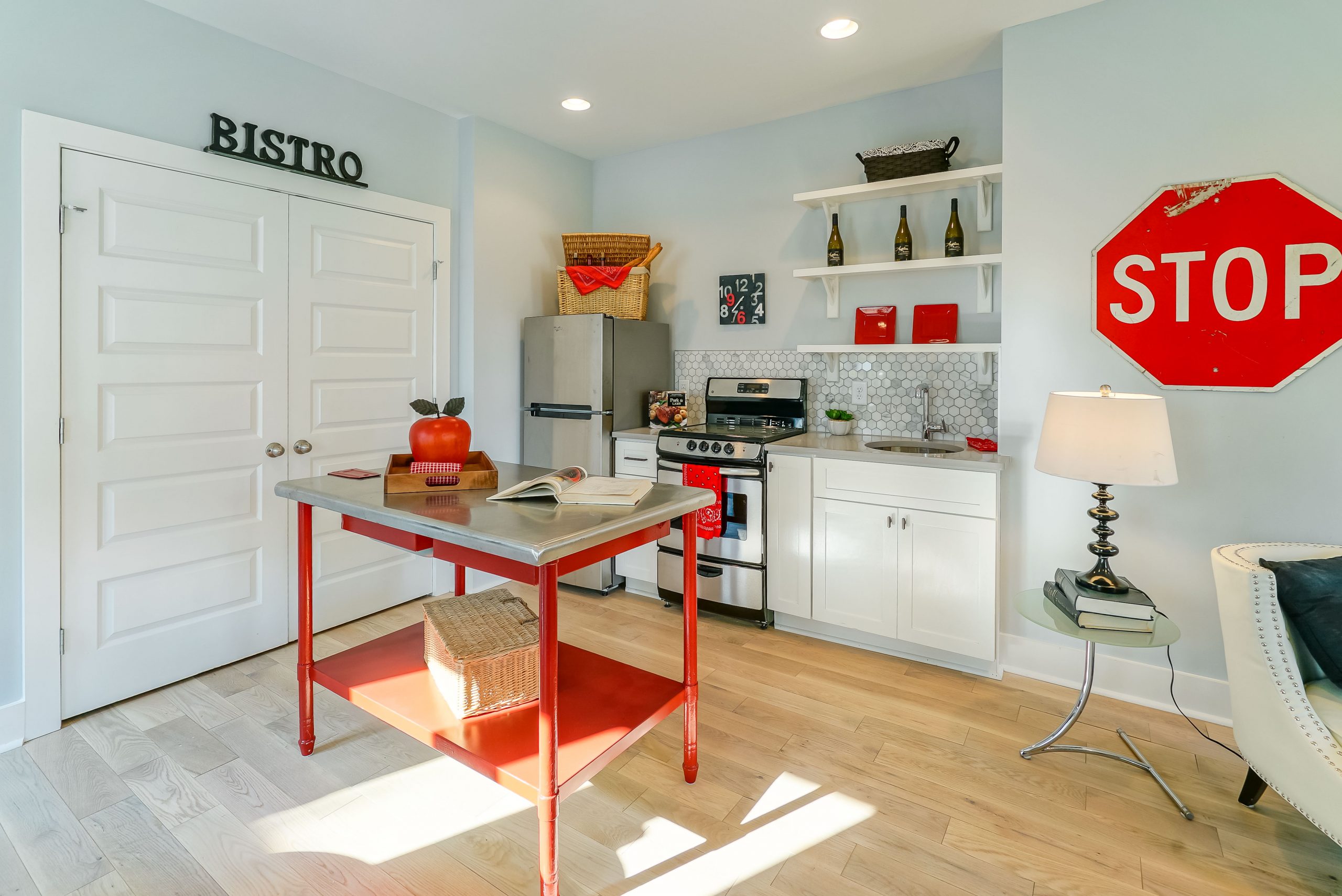
Charming Kitchen
This kitchen may be small, but it packs a mean punch both in design and functionality. The compact island is funky but useful, serving as additional counter or eating space. The stainless steel appliances and honeycomb backsplash add a clean, modern feel.
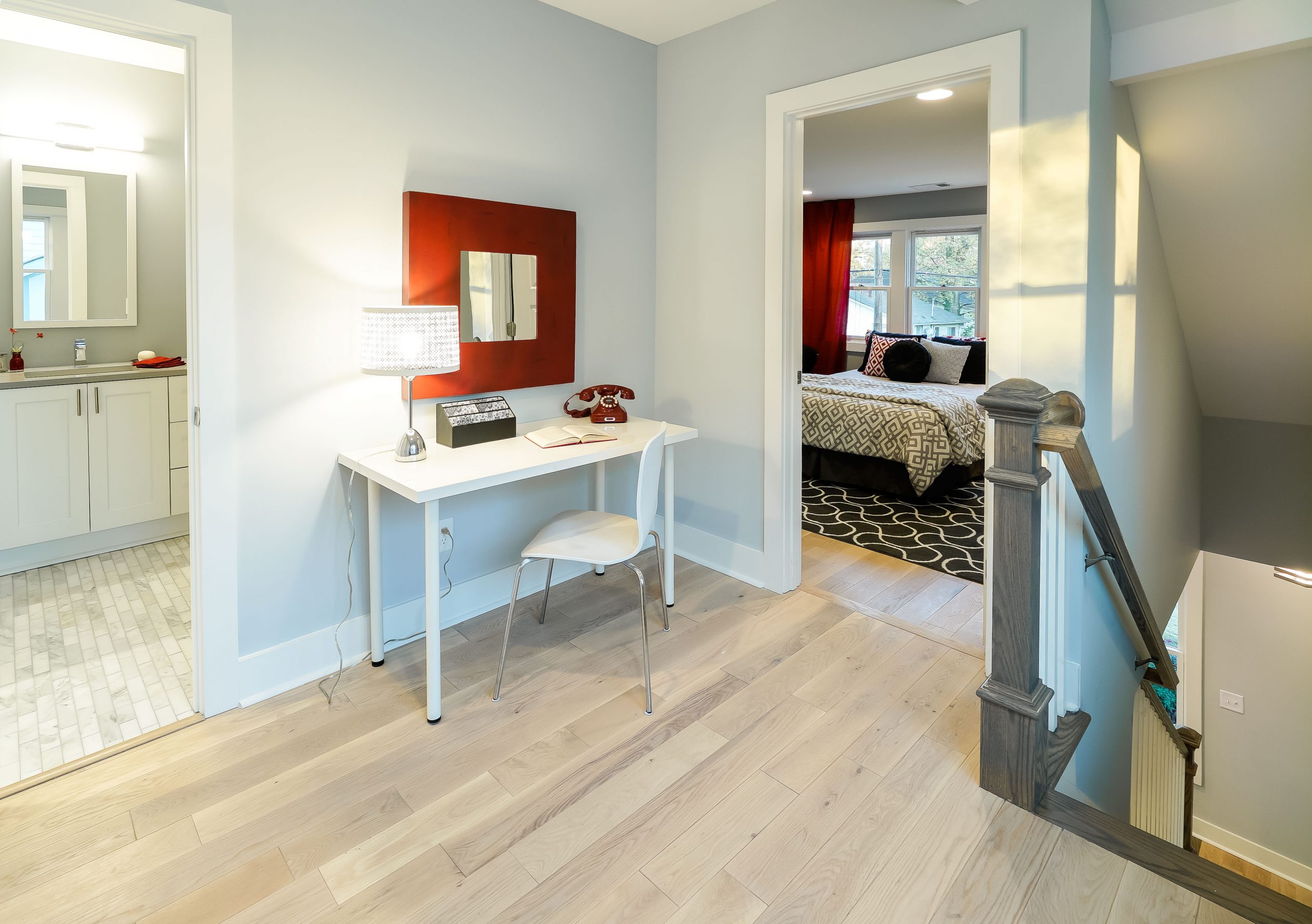
Makeshift Office
Upstairs, Kortney maximized space by fashioning a small office area, which is the perfect solution for those looking to work from home. The narrow table is the ideal makeshift desk, while the sleek chair and added electrical outlet keep it functional. Add in the gorgeous mirror with large red trim and it’s as if this landing is a room of its own.
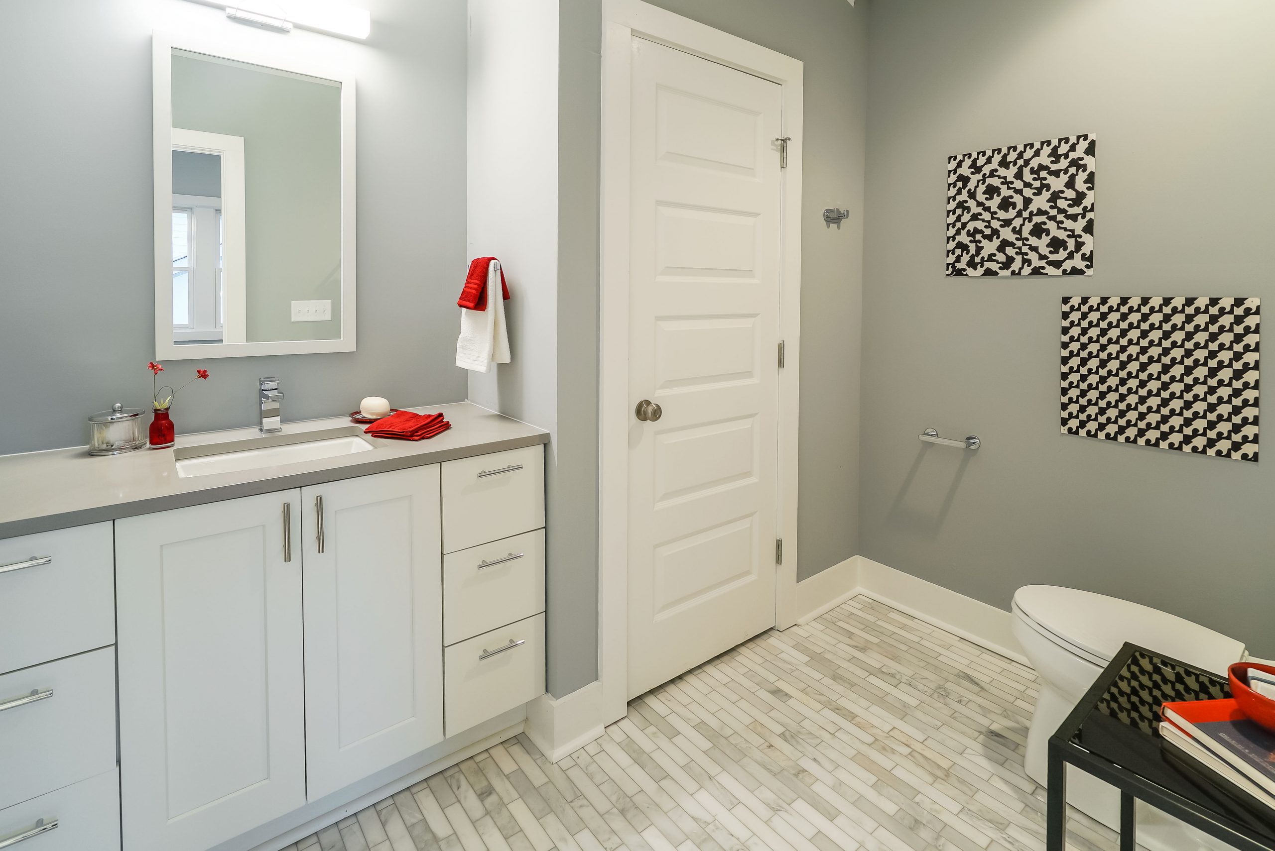
Pretty and Polished
Grey and red is the ultimate modern colour combo, as seen in this small bathroom. The floor tiles also turn up the space’s style factor, while the large vanity allows renters to stay tidy and organized as soon as they move in.
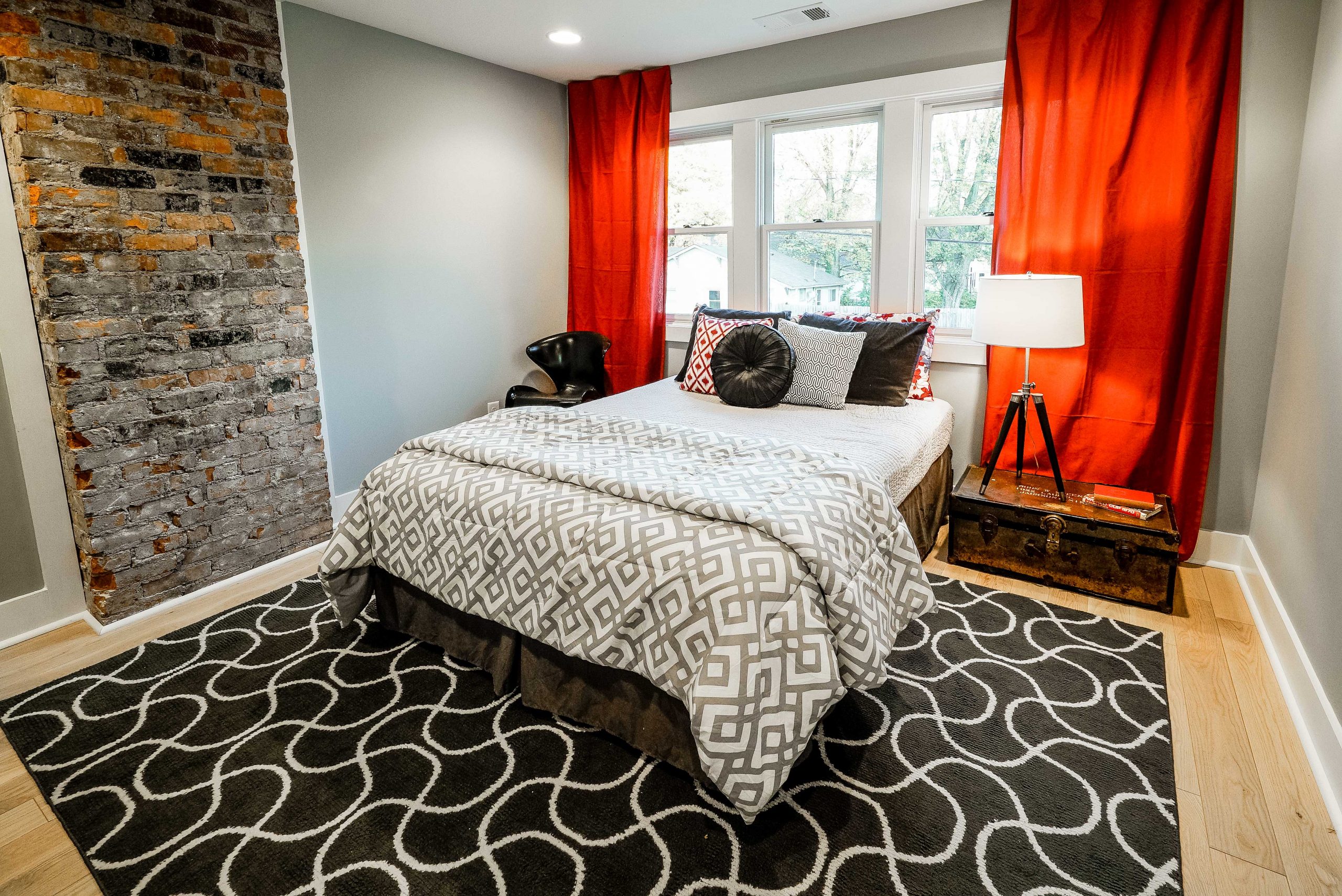
Masterful Master
This is the perfect master bedroom for a single renter or a couple. The beautiful exposed brick adds character, while the rich reds and blacks provide a bold and modern feel. Introduce a few talking pieces like the chest that serves as a night table and the leather chair, and it becomes a room renters will never want to leave.
HGTV your inbox.
By clicking "SIGN UP” you agree to receive emails from HGTV and accept Corus' Terms of Use and Corus' Privacy Policy.


